Quantcast
Channel: howmuch.net
Viewing all 687 articles
Browse latest View live

Median U.S. Home Prices and Housing Affordability by State

$
0
0

The coronavirus pandemic is reshaping the U.S. economy in a lot of different ways, especially the housing market. COVID-19 has sent office workers looking to move away from major cities and into the suburbs for more space, and historically low mortgage interest rates have added further fuel to an already hot market. But most households cannot comfortably afford to own a house, as our latest map of median U.S. home prices illustrates.
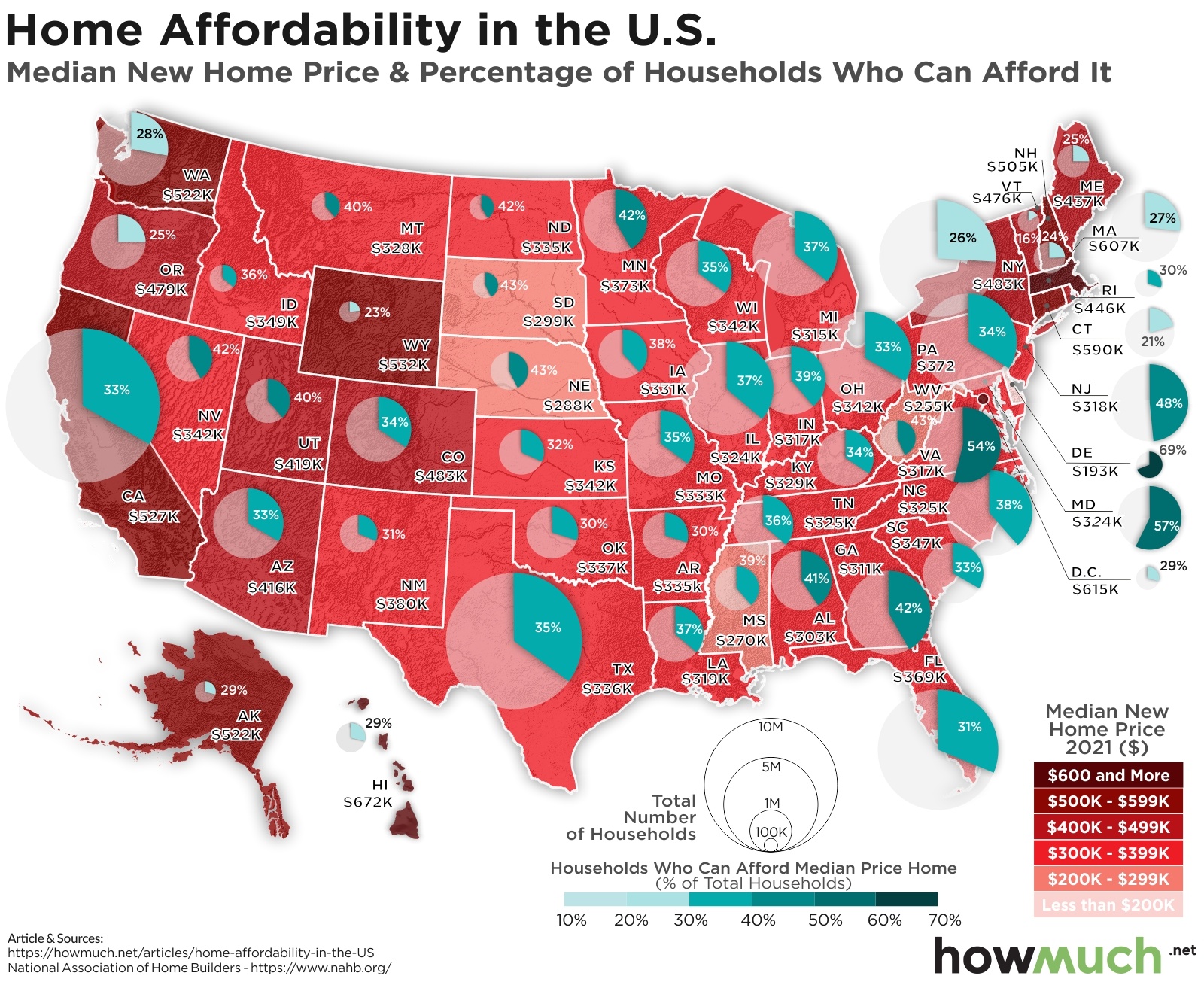
Median US home prices

  • Vermont is the least affordable state in the country, with only 16% of households able to easily afford a mortgage payment for a new median price home costing $476K.
  • Not every state in the Northeast has a massive housing affordability problem. Delaware is the most affordable place in the entire country because some 69% of households can afford a home worth about $193K.
  • Housing affordability is a real problem in largely rural states like Wyoming (23%) as well as states with large urban areas, like New York (26%).
  • A close look at our map reveals how different income levels between states directly plays into the housing affordability crisis. The same proportion of households can afford a home in California as Arizona (33%), but the median new home price is vastly different ($527K vs. $416K, respectively).

First, we color-coded each state based on the median new home price according to an index from the National Association of Home Builders. Second, we overlaid a circle representing how many households live in each state. And finally, we shaded a slice of each circle to indicate what percentage of households can afford a home. The result of our analysis is a detailed snapshot of the U.S. housing crisis from coast to coast.

Top 10 States Where the Least (%) of Households Can Afford a New Home

State Percentage of Households Who Can Afford the Median Price New Home
1. Vermont 16%
2. Connecticut 21%
3. Wyoming 23%
4. New Hampshire 24%
5. Maine 25%
6. Oregon 25%
7. New York 26%
8. Massachusetts 27%
9. Washington 28%
10. Washington, DC 29%

In one broad stroke, our map uses a housing affordability index to illustrate the crisis across the country. There are only 3 states where more than half of the households can afford a home, like Delaware (69%), Maryland (57%) and Virginia (54%). In the vast majority of places, hardly anyone is in a position to pay the mortgage on a typical single-family home. This means that in places like Vermont here only 16% of the population can afford to own a home, families are getting financially stretched thin. This is true in states with huge cities like New York (26%) as well as largely rural states like Wyoming (23%). There’s no doubt mortgage payment forbearance is directly impacting lots of people’s lives.

But our map also tells a deeper story about housing prices. Interestingly, housing prices alone are not the sole determiner of affordability. If a lot of families have high enough incomes to support themselves, then an expensive housing market in itself doesn’t make homeownership impossible. Take California as an example, a state notorious for exorbitant housing prices, where a new home costs $527K but 33% of households can afford it. Compare that to next door Arizona, where a comparable house costs significantly less at $416K and still only 33% of the households can afford it. This suggests that runaway housing prices aren’t the only contributor to the affordability crisis. Wages are an equally important factor to consider.

If you are on the market for a new home, or shopping around for a better loan rate, check out our mortgage cost guide today.

Data: Table 1.1


Charting 17 Years of American Household Debt

$
0
0

The coronavirus pandemic is changing consumer habits in a lot of ways. In fact, according to recent surveys, people say they will use additional government stimulus payments to pay off personal debt. This got us thinking about how total household debt has changed across the U.S. over the last several years.

US household debt chart

  • Student loan debt has exploded over the last 17 years, growing some 546% from 2003 through 2020.
  • Auto loans have also increased substantially, growing by 114% as the average price of new cars and longer loan terms enable Americans to take on more debt than ever before.
  • Every category of consumer debt has increased in the last several years with the exception of other miscellaneous types of debt, which decreased 12% since 2003.
  • Many Americans say they intend to pay down their debts with a third round of direct government stimulus hitting bank accounts starting March 2021.

We found the data for our visualization from the Federal Reserve Bank of New York. Starting with the first quarter of 2003, we plotted out the overall relative percentage change in household debt based on different categories. This allows you to easily and quickly see how the relative debt load for American households has changed over the last several years, and it provides a few clues as to where things are headed in the future.

The most obvious story our visualization tells is how student loans exploded as a portion of household debt. From 2003 through the end of 2020, student loans increased by some 546%. This means that as a relative share of total household debt, student loans increased by more than five times their original starting balance. And there are lots of things happening at the federal level in response to the rise of student loans. President Trump initially suspended student loan payments and the accumulation of interest, which President Biden continued until September 2021. Democrats recently made any future cancellation of student debt income tax free. All of this suggests President Biden may directly cancel some amount of student loan balances in the future.

Student loan debt has shot up over the last several years, and other types of household debt have also seen increases. Auto loans make up the second highest growth in relative household debt, topping 114% of their relative share compared to 2003 levels. There are a few reasons why car loans are going up. The average price of a new vehicle now often tops $40,000, and some lenders are willing to write loans for up to 8 years. Mortgages are also higher as a relative share of household debt at 103% of 2003 levels. Home equity loans accelerated in the run up to the housing crisis until 2009, when they started a long downward trend. Credit card debt meanwhile has remained relatively flat, rising slightly in the lead up to the Great Recession before declining and rising again. And other types of loans, such as unsecured personal loans or payday advances, are likewise down about 12% from their 2003 baseline.

Not all types of debt are bad. Sometimes taking out a loan is the best way to spread the cost of an expensive purchase over a long period of time. And it always pays to shop around for the best rates. We have a lot of resources to help you get started, like our guide to how student loans work, how to get prequalified for an auto loan, the best personal loans for paying off credit card debt, and how to understand your mortgage.

Data: Table 1.1

Top 25 Most (and Least) Expensive American Cities to Rent an Apartment

$
0
0

Paying the rent is usually one of the most expensive bills due each month. But some people are spending a lot more than others on rent, as our latest map of the most expensive and cheapest cities to rent an apartment in the U.S. demonstrates.

The cheapest and most expensive cities to rent an apartment in the us

  • New York City is the most expensive city in the country to rent a typical 2-bedroom apartment, costing $4,927 per month.
  • Wichita, KS is the cheapest American city where it runs just $763, or about 15% as much as New York City.
  • Some of the most expensive and cheapest markets aren’t actually very far from each other. Fresno and San Francisco are only a few hours’ drive, but the cost to rent an apartment is wildly different ($942 vs. $4,084, respectively).
  • The price difference in rents between the most expensive and cheapest cities is enormous. Many remote workers will likely end up with more money at the end of the month even if companies pay less based on local costs of living.

We found the data for our latest map thanks to the February 2021 Rent Report from Apartment Guide. The researchers used 2019 US Census population estimates to determine the top urban areas. Apartment prices are based on Apartment Guide and Rent.com’s multifamily rental property inventory. We plotted a spike for each of the top 25 cheapest and 25 most expensive cities for renting an average 2-bedroom apartment. The size of the spike corresponds to the price for rent, creating a snapshot of the rental market across the U.S.

Top 10 Most Expensive U.S. Cities for Renting an Apartment

City State Average Monthly Rent (2021)
1. New York NY $4,927
2. Boston MA $4,728
3. Los Angeles CA $4,514
4. San Francisco CA $4,084
5. Jersey City NJ $3,821
6. Oakland CA $3,305
7. San Diego CA $3,232
8. Chicago IL $3,065
9. San Jose CA $3,034
10. Scottsdale AZ $3,020

See the top 25 here.

Top 10 Cheapest U.S. Cities for Renting an Apartment

City State Average Monthly Rent (2021)
1. Wichita KS $763
2. Lubbock TX $875
3. Tulsa OK $898
4. Fresno CA $942
5. Oklahoma City OK $944
6. Toledo OH $949
7. Greensboro NC $1,026
8. Gilbert AZ $1,029
9. Tucson AZ $1,044
10. Fort Wayn IN $1,077

See the top 25 here.

Our map illustrates the enormous price difference between the most expensive and cheapest markets for being a renter. As you might expect, the most expensive markets tend to be on the coasts in big cities, while the cheapest are generally scattered across the country’s interior. At one end of the price scale, it costs almost $5,000 just to rent an apartment in New York City. Compare that to the opposite end of the spectrum, where it runs only $763 for a two-bedroom apartment in Wichita, KS. Rent in Wichita is only about 15% as much as in New York City. Over the course of an entire year, that represents a total cost difference of over $49,000.

But things get more interesting when the most expensive and cheapest rental markets are located relatively close to each other. For example, in Fresno, CA it only runs about $942 for the typical 2-bedroom apartment. Some of the most expensive rental markets in the country are only a few hours away, including San Francisco ($4,084) and Oakland ($3,305). Certainly Fresno isn’t on the coast, but neither are a lot of expensive apartments in San Francisco. Immediate proximity to major high-paying emplyers is obviously a major driver of rental costs.

There are lots of ways to explain the disparity between rent costs across US cities. For starters, New York, Boston and Los Angeles are a lot more crowded than Wichita, Lubbock or Tulsa. They are also home to several major employers with high-paying jobs and lots of urban amenities. But the price differential is also why a lot of people are leaving expensive coastal markets in favor of cheaper places with lower costs of living. Last year the rental market in San Francisco actually saw prices decline for the first time in recent memory. And many remote workers are stating they would prefer to stay remote indefinitely, even after the coronavirus pandemic ends. The price differentials in our map are so huge, that even if companies determine they can lower pay based on where workers choose to live, the savings from cheaper rent can outweigh any reduction in wages. Workers end up better off in the end.

If you are renting an apartment, it’s a smart idea to carry retner’s insurance. Check out our renter’s insurance cost guide to get started today.

Data: Table 1.1
Here’s How the U.S. Tax System Compares to Other Developed Countries

$
0
0

What would it mean to have a fair tax system? Would individuals pay more than companies? And would people pay more taxes through consumption, or when they earn an income? This visualization contains a snapshot of different tax categories for OECD member countries, demonstrating how there are lots of different ways to raise revenue.

Developed countries sources of tax revenue

  • The U.S. tax system generates the most money in the world ($5.2T), and individuals shoulder a disproportionate burden of that total (41.5%) compared to other OECD countries.
  • Social insurance and consumption taxes contribute a higher share of tax revenue for other OECD countries than the U.S. (24.9% OECD average vs. 17.6% in the U.S.).
  • Companies pay far less in taxes in the U.S. (3.9%) compared to other countries, like Japan (12.9%) or Australia (19.1%).
  • Consumption taxes, like the Value-added Tax (VAT), make up a third of total tax revenue for OECD countries, but this is usually passed to consumers through higher prices.

We found the data for our visualization from two different places. We got total revenue details by country from the OECD. The Tax Foundation then took these numbers and calculated the percentage of different types of taxes by country. It is worth pausing to consider the methodology behind these numbers before diving into a discussion of the results. The OECD has its own way of placing types of taxation into different categories, which creates an apples-to-apples comparison across countries. And data for specific countries like Australia, Japan and Mexico is from 2018, the latest for which information is available. All other numbers are from 2019. We sorted each country by the total tax revenue grouping countries by continent, showing both the overall picture of which types of entities pay the most in taxes as well as the relative ranking inside each country.

Top 10 Countries With the Highest Tax Revenues

Country Total Tax Revenue (2019)
1. United States $5.2T
2. Japan* $1.6T
3. Germany $1.5T
4. France $1.2T
5. United Kingdom $933B
6. Italy $849B
7. Canada $581B
8. Spain $482B
9. Korea $450B
10. Australia* $417B

*Data for Australia and Japan is from 2018 because 2019 data was not available yet.

It’s no surprise that the U.S. raises the most overall tax revenue of any country in the world. However, with $5.2T in total revenue, an astonishing 41.5% ultimately comes from individuals. Only Denmark has a higher rate at 52.4%. In the U.S., 24.9% of the total derives from social insurance, 17.6% from consumption taxes, 12.1% from property and only 3.9% from corporations. This means that companies are paying a far smaller share of tax revenue than individuals.

The situation in the U.S. is remarkably different from all the other OECD countries. For starters, social insurance and consumption taxes generate a lot more revenue in other countries than the U.S. In fact, social insurance is the top tax revenue generator in a lot of places, including Japan (40.2%), Germany (37.9%) and France (32.8%). And the comparative amount shared by individuals is substantially less across the developed world compared to the U.S. In a lot of countries, individuals don’t even contribute 20% of their incomes to total taxation, like Colombia (6.2%), Slovenia (14.3%) or Portugal (18.4%). That’s because other entities, like companies, pay a lot more in taxes in countries like Japan (12.9%) or Australia (19.1%) compared to the U.S. (3.9%).

Individual taxpayers end up paying a big chunk of total tax revenue in countries other than the U.S. through consumption taxes. The Value-added Tax (VAT) is an obvious example of this. A tax system based around VAT means that every time one business “adds value” in the supply chain, a tax is due to the government. This adds up over time as finished products get made and brought to market, and it’s usually passed to consumers through higher prices.

Why do you think individuals pay so much in taxes in the U.S.? Should the U.S. switch to a tax system more focused on consumption like the rest of the developed world? Let us know in the comments.

Data: Table 1.1

Mapped: Uninsured Rates by State

$
0
0

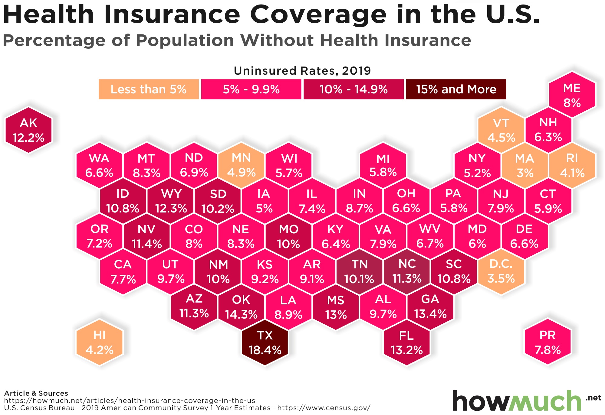
After Obamacare was passed in 2010, the rate of uninsured people steadily declined for several years. But then, a couple years ago the trend reversed, and the number of uninsured Americans started to rise. Our latest map breaks down how many Americans don’t have health insurance living in each state.

How many americans don't have health insurance

  • Texas easily has the highest rate of uninsured people of any state in the country, with 18.4% of the entire state’s population without coverage.
  • Our map shows that across the South, many states have double-digit percentages of uninsured people, including Oklahoma (14.3%), Georgia (13.4%) and Florida (13.2%).
  • Massachusetts has the single best rate of insurance coverage in the country, with only 3% lacking coverage.
  • There’s a cluster of states in the Northeast with similarly low rates of uninsured people, highlighting a major regional gap between the North and South for health insurance coverage.

We got the data for our map directly from the US Census Bureau, which runs an annual demographic survey of the U.S. called the American Community Survey (ACS). The ACS generates useful estimates through statistical sampling of the population. In this case, we generated a simple heat map to show the percentage of people who don’t have health insurance coverage. The darker color, the more people there are who don’t have insurance. The result is an intuitive snapshot of who has coverage, and who doesn’t. We are showing 2019 rates, the latest data available.

Top 10 States With the Highest Percentage of Uninsured Americans

State Population without health insurance (%)
1. Texas 18.4%
2. Oklahoma 14.3%
3. Georgia 13.4%
4. Florida 13.2%
5. Mississippi 13%
6. Wyoming 12.3%
7. Alaska 12.2%
8. Nevada 11.4%
9. Arizona 11.3%
10. North Carolina 11.3%

Health insurance is a key cornerstone of personal financial security. The cost of medical care for certain conditions in the U.S. is prohibitively expensive. In fact, health issues are frequently cited as a leading contributor to bankruptcies. Regardless if someone has health insurance from an employer or directly through a government program, expanding insurance coverage to more people is a specific way to decrease poverty in the U.S. 

And our map makes it clear which states are doing a good job, and which ones are doing a bad job, in making sure their people have health insurance coverage. Texas easily leads the country as the state with the greatest percentage of uninsured people at 18.4%. Oklahoma isn’t too far behind at 14.3%, followed by Georgia at 13.4%. Five out of the top ten states with the highest rates of uninsurance are all across the South, with several states from Arizona (11.3%) to South Carolina (10.8%) breaking the double-digits. 

The situation in the South stands in contrast to North and Northeast, where apparently a lot more people have access to health insurance coverage. Massachusetts leads the country with the lowest rate of uninsured people (3%). There is some irony in how the healthcare plan Mitt Romney implemented for Massachusetts paved the way for Obamacare, which greatly expanded the ranks of insured Americans by covering an additional 30 million people. Several other states in the Northeast also boast insured percentages in the low single digits, like Rhode Island (4.1%), Vermont (4.5%) and New York (5.2%). Clearly it is much better to live in the North than the South when it comes to staying covered in case of major health problems.

If you don’t have health insurance right now, it’s a good idea to get covered. Check out our health insurance cost guide to get started today.

Data: Table 1.1

5 Visualizations We Wish We Had Published in March 2020

$
0
0

There’s a lot of fantastic data visualization professionals out there, and we’d like to highlight some of our personal favorites we saw over the last month. Our top 5 favorite visualizations all have one thing in common. They do a good job of helping us understand our place in the world and the historical context of a global pandemic and its impacts on industries.

The World’s Deadliest Pandemics

The worlds deadliest pandemics

Visual Capitalist’s Carmen Ang powerfully situates the coronavirus pandemic in its proper historical context by comparing it to the deadliest pandemics of all time. This is not to minimize the severity of Covid-19, but instead highlight the significant advances of science and medicine over the centuries. If approximately half the world’s population perished in the Black Death, before doctors understood modern germ theory, then we are all lucky to live in an era where vaccines are rolling out in record time.

Start-up Funding by Industry: 2019 vs. 2020 (Animation)

Start-up Funding by Industry

Business Financing has an original way to visualize how start-up funding changed from 2019 to 2020. Despite the coronavirus pandemic, start-ups received an incredible 42% more funding than they did the prior year. The creatives at Business Financing demonstrate how these funds are unevenly distributed around the world, and the U.S. only increased its share of start-up funding in the pandemic.

See the animation HERE.

Lockdowns Help Ease Covid-19 Death Toll From January Peak

Lockdowns Help Ease Covid-19 Death Toll From January Peak

It’s hard to wrap your head around how disproportionate the coronavirus’ impact has been around the world for the past year. The Finance Times has a brilliant visual demonstrating how far the world has come, and indeed how far the pandemic is ending. Deaths are on the decline in the U.S., but they’ve never been higher in Brazil. In fact, taking a step back to look at deaths across the whole world, we aren’t that far removed from the peak in late January 2021.

World’s Biggest Data Breaches and Hacks (Interactive Visualization)

World’s Biggest Data Breaches and Hacks

One thing the coronavirus pandemic has changed is how much people rely on the Internet. And because so many companies now collect and use consumer data, there is a large and growing threat from hackers. The researchers at Information is Beautiful do a great job demonstrating how common large data breaches have become. Indeed, scrolling up and down this visual shows how the number of companies and the size of the hacks only increases with each passing year.

See the visualization HERE.

Map: A Look at World Population Density in 3D

A Look at World Population Density in 3D

We originally discovered Alasdair Rae’s eye-catching visualization of the world’s population density on Twitter. This is a beautiful take on the distribution of the world’s population because of its minimalist aesthetic. The viewer’s attention is drawn to the yellow peaks representing humanity’s greatest concentrations across the Eastern Hemisphere. This is a great reminder that the vast majority of people live somewhere along a coastline and not in the interior of continents.

How do you like our selection of visualizations from around the Internet? Have you seen any creative and unique data visualizations in the last month? Drop us a link in the comments.

Visualize How Enormous U.S. Corporate Profits Really Are

$
0
0

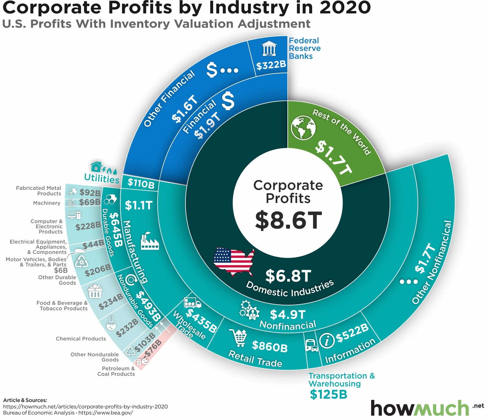
U.S. corporate profits are hovering around an all-time high, despite the challenges of lockdowns due to the pandemic. And according to our most recent visualization, some of the most profitable industries and sectors just might surprise you.

US corporate profits by industry in 2020

  • U.S. corporations generate most of their profits in domestic industries, not international markets ($6.8T vs. $1.7T).
  • The financial sector generates more net income than every other U.S. company in international markets ($1.9T vs. $1.7T).
  • High-flying tech companies overall make less money than less flashy industries, like retail trade and durable goods ($522B vs. $860B and $645B, respectively).

We found the data for our visualization thanks to researchers at the U.S. Bureau of Economic Analysis (BEA). We broke down the figures into several different underlying categories. At the most basic level, we split U.S. corporate profits between domestic and international markets. We then added subsequent layers in our breakdown, across financial and non-financial industries, and their underlying sectors. Our visualization therefore contains both high-level information about the source of U.S. corporate profits, and detailed stats on the specific industries and sectors earning the most money.

Our visualization shows how U.S. companies make the majority of their profits here in the United States, not through overseas operations ($6.8T domestic vs. $1.7T international). President Biden recently articulated a spending program backed by raising taxes on corporations, focusing on taxing their overseas earnings. Although U.S. companies do make a lot of money through their international operations, the vast majority of net income continues to come directly from the American market. That being said, U.S. companies shoulder a lighter tax burden compared to other developed countries.

But our visualization also demonstrates the specific industries and sectors generating the most profit. It’s no surprise the financial industry is huge, with some $1.9T in annual profits. That single industry is more profitable than the entire combined total of U.S. corporate profits from overseas. One unexpected takeaway from our visual is how information companies aren’t the most profitable in the U.S. With $522B in annual net income, IT companies aren’t exactly strapped for cash, but that’s still less than retail trade ($860B) and durable goods ($645B). Compare that to oil and petroleum companies, which only generate $76B in profits.

Are you surprised that financial institutions make so much money compared to other industries? Do you think Biden’s proposal to tax international earnings will raise enough money to fund his spending programs? Let us know in the comments.

Data: Table 1.1

Mapping the Highest Paid Professions in Each State

$
0
0

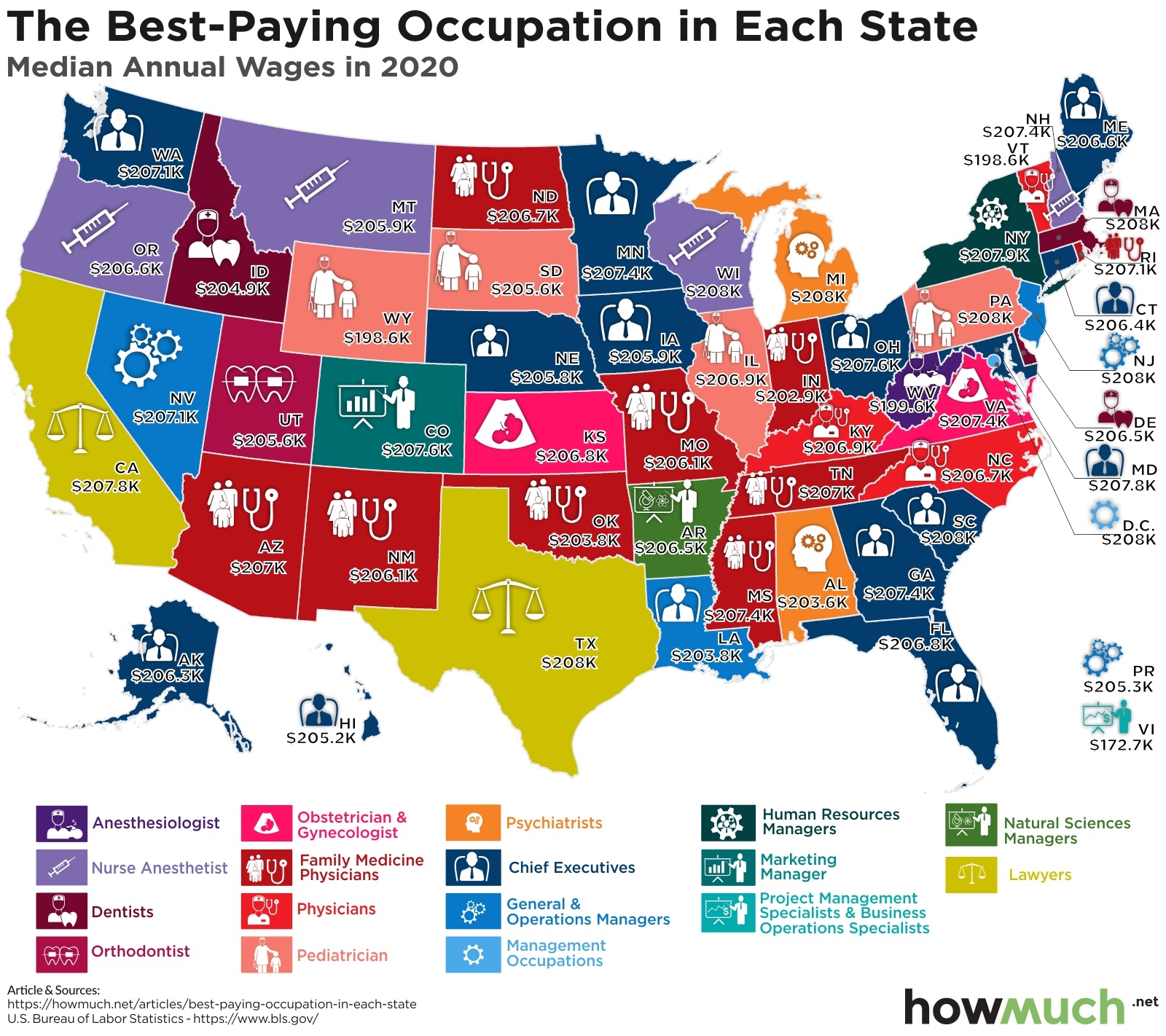
Money doesn’t buy happiness, but it can make your life easier. That’s why a lot of young people immediately think about future earning potential for a given career path. This map can help frame the choices by identifying the most highly paid occupation for every state in the U.S.

Highest paying jobs in america

  • Dentists in Massachusetts and pediatricians in Pennsylvania boast the highest median salaries anywhere in the country, with both making $208K per year.
  • At the other end of the spectrum, a project manager in the Virgin Islands can expect to make only $172.2K per year. That’s still significantly above the median wage for all workers across the U.S.
  • A lot of occupations in medicine rank as the highest paid, including anesthesiologists, dentists and physicians.
  • The highest paid professionals in each state usually earn at least $200K, with only 4 states or territories falling below $200,000.

We found data on the highest paid occupations from the U.S. Bureau of Labor Statistics. Our map reflects the jobs with the highest median annual salary in each state. We categorized each profession with a color and an intuitive icon. This is the best approach for understanding the dataset because a median figure separates the sample between the higher and lower half. All things being equal, someone working in a given job will likely earn somewhere close to the numbers on our map.

There are a couple clear takeaways from our map of the best paying jobs in the U.S. First, medical professionals dominate the rankings across several states. Looking at the map, there are a lot of states like Arizona, New Mexico and Indiana where family medicine physicians take the top spot. Anesthesiologists, dentists and pediatricians also do extremely well. For example, the median pay for a dentist in Idaho is $204.9K even though the state is largely rural outside of Boise. But apparently you don’t have to go all the way through medical school and become a certified physician to make the big bucks. Nurse anesthetists, who assist an anaesthesiologist but may not be doctors themselves, pull down well over $200K in a few states, including Oregon ($206.6K), Montana ($205.9K) and Wisconsin ($208K). 

One surprise in our map is actually what’s missing. There are a lot of places where chief executive is the highest paid role, like Florida ($206.8K) and Minnesota ($207.4K). The highest paid CEO in the S&P 500 personally made $211M, which is an astonishing sum of money. However, there aren’t any states where financial professionals make the most money. In New York, HR managers make the most money ($207.9K). Finance is no doubt a lucrative career, but it’s certainly not the most profitable.

Medical occupations make the most money partly because medical care is so expensive in the U.S. If you don’t have health insurance, check out our health insurance cost guide to get started today.

Data: Table 1.1


Visualizing One Year of Fluctuating Covid-19 Vaccine Stock Prices

$
0
0

The coronavirus is reshaping the global economy in a lot of different ways, and it’s placed a spotlight on how pharmaceutical companies make money. After all, 1 in 5 Americans is now fully vaccinated against Covid-19. But a detailed look at the stock market performance of top vaccine stocks raises questions about whether they are still worth investing in.

Top vaccine stocks

  • Novavax is easily the biggest winner in a portfolio of Covid-19 vaccine companies, returning +1,192% from a year ago and topping out in February at $319.93 per share.
  • Other Covid-19 vaccine companies have seen positive share price results over the last 12 months, including Moderna (+341%), BioNTech (106%) and Johnson & Johnson (+31%).
  • Not all Covid-19 vaccine makers are seeing outstanding shareholder returns, including Sinovac which is exactly flat at $6.47 over the last year.
  • These movements in stock value should be placed in the broader context of a stock market that is high by historical standards, not to mention business models that rely on more than just the production of a single vaccine.

We found the data for our visual at Yahoo Finance. We charted the last 12 months of stock price changes in percentage terms, and we marked the highest prices reached for several major companies intimately involved with the manufacture and distribution of Covid-19 vaccines. The result is an interesting portrait of the market’s reaction to the key companies most closely tied to helping the world resolve Covid-19 once and for all.

The most obvious standout among the portfolio of Covid-19 vaccine makers is Novavax. On April 1, 2020, Novavax stock opened at just $14.18 per share. It then sharply skyrocketed throughout the summer peaking in mid-August at around $180 per share, before dropping back down and shooting back up in the fall to a high of $319.93. In total, over the last 12 months, shareholders have experienced a net gain of +1,192%. That’s because unlike most of the other companies in our visual, Novavax went from being a relatively unknown pharmaceutical company on the East Coast to a major contender with a highly effective Covid-19 vaccine.

Other vaccine makers have also seen positive returns on their stock, but none anywhere close to Novavax. Moderna boasted excellent returns for shareholders, topping +340% in year-over-year growth, followed by BioNTech at +106%. Johnson & Johnson saw a total increase of +31% in value, peaking at $169.42 per share in January. It remains to be seen how the latest federal guidance to pause the Johnson & Johnson vaccine will impact the company. And at the lowest end of the scale, Sinovac remained steady, closing at exactly the same price of $6.47 from where it started 12 months ago.

It helps to put some of these stock price movements into context. In general, the broader stock market is close to an all-time record high. Over the last 12 months, the S&P 500 is up +56.3%, beating half the companies in our visual. The price for a share of Slack is up +69.8%, and Zoom is up an eye-popping +158%. And don’t forget, Gamestop is still up +3,527% from a year ago.

There are a couple other caveats to keep in mind about the stock price movements for these major pharmaceutical companies. Covid-19 vaccines are still only a portion of many of these companies’ portfolios of products. Johnson & Johnson for example makes a lot of different medical and consumer products, including well-known brands like Neutrogena and their now infamous baby powder. And finally, many companies manufacturing the Covid-19 vaccine are sensitive to the perception that they are making money off the pandemic. That’s why the most expensive vaccine costs only about $40, and the U.S. federal government’s stated policy is to provide vaccines at no cost to consumers. In short, big pharma stock prices are up, but that doesn’t necessarily mean these companies are gouging consumers during a lethal pandemic.

Want to help fight the coronavirus right now? Donate to the WHO’s Covid-19 Response Fund. Many health insurance companies are also covering the cost of getting the Covid-19 vaccine, so check out our health insurance cost guide if you don’t have coverage yet.

Data: Table 1.1

Top 10 Most Expensive Riots in the U.S. Insurance History

$
0
0

From California to Washington, DC, coast to coast, various protests and riots unintentionally and intentionally lead to damage. Once this occurs and the dust settles, who foots the bill? Research shows that not only is the insurance industry covering the costs, but so are U.S. taxpayers.

Costliest civil disorders

  • Since the 1960s, civil disorders have cost the United States billions due to damages.
  • Damage costs from civil disorders in the 1960s totaled over 1 billion.
  • Los Angles, California alone has incurred a little under 2 billion in damage costs from civil disorders from 1965 to the present.
  • America’s most destructive riots occurred in high-population cities.

Our visualization looks at the cost of riots and civil disorders over the last century. The data comes from the Insurance Information Institute and was compiled by Axios. It looks at insured losses to the insurance industry. Anything over $25 million in loss is categorized as a catastrophe. The data is adjusted for inflation.

Top 10 Most Expensive Riots in the U.S. Insurance History

Date Location Insurance Loss (Current $)
Apr. 29-May 4, 1992 Los Angeles, CA $1.42B
Jan. 6, 2021 Washington, DC $500M-$1B
Aug. 11-17, 1965 Los Angeles, CA $357M
Jul. 23, 1967 Detroit, MI $322M
May 17-19, 1980 Miami, Fl $204M
Apr. 4-9, 1968 Washington, DC $179M
Jul. 13-14, 1977 New York, NY, $118M
Jul. 12. 1967 Newark, NJ, $115M
Apr. 6-9, 1968 Baltimore, MD $104M
Apr. 4-11, 1968 Chicago, IL $97M

Riots and civil unrest can cost hundreds of millions of dollars. The longer they last, the more damage they tend to cause. Nearly all major riots and unrest are associated with political upheaval, with many related to civil rights. Yet, insured data doesn’t include unfiled claims, which means these figures underrepresent the true value of the damage.

The protests related to George Floyd are different because they are widespread and not centralized to one city or state, making it difficult to judge their true cost immediately. Yet, it’s likely that it eclipsed $1B-$2B in paid insurance claims.

However, it’s important to note that the vast majority of protests remain peaceful. Additionally, the cost of insurance claims related to civil unrest and riots is dwarfed by natural disasters such as hurricanes.

Understanding the financial strain that civil disorders are costing the United States, is there a way to make protests more peaceful so we can reduce the damage costs that we incur? Let us know in the comments below.

Data: Table 1.1

Visualized: Regional Price Parity For Each State

$
0
0

Purchasing power is a great way to compare how expensive things are between one place and another. One of the most common ways economists do this is by measuring regional price parity, which allows us to stack rank the most expensive (and cheapest) states for everyday goods and services.

Regional price parity by state

  • Hawaii is the most expensive state in the country for everyday items and services, with a price parity score of 119.3, or 19.3% above the national average.
  • At the opposite end of the spectrum, Mississippi is the least expensive with a price parity score coming in at 84.4%, below every other state and significantly lower than the national average.
  • Delaware and Florida are the two closest to the national average in terms of price parity (99.4 and 101, respectively).
  • More populous states along the East and West Coasts tend to have higher costs of living than the Midwest and South, highlighting a key reason why people move to warmer climates during retirement.

We found the dataset for our visual at the U.S. Bureau of Economic Analysis. The underlying numbers reflect prices across states as of December 2020. You can read the detailed methodology behind the researchers’ analysis, but in short, the numbers represent the relative expense between geographies at a given point in time. For example, Maryland has a price parity of 107.7, meaning that on average things cost 7.7% more in Hawaii than the U.S. as a whole. The result of our visual is an intuitive snapshot of the most expensive (and cheapest) states to live in across the country.

It’s unsurprising that Hawaii tops the charts as the most expensive state in the country. Almost all the consumer goods purchased on the Hawaiin Islands have to be flown in or transported by boat. It’s not cheap to live in tropical paradise, and with a price parity score of 119.3, residents are paying almost 20% more just to live there.

Setting Hawaii aside as a clear outlier, the continental U.S. states generally fall into two groups. At one end of the expense spectrum, populous coastal states like California (116.4), New York (116.3) and New Jersey (116) have extremely high costs of living. Consumers pay a lot more for everyday items in those states compared to the national average. And in the other group, Southern and Midwestern states boast relatively low price parity numbers. Mississippi is the cheapest in the country (84.4), followed by Arkansas (84.7) and Alabama (85.8). Ohio (88.4), Indiana (88.7) and Iowa (89) aren’t too far away from the bottom tier either. Delaware and Florida (99.4 and 101, respectively) are the closest to the national average.

The rise of remote work during the coronavirus pandemic is leading a lot of people to leave expensive cities like San Francisco and New York in search of more space at a lower cost. Although COVID-19 hasn’t completely rewritten the rules for where millions of people want to live, it has opened up new possibilities. In this sense our visualization highlights some different states, like Mississippi and Alabama, that are worth considering for their high levels of cost savings.

Are you working remote during the pandemic? Have you moved to a new state to save on cost? Let us know your story in the comments.

Data: Table 1.1

What's in Joe Biden's American Jobs Plan?

$
0
0

President Biden’s American Jobs Plan proposes to spend hundreds of billions on new infrastructure, upgrading the U.S. water system and creating a variety of new jobs across industries. The total proposed spending comes out to around $2.65T, and here is where all that money is likely going.

American jobs plan

  • Transportation infrastructure is the single biggest category of spending in President Biden’s American Jobs Plan, totalling an eye-popping $621B.
  • Biden’s plan includes money for different enhancements in several sectors, including $40B to improve public housing, $52B for domestic manufacturing and $100B for expanded broadband.
  • President Biden’s $2.65T in additional spending is meant to be offset by corresponding tax increases, making it revenue neutral despite the high price tag.
  • It remains to be seen how the American Jobs Act will change as it becomes law, with several congresspeople proposing to increase allocations to pet projects

We found the 10-year estimates of President Biden’s American Jobs Plan thanks to observers at the Committee for a Responsible Federal Budget. We wanted to visualize the main parts of Biden’s spending program as well as the specific initiatives getting the money. The result is an intuitive and detailed look at where a giant bucket of $2.65T in federal spending is ultimately going.

The single largest category of funding in Biden’s proposal is for transportation infrastructure ($621B). This money will be spread out across a variety of different things, including electric vehicles ($174B), roads and bridges ($115B) and airports ($25B). There’s no question that American infrastructure is crumbling due to a lack of funding over several decades. Biden’s proposal is to take a big step forward toward infrastructure parity across the developed world.

Infrastructure funding alone would make Biden’s proposal a historically massive investment. But there’s a lot of other money in the American Jobs Act too. Billions are set to be plowed into job training programs ($40B), broadband ($100B), clean water ($56B) and building new public school buildings ($50B). Additional hundreds of billions will get spent on clean energy tax credits, as Biden pledges to cut U.S. greenhouse gas emissions in half by 2030. And another pot of money totalling $400B is devoted to home care services as America’s population continues to age.

So where is the U.S. federal government planning to get all this money? Although most of the recent economic stimulus was added on top of the exploding national debt, that’s not the case for Biden’s American Jobs Plan. According to Biden’s proposal, the new allocations would be offset by tax increases on wealthy individuals and corporations with global operations. It remains to be seen how the proposal will change as it becomes law. Some politicians are already trying to increase the funding for some items in Biden’s plan, like infrastructure. Others are angling to get pet projects in their home districts funded, potentially bringing back pork barrel spending.

Regardless of how Biden’s proposal develops over the next several weeks, $2.65T in federal spending would no doubt change the employment landscape across the U.S. to counteract the impact of COVID-19. How much do you think Biden will ultimately get to spend? Let us know in the comments.

Data: Table 1.1

Pandemic Payouts: The Cost of COVID-19 to the United States

$
0
0

Most Americans are well aware that federal spending during the COVID-19 pandemic has been very costly. Yet, are we aware of just how costly the government response to the 2019 Coronavirus has been? Furthermore, what is the federal budget for these expenditures? As our visualization shows, a larger percentage of current spending as of February 28, 2021 spans federal agencies focused on the health, treasury, and social security of Americans.

US response to pandemic

As of February 28, 2021:

  • In response to COVID-19, $2.07 trillion of the $2.96 trillion in total budgetary resources have been paid out.
  • Of the $2.96 trillion budget available to be spent, only $2.42 trillion have a promise to be spent, with a leftover amount of $540 billion which has no promise to be spent.
  • Around 30.5% of COVID-19 spending has gone to the maintenance and sustainability of small businesses as shown by the $902.5 billion granted to the Small Business Administration.
  • Almost 46.1% of COVID-19 spending has gone to agencies such as the Department of Treasury and Department of Labor to undergird the loss of U.S. salaries and wages.
  • COVID-19 spending for the Environmental Protection Agency accounts for less than 0.0002% of the total U.S. federal budgetary resources for FY 2021.

For our data presented, COVID-19 spending amounts represent total outlays of COVID-19 supplemental appropriations as reported by federal agencies to the official open data source of federal spending information. From these spending amounts, we were able to determine the percentages of total budgetary resources per agency category. As a note, our data accounts for spending as of February 28, 2021. Given that, COVID-19 spending amount could be higher than reflected in this article at the date of publication.

Unsurprising to most, the U.S. response to the COVID-19 pandemic looms well above the trillions as it relates to federal spending. A large percentage of current spending is shared between U.S. agencies such as the Department of Health and Human Services, Department of Treasury, and the Small Business Association. Expenditures from these agencies alone account for nearly $1.76 trillion of a proposed $2.1 trillion spend and $2.2 trillion of the $3.0 trillion budget based on the total U.S. federal budgetary resources for FY 2021. 

During the early months of the COVID-19 pandemic, federal shutdowns threatened the survival of many small businesses. As a result, around $674.4  billion of current spending has gone to the maintenance and sustainability of small businesses through the Small Business Administration. This government elected to further support Americans through economic stimuli resulting in nearly $1.3 trillion budgeted for agencies such as the Department of Treasury and Department of Labor. Interestingly, budgeted spending for the Environmental Protection Agency currently accounts for a minuscule $7.32 billion, which is just more than a third of the JFK Center for Performing Arts budget. Yet, this may change as FY2021 continues with the U.S. placing more emphasis on climate change since the Biden Administration began.

As the U.S. continues to respond to the COVID-19 pandemic through the financing of various federal agencies, Americans can better understand expenditures through various open data sources. Being aware that to date, the government may have a leftover amount of $540 billion of the FY 2021 federal budget with no promise to be spent, how do you think the government should allocate the leftover funds? Let us know in the comments below.

Data: Table 1.1

Visualizing the Negative Economic Impact of COVID-19 on Tourism

$
0
0

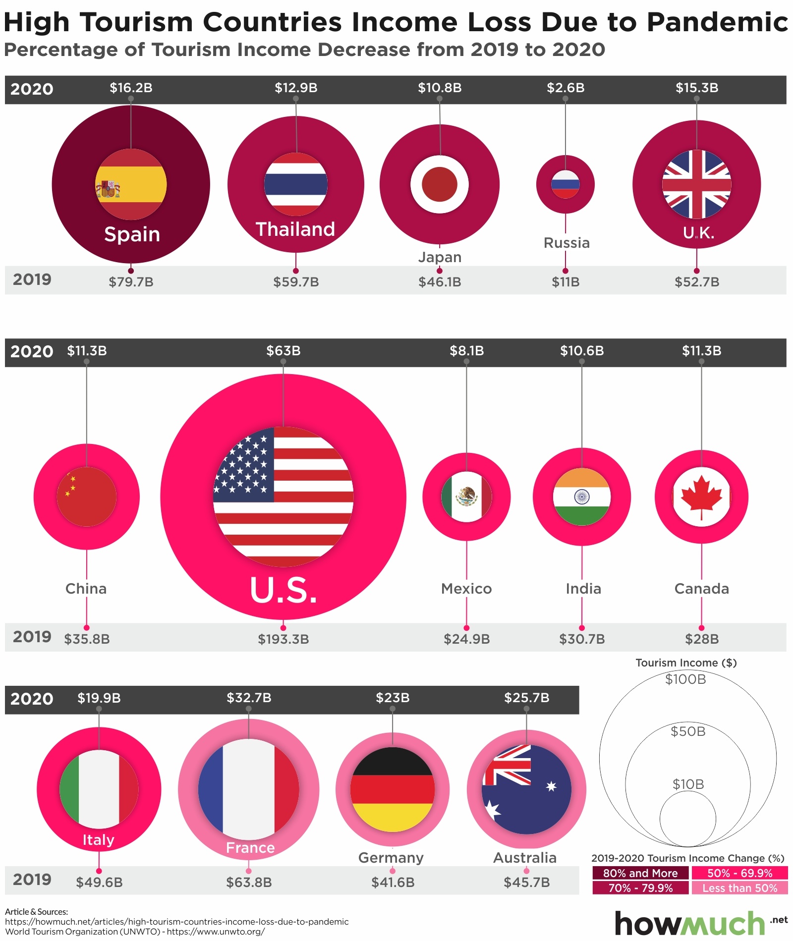
The coronavirus pandemic has caused widespread revenue loss for lots of different industries, but none more so than the tourism sector. We focused on the highest tourism countries to visualize the negative impact of COVID-19 on a year-over-year basis. The economic losses are staggering.

Tourism revenue loss

  • Spain had the single biggest drop in tourism spending due to COVID-19 from 2019 to 2020 when measured as a percentage of the total, decreasing from $79.7B to $16.2B or -80%.
  • The U.S. witnessed the single biggest overall decrease, going from $193.3B to $63B, or about -67%.
  • Every country in our visual experienced massive losses in tourism spending, with most countries suffering through drops of over 50%.
  • Travel bans are still in place for lots of countries around the world, which suggests it will take a long time for the tourism industry to recover to pre-pandemic revenue levels.

We found financial figures for tourism loss broken out by country from a report at the UN’s World Tourism Organization (UNWTO). We plotted 2019 and 2020 total spending figures, illustrating the gap between the two for each country. We added a color-coded circle to represent the size of the loss as a percentage of revenue, allowing you to quickly and easily see which countries have had the hardest time due to COVID-19 restrictions and the decrease in tourism.

Our visualization reveals the extensive economic damage COVID-19 has wrought on the tourism industry. Every country in our visual saw well over 40% decreases in tourism spending. Australia was off -44%, Germany was down -45% and France declined -49%. And those are the best case scenarios. The situation was far more severe in lots of other places. In the worst case, Spain saw tourism plummet from $79.7B in 2019 to $16.2B last year, or a decline of about -80%. Thailand likewise went from $59.7B to $12.9B, dropping -78%. And tourism in Japan similarly fell an incredible -77%, going from $46.1B to $10.8B.

It may not come as a surprise to hear the U.S. experienced the biggest overall drop in tourism spending from 2019 to 2020, decreasing from $193.3B to only $63B. That still places the U.S. as the top destination for tourism dollars in our visual, but it represents serious economic damage for thousands of businesses and their employees. To put that in perspective, the U.S. still saw as much tourism spending in 2020 as did France before the pandemic ($63.8B).

There are a few different reasons for the widespread drop in tourism. Beyond the fear of contracting and spreading COVID-19, a lot of countries went on lockdown at different points in 2020, barring both foreigners from traveling into and locals from traveling within countries. France still has some domestic travel limitations as of this writing. The EU is just now considering lifting a travel ban on fully vaccinated Americans. The U.S. for its part still maintains travel bans on several countries, including ones with widespread COVID-19 variants like Brazil and South Africa. This suggests it could take a long time before the tourism sector gets back to normal.

When do you think global tourism will fully recover to pre-pandemic levels? Do you plan to travel during the summer of 2021? Let us know in the comments.

Data: Table 1.1

How Far Can America’s Top 10 Cheapest Electric Cars Go On a Single Charge? GIF

$
0
0

Electric cars or electric vehicles, no matter the term used, are intriguing the minds (and pockets) of Americans. With so many options, pricing, and payoffs, which is the best option for you? As our visualization shows, electric cars can vary widely in terms of price but also in distance traveled per charge. This helps us answer the question of how long does an electric car battery lasts off a single charge.

Least expensive electric cars

Based on miles traveled per charge and 2021 electric car pricing:

  • Ford Mustang Mach-E tops the list as the most expensive electric car at $42,895 but falls to the bottom half of car rankings in terms of miles traveled per charge (230 miles).
  • The second most expensive electric car at $40,000, the Nissan Ariya, offers the most distance traveled per charge (300 miles).
  • Chevrolet Bolt EV presents itself as a very affordable electric car option at $31,995 with a very modest amount of miles traveled per charge (259 miles).
  • Mini Cooper SE presents itself as the cheapest option on the list at $29,900 and perhaps unsurprisingly travels the shortest distance per charge (110 miles).
  • The average distance that most electric cars travel per charge is around 220 miles, with the majority of the cars that travel the average distance costing in between $34,000 to $40,000.

For our data presented, we gathered information from Business Insider. The most affordable EVs or electric cars were defined as most affordable if their official Manufacturer's Recommended Sale Price (or MSRP) listed below, at, or slightly above $35,000. It is important to note that since most cars are eligible for the $7,500 tax credit, some cars shared in our data have an MSRP higher than $35,000. As a result of the tax credit these higher-priced options can still offset buyer costs with total costs at or below $35,000 in the long run.

Gone are the days of Tesla being the main car consumers think about when they hear the phrase “electric car”. With notable competitors such as the Nissan Ariya or Chevrolet Bolt EV, electric cars are becoming more common and more affordable. While there are still some options that are priced higher and may underdeliver, majority of the 2021 options are providing reasonable mileage output per charge at an even more reasonable price point. Each company competes to deliver the cheapest new electric cars while maintaining quality. While the lower prices often sacrifice range, the least expensive electric cars still offer a decent car battery range.

The Ford Mustang Mach-E topped the list as the most expensive car with one of the shortest distances traveled per charge, while the Nissan Ariya emerged as the furthest traveler and price tag about $3,000 cheaper than Ford. The Chevrolet Bolt EV stood as a contender as one of the lower priced cars, while still managing to produce competitive mileage per charge at 250 miles. The average distance that most cars traveled loomed around 200-250 miles with an average cost of across all cars on the list coming in around $36,000. This shows that the average pricing of cheaper 2021 electric cars appears to be on par with more popular options, such as Tesla, while still being able to benefit from a tax credit for now. As a final note, remember that when choosing a car, whether it be electric or not, insurance costs and auto loan options need to be taken into account as well when considering the total amount you are comfortable paying. As such, your options may be more limited, so choose what works best.

Electric Cars Pros and Cons

Pros Cons
Lower vehicle maintenance costs Higher upfront costs
Cheaper fueling costs Fewer stations to charge
More environmentally friendly over the vehicle's lifetime Limited selection on trucks and SUVs
Tax credits may available towards the purchase price Initial environmental impact is higher

As Americans continue to purchase more and more electric cars, should there be a concern of its effect on federal tax credits? With Tesla and General Motors electric vehicles no longer eligible for the $7,500 tax credit, how may this affect electric car purchasing habits overall? Do you think these thresholds should exist? Why or why not? Let us know your thoughts in the comments below.

Data: Table 1.1


Visualizing the State of Government Debt Around the World (Update, 2021)

$
0
0

The COVID-19 pandemic forced governments around the world to go on a spending spree to prop up their economies. At the same time, fear of the virus combined with strict lockdowns are keeping people at home, causing tax revenues to plummet. How has this ultimately impacted the world’s debt? This visualization breaks down the debt to GDP ratio for each country around the world.

Government Debt Around the World

  • Japan still has the highest debt to GDP ratio in the world at 257%, which is significantly higher than other developed countries.
  • The COVID-19 pandemic significantly increased government debt around the world, with 3 countries now over 200% of debt to GDP and 32 over 100%.
  • At the opposite end of the spectrum, a handful of petro countries carry very little debt, including Kuwait (14%), Russia (18%) and Saudi Arabia (31%).
  • The coronavirus pandemic is far from over, and many countries are continuing to spend a lot of money to support their economies, suggesting government debt will only continue to get worse in the future.

We created our visualization by taking debt to GDP ratios for each country around the world according to the International Monetary Fund (IMF). The numbers represent figures for 2021. This measure is important because it puts government debt within the context of the size of each country’s economy. For example, the U.S. has a massive economy and can tolerate a lot more debt than somewhere with a comparably smaller economy, like Greece. In this case we adjusted the size of the county and its color to correspond to the level of debt, providing a unique snapshot into the growing debt problem lots of countries are experiencing.

Government Debt by Country

Country Debt to GDP Ratio (Top 10)
1. Japan 257%
2. Sudan 212%
3. Greece 210%
4. Eritrea 176%
5. Suriname 157%
6. Italy 157%
7. Barbados 143%
8. Maldives 140%
9. Cabo Verde 138%
10. Belize 135%

The bad news is that there are lots of countries with ever-increasing government debt. An incredible 32 countries now have debt to GDP ratios larger than 100%, meaning the government carries more debt than the entire annual output for their economies. And there is a small number of countries with very little debt, especially places that rely heavily on oil, like Kuwait (14%), Russia (18%) and Saudi Arabia (31%). The vast majority of places around the world lie somewhere in between these two extremes, carrying somewhere from 50-99% of debt to GDP ratios. From this perspective, the U.S. carries more debt than the average country given the size of its economy (133%), just outside the top 10.

Our visualization represents total government debt as a percentage of GDP for 2021, and it’s an update from the same approach we took in early 2019. Comparing the numbers from before the pandemic to the most recent set of data allows us to see how the pandemic influenced total debt levels. Japan remains the world leader, rising from 238% of GDP to 257%. In fact, there are now 3 countries with a debt to GDP ratio over 200%, including Greece (210%) and Sudan (212%). And the U.S. has risen from 105% to 133%. At the highest level then, no country has moved out of debt over the last couple years, and almost everywhere in the world is going deeper and deeper into the red. And with President Biden proposing trillions in additional spending both to revitalize and transform the American economy, the situation is likely to get even worse before it gets better.

How much debt do you think the world can take on before it starts to impact growth rates? Let us know in the comments.

Data: Table 1.1

Mapped: Biden’s Capital Gain Tax Increase Proposal by State

$
0
0

Capital gain tax rates are a constant subject of political debate, and they’re once again part of the new proposed tax plan. Republicans argue that capital gains should be low because income is already taxed when it’s earned, and taxing investments has the effect of lowering overall economic growth. Democrats believe the wealthiest Americans should pay a lot more in capital gains to bring their tax burden closer in line with working people. Here’s how Biden’s tax proposals would impact capital gains rates around the country.

Bidens tax proposal

  • California is set to have the highest top marginal tax rate on capital gains in the country, totalling 56.7%.
  • 14 states would see their top rates surpass 50% on capital gains under President Biden’s proposal.
  • The vast majority of states would see top capital gain tax rates almost double, rising from about 24% to 43% in most places.
  • President Biden wants to spend a lot of the money he’s raising through taxes, leaving the future economic picture of his policy proposals up for debate.

The Tax Foundation originally crunched the numbers state by state to determine the before-and-after picture for President Biden’s proposed tax plan. We added an intuitive color-coded scale to illustrate how the top rates are changing. We also set the before-and-after to an animated GIF, allowing you to immediately see how Biden’s proposal is going to impact tax rates around the country.

States with the Highest Capital Gain Tax Rates Under Biden’s Plan

State Top Capital Gains Rate (Proposed)
1. California 56.7%
2. New York 54.3%
3. New Jersey 54.2%
4. Minnesota 53.3%
5. Oregon 53.3%
6. Washington, D.C. 52.4%
7. Vermont 52.2%
8. Hawaii 50.7%
9. Maine 50.6%
10. Connecticut 50.4%

Capital gains can be a little tricky to understand, so are they and what’s the new proposed tax plan? Taxpayers have a capital gain when they sell an asset for more than what they originally paid for it. The federal government levies different taxes for short-term capital gains (meaning the owner held the asset for less than a year) and long-term capital gains. State and local governments tack on additional taxes, plus an additional net investment income tax at the federal level for certain high-earners. And like income taxes, capital gains are progressive, meaning the more investment income someone makes, the higher the applicable rate. Our visualization takes all of this into consideration for long-term capital gains, focusing on the combined total highest tax rate.

And President Biden’s proposal would dramatically increase the highest marginal capital gain tax rates in several places across the country. Residents in 14 states would see a top capital gain tax rate of more than 50%, led by California (56.7%), New York (54.3%) and New Jersey (54.2%). In fact, no state would be below 40%, and the vast majority would be above 45%. The combined impact of Biden’s proposal is to practically double the top capital gains rate for most states, with the typical top rate going up from about 24% to 43%.

There are a couple important caveats to keep in mind about our visual. Biden wants to raise a lot of new revenue partly because he wants to spend a lot of it on infrastructure. And indeed total U.S. government revenue has been declining in recent years. Capital gain taxes are only incurred when an investor sells an asset and realizes the gain. Biden’s tax plan is just now in front of Congress, meaning that the exact rates are about to be subject to intense multiple rounds of negotiation both between political parties and within the Democratic party. Things could still change very quickly.

How do you think Biden’s tax proposal will impact the economy? Will it decrease inequality or depress economic growth? Let us know in the comments.

Data: Table 1.1

COVID-19 Unemployment Rates and Assistance Benefits by State

$
0
0

With the onset of COVID-19, Americans were faced with questions only regarding their health, but also their income sustainability. With so many companies having to make the difficult decision to lay off employees and downsize, many Americans turned to unemployment assistance benefits. So, how the number of weeks of unemployment insurance and unemployment rate stack up by state?

Unemployment Rates and Weeks of Unemployment Insurance

These takeaways are based on the Center on Budget and Policy Priorities report:

  • Unemployed workers in most states are eligible for up to 26 weeks of benefits from the regular state-funded unemployment assistance benefits program.
  • Eight states provide less than 26 weeks of unemployment assistance benefits (i.e., Alabama, Arkansas, Florida, Idaho, Michigan, Missouri, North Carolina, and South Carolina) and one state (i.e., Montana) provides more than 26 weeks.
  • Extended benefits, lasting beyond the state's regular length of regular state-funded unemployment assistance benefits, are offered in 13 states plus the District of Columbia.
  • For those in need, additional weeks of federally-funded unemployment assistance benefits are also available in most states through September 6, 2021.
  • The majority of the states across the country have an unemployment rate that falls between 4% to 6%.

For our data, we collected the information from the Center on Budget and Policy Priorities, Unemployment insurance (UI) or unemployment assistance benefits help Americans who have lost their jobs by temporarily replacing part of their wages. Sometimes, unemployed workers may exhaust their regular state-funded unemployment benefits before they can find work. Under certain circumstances, workers may be able to receive additional extended benefits and in some instances, federally-funded benefits. Our visualization shows a three-month (January to March 2021) average unemployment rate for each state, as well as the maximum number of weeks of benefits currently available through regular and extended benefits.

Top 5 States With the Highest Unemployment Rates

1. Hawaii - 9.5%
2. New York - 8.7%
3. California - 8.6%
4. Nevada - 8.4%
5. New Mexico - 8.4%

Top 5 States With the Lowest Unemployment Rates

1. South Dakota - 3.0%
2. Utah - 3.0%
3. Nebraska - 3.1%
4. Vermont - 3.1%
5. Idaho - 3.3%

States such as Montana and South Carolina recently decided to end their enhanced unemployment benefits in June. As companies struggle to fill vacancies, critics believe that high unemployment insurance payouts disincentivize people to rejoin the workforce.

United States unemployment rates and the duration of unemployment assistance benefits vary between states. Across the country, employment rates appear to be the highest in the West and Northeastern regions. Over the first three months of 2021, the states in these regions with the highest unemployment averaged a rate of around 8.4%. While it appears that most unemployed workers across states are eligible for up to 26 weeks of regular state-funded unemployment assistance benefits, some states provide less. Alabama, Arkansas, Florida, Idaho, Michigan, Missouri, North Carolina, and South Carolina are among the eight states providing less than 26 weeks of benefits (averaging 18 weeks), with Montana being the only state that provides more (28 weeks).

As Americans continue to use unemployment assistance benefits during the pandemic, should there be a concern about its long-term effect on state unemployment assistance? Should states strive to equalize the regular weeks and extended weeks of unemployment assistance that are available to unemployed workers? Why or why not? Let us know your thoughts in the comments below.

Data: Table 1.1

Visualizing Global Corporate Tax Rates Around the World

$
0
0

President Joe Biden needs to either raise taxes or add to the national debt to fund his new programs. He points to global corporate tax rates as one way to raise a lot of new money. And he often claims that U.S. corporations pay one of the lowest tax rates in the country. So we did some investigation to compare the total corporate tax by country around the world.

Corporate tax rates worldwide

  • The median top corporate tax rate around the world is 25%, meaning half of all countries are above and half are below the 25% rate.
  • The U.S. is right in the middle of the pack with a top statutory corporate tax rate of 25.77%.
  • 15 countries have a 0% corporate tax rate, including a lot of “offshore” places famous for allowing shell companies, like the Bahamas, Bermuda and the Cayman Islands.
  • Very few developed Western economies have a top corporate tax rate above 30%, like Portugal (31.5%) and France (32.02%).

We found the data for global corporate tax rates at the Tax Foundation for 2020. We colored each country on a sliding scale to indicate statutory top corporate tax rate. This does not mean that all companies pay exactly the specified rate. There are numerous tax deductions, rebates and credits, not to mention progressive tax rates depending both on how profitable a corporation is and in what industry it primarily operates. In a more detailed view, we broke down each region of the world so that the size of each country was scaled to its top corporate rate. Our approach to this data gives a very clear picture of which countries have the highest marginal corporate tax rates around the world.

US business tax rate vs other countries

Corporate Tax Rates in the Americas

Top 3 Highest Tax Rates Top 3 Lowest Tax Rates 0% Tax Rate
1. Puerto Rico: 37.5% 1. Barbados: 5.5% Anguilla
2. Suriname: 36% 2. Paraguay: 10% Bahamas
3. Saint Martin: 35% 3. Curacao: 22% Bermuda
    British Virgin Islands
    Cayman Islands
    Saint Barthelemy
    Turks and Caicos Islands

Puerto Rico has the highest tax rate in the Western Hemisphere at 37.5%, and in fact the second highest in the world. Brazil is not far behind at 34%, meanwhile there are several countries in the Carribean with zero corporate tax whatsoever. The U.S. has one of the top tax rates in the region at 25.77%.

EU corporate tax

Corporate Tax Rates in the Europe

Top 3 Highest Tax Rates Top 3 Lowest Tax Rates 0% Tax Rate
1. Malta: 35% 1. Hungary/Montenegro: 9% Guernsey
2. France: 32.02% 2. Andorra/B&H/Bulgaria/Gibraltar/Kosovo/Macedonia: 10% Isle of Man
3. Portugal: 31.5% 3. Moldova: 12% Jersey

A quick glance at Europe demonstrates a significant difference in how countries tax corporations. At one end of the spectrum, countries like Malta and France are charging corporate profits a top tax rate of over 30%. And at the other end, many countries are in the low double digits, including the UK (19%), Ireland (12.5%) and Cyprus (12.5%). There are also a few tax shelters charging companies 0%, like Guernsey, Isle of Man and Jersey.

Corporate tax rate in Africa

Corporate Tax Rates in Africa

Top 3 Highest Tax Rates Top 3 Lowest Tax Rates
1. Comoros: 50% 1. Mauritius: 15%
2. Chad: 35% 2. Libya/Madagascar: 20%
3. Democratic Republic of the Congo: 35% 3. Botswana/Cabo Verde: 22%

All the purple on this map indicates a lot of African countries charge a top corporate tax rate of over 20%. Comoros is the highest in the entire world at 50%, but most places fall between 20 to 40%. Mauritius is the lowest on the continent at just 15%.

Corporate tax in Asia

Corporate Tax Rates in Asia

Top 3 Highest Tax Rates Top 3 Lowest Tax Rates 0% Tax Rate
1. Bhutan/India/Philippines: 30% 1. Uzbekistan: 7.5% Bahrain
2. Japan: 29.74% 2. Turkmenistan: 8% UAE
3. Pakistan: 29% 3. Kyrgyzstan/Qatar: 10%

Our map of Asia includes everywhere from Palestine in the West to Japan in the East. Across this entire continent, there are 2 countries charging 0% to corporations, like Bahrain and the UAE. Bhutan, India and the Philippines are all tied at 30%. All things considered, the mix of turquoise and purple indicates a wide variety of different corporate tax rates across Asia.

Corporate tax rates in Australia and Oceania

Corporate Tax Rates in the Oceania

Top 3 Highest Tax Rates Top 3 Lowest Tax Rates 0% Tax Rate
1. Kiribati: 35% 1. Timor-Leste: 10% Tokelau
2. American Samoa: 34% 2. Cook Islands/Fiji: 20% Vanuatu
3. Australia/Micronesia/New Caledonia/Niue/Papua New Guinea/Solomon Islands: 30% 3. Guam/Northern Mariana Islands: 21% Wallis and Futuna Islands

Oceania presents an interesting contrast to the world’s other regions. Australia and New Zealand both charge top corporate tax rates of 30% and 28%, respectively. And yet there are several countries relatively nearby with rock bottom rates, like Vanuatu (0%).

There are a lot of variables in play when lawmakers establish top corporate tax rates. The size of the economy, the desire to attract businesses from abroad, and ease with which companies can exit a market all go into setting rates. However, there are a lot of countries offering 0%, and with global companies only interested in maximizing their bottom lines, corporate accountants will always have opportunities to lower tax liabilities.

Data: Table 1.1

Charting the 20 Top Growing U.S. Careers Based on Real Salary Projections

$
0
0

It’s great to work in a high-paying job, but what are the occupations with the highest growth over the next several years? This visualization focuses on the top 20 fastest growing job markets, letting you easily compare the top growing careers, how much money they make and the expected growth over the next decade.

Fastest growing jobs in US

  • The U.S. Bureau of Labor Statistics predicts that wind turbine service technicians will see the fastest salary growth in the coming decade, jumping from $52,910 to $85,185 by 2029.
  • Solar photovoltaic installers are set to be the third fastest growing profession in terms of compensation, increasing by some $22,894 in the next ten years.
  • Nurse practitioners are expected to receive the highest total increase in salary over the next several years, starting from $109,820 and going up to $166,926.
  • In general, the occupations with the fastest salary growth tend to be either tied to a green economic future or ones in the medical profession which cannot be easily automated.

We found the original set of numbers for our visual at the U.S. Bureau of Labor Statistics. The BLS just updated their statistics with 2020 but are still showing 2019-2020 percentage increases. We decided to focus on 2019 salary numbers in orange and their 10-year projected growth rate from 2019 to 2029 in a blue sliding scale. We also ordered the ranking by the anticipated growth rate, showing the top 20 fastest growing careers in terms of salary in the coming decade.

Top Growing Careers in the U.S.

Occupation 2019 Median Pay (Yearly) Growth Rate (2019-2029)
1. Wind turbine service technicians $52,910 61%
2. Nurse practitioners $109,820 52%
3. Solar photovoltaic installers $44,890 51%
4. Statisticians $91,160 35%
5. Occupational therapy assistants $61,510 35%
6. Home health & personal care aides $25,280 34%
7. Physical therapist assistants $58,790 33%
8. Medical & health services managers $100,980 32%
9. Physician assistants $112,260 31%
10. Information security analysts $99,730 31%
11. Data scientists & mathematical science occupations $94,280 31%
12. Derrick operators, oil & gas $46,990 31%
13. Rotary drill operators, oil & gas $54,980 27%
14. Operations research analysts $84,810 25%
15. Speech-language pathologists $79,120 25%
16. Substance abuse, behavioral disorder, mental health counselors $46,240 25%
17. Roustabouts, oil & gas $38,910 25%
18. Forest fire inspectors & prevention specialists $45,270 24%
19. Cooks $27,790 23%
20. Animal caretakers $24,780 23%

According to researchers at the BLS, the single occupation with the fastest overall increase in compensation for the next decade will be wind turbine service technicians. President Biden recently set ambitious goals for the country to meet certain greenhouse gas emissions standards by 2030. This no doubt promises to increase the demand for wind turbines and their maintenance, potentially pushing wages for service technicians up from $52,910 to $85,185, or 61%. Solar photovoltaic installers are also anticipated to receive a payday, coming out of the next decade averaging about 51% more in salary.

But many of the occupations in our visual are starting the decade at a relatively low base number. A 34% increase sounds like a lot for home health & personal care aids, but they only take home about $25,280 to begin with. In terms of overall dollars, the occupation with the highest pay increase by the end of the decade will be nurse practitioners, who will see their income go up from $109,820 to $166,926. Physician assistants will likewise go up by $34,801 to $147,061 in median salary. Medical and health service managers are not far behind, expecting to see an increase of $32,314 to $133,294.

There are a few things to keep in mind about salary growth projections over the long-term future. Nobody really knows what’s going to happen in the economy. Inflation could take off thanks to Joe Biden’s American Jobs Plan and radically change salaries for lots of different occupations. Biden’s capital gains tax plan could also reshape the U.S. economy in unexpected ways. COVID-19 has already changed employment in several U.S. industries. And most importantly, hot growth projections like this tend to attract more people into those jobs, which could slow down the anticipated increase in salaries. That being said, our visualization of the top 20 occupations with the fastest compensation growth all tend to be either directly tied to the green economy, or located in industries where it will be extremely hard for artificial intelligence to automate the work.

Do you think health care workers know they’re going to see some of the fastest salary growth in the coming years? Repost our article on social media and tag someone you know who is going to get big raises in the next decade.

Data: Table 1.1

Viewing all 687 articles
Browse latest View live