Quantcast
Channel: howmuch.net
Viewing all 691 articles
Browse latest View live

These Countries Suspended Their External Debt Payments Due to COVID-19 (Interactive Map)

$
0
0

COVID-19 decimated balance sheets for the world’s poorest countries. That’s why the International Monetary Fund (IMF) teamed up with the World Bank to create a Debt Service Suspension Initiative (DSSI), allowing debtor countries to pause payments on externally held debt. Here’s an interactive visualization highlighting countries opted to participate in the program in 2020, and which countries ultimately own the underlying debt.

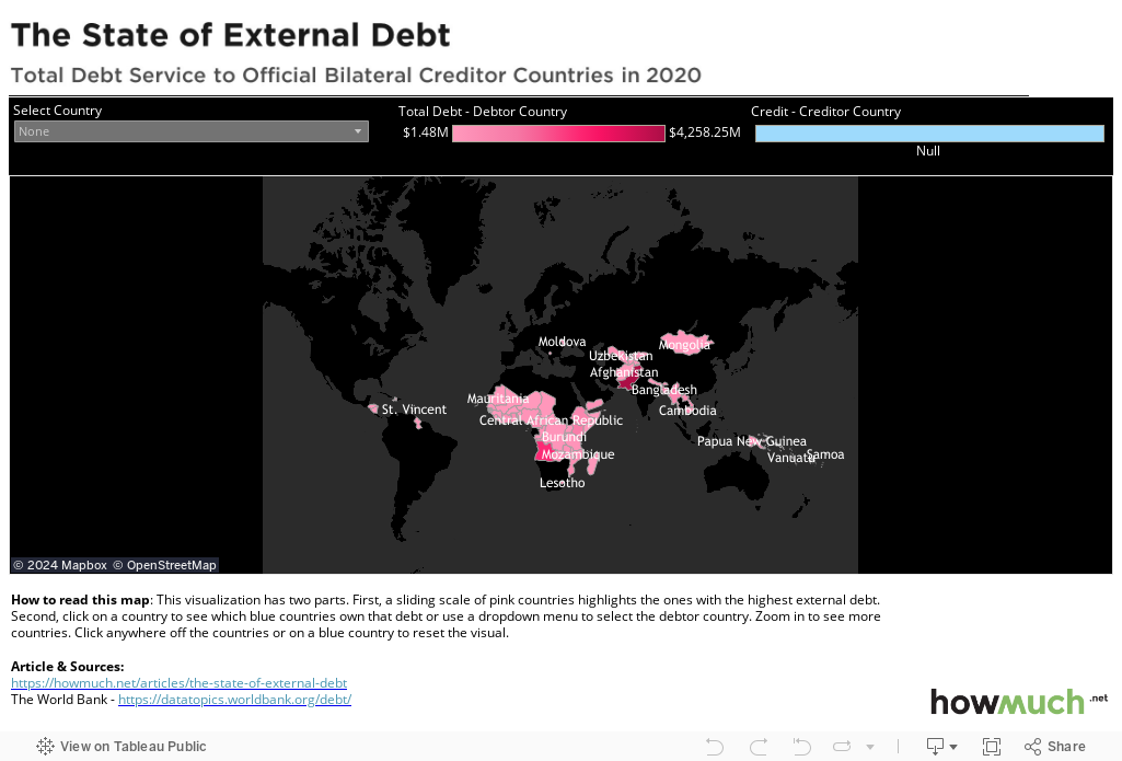
  • China is the single biggest creditor under the DSSI for several countries, controlling the largest amount of debt for Pakistan ($2.92B), Angola ($2.99B) and Kenya ($849M) among several others.
  • In comparison to China, the U.S. has lent relatively little money to the rest of the world under the DSSI, with the highest total going to Ghana ($146M).
  • In total, the poorest countries paused payments on some $17.68B in sovereign debt under this program in 2020.
  • China’s participation in the DSSI is strongly aligned with its strategic interests, suggesting that some alternative motivations are in play.

We took the numbers for our map directly from the World Bank. The pink countries are all participating in the Debt Service Suspension Initiative, and the color corresponds to the total amount of debt. When you click on a pink country, you will see which foreign governments own that suspended debt, again where the shade of blue indicates how much money is at stake. Click anywhere to reset the visual.

At the highest level, our interactive visualization shows which developed countries are lending money to poor governments, and not requiring immediate payments to service the debt. China evidently spent a lot of money through the DSSI, making it the single biggest creditor for several developing countries. Pakistan owes China $2.92B through this program, Angola another $2.99B and Kenya owes $849M, all for just 2020. Ethiopia, Myanmar, Lao PDR and Cameroon all share China as their single biggest creditor. Compare that to the U.S., which only sent tens of millions (and not billions) through the DSII. The U.S. is the biggest creditor to Ghana ($146M) but nowhere else are the sums of money enormous.

At first glance, this activity seems charitable. It’s the right thing to do when the world is facing a common crisis to pitch in and help out poor areas. After all, places like India are getting slammed with another wave of the coronavirus just as many Western countries are starting to reopen again thanks to vaccines. However, China is clearly sending money around the world to the poorest countries which are also directly aligned with its long term strategic interests. Pakistan is a natural ally because it sits on the other side of India, not to mention the massive investment in the China-Pakistan Economic Corridor. China has a strong interest in natural resources in Angola. The same can be said for Kenya. All of these countries need economic relief in light of the COVID-19 pandemic, however there are clearly some alternative motivations in play too.

Do you think the U.S. should be doing more to fight the pandemic in the world’s poorest countries? Let us know in the comments.

Data: Table 1.1


Mapped: VA Approved Loan Volume and Amounts for Each State

$
0
0

One way the U.S. recognizes military service is through the VA loan program. And although a lot of veterans are eligible to take out mortgages through this program, this map shows how some places see a lot more loans guaranteed through the VA than others.

VA loan volume by state

  • Washington, DC is the most expensive location for VA guaranteed loans, averaging $588K, followed by Hawaii at $579K.
  • California has the highest number of overall VA-guaranteed loans, with 130,700 loans going to members of the military and their families, averaging $439K.
  • Vermont has the fewest number of VA loans, at only 1,243 last year, averaging $249K.
  • Higher loan amounts roughly correspond to housing market trends, where more expensive locations on the East and West coasts tend to have pricier homes.

We gathered the data to create our map of VA home loan volume for FY 2020 from the U.S. Department of Veterans Affairs. We color-coded each state to correspond to the average loan amount, with the darker shades of red representing higher average home loan amounts. We also added a shape to highlight the total number of loans, letting you easily and quickly understand the contributions of the VA to the U.S. housing market across the country.

Here’s how the VA loan program works at a high level. If an applicant meets certain criteria, he or she is eligible to take out a loan, underwritten by a bank but backed by the U.S. Department of Veteran Affairs. The VA program allows the applicant to put $0 down and waives the requirement to carry private mortgage insurance (PMI). The program also comes with potentially lower loan interest rates, and it waives various other prepayment penalties and fees as well. In short, a VA loan can potentially save veterans a lot of money.

Our map brings to light a few different interesting trends about loan guarantees through the VA across the U.S. housing market. The vast majority of loan recipients in 2020 live along the country’s edges, stretching from Washington to California, through Texas to Florida and back up to Virginia. This means there are several notable high population centers with relatively few VA loans, and by extension, military veterans. New York only saw 10,700 VA loans last year. Illinois likewise had 22,000. Compare that to California and Texas, which had 130,700 and 103,700, respectively. There are lots of U.S. military bases around the country, so it’s not exactly clear why some high-population states have relatively few VA loans. That being said, our map makes it clear that most VA-backed mortgages were issued in 2020 along the coasts, not the country’s interior.

If you are eligible to take out a VA loan and are looking to get started, check out our VA home loan cost guide today.

Data: Table 1.1

VA Dependency and Indemnity Compensation Rates in 2021

$
0
0

Memorial Day, originally known as Decoration Day, honors our fellow Americans who died while serving in the United States military. Every year this holiday brings with it a bittersweet tone marked by the loss and celebration of lives that demonstrated great valor. Often when this holiday comes around, it's focused on those who served, but what about the sacrifices of the spouses and children of those who served as well?

VA dependency and indemnity compensation rates in 2021

  • Although the minimum monthly rate of VA DIC 2021 benefits is $1,357.56 for surviving spouses as of December 2020, compensation may be higher if the Veteran was totally disabled for eight years or more while married, if the surviving spouse is disabled, and/or if the children are under age 18.
  • For the surviving spouse or child of a Veteran who died before January 1, 1993, monthly VA DIC benefits are based on the Veteran’s pay grade category and the matching monthly payment (the minimum rate is also $1,357.56).
  • When the Veteran doesn’t have a surviving spouse who’s eligible for VA DIC, surviving children will be eligible if they are under age 18, between 18 and 23 and in a VA-approved school program, or were disabled prior to 18 (i.e. helpless children).
  • VA survivor benefits are tax-exempt which means that spouses and children will not have to pay any taxes on their compensation payments.

For our data, which comes from the U.S. Department of Veteran Affairs, VA Dependency and Indemnity Compensation (VA DIC) was defined as a tax-free monetary benefit provided to the eligible surviving spouse or child of a service member who died in the line of duty, or the survivor of a Veteran who died from a service-related injury or illness. It is important to note compensation may vary for spouses or children with disabilities, if the children are under the age of 18, or if they are between 18 and 23 in a VA-approved program. As a result, monthly VA DIC benefits for 2021 may be higher for these special populations.

Pay Grade Monthly Payment ($)
Enlisted veteran’s pay grade  
E-1, E-2, E-3, E-4, E-5, E-6 1,357.56
E-7 1,404.49
E-8 1,482.72
E-9 regular 1,546.40
E-9 special capacity 1,669.31
Warrant officer pay grade  
W-1 1,433.56
W-2 1,490.53
W-3 1,534.11
W-4 1,623.49
Officer pay grade  
O-1 1,433.56
O-2 1,482.72
O-3 1,584.38
O-4 1,679.35
O-5 1,848.08
O-6 2,083.85
O-7 2,249.19
O-8 2,470.44
O-9 2,642.50
O-10 regular 2,898.37
O-10 special capacity 3,110.67

VA dependency and indemnity compensation rates in 2021

As of 2021, VA DIC rates vary across surviving spouses and children, associated disabilities, dependent ages, and military pay grades. Favorably, the minimum monthly rate of VA DIC 2021 benefits loom around $1,357.56 for surviving spouses whether Veterans died before or after January 1, 1993. However, VA DIC compensation may increase if the Veteran was totally disabled for eight years or more while married; if the spouse is disabled; the family has more than nine children; or if the children are under age 18, between 18 and 23 in an approved school, or were disabled before 18.

Number of Veteran’s Eligible Children Monthly Rate per Child ($) Total monthly payment ($)
1 573.20 573.20
2 412.30 824.59
3 358.67 1,076.01
4 320.12 1,280.49
5 296.99 1,484.97
6 281.58 1,689.45
7 270.56 1,893.93
8 262.30 2,098.41
9 255.88 2,302.89

Fortunately, U.S. recognition of military service spans the life and death of a Veteran. While this article primarily focused on VA DIC benefits, other survival benefits exist as well to help Veterans and their families. These include pensions; health care benefits for spouses, dependents, and family caregivers; and education benefits. As a result, VA DIC may affect compensations related to the VA Survivors Pension or Survivor Benefit Plans. In the event that surviving spouses or children are eligible for both DIC and Survivors Pension benefits, they will be paid whichever benefit is the most and will not receive both.

Furthermore, programs such as the VA loan program provide $0-down mortgages issued by private lenders and guaranteed by Veteran Affairs. These loans, which vary in volume and amount across the nation, are available to service members, veterans, and military spouses.

We are now aware that VA DIC compensation rates vary between surviving spouses and children of Veterans, especially if the children are over the age of 18. Considering the stipulations around children over the age of 18, mainly those not in a VA-approved program, should there be some additional benefits considered to offer more assistance? Why or why not? Let us know your thoughts in the comments below.

Data: Table 1.1

Visualizing the Top Export Partners for Each U.S. State

$
0
0

Who does the U.S. trade with the most? Our latest map breaks down one side of the equation, focusing on the top export partners for every state in the U.S.

Each State's Main Export Partner Map

  • Canada is the single biggest trading partner for the vast majority of states, receiving the most exports for 33 states.
  • North Dakota and New Mexico are the two states most heavily dependent on a single country for their export industries. 84.6% of all exports from North Dakota head north, and 59.5% from New Mexico go south.
  • China is the largest trading partner for only 5 states, which includes Alaska. This is one sign of the large trade deficit between the U.S. and China.
  • Most states have a balanced and diversified number of international trade partners, with the average across all states coming in at 26.4%.

We gathered the data from 2020 for our map from the U.S. Census Bureau. We overlaid the flag of the country for each state’s top export partner, together with a percentage of total state exports and the overall dollar figure. The result is an intuitive and original take on the U.S. place in the global economy.

The U.S. has a lot of different trading partners scattered across the world, and a wide variety of different types of major exports. Our newest map highlights a different angle of all this economic activity, starting with the fact that Canada and Mexico are the largest trading partners for the vast majority of states. Canada alone is the top export partner for 33 states. Mexico claims top spot for an additional 6. The state most heavily dependent on Canadian exports is North Dakota, where 84.6% ($4.4B) of all exports head north. Likewise, New Mexico is the most dependent on Mexico, which accounts for 59.5%, ($2.2B). A lot of the local economies in these places hang in the balance of international trade agreements, which is why President Trump’s efforts to get rid of NAFTA, the North American Free Trade Agreement, were such a big deal.

If North Dakota and Mexico are the most heavily dependent on Canada and Mexico, Florida is at the opposite end of the spectrum. Florida is the only state to have Brazil as its top export partner, representing only 7.7% of the state’s exports ($3.5B). In fact, most states have somewhere between 20 to 30% of total exports going to a single trading partner. The average is 26.4% taking all the states together. All things considered, it is probably better to have a more diversified economy than one that is so dependent on a single trading partner.

Perhaps the most interesting thing our map demonstrates is how China is only the top export partner for 5 states, which includes Alaska. Our map’s focus on exports means that we are only looking at goods and services moving in one direction, from the U.S. to some other country. President Trump focused attention on how the U.S. is at a trade deficit with China, which soared during his time in office from $481B in 2016 to $916B in 2020. China and the U.S. have a dynamic relationship where each side sends the other many different types of goods. Our latest map is more evidence of how the relationship is imbalanced, where the U.S. imports a lot more from China than it exports.

Do you think it’s bad for a handful of states to be so dependent on single countries for their exports? Let us know in the comments.

Data: Table 1.1

Visualizing the Top Import Partners for Each U.S. State

$
0
0

Where does the U.S. get most of its imports? And does the main import partner for each state vary across the country? Our latest map of top importers around the country has the answers.

Each State's Main Import Partner Map

  • Canada is the main import partner for 20 states, and Mexico is only the top import partner for 6 states.
  • The U.S. has a massive trade imbalance with China. Although only a handful of states have China as their main export partner, China plays a much larger role in imports, serving as the main import partner for 15 states.
  • Montana is the most heavily dependent state on a single country for imports. Montana received $3.4B in goods from Canada, representing 87% of the state’s total.
  • Most states have a diversified portfolio of import partners, with the average top importer across all states and territories contributing some 28.3% of the total.

We grabbed the numbers for our map of main imports for each state for 2020 from the U.S. Census Bureau. We overlaid each state with the flag of its top import partner, adding the total value of goods as well as the share of imports each foreign country accounted for in the state. This lets us easily see where Americans get the bulk of their forign-made goods in any given place around the country.

One of the most interesting ways to understand this type of map is to compare it with a similar map of top export partners. Canada and Mexico both feature prominently on each one, but there is a key difference. Canada claims top import partner on the map for 20 states, and it’s the top export partner for 33. Mexico is similarly a top importer for 6 states, and it’s also the main source of goods for 6 states. But take a look at China, which is the top import partner for an incredible 15 states but only top exporter for 5. The U.S. is clearly taking in a lot more goods and services every year from China than it is selling back, meaning there’s a significant trade imbalance.

Because we are only focusing on the single biggest import partner for each state, we aren’t able to show which country contributes the largest amount of imports overall. For example, Canada is the top import partner for a lot of Western states with small populations, but China takes the top spot for several of the most populated states. California alone imported $130.3B in goods from China in 2020, which is more than the top import partners for 39 states and territories combined. Interestingly, Switzerland takes the top spot for New York. It’s therefore important to keep in mind the bigger picture of total economic activity in imports and exports.

Do you think it is a bad thing for the U.S. to have such a large trade imbalance with China? Let us know in the comments.

Data: Table 1.1

Top 10 U.S. Cities by Fastest Growing and Declining Rent Prices

$
0
0

When considering a rental property usually the price, among other factors, determine if the option is a yay or nay.

During 2020 with telework mandated for many across the nation, many Americans opted for new surroundings, free from the restrictions they once had. As such, various U.S. cities experienced increases and decreases in average costs of rental properties, such as two-bedroom apartments. As our visualization shows, these percentages varied widely across cities from April 2020 to April 2021.

The State of the Rental Market Map

Based on city average rent price trends for two-bedroom apartments from April 2020 to April 2021:

  • Although Las Vegas, NV tops the list with the biggest increase in rent pricing at 45.60% ($1,997), it does not top the list as one of the most expensive two-bedrooms.
  • Scottsdale, AZ tops the list as the most expensive rent prices for a two-bedroom at $3,125 (a 36.80% increase).
  • Seattle, WA experienced the largest decrease in rent pricing at 26.30% ($2,884) but was still not among the most inexpensive two-bedrooms.
  • Lexington, KY and Fort Wayne, IN only experienced average decreases in rent pricing (17.70% and 14.50%, respectively) but were still amongst the most inexpensive two-bedrooms at $976 and $839, respectively.
  • The average percentage that most rent prices increased by was 30.3% and the average percentage rent prices decreased was by 16.8%.

For our data presented, city average rent price trends and percentages were gathered from the Apartment Guide’s Rent Report, May 2021: The State of the Rental Market. It is important to note that the cities included in the top 10 list experienced the biggest increases or decreases in two-bedroom rent prices year-over-year. Furthermore, this report also includes a more inclusive list of how rent prices are changing among the 100 most populated U.S. cities as well.

Top 5 U.S. Cities With the Largest Rental Price Increase

City Rent Price Increase (April 2020-April 2021)
1. Las Vegas, NV 45.6%
2. Buffalo, NY 41.8%
3. Scottsdale, AZ 36.8%
4. Detroit, MI 31.4%
5. Tucson, AZ 28.8%

Top 5 U.S. Cities With the Largest Rental Price Decrease

City Rent Price Decrease (April 2020-April 2021)
1. Seattle, WA -26.3%
2. Miami, FL -20.5%
3. Philadelphia, PA -20.3%
4. Lexington, KY -17.7%
5. San Jose, CA -14.7%

As of April 2021, the average price of two-bedroom apartments across U.S. cities has varied widely since April 2020. With the average percentage that most rental prices increased by 30.3% and decreasing by 16.8%, this gives a consumer much to think about regarding their next rental decision.

For renters interested in the Midwest, Scottsdale, AZ tops the list at $3,125 for a two-bedroom (the highest on the top 10 list) with a 36.80% increase since last year. Conversely in a neighboring city, with a percentage increase at $28.8%, Tucson, AZ offers the lowest rental price among the top 10 at $1,366. Shifting to the cities with the largest decreases in rental price percentages, the West tops the list with Seattle, WA. With a steep decrease of 26.3%, renters can enjoy two-bedrooms in Seattle at an average price of $2,884. Additionally, for renters looking for the most budget-friendly options, Lexington, KY and Fort Wayne, IN offer average rental prices at $976 and $839, respectively, which still fall near or slightly below the average percentage decrease of 16.8%.

As a final note, remember that when choosing a rental property, regardless of fluctuating rental prices from year to year, renters insurance is important and should be considered. With unexpected expenses or a looming disaster always an unfortunate possibility, allocating for it into your rental budget is critical.

Now aware that some U.S. cities have declined by large percentages over the past year, if you are a renter, does this potentially pique your interest to explore another city? Furthermore, if rates have risen by a large percentage in your city, does this push you closer to pursuing homeownership? Why or why not? Let us know your thoughts in the comments below.

Data: Table 1.1

Ranking Insurance Companies by Direct Premiums Written in 2020

$
0
0

How big is the market for insurance in the U.S.? And which companies dominate the industry? Our newest visualization provides an intuitive way to think about insurance company rankings based on direct premiums.

Insurance company rankings in the U.S.

  • MetLife wrote the most direct premiums in any single insurance sector, topping $103.3M in its life/annuity insurance business.
  • State Farm boasts the highest market share of any insurance sector. The company received $40.4M of direct passenger auto insurance premiums in 2020, about 16.2% of the total market.
  • The insurance market is much more fragmented in some sectors than others. Workers’ compensation only has two companies, Travelers and Hartford, with more than 5% market share.
  • Direct premiums don’t always translate into profits. They don’t take into account reinsurance or how much money gets paid out in claims.

We found the information for our visualization at the Insurance Information Institute (III). We wanted to understand how much money was coming into which companies across the entire insurance industry, broken down into different sectors. The circles in our visual correspond to the amount of direct premiums written in 2020, while the color highlights the relative percentage of market share. We added each company’s logo to make it even easier to see the largest winners in each sector.

Our visualization shows how some parts of the insurance industry are a lot more top-heavy than others. MetLife clearly dominated the life/annuity sector last year, taking in some $103.3M in direct premiums. Life insurance is complicated, but that represents about 13% of the entire market. Homeowners and auto insurance are also both top-heavy, with State Farm taking the top spot in each. But compare that to workers’ compensation or commercial property insurance, where several companies control much smaller slices. In fact, Travelers and Hartford are the only two companies with more than 5% market share of workers’ comp (7.3% and 5.9%, respectively).

There are a few things to keep in mind about our visualization of insurance premiums. First off, our visual doesn’t consider reinsurance, which occurs when a company issues a policy and then transfers the underlying risk to other companies. Different types of insurance are also subject to wildly different market conditions. A major hurricane for example could devastate a large part of the country, and property/casualty companies could lose a lot of money. Likewise, the COVID-19 pandemic has scrambled plans around life expectancy, not to mention workers’ compensation. In other words, just because a company is getting a lot of premium income, doesn’t necessarily mean it translates into profitability.

If you are looking for any type of insurance, we have a robust set of cost guides to help get you started today.

Data: Table 1.1

How Much Does the Average American Spend on Transportation?

$
0
0

We know commuting is costly, but just how much are Americans spending on their commutes? Depending on the state, Americans spend as much as over $3,000 per year on their daily commutes - including gas, maintenance costs, public transportation, and other expenses.

Let’s take a look at how much the average American spends on transportation in each U.S. state, including Washington, D.C.

A U.S. map showing the percentage of workers who commute by car and their annual transportation costs.

  • On average, Americans are spending anywhere between $1,300 and just over $3,000 on transportation each year.
  • North Dakota has the highest average commuting costs in the United States.
  • Washington, D.C. is the only area in the United States in which the majority of residents utilize environmentally-friendly modes of transportation.
  • While most Americans drive to work, many workers utilize other means of transportation to complete their daily commutes.

To demonstrate the average commuting costs in the United States, we used data from The U.S. Bureau of Economic Analysis and U.S. Census Bureau , which was also summarized in Business Insider, which demonstrates how much adults spend on transportation in all 50 states, plus Washington, D.C. By analyzing this data, not only can we see how much commuters are spending on transportation, but also which types of transportation workers are utilizing to get to work.

States With Most Expensive Yearly Commutes

1. Florida: $3,140
2. Louisiana: $2,905
3. Michigan: $2,901
4. Nevada: $3,660.54
5. New Jersey: $3,631.39

States With Least Expensive Yearly Commutes

1. Ohio: $1,369
2. North Carolina: $1,482
3. Idaho: $1,497
4. Wisconsin: $1,548
5. Iowa: $1,549

Adults in the U.S. are spending thousands of dollars on transportation every year. While the type of transportation is a major factor in the overall cost of commuting, there are other factors to consider. Commute time, in particular, seems to be a major contributor to the overall cost of transportation.

Washington, D.C., for example, has, by far, the largest number of workers who choose environmentally-friendly transportation options. Yet, it is number 33 in transportation spending. This may be due to D.C. having the second-longest commute time in the country. New York also seems to support this trend. Despite nearly 47% of residents choosing environmentally-friendly transportation, the Big Apple has the third-highest average commute cost — likely due to the city having the longest average commute in the U.S.

As the graphic demonstrates, the average American is spending quite a bit on transportation every year. But these costs seem to be impacted by more than method of transportation. Environmentally-friendly methods allow commuters to reduce costs per-person by spreading out the cost of each ride to multiple people.

Are the cost-savings of going green worth making the switch? Have any other ideas for saving money on your commute? Let us know in the comments.


Which Professional Sports Leagues Make the Most Money?

$
0
0

Each major sporting group has its way of doing things, complete with stunning performances, millions of screaming fans, and an impressive grand prize and trophy at the end. Although the debate over which sport is best will rage on forever, we can answer the question of which sports league makes the most money. Below you will find a graphic of the wealthiest sports leagues by revenue in 2024.

professional sport leagues by revenue

You can see the top 20 sports teams shown by each individual logo in order of revenue from right to left, with revenues placed above each logo.

Top Sports Leagues by Revenue

  • National Football League (NFL)

    • USA - American Football - Revenue: $13 billion

  • Major League Baseball (MLB)

    • USA/Canada - Baseball - Revenue: $11.6 billion

  • National Basketball Association (NBA)

    • USA/Canada - Basketball - Revenue: $10.6 billion

  • Premier League

    • England/Wales - Soccer - Revenue: $8.1 billion

  • National Hockey League (NHL)

    • USA/Canada - Ice Hockey - Revenue: $6.4 billion

  • La Liga

    • Spain - Soccer - Revenue: $6.1 billion

  • Bundesliga

    • Germany - Soccer - Revenue: $5 billion

  • Serie A

    • Italy - Soccer - Revenue: $3.2 billion

  • Ligue 1

    • France/Monaco - Soccer - Revenue: $3.2 billion

  • Formula One

    • Global - Motorsport - Revenue: $3.2 billion

There are two major patterns that can be seen from our infographic. First, football leagues dominate the top chart. Now, there is a big debate over the use of the term football. America and a few other countries use the term soccer, while most of the world uses the term football. Either way, it’s an extremely popular sport. Out of the top 20 leagues by revenue, 6 are soccer, or to give them their official name, associated football groups. These leagues make a combined $27.2 billion and most of them are unsurprisingly located in Europe. You may also be able to see the popularity of a sport in a certain region. European football leagues enjoy large revenues due to their popularity. Although America’s Major League Soccer (MLS) takes the 11th spot on our list, its revenues are well below the major European football leagues. In comparison, the Premier League in England makes $8.1 billion, making it the top football/soccer league by revenue.

The second major trend that you should notice is that 4 out of the top 5 positions are dominated by American/Canadian sports leagues. Not only this, but also the revenue of these leagues far outpaces all others. The National Football League alone commands $13 billion in revenue, giving it the top spot overall by a huge amount. The combined revenues of the NFL and MLB are equal to $24.6 billion, surpassing the top 14 football leagues. When you add in the NBA and NHL, the combined revenue is $17 billion. Another smaller trend to notice is the diversity of sports leagues in America and Canada. While all of Europe’s top sports leagues involve football, America’s and Canada’s top leagues by revenue span 5 different sports: American Football, Baseball, Basketball, Ice Hockey, and Football/Soccer.

Europeans as well as others certainty enjoy their football, while American and Canadians seem to enjoy a more diverse set of sports. Although football leagues are various and post decent revenues, the sports leagues coming out of North America make more money.

Please feel free to leave your comments below! We would like to hear your feedback.


Visualizing the Top 20 Most Valuable Companies of All Time

$
0
0

Our new visualization looks at the most valuable companies of all time, measured by their market capitalization.most valuable companies

  • Twelve companies have reached a market capitalization of more than $1 trillion in today’s dollars.
  • Six of the top 20 most valuable companies of all time were founded by countries other than the United States.
  • The three largest companies were part of the shipping industry during the early colonial age. The next three largest are related to oil & petroleum. The tech industry rounds out the rest of the top ten largest companies of all time.
  • While most of these companies are still in business in 2024, four of them (Standard Oil, South Sea Co, Mississippi Company, and Dutch East India Company) have already gone bust.

We gathered the market capitalization data for this visualization from Yahoo Finance as of September 17, 2024, with VOC, Mississippi, South Sea, and Standard Oil values from Fool.com, and Petro China’s from CNBC. All prices are expressed in USD. The companies in the visualization are listed in order from lowest market capitalization at the top to highest market capitalization at the bottom, with each company’s corresponding circle growing larger to reflect the size of its market cap. The years on the right indicate the date we referenced for the market capitalization data.

Top 10 Most Valuable Companies of All Time

1. Dutch East India Company: $8.28 trillion
2. Mississippi Company: $6.8 trillion
3. Saudi Aramco: $6.58 trillion
4. South Sea Company: $4.5 trillion
5. Apple: $3.29 trillion
6. Microsoft: $3.21 trillion
7. Nvidia: $2.86 trillion
8. Alphabet: $1.95 trillion
9. Amazon: $1.94 trillion
10. META (Facebook) $1.35 trillion

The Dutch East India Co. holds the distinction of being the first company to offer shares of its business to the public, effectively conducting the world's first initial public offering (IPO). Interestingly, the three shipping companies on this list--the Dutch East India Co., the Mississippi Co. and the South Sea Co.--had market caps more than twice as high as today’s biggest company, Saudi Aramco. These “joint-stock companies” that sought to capitalize on trade with the New World ultimately went bankrupt before 1800. However, the Dutch East India Co. in particular ushered in a new wave of economic growth and social change similar to how industry giants in the tech field are doing today.

Another company on this list that no longer exists is John D. Rockefeller’s Standard Oil Company. The Standard Oil Company was dissolved on May 15, 1911 when the Supreme Court ruled that it was a monopoly and therefore violated the Sherman Antitrust Act. As legislators turn their attention to Big Tech and whether or not companies like Google and Amazon are also in violation of antitrust laws, it is interesting to ponder if history will repeat itself or what might turn out differently this time around.

Do you think more of these companies will reach market caps above $1 trillion? How do you think future legislation may impact some of these large tech and financial companies and their market caps? Please let us know in the comments.

Data: Table 1.1

How Many Hours Americans Need to Work to Pay Their Mortgage

$
0
0

Many people define the American dream as owning your own home, not to mention a comfortable lifestyle, healthy children, and a secure retirement. But the ability to afford a home—let alone all those other things—depends entirely on where you live and your level of income. This makes apples-to-apples comparisons across the country extremely difficult. How can you easily compare real estate locations and income levels for the entire population? Take a look at our new map to find out.


Our experts took a unique and creative approach to modeling the data. We started first by taking data from the U.S. Census Bureau to find out the median income for people in 98 of the biggest cities in the U.S. Using a 40-hour work week as the standard, we calculated an average hourly rate. This levels the playing field between all the different types of jobs in the country (some people make a salary, others are paid by the hour).

Next, thanks to Zillow, we figured out the median housing price for each city and determined a monthly mortgage payment. Most people take out a 30-year loan, so that’s what we used too. Finally, we compared the two numbers to see how long you’d have to work to make that mortgage payment each month. We color-coded and mapped the results, revealing a couple of key insights into the housing market and income inequality in the U.S.

The red circles represent places where you have to work the most hours to keep the roof over your head. Only in cities in California do you put in more than 100 hours to make enough money just to pay for housing. That’s longer than two-and-a-half weeks, meaning well over 50% of your take-home pay! Not surprisingly, unaffordable places are all located on the either coastline. In fact, 8 of the 10 most expensive places are all located in California while the other 2 are in New York and New Jersey. 

Top 10 Cities Where You Have to Work the Most Hours to Afford a Home

1. Irvine, CA - 117 hours

2. Los Angeles, CA - 115 hours

3. Anaheim, CA - 104 hours

4. San Jose, CA - 101 hours

5. Long Beach, CA - 99 hours

6. New York, NY - 98 hours

7. San Francisco, CA - 97 hours

8. San Diego, CA - 93 hours

9. Santa Ana, CA - 92 hours

10. Newark, NJ - 87 hours

Although most of the expensive places to live are concentrated on the coasts, you can find affordable housing almost anywhere else in the country. The best places are cities like Louisville, KY and Detroit, MI (18 and 19 hours, respectively). That’s right—you don’t need to work past lunch on Wednesday to earn enough money to make a mortgage payment in the Midwest. That’s an incredible standard of living.

Viewing all 691 articles
Browse latest View live