Quantcast
Channel: howmuch.net
Viewing all 687 articles
Browse latest View live

Visualizing Over 20 Years of Retail Sales and E-Commerce in the U.S. Retail Industry

$
0
0

The coronavirus pandemic is once again causing new widespread business lockdowns. For lots of people, this means the only way to order Christmas gifts is through the Internet. However, the consumer shift to e-commerce instead of in-person shopping is a long-standing trend, as our most recent visualization makes clear.

US retail sales and ecommerce

  • E-commerce sales have continuously increased every year since 2000 as more and more people become comfortable shopping online. Overall retail sales have also grown during this same time period, increasing from $2.98T in 2000 to $5.45T in 2019.
  • 2020 has already set an all-time record for e-commerce, topping 14% of retail sales.
  • The coronavirus pandemic is forcing more and more people to shift their shopping habits online instead of brick-and-mortar stores. Observers expect e-commerce to only accelerate in the years ahead.

We got the data on retail numbers directly from the US Census Bureau. Check out the bureau’s methodology for additional detail about what counts as a company in the retail industry, defined as a company that sells small goods to the public. We took results from the last 20 years to create an exploding sequenced pie chart, showing annual totals adjusted for inflation. For the sake of comparison, we took the first 3 quarters of results for 2020. We then added another layer showing the relative growth of e-commerce as a portion of retail sales. The result is an intuitive snapshot of the last two decades in retail history.

The first and most obvious insight from our visual is how e-commerce accounts for an ever-increasing portion of all retail sales. Starting at only 0.9% in 2000 when most people still had reservations about making purchases over the Internet, e-commerce sales have increased every single year. The relentless uptick of e-commerce as a portion of retail has occurred every year regardless of what the broader retail industry is doing. From 2007 to 2008, for example, retail sales overall declined from $4T to $3.93T, and e-commerce still increased from 3.4% to 3.6%.

But our visualization also shows how overall retail sales are also growing. Except in the depths of the Great Recession from 2007 to 2009, retail sales have increased year-over-year since at least 2000, rising from $2.98T in 2000 to $5.45T in 2019. This means that people are spending more money in the retail industry regardless of the sales channel.

The coronavirus pandemic has accelerated the rise of e-commerce. Our numbers for 2020 only run through the 3rd quarter, before the busiest shopping period leading to the holidays. 14% of retail sales are now occurring via e-commerce, and the lingering threat of COVID-19 suggests this number will only continue to go up. In fact, Amazon has hired over 427,000 people to answer the increased demand. There’s so much consumer demand that UPS is limiting how many packages they will handle for certain companies. It remains to be seen if the rapid shift to e-commerce marks a permanent shift in consumer behavior, but don’t be surprised if e-commerce tops 15% by the end of the year.

Are you buying more things over the Internet than before the coronavirus? Let us know in the comments.

Data: Table 1.1


Charted: How COVID-19 Has Changed Employment in the U.S. Industry

$
0
0

The U.S. Congress and the President continue to negotiate the shape and size of another round of economic stimulus. With deaths from COVID-19 approaching 300,000 as some parts of the U.S. reestablish lockdowns, the unemployment numbers are again trending in the wrong direction. But the coronavirus has already brought massive damage to key industries, as our visualization makes clear.

US Employment Downsizing

  • The coronavirus pandemic decimated the leisure and hospitality industry, shedding almost 50% of all jobs in the two months between February and April 2020. The industry has seen a very slow recovery since.
  • The mining and logging industry, which includes oil drilling, has seen the second most damage in terms of lost employment, dropping over 10% of all jobs with the historic collapse in oil prices.
  • Every industry in our visual has seen a net decrease in employment, however some industries like financial activities and utilities have only been slightly impacted.
  • The overall recovery of U.S. employment to pre-pandemic levels appears to be taking a Nike “swoosh” shaped trajectory, foreshadowing a long and slow grind back to pre-pandemic employment.

We found the data for our visualization from the U.S. Bureau of Labor Statistics, which tracks employment numbers by industry on a monthly basis. We started with January 2020 as the basis for our graph, when the economy was humming along and unemployment was at record lows. We then plotted the month-by-month percentage change from that point until November, the latest month with available data. We also assigned a color to each line representing a given industry, creating an intuitive snapshot of the dramatic change happening in the economy right now.

Our visualization makes it clear how the leisure and hospitality industry is witnessing the greatest damage due the coronavirus pandemic. Employment tanked from the start of the year, contracting by almost 50% in less than two months from February to April. The industry has since started to regain some lost ground, but overall it is still down by about 20%. The combination of forced closures and the lack of tourism is creating a perfect storm for the leisure and hospitality industry.

But that’s not the only industry suffering a severe economic contraction. Mining and logging is also down over 10% in total employment since the start of the year, making it the second hardest hit industry in terms of jobs lost during the pandemic. What explains this? The U.S. Bureau of Labor Statistics includes oil drilling and petroleum extraction under this category of employment, and oil suffered a historic collapse in tandem with the travel industry. If a lot fewer people are traveling, much less commuting to an office, then the world suddenly needs a lot less oil.

There is also a larger and more significant insight about the state of U.S. employment in our visualization. When the coronavirus first surged across the Northeast and forced widespread lockdowns across the country, economists immediately started to debate the shape of the U.S. recovery. Would demand for goods and employment come roaring back, creating a “V” shaped recovery? Or would there be a prolonged period of economic contraction, to be followed by a rapid rise, creating a “U” shaped recovery? Our visualization makes it clear that at least in terms of employment numbers, the U.S. is currently experiencing a Nike “swoosh” shaped recovery. The depth of the initial fall varied by industry, but the eventual climb back to pre-pandemic employment numbers is a slow grind.

Do you think the U.S. government should pass another round of economic stimulus to help the “swoosh” shaped recovery in employment? Let us know in the comments.

Data: Table 1.1

Top 10 Visualizations of 2020

$
0
0

How do we best describe 2020 – a year of extraordinary impact? Our top visualizations offer key insights into some of the most popular topics out there. You might be surprised which ones came out on top.

Top Visualizations 2020

  • Wealth remained highly concentrated, with lower-end workers suffering the brunt of the economic fallout.
  • Technology companies dominated the marketplace, with manufacturing concentrated in emerging markets.
  • Each of these visualizations tells a different story, with at least one sure to resonate with you.

1. Mapped: The Richest Women in the World

The Wealthiest Women
Updated: 7 October 2020

While we long assumed American dominance, it's clear that Asia's breakneck growth created some extremely wealthy women along the way.

Our visualization illustrates where some of the richest women in the world reside along with their estimated wealth.

The wealthiest woman in the world – Francoise Bettencourt Meyers, granddaughter of L'Oréal's founder, with $65.9 billion.

But don't forget Mackenzie Bezos, jumping to #3 with an estimated wealth of $59.6 billion. And Alice Walton, member of the Wal-Mart founding family, with $61 billion.

2. Visualizing the Richest Countries in the World in 2020

Richest Countries in the World

The U.S. is noticeably absent from the list of top 10 countries. Whether or not you believe the U.S. is the greatest country in the world, it is certainly not the wealthiest on a per capita basis. This visualization also highlights how poorly African nations fare due to low economic output and large populations.

3. All the World’s Wealth in One Visual

World's Wealth
Published: 16 January 2020

With control of almost a third of the world's wealth, it's no contest - the United States remains at the top. Even China's rise in the last several decades leaves its total wealth at just over half of the size of the U.S.

However, when you combine all the Asian countries, they exceed all the Americas and Europe's wealth. In fact, all of Europe combined doesn't equal the wealth of the United States.

This visualization highlights an interesting trend amongst the major global economies.

4. Here's the Wealthiest Person in Every State

The Richest Person in Every State

Only four states, New Mexico, Alabama, New Hampshire, and Vermont, don't count a single billionaire as a resident.

While some of the wealthiest individuals live in typical big city hotspots, we often forget about folks like Warren Buffett, the Oracle of Omaha, or Charles Koch of Kansas.

Our visualization paints an interesting portrait across the American landscape, highlighting the shift from natural resource development to technology over the years.

5. In One Map: How Many Billionaires Are in The World

World's Billionaires

John D. Rockefeller might have been the first billionaire, but today, he would get lost in the crowd of them.

The United States is home to 614 billionaires. Yet Asia holds plenty more with 799 across the continent. 388 alone call China home.

The visualization highlights the disparity in growing wealth among emerging and established economies compared to the rest of the world. Consider how large Africa is in terms of landmass and population, yet only claims 19 billionaires as residents.

6. Visualizing the Most Valuable Brands in the World in 2020

Top 100 Most Valuable Brands

2020 accelerated trends already in place. Direct-to-consumer delivery and technology hold the tops spots, as shown in our visualization.

When you look at traditional hard asset companies like energy, automotive, you get a sense of just how much the world has changed. Even in Asia, Samsung and Huawei hold two of the top ten spots for the world's largest companies.

Interestingly, the visualization highlights the importance of the banking and financial sector in North American and Asia, but only one company shows up for Europe.

7. Visualizing The Largest Economies in The World Over the Last 40 Years

World's Biggest Economies

Our world has changed dramatically over the last 40 years. European powerhouses from Italy to the United Kingdom slid from the top.

At the same time, emerging markets, especially China, shot up the list as they became manufacturing powerhouses.

One of the most interesting points – after Russia shifted away from Communism in the 1990s, their economy jumped into the top 10 in a decade.

Now, we’re seeing the U.S slip behind China as measured by Gross Domestic Product adjusted for purchasing power parity.

8. Visualizing China's Trading Partners

China's Trade

As the political landscape shifts in the United States and around the world, it's worth noting that despite heightened tensions, the U.S. and China rely on one another.

One of the most striking parts of the exports visualization is the size of U.S. trade with China. And believe it or not, that's set to expand.

At the same time, China imports more from Taiwan, South Korea, and Japan than it does from the U.S.

While it gives China more leverage over regional players, it shows the unequal footing the country has in their trade relationship with the United States.

9. Visualizing Trillion Dollar Companies

Trillion Dollar Companies Club

Not even a decade ago Exxon Mobile was one of the largest companies in the world. Today's economy is dominated by technology.

What's fascinating is how the visualization highlights a key difference with Amazon.

Apple, Microsoft, and Alphabet all garner high revenues and in most cases profits, with comparatively little staff.

Amazon turns a small profit yet employs a workforce that is nearly double that of all three of the others combined. So, it shouldn't surprise you their profit per employee is miniscule to say the least.

10. Mapping Countries Manufacturing Output: China's Superpower vs. the World

The Biggest Manufacturing Countries

China delivers nearly twice the manufacturing output as the United States. Behind that, Japan is less than half of the U.S.

If you thought China dominated the global manufacturing landscape, you'd be right. In fact, Asia accounts for over half the global manufacturing output.

Despite efforts to boost U.S. manufacturing, levels remain below their peak over a decade ago.

Yet, the visualization again highlights the disparity with continent of Africa and the rest of the world.

These visualizations illustrate some stunning insights into wealth and economic activity. But will these topics dominate our discussions in 2021?We'd love to hear from you in the comments section.

From all of us, we wish you a happy holidays.

Mapping the World’s Top 30 Richest Men

$
0
0

The coronavirus pandemic is creating two completely different economies. On one hand, millions of people are out of work and falling behind on rent or mortgage payments. And on the other, the stock market is hitting all-time highs. This got us thinking about the tippy top of inequality. Where do the 30 richest men in the world live, how big are their fortunes, and how did they make their money?

Richest men in the world

  • Jeff Bezos is easily the richest person in the world with an estimated net worth of $191.2 B.
  • 16 out of the 30 wealthiest people in the world come from the U.S., including 3 out of 4 people worth over $100B.
  • None of the top 30 richest men in the world come from the Southern Hemisphere.
  • Elon Musk is now the second wealthiest person in the world with a net worth of about $153.5 B, thanks to the meteoric rise of Tesla’s stock in 2020.

We found our information on the 30 richest men in the world thanks to the real time billionaire tracking tool from Forbes. We created a map of the world showing where each billionaire is from combined with a color-coded and sized circle corresponding to their estimated net worth as of December 31, 2020. Our map provides an easy to understand snapshot of the tippy-top of the wealthiest men in the world.

Top 10 Richest Men in the World

Rank Name Net Worth Source of Wealth
1 Jeff Bezos $191.2 B Amazon
2 Elon Musk $153.5 B Tesla
3 Bernard Arnault & family $151.9 B LVMH
4 Bill Gates $120 B Microsoft
5 Mark Zuckerberg $99.9 B Facebook
6 Larry Ellison $87.7 B Software
7 Warren Buffett $86.8 B Berkshire Hathaway
8 Zhong Shanshan $78.6 B Beverages, Pharmaceuticals
9 Larry Page $76.6 B Google
10 Mukesh Ambani $76.5 B Diversified

The first and most obvious insight in our global map of the 30 richest men is that they all come from the Northern Hemisphere, and in particular the U.S.. In fact, the U.S. is home to 16 out of the 30 people in our visualization. Only 4 people crack $100B, and 3 are from the United States. Jeff Bezos easily boasts the highest net worth in the world ($191.2 B), followed by Elon Musk ($153.5 B) and Bernard Arnault and family ($151.9). To put these numbers in perspective, Bezos, Musk and Arnault combined control more money than the value of the entire annual GDP of Argentina ($496.6B vs. $445.4B).

The single biggest contributor to these billionaires’ net worth is the stock price of the companies they founded. For example, Jeff Bezos personally owns more than 10% of Amazon, or about 55 million shares. Amazon’s share price recently passed $3,200, and Bezos has unloaded $10B this year alone. This means that whenever Amazon’s price rises or falls, Bezos’ net worth moves in the same direction. This is especially true for Elon Musk, the infamous CEO of Tesla, whose stock has surged to record highs and recently joined the S&P 500. Tesla’s stock performance has catapulted Musk’s net worth into the stratosphere ($153.5 B).

Almost all of the richest people in the world first started out as the owner of a small business. If you are building your business empire and in need of a loan, check out our small business loan calculator to start the process of shopping around for the best deal.

Data: Table 1.1

Charted: How the S&P 500 Generated Fantastic Returns in a Tough Year

$
0
0

2020 was a bad year, but not for the stock market. In fact, the S&P 500 ended the year at an all-time record high. But that doesn’t mean there weren’t challenges along the way, as our latest visualization shows.

S&P 500 Price Index

  • The S&P 500 index provided a V-shaped performance throughout 2020, opening the year at 3,258 before collapsing to 2,237 on March 23 and then rising to an all-time record of 3,756 on December 31.
  • 2020 also saw the S&P 500 set a record for the fastest bear market, including the third worst one-day decline ever on March 16.
  • April 2020 was one of the best months in 80 years of stock market history, with the S&P 500 growing over 12%.
  • The S&P 500 index’s rapid recovery in the midst of the coronavirus pandemic highlights how the stock market is very different from how regular people experience the economy.

We created our visual by first grabbing daily S&P 500 performance data from Yahoo Finance. We then plotted the most important news events of the year, demonstrating how the markets first plunged when COVID-19 hit, then continued to relentlessly climb despite serious headwinds.

The stock market almost collapsed during March 2020 as COVID-19 forced widespread closures both in the U.S. and around the world. After starting the year off on a good note and climbing to a record on February 19 of 3,386, the S&P 500 index fell all the way to 2,237 on March 23. Over the course of just 23 trading days, the index lost more than a thousand points, including the third single worst trading day ever on March 16. On multiple occasions, stocks were plunging so fast that exchanges had to automatically break their circuits to pause trading and prevent a total crash.

But then S&P 500 started to climb and never looked back. April was the best month in some 82 years, turning in a 12.7% return. Lots of things were still broken in the global economy, like how the price of oil dropped to minus $40.32 on April 20. But even as the coronavirus infected millions of people and unemployment exploded to record levels, the stock market continued its upward trajectory throughout the summer. When racial unrest erupted in the aftermath of George Floyd’s murder, igniting perhaps the largest social movement in American history, the stock market still climbed higher. And even after a second and then a third wave of the virus washed over the U.S., the markets still went up.

There are a few reasons why the stock market climbed throughout 2020 even though lots of people experienced a terrible year. The economic stimulus packages in the U.S. and around the world no doubt reassured markets. More importantly, the stock market is always future-oriented. Stock traders usually value the future earning and profit potential of companies, not the hardship people are facing right now. This means that even with a dark winter ahead of the country with COVID-19, the vaccine promises a brighter future with a healthier U.S. economy.

Want to help fight the coronavirus right now? Donate to the WHO’s COVID-19 Response Fund.

Data: Table 1.1

These 3 Visualizations are Illustrating Racial Wealth Gap in the U.S.

$
0
0

We celebrate the life and work of Dr. Martin Luther King jr. on the 3rd Monday of January each year. As a key leader, he was instrumental in the civil rights movement breaking down the segregationist barriers. Yet, more than half a century later, an enormous economic chasm separates the white and African American communities.
Our visualizations display income inequality through several lenses to help us understand the scope and breadth of the issue we all face.

Racial income inequality by state

  • In every state (except New Hampshire), the gap between the white and black communities’ median income is at least 12%
  • North Dakota, Utah, Wyoming, and Washington D.C. report gaps of greater than 50%
  • Outside of the New Hampshire outlier, the black community in Hawaii shows the highest median income in 2019 at $70,048
  • Only 15 states report median income for the black community over $50,000 a year compared to every state for whites with the exception of West Virginia and Puerto Rico

Data can and does change from year to year, which is why it’s important to look for trends over time. Our first set of visualizations looks at U.S. Census Bureau data as broken down by ethnicity. Income data includes anyone 16 years old and older earning income, calculated on the basis of a standard distribution. You can find a full report of definitions and methodology here. The last visualization pulls from Federal Reserve data looking at total assets held by racial group.

Racial income inequality by state

Top 10 Worst Places for African American and White Median Income Inequality

State Median Household Income - White Median Household Income - Black Gap (%)
Washington, DC $149.7K $48.7K 67.51%
Wyoming $66.8K $22.3K 66.59%
Utah $77.8K $38K 51.11%
North Dakota $68.4K $34.1K 50.17%
Wisconsin $61.5K $35.2K 47.50%
Louisiana $61.5K $32.7K 46.79%
Illinois $74.7K $39.8K 46.72%
Minnesota $77.6K $41.6K 46.23%
Mississippi $57.2K $31.1K 45.68%
Ohio $62.6K $35.K 44.12%

Comparing our data from 2019 to 2018, we note that Washington D.C. remains top of the list, with the gap inching up from 66.88% to 67.51%. Utah, Wyoming, and North Dakota made this top 10 this year, taking the spots of Iowa, Michigan, and South Carolina (which all remained in the top 15). Interestingly, Wyoming showed the median income for African Americans higher than whites in 2018, yet shows one of the worst gaps in 2019. Part of this stems from the low percentage of the population African Americans make up of the state. That led to a margin of error for the Black community of +/- $22,620 on a median income of $33,816.

What we can see is that states like Wisconsin improved the gap while both communities saw median income increase year over year. Most states saw the gap widen as median income increased for white communities at a faster pace.

Wealth by race in america

What isn’t immediately apparent from the visual is the improvement in ownership of assets by the African American demographic compared to whites. During most of the ‘90s, African American ownership averaged 4.6% of assets owned by whites. That improved to 5.0% during the next decade and 5.5% in the most recent ten year period. In fact, when you compare Q1 of 1990 to the most recent reading, assets owned by the black community increased 566% compared to white household ownership of 510%. Still, if you compare the first reading for the white households in 1990, which came in at $21.6 trillion, the latest reading for the black community, $5.66 trillion, the disparity is 26.2% even separated by three decades.

These measures illustrate an improvement in economic inequality that is mediocre at best. Yet, such a complex must be looked at from multiple perspectives. Do these visualizations adequately portray the situation or are there other measures that demonstrate the point better?

Data: Table 1.1

Mapped: The Wealthiest Billionaires Around the U.S.

$
0
0

The COVID-19 pandemic is creating a two-sided economy. On one hand, there are high levels of unemployment, record business closures and evidence of financial decline. But on the other, the stock market is setting record highs, tech companies are thriving, and wealth inequality is accelerating. Our latest map of the richest billionaire in every state for 2021 provides a snapshot of this second economy.

Wealthiest Billionaire in every state

  • Jeff Bezos, the founder and CEO of Amazon, is the richest person in the U.S., with a net worth topping $193.8B.
  • Elon Musk rapidly rose through the ranks, coming in at $191.8B thanks to a meteoric rise in the share price of his company, Tesla.
  • The COVID-19 pandemic has dramatically accelerated wealth inequality in the U.S., with the richest billionaires, especially the ones leading tech companies like Mark Zuckerberg ($101.3B), seeing their fortunes explode to new heights.
  • Only a handful of states don’t have billionaires residents, including Alabama, New Hampshire and New Mexico.

We found the data for our visualization thanks to the Real Time Billionaire tracker at Forbes. We color-coded each state according to the relative size of the richest billionaire’s fortune, leaving the ones without any billionaire citizens gray. We also added a picture, creating a handy snapshot of the wealthiest individuals across the country.

Top 10 Richest Billionaires in the U.S. by State

Name State Net Worth
Jeff Bezos WASHINGTON $193.8
Elon Musk TEXAS $191.8
Mark Zuckerberg CALIFORNIA $101.3
Warren Buffett NEBRASKA $87.6
Jim Walton ARKANSAS $67.5
Michael Bloomberg NEW YORK $54.9
Phil Knight and family OREGON $51.7
Daniel Gilbert MICHIGAN $45.5
Charles Koch KANSAS $44.9
Jacqueline Mars VIRGINIA $28.9

Our map demonstrates how the wealthiest individuals in every state across the country aren’t just rich, they are absurdly wealthy. Jeff Bezos personally controls more wealth than the entire annual GDP of Qatar ($193.8B vs. $175.8B). Taken collectively, our map visualizes some $1.16T which is a lot more than the entire economic output of Saudi Arabia ($793B). Only a handful of small states aren’t home to a billionaire, like Alabama, New Hampshire and New Mexico. But our map also shows how the richest people predominantly remain white men. There are a handful of billionaire women such as Abigail Johnson (MA, $15B), Susan Alfond (ME, $1.9B) and Gail Miller (UT, $1.9B).

There are a couple things to keep in mind about our map. Sheldon Adelson, the famous casino magnet and political donor, is not on the list because he recently passed away. The numbers are also rapidly changing year by year and even day by day. For example, Elon Musk added some $140B to his net worth in 2020 alone, vaulting into second place on our list. Jeff Bezos likewise added $72B. That’s because a lot of billionaires derive their net worth to a great extent from the value of the shares in the companies they founded. Mark Zuckerberg personally owns over 28% of all Facebook’s stock, which explains almost all of his net worth. This means that underlying numbers showing just how wealthy these billionaires are are changing all the time.

One thing most of the people featured in our visualization have in common is that they originally got their start in a small business. If you are chasing your dream and interested in taking out a loan for a new venture, check out our small business loan guide and loan calculator to get started today.

Data: Table 1.1

The Economic Impact of the 10 Worst Disasters in 2020

$
0
0

Natural disasters are sudden and terrible events in nature that cause widespread property damage and loss of human life. The coronavirus pandemic does not technically count as a true natural disaster. As if 2020 weren’t already one of the worst years ever, there was also substantial economic damage from more “traditional” natural disasters as well. Our latest visualization charts the destruction throughout 2020 for both total and insured losses.
Economic impact of the natural disasters

  • The worst natural disaster from an economic loss perspective happened in China, where seasonal floods wiped out $35B in property, only $2B of which was insured.
  • 2020 witnessed several natural disasters throughout the summer months from June to August, especially due to floods and hurricanes,
  • None of the top 10 worst natural disasters occurred in the Southern Hemisphere, or during the winter.
  • The U.S. suffered 5 out of the top 10 worst disasters, totalling some $51.1B in economic losses, only $25.2B of which was backed by insurance.

We found the figures for the top 10 worst natural disasters in 2020 thanks to an annual report from Aon. Some of the figures represent researchers’ best approximation of total economic costs and might be changed when complete assessments are done. We plotted both the total financial cost of each natural disaster as well as the amount insured across a timeline for 2020. We also added a quick map of where the event occurred, creating an intuitive snapshot for the most challenging year yet in this century.

Our visualization illustrates the magnitude of economic loss last year. The top 10 worst disasters account for some $123.2B in damages out of a total $268B catalogued by Aon. But this economic impact was not distributed evenly around the world. None of the top 10 disasters occurred in the Southern Hemisphere, and 7 happened in the summer months from May through August. The single worst event was a flood that occurred in China over the summer, totaling an incredible $35B in destruction. Only $2B of that was covered by insurance.

Our visualization tells this deeper story about the true toll of natural disasters, especially for uninsured property. Out of the total $123.2B in natural disaster damage, only $30.6B was covered under insurance. In other words, property owners were personally liable for recovering over $92B in losses. In fact, although 5 out of the 10 worst disasters occurred in the U.S., almost all of the damages to Americans was covered by insurance. Compare that to the situation in Asia, where $33B of uninsured property damage hit China in a single flood alone. It is precisely because floods can be so economically damaging that the U.S. subsidizes flood insurance.

Although major natural disasters clearly don’t happen all the time, they can be catastrophic if they hit a small business. That’s why it is smart to carry insurance, and our business interruption insurance guide is a great place to start.

Data: Table 1.1


Mapped: Healthcare Costs in All 50 States

$
0
0

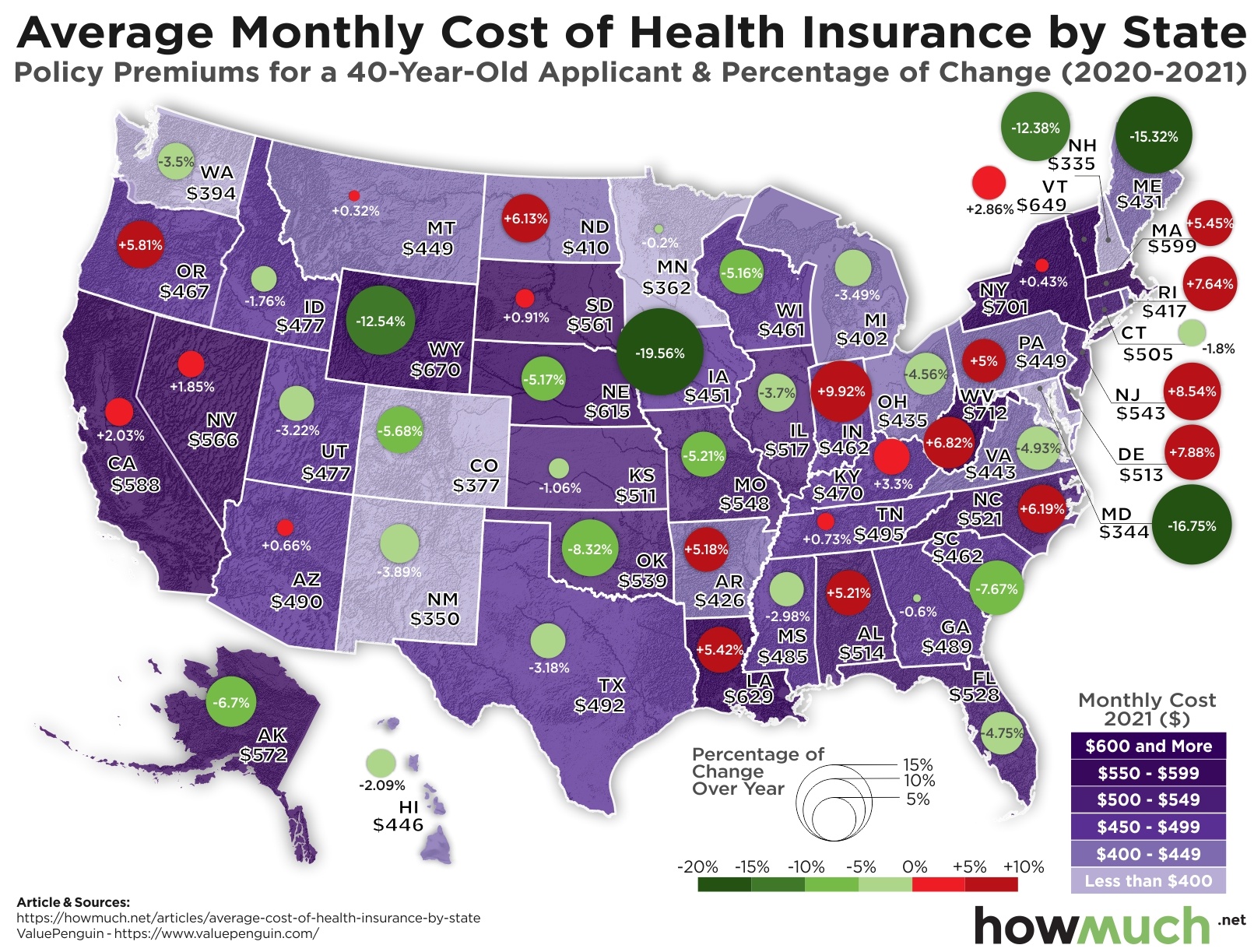
The average cost of health insurance for a typical 40-year-old applicant is about $495 per month, a price that has gone down over 2% from last year. However, health insurance might cost a lot more (or a lot less) depending on where you live.

Healthcare Cost Map

  • West Virginia is the most expensive state in the country for health insurance, costing on average $712 per month.
  • The cheapest place is New Hampshire, where insurance only costs about $335 per month for a typical 40-year-old applicant.
  • Prices are wildly fluctuating from last year depending on where you live, declining some -19.56% in Iowa but rising +9.92% in Indiana.
  • Taken together, health insurance premiums decreased over 2% from last year and cost on average $495.

We got the data for our map thanks to ValuePenguin. First we color-coded each state based on the average monthly cost of health insurance premiums for a 40-year-old applicant. The rates come from Public Use Files at the Centers for Medicare & Medicaid Services. Then, we added a circle corresponding to the percentage of change from 2020 to 2021, with green indicating a net reduction in cost, and red an increase. The result is an intuitive snapshot of the national market for health insurance.

Top 10 Most Expensive States for Health Insurance (And Year-Over-Year Change)

State Monthly Cost 2021 % of Change From 2020
1. West Virginia $712 +6.82%
2. New York $701 +0.43%
3. Wyoming $670 -12.54%
4. Vermont $649 +2.86%
5. Louisiana $629 +5.42%
6. Nebraska $615 -5.17%
7. Massachusetts $599 +5.45%
8. California $588 +2.03%
9. Alaska $572 -6.7%
10. Nevada $566 +1.85%

Our map demonstrates the extent to which geographic location drives pricing for health insurance premiums. The most expensive state is West Virginia, where on average it costs a 40-year-old applicant $712 each month. By contrast, that same applicant would only need to pay $335 in New Hampshire, less than half as much. Not only that, but the price of insurance year-to-year varies across the country too, dropping by almost 20% in Iowa but rising almost 10% in Indiana. The states with the highest populations also tend to see the highest prices, like New York ($701) and California ($588).

What explains the dramatic differences? Why does it cost so much more for health insurance in some states than others? The simplest explanation is that some Americans are healthier than average, and a major factor is location. West Virginia is widely seen as the epicenter for the opioid epidemic, and it is also the most expensive for insurance. By contrast, Colorado has one of the lowest rates of obesity in the U.S., and their health premiums only $377.

There are a few caveats to keep in mind about our visual. The price of health insurance depends on a few different variables, especially the type of plan, the age of the insured, tobacco use, and the number of people being insured. All of these factors go into pricing in addition to physical location. And more importantly, because a lot of people get their health insurance through their employer, most people don’t pay the full price out of their own pocket. Employers usually pay some portion of the premium, which also depends on where you live.

All of which is to say, it pays to shop around for health insurance. If you are in the market for coverage, a good place to start is with our health insurance cost guide.

Data: Table 1.1

Here’s How WallStreetBets Is Exploding the Market

$
0
0

WallStreetBets is a subreddit suddenly famous for driving individual investors to crowd into and out of stocks, launching several companies on a rollercoaster ride and setting record levels of market volatility. Here’s how 7 picks from Reddit’s WSB have fared over the last several days.

Reddit Investors Rising Stocks

  • Gamestop saw the most action in overall price movement, rocketing up from $147.98 on January 26 to $347.51 the next day.
  • Naked Brand Group witnessed the greatest overall swing in percentage terms, skyrocketing an astonishing +323.08% in only three days.
  • AMC and Nokia were the first stocks to come back down, immediately retreating off the highs on Jan 26.
  • Overall, these 7 companies have share prices that are still higher than where they started the year, suggesting either genuine new demand or still have more room to fall.

We grabbed the daily closing price according to Yahoo Finance for several companies popular on Reddit’s WallStreetBets. We focused on the day where the market saw the wildest swing in prices, January 26, marking where these companies started and ended the day together with the overall percentage change in value. Since a lot of brokerages now offer trading for free, including fractional shares of companies, our approach allows for an apples-to-apples comparison of how volatile these companies have been over the last several days.

GameStop is certainly the most famous pick in WallStreetBets. The stock started the year at $17.25, before rising throughout mid-January to about $40. But things started to take off on January 27, when it closed at $347.51, a record high. That represents a YTD increase of some 1,914%. If you had put $1,000 into GameStop at the start of the year and sold at its peak, you’d net a tidy profit of over $19,000. But then platforms like Robinhood decided to suspend new orders, and as the demand dried up, the price started to plummet. GameStop closed on February 3 at $92.41, still about five-times higher in just over a month. Robinhood is now being sued for its actions, not to mention some high-profile Congressional hearings.

But GameStop is not the only company seeing its share price gyrate “to the moon” and back. AMC shot up over the course of a single trading day, going from $4.96 on January 26 to $19.90 on the following day. AMC then immediately came back down to Earth, recently closing at $8.97. Blackberry (+32.66%), Blockbuster (120%), Macy’s (11.93%), Naked (323.06%) and Nokia (+38.48%) all saw an extreme surge followed by a decrease.

There’s been a lot of reporting about these stock price movements over the last several days, but there is still a lot we don’t know. For example, many Reddit users are saying they are not behind the recent surge in the price of silver. They claim it’s hedge funds trying to make the WallStreetBets community look bad. It seems much more likely that an uncontrollable mass movement of individuals is moving into and out of assets depending on how they read crowdsourced information. That being said, all of the stocks mentioned in this article are still trading above where they started the year. Either there’s a new populist dynamic in financial markets, or these shares still have a ways to fall before 2021 is over.

Data: Table 1.1

Visualizing the Sharp Decline in Credit Card Debt Around the U.S.

$
0
0

Consumers have some good news to celebrate despite the COVID-19 pandemic. With the government sending out stimulus checks and the coronavirus keeping a lot of people at home, people are paying down their credit card debt at a very high rate.

Credit card debt by state

  • On average, credit balances decreased $879 or 14% from 2019 to 2020.
  • Every state across the country has seen average credit card debt decline by double digits except North Dakota (-8%) and West Virginia (-9%).
  • Alaskans paid down their debt at one of the highest rates in the country (-18%), but still carry the highest overall debt load ($6,617).
  • Generation X has the highest overall credit card debt at $7,155, but the Silent Generation is paying it down at the highest clip (-16%).

We found the data for both of our visualizations at Experian, one of the major U.S. credit reporting agencies. First we color-coded each state based on the severity of credit card indebtedness. Then we added another layer to indicate the relative decline of average credit card debt from 2019 to 2020 for each state. And finally, we broke the numbers out by generation, demonstrating who has the most credit card debt.

Top 10 States for Declining Credit Card Balances

State Credit Card Balance Decline
1. Washington, DC -20%
2. Alaska -18%
3. California -18%
4. New York -17%
5. Massachusetts -17%
6. New Jersey -16%
7. Hawaii -16%
8. Connecticut -15%
9. Rhode Island -15%
10. Washington -15%

The good news is that average credit card debt is declining across the map. In fact, every state has seen a double-digit decrease with the exception of North Dakota (-8%) and West Virginia (-9%). People living in Washington, DC paid off an amazing 20% of their credit debt in a single year, followed by Alaska and California (both -18%). That being said, Alaska remains the state with the highest credit card balances on average, totaling $6,617. At the other end of the spectrum, Iowans boast the lowest average debt at $4,774, however they only paid off 10% from 2019 to 2020.

Another way to look at these figures is to break the numbers out by generation. Generation X, or people 40 to 55 years old, carry the highest overall credit card debt on average ($7,155). Compare that to Generation Z, which only has $1,963. Evidently, consumers rack up credit card debt throughout their lifetimes.

Credit card debt by generation

There are two main reasons why credit card balances are declining. First, the coronavirus continues to pose a threat to the economy, forcing businesses to shut down and keeping consumers from going out. A lot of people are curtailing their spending as they stay at home and don’t travel, leaving more room in their budgets for paying down debt. Second, the U.S. government is actively considering another round of economic stimulus. This includes supplemental unemployment benefits, and some people are actually making more money without a job than they were working. Another part of the stimulus involves direct cash payments from the IRS to taxpayers, and surveys indicate a lot of people use the extra financial windfall to pay down debt.

Overall it is good news that credit card balances are declining across the board. However, they are still quite high. If you are on the market to refinance your debt, a good place to start is by checking out our cost gude of unsecured personal loans.

Data: Table 1.1

Charting 2020 Stock Market Ups and Downs

$
0
0

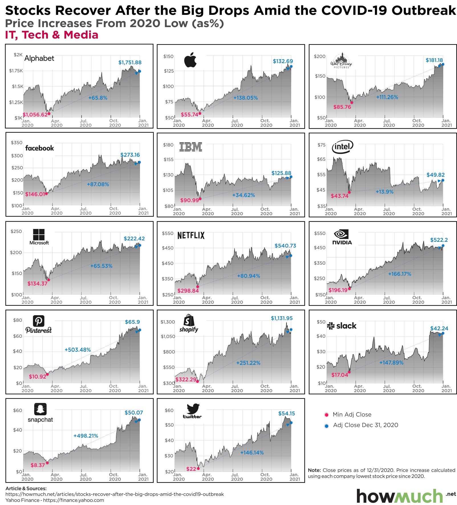
The coronavirus pandemic is still actively reshaping the economy. With people stuck at home during a long winter, the demand for technology and delivery services has never been higher. But that doesn’t mean transportation and retail companies are all suffering, as our latest analysis of share prices makes clear.

stock market 2020

Stock market 2020Stock market 2020Stock market 2020

  • Tesla has seen the most dramatic rise in share price in recent memory through the pandemic, skyrocketing some 876.84% from $72.24 in March to $705.67. This landed the company in the Fortune 500 and made Elon Musk the richest man alive.
  • Amazon, already a highly valued company before the pandemic, has seen its share price rise the most in overall dollar terms, going from $1,676 to $3,566.93, or 94.23%.
  • Taken as a group, IT, tech and media companies are faring extremely well in the COVID economy with several companies posting triple-digit percentage increases in stock price.
  • Transportation and travel companies have also done pretty well recently, including Ford and GM (+119.2% and +147.86%).

To create our visual of the stock market’s broad recovery, first we identified 32 well-known companies representing a cross-section of the economy, including tech, travel, retail, banking and transportation. We located the lowest closing price in 2020 for each company according to Yahoo Finance. For the vast majority of firms, prices bottomed out mid- to late-March. Then we calculated the overall difference from the low point until December 31, 2020, drawing a straight line with a percentage change called out. The result is a snapshot of a rapidly recovering and now expanding stock market, despite the enduring challenges of COVID-19 to the broader economy.

Top 10 Companies With the Highest Stock Surge

Company Rise Since Min Adj Price (2020)
1. Tesla +876.84%
2. Pinterest +503.48%
3. Snapchat +498.21%
4. Shopify +251.22%
5. Uber +244.13%
6. Lyft +206.11%
7. Expedia +190.03%
8. Nvidia +166.17%
9. Slack +147.89%
10. GM +147.86%

Our visualizations make it clear that lots of companies have seen their values recover, and in fact grow, during the coronavirus pandemic. The U.S. stock market overall is performing exceptionally well, recently setting another record high in light of more fiscal stimulus from the federal government. This optimism is reflected across the board in several different parts of the economy. Even big American car manufacturers have seen demand for their share prices, with Ford and GM both rising (+119.2% and +147.86%, respectively).

There are a couple reasons why stock prices keep going up as unemployment doesn’t seem to get better. Since interest rates are so low, investors necessarily have to buy stocks to have any kind of hope for a return. But individual investors have also started actively day trading stocks too, sending the prices of some companies on a wild ride.

What are the implications of a rapidly rising stock market? The richest people in the world are getting a lot richer, since a lot of Americans don’t actually own any stock. Elon Musk’s personal net worth very much depends on Tesla’s stock price, and his fortune is now valued at about $185B. Amazon’s stock has likewise seen a great year rising from $1,676 to $3,256.93, though nowhere near as good as Tesla. Depending on how the prices of Tesla and Amazon stock are doing on any given day, Elon Musk or Jeff Bezos are trading places as the world’s wealthiest individuals.

How do you think the stock market will perform in 2021? Are we headed for another record-breaking year? Let us know in the comments.

Data: Table 1.1

Visualizing Unemployment by Metropolitan Area

$
0
0

In early 2020, the U.S. government locked down most of the economy in a bid to halt the spread of Covid-19. Unemployment rates skyrocketed to levels not seen since the Great Depression. A year later, we survey the job market damage to see how each job market fared. Our visualization compares the December 2020 unemployment rates by metropolitan area.

Unemployment rates by metropolitan area

  • Tourist heavy economies like Las Vegas, Nevada, Hawaii, and Atlantic City, New Jersey saw unemployment rise over 5%.
  • Key oil-producing regions such as Odessa and Midland, Texas suffered similar rises in unemployment.
  • Only 10 of 389 metropolitan areas saw unemployment rates remain the same or drop.
  • Overall U.S. unemployment rose by 3.1% year-over-year.
  • 20 municipalities have unemployment rates over 10%.
  • Traditional farming areas have some of the highest unemployment rates in 2019 and 2020.

We pulled data from the Bureau of Labor Statistics, which tracks unemployment by nearly 400 metropolitan areas. Taking that information, we created a heat map graphic to show unemployment rates across the U.S.

Top 5 Metros With the Highest Unemployment Rates

Metropolitan Area Unemployment Rates 2020
1. El Centro, CA 17.7%
2. Kahului-Wailuku-Lahaina, HI 13%
3. Yuma, AZ 12.4%
4. Atlantic City-Hammonton, NJ 12%
5. Visalia-Porterville, CA 11.8%

Top 5 Metros With the Lowest Unemployment Rates

Metropolitan Area Unemployment Rates 2020
1. Ames, IA 2.1%
2. Logan, UT-ID 2.4%
3. Burlington-South Burlington, VT 2.6%
4. Sioux Falls, SD 2.8%
5. Iowa City, IA 2.8%

Covid-19 didn’t just drive unemployment up in the U.S. The entire world saw unprecedented joblessness. And the impact was by no means equal. Many businesses leaned on insurance plans like business interruption insurance and savings to weather the storm. Yet that only gets you so far.

The visual highlights the geographies tied to many of the industries that experienced the worst job losses. Sectors like leisure and hospitality shed numerous jobs while struggling to recover. Yet, non-discretionary industries like finance and utilities saw fewer layoffs and recovered faster.

Areas with high unemployment in 2019 such as Southeastern California and Southwestern Arizona remained high in 2020 with little change.

Hawaii was hit particularly hard, as unemployment in the Maui area jumped from 10.8% to 13%, making the second worst unemployment rate amongst metropolitan areas in the U.S.

In an effort to stem the bleeding, central banks around the world dropped interbank lending rates to 0% or negative. Like many countries around the world, the U.S. government added fiscal stimulus to fight shrinking demand in 2020, with the possibility of additional support in 2021. These packages aim to help companies retain employees and weather the downturn until the recovery takes hold.

Although unemployment rates improved from their worst levels, the road to full recovery remains uncertain for many.
What do you think helps some job markets recover faster than others? Let us know in the comments.

Data: Table 1.1

The Historic Collapse of U.S. Airline Stocks In One Visual

$
0
0

During a global pandemic with a highly contagious airborne disease, who wants to go shoulder-to-shoulder on an airplane with hundreds of other travelers? It’s no surprise that travel numbers fell off a cliff in 2020, but here’s how the stock market reacted to the turmoil inside the U.S. airline industry.

U.S. airline companies stock prices

  • Allegiant was the only U.S.-based airline to see its share price end 2020 in positive territory, opening the year at $175.14 and closing at $189.24.
  • Every other U.S. airline saw a net decrease in stock market value, in some cases like United, as much as -50%. Most finished the year down by more than 25%.
  • U.S. airlines started the year like the rest of the stock market at relatively recent highs, only to crater with the onset of the pandemic as millions of people decided to cancel plans and stay home.
  • Airlines have seen their stocks recover from their 2020 lows, however the vast majority of the industry still has a long road to recovery.

To create our visualization, first we grabbed the daily percentage change in stock price for 9 major publicly traded U.S. airlines according to Yahoo Finance. Not every major airline in the U.S. is publicly traded, like Frontier, however our visualuation still represents the vast majority of the airline industry. Then, we overlaid a series of events throughout 2020 to illustrate the rollercoaster share prices have gone on, and how far some companies have yet to go.

2020 started off as an overall positive year for the stock market and the broader American economy. U.S. stocks were setting record highs in February and the unemployment rate was only 3.5%. In reality, COVID-19 was spreading around the world, with the first case being reported in the U.S. on January 20. Researchers now believe the virus may have been in America and Europe as early as November or December 2019. But once people finally started to understand what was happening, the U.S. came to a standstill as millions of people sheltered in place. The WHO declared a pandemic on March 11 and by April 2 more than a million people were confirmed infected. Airline stocks absolutely cratered during this time period, collapsing in some cases over 75%. Every single U.S. airline stock was off its 2020 opening price by 50% or more.

Company 2020 High Date Price 2020 Low Date Price
Alaska Jan 2, 2020 67.79 Mar 20, 2020 23.56
Allegiant Feb 04, 2021 219.38 May 07, 2020 66.23
American Feb 12, 2020 30.47 May 15, 2020 9.04
Delta Jan 17, 2020 61.6 May 14, 2020 19.38
Hawaiian Jan 16, 2020 30.31 Mar 19, 2020 8.63
JetBlue Feb 13, 2020 21.56 Mar 23, 2020 6.86
Southwest Airlines Feb 13, 2020 58.32 May 15, 2020 23.87
Spirit Feb 13, 2020 44.58 May 15, 2020 8.01
United Jan 2, 2020 89.74 May 15, 2020 19.92

From their lowest point in spring 2020, airline stocks have had a slow and gradual climb back. U.S. deaths from the virus topped 200,000 on September 22, a point at which no airline stock was within -25% of its pre-crisis valuation. The federal government also stepped in again with direct aid for the transportation industry, including billions earmarked specifically for airlines. And yet the promise of more federal aid wasn’t enough to save tens of thousands of jobs. By the time vaccines were authorized in December, Allegiant was the only airline to see its price completely recover and in fact end the year in positive territory.

Even with the distribution of effective vaccines, the world still continues to suffer from the coronavirus. Donate now to the WHO COVID-19 Response Fund to make an immediate impact today.

Data: Table 1.1

Breaking Down America’s Imports and Exports by Product

$
0
0

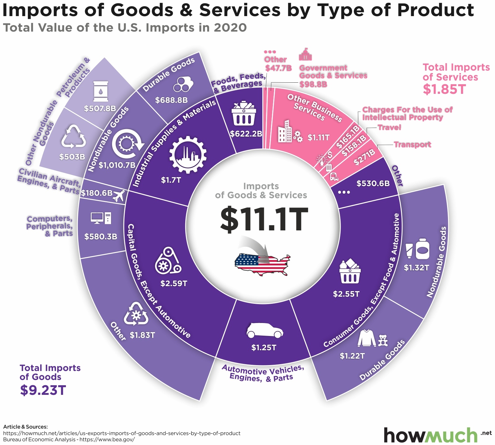
In 2020, the United States imported $11.1 trillion worth of goods and services while exporting $8.5 trillion. Breaking this down into the various product types draws a picture of the American economy. Looking at the value of the different categories, we get a sense of what products the U.S. relies heavily on other countries for, and which they produce in excess.

US export by product

  • America exports $2.84 trillion in services, nearly twice the $1.85 trillion it imports.
  • Imports of goods stood at $9.23 trillion in 2020, nearly twice the $5.67 trillion it exports.
  • The difference between imports and exports of consumer goods, except food and automotive is $1.85 trillion, the largest imbalance favoring imports.
  • On the flip side, the gap between imports and exports in the other business services category came in at $570 billion favoring exports.
  • Total exports dropped by $1.55 trillion and imports by $1.41 trillion in 2020 compared to 2019.

Our data comes from the U.S. Bureau of Economic Analysis. The information collected is broken down into various categories and presented in total dollars. ‘Other’ categories help capture smaller subcategories within the groups.

US import by product


Top 5 U.S. Exports by Category

Category Export Value (2020)
1. Capital goods, except automotive $1.84T
2. Industrial supplies and materials $1.82T
3. Consumer goods, except food and automotive $698.9B
4. Foods, feeds, and beverages $551.4B
5. Automotive vehicles, engines, and parts $515.8B

Top 5 U.S. Imports by Category

Category Import Value (2020)
1. Capital goods, except automotive $2.59T
2. Consumer goods, except food and automotive $2.55T
3. Industrial supplies and materials $1.70T
4. Automotive vehicles, engines, and parts $1.25T
5. Foods, feeds, and beverages $622.2B

A quick look at the visualization might level a reader scratching their head, wondering why the U.S. imports and exports in the same category. Consider one of the top exports for the U.S. is petroleum. Differences in supply chains, types of crude oil, and refining capabilities mean that it may be cheaper to import in one part of the country and export in another. That is why, in part, Mexico and Canada are the U.S. largest export destinations.

What we can see is the heavy reliance on imports for many of the raw material products. Companies might then assemble these to sell one of America’s top exports in 2019, air and spacecraft. And, we can see how the U.S. heavily relies on imports for most consumer goods.

But we need to take this with a grain of salt. 2020 was a bit of an anomaly with the global pandemic. Economies around the globe shrank as did trade. Aircraft and engine parts exports fell by over 40% from 2019 as travel ground to a halt. As economies reemerge, these categories are likely to shift.

2021 brings a new administration in the U.S. and hope of a global recovery. So, what do you think these visuals would look like next year? Let us know in the comments.

Data: Table 1.1


Visualizing Extreme Poverty by Country

$
0
0

Basic internet access to this article isn’t even a thought for people living in extreme poverty. Most of us think of extreme poverty as an abstract concept that we hear about but never see. Yet, as our visualization illustrates, a significant portion of the world’s population lives like this, separated geographically from the rest of us.

Extreme poverty in the world

  • South & Central America and Africa contain the majority of the countries with high percentages of the population living in extreme poverty.
  • Countries with modern histories rife with warfare exhibit higher levels of extreme poverty such as South Sudan, Rwanda, and Somalia.
  • Extreme poverty for developed countries such as the United States and countries in Europe range between 0.1-0.5%.
  • Some smaller countries with strong social safety nets and economies such as New Zealand, Switzerland, and Taiwan carry extreme poverty rates below 0.1%.

For our data, extreme poverty is defined as living on less than $1.90 per day. The World Data Lab provides real-time estimates and projections at the country level, presenting the total population and estimated size of people living in extreme poverty. From that information, we can derive the percentage of the population living in extreme poverty. It’s worth noting that the data is only as good as the information provided or estimated when counts cannot be reliably obtained.

Countries With The Highest Percentage of Population In Extreme Poverty in 2021

Country Percentage of people living in extreme poverty
1. South Sudan 85%
2. Burundi 80%
3. Central African Republic 79%
4. Madagascar 77%
5. Congo 75%
6. DR Congo 74%
7. Malawi 73%
8. Eritrea 71%
9. Yemen 63%
10. Somalia 61%

Extreme poverty is a fluid state that people and countries move in and out of. And unfortunately, global catastrophes like the pandemic halt and often reverse decades of progress. Social programs through government agencies and private organizations get stretched as more people rely on them and less money comes in.

What’s interesting is when you compare the current levels with those in 2018. Well-off countries like Germany saw the number of people living in extreme poverty skyrocket from 28,000 in 2018 to 194,000. Interestingly, some countries made improvements over the same time such as the United States dropping from 3.2 million to 1.3 million or China from 9.5 million to 2.1 million. Yet, we can see how countries like Somalia, Burundi, and Madagascar garner top spots year after year. It demonstrates how systemic extreme poverty can be in certain areas while economic activity helped others reduce their levels even as populations grew.

Programs like child tax credits and organizations like OXFAM aim to reduce the number and percentage of people living in extreme poverty. But what do you think is the number one thing we can do to reduce extreme poverty around the globe? Let us know in the comments below.

Data: Table 1.1

Beyond Bitcoin: The Top Cryptocurrencies of 2021

$
0
0

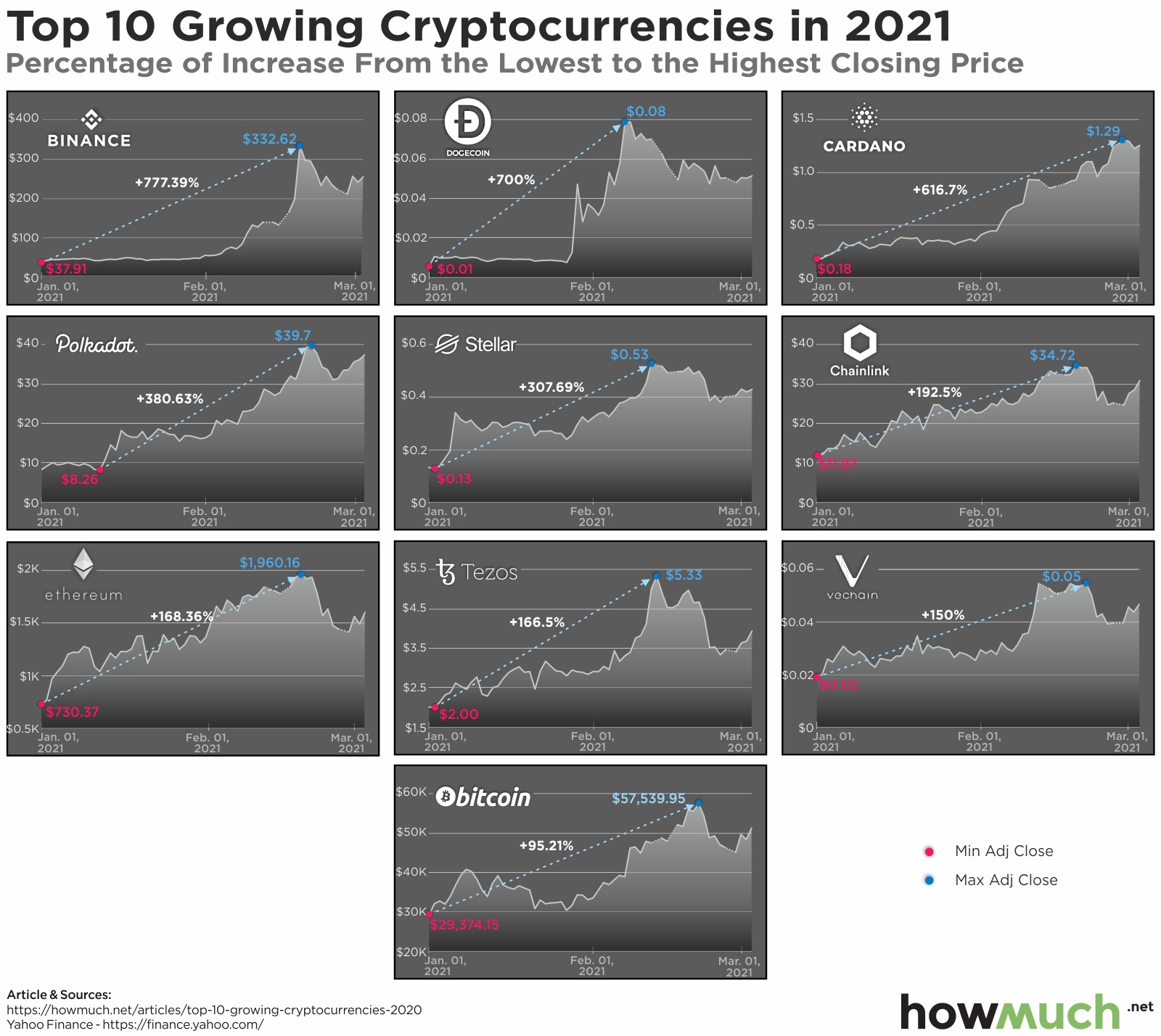
Cryptocurrencies saw their values soar in 2021. Big companies like Paypal dove into the market, creating greater access. Demand skyrocketed alongside equity markets as troves of new investors snatched up various cryptocurrencies. And surprisingly, Bitcoin wasn’t the top performer.

Best crypto to invest in 2021

  • A significant amount of the gains occurred alongside the ‘Gamestop’ mania as investors and traders poured into risk assets.
  • The price of little-known cryptocurrencies like Dogecoin and Binance experienced a surge in a relatively short amount of time (days to weeks instead of months).
  • Companies like Tesla investing $1.5 billion in Bitcoin for payments fueled demand.
  • Many of the smaller coins still trade near or below $1 per coin.

Cryptocurrencies act much like stocks. You buy at one price, sell at another, at the difference is your profit. Using Yahoo Finance, our data looks at the percentage gain in the price of each cryptocurrency from the beginning of 2021 until the present. We then plot their price charts for 2021 from top left to bottom right in order of the largest percentage gains.

Top 10 Cryptocurrencies Percentage Gains in 2021

1. Binance: +777.39%
2. Dogecoin: +700%
3. Cardano: +616.7%
4. Polkadot: +380.63%
5. Stellar: + 307.69%
6. Chainlink: +192.5%
7. Ethereum: +168.36%
8. Tezos: +166.5%
9. Vechain: +150%
10. Bitcoin: +95.21%

A simple tweet from Elon Musk sent shares of Dogecoin up double-digit percentages in a single day. And this cryptocurrency was started as a joke in 2013. Each cryptocurrency emerged for different reasons. And its worth understanding those to get a sense of where their value comes from.

Binance

Binance is the cryptocurrency that operates the Binance Exchange, one of the most widely used in the world. Using the ‘token’ as a method of payment on the exchange can trade at a discount.

Dogecoin

Originally created as a joke, Dogecoin garnered attention with its meteoric rise in price and associated memes. While most currencies continue to create coins over time, Dogecoin put a cap on the total number of coins ever available in circulation.

Cardano

Engineers, mathematicians, and cryptographers created Cardano using a research-based approach. They wanted to create a better version of Etherium as well as create solutions for chain interoperability, voter fraud, and legal contract tracing. While much smaller than Etherium, Cardano gained some notable investments lately.

Polkadot

Miners of Bitcoin often sell their reward coins, creating downward pressure on Bitcoins. Polkadot uses a ‘Proof of Stake’ concept to avoid this issue by attributing the mining power to the proportion of coins held by the miner, essentially disincentivizing their sale. This avoids a potential ‘Tragedy of Commons’ problem that exists in Bitcoin’s future.

Stellar

Not all cryptocurrencies are aimed at the retail audience. Stellar’s blockchain network is designed to connect financial institutions for large transactions. This specific blockchain works to reduce the transaction time from several days across many intermediaries to near-instantaneous movement.

Chainlink

Oracle decided to get into the game with Chainlink, a cryptocurrency designs to bridge the gap between smart contracts (like Ehterium) and outside data. Chainlink provides some interesting use cases including water supply monitoring.

Etherium

One of the most well-known Bitcoin alternatives, Etherium is a decentralized software platform enabling Smart Contracts. They aimed to deliver a decentralized suite of financial products for anyone in the world with free access. Etherium is the second-largest digital currency next to Bitcoin by market cap.

Tezos

After several early cryptocurrencies split, Tezos set out to create a ‘self-amending blockchain.’ Their idea was to allow anyone who owned their cryptocurrency to vote on possible changes to its rules. That moves the decisions out of the hands of developers and into the owners.

VeChain

Aimed at enhancing the supply chain management, VeChain contains two tokens: VeChain Token and VeChainThor Energy. The first transfers value across the network while the second powers the smart contracts themselves.

Bitcoin

The most well-known cryptocurrency out there, Bitcoin’s origin is a bit of a mystery. It’s the first currency with no physical coins, where transactions are governed by a consensus of participants that add approve of a transaction and add it to the ledger. Unlike government currencies, Bitcoin is operated by this decentralized structure.

Cryptocurrencies already saw one bubble cycle several years ago. Are we headed for another one now or are we at the precipice of a new age of digital currencies? Let us know your thoughts below.

Data: Table 1.1
Visualizing the Massive Gender Pay Gap Across U.S. Industries

$
0
0

The gender pay gap is real, and it exists in every industry across the economy according to our latest visualization. But just how much more money do men make than women? The exact size of the wage gap depends on the industry.

Gender pay gap across us industries

  • Women make less money than men across several different industries in the U.S. economy, including educational services, health care, and food services.
  • The single industry with the largest gender pay gap is finance and insurance, where on average men take home $33,000 more than women every year.
  • Across the entire U.S. economy, median male earnings were $45,893 compared to $32,436 for women. In other words, women’s earnings are only 70.7% of men’s.

We got the data for our visualization from the US Census Bureau. The numbers reflect median earnings for men and women in 2019 inflation-adjusted dollars. We plotted the wage figures across industries, where the size and color of each bar corresponds to the total gross earnings by gender. And we ordered each industry by the size of the wage gap, creating a clear snapshot of gender income inequality across industries.

The Gender Wage Gap by Industry

Rank Industry

Median earnings

(Men)

Median earnings

(Women)

Women's earnings

(as a % of men's earning)

1 Finance and insurance $83,660 $50,456 60.30%
2 Other services, except public administration $35,778 $22,083 61.70%
3 Professional, scientific, and technical services $84,749 $53,152 62.70%
4 Agriculture, forestry, fishing and hunting $32,021 $20,689 64.60%
5 Management of companies and enterprises $85,219 $58,718 68.90%
6 Retail trade $30,592 $21,415 70.00%
7 Health care and social assistance $51,233 $35,916 70.10%
8 Information $65,475 $46,552 71.10%
9 Transportation and warehousing $44,984 $32,345 71.90%
10 Manufacturing $52,026 $37,694 72.50%
11 Arts, entertainment, and recreation $28,313 $21,066 74.40%
12 Public administration $66,032 $50,132 75.90%
13 Accommodation and food services $20,953 $16,256 77.60%
14 Utilities $76,884 $60,481 78.70%
15 Wholesale trade $51,407 $40,630 79.00%
16 Administrative and support and waste management services $31,531 $25,056 79.50%
17 Educational services $47,489 $39,704 83.60%
18 Real estate and rental and leasing $46,799 $40,293 86.10%
19 Mining, quarrying, and oil and gas extraction $73,037 $65,364 89.50%
20 Construction $42,098 $39,222 93.2%

Our visualization contains several key insights into just how much more money men make than women. For starters, the gender pay gap is obvious in every industry, even ones where women hold the predominant share of the workforce. According to the National Center for Education Statistics, about 76% of public school teachers in the U.S. are women. And yet men working in education make $47.5K compared to $39.7K for women, a difference of about $7,800. The industry with the lowest gender pay gap is construction, where men take home $2,800 more than women each year. And the Bureau of Labor Statistics says women only make up about 10% of the workforce in the construction industry. So some industries where women hold most of the jobs, like education and healthcare, have worse gender pay gaps than industries where there are relatively few female employees, like construction.

But the scales are tilted even more disproportionately toward male workers in other parts of the economy. Take finance and insurance as an example. The median income for men is $83,600 compared to just $50,456. As a percentage of earnings, women only make 60.30% as much as men. That’s an eye-popping gender pay gap.

We won’t rehash all the different explanations and excuses for why men are compensated differently than women, however it’s worth considering how the coronavirus pandemic is making the situation even worse. There’s no doubt the entire economy went through a severe contraction last year. Women are already disproportionately represented in low-wage jobs, and with schools and childcare facilities forced to close, they are more likely than men to leave the workforce. All of which suggests that the gender pay gap will grow considerably worse before it gets better.

Data: Table 1.1

What Schools Create the Most Student Loans in the U.S.?

$
0
0

President Joe Biden has a plan to forgive up to $10,000 of federal student loans per borrower, but many people in the Democrat party want him to go even further and forgive $50,000. And the latest COVID relief bill includes a provision that would make any student debt forgiveness income tax free. But where is all this student debt coming from? Our latest visualization has some answers.

Universities with the highest loan originations

  • Students at Arizona State University took out the most loans of any school in the country for the 2020-21 academic year ($568M).
  • 35 out of 50 U.S. states list a public university as the highest originator of student loans.
  • 14 states have a private-nonprofit institution with the highest total loan originations, led by Liberty University in Virginia ($405M).
  • There is only one state in the entire country, Minnesota, where a for-profit university is responsible for the most loan originations ($332M).

To create our map of student loan debt, first we gathered figures from the US Department of Education of total student loan originations for the 2020-21 academic year for every university and college in the country. Then we narrowed the list to the top producer in each state, and classified each institution as either public, private-nonprofit, or proprietary. The result is an intuitive color-coded heat map showing where the bulk of student loan debt ultimately comes from.

Top 10 Universities With the Highest Loan Originations by State

University Total Loans Originated
1. Arizona State University (AZ) $568M
2. Liberty University (VA) $447M
3. New York University (NY) $405M
4. Pennsylvania State University (PA) $388M
5. Capella University (MN) $332M
6. Rutgers University (NJ) $309M
7. University of Southern California (CA) $243M
8. Nova Southeastern University (FL) $232M
9. Michigan State University (MI) $228M
10. Texas A&M (TX) $227M

Our map clearly demonstrates how the majority of student loans come from public universities. 35 out of 50 states have a public school listed as the highest originator of student debt. Arizona State University is the highest offender at $568M in just a single academic year. Several public universities top $200M, including Penn State ($388M), Rutgers ($309M) and Michigan State ($228M). But that’s not to say private-nonprofit universities aren’t driving student loan originations to astronomical levels as well. Liberty University ($447M) and New York University ($405M) are both in the top 3 across the country. Among proprietary schools, Capella University is easily the highest ($332M).

To be fair, our visual doesn’t tell the whole story about student debt. By focusing only on total debt originations, it leaves out the number of students going to these schools. The University of Arizona, for example, saw 26,663 students receive federal student loans totalling $568M, or just over $21K per person. Compare that to Capella University, where only 3,736 students took out $$332M, or almost $89K per person. Our visual also doesn’t take into account the economic status and career mobility of those students. It’s also possible that some outlier students are taking out 6-figure loans, driving up the total loan originations. The being said, with some U.S. politicians actively pushing for debt cancellation, it’s helpful to know where most of the funds will be going.

If you need to take out a student loan to finance your education, it doesn’t always make sense to turn to the federal government. Check out our student loan cost guide for more information.

Data: Table 1.1

Mapped: The United States of Debt

$
0
0

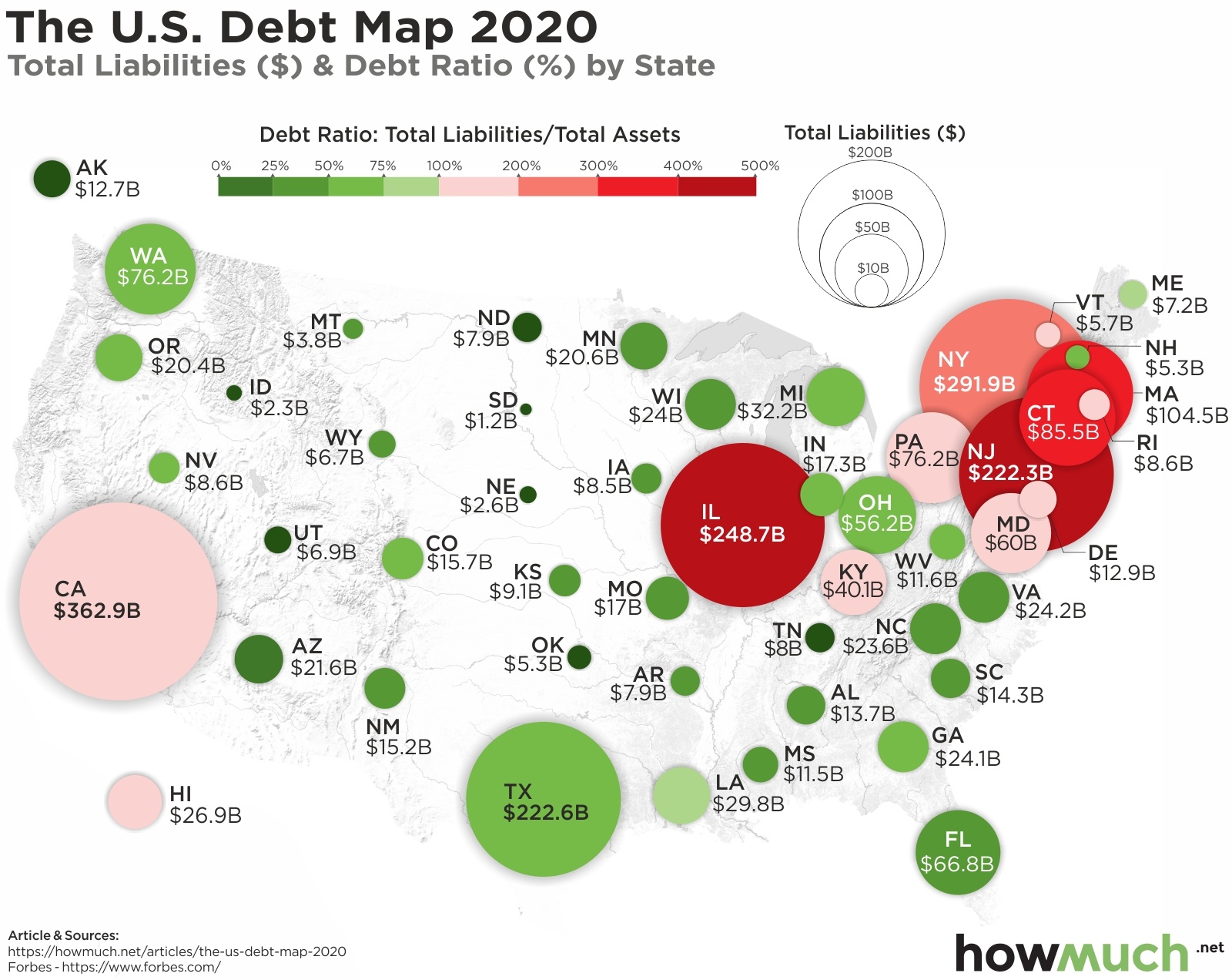
Is there a state debt problem in the U.S.? A major part of President Biden’s $1.9T economic stimulus package is $350B in direct aid to states. The idea is that states need additional revenue to deal with the pandemic and supplement their reserves. Critics point out that states tax revenues in 2020 were roughly flat compared to the previous year. But nonetheless there is a massive state debt problem, as our latest visualization of debt by state makes clear.

Debt by state

  • California has the highest overall total debt liability of any state at $362.9B, representing 120.5% of total assets.
  • The most leveraged state is Illinois, where $248.7B of debt equals an astonishing 468.7% of assets.
  • 13 states have debt loads topping 100% or more of assets, with a concentration of heavily indebted states in the Northeast.
  • The vast majority of states across the country have manageable total debt levels. Alaska (14.2%), South Dakota (15.1%) and Nebraska (15.1%) have the healthiest balance sheets.

Forbes originally collected and published the data for our visualization. We first created a bubble corresponding in size to the overall debt load for each state, which highlights the places with the highest and lowest debt totals. Then, we added a sliding color scheme to illustrate the relative size of debt compared to state-owned assets. It makes sense for California and New York to have higher overall debt levels than South Dakota and Alaska. However, our approach indicates the places with potentially enormous debt problems.

Top 10 States With the Highest Debt Ratio

State Total Liabilities ($) Debt Ratio (%)
1. Illinois $248.7B 468.7%
2. New Jersey $222.3B 441.7%
3. Connecticut $85.5B 334.9%
4. Massachusetts $104.5B 305.5%
5. New York $291.9B 273.8%
6. Delaware $12.9B 174.2%
7. Maryland $60B 123.9%
8. Kentucky $40.B 121.4%
9. California $362.9B 120.5%
10. Hawaii $26.9B 118.4%

The most obvious takeaway from our map is that there are lots of states with tens of billions in debt. The state with by far the most debt in the country is California at $362.9B, topping some 120.5% of the state’s assets. Five other states also crack $100B in debt, including New York ($291.9B), Illinois ($248.7B), Texas ($222.6B), New Jersey ($222.3B) and Massachusetts ($104.5B). Clearly these states have been spending a lot more money than they’ve been collecting in tax revenues for several years.

But just because some states carry a lot of debt doesn’t necessarily mean they are on an unsustainable path. After all, Jeff Bezos is one of the richest men in the world, and he could easily afford a million-dollar credit card bill. Taking a look at debt ratios provides a fuller picture because it divides total debt by total assets. Some of the states with the highest debt loads also have extremely high debt ratios, like Illinois (468.7%) and New Jersey (441.7%). And there are a lot of states with a lot less overall debt, but which are still at unsustainable levels. Connecticut only carries $85.5B in debt, but that’s the third highest ratio in the country at 334.9%. All these states have a real problem spending more money than they actually have.

On the flip side, Texas has one of the highest total debt levels, but is middle-of-the-pack with its debt ratio at just 62.5%. In fact, the vast majority of states have very little debt both overall and as a ratio. Alaska only carries debt levels of 14.2%. This is why federal aid for states is such a controversial and political issue. Politicians from states with high debt ratios believe they need federal help to manage through the COVID pandemic. But others from places with manageable levels see a bailout in response to a long-term problem with spending.

If you are in debt, it might be worth consolidating different loans into a single payment. Our personal loan for debt consolidation cost guide is a great place to get started.

Data: Table 1.1

Viewing all 687 articles
Browse latest View live