Quantcast
Channel: howmuch.net
Viewing all 687 articles
Browse latest View live

Mapped: The Most Profitable Companies on the Fortune 500 for Every State

$
0
0

The coronavirus continues to wreak havoc across the American economy. With unemployment approaching Depression Era levels at 13.3%, it pays to have an employer with a secure business model and fat profit margins. Here are the most profitable companies on the Fortune 500 headquartered in every state around the country.

most profitable companies

  • Berkshire Hathaway remains the most profitable company on the Fortune 500. Headquartered in Nebraska, Warren Buffett’s company generated an incredible $81.4B in profit in 2019.
  • 35 companies on our map saw more than $1B in profits last year. The average company made $9.4B.
  • Almost every state in the country is home to at least one Fortune 500 company. The only exceptions are New Mexico, Wyoming, Montana, South Dakota, Alaska and West Virginia.
  • The most profitable companies for every state from the Fortune 500 represent a variety of different industries, including insurance, oil, retail and banking.

To create our map, first we took every company on the Fortune 500 for the year 2020. Then, we figured out the most profitable company headquartered in each state, overlaying both their logos and a color-coded map of profitability. The result is a snapshot of the biggest winners in the American economy.

Top 10 Most Profitable Companies by State (2020)

1. Berkshire Hathaway - Nebraska: $81.4B
2. Apple - California: $55.3B
3. Microsoft - Washington: $39.2B
4. JPMorgan Chase - New York: $36.4B
5. Bank of America - North Carolina: $27.4B
6. Johnson & Johnson - New Jersey: $15.1B
7. Walmart - Arkansas: $14.9B
8. ExxonMobil - Texas: $14.3B
9. Fannie Mae - Washington, DC: $14.2B
10. UnitedHealth Group: Minnesota: $13.8B

There are two important caveats to keep in mind about our map. First, the Fortune 500 looks primarily at public companies. The list includes private companies only if their financial statements are readily available. It therefore excludes a lot of highly profitable but privately held companies, like Koch Industries. And second, our map only accounts for one company in each state. Facebook, Google and Apple are each from California, but there’s only room for one on our map. That being said, a remarkable insight from our map is just how diversified the most profitable companies across the Fortune 500 actually are. There are companies representing nearly every sector of the economy, including retail (Walmart, $14.9B), banking (Bank of America, $27.4B) and oil and gas (ExxonMobil, $14.3B).

Another takeaway from our map is how the majority of companies generate a lot more than $1B in annual profits. In fact, only 11 on the map turned in less than $1B, with the average across the entire visual coming in at $9.4B. The most profitable Fortune 500 company remains Berkshire Hathaway ($81.4B) in Nebraska followed by Apple ($55.3B) in California. At the other end of the spectrum, Sanderson Farms created “only” $53M in profits in Mississippi, just enough to make it onto the Fortune 500.

It’s also interesting how our map confirms the dominant players in the economy while packing a few surprises. Oregon has Nike ($4B). Apple is in California ($55.3B). Texas is home to ExxonMobile ($14.3), and there’s a few large insurance companies in the Midwest, like UnitedHealth Group in Minnesota ($13.8B) and Progessive in Ohio ($4B). The Northeast is dominated by media companies and banks like NBC Universal in Pennsylvania ($13.1B) and JPMorgan Chase in New York ($39.2B). But check out Kansas, home to Spirit AeroSpace ($530M), a major supplier for Boeing. Or what about Micron from Idaho ($6.3B), a computer memory manufacturer? Indeed, the American economy has a lot of diversity.

Are there any surprises to you on our map? And do you work at any of these companies? Let us know how you like it in the comments.

Data: Table 1.1


Charted: U.S. Unemployment Rates Over Time

$
0
0

To say the coronavirus has taken a toll on the U.S. economy would be an understatement. At the end of 2019, the U.S. experienced the lowest unemployment levels in 50 years. But since COVID-19 swept the nation in mid-March, more than 47 million Americans have filed for unemployment and the country has entered a recession. How do today’s numbers compare to other major periods of unemployment? Our new visualization illustrates how unemployment rates have changed over time in relation to major events.

unemployment rate change over time

  • The highest unemployment rate was 24.9% in 1933, during the Great Depression.
  • The lowest unemployment rate was 1.2% in 1944.
  • The most dramatic change in unemployment occurred between March 2020 and April 2020, representing a 10.3 percentage point increase at the outset of the COVID-19 outbreak.

We gathered unemployment data over time from the Bureau of Labor Statistics, which is represented in the visualization by the red line graph. The horizontal axis represents the years 1929 - 2020, while the vertical access is the unemployment rate expressed as a percentage. We also included information about recessions, which are shown by the purple bars at the bottom of the graph to correspond with the years. To further situate unemployment rates in their historical context, we included major economic and political events that took place over the past 100 years. These are represented by the green circles above the line graph.

Top 10 Years with the Highest Unemployment Rates

1933 - 24.9%
1932 - 23.6%
1934 - 21.7%
1935 - 20.1%
1938 - 19%
1939 - 17.2%
1936 - 16.9%
1931 - 15.9%
1940 - 14.6%
1941 - 9.9%

According to the Federal Reserve, the “natural rate of unemployment” (which accounts for the frictional, structural, and surplus unemployment that occurs in a healthy economy) is estimated to be between 3.5% - 4.5%. There will always be some unemployment because people are in-between jobs, or they are upskilling for new jobs because their old jobs are obsolete. However, the graph shows several noticeable periods when unemployment rates were much higher than the natural rate of unemployment. Not surprisingly, unemployment rates experienced a spike during depressions, recessions, and other major economic events such as the OPEC oil embargo in 1973, the Dotcom bubble in 2000, and most recently, the coronavirus outbreak in 2020.

Some states are bearing the brunt of COVID-19 losses more than others. According to CNN, Nevada is the hardest-hit state, with a 25.3% unemployment rate in May. Hospitality and tourism are significant drivers in Nevada’s economy, but these sectors have suffered as a result of stay-at-home orders around the country. By contrast, Nebraska had the lowest unemployment rate in May, at 5.2%.

Yet there is some hope on the horizon. Even though the nationwide unemployment rate reached 14.7% in April, it dropped to 13.3% in May. Furthermore, economists predict that the unemployment rate dipped even further in June, while also adding 3 million jobs. The coronavirus outbreak is still far from over, and further effects on the economy remain to be seen.

Want to read more of our coronavirus coverage? Check out our breakdown of coronavirus stimulus programs around the world and the impact of COVID-19 on the world’s major stock indexes.

Data: Table 1.1

Charting America's Most Profitable Companies

$
0
0

It’s been a rough start to 2020 for the U.S. economy, with the Bureau of Economic Analysis reporting a 12.3 drop in corporate profits in the first quarter. The most profitable U.S. companies have proved no exception to this downturn, although things are starting to look up for some.

Charting most profitable companies

  • U.S. corporate profits fell by 12% in the first quarter of 2020.
  • Berkshire Hathaway, the most profitable U.S. company, posted a net loss of $50 billion in the first quarter.
  • Profits at JPMorgan Chase, the most profitable financial company, fell 69% in the first quarter.
  • Some profits may be looking up: Microsoft posted a 22% increase in net income in the third quarter.

Our data comes from the 2020 edition of the Fortune 500. For our viz, each of the 50 most profitable companies are represented by a bubble labeled with that company’s logo and its profits. A larger bubble and darker shade of green indicates a more profitable company, while a smaller bubble with lighter shade of blue indicates a less profitable company. Our viz has categorized these companies by industry.

Top 10 Most Profitable Companies in the U.S.

1. Berkshire Hathaway (Insurance): $81.4B
2. Apple (Computers & software): $55.3B
3. Microsoft (Computers & software): $39.2B
4. JPMorgan Chase (Internet services & retailing): $36.4B
5. Alphabet (Internet services & retailing): $34.3B
6. Bank of America (Internet services & retailing): $27.4B
7. Intel (Electronics, electrical equipment & electronic components): $21.05B
8. Wells Fargo (Financials): $19.5B
9. Citigroup (Financials): $19.4B
10. Verizon Communications (Telecommunications): $19.3B

The most profitable U.S. company by far is the Berkshire Hathaway, the insurance conglomerate run by billionaire Warren Buffett. At over $80 billion in 2019 profits, Berkshire Hathaway is more profitable than any company worldwide except for oil giant Saudi Aramco. 

Even mighty Berkshire stumbled in the first quarter of 2020 amid the global economic shutdown triggered by the coronavirus pandemic: the company posted a nearly $50 billion loss, the largest ever in its history. This loss, along with Buffett’s seeming lack of response to adjusting the company’s portfolio, has led some to question whether the “Oracle of Omaha” has lost his touch, while others insist that Buffett will again be proven correct with a steady “buy-and-hold” strategy.

Following Berkshire Hathaway on the most profitable list is Apple, a company which had only gained in earnings 2.5% annually as of March 2020. Analysts seem optimistic that the technology company will be able to bounce back with increasing consumer spending and confidence. And there is reason to believe: Microsoft posted strong year-over-year earnings growth in the third quarter of 2020, citing minimal impact of the coronavirus.

A noticeable absence on the list is Amazon, the world’s largest retailer. While a large company by market capitalization, Amazon still has a relatively low profit. This is because the company re-invests much of its revenue into the company, with the expectation of higher profits in the future. The strategy has paid off, while some wonder how long it can continue.

What companies are you surprised to see among the most profitable? Are there any you’re surprised not to see? Will corporate profits rebound in the coming quarters? Let us know in the comments and share with your friends.

Data: Table 1.1

The Paycheck Protection Program (PPP) is Helping These Industries the Most

$
0
0

Congress is returning to the Capitol to discuss another round of economic stimulus as the coronavirus pandemic rages on across the South and West. Nancy Pelosi wants more than $1.3T in aid, while Donald Trump says he wants a payroll tax cut. With the deficit already climbing to dizzying heights at $864B in June, it might be helpful to pause and consider which industries are benefiting the most from all this spending.Industries Receiving PPP Loans

  • Health care and social assistance organizations received more money than any other industry in the Paycheck Protection Program (PPP) at $67.36B, or 12.92% of the program’s total.
  • 3 industries other than health care also received more than $50B, including professional services ($66.43B), construction ($64.57B) and manufacturing ($54B).
  • Companies working in educational services got comparatively little funding at just $11.99B or 2.34% of the total.
  • A lot of industries received lesser amounts, like utilities ($1.5B) and mining ($4.51B), demonstrating how the PPP is impacting diverse segments in the economy.

We found the data for our visualization directly from the U.S. Small Business Administration’s report on the Paycheck Protection Program (PPP). The PPP is a uniquely American response to the forced lockdowns and business closures resulting from the coronavirus pandemic. The government guaranteed forgivable loans to small businesses impacted by the virus if they kept workers on the payrolls. Businesses could apply for these loans through banks. You can find all the details about PPP, including limits and conditions, from the SBA. Our visualization highlights the specific industries benefiting the most from the $521.48B in PPP loans as of June 30, 2020.

Top 10 Industries Receiving PPP Assistance

  • Health Care & Social Assistance: $67.36B or 12.92%
  • Professional, Scientific & Technical Services: $66.43B or 12.74%
  • Construction: $64.57B or 12.38%
  • Manufacturing: $54B or 10.36%
  • Accommodation & Food Services: $42.1B or 8.07%
  • Retail Trade: $40.36B or 7.74%
  • Wholesale Trade: $27.73B or 5.32%
  • Administrative & Waste Management: $26.48B or 5.08%
  • Transportation & Warehousing: $17.9B or 3.28%
  • Real Estate, Rental & Leasing: $15.63B or 3%

Health care and social assistance companies are obvious standouts for direct government funding. Working on the frontlines of the coronavirus pandemic merits additional government money, and at $67.36B, this industry is taking home the largest percentage of PPP aid (12.92%). The other industries at the top of the list also make a lot of sense. Scientific, technical and professional services ($66.43B), construction ($64.57B) and manufacturing ($54B) all cover huge segments of the workforce. The pandemic is also hitting the food services ($42.1B) and retail ($40.36B) industries especially hard. In fact, our visualization makes it clear how the PPP is impacting a wide variety of industries, providing another indication of the breadth of disruption to the workforce.

A lot of different industries are benefiting from PPP, but there are still a few controversies in the disbursement of government aid. For starters, educational services and schools received relatively little money and are now a major flashpoint in the debate around additional stimulus funding. Big banks are also benefiting as the middlemen in the disbursement of PPP money, raising fees for their services and giving well-connected clients concierge treatment. Other questionable loans through PPP are now emerging. To give just two examples, Kanye West’s Yeezy received a multimillion dollar loan, and so did some hedge funds.

So the PPP has some problems, but it’s clear that a wide variety of industries and companies are benefiting from the rush to get stimulus into the economy. What do you think will happen with the next round of government stimulus? Let us know in the comments.

Data: Table 1.1

Is Your State Getting Its Fair Share of Coronavirus Stimulus?

$
0
0

Congress is now negotiating another round of economic stimulus to counter the coronavirus, and it still remains to be seen exactly what will be in it. The Paycheck Protection Program (PPP) was one of the biggest planks of the previous stimulus effort, offering small businesses forgivable loans in exchange for keeping workers on their payrolls. Our two latest maps reveal how this money was distributed across the country.

Paycheck Protection Program by State

  • The states with the most people received the most money overall from the Paycheck Protection Program, including California ($68.23B), Texas ($41.05B) and New York ($38.35).
  • The most populated states likewise received the most loans, led by California (581K), Florida (393K) and Texas (389K).
  • Rural and less populated states are getting much less money overall, including Wyoming, which has only received about 13,000 loans valued at $1.04B in total.

Paycheck Protection Program per Capita

  • When measured on a per capita basis, Washington, DC is receiving the highest share of money in the country at $3,029 per person.
  • At the other end of the spectrum, American territories far away from the capitol are receiving much less per capita, including American Samoa ($213), Puerto Rico ($564) and the Northern Mariana Islands ($765).
  • There’s a group of states across the South receiving relatively less per capita than other states, stretching from Arizona ($1,185) to North Carolina ($1,183). These are the same places now seeing the worst case numbers for the coronavirus.

First, we illustrated the overall volume of dollars according to the US Small Business Administration with a color-coded map, overlaid with a yellow circle for the overall number of loans. This gives you a sense for which states are getting the most money in general. Second, we wanted to dive deeper into the numbers and make adjustments for population levels. So we created another map highlighting loan payments on a per capita basis, according to US Census figures for 2019, highlighting the places disproportionately benefiting from the program.

Top 10 State With the Highest Overall PPP Funding

State Paycheck Protection Program (PPP) Funding Loan Count
1. California $68.23B 581,140
2. Texas $41.05B 389,396
3. New York $38.35B 323,903
4. Florida $32.05B 393,028
5. Illinois $22.49B 202,143
6. Pennsylvania $20.71B 165,918
7. Ohio $18.37B 140,270
8. New Jersey $17.20B 147,550
9. Michigan $15.96B 121,135
10. Georgia $14.5B 156,814

Top 10 States With the Highest PPP Funding Per Capita

State Paycheck Protection Program (PPP) Funding - Per Capita
1. Washington, DC $3,029
2. North Dakota $2,316
3. Massachusetts $2,079
4. Minnesota $1,987
5. New York $1,971
6. New Jersey $1,937
7. Vermont $1,903
8. South Dakota $1,881
9. Connecticut $1,877
10. New Hampshire $1,876

The combination of both of our maps paints a complete picture of the Paycheck Protection Program. It’s no surprise to learn that the states with the highest population are taking in the most money overall. In fact, 9 out of the top 10 states receiving the most dollars are among the 10 most populated. California ($68.23B), Texas ($41.05B), New York ($38.35B) and Florida ($32.05) are the only four states to pull in more than $30B. That represents 34.45% of the total distribution, and those states account for 33.34% of the country’s population. At first glance, this suggests the Paycheck Protection Program was reasonably distributed across the country.

A closer look at the per capita disbursement of funds suggests a more complicated story. In fact, people living in some places took home significantly more money than other people. The clear stand out is Washington, DC where the per capita disbursement astonishingly came out to $3,029. Why would the businesses physically located in the capitol get more money on a per capita basis than everyone else?

It is worth pointing out who is at the opposite end of the spectrum, with the least PPP dollars per capita. That would be American Samoa ($213), Puerto Rico ($564) and the Northern Mariana Islands ($765). We didn’t map these locations because they aren’t official states, but it’s interesting to note the Americans receiving the least PPP aid are geographically the furthest from the capitol.

There are two other insights worth calling out about the per capita map of PPP dollars. North Dakota and South Dakota are two of the 6 least populated states in the country, and yet they land in the top 10. And there is an obvious collection of lightly shaded states across the South, stretching from Arizona ($1,185) to North Carolina ($1,183). West Virginia received the least money when adjusted for population among any US state ($1,005). And yet these are the exact same places undergoing the brunt of the latest surge in cases. The pandemic and economic crisis are therefore colliding with particular force across the South and Sun Belt.

Do you think there will be another round of economic stimulus in light of the resurgent coronavirus? What do you think will be in the package? Let us know in the comments.

Data: Table 1.1

Visualized: The Top 25 Business Insurance Firms in the U.S.

$
0
0

Having the right insurance is a critical part of small business financial planning. It can provide much needed funds in case of a covered interruption to business. But what are the biggest brokerages selling policies today?biggest brokerage firms

  • Marsh & McLennan is the top brokerage by revenue by a long shot. With $7.5B in annual revenue, Marsh & McLennan is the only brokerage to top $5B.
  • Three other companies generate more than $3B in annual revenue, including Aon ($4.7B), Willis Towers Watson ($4B) and Arthur J. Gallagher ($3.6B).
  • The business insurance brokerage industry is dominated by several smaller players. 12 out of the top 25 companies make less than $1B in annual revenue.
  • There is substantial volatility in revenues year-over-year, with several companies entering and leaving the top 25 from one year to the next.

We got the data for our visualization from an annual list of top 100 business insurance brokerages based on revenue from Business Insurance. We ranked the companies in order of their 2018 cash flow, the last year for which complete data was available. We then color-coded the exploding pie chart by revenue level, providing a clear snapshot of the biggest players in the business insurance brokerage industry.

Top 10 Largest Business Insurance Brokerages by Revenue (2018)

Company Brokerage Revenue ($)
1. Marsh & McLennan Cos. Inc. $7.5B
2. Aon PLC $4.7B
3. Willis Towers Watson PLC $4B
4. Arthur J. Gallagher & Co. $3.6B
5. BB&T Insurance Holdings Inc. $2B
6. Brown & Brown Inc. $2B
7. Hub International Ltd. $1.7B
8. USI Insurance Services LLC $1.7B
9. Alliant Insurance Services Inc. $1.3B
10. Acrisure LLC $1.3B

The first insight from our visual is just how top-heavy the business insurance market is. Marsh & McLennan clearly stands out as the largest company by annual revenue. With $7.5B in money coming in during 2018, Marsh & McLennan saw more money than all the companies in spots 11 to 25 combined. But there are a few other large, multi-billion dollar companies in the top 5, like Aon ($4.7B), Willis Towers Watson ($4B) and Arthur J. Gallagher ($3.6B).

So there are a handful or large companies at the top, but what about the other end of the spectrum? Further down the list, there are a lot of companies generating highly volatile revenue year-over-year. 12 companies in the top 25 have less than $1B in revenue. Looking further down the list from Business Insurance, 13 out of the top 50 companies saw less than $100M in annual revenue. This means that making a few key sales to large companies could dramatically improve any specific company’s place on the ranking.

And finally, a lot remains unknown about how the coronavirus pandemic will impact the business insurance industry, and which companies are going to make it through to the other side of the current economic recession. For example, one open issue is whether business insurance policies cover government-mandated closures due to the pandemic. We will see how the issue progresses through ongoing litigation, but the widespread economic downturn will surely impact revenue figures for 2020 and beyond.

If you have a small business and are looking for insurance, check out our collection of business insurance guides to learn more about the industry.

Data: Table 1.1

Ranking the World’s Biggest Economies Over the Last 40 Years

$
0
0

The coronavirus recession is dramatically shrinking the global economy. According to the World Bank, we are currently in the worst recession since World War II. Exactly how this will impact the standing of the largest economies is unknown, but here’s the latest projected top 10 by GDP (PPP).Biggest Economies

  • 2020 marks the start of the first decade where the U.S. does not have the largest economy in the world ($22.32T). First place belongs to China by a long shot ($29.47T).
  • Before this decade, the U.S. consistently had the largest economy in the world for the last 40 years, growing from $2.86T in 1980 to a projected $23.18T next year.
  • Over the last few decades, many Asian countries have seen their economies grow significantly, including China ($29.47T), India ($12.36T), Japan ($5.89T) and Indonesia ($4.01T).
  • Asian countries reached the top of the rankings, and Western European countries declined. Italy is no longer in the top 10, and Germany, France and the U.K. have all fallen further down the ranking.

We wanted to understand how the top 10 largest economies in the world measured by GDP have changed over the last few decades. We took historical GDP figures from the International Monetary Fund (IMF) from 1980 to 2020 with a projection for 2021. After color-coding each economy by continent, we traced where it landed in the rankings decade by decade. This snapshot reveals at a high level the grand narrative over the last 40 years, which is the emergence of Asian economic power and the relative decline of the Western industrialized world.

Top 10 Biggest Economies in 2020

  • China: $29.47T
  • United States: $22.32T
  • India: $12.36T
  • Japan: $5.89T
  • Germany: $4.59T
  • Russia: $4.52T
  • Indonesia: $4.01T
  • Brazil: $3.60T
  • United Kingdom: $3.24T
  • France: $3.16T

One of the most obvious trends in our visual is how the U.S. previously held the top spot decade after decade. Starting in 1980 with a GDP of $2.86T, the U.S. was always significantly larger than the countries in second place. The Japanese economy took off after 1980 and eventually reached roughly one-third the size of the U.S. around the year 2000 ($10.25T vs. $3.42T). But then Japan plateaued and today only has a GDP of $5.89T compared to $22.32T for the U.S.

At a high level, our visualization reveals the macro trend of global economic growth over the last 40 years. Asian economies thrived through industrialization and urbanization, becoming the factories of the world and lifting billions of people into the middle class. This narrative is most applicable for China, which wasn’t even counted among the top 10 economies before 1990. However, China now has the largest economy in the world at $29.47T today, and is projected to grow to $31.85T next year. The same rapid growth is evident for other Asian countries too, like India ($12.36T), Japan ($5.89T) and Indonesia ($4.01T).

If Asian economies are rising to become the largest in the world, then they are taking the place of industrialized Western countries. In 1980, Germany had the third biggest economy in the world at $867B. It is projected to be in fifth place at $4.75T by 2021. The French economy tells a similar story, starting at $576B in 1980 in sixth place and falling to tenth by 2021 at $3.27T. Italy fell out of the top 10 completely.

The wild card moving forward is how the coronavirus will impact economic growth. The IMF recently found that the cumulative loss of economic output due to the coronavirus will total about $9T through 2021. And although a lot remains unknown about the virus, the largest economies in the world will look very different as a result.

How do you think the coronavirus will affect the economy? Let us know in the comments.

Data: Table 1.1

Visualizing the 50 Most Profitable Insurance Companies in the U.S.

$
0
0

If you pay for insurance, but never make a claim, are you wasting your money? We think the answer is no, but there’s no denying insurance companies can be highly profitable companies, as our latest visualization of the top 50 illustrates.Top insurance companies by profit

  • Only three companies generated more than $5B in annual profit, namely Berkshire Hathaway ($81.4B), MetLife ($5.9B) and State Farm ($5.6B).
  • There are 13 property and casualty insurance stock companies making multi-billion dollar annual profit, a lot more than in other categories of insurance. 
  • The average profit figure across the top 50 is $3.2B in annual profit.

To create our visualization, first  we grouped the top 50 most profitable insurance companies in 2020 by the type of insurance according to a ranking from Fortune. Then, we color-coded and sized each circle based on how much profit the underlying insurance company made. This lets you easily and quickly see which companies dominate the different parts of the insurance industry.

Top 10 Most Profitable Insurance Companies in 2020

Company Profit 2020
1. Berkshire Hathaway $81.4B
2. MetLife $5.9B
3. State Farm $5.6B
4. Allstate $4.8B
5. Prudential $4.2B
6. USAA $4B
7. Progressive $4B
8. MassMutual $3.7B
9. AIG $3.3B
10. Aflac $3.3B

There are a couple caveats to keep in mind about our visualization. We are using the same division between stock and mutual companies as Fortune. Some companies, like Liberty Mutual ($1B) and Mutual of Omaha ($272M), are not actually stock companies, but are grouped that way in our visual. That’s because they adhere to the Generally Accepted Accounting Principles (GAAP) in how they report their financial numbers.

Here’s another caveat. Insurance companies make their money in a couple different ways, mainly off the premiums they get from policyowners who don’t have a claim, and income earned through investments of past profits. Annualized profit figures, like the ones our visual focuses on, are from operating gains and don’t speak to the mountains of money sitting in surplus and reserves. After all, from a legal perspective, major insurance companies have to be properly capitalized in case they have to pay out an unexpectedly high number of claims, like what might happen to life insurers during a global pandemic. Still, these companies are generating sizable profits in the hundreds of millions and even billions of dollars year after year.

One initial insight from our visualization is how there are only 3 major insurance companies making more than $5B in total annual profit, including Berkshire Hathaway ($81.4B), MetLife ($5.9B) and State Farm ($5.6B). In other words, there are a lot of insurance options on the market today with several companies making healthy profits, but no one in particular consolidating the entire industry. Combining the entire top 50 list of companies, the average company generated $3.2B in annual profit. To get a sense for proportionality, Apple is on track to generate $55.3B in annual profit according to Fortune.

In fact, there are a lot more small companies in blue making less than $1B in annual profit, or even less than $500M. These include health insurers, life insurance companies and property and casualty insurers. This would suggest that the insurance market across industries like life, health and property insurance continues to be split among several different players. That’s usually good for competition, which means lower prices for you.

If you are on the market for insurance, read one of our insurance guides to better understand the types of decisions you need to make.

Data: Table 1.1


Visualizing Coronavirus Economic Impact on Major Corporates

$
0
0

COVID-19 continues to inflict massive damage on the global economy, but how are some of the most recognizable companies doing? We crunched the numbers for a handful of well known corporations from around the world to visualize just how bad the carnage has been in some corners of the corporate world for the first half of 2020.Companies losses due to covid19

  • Two of the companies with the worst balance sheets in our visualization are the oil companies BP (-$21.2B) and Shell (-$18.1B).
  • Our visualization illustrates the pain being felt by travel companies around the world, including airlines like Delta (-$6.3B), car manufacturers like Volkswagen (-$1.8B) and banks like Wells Fargo (-$1.7B).
  • COVID-19 is also punishing companies that were already experiencing trouble, like Boeing, which has lost $3B in the first half of 2020 alone.

We sourced the data for our visualization directly from each company’s separate quarterly earnings report for 2Q2020. We plotted the total net income lost in the first half of the year together with each company's logo and a correspondingly sized representation of the coronavirus. The carnage to corporate balance sheets is enormous.

Top 10 Companies With the Worst Losses in Our Visual

Company Net Income (Loss)
1. BP -$21.2B
2. Shell -$18.1B
3. Santander -$12.7B
4. Renault -$8.6B
5.Delta -$6.3B
6. Chevron -$4.7B
7. American Airlines -$4.3B
8. DuPont -$3.1B
9. Air France-KLM -$3.1B
10. Boeing -$3B

Our visualization illustrates in stark detail how the coronavirus pandemic is inflicting significant damage on the travel industry. First and foremost, oil companies saw a total collapse in oil demand. Back in April 2020, there was so much excess oil on the market and not enough demand that prices actually turned negative. That means there was so much oil, and nowhere near enough people to buy it, that producers would literally pay anyone to take it off their hands. This new reality directly impacted the bottom lines at companies like BP (-$21.2B), Shell (-$18.1B) and Chevron (-$4.7B).

Oil companies weren’t the only ones to suffer an epic collapse in consumer demand with the onset of the pandemic. The TSA counts how many people pass through its checkpoints at airports around the country. During the 2Q2020, more than 90% of the market simply disappeared, directly hammering the profits for airlines. Delta lost $6.3B, American Airlines saw a loss of $4.3B, and Air France-KLM likewise suffered a decline of $3.1B. Even Warren Buffett decided to dump all of his airline stocks. The same economic damage is visible in other parts of the economy, like auto manufacturers, banks and consumer goods, but it’s nowhere near as bad as in the travel industry.

But also spare a thought for Boeing. The company was already experiencing significant problems before the coronavirus suckerpunched global travel. Boeing was forced to ground its marquee airplane, the Max 737, in March 2019 due to two horrific fatal crashes. Airlines have since canceled over 800 orders for the plane, slamming the company’s profits and resulting in a combined loss of -$3B for the first half of the year.

We should also add that there is a significant disconnect between the real economy, as it’s experienced by the tens of millions of unemployed Americans, and the stock market. How can it be true that the US is currently experiencing record unemployment rates of 10.2%, and yet the S&P 500 is actually up 3.19% year-to-date as of this writing? Part of the explanation is that some major companies, like Amazon, have benefited from the coronavirus and now represent a larger share of the economy while all the companies in our visual suffer. Another reason is that stock prices are inherently future oriented, and count us among those who hope for a brighter future ahead.

If you own a small business, this visualization is a major reason why you should consider business insurance, which could cover a disruption to your normal operations like COVID-19. Check out our small business insurance guides to learn more.

Data: Table 1.1

Visualizing the International Market for Computer Device Exports

$
0
0

President Trump has repeatedly told Apple to manufacture iPhones in the U.S. instead of China. Even with the coronavirus scrambling international supply chains, Apple doesn’t appear ready to shift its manufacturing from China to the U.S. anytime soon. Part of the reason why is that China dominates the world export market for computer devices, as our new map makes clear.Computer devices exports

  • China is by far the largest exporter of computer devices in the world with $148B in annual exports as of 2019, representing over 40% of the entire global market. China’s total excludes Hong Kong ($21B) and Taiwan ($9B).
  • Mexico has the second largest share of the market at $32B or about 8.7% of the world’s total.
  • The U.S. also has a sizable export market for computer devices, valued at $26B.
  • Asia, Europe and North America produce almost all of the computer devices exported around the world. South America, Africa and the Middle East have a tiny presence, if any.

We got the data for our visualization from the International Trade Centre’s list of exports for 2019. For research purposes, the 4-digit Harmonized Tariff System code prefix for computer devices is 8471. The technical label for that product category is automatic data-processing machines including magnetic or optical readers. To make our map easy to read, we excluded any countries with less than $100M in annual computer device exports. We first changed the size of each country in proportion to their export market, and then color-coded based on level. The result is a fascinating snapshot of the global export market for computer devices right before the coronavirus pandemic.

Top 10 Largest Computer Device Exporters in the World

Country Exports 2019 ($) Share of Market (%)
1. China $148B 40.3%
2. Mexico $32B 8.7%
3. Netherlands $28B 7.7%
4. USA $26B 7%
5. Hong Kong $21B 5.7%
6. Germany $15B 4%
7. Czech Republic $13B 3.5%
8. Thailand $12B 3.2%
9. Taiwan $9B 2.4%
10. Singapore $8B 2.1%

Asia, Europe and North America clearly dominate the export market for computer devices. South America, Africa and the Middle East are almost entirely missing from the visualization. Although we exclude countries with less than $100M in annual exports, the absence of entire countries illustrates the top-heavy nature of the computer and electronic device market. Brazil ($121M) and South Africa ($176M) are tiny compared to other countries.

And China is by far the world’s leader in manufacturing computers. At $148B, the Chinese control over 40% of the entire market. Lots of different companies make computers and smartphones, and many source their microchips from China, including Apple. And China’s figure doesn’t include separate totals from other Asian manufacturing powerhouses like Hong Kong ($21B) or Taiwan ($9B). In fact, our visualization makes it clear just how much the world relies on Asia to build and export its computers and smartphones.

And yet there’s a decent industry of computer exports in Europe as well as North America. Mexico boasts the second largest overall share of exports at $32B or 8.7%. Even the U.S. generates roughly $26B in annual international sales, not counting devices that are manufactured and bought inside American borders. The Netherlands ($28B), Germany ($15B) and the Czech Republic ($13B) also deserve special mention for their sizable device export industries.

How do you think the coronavirus will change the international export market for computers and devices? Will China maintain its dominance in the years ahead? Let us know in the comments.

Data: Table 1.1

Visualizing The Entire History of Tesla Stock Price

$
0
0

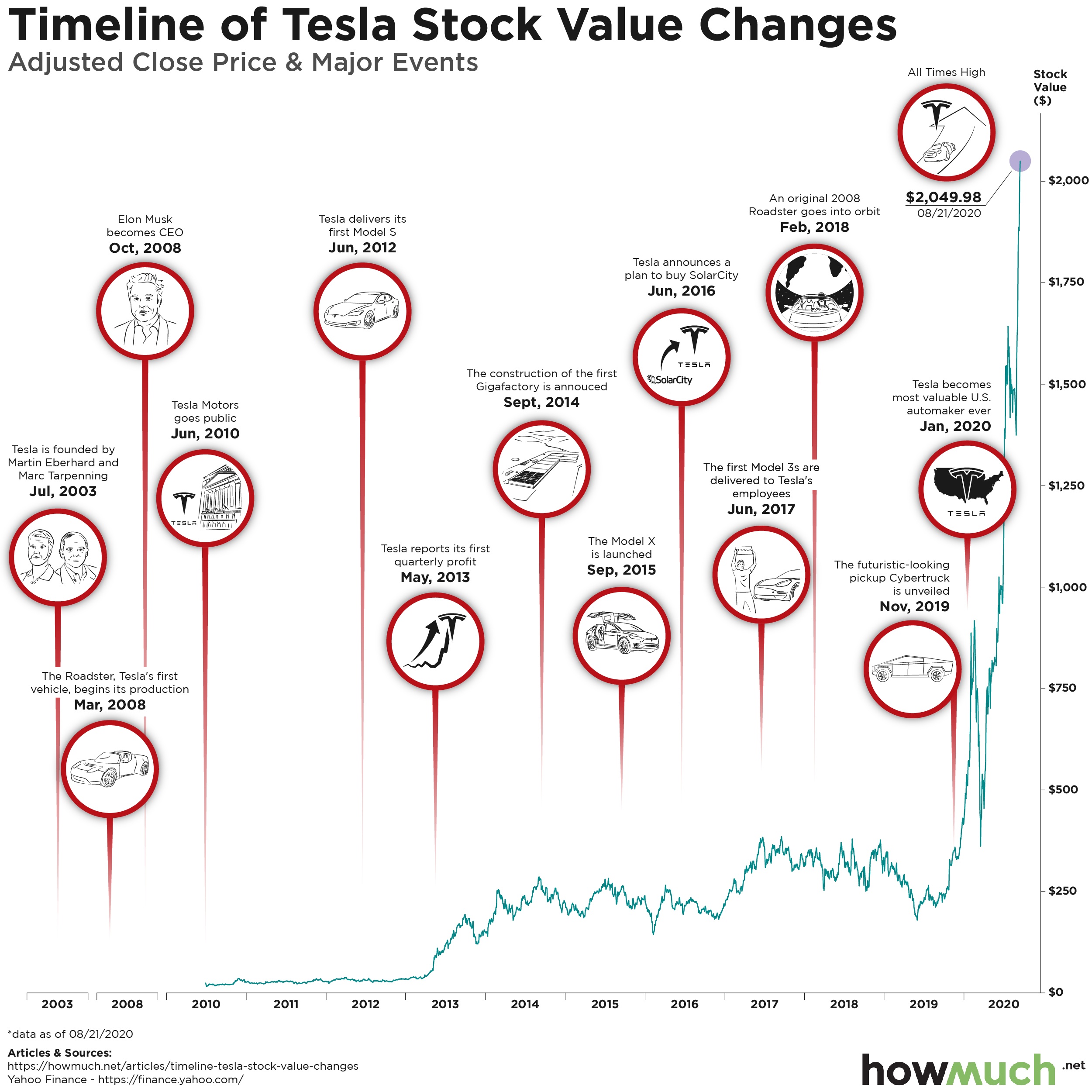
Tesla has repeatedly defied its naysayers throughout its history. Lots of people are still betting against the company, and its infamous CEO Elon Musk has had to prove his worth over and over again en route to captaining the most valuable carmaker in the world. But how did Tesla get here?

Tesla Stock Price

  • Tesla’s share price originally jumped in May 2013 when the company first turned a profit. Now that Tesla has generated additional profits, the stock price has reached an all-time new height of $2,049.98 as of 08/21/2020.

  • The company thrived even while its famous CEO Elon Musk engaged in various high-profile publicity stunts, like launching a Roadster into orbit in February 2018.

  • Tesla became the most valuable US carmaker in January 2020 before the coronavirus recession, which hammered the company’s stock.

  • Throughout the summer of 2020, Tesla’s price has skyrocketed past its previous highs, allowing the company to overcome Toyota as the most valuable carmaker in the entire world.
     

We created our visualization by first plotting the closing price for a share of Tesla stock since its IPO in June 2010 according to Yahoo! Finance. Then, we researched all of the major company events, overlaying the milestones and announcements with the share price. The result is an intuitive snapshot of Tesla’s history, tracing the company’s trajectory as an eccentric laughing stock all the way to becoming the most valuable carmaker in the world.

Originally founded in July 2003, Tesla didn’t go public until seven years later in 2010. The stock was nothing to write home about for the first few years, moving around a bit from $20 to $40 until about May 2013, when the company turned its first profit. It is difficult to understate how important this moment was in the company’s history. It proved that manufacturing luxury electric vehicles could be a viable long term business. The company continued to grow and bring new models to the market, like the Model X in September 2015 and the Model 3 in June 2017. All the while Elon Musk, the company’s infamous CEO, engaged in his usual theatrics, like launching a Roadster into orbit in 2018.

More recently, Tesla’s performance has been nothing short of astonishing. Like the broader US economy, Tesla started the year on a hig note. In fact, Tesla surpassed Ford to become the most valuable US carmaker in January, despite its relatively low total vehicle manufacturing numbers.

The coronavirus pandemic scrambled the global economy and sent the world into mandatory lockdowns. Millions of people lost their jobs, and suddenly it looked like hardly anyone would be buying a new car,  much less a luxury electric brand. Tesla hit bottom on March 18, when it closed at $361.22. Ever since then Tesla has been on an eye-popping comeback, climbing way past its previous all time high to $2,049.98 as of this writing. In fact, this summer the company surpassed Toyota to become the most valuable carmaker in the entire world.

So why is Tesla suddenly riding so high? For starters, a lot of people have been betting against Tesla for a long time, and they’re cashing out their short selling positions, stoking artificial demand. The latest high includes the market’s optimistic reaction to the news of Tesla’s five-to-one stock split coming August 28, meaning everybody who owns one share of Tesla will have five shares when the markets open August 31. But that also means the price of the stock will be adjusted downward to reflect the diluted market. So why would prices inherently jump 50% just because a company is splitting its stock? We aren’t sure why, but we wonder if Elon still thinks Tesla’s share price is too high.

Do you think the share price of Tesla will continue its meteoric rise? Or will it tumble back to earth? Let us know in the comments.

Mapping the Richest Men Around the World

$
0
0

The coronavirus has created a fascinating paradox in the economy. On the one hand, millions of Americans are out of work, supplemental unemployment insurance is now only $300 per week, and Congress can’t agree to pass a new relief package. And yet the stock market is at an all-time high, and some of the richest people in the world have therefore seen their fortunes surge, as our latest visualization makes clear.Top 10 richest men in 2020

  • This year Jeff Bezos became the first person to ever have a personal net worth of over $200B, making him by far the richest person in the world.
  • Only one other person, Bernard Arnault, controls over $100B. Since we are only focusing on the single wealthiest person or family per country, Bill Gates didn’t make the cut ($118B).
  • The distribution of wealth across the richest men in the world starts to flatten out under $50B, with several men controlling $10 to $30B.
  • There’s almost nobody from the Southern Hemisphere with more than $10B in wealth. Carlos Slim Helu ($51B) and Joseph Safra ($22.8B) are the only entrants from South America.

We found the data for our visualization of the richest men at the real-time billionaire tracker from Forbes, which measures the approximate daily fluctuations in wealth across the world’s richest people. We previously analyzed the richest women in the world. We took the pictures of the richest men in the world and placed them on the map, limiting our work to just those with a fortune of $10B or more as of September 1, 2020. Then, we sized each photo to a bubble corresponding to the size of their fortune, creating an intuitive snapshot of the world’s wealthiest men in 2020.

Top 10 Richest Men in the World

Name Net Worth 2020 ($) Source of Wealth Country
1. Jeff Bezos $204.6B Amazon United States
2. Bernard Arnault & family $114.5B LVMH France
3. Mukesh Ambani $79.8B Petrochemicals India
4. Amancio Ortega $66.4B Zara Spain
5. Ma Huateng $59.6B Internet Media China
6. Carlos Slim Helu & family $51B Telecom Mexico
7. Beate Heister & Karl Albrecht Jr. $41.6B Supermarkets Germany
8. David Thomson & family $38.4B Media Canada
9. Masayoshi Son $31.1B Internet Japan
10. Li Ka-shing $28.6B Diversified Hong Kong

The top dog by a long shot is Jeff Bezos, the founder of Amazon, who has a personal net worth of some $204.6B. Since our ranking can only account for one person per country, we had to exclude Bill Gates ($118B). The only other person controlling over $100B in wealth is Bernard Arnaul from LVMH, which owns brands like Louis Vitton. The wealth distribution across our ranking then starts to flatten out with four more men who have amassed fortunes over $50B, including Carlos Slim ($51B). In fact, a main takeaway from our visualization is how billionaires can come from a variety of different industries, including telecoms, banking and media.

Another key insight is how unevenly distributed the wealthiest billionaires are from a geographical perspective. There are only two entrants from Latin America. There is literally nobody in Africa with a personal fortune of over $10B. The same can be said about the Middle East. This means that developed economies in the U.S., Europe and Asia produce a lot more insanely wealthy people than the rest of the world.

To be fair, there are some complications to keep in mind. Some of the individuals pictured represent the head of a family with a ton of money, like Carlos Slim Helu, whose family controls a telecom conglomerate in Mexico. It is also inherently subjective to measure wealth if a lot of it is spent on things like real estate and artwork. It’s also important to mention how some famous billionaires, like Bill Gates, spend their time and fortune on making the world a better place, like finding a coronavirus vaccine, which in effect intentionally depresses their total net worth in rankings like this one. And of course someone like Jeff Bezos has billions of stock in Amazon, which is surging in value right now thanks to the coronavirus.

When do you think someone will be worth more than $300B? Will it be Jeff Bezos? Let us know in the comments

Do you need insurance for your business? Don't worry, we've got you covered.

Check Our Business Insurance Guides

General Liability Insurance Cost
Errors & Omissions Insurance Cost
Legal Malpractice Insurance Cost
Business Insurance Cost for Startups
Medical Malpractice Insurance Cost
Commercial Property Insurance Cost
Product Liability Insurance Cost

Data: Table 1.1

The World Economy in One Chart: GDP by Country

$
0
0

The coronavirus is upending the global economy in a lot of ways. Many companies are allowing their employees to work remotely forever. Millions of Americans remain unemployed due to shutdowns and cutbacks. And the future is still very cloudy as to what shape a recovery will eventually take. Our latest visualization captures the state of the global economy on the eve of all the coronavirus disruption.GDP by country

  • The U.S. remains by far the largest economy in the world with a GDP of $21.43T or 24.42% of the entire globe.
  • China’s economy grew from 2018 to 2019 to $14.34, but the country is still nowhere close to catching up to the U.S.
  • The rest of the world’s economic powerhouses have comparatively much smaller economies, including Japan ($5.08T), Germany ($3.84T) and India ($2.88T).
  • Our visualization doesn’t take into account the size of each country’s population.

We found the data for 2019 gross domestic product figures over at the World Bank. First we divided the “pie” of the global economy into color-coded continents. Then, we sized each country according to its relative contribution to the world’s GDP, in effect creating a snapshot of the global economy on the eve of the coronavirus depression.

Top 10 Largest Countries by GDP (2019)

Country GDP (2019) % Of Total World GDP
1. United States $21.43T 24.42%
2. China $14.34T 16.34%
3. Japan $5.08T 5.79%
4. Germany $3.85T 4.38%
5. India $2.88T 3.28%
6. United Kingdom $2.83T 3.22%
7. France $2.72T 3.09%
8. Italy $2T 2.28%
9. Brazil $1.84T 2.1%
10. Canada $1.74T 1.98%

The first and most obvious insight from our visual is just how big the U.S. economy is compared to the rest of the world. At $21.43T, the Americans enjoy an economy that is more than $7T larger than the second biggest, China, at $14.34T. Another insight is how the other economic powers, like Japan ($5.08T), Germany ($3.84T) and India ($2.88T), are actually not very big compared to the U.S. and China. In fact, the rest of the world is made up of relatively small economies. Only 17 countries have a GDP figure of at least $1T.

One of the most interesting things to do with this type of visual is to compare how it changes from year to year. India’s economy continued to grow and surpassed both the United Kingdom and France in 2019 to become the fifth largest in the world at $2.88T. The United States ($21.43T) and China ($14.34) both grew in size overall as well as a relative slice of the global economy, changing from 23.89% to 24.42% for the U.S. and from 15.86% to 16.34% for China. This means there is still a large gap between the American and Chinese economies, and China has a long way to go to overtake the top spot.

A key thing to remember about GDP figures is that they do not take into account population. The U.S. has a significantly bigger economy than countries like China and India, but the U.S. also has significantly fewer people. The average American is therefore a lot wealthier and enjoys a higher standard of living compared to the average person in China or India. Our visualization of GDP per capita supports this conclusion.

Do you think the coronavirus will change the ranking of the largest countries by GDP? Let us know in the comments.

Check Our Business Insurance Guides

General Liability Insurance Cost
Errors & Omissions Insurance Cost
Legal Malpractice Insurance Cost
Business Insurance Cost for Startups
Medical Malpractice Insurance Cost
Commercial Property Insurance Cost
Product Liability Insurance Cost

Data: Table 1.1

Visualizing the Richest Countries in the World in 2020

$
0
0

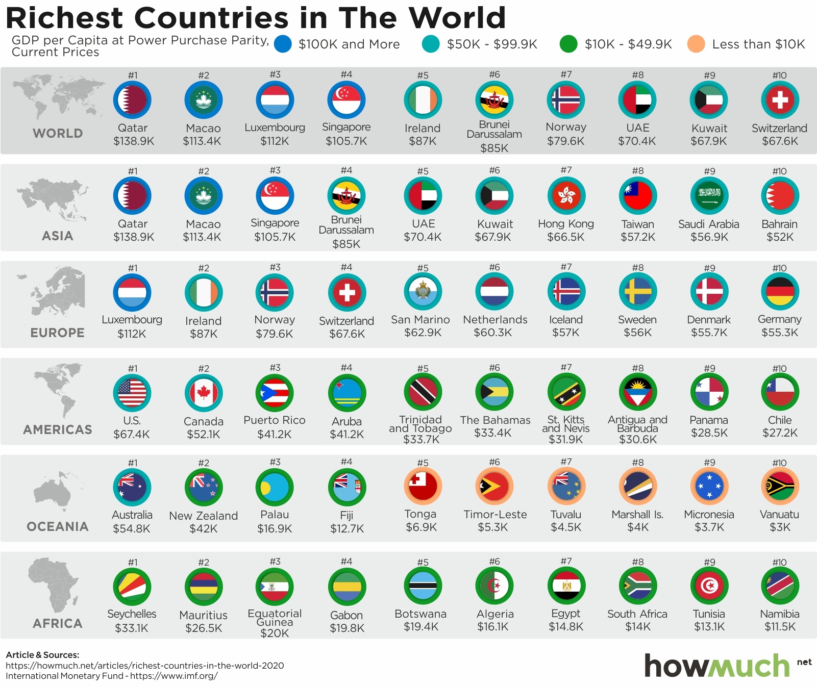
Ever wonder why a pint of beer costs a lot in some places, but next to nothing in other parts of the world? Part of the reason has to do with international currency exchange rates, but the biggest reason is that some places are just richer than others, as our latest visualization makes clear.

Richest Countries in the World

  • There are four countries in the world with a GDP per capita over $100K: Qatar ($138.9K), Macao ($113.4K), Luxembourg ($112K) and Singapore ($105.7K).

  • The richest countries in the world tend to have small population sizes. For example in Asia, China, India and Japan don’t make it in the top 10.

  • The US is not even close to being the richest country on a GDP per capita basis. Although the highest in the Americas at $67.4K, the US is only middle class across the entire world.

  • Africa is extremely poor. The richest two countries aren’t even on the physical continent, the Seychelles ($33.1K) and Mauritius ($26.5K).

We found our data from the International Monetary Fund (IMF) for 2020. GDP per capita measures the economic output of a given country adjusted for its population size. This is a critical figure because highly populated countries, like China or India, can boast a high gross domestic product but still have hundreds of millions of impoverished citizens. The IMF further adjusts its figures to achieve purchasing power parity, which levels the playing field between international currencies. We combined each country’s flag with a color-coded ranking to demonstrate the have’s and have-not’s around the world.

Top 10 Richest Countries in the World - GDP Per Capita (2020)

1. Qatar: $138.9K

2. Macao: $113.4K

3. Luxembourg: $112K

4. Singapore: $105.7K

5. Ireland: $87K

6. Brunei Darussalam: $85K

7. Norway: $79.6K

8. UAE: $70.4K

9. Kuwait: $67.9K

10. Switzerland: $67.6K

The countries with the highest per capita GDP, adjusted for purchasing parity, all tend to be relatively small city-states with international fame in specific industries. The richest country in the world, Qatar ($138.9K), is a tiny Middle Eastern country with an absolutely massive amount of oil. Macao ($113.4K) is similarly a tiny autonomous region where Asia’s wealthy go to gamble. The other two countries to break $100K are likewise small countries, Luxembourg ($112K) and Singapore ($105.7K).

The US is noticeably absent from the list of top 10 countries. Whether or not you believe the US is the greatest country in the world, it is certainly not the wealthiest on a per capita basis. Coming in at just $67.4K, the US ranks 12th behind places like Switzerland ($67.6K) and Kuwait ($67.9K). That being said, the US is by far the richest in the Americas, easily outranking Canada ($52.1K). The rest of the hemisphere falls somewhere well below $50K.

The final insight from our visualization is just how poor Africa is compared to the rest of the world. Ranked dead last in almost every measure of wealth and living standards, there isn’t a single African country with more than $50K in per capita GDP. In fact, the two highest ranking African countries, the Seychelles ($33.1K) and Mauritius ($26.5K), aren’t even on the physical continent. The vast majority of Africa subsists on less than $10K in GDP per capita, several orders of magnitude less than any other developed economy in the world.

GDP per capita, adjusted for purchasing power, is a great way to compare the wealth between countries, however it doesn’t take into account wealth disparities inside each country. The US for example has a GDP per capita of $67.4K, but this doesn’t mean the average person contributes that much to the economy. As of 2018, the average wage in American was around $50,000 but the median was about $33,000. This suggests that a small number of wealthy people are driving up the overall figures.

How do you think the coronavirus will change the global economy? Let us know in the comments.

Check Our Business Insurance Guides

General Liability Insurance Cost
Errors & Omissions Insurance Cost
Legal Malpractice Insurance Cost
Business Insurance Cost for Startups
Medical Malpractice Insurance Cost
Commercial Property Insurance Cost
Product Liability Insurance Cost

Data: Table 1.1

Visualizing the Richest Cities in the US

$
0
0

It’s no secret the US economy is powered by cities. The coronavirus forced several major metro areas into lockdowns, halting all nonessential in-person activities and sending unemployment to historic highs. With many states now reconsidering lockdowns, we thought it would be time to measure just how important American cities are to the national GDP.

Richest Cities in the US

  • The greater New York City metro area has by far the largest GDP of any American city at $1.77T. That’s larger than the whole economies of several countries.

  • Los Angeles just recently surpassed $1T in total economic output, making it the second biggest metro area by GDP.

  • San Francisco has seen rapid economic growth, shooting up from $406B just a couple years ago to $549B in this visual.

  • It remains to be seen exactly how the coronavirus will impact the American economy as tech workers who can do their jobs from anywhere consider moving to cheaper locations.

We got the data for our visual from the US Bureau of Economic Analysis for 2018, the latest year complete data were available. We created a 3D map where spikes indicate the gross domestic product (GDP) of each metro area, adjusted for inflation to 2020. The result is an intuitive snapshot of the geography of the American economy on the eve of the coronavirus disruptions.

Top 10 Richest Cities in the US - GDP by Metro Area

1. New York: $1.77T

2. Los Angeles: $1.05T

3. Chicago: $689B

4. San Francisco: $549B

5. Washington, DC: $541B

6. Dallas: $513B

7. Houston: $479B

8. Boston: $464B

9. Philadelphia: $444B

10. Atlanta: $397B

Our map reveals how the country’s economic output is concentrated in a select number of metro areas. New York stands head and shoulders above the rest, generating $1.77T in GDP each year, far ahead of second place Los Angeles at $1.05T. The greater New York area has a larger economy than all of Russia. A lot of these cities have larger economies than entire countries, as our previous analysis showed. The top 10 metros alone account for over 37% of the entire economic output for all American metros, or about $6.15T. That’s so big, if these cities left the US and formed their own country, it would have the third largest economy in the world.

To put our map in context, the top metro areas have seen their economies substantially grow over the last few years. New York’s GDP increased from $1.43T in 2016 (not adjusting for inflation) to approximately $1.77 (as of 2018 adjusted to 2020). Los Angeles similarly went from $885B to $1.05T. But San Francisco experienced the most growth relative to other cities, catapulting from seventh to fourth and going from $406B to $549B. That’s north of 35% growth in just a couple years.

One of the most interesting ways to think about this type of analysis is to consider how the coronavirus is scrambling and reordering the economy. Take San Francisco as an example. Filled with tech workers and software engineers, San Francisco has seen an exodus of people leaving the Bay Area as companies increasingly allow their employees to work remote, sometimes indefinitely. This has put downward pressure for the first time in recent history on real estate and rent prices, instead redistributing workers across the country where the costs of living are a lot lower. This should benefit smaller cities and potentially depress the GDP of major metros.

How do you think the coronavirus is going to change the economic map of the US? Let us know in the comments.

Data: Table 1.1

The Largest Brands of the World 2020

$
0
0

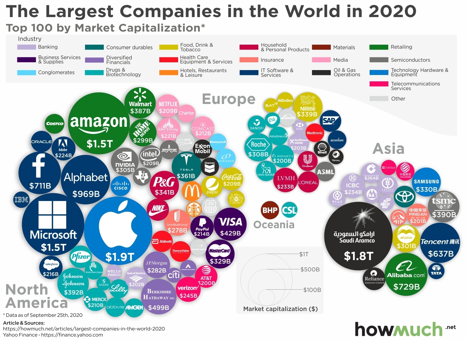
Market capitalization is one of the best ways to easily measure a company’s value. First, figure out how many shares a company has on the stock market. Then, multiply that by the price of the stock. As the share price rises and falls throughout the year, the company’s total value also moves up and down. And the 100 most valuable companies in the world aren’t all high-flying tech companies, as our latest visualization makes clear.

brands of the world

  • Apple is the largest company in the world as of this writing, topping $1.9T in total market capitalization. That’s more than Saudi Aramco, the second most valuable company in the world at $1.8T.

  • The US dominates the list of top 100, led by a handful of trillion dollar tech companies like Microsoft ($1.5T), Amazon ($1.5T), Alphabet ($969B) and Facebook ($711B).

  • The US also produces a wide variety of companies in the top 100 representing different industries like financial services, physical retail and restaurants. That compares to the relative lack of diversity in Asia.

  • South America and Africa are totally absent from our visual, demonstrating just how far the Southern Hemisphere has to go to catch up with the industrialized economies of the world.

We grabbed the top 100 companies by market capitalization from Forbes as of September 25, 2020. We sized each bubble according to its USD market cap and added a color to indicate the underlying industry, creating a nice snapshot of the global economy in 2020.

Top 10 Largest Brands of the World by Market Cap in 2020

1. Apple (US): $1.9T

2. Saudi Aramco (Saudi Arabia): $1.8T

3. Microsoft (US): $1.5T

4. Amazon (US): $1.5T

5. Alphabet (US): $969B

6. Alibaba (China) $729B

7. Facebook (US): $711B

8. Tencent Holdings (China) $637B

9. Berkshire Hathaway (US): $499B

10. Visa (US): $429B

One of the most obvious insights from our visual is just how dominant the American economy is in producing large mega corporations with enormous market capitalizations. The US boasts three companies with a total value of over $1T, including Apple ($1.9T), Microsoft ($1.5T) and Amazon ($1.5T). There are also several notable companies worth several hundreds of billions of dollars, like Alphabet which owns Google ($969B) and Facebook ($711B). In fact, there are only two companies from China in the top 10, Alibaba ($729B) and Tencent Holdings ($637B). That being said, Asia has more collective market cap than Europe across the top 100 companies in the world thanks in large part to Saudi Aramco ($1.8T). We should also note how both South America and Africa are entirely missing because neither continent has any company with a market cap in the top 100.

Another way to look at our visual is to slice it by industry. There is a lot of diversity across North America, with the largest tech companies balanced by a variety of other industries. Johnson & Johnson ($392B) is a major player in the drug and biotechnology industry. Walmart ($387B) and Home Depot ($299B) are the giants in physical retail. There’s also a collection of American banks, financial services, healthcare and restaurant chains too. Compare that to the relative lack of diversity across Asia, where an oil company dominates, followed by banks and only one or two companies from a couple other industries. Clearly the US economy not only produces more mega-winners overall, but scale and size are spread across industries too.

There are two important limitations about our visualization. First, not every company actually has this much stock listed for sale on public exchanges. For example, Saudi Aramco listed its shares for the first time in December 2019. However, the company only made available the equivalent of 1.5% of its shares to the public, meaning the vast majority of the company remains in the control of Saudi Arabia’s government. Those shareholders could always sell their shares later. And second, the stock market is in a constant state of flux right now. Market volatility is very high right now due to uncertainty around the presidential election and coronavirus fears. Apple recently shot above a $2T valuation before coming back down. The six biggest tech stocks together lost more than $1T in value in just three days. In short, our visual could look very different by the end of the year than it does today.

Which company do you think will be the most valuable after the coronavirus pandemic ends? Let us know in the comments.

Data: Table 1.1

Here’s How Americans Would Spend a Second Stimulus Check vs. The First One

$
0
0

When the coronavirus brought the world economy to its knees, the US government opened the floodgates of spending. The feds added an extra $600 to weekly unemployment benefits, spent hundreds of billions on a Paycheck Protection Program (PPP), and sent out $1,200 per adult (plus $500 per child) to millions of people. With the US Congress actively negotiating with the White House on a new stimulus package, how did Americans spend the first round? And what would they do with a second stimulus check?

First Stimulus Check

How Americans Spent the First Stimulus Check

  • Americans spent only 29% of the first round of stimulus checks on consumption.

  • Over two-thirds of the stimulus checks went to either repaying debts or straight into savings accounts.

  • The American savings rate is at all-time highs right now as people fear job losses and prepare for more disruptions to their everyday lives.

We got the data for how Americans spent the first round of economic stimulus checks, and what they say they would do with another round, from the New York Federal Reserve. Credit to Forbes for posting the data. To be fair, the prospects for another round of economic stimulus in the US continue to change by the day. Although it looks increasingly unlikely to happen before Americans vote in the election on November 3rd, most observers believe there will be another round of stimulus, and perhaps even additional direct cash payments to US adults.

Our visualization makes clear that this would be one of the most ineffective ways to stimulate the economy. In the first round of stimulus checks, Americans socked away 36% of the payments directly into their savings accounts. They spent another 35% retiring debts, and only spent the remaining 29% on consumption. This means that 71 cents out of every dollar the government sent to Americans didn’t actually stimulate the US economy, which relies heavily on personal consumption for growth.

second stimulus check

How Americans Would Spend a Second Stimulus Check

  • Americans report that they would spend a second stimulus check very much like the first one, except they’d contribute even more to savings this time around (36% vs. 45%).

  • Americans also say they would spend less of the second stimulus check on personal consumption than the first one (29% vs. 24%).

  • The US economy remains largely driven by personal consumption, making direct payments to savings accounts and debt retirement a relatively ineffective way to stimulate economic activity.

What are people saying they will do with another round of stimulus checks? According to Forbes, they would pretty much do exactly the same thing as the first round, except maybe save even more. Americans say they would spend only 24% on personal consumption, put a little less toward repaying debts at 31% and put the remainder away in a savings account. Paying off debt could include a variety of categories, like an auto loan, a student loan or even an unsecured personal loan.

Other data bear out our visualizations. The US savings rate jumped to all-time historic highs of 33% over the summer. Before the pandemic, Americans were routinely saving only about 7% of their income. Nowadays, the economic data indicate people are simply not engaging in their normal spending patterns, whether taking a vacation or going to crowded venues. This suggests the US economy may not ever be able to fully recover without first controlling the coronavirus.

These Maps Show Every Country’s Most Valuable Export

$
0
0

The coronavirus disrupted the global economy in more ways than we can count. With multiple European countries reimposing strict lockdowns in light of a predicted second wave of the virus, international trade is primed for another unstable period. With that being said, here are the top exports for every country in the world.

Top Export by country

  • Petroleum is the single most common top export around the world, spanning North America, Africa, the Middle East and Russia.

  • Our map illustrates how manufacturing finished goods, like cars and airplanes, is much more common in Europe than anywhere else in the world.

  • Many African economies remain heavily dependent on the export of raw materials, especially petroleum, gold and copper.

  • The electronic industry as a top export is most prevalent in Asia, where there is a cluster of countries specializing in high-end electronic devices.

We found the data for our maps at CEPII, a leading French center for economic research and analysis. We located each country’s top export and classified its industry designation according to the UN Comtrade Database. We then applied a simple color-coding schema to create a snapshot of the world’s top export industries as of 2018, the latest year for which data were available..

North America Top Export The petroleum industry looms large in exports for North America. According to the US Energy Administration, the US is both the single largest producer and the largest consumer of oil. Thanks to a boom in hydraulic fracking, the US dramatically slowed its importation of oil and now exports millions of barrels each year around the world ($95.8). That’s one reason why, when the coronavirus forced the Western world into a lockdown this spring, oil prices plummeted into negative territory. Mexico meanwhile remains a source of manufacturing vehicles primarily to be sold in US markets ($50.7B).

Top Export in Latin AmericaExports look very different in South and Central America. There is a cluster of countries in Nicaragua, El Salvador and Guatemala that exports t-shirts around the world. Further to the south, countries increasingly rely on natural resources and agricultural products. Venezuela sent $23.2B of oil to foreign markets in 2018, while Brazil provided $33.2B of grains. And there are also a few obvious exports from Caribbean countries, including cigars from Cuba, yachts from the Cayman Islands and nutmeg from Grenada.

top export in EuropeOur snapshot of top exports from Europe highlights an important aspect of how developed economies work. For the most part, European countries export finished manufactured products, like automobiles, airplanes and pharmaceuticals. The continent’s leading economic power, Germany, sells about $155.7B of vehicles to the rest of the world every year. France, home to Airbus, sends abroad $43.8B in airplanes every year. Even the UK, which isn’t known for its auto manufacturing sector, exports $43.4B of vehicles.

Top Export in AsiaOur map of Asia stretches from Turkey to Japan, and there are therefore a few different stories to tell. For starters, Asia exports a lot of finished products to the rest of the world similar to Europe, but the types of manufactured goods and underlying industries are different. China alone sends over $223B of electrical machinery around the world on an annual basis. Saudi Arabia’s oil industry is predictably off the charts, topping $164.8B each year, or about $30B more than Russia. Perhaps most surprisingly, petroleum is the top export for both India ($41.5B) and Myanmar ($5.6B). Clearly there’s a lot of economic diversity across such a large continent.

The single biggest takeaway from our export map of Africa is how the continent relies almost entirely on raw materials for its top exports. There isn’t a single country specializing in high-end industries like medicine, with the exception of St. Helena, which is a tiny island nation. Morocco is the only country supplying finished products as its top export (automotives) to the world. The rest of the continent is focused in heavy industries and raw materials like petroleum, gold and copper exports.

Top Export in OceaniaThe top exports from countries in Oceania don’t come with any surprises. Island nations specialize primarily in fishing industries and the manufacturing of yachts and cruise ships. Australia’s single biggest export is coal ($57.2B), making it the second largest minerals exporter in the world behind Switzerland ($63.8B).

The coronavirus pandemic is scrambling the world’s supply chains and rewriting the norms of international trade. How do you think the pandemic will impact the world’s top exports like petroleum? Let us know in the comments.

Data: Table 1.1

These Maps Show Every Country’s Most Valuable Import

$
0
0

Oil and cars are the most common top imports around the world. Even for countries with well-established domestic oil production and car manufacturing industries, transportation is by far the single most common driver of international trade, according to our latest series of maps.

Biggest Import by country

  • Oil is the most valuable top import for 126 countries around the world, making it by far the most popular.

  • Cars are the top import for 32 countries, which is nowhere near as common as oil but still prevalent across much of the industrialized world.

  • African countries are the true standouts in the world of top imports because they commonly bring in things like food and medicine from the rest of the world.

  • Many countries have the same top imports and exports, making it clear how interdependent the global economy truly is.

We found the data for this article thanks to CEPII, a leading French center for economic research and analysis. We located each country’s top import and classified its industry designation based on the UN Comtrade Database. We color-coded each country according to its top import industry as of 2018.

An interesting way to analyze this map is by comparing it with a similar map of exports. A major takeaway comparing imports and exports is how common it is for countries to buy and sell both petroleum and cars around the world. In fact, a lot of countries like England, France and Germany both have cars as both their most valuable import and export. Clearly people like driving foreign vehicles.

biggest import north americaThe most valuable imports in North America almost couldn’t be more straightforward. Americans and Canadians love to buy foreign cars, while Mexico and Greenland clearly need a lot of oil.

These Maps Show Every Country’s Most Valuable Import  https://howmuch.net/articles/biggest-import-by-country via @howmuch_net #trade #economy #imports #money #datavizAlmost all of Latin America, and most of the Carribean for that matter, is dependent on the importation of oil. This is why organizations like OPEC are critical for the smooth functioning of the global economy. Even Venezuela, an extremely oil-rich country with about 25% of all the known reserves in the world, buys petroleum on the international market. Predictably, a lot of countries in the Carribean import cruise vessels and yachts at high rates.

biggest import in europeThe most valuable imports for European countries are likewise oil and cars. In fact, several contiguous countries stretching from France up to Sweden and back down to Romania have vehicles as their most valuable import. Across Southern Europe, oil remains the most valuable, similar to the countries in Eastern Europe. The only exceptions to the general prevalence of oil and vehicles in European import markets are Switzerland (gold), Bulgaria (copper) and Macedonia (platinum).

biggest import in asiaSimilar to the situation across Europe, cars and oil dominate Asian import markets. There is one important caveat we should mention about our map. It is very common for global supply chains to touch multiple countries. This means that as things like electronics are assembled, they might pass through multiple places before ultimately landing in the destination market. This could be one reason why Malaysia, Vietnam and the Philippines, for example, have electronics listed as their most valuable imports.

biggest import in africaOur map of the top imports across Africa contains an obvious insight into these economies. Instead of importing valuable consumer goods like electronics or high-priced manufacturing items like cars, a lot of African countries need to buy food and medicine from the world. Petroleum still figures to be an important category, however Africa is the only continent in the world where things like wheat and meat are the most valuable imports.

biggest import in oceaniaOur picture of top imports across Oceania echoes many of the themes from our other maps. Petroleum is the single most common category of imports. The Marshall Islands spend more on cruise ships than anything else. New Zealanders import a lot of cars every year, and some remote countries rely on food imports more than anything else

Why do you think oil and cars are the two most common top imports in the world? Let us know in the comments.


Data: Table 1.1 
The Unemployment Rate for Each Country Before More Coronavirus Lockdowns

$
0
0

Unemployment numbers swelled around the world this past spring when countries slammed shut their economies to slow down the coronavirus. With another wave of the pandemic hitting right now, here is where unemployment around the world stands as countries contemplate more closures.

Unemployment Rates Around the World

  • Unemployment rates are significantly higher in underdeveloped countries compared to advanced economies. The worst rates are in South Africa (37%), the West Bank and Gaza (32.2%) and the Bahamas (25.1%).

  • Singapore (3%), the Czech Republic (3.1%) and Switzerland (3.2%) have the lowest unemployment rates in the world, signaling how some economies are faring during the coronavirus pandemic.

  • The US falls somewhere in the middle of the pack compared to the rest of the world. With an unemployment rate hovering around 8.9%, the US ranked 45 out of 103 countries.

  • The two regions fairing relatively well compared to the rest of the world are Central and East European countries as well as parts of Asia. The rate is 4.3% in Germany and 3.3% in Japan.

We found the data for our worldwide map of unemployment at the International Monetary Fund (IMF). The numbers represent the percentage of a country’s population that is out of work but looking for a job. The countries with the highest observed unemployment rates are both at the center of our visual and sized the largest. Conversely, countries with the lowest rates are located on the periphery and sized the smallest. We also applied a color-coding schema by continent, providing an intuitive multi-dimensional view of the global unemployment situation.

Here’s a ranking of the worst countries for unemployment rates on each continent, where data is available.

The Highest Unemployment Rates in  North America

1. Canada: 9.7%

2. United States: 8.9%

3. Mexico: 5.2%

The Highest Unemployment Rates in South America

1. The Bahamas: 25.4%

2. Belize: 25.1%

3. Costa Rica: 22%

4. Colombia: 17.3%

5. Dominican Republic: 16%

The Highest Unemployment Rates in Europe

1. North Macedonia : 20.2%

2. Greece: 19.9%

3. Bosnia and Herzegovina: 19%

4. Spain: 16.8%

5. Serbia: 13.4%

The Highest Unemployment Rates in Asia

1. West Bank and Gaza: 32.2%

2. Armenia: 22.3%

3. Turkey: 14.6%

4. Iran: 12.2%

5. Mongolia: 12%

The Highest Unemployment Rates in Africa

1. South Africa: 37%

2. Sudan: 25%

3. Mauritius: 21%

4. Algeria: 14.1%

5. Morocco: 12.5%

(Limited data available in Africa)

The Highest Unemployment Rates in  Oceania

1. Fiji: 13.4%

2. Australia: 6.9%

3. New Zealand: 6%

(Limited data available in Oceania)

The first and most glaring insight from our visual is how astonishingly high the unemployment rate is around much of the world. An incredible 36 countries have unemployment rates in the double-digits. The worst is South Africa at 37% followed by the West Bank and Gaza (32.2%) and the Bahamas (25.1%). But unemployment rates are also extremely high in several developed and advanced economies as well, including Spain (16.8%) Italy (11%) and Canada (9.7%). To be fair, the IMF data illustrate how many of these countries were struggling with high unemployment numbers before the coronavirus pandemic, suggesting that perhaps the virus is compounding an already bad economy for some people.

Our map also contains a few bright spots. There are lots of countries with low, and occasionally extremely low, unemployment numbers. Japan stands out as one of the largest economies in the world where the rate stands at just 3.3%. China’s rate is only 3.8%. And for Germany, the economic powerhouse of the EU, unemployment is just 4.3%. The US falls right in the middle of the pack at 8.9%.

There is one important caveat when it comes to unemployment numbers. Throughout 2020, the number of unemployed people, at least across much of the Western developed world, depended entirely on the extent to which governments locked down the economy to stop the spread of the coronavirus. With the new increase of cases this fall, there is already talk of more mandatory closures. This will only drive the unemployment rates back to historically high numbers.

The coronavirus is causing long-term problems for a lot of people’s health. This could count as a potential cause of future disability insurance claims if it keeps people from going back into the workforce. If you are on the market for disability income insurance, our cost guide is a great place to start.

Viewing all 687 articles
Browse latest View live