Quantcast
Channel: howmuch.net
Viewing all 687 articles
Browse latest View live

Visualizing the Ever-Rising National Debt

$
0
0

Congress and President Trump are responding to the coronavirus pandemic by pumping over $2T of stimulus into the economy. The government is sending checks to workers, guaranteeing loans to small businesses and propping up the airlines. And all of this activity is adding to the national debt, which as our latest visual illustrates, has been exploding for years.

  • For the first 50 years in our visual from 1929 until 1979, the U.S. national debt only grew gradually. It was just $16B in 1929 or about 16% of GDP, rising to $827B or 31% of GDP in 1979.
  • Debt levels started to explode during the 1980s and 1990s, rising from $908B when Volcker raised the Fed rate to 20% to tame inflation to $5.6T when the Glass-Steagall Act was repealed in 1999.
  • In the late 1990s, the growth of the national debt slowed down. The U.S. government actually ran a surplus in 2000, and the debt decreased as a percentage of GDP from 65% in 1995 to 55% in 2001.
  • The U.S. debt resumed its skyrocketing trajectory with the War on Terror, the Great Recession and now the Coronavirus crisis. It’s projected to be well over 100% of GDP for the foreseeable future, topping $24T this year.

We gathered figures for the national debt and a list of relevant events from The Balance, which adjusted debt figures for inflation. We added a color-coded schema making it easier to tell every time the country adds another $6T to the debt. Another way to think about national debt is to compare it to the size of the economy. A country with a small economy can’t afford to rack up as much debt as a large one. 

Taking the long view of history illustrates how the national debt wasn’t always so enormous. It was less than $40B throughout the entire Great Depression, and it only started to rise when the U.S. entered World War II and ramped up spending to support the military. In fact, the debt topped $269B or 119% of GDP in 1946, the highest ever when measured as a percentage of GDP. As the country recovered from World War II, the debt-to-GDP ratio actually declined even as the overall debt slowly marched upward. Debt-to-GDP was as low as 32% when Nixon ended the gold standard, or $458B.

But then the national debt started to explode in the 1980s, rising in short order from $908B in 1980 to $3.2T by the end of the decade. The inexorable rising national debt didn’t slow until the late 1990s, and the country actually ran a surplus in 2000. Over the next two decades, the country saw one crisis after another. The terror attacks on 9/11, the Iraq War and the global financial crisis all required extensive government spending. And now the government is poised to add another couple trillion to the debt due to the coronavirus crisis. President Trump entered office promising to eliminate the deficit, but he may be overseeing the largest deficit ever at $4T. Of course, the size of the debt depends on the extent the coronavirus damages the economy and whether Congress passes yet another round of stimulus, so the final numbers remain to be seen.

Want to take action while you’re on lockdown at home? Donate to the WHO’s COVID-19 Response Fund now.

Data: Table 1.1


A Snapshot of Wage Inequality in the U.S.

$
0
0

In 2019, economic inequality in the U.S. reached its highest level in more than half a century. However, the World Economic Forum recently warned that income inequality could worsen as a result of the coronavirus crisis. Our latest visualization provides a snapshot of economic inequality in the U.S. prior to the outbreak by comparing the distribution of wage income in 2018. Here’s what we found:

  • There were 168 million wage earners in the U.S. in 2018.
  • The amount of wages paid in 2018 was $8.4 trillion.
  • The “raw average” wage paid out to workers in 2018 was $50,000.44. 
  • In the U.S., 67.43% of workers earned less than $50,000.

The visualization draws upon 2018 wage data from the Social Security Administration. The circle graph represents 100% of the total wages earned in the U.S. Each slice of the circle represents the percentage of Americans whose net compensation fell within a certain interval, such as $0-$4,999 or $5,000-$9,999. The larger the slice of the circle, the higher the percentage of Americans within that net compensation range. In addition, each slice of the circle is color-coded. The shades of pink indicate lower wages, while the shades of blue and green indicate higher wages. At first glance, you can see that most of the circle is pink, corresponding with the high percentage of low-income Americans.

Distribution of Wage Income in the U.S.

Less than $30,000: 46.51%
$30,000 - $49,999: 20.93%
$50,000 - $99,999: 22.27%
$100,000 - $250,000: 8.89%
$250,000 - $1,000,000: 1.39%
More than $1,000,000: 0.09%

The coronavirus crisis is taking an even greater toll on Americans’ wages. Last week, more than 6 million Americans filed for unemployment benefits, since many nonessential businesses were forced to temporarily close their doors to promote social distancing.

However, some help is on the way. The government recently passed a $2 trillion stimulus package to jumpstart the economy, support small businesses, and provide temporary relief for individuals. As the coronavirus outbreak continues to rattle the economy, the long-term effects on economic equality remain to be seen.

How do you think wage inequality will change in the wake of the coronavirus? Do you think the stimulus package will help low-income workers? Let us know in the comments below.

Data: Table 1.1
Mapping How Much Money Governments Are Injecting into their Countries To Fight Coronavirus

$
0
0

Just last year, the American economy was performing strong: the Dow Jones hit record highs and the U.S. unemployment hit a record 2.1%. In usual times, it would have been highly unlikely to have seen the country’s largest-ever stimulus package just a year later. But, the coronavirus has brought entirely unique circumstances to the world economy, and the U.S., along with other countries, has responded with massive economic programs.

  • The United States has implemented a $2 trillion stimulus package, the largest in the country’s history.
  • The European Central Bank will spend over 1 trillion euros on Eurozone bonds over the next nine months.
  • Canada has guaranteed C$2,000 a month to individuals affected by the coronavirus outbreak.
  • Australia has guaranteed struggling businesses A$1,500 every two weeks per employee.

Our coronavirus stimulus data comes from the International Monetary Fund (IMF). We also have compared the stimulus for each country to that country’s gross domestic product (GDP) using additional data from the IMF and from the United Kingdom’s Office for National Statistics. We have plotted the data in a map for each country with a fiscal stimulus program, drawn to scale for its total stimulus amount. A darker shade of red on the country indicates the stimulus plan represents a larger percentage of GDP. Note that our analysis focuses on G20 countries only.

The Five G20 Countries with the Largest Coronavirus Stimulus Programs

1. United States: $2.3 trillion (11% of GDP)
2. Germany: $189.3 billion (4.9% of GDP)
3. China: $169.7 billion (1.2% of GDP)
4. Canada: $145.4 billion (8.4% of GDP)
5. Australia: $133.5 billion (9.7% of GDP)

In the United States, a relief package was delivered that President Trump claimed as “twice as large” as any prior program. The $2 trillion package includes a one-time cash payment of $1,200 to qualifying Americans. While proponents of a universal basic income program claim the program shows the idea is becoming mainstream, there are significant logistical challenges: those without IRS direct deposit may not receive their check for months.

The U.S. is not the only major economy implementing a direct cash payment: Canada has guaranteed $2,000 every four weeks for up to 16 weeks for all workers affected by the pandemic. The program is part of Canada’s C$52 billion ($36.62 billion) program, which was doubled from an initial C$27 billion program.

In Australia, the government will provide wage subsidies of A$1,500 every two weeks per employee. Although summer in Australia, the country reported nearly 6,000 cases by early April, questioning the assumption that warmer weather will kill the virus.

Europe, and particularly Germany, have also passed aggressive economic stimulus programs: the European Central Bank (ECB) will spend over 1 trillion euros on Eurozone bonds over the next nine months. While the ECB has considered a special European coronavirus bond, northern European countries like Germany and the Netherlands fear that this will encourage southern countries like Italy and Spain to spend recklessly.

Was the stimulus plan in your country appropriate? Do you support direct cash payments? Please let us know in the comments and share with your friends.

Data: Table 1.1

Mapped: China's Manufacturing Superpower vs. the World

$
0
0

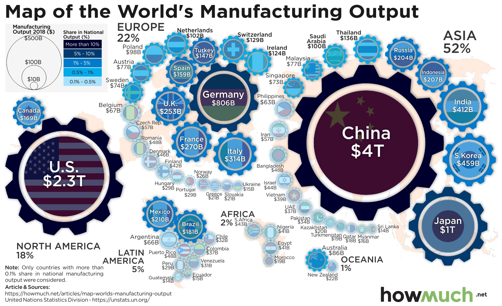
In 2016, then-candidate Donald Trump said on the campaign trail, "My plan includes a pledge to restore manufacturing in the United States." Manufacturing has remained a major emphasis of Trump’s presidency, perhaps never more so than during the coronavirus pandemic, with the invoking of the Defense Production Act. So, what is the state of the U.S., and the global, manufacturing industry?

  • The $2.33 trillion U.S. manufacturing sector made up 11.6% of the country’s economic output in 2018.
  • U.S. factory production shrank by 1.3 percent in 2019.
  • While half a million manufacturing jobs have been added during the Trump administration, job growth in the Midwest remains sluggish.
  • Chinese manufacturing expanded slightly in March, as factories slowly came back online after the coronavirus shutdown.

Our data comes from the United National Statistical Division and is plotted as a map. Only countries with more than a 0.1% share of national manufacturing output were considered. A larger gear wheel indicates a larger manufacturing output, and a darker shade of blue indicates a larger share of manufacturing as related to total national output.

Countries with the Five Largest Manufacturing Industries

1. China: $4T (28.37% of world total)
2. United States $2.3T (16.65% of world total)
3. Japan: $1T (7.23% of world total)
4. Germany: $806B (5.78% of world total)
5. South Korea: $459B (3.29% of world total)

Much of President Trump’s focus on manufacturing has laid with China: in August 2019, Trump ordered U.S. companies to begin looking for an alternative to manufacturing in that country. Calls for decreased dependence on Chinese manufacturing have intensified with the coronavirus outbreak, as lawmakers have questioned the natural security implications of relying heavily on a foreign country for essential supplies like pharmaceuticals. 

While new data indicates that U.S. companies are indeed shifting production from China, the effects to the U.S. manufacturing economy remain unclear. Ironically, the manufacturing sector has been adversely impacted by tariffs on Chinese imports enacted by the Trump administration. As a whole, factory production in the U.S. shrank by 1.3 percent in 2019, a ten-year low.

All that said, manufacturing remains an essential component of U.S. GDP: at $2.33 trillion in 2018, it drove 11.6% of U.S. economic output, and comprise half of the country’s exports. And, while the sector is likely in for record lows during March amid the coronavirus pandemic, there may be hope for a speedy recovery from rival China’s manufacturing rebound: Chinese manufacturing expanded slightly in March as the country begins slowly rebounding from the coronavirus.

Unfortunately, other manufacturing giants have been slower to recover: the German manufacturing sector saw its steepest decline in over a decade in March, as did Korea.  Meanwhile, Japanese manufacturers took a rare pessimistic view of their sector for the first time in seven years. This has led to the rare furloughing of workers at Nippon Steel, the world’s third-largest steelmaker.

When will the manufacturing industry bounce back from the coronavirus? Will the United States really mount a manufacturing comeback? Let us know in the comments and share with your friends.

Data: Table 1.1

Charting the World’s Annual Gold Consumption

$
0
0

In times of market volatility, investors seek so-called “safe havens” like gold to limit exposure to losses. With financial markets seeing the most volatility in a decade as a result of the coronavirus, investors have indeed begun fleeing to gold, and gold prices posted their biggest weekly gain since 2008. This new demand has highlighted significant structural problems in the gold market, but few viable alternatives have been found. 

  • Gold prices posted their biggest weekly gain since 2008 amid the coronavirus market crash.
  • Bitcoin, believed by some to be a substitute for gold, has not risen in price among the market panic.
  • Supply chain disruptions have led to unprecedented disruptions in the gold market.
  • Industry experts believe that gold reserves are now being mined faster than they are replaced.

Our data comes from the World Gold Council and shows annual global gold demand as of Q4 2019 by category. Our viz is a Voronoi chart with each category drawn proportionally to demand. 

The Largest Sources of Annual Global Gold Demand

1. Jewelry: 2,107t (48.37% of demand)
2. Investment (total bar & coin): 870.6t (19.99% of demand)
3. Central banks & other institutions: 650.3t (14.93% of demand)
4. Investment (ETFs & similar): 401.1t (9.21% of demand)
5. Technology: 326.6t (7.5% of demand)

Nearly half (48.37%) of the world’s annual demand of over 4,000 tons of gold goes to jewelry, a growth market which was estimated in 2018 at $278.5 billion. However, a recession may slow the growth of this market, as it did during the 2008 recession. While this category may drop in demand, that still leaves significant categories of demand in investing and financial institutions. 

While gold’s role as a safe haven for investors is nothing new, the coronavirus has brought unprecedented pressures on the industry. At a time when demand for gold is at a high, mines are shutting down from South Africa to Canada. These supply chain disruptions have caused traders to fear for unsettled futures contracts for gold bullion, as international travel has been curtailed

Even prior to the coronavirus upending markets, there had been concerns over the sourcing and use of gold, on human rights and environmental grounds. With these serious flaws of gold -- a commodity that becomes only more flawed when it’s needed most, in a crisis -- is there an alternative?

Some analysts suspect a digital currency could provide a safe haven without the flaws of gold, and even the U.S. federal government has considered making a digital dollar to deliver payments quickly to citizens. However, Bitcoin -- the largest digital currency by market cap -- has proven not to correlate with the price of gold, but instead with the equity market, making the digital currency an undesirable safe haven. 

With a lack of viable alternatives, demand for gold may continue to surge in demand among investors these uncertain times, along with demand from the technology sector, where gold is used in everything from medicine to astronomy. Even after the coronavirus is contained, there could be long-term gold supply issues: experts believe we may have reached “peak gold”, the point at which gold reserves are being mined faster than they are replaced.

Will the price of gold continue to rise, despite issues with supply? Will a digital substitute like Bitcoin ever work? Let us know in the comments and share with your friends. 

Data: Table 1.1

Visualizing How the Tax Burden Impacts Take-Home Pay for All 50 States

$
0
0

The coronavirus has forced the U.S. economy to ground to a halt. The IRA extended the deadline to file taxes, and with the vast majority of the country under a stay-at-home order, more than 16 million people filed for unemployment over the last 3 weeks. Like other social programs, unemployment benefits are funded by taking a percentage out of workers’ paychecks. But the relative tax burden for U.S. workers depends on the state, as our latest visualization makes clear.

  • Hawaiians pay the heaviest tax burden in the country, contributing 26.7% of their income to taxes, leaving $57,198 for workers to take home.
  • Floridians enjoy the lowest tax burden, paying just 16.6% of total income. This leaves $44,411 in median annual take home pay.
  • 29 states have tax burdens between 20% to 25% of annual income, leaving between $40,000 to $50,000 of income.
  • States with no income tax don’t always have the lightest tax burden, suggesting that governments look for other ways to generate just as much revenue.

We found the data for our visualization at GOBankingRates. First, we ranked each state based on the size of the median annual household income, according to the 2018 American Community Survey from the U.S. Census. Then, we used the total tax burden individual filers pay each year using the standard deduction, expressed as a percentage of total income (pink and red). We used 2020 federal and state tax brackets according to the Tax Foundation, including FICA taxes. Finally, we calculated how much money is left for take-home pay (blue). The result is an intuitive demonstration of how tax burdens vary around the country.

Top 5 States with the Lowest Tax Burden

1. Florida: 16.6% on median income of $53,267
2. Tennessee: 17.1% on median income of $50,972
3. South Dakota: 17.4% on median income of $56,499
4. Nevada: 17.6% on median income of $57,598
5. Ohio: 18% on median income of $54,533

Top 5 States with the Highest Tax Burden

1. Hawaii: 26.7% on median income of $78,084
2. Maryland: 25.2% on median income of $81,868
3. Massachusetts: 24.9% on median income of $77,378
4. Oregon: 24.7% on median income of $59,393
5. Connecticut: 24.6% on median income of $76,106

One insight from our visualization is how low-income states generally see lower tax burdens. Mississippi, West Virginia and Arkansas are among the poorest states in the country, and consequently residents in each state pay less than 20% in total taxes. On the other hand, high-income states typically pay a greater percentage of their income in taxes. Maryland and Hawaii are among the top 3 highest income states, and they both pay over 25% in taxes. That’s because progressive tax systems require high-income earners to pay more, expressed as a percentage of income, than low-income earners. Of course, how much individual states are getting back from the federal government is also unequal.

But that’s just at the federal level. Alaska, Nevada, Texas, Wyoming, New Hampshire, Florida, South Dakota, Washington and Tennessee all don’t have a statewide income tax. What’s the tax burden look like in those places? Unsurprising, taxpayers in these states usually get to keep a higher percentage of their income. Washington deserves special mention with a tax burden of only 19.8% leaving take home pay of $56,264. Several other income tax-free states likewise place tax burdens on workers of less than 20%, including Wyoming (18.5%), Texas (18%) and Nevada (17.6%). But that’s not always the case. New Hampshire stands out with a tax burden of 24.4%, meaning taxpayers are no doubt seeing bigger fees and excise taxes to make up for the lost revenue.

What’s your impression of the relative size of the tax burden where you live? Do you think you are getting a fair bargain for your money, or not? Let us know in the comments.

Data: Table 1.1

Mapping Each Country’s Wealthiest Person Around the World

$
0
0

The world’s 2,095 billionaires are found on every continent, just like the coronavirus, and billionaires have not been immune to its economic losses: the world’s top 100 wealthiest have lost an estimated $408 billion in the past two months. The United Nations estimates that 6.7% of working hours will be wiped out globally in the second quarter as a result. With this economic devastation, many are looking to their country’s wealthiest person to step in with support. But who are these wealthy individuals across the globe? And what are they doing to combat the coronavirus?

  • The coronavirus has wiped out a combined $408 billion from the world’s top 100 billionaires.
  • Bernard Arnault, France’s richest person, is estimated to have lost $30 billion.
  • Jeff Bezos, the world’s richest person, has donated $100 million to U.S. food banks.
  • Jack Ma, China’s richest person, has donated medical supplies including 2 million face masks to the U.S.

Our data comes from the Forbes list of the world’s billionaires. We have grouped the data by continent and mapped the richest person with at least $1 billion in net worth for each country in that continent. A darker shade of green indicates a larger net worth. Our viz also indicates the industry in which the individual acquired their wealth.

The Top 3 Wealthiest Individuals in North & Central America by Country

1. Jeff Bezos, United States: $113B
2. Carlos Slim Helu & Family, Mexico: $52.1B
3. David Thomson, Canada: $31.6B

North America is home to the world’s richest man: Jeff Bezos, the founder of Amazon, who has donated $100 million to the U.S. in response to the crisis. Amazon is only poised for further growth from the coronavirus, with online grocery sales up 25% in March as consumers chose to shop from home during social distancing.

The Top 3 Wealthiest Individuals in South America by Country

1. Joseph Safra, Brazil: $19.9B
2. Iris Fontoba & Family, Chile: $10.8B
3. Luis Carlos Sarmiento, Colombia: $9B

Despite being in warmer seasons, South America is still battling the coronavirus, with Brazil reporting 1,000 cases. Luis Carlos Sarmiento, the founder of Colombian conglomerate Grupo Aval, has announced a $20 million donation to help alleviate the impact in his country.

The Top 3 Wealthiest Individuals in Europe by Country

1. Bernard Arnaul & family, France: $76B
2. Amancio Ortega, Spain: $55.1B
3. Beate Heister & Karl Albrecht Jr., Germany: $33.3B

One of the hardest-hit regions from the coronavirus, European billionaires have stepped up: Giovanni Ferrero of Italy donated nearly $11 million to the Italian government’s national emergency commission. France’s richest man, Bernard Arnault, lost nearly $30 billion in wealth as a result of the coronavirus. This is the biggest single loss of any billionaire, with an estimated $408 billion in losses among the world’s top 100 richest individuals.

The Top 3 Wealthiest Individuals in Asia by Country

1. Jack Ma, China: $38.8B
2. Mukesh Ambani, India: $36.8B
3. Lee Shau Kee, Hong Kong: $28.1B

China’s richest person, Jack Ma, along with Alibaba co-founder Joe Tsai, have donated over 2 million face masks along with other medical equipment to New York. India’s richest person, Mukesh Ambani, has contributed $67 million to the prime minister’s emergency fund.

The Top 3 Wealthiest Individuals in Africa by Country

1. Aliko Dangote, Nigeria: $8.3B
2. Nicky Oppenheimer & family, South Africa: $7.4B
3. Nassef Sawiris, Egypt: $5B

While Nigeria currently has 65 cases of coronavirus, there are fears that an exponential spread will overwhelm health facilities in the country. As a response, Aliko Dangote, the country’s richest person and the richest in Africa, pledged 200 million Nigerian naira (about $517,000) to support Nigeria’s health authorities.

The Top Wealthiest Individuals in Oceania by Country

1. Gina Rinehart, Australia: $13.1B
2. Graeme Hart, New Zealand: $10.5B

Countries in Oceania may be in their summer months, but they are still fighting the coronavirus. In particular, Australia has reported over 6,000 cases. Australia’s richest individual Gina Rinehart has donated $6 million to the Royal Flying Doctors for equipment.

In all corners of the globe, the world’s wealthiest have made contributions to combat the coronavirus, despite losses to their own fortunes: estimates claim that the world’s top 100 richest have lost $408 billion in two months due to the coronavirus. However, some claim they still haven’t done enough.

Have the wealthiest individuals in your country responded appropriately to the coronavirus? Who has been exceptionally generous? Let us know in the comments and share with your friends.

Data: Table 1.1

Mapping Billionaires Around the World

$
0
0

The coronavirus has affected people from all walks of life--including those worth more than $1 billion. As global markets are in flux, the net worth of the world’s richest people has fluctuated to the point where many of them have lost the title of “billionaire.” Our new visualization takes the most recent data from Forbes to illustrate how many billionaires there currently are in each country, as well as the size of their cumulative net worth.

  • According to Forbes, as of March 18, 2020 there were 2,095 billionaires worldwide.
  • The total net worth of the world’s billionaires is $8 trillion, $700 billion less than the previous year. 
  • There are 58 fewer billionaires than a year ago and 226 fewer than at the beginning of March. This is in large part because of the economic meltdown in the wake of the coronavirus.
  • More specifically, 51% of the billionaires on the list are “poorer” than they were in 2019. 

The visualization and trends are based on the Forbes 2020 World’s Billionaires List. The map above shows how many billionaires are in each country, as labeled by the large white number. Each country in the map is composed of little dots, with each dot representing one billionaire. The size of each country is also proportional to the total wealth of billionaires in that country. For example, both Malaysia and Mexico have 12 billionaires, but Mexico appears bigger on the map because the net worth of Mexican billionaires ($103 billion) is more than twice as much as Malaysian billionaires ($44.7 billion)  Countries are also color-coded by region, as expressed in the map legend.

Top 10 Countries with the Most Billionaires

1. United States: 614
2. China: 388
3. Germany: 107
4. India: 102
5. Russia: 99
6. Hong Kong: 67
7. Brazil: 45
8. United Kingdom: 45
9. Canada: 44
10. France: 39

Not surprisingly, the U.S. and China, the two largest economies, are home to about half of the world’s billionaires. Even though billionaires’ net worth has taken a hit recently, millionaires and billionaires in the U.S. are set to reap more than 80% of the benefits from a change to the tax law Republicans put in the coronavirus economic relief package. This represents a continuation of recent tax laws that have favored the ultra-wealthy. For example, the 2017 Tax and Job Cuts Act reduced corporate tax rates and the top income tax bracket. As a result, in 2018 the super-rich paid a lower tax rate than the bottom 50% of earners. The details of a possible fourth phase of a stimulus package remain up for debate, as well as which industry sectors and income groups would stand to benefit the most. 

Given the rapid economic changes from the coronavirus, how do you think the number of billionaires by country will look different three months from now, six months from now, and one year from now? Let us know in the comments.

Data: Table 1.1


Mapped: Average Homeowners Insurance Rates for Each State

$
0
0

If you’re looking for ways to save money right now, you might start by looking at how much you’re spending each year on homeowners insurance. According to our latest map, how much it costs for homeowners insurance depends entirely on where you live.

  • The most expensive states for homeowners insurance tend to be located in Tornado Alley and along the Gulf Coast, led by Oklahoma with an average annual premium of $4,445, well over 60% higher than the national average.
  • Hawaiians enjoy the cheapest rates for homeowners insurance at just $499 per year, thanks in large part to the relatively rare occurrences of insurable natural disasters.
  • The Northeast and Northwest have below-average rates for insurance, including some states with major metro areas like New York, where it costs just $1,840.
  • The national average is $2,305, but most people pay somewhere between $1,500 and $3,000 each year on homeowners insurance.

We found the data for our map at Insurance.com, a cost comparison website. There are a few assumptions behind the data in our map. Imagine a married couple with excellent credit wanted to insure a home worth $300,000 with typical policy features, like a $1,000 deductible and guest medical coverage of $5,000 per person. We calculated the average cost of insurance in each state, then plotted a color-coded map based on how much more or less each state’s rates cost than the national average. This lets you easily see both the relative and absolute totals of average homeowners insurance costs around the country.

Top 10 Most Expensive States for Homeowners Insurance

1. Oklahoma: $4,445 (92.8% above average)
2. Kansas: $3,931 (70.5% above average)
3. Arkansas: $3,439 (49.2% above average)
4. Florida: $3,439 (49.2% above average)
5. Texas: $3,429 (48.8% above average)
6. Mississippi: $3,340 (44.9% above average)
7. Louisiana: $3,270 (41.9% above average)
8. South Dakota: $3,172 (37.6% above average)
9. Nebraska: $3,133 (35.9% above average)
10. Missouri: $3,111 (35.0% above average)

There are two interesting insights about the homeowners insurance market in our map. First, the most expensive states tend to be located in the South along the Gulf of Mexico and stretching into Tornado Alley. Oklahoma is by far the most expensive state in the country at $4,445 per year, or 92.8% above average. If you drew a straight line from Montana to Florida, every state would have an above average rate. That’s because geography is the single biggest determiner of natural disasters like hurricanes, tornadoes and avalanches, which tend to destroy property and drive up insurance rates.

Another interesting insight is how homeowners insurance is relatively cheap on both coasts. Vermont is the most affordable in the Northeast at just $1,212, or slightly more than $100 per month. And check out California, where it only costs $1,166 on average. Bear in mind we assumed a starting home value of $300,000 to arrive at these numbers, making it an apples-to-apples comparison. We know $300K goes a lot further in some states than others.

But here’s the most important thing to remember about homeowners insurance: it only offers protection against specific things, or perils, like fire and tornadoes. The vast majority of insurance policies on the market today do not offer coverage for earthquakes or floods. These types of natural disasters would completely wipe out the property and casualty insurance industry. That’s why there are other separate insurance policies available in states like California, where the government mandates earthquake coverage for certain residents and requires new buildings to abide by strict earthquake-mitigation codes. Companies simply wouldn’t offer that type of protection if it weren’t required by law.

If you’re looking to buy a home for the first time, or even just trying to save some money in your budget, check out our homeowners insurance cost guide. And if you’re still a renter, take a look at our renters insurance cost guide.

If you like our visualizations, give us a shout on social media and tell your friends about our site.

Data: Table 1.1

Mapped: The Richest Women in the World

$
0
0

Last month, 2,095 individuals earned the honor of appearing on Forbes’ World Billionaires List. In some of our recent visualizations, we’ve used this list to map out the richest person in each country and in each state. But if you take a closer look, you’ll notice a pattern--most of them are men! But what about the richest women? That’s the subject of our latest visualization, which illustrates where the world’s richest women live, how much they are worth, and in which industry they acquired their wealth.

  • The total net worth of female billionaires totals just under $1 trillion.
  • Half of the top 10 richest women live in the U.S.
  • Even though Alice Walton is the richest woman in the world, she is the ninth richest person in the world.
  • Across the entire Forbes list, there are 241 female billionaires.

Our data comes from Forbes’ 2020 World Billionaires List. The circles around the map represent the top 35 richest women in the world, with her rank on the list of the richest women, her photo, her net worth, and the flag representing her country. The circles are also color-coded, with a darker shade of pink indicating a larger net worth. Similarly, the larger circles correspond to greater wealth. Each circle also lists the individual’s associated industry or company. All values are expressed in U.S. dollars.

Top 10 Wealthiest Women in the World

1. Alice Walton: $54.4 billion
2. Francoise Bettencourt Meyers & Family: $48.9 billion
3. Julia Koch & Family: $38.20 billion
4. Mackenzie Bezos: $36 billion
5. Beate Heister & Karl Albrecht Jr.: $33.3 billion
6. Jacqueline Mars: $24.7 billion
7. Yang Huiyan & Family: $20.3 billion
8. Susanne Klatten: $16.8 billion
9. Laurene Powell Jobs & Family: $16.4 billion
10. Zhong Huijuan: $14.6 billion

The world’s richest women represent several industries, including fashion & retail, food & beverage, and real estate. In addition, a few famous families are represented in the visualization. For example, five of the top 35 women are from the Mars family (of candy-making fame). Similarly, both Alice and Christy Walton are heirs to the Walmart fortune.

A notable newcomer to the list is MacKenzie Bezos, the ex-wife of Amazon founder Jeff Bezos (who also has the distinction of the richest person in the world). As part of their divorce settlement in 2019, MacKenzie received 25% of Jeff's Amazon stake, or 4% of the company.

As the stock market’s current volatility affects billionaires’ fortunes, how do you think this list will change in the near future? Let us know in the comments.

Data: Table 1.1.

Mapped: How Much Each Country Contributes to the World Health Organization

$
0
0

President Trump recently cut funding for the World Health Organization (WHO), claiming that the group didn’t do enough to protect Americans from the coronavirus. This made us wonder which countries make the biggest financial contributions to support the WHO.

  • The U.S. currently pays $116M each year to the World Health Organization (WHO), or about 24% of the entire organization’s budget.
  • China pays the second most of any country in the world at $57M, or 12% of the organization’s total.
  • The vast majority of countries pay significantly less than the U.S. for the WHO. Only 13 countries pay more than $10M, including the U.S. and China.
  • 44 countries pay less than $1M each year to support the WHO.

We took the data for our visual directly from a recent WHO report on annual funding totals for 2020. You can read more about how the WHO gets its money here. Focusing only on the countries with a total contribution of $100K or more, we changed the sizes and colors of countries on a world map corresponding to their contributions to the WHO, creating an intuitive snapshot of where the organization’s money comes from.

Top 10 Countries Contributing the Most to the WHO

1. U.S.: $116M (24% of total)
2. China: $57M (12% of total)
3. Japan: $41M (8% of total)
4. Germany: $29M (6% of total)
5. U.K.: $22M (4% of total)
6. France: $21M (4% of total)
7. Italy: $16M (3% of total)
8. Brazil: $14M (3% of total)
9. Canada: $13M (2% of total)
10. Russia: $12M (2% of total)

Our visualization makes it clear how the U.S. funds a significant portion of the WHO’s budget, topping $116M. No other country comes close to $100M, with China in second place at $57M. This means that Trump’s cuts to the WHO blow a big hole in the organization’s budget, a gap that China is now partially filling. To be fair, other countries contribute substantial funds, including Western economies like Germany ($29M), the U.K. ($22M) and France ($21M). Other developed countries like Japan ($41M) and South Korea ($11M) contribute millions of dollars as well. Most countries in the world pay in less. 44 contribute less than $1M, and for the sake of simplicity we left off over 100 countries that pay less than even $100K. For example, only a few countries from Africa even made it onto our visualization. Clearly only a handful of countries, led by the U.S., is footing the bill for the WHO.

There are lots of reasons why the U.S. has historically paid more than any other country for the WHO. For starters, the WHO is part of the United Nations, which is headquartered in New York City and grew out of World War II. Like the UN, the WHO’s goal is promote international stability and global health. These are critical building blocks for democracy and a well functioning world economy, and the U.S. remains the biggest and richest country in the world. Since millions of people from around the world travel to the U.S. each year, it’s in everyone’s self-interest to prevent things like pandemics.

There are likewise some good reasons to reconsider American financial support for the WHO. The coronavirus pandemic is crippling the world economy as of this writing, with the real unemployment rate in the U.S. soaring past 20%. Some critics blame the WHO for a cozy relationship with China and its consequent slow response to the pandemic. In any case, Trump’s decision to withdraw funding from the WHO in the middle of a pandemic is now under investigation by the House of Representatives.

Should the U.S. be paying $116M for the WHO? Or is President Trump right to cut contributions to the WHO? Let us know in the comments.

Data: Table 1.1

5 Visualizations We Wish We Had Published in April 2020

$
0
0

Welcome to this month's Data Visualizations We Wish We Had Published for April 2020. In this article, we will explore some vizs created this past month that we thought were truly amazing. In this month’s edition, we will explore some very colorful and informative data displays from vast depths of the world wide web.

1. What Hubble has Seen, Visualized - PhysicsToday

Have you ever wanted to see what it looked like in space? This visual creation published by Physics Today displays the number of times scientists classified something in the vast universe with the Hubble telescope. The use of a black background is only fitting to match the theme of space. The clustering of brighter colors offset the black background assisting the elements to pop out of the designs. The circles themself have bolded areas inside giving the chart the starlight sparkle for the viewer. The topic of space always has a great set of data to create some out of this world designs!

2. The Focus of Covid Deaths has Switched from Asia to the E.U., then the U.S. - Financial Times

The next visual was created by our friends over at Financial Times. In this collection of data visualizations, Financial TImes focused on the recovery of the world from the COVID-19. The first image is a line chart of all the countries affected by COVID-19 and the death rate. These highlighted lines are some of the large countries showing that the death rates from COVID-19 have started to peak all around the world.

As you scroll down, you can see all of the countries separated into a grid pattern for a focused observation. But the real crown jewel of this data visualization collection is the sideways waterfall chart. This colorful display emphasizes the death rates by continents in a way to compare against each other. It captures the evolution over time perfectly!

3. Searching for Answers in a Pandemic - Axios

Axios has taken the curiosity of people's web searches over COVID-19 and has broken it into three categories and five sections. The searches break into the three categories; knowledge, first death reported in the U.S., and the signing of the stimulus package by President Trump. Each little bubble in the cluster is a query put into Google, the larger bubble the more states that searched with that query.

The division of the sections showcases a timelapse picture of worrying in the U.S. But what really sets this visualization apart is the fact that the dots are interactive! Just roll your course pointer over one of the bubbles and it will tell you the query that was imputed into Google’s search bar.

4. These Charts Put the Historic U.S. Job Losses in Perspective - VisualCapitalist

This next data visual is created by Visual Capitalist, and it focuses on the unemployment consequence of the COVID-19. It is no surprise that COVID-19 has rocked the economy and left millions unemployed. This visual compares the United States unemployment over time since the 1970’s. Each bubble size is based on the number of people who filed for unemployment. The color choice of red against a light orange background really makes these elements explode on the chart. And to top it off, the bubbles have an image inside that sums up the event period. 

In the period Visual Capitalist calls the “Great Lockdown”, it was recorded that over 22 million people filed for unemployment in the United States. As you scroll down the chart, it compares the unemployment of the United States against other large economies of the world. This different take on COVID-19 provides a clear insight on the after-effects from this pandemic. 

5. The Social Distancing of America - Reuters

This unique visualization published by Reuters Graphics not only captures the social distancing felt across the United States. The selling factor is the scrolling effect the visual does on the browser. As you scroll down the page, the data visualization changes information without the actual page moving downward. Instead of scrolling down, an information box moves across the screen from bottom to top of the screen. But that is not all this chart has to offer. 

The map highlights the traveling accumulated by the citizens inside each county. The color scale of blue and reddish-orange provide the contrast of just how much the U.S. was not traveling during the last few weeks. And if the map wasn’t enough, scrolling down after the map is a bubble chart displaying the same thing broken up by household income, age, voting preference, and location. The bubbles are placed on scatter plots giving information about different demographics as it relates to the amount of travel during the lockdown. To change the demographic all you need to do is scroll down and watch the magic happen.

Thank you again for joining us in April’s Visualizations We Wish We Had Published. This past month had some great visualizations that took us all over the place, even space! Please let us know which visual you liked best in the comments below. Or better yet, share a visual you think should have made the list. We would love to hear from you! 

Read Personal Loan Guides at HowMuch.net 

Visualizing Auto Insurance Rate by State in 2020

$
0
0

If you own a car, then your insurance bill is no doubt part of your budget. Rates can vary by several hundred dollars depending on where you live, and it turns out, the difference between full and minimal coverage makes a big difference too.

auto insurance rate by state

  • Michigan is the most expensive state to buy car insurance for both minimum ($5,282) and full coverage ($8,723) policies due to its unique requirement of no-limit personal injury protection.
  • Maine is at the other end of the spectrum with the cheapest rates in the country at just $1,268 for full and $489 for minimum coverage amounts.
  • The average cost difference between full and minimum coverage across the entire U.S. is $1,453.
  • For full coverage, the average cost around the country is just under $2,400 or about $200 per month.

We found the data for our visualization at ValuePenguin, a cost and financial product comparison website. We pulled together both full and minimal coverage averages for each state, ranking from highest to lowest in a spiral stacked bar chart. Minimal coverage is defined for these purposes as the least amount of insurance a motorist can carry and still legally operate a vehicle. Full coverage means also taking on collision and comprehensive coverage above the minimum, as well as extra liability coverage. Read more about ValuePenguin’s specific methodology here. Suffice it to say, this approach lets you easily see an apples-to-apples comparison of auto insurance rates around the country.

Top 5 Lowest Auto Insurance Rates by State (Full Coverage)

1. Maine: $1,268
2. Hawaii: $1,340
3. North Carolina: $1,434
4. Iowa: $1,482
5. Indiana: $1,489

Top 5 Lowest Auto Insurance Rates by State (Minimum Coverage)

1. Iowa: $357
2. South Dakota: $420
3. Hawaii: $475
4. Alaska: $485
5. Wyoming: $485

Our visual makes it clear how there are major differences in cost between minimal and full coverage. The average difference comes out to $1,453 per year. The state with the biggest difference is Michigan ($3,441), followed by Rhode Island ($2,258) and Louisiana ($2,196). In fact, the lowest difference between full and minimal coverage can be found in Maine, where drivers can still save $779 each year with the cheapest policies. This means you could find some significant savings in your monthly budget by switching to the cheapest policy available, especially if your car is sitting idle now thanks to lockdowns and quarantines.

There’s one big reason why auto insurance rates are so high in Michigan. The state uniquely required all motorists to purchase unlimited personal injury protection. This was extremely expensive for insurance companies, so they passed the cost to consumers, resulting in the highest rates in the country for both full ($8,723) and minimum ($5,282) coverage. Last year, Michigan passed a law changing this requirement starting in spring 2020, meaning Michiganders should soon see dramatically lower rates if they elect lower protection limits. And all this just as the pandemic forces millions of people to become unemployed. Timing is everything.

Speaking of the pandemic, many car insurance companies are seeing high profits as Americans stay home and off the roads. Less driving means fewer accidents and car insurance claims. A number of companies are passing these savings back to policyholders through refunds or lower rates.

If you’re looking to save even more money, you might be on the market for a new car insurance carrier. Check out our cost guide to get started.

Read Insurance Cost Guides at HowMuch.net 

Data: Table 1.1

Visualizing America's $25T Debt Explosion Amid Coronavirus Pandemic

$
0
0

In April 2020, the national debt hit an eye-popping $25 trillion, coming off the back of a $2.2 trillion stimulus passed by the U.S. Congress. The projected annual deficit for this year alone is almost $3.7 trillion -- over triple what it was the year prior.

U.S. 25T debt

Recently, The Balance published an article noting major milestones in the accumulation of national debt, using data from the ”U.S. Debt to the Penny” report from the United States Department of the Treasury. We used the information compiled by The Balance to create our latest visualization, which shows how much the national debt has grown since 1934. Prior to 1996, the visualization only uses years but not the exact dates because debt levels are not available for each day. Each box in the visualization is equal to $1 trillion.

In 1934, the national debt was only $25 billion. It began increasing rapidly in the 1980s, reaching $1 trillion in 1982 and ballooning throughout the 1990s and 2000s. 

Just as with household debt, the national debt increases when spending outpaces revenue. In the case of the government, the majority of revenue comes from taxes levied on personal and corporate income. To amass more funds (which results in accruing debt), the federal government issues treasury bills, notes, and bonds to creditors.

The national debt is composed of two main categories: intragovernmental debt  and debt held by the public. Intragovernmental debt is held by federal agencies, such as the Social Security Trust Fund and Medicare. For debt held by the public, the creditors are individuals, corporations, state or local governments, Federal Reserve Banks, foreign governments, and other entities outside the United States government. About two-thirds of the national debt is classified as debt held by the public.

Acquiring too much debt can have a negative effect on a number of economic factors, including slower economic growth, lower stock market returns, and decreased confidence in the U.S. government’s ability to repay its debt. Currently, the debt-to-GDP ratio in the U.S. is 106%, above the World Bank’s recommendation of 77%. The higher the ratio, the greater the risk of default. This makes it more imperative than ever to rein in the national debt and get the government’s “checkbook” under control.

Looking for another perspective of the national debt? Here’s our visualization on how the national debt has grown under each president.

Read Personal Loan Guides at HowMuch.net 

Data: Table 1.1

Visualizing Thirty Years of Crude Oil Prices

$
0
0

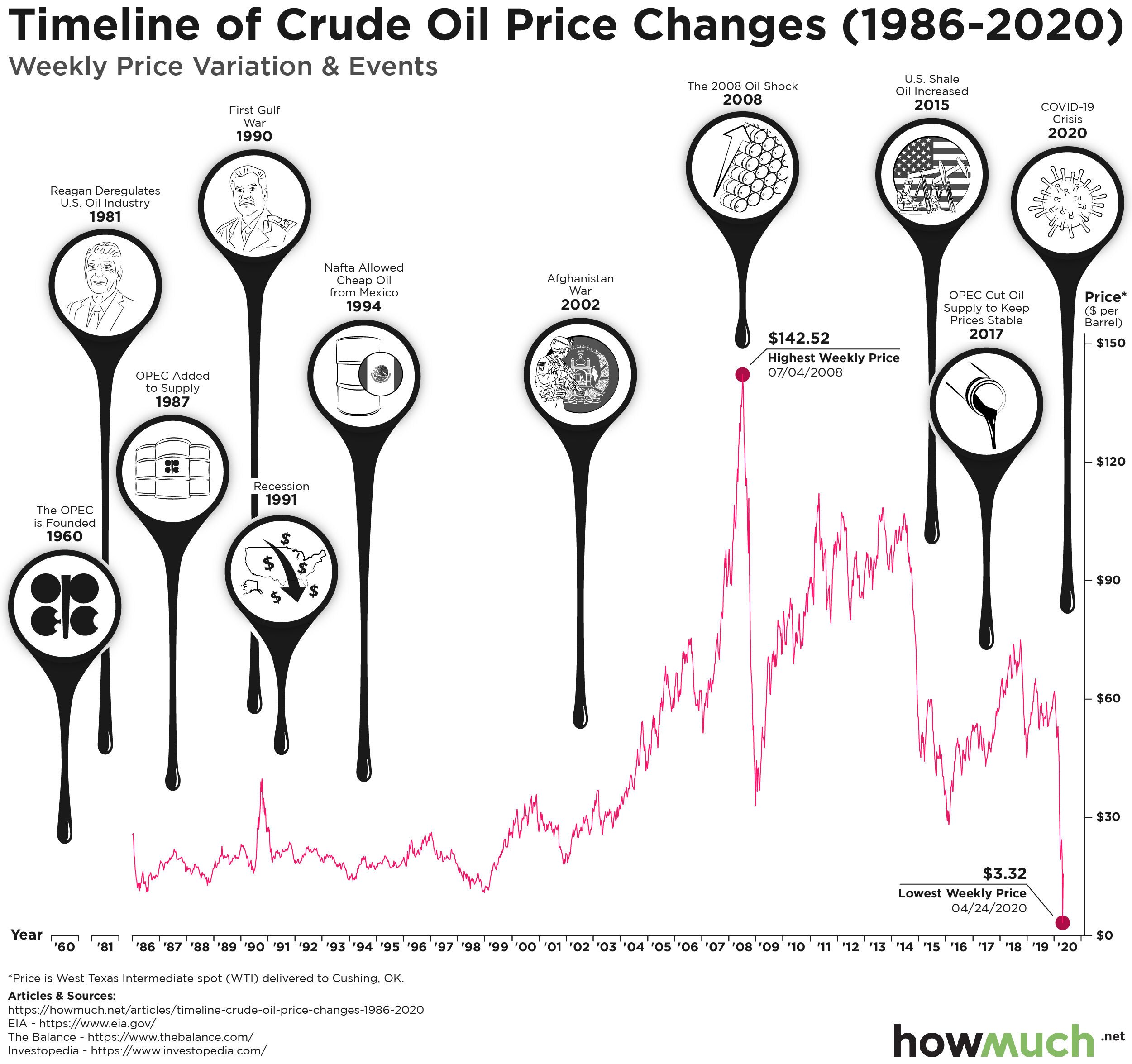
Last month, oil contracts turned negative for the first time in history amid the coronavirus lockdown. While consumers may be taking advantage of paying less than $1 per gallon of gasoline, producers are wary of a coming oil glut.

timeline of crude oil prices

  • The price of oil fell by 83.5% in late April 2020, the largest single-week drop-off since records began in 1986.
  • Oil contracts fell below zero for the first time in history.
  • Global daily oil consumption fell from 100 million barrels to between 65 and 70 million.
  • OPEC began cutting product by nearly 10 million barrels per day in early May.

Our data comes from the United States Energy Information Administration. The viz is a line chart showing the history of West Texas Intermediate crude oil prices since 1986. This is the spot price of oil as delivered to Cushing, Oklahoma. We also include events influential to oil prices, as gathered from Investopedia and The Balance.

Top Five Biggest Weekly Increases in Crude Oil Prices

  • May 1, 2020: +373.19%
  • Jan 2, 2009: +28.56%
  • Aug 8, 1986: +27.77%
  • Aug 10, 1990: +24.29%
  • Jun 26, 1998: +17.69%

Top Five Biggest Weekly Decreases in Crude Oil Prices

  • Apr 24, 2020: -83.50%
  • Mar 13, 2020: -28.92%
  • Mar 20, 2020: -25.32%
  • Mar 27, 2020: -19.64%
  • Apr 17, 2020: -17.57% 

Oil prices had been relatively low in the weeks leading up to the coronavirus, in part due to the United States becoming a net exporter for the first time in decades. Even so, the commodity suffered its single-biggest weekly drop in April 2020, at -83.5%, due to the coronavirus crisis. 

Prior to the virus putting much of the economy on standby, the world was consuming around 100 million barrels a day. By late April, however, demand had dropped by around a third, to between 65 and 70 million. Including the March price rout, oil prices are now down 57% this year. Ordinarily, low oil prices lead to greater consumer spending. But with nearly 95% of the U.S. population on lockdown due to the coronavirus, consumers had no reason to purchase gasoline. And while oil is used for far more than gasoline, including products like asphalt and heating oil, nearly every sector of the economy came to a standstill, causing a historic drop in demand. 

Indeed, oil powers nearly every sector of the economy, and arguably even politics too: price volatility is often accompanied by geopolitical instability. To learn about the major industry players, check out this HowMuch article on global oil reserves: you will see that a drop in oil price could significantly affect major world powers like the United States, Russia and Saudi Arabia.

Historically, some of the most volatile swings in oil prices have accompanied geopolitical instability, and vice versa, such as during the 1990 Iraqi invasion of Kuwait. Adjusting to the extreme drop in oil consumption, the Organizations of the Petroleum Exporting Countries (OPEC) began cutting its output by nearly 10 million barrels a day. However, this may not be enough to avoid a massive oil glut later this year.

Have oil producers cut production enough to cause a supply glut? Where do you see the price of oil heading? Let us know in the comments and share with your friends. 

Data: Table 1.1


Visualizing Wine Exports by Country

$
0
0

Lockdowns under COVID-19 have shifted consumer preferences over the past few months. One of the products that has experienced a surge in demand is wine. At the end of March, wine sales were up 42% compared to the same time last year. How important is wine for the global economy? For some countries, it’s essential! Our new visualization breaks down which countries export the most wine.

Wine Exports by country

  • World wine exports are worth $36.1 billion.
  • Half of the world’s wine exports come from two countries, France and Italy.
  • Three-quarters of the world’s wine exports come from Europe.
  • Wine exports from Australia ($2.1 billion) are worth more than wine exports from Africa and Asia combined.

Data for the visualization came from the International Trade Centre. Only countries with more than 0.01% of the world’s total wine exports were included in the map. Each country’s wine exports are represented by a circle with the dollar value listed inside or next to it. The larger the circle, the greater the total value of that country’s wine exports in 2019. Similarly, the darker circles represent countries with a higher percentage of the world’s wine exports. At a glance, it is clear that European countries dominate the global wine market, although Australia and New Zealand also account for a significant share.

Wine Exports by Country - Top 10

1. France: $11 billion
2. Italy: $7.3 billion
3. Spain: $3.1 billion
4. Australia: $2.1 billion
5. Chile: $1.9 billion
6. United States: $1.4 billion
7. New Zealand: $1.2 billion
8. Germany: $1.2 billion
9. Portugal: $920 million
10. United Kingdom: $837 million

Wine production is liable to change as a result of a warming planet. Winemakers are adapting their agricultural techniques by producing wine at higher altitudes, finding spots with less direct sunlight, and experimenting with different types of grapes. As temperatures rise, more regions are also experiencing environmental changes that are conducive to starting vineyards. The sunny climes of France and Italy may face more competition from burgeoning wine industries in unexpected places like England!

How do you think COVID-19 and climate change will affect the value of wine exports in 2020? Will other non-European countries capture a greater share of the global wine market in the future? Let us know in the comments.

Data: Table 1.1

Charted: The Biggest Foreign Holders of U.S. Debt

$
0
0

The U.S. government is borrowing $3 trillion in the second quarter this year, an eye-popping number with unknown implications for the future of the economy. With so much government spending in response to the coronavirus, we started to wonder, which countries actually own the most U.S. debt?foreign holders of U.S. debt

  • Japan holds more U.S. debt than any other country in the world at $1,271.7B, or 18.67% of the total.
  • China used to own the most debt but is now in second place at $1,081.6B or 15.88%.
  • No other country besides Japan and China holds more than 6% of total foreign-held debt. The U.K. owns the third most in the world at just $395.3B or 5.8% of the total.
  • Foreign countries control only about 30% of the entire national debt. American investors, the Federal Reserve and other parts of the U.S. government own the rest.

We collected the figures for our visualization from the U.S. Department of the Treasury as of March 2020, the latest month for complete numbers. We wanted to see which countries hold the most debt both in overall terms and a percentage of the whole. We also grouped countries from the same continents together. In turns out, there are two heavyweights in Japan and China, followed by dozens of other countries holding much smaller levels of U.S. debt.

Top Ten Foreign Holders of U.S. Debt

1. Japan: $1,271.7B
2. China: $1,081.6B
3. U.K.: $395.3B
4. Ireland: $271.5B
5. Brazil: $264.4B
6. Luxembourg: $246.1B
7. Hong Kong: $245.3B
8. Switzerland: $244.6B
9. Cayman Islands: $207.2B
10. Belgium: $206.1B

The most obvious takeaway is that Japan and China both account for the largest share of U.S. debt in our visual. According to the month-by-month figures from the Treasury, Japan surpassed China as the largest foreign holder of American debt in May 2019. Taken together, Japan and China account for $2,353.3B or 34.55% of American debt owned by foreign countries. In other words, two countries alone control more than a third of the foreign market for American debt.

But there are also a variety of other interesting nuggets about foreign holders of U.S. debt in our visualization. A number of European countries own a lot of debt, including the U.K. ($395.3B), Ireland ($271.5B) and Luxembourg ($246.1B). These countries don’t inspire the same kind of doom and gloom in the American media imagination as Japan and China. The Cayman Islands also deserve special mention because they own a surprising amount, $207.2B or 3.04% of all foreign holders. Perhaps that is due to American investors holding assets offshore but still looking for the security of government bonds.

Foreign holders of U.S. debt will have no shortage of opportunities to buy more of it. The U.S. national debt has been on an upward trajectory for several years. In fact, the recent coronavirus spending will up the deficit this year to $3.7T, pushing the national debt to new heights. There’s one big and important caveat to keep in mind when considering who owns the U.S. debt. The grand total amount of debt in our visualization only comes out to $6.8T. But smart observers know that the total U.S. debt is about $25.7T. What accounts for the difference? American investors, the Federal Reserve and other parts of the U.S. government actually own about 70% of the entire national debt. Foreign countries would need to buy trillions of more in U.S. debt before they’d control even half of the total.

Do you think that all the U.S. government’s spending will eventually come back to haunt the economy in the future? Let us know in the comments.

Data: Table 1.1

Ranked: Average Workers’ Compensation Costs for Each State

$
0
0

Workers’ compensation is a basic part of social insurance. If you get injured while on the job and can no longer work, you might qualify for a steady income stream thanks to workers’ comp. But since it isn’t a federal program, the costs for workers’ compensation insurance depend on the state.
 workers compensation insurance rate

  • Alaska is the most expensive state in the country for workers’ compensation, costing companies as much as $2.27 per $100 of payroll.
  • California is the third most expensive in the country at $1.83 thanks in part to its generous provisions around parental leave.
  • Texas is the cheapest costs for workers’ comp at only $0.54, but that’s because companies aren’t required to participate in the program unless they want to.
  • The average cost for workers’ compensation programs across all 50 states and Washington, DC is $1.21.

We got the data for our visual from the National Academy of Social Insurance (NASI) for 2017, the latest year where complete figures were available. Proper credit to Fit Small Business for writing an original article bringing it to our attention. We broke the numbers down into a spiraling bar chart with a color-coded breakdown, highlighting each 50-cent increment of cost per $100 of payroll. This lets you easily see which states carry the heaviest and lightest burdens in paying workers’ compensation.

Top 5 Most Expensive States for Workers’ Compensation

1. Alaska: $2.27
2. Montana: $2.01
3. California: $1.83
4. South Carolina: $1.71
5. Wyoming: $1.70

Top 5 Least Expensive States for Workers’ Compensation

1. Washington, DC: $0.51
2. Texas: $0.54
3. Ohio: $0.67
4. Massachusetts: $0.73
5. Arkansas and Michigan: $0.74

Read the full report from NASI for a detailed description of the research methodology, but there are a couple things to call out in our visual before diving into the details. Workers’ compensation is for people who are injured on the job. It’s an insurance program run by individual states covering specific types of workers. The figures from NASI take into account only employers who are legally required to offer workers’ compensation benefits. Some companies may offer benefits even without a legal requirement, but a lot of workers don’t have coverage. The researchers were also only focused on workers’ compensation through official reporting channels, meaning they don’t take into account all the ways a company might support an injured employee. And finally, workers’ compensation is organized on a state-by-state basis. There is no uniform federal requirement across the country.

Alaska clearly stands out head-and-shoulders above the rest of the states as the most expensive. It costs companies a whopping $2.27 per $100 of payroll just to cover the premiums for insurance in case someone gets injured. That’s likely thanks in large part to the predominance of heavy extraction industries in Alaska and how far away many people are from major hospitals. The only other state to cost more than two bucks is Montana, where it runs employers $2.01, likely for the same reasons as Alaska. But why is California so expensive? Part of the reason has to do with California’s laws on short-term disability due to non-work related injuries as well as leaves due to pregnancy. According to NASI, other states high in the rankings also have similar programs, including Hawaii, New York, New Jersey and Rhode Island.

At the other end of the spectrum, Texas is the second cheapest in the country at $0.54 after Washington, DC at $0.51. That’s because companies aren’t required to offer it unless they want to, which means companies offer workers’ comp as a fringe benefit especially when such insurance plans are cheap. Wyoming likewise restricts workers’ compensation only for employees who are in “extra-hazardous” occupations, likely driving up the cost of insurance and placing the state fifth on the list of most expensive at $1.70.

Protecting your ability to earn an income is a key part of financial security. Consider purchasing a disability income insurance policy if you aren’t covered by workers’ compensation. Check out our disability insurance cost guide for more information, or if you’re an employer, see our workers’ compensation cost guide.

Data: Table 1.1

These Visualizations Break Down America’s Huge Racial Wealth Gap

$
0
0

The U.S. has an enormous racial wealth gap. White workers across all education levels, on average, take home more money than African Americans with similar experience and education levels. Our three newest visualizations reveal the extent of the problem across the country by focusing on the differences in median income between white and African Americans.median income difference between black and white households

  • Wyoming is the only state in the country where the median income for African American workers is higher than that of white workers ($89.9K vs. $62.3K). This is very likely due to how sparsely populated the state is.
  • Washington, DC and Wisconsin are the two places with the worst median income gaps (66.88% and 51.25%, respectively).
  • There’s a noticeable cluster of states with median income gaps over 40% across both the Rust Belt and the Deep South, indicating that racial inequality is an issue everywhere in America, not just in the South.
  • The place with the lowest gap between African American and white workers is in the Northwest, where median incomes for white people are still more than 25% higher than their African American counterparts.

We found the numbers behind our map and chart from the American Community Survey by the U.S. Census Bureau. We took median income figures by ethnicity for 2018, the latest year for which complete numbers were available. Median income includes anybody earning money 16 years old and older, calculated on the basis of a standard distribution. See this report for a full list of definitions and detailed methodology.

median income difference between black and white households

Top 10 Worst Places for African American and White Median Income Inequality

1. Washington, DC: 66.88% ($45.2K vs. $136.4K)
2. Wisconsin: 51.25% ($30.8K vs. $63.2K)
3. Minnesota: 49.54% ($36.8K vs. $73.0K)
4. Louisiana: 49.041% ($30.2K vs. $59.2K)
5. Iowa: 47.74% ($32.0K vs. $61.2K)
6. Mississippi: 44.95% ($30.6K vs. $55.6K)
7. Ohio: 44.74% ($33.6K vs. $60.8K)
8. Illinois: 43.81% ($39.7K vs. $70.7K)
9. Michigan: 43.49% ($34.5K vs. $61.1K)
10. South Carolina: 43.39% ($34.6K vs. $61.1K)

A few things stand out about our chart and map right away. For starters, Wyoming is the only state where the median income for African American workers is higher than for white workers ($89.9K vs. $62.3K). A close look at the underlying data reveals that Wyoming is the least populous state in the country, with less than 600,000 people according to most recent figures from the U.S. Census Bureau. And in fact only 1.29% of that population is African American, again according to the Census. In short, Wyoming is an outlier.

The real story is both devastating and informative of just how large the racial gap is when it comes to earning an income. The median income for white workers is larger, and in some cases significantly larger, than the median income for African Americans in every state except Wyoming. Although Washington, DC has the single largest measurable median wage gap between whites and blacks at 66.88%, Wisconsin has the single biggest of any state in the country at 51.25% or ($63.2K for whites vs. $30.8K for African Americans).

racial wealth gap

A comparison of wealth between white and black households shows how these trends have continued to get worse over time. For example, in 1990 black households controlled $1.04T in total assets compared to $22.13T for white households. The wealth gap has only continued to grow in the last couple decades, declining only slightly after the Great Recession before returning to growth. Today, the gap stands at $6.07T for black and $107.46T for white households.

One of the most striking insights from our map is how income differences cluster in both the South and the North. Several states in the Rust Belt have eye-popping differences between white and black median incomes, including Ohio (44.74%), Illinois (43.81%) and Michigan (43.49%). The same figure in Minnesota is the third highest in the country behind only Washington, DC and Wisconsin at 49.54%. The situation across the Deep South is strikingly similar, with states like Louisiana (49.04%), Mississippi (44.95%) and South Carolina (43.39%) topping the charts of inequality.

There really isn’t a “best place” for African American's median income numbers. Wyoming represents something of an anomaly, as mentioned earlier. Instead, the region with the lowest median income gap between white and African Americans is the Northwest. Washington (25.96%), Oregon (28.34%) and Idaho (27.2%) have some of the lowest gaps in the country. That being said, a wage difference of over 25% is still an incredible gap.

Why do you think there continues to be such a significant gap in income? Let us know in the comments.

Data: Table 1.1

This Chart Shows Over 100 Years of Gold and Silver Prices

$
0
0

A lot of investors are looking at the stock market and wondering how it could possibly be so high right now. Unemployment is at levels last seen in the Great Depression. The U.S. is facing historic civic unrest and protests. There’s an uncertain national election in 6 months. And a feared second wave of the coronavirus is still on the horizon. All these events are making people rethink their position on precious metals, and our latest visualization can provide a needed long-term perspective on financial history.

gold and silver prices

  • The gold/silver spot ratio reached a record high of 132.4 in 1933 during the Great Depression.
  • The same ratio collapsed to as low as 17.9 before President Nixon took the U.S. off the gold standard in 1971.
  • The introduction of the American Eagle Gold and Silver Coins allowed investors to buy the precious metals directly, keeping the gold/silver ratio at elevated levels.
  • The gold/silver ratio is approaching an all-time record high in the COVID economy, most recently topping out 91.5.

Top 5 Highest Years for the Silver/Gold Spot Ratio

  • 1941 - 101.4
  • 1939 - 100
  • 2020 - 99.3
  • 1940 - 98.6
  • 1990 - 93.2

Top 5 Lowest Years for Silver/Gold Spot Ratio

  • 1967 - 15.4
  • 1919 - 15.7
  • 1862 - 16
  • 1872 - 16.3
  • 1874 - 16.6

The gold-to-silver spot ratio is a straightforward though relative measurement. It represents the number of silver ounces worth 1 ounce of gold. Since the prices of gold and silver can change, the spot ratio indicates the relative worth of these two metals. We grabbed the underlying data for our visualization from Gold Charts R Us in partnership with SD Bullion. Then, we combined the historical price information with a timeline of important events in the history of gold and silver from Reuters. The result is an intuitive snapshot of the history of gold and silver in U.S. history.

For the roughly 30 years after the American Civil War, gold and silver prices were stable relative to each other. By 1900 with the Gold Standard Act, the ratio had more than doubled from 16 to 34.5. The twentieth century then brought increasingly unstable gold/silver ratios, rising as high as 132.4 and forcing a 4-day banking holiday in 1933 during the Great Depression. Following World War II the ratio plummeted, eventually reaching a low of 17.9 in 1970. A year later, President Nixon ended the convertibility of U.S. dollars into gold.

Since Nixon ended the Gold Standard in 1971, the gold/silver spot ratio has been on an upward trajectory. In 1986, the U.S. Mint introduced the American Eagle Gold and Silver coins, allowing investors to buy the precious metals directly. Although it hasn’t reached its Great Depression record of 132.4, the most recent figure from May 2020 puts it at 91.5. This makes a lot of sense for a few different reasons. With unemployment rising to levels last seen in the Great Depression, and with the stock market defying gravity despite the unprecedented hit to the economy, gold and silver prices are responding to unclear economic realities like everything else. Investors might also be willing to place increasingly speculative bets, chasing yield out of boredom and as a substitute for the lack of sports. We don’t know what will happen to prices in the future, but there’s no doubt they will continue to change as the economy either hopefully improves or continues to deteriorate.

Do you think the U.S. should revert back to the gold standard? Let us know what you think in the comments.

Data: Table 1.1

Viewing all 687 articles
Browse latest View live