Quantcast
Channel: howmuch.net
Viewing all 687 articles
Browse latest View live

Looking at Renters Insurance Across All 50 States

$
0
0

The decision to rent or buy your home is one of the biggest in your financial life. But what about the decision to insure it? Renters insurance is often overlooked relative to homeowners insurance, but it’s an important financial product to understand. And, like homeowners insurance, prices for renters insurance vary wildly across the country.
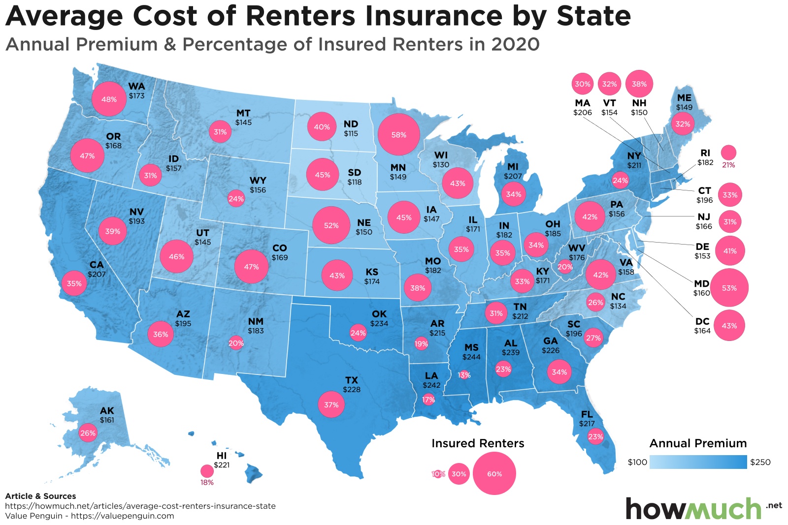
  • Americans on average pay $187 annually in renters insurance, with amounts by state ranging from $115 to $244.
  • With home prices rising nearly 5% year-over-year, some consumers (especially Millennials) believe they have no choice but to rent.
  • The renters’ market is also feeling upward pressure, with the number of high-income renter households rising 45% between 2010 and 2018.
  • Despite the booming housing market, advances in technology and artificial intelligence may keep downward pressure on renters insurance prices.

Our data comes from ValuePenguin and includes both the average annual/monthly renters insurance premium and the percent of renters who are insured in that state. For our viz, a darker shade of blue on the map indicates a greater annual premium, and a larger pink circle indicates a larger percentage of insured renters.

Top Ten States with the Highest Renters Insurance

1. Mississippi. Annual premium: $244; percent of insured renters: 13%
2. Louisiana. Annual premium: $242; percent of insured renters: 17%
3. Alabama. Annual premium: $239; percent of insured renters: 23%
4. Oklahoma. Annual premium: $234; percent of insured renters: 24%
5. Texas. Annual premium: $228; percent of insured renters: 37%
6. Georgia. Annual premium: $226; percent of insured renters: 34%
7. Hawaii. Annual premium: $221; percent of insured renters: 18%
8. Florida. Annual premium: $217; percent of insured renters: 23%
9. Arkansas. Annual premium: $215; percent of insured renters: 19%
10. Tennessee. Annual premium: $212; percent of insured renters: 31%

Top Ten States with the Lowest Renters Insurance

1. North Dakota. Annual premium: $115; percent of insured renters: 40%
2. South Dakota. Annual premium: $118; percent of insured renters: 45%
3. Wisconsin. Annual premium: $130; percent of insured renters: 43%
4. North Carolina. Annual premium: $134; percent of insured renters: 26%
5. Utah. Annual premium: $145; percent of insured renters: 46%
6. Montana. Annual premium: $145; percent of insured renters: 31%
7. Iowa. Annual premium: $147; percent of insured renters: 45%
8. Minnesota. Annual premium: $149; percent of insured renters: 58%
9. Maine. Annual premium: $149; percent of insured renters: 32%
10. New Hampshire. Annual premium: $150; percent of insured renters: 38%

A primary determinant of renters insurance is the likelihood of natural disaster: the relatively docile Great Plains and Midwestern states have some of the nation’s lowest premiums. If you really want to save on renters insurance (and spare yourself from a hurricane), consider moving to the Dakotas: North and South have the cheapest on average at $115 and $118 a year, respectively.

By contrast, states with the highest renters insurance include the hurricane-battered Gulf states of Mississippi and Louisiana, and Tornado Alley locales like Oklahoma and Texas. If you’re a renter in these states and disaster does strike, keep in mind that renters are eligible for assistance from the Federal Emergency Management Administration (FEMA). However, this only covers damages from natural disasters and related circumstances, and not events like a burst pipe or a burglary. To learn more about what renters insurance covers, check out our Renters Insurance Guide.

Despite the benefits of renters insurance, the minority of renters have it in all but three states (Minnesota, Maryland and Nebraska). At an average of nearly $200 annually nationwide, it’s not a trivial sum. But will these numbers change with demographic differences and insurance tech breakthroughs?

With a booming housing market, many are rethinking their plan to buy a home. Home prices have been rising nearly 5% year-over-year as of November 2019, and there are over 100,000 fewer homes on the market at the end of 2019 than there were the previous year. With numbers like that, it’s easy to think that renting is the only option -- and this attitude is most common among Millennials, 12% of whom plan to rent forever.

With a crowding-out of would-be homeowners into the rental market, the demographics of renters is also shifting up. The percentage of renter households making $75,000 or more in 2019 hit an all-time high of 22 percent.

So, with rising home prices and rents, do tenants have anything to look forward to? Possibly renters insurance: the insurance market is changing rapidly due to technological advances such as artificial intelligence. Take for example the insurer Lemonade who uses AI to approve coverage for renters insurance in 90 seconds. With lower overhead, Lemonade can pass savings on to consumers. Maybe the ease of use and lower prices will lead more renters to get insured, but it’s unlikely that these relatively small savings will clear a path for increasingly costly home ownership.

Do you prefer to rent or own where you live? If you’re a renter, do you have renter’s insurance? Why or why not? Does anything in the data surprise you? Let us know in the comments and share with your friends.

Data: Table 1.1


Visualizing 20 American Cities with Economies as Big as Countries

$
0
0

The U.S. accounts for one-fourth of the entire world economy, or about $21.44T in nominal GDP. It can be hard to comprehend just how big that is, so we created a new map comparing the GDP of individual cities against entire countries.

  • New York boasts the largest GDP of any metro area in the U.S. at $1.8T, the same size as the entire Canadian economy.
  • Los Angeles also has a GDP over $1T, roughly the same size as Malaysia.
  • Other large cities have enormous economies. Four urban areas contribute more than $500B in GDP, including Chicago ($689B), San Francisco ($549), Washington, DC ($541B) and Dallas ($512B).
  • Even smaller American cities have enormous economic weight. Riverside-San Bernardino is the smallest one on our map, and it still generates $187B in GDP, or about as much as Slovakia.

We created our visual comparing GDP between U.S. cities and other countries by gathering data from two places. The World Bank publishes GDP figures for every country in the world, supplying estimates whenever official numbers are difficult to find. The U.S. Bureau of Economic Analysis breaks down GDP by metro areas, letting you easily see the biggest economic engines in the country. Combining the datasets to create our map indicates just how big the U.S. economy truly is.

Top 10 Largest U.S. Metro Areas by GDP

1. New York-Newark-Jersey City: $1.8T
2. Los Angeles-Long Beach-Anaheim: $1T
3. Chicago-Naperville-Elgin: $689B
4. San Francisco-Oakland-Berkeley: $549B
5. Washington-Arlington-Alexandria: $541B
6. Dallas-Fort Worth-Arlington: $513B
7. Houston-The Woodlands-Sugar Land: $479B
8. Boston-Cambridge-Newton: $464B
9. Philadelphia-Camden-Wilmington: $444B
10. Atlanta-Sandy Springs-Alpharetta: $397B

The greater New York metro area alone accounts for the same amount of GDP as the entire country of Canada ($1.8T). Even mid-sized cities like Riverside-San Bernardino, CA generate as much economic output as member countries in the EU, like Slovakia. Dallas is about as important from a pure GDP perspective as Hong Kong ($512B), which has its own stock exchange. Chicago alone carries as much economic weight as Iraq ($689B), and the latter has an astonishing 145 billion barrels of proven crude oil reserves.

The U.S. economy is mighty indeed, but there are lots of ways it could teeter in the future. The escalating coronavirus is already starting to have an impact on the stock market. The ongoing Boeing 737 Max crisis could mean the American economy grows less than 3% this year. At the same time, a new trade deal with Mexico and Canada might counteract these forces and stimulate the economy. All of which is to say we don’t really know how these numbers will change from year to year, however the size of the U.S. economy is quite impressive.

Data: Table 1.1

Here’s How Much It Costs to Set Up an LLC in Each State

$
0
0

It’s really easy to form a company these days. There are lots of services available that will handle all the paperwork, like opening bank accounts, getting a mailing address and filing articles of incorporation. But the most straightforward way to form a business is by creating a limited liability corporation (LLC), and the cost to do so varies around the country.

  • Some states require considerably more money than the rest to start a company. It costs $500 to form an LLC in Massachusetts.
  • The cheapest state in the U.S. to found a company is Kentucky, where it only takes $40.
  • Most states fall between these two extremes. It costs $100 to form an LLC in 12 states.
  • The average cost to file an LLC across all 50 states and Washington, DC is only $122.

We prepared the data behind our visualization by researching the fee it costs to form an LLC around the country. We looked up the requisite numbers according to each state’s filing requirements. To keep things simple, we looked at only the regular, articles of organization fee to form an LLC. We did not take into consideration additional fees for expediting the filing process.

The 10 Most Expensive Places to Form an LLC

1. Massachusetts: $500
2. Tennessee: $300
3. Texas: $300
4. Alaska: $250
5. Washington, DC: $220
6. New York: $200
7. Washington: $200
8. Maine: $175
9. Kansas: $160
10. Illinois: $150

Massachusetts stands out as by far the most expensive in the country. At $500, forming an LLC is not a small decision. In fact, Boston ranks as one of the most expensive cities for startups, costing on average $389K to get off the ground. Contrast Massachusetts with the other end of spectrum, Kentucky, where it only takes $40 to form an LLC.

It’s curious how Delaware is not the absolute cheapest in the country. The state is famous as a friendly place for companies to incorporate. More than half of all the publicly traded companies in the U.S. are incorporated there. And yet it costs $89, more than half the price of Kentucky ($40). Delaware is so popular because of lots of other reasons, especially its court system and ability for companies to minimize taxes. To be fair, forming an LLC in Delaware is slightly cheaper than what it costs in most places. The most common price tag? $100 in 12 states.

There are lots of reasons why you should consider forming an LLC. If you’re doing any sort of work as a freelancer, or entering into contracts as a sole proprietor, you could be opening yourself up to unnecessary legal and financial risks. Creating an LLC is a great way to protect yourself, plus it conveys professionalism to your customers. If you’re thinking about starting a small business, you might be in the market for a loan. Our small business loan andequipment financing guides can help you get started.

Data: Table 1.1

5 Visualizations We Wish We Had Published in February 2020

$
0
0

These 5 data visuals of February 2020 are the pieces we wish we had done because of their awesomeness! Each month we select five amazing data displays to showcase to our audience. This month, we picked 5 pieces that do a phenomenal job of packing a lot of data and putting it in a visual that looks sharp. In this article we will discuss what we loved about each one of the charts.

1. Flying High: The Top Ten Airline Routes by Revenue (Visual Capitalist)

This display from VisualCapitalist does a fantastic approach on a different view point of showing the globe. Most standard map type charts flatten the earth on the Prime meridian. This chart takes the idea of flattening the map from the top! Viewing the world from the top gives a great perspective on flights that are made around the planet.

On top of the change of perspective, this chart's color selection does a great job of using a teal for the map and the lines as a rainbow of contrasting colors to teal. This chart does a great job of keeping it clean and simple and using color contrast to do the highlighting.

2. Twitter Sentiment Index (CJ Ezinne)

During the election season, some of the most creative ways to display data arise. And this visual from CJ Ezinne takes live twitter from political mentions and turns it into an easy to see chart, IN REAL TIME! This chart seems simple, but behind the sense is what makes this chart amazing.

This simple line chart is gathering Twitter data in real-time on democratic party candidates mentions on twitter. After it collects this data, it then decides if the comment or mention is positive or negative in content. This chart then makes this massive machine learning model processing and provides it into a trend line. Now anyone can see who is being spoken of positively on twitter and which candidate is being addressed in a negative light.

3. The Oldest Company in Every Country - Still in Business (BusinessFinancing.co.uk)

This chart from BusinessFinancing.co.uk can make big companies look really tiny in the world. This chart has a great color selection for a map type display. Then on top of the colors, the lines are spaced almost entirely apart with sharp angles giving it a futuristic computer chip type of overlay on the map.

When you scroll down on the site, each continent breaks down to provide an enlarged view. On the main route, the section of expanding Europe is executed beautifully while still balancing the chart as a whole. Oh not to mention the cutie little icons this has as the company. This map packs a ton of data in a clean colorway!

4. 13,000 Missing Flights: The Global Consequences of the Coronavirus (New York Times)

With the coronavirus still scaring people, this chart shows how the virus is affecting the flight traffic of the outbreak area. This animated map of flights by NYTimes puts into perspective the amount of travel stopped by the fear of spreading.

This map uses red planes that show where the flights come and go to China during regular operation periods and compare them to what the travel currently looks like in the same area. The viewer sees this large big cluster of planes overlapping on the left side, while there are barely any flights on the right. The volume on the right is so small that the aircrafts can be easily counted. And as these little planes fly around China, it is a somber reminder that anything can cause economies to slow down.

5. Bloomberg’s Immense Spending Gets him 30,000 Online Ads a Minute (Washington Post)

Going back to a political chart, the Washington Post made a chart comparing how one candidate is spending money on advertising to win the democratic nomination. That candidate is Mike Bloomberg. Bloomberg has spent over 233 million dollars on ads. When this is put into a data viz, the scrolling keeps going and going. But during the scroll, the chart provides small comparisons against related spending habits of other candidates.

At the very top of the page, the first thing in view is a chart that displays the count of ads bought by Bloomberg since you entered the page. One of the first comparisons is the spending by President Trump. Bloomberg blew President Trump's spending greater than ten times! Mike Bloomberg spent that amount of money on over 1.6 million ads. And the counter keeps increasing at a fast rate.

These five data visualizations are the five that we at Howmuch.net wish we would have made in February 2020. These visuals accomplish one of the hardest goals of a visual data designer, pack a lot of data and make it look clean. What visual did you like best? What chart did we miss for this month? Let us know in the comments.

Visualizing the 50 Most Innovative Fintech Startups

$
0
0

When was the last time you walked into a bank? And when was the last time you checked a banking app on your phone? Researchers at Wharton found that while people walk into a bank branch once or twice a year, they check their bank’s mobile app 20 to 30 times a month. Fintech, or “financial technology,” has changed the way we use financial services, and the market is only growing.

  • Online payments processor stripe recently raised another $250 million in funding, with no plans to go public.
  • Real estate company Opendoor is expanding into nine new markets.
  • Intuit recently purchased credit monitoring service Credit Karma for over $7 billion.
  • The United State government has loosened restrictions on all-digital banks.

Our data comes from the Forbes Fintech 50 2020. Our viz compares the funding of all companies across industries. A larger bubble on the viz indicates more funding, and bubbles are colored according to category.

Top 10 Highest Funded Innovative Fintech Companies

1. Opendoor (Real Estate; Irvine, California): $1.3B
2. Stripe (Payments; Mountain View, California): $1B
3. Credit Karma (Personal Finance; San Francisco, California): $869M
4. Chime (Personal Finance; San Francisco, California): $805M
5. Affirm (Personal Finance; San Francisco, California): $800M
6. TransferWise (Payments; London, United Kingdom): $689M
7. Root Insurance (Insurance; Columbus, Ohio): $528M
8. Coinbase (Blockchain & Bitcoin; San Francisco, California): $525M
9. Toast (Payments; Boston, Massachusetts): $498M
10. Kabbage (B2B Lending; Atlanta, Georgia): $489M

Not just banks are affected by fintech: from investing, to insurance, to real estate, these startups are revolutionizing financial services -- and getting lots of funding to do it. Two of the startups on the Forbes list have even received over $1 billion in funding: Opendoor, a real estate company, buys homes directly from homeowners, and Stripe, a payments company, offers software for Internet-based payments.

While Opendoor charges a higher fee than typical real estate agents, the process can take only days, versus months if listing with a realtor. Partnering with the real estate brokerage Redfin, Opendoor has recently announced expansion to several new markets like Charlotte and Orlando.

Founded in 2010, Stripe is an old-timer among fintech startups, but it shows no signs of slowing down. In fall of 2019 Stripe raised another $250 million in funding, putting the company at a $35 billion valuation. Co-founder John Collison told the press that the company has “no plans” to go public at the moment, and that Stripe is “quite early in this opportunity.”

While Stripe has no plans to go public, the credit monitoring service Credit Karma did just that, through acquisition. The financial software company Intuit recently purchased it for over $7 billion. With nearly $900 million in funding, Credit Karma was the third most-funded on startup on the Forbes list. Intuit plans to use the Credit Karma acquisition to build a personal finance platform for customers.

With more and more financial services being conducted digitally, expect brick-and-mortar banking to compete with all-digital banks: Revolut, an all-digital bank, has recently became the UK’s most valuable fintech startup. All-digital banks are similarly making headway in the United States, where regulatory pressures on fintech have been loosened.

How often do you visit a bank versus check your mobile app? Do you use any of the services of the companies on our list? Let us know in the comments and share with your friends.

Data: Table 1.1

Visualizing America's Rising Credit Card Debt Nationwide

$
0
0

Credit card payments have become a way of life for many Americans. Nearly 60% of families claim to use them for the convenience, and market innovations like Apple Pay have made it even easier to “charge it." While credit cards may be easy to use, they’re also easy to pile up debt with.

  • Credit card debt grew near 6% year-over-year in Q2 2019 to $6,194 nationwide.
  • Alaska, New Jersey and Connecticut lead the nation in credit card debt balances.
  • Iowa, Wisconsin and Mississippi are the states with the lowest credit card burdens.
  • The rise in credit card debt has led to double-digit revenue growth among many banks and credit card processors.

The data comes from Experian and compares the average debt in each state as of the second quarter of 2019 versus one year prior. A darker shade of blue on our map viz indicates a higher average debt, and a larger red bubble indicates a greater change from 2018.

Top 10 States With Highest Average Credit Card Debt

1. Alaska: $8,026 (+0.65%)
2. New Jersey: $7,084 (+2.56%)
3. Connecticut: $7,082 (+2.74%)
4. District Of Columbia: $7,077 (+2.62%)
5. Virginia: $6,969 (+2.15%)
6. Maryland: $6,946 (+2.60%)
7. Texas: $6,753 (+2.38%)
8. Hawaii: $6,673 (+3.60%)
9. Georgia: $6,569 (+2.64%)
10. New York: $6,491 (+2.88%)

Credit card debts are up in every state across the country, with annual increases in average debt ranging from 0.49% in Wyoming to 5.81% in Maine. Total average debt ranges from $4,774 in Iowa, to $8,026 in Alaska. Overall cost of living is a large factor in total credit card debt. The states with the highest credit card burdens, such as Alaska and New Jersey, are some of the most expensive states to live in, and Washington DC is one of the most expensive cities to live in. But even in Iowa, the state with the lowest credit card debt, the average balance is nearly $5,000. Compared to the state’s per capita income of about $50,000, this is still a sizable debt.

So what explains the explosion in credit card debt nationwide? Technological convenience is certainly one factor: according to a recent study by debt resolution company Freedom Debt Relief, groceries are the number one reason why people carry a balance. These consumers may do so out of convenience, or for the many perks that accompany many credit cards.

If not repaid promptly, however, even a grocery card bill can morph into a huge payment: individuals with good credit have an average credit card interest rate of 17%, while those with poor credit face average rates of 25%. Store credit cards tend toward 30%, for all borrowers. On top of that, many banks are cutting their credit card perks, while raising rates still higher.

While your bank card’s perks may be cut, it’s unlikely that your bank’s profits will. JPMorgan Chase and Citigroup reported that credit card sales were up 10 and 5 percent, respectively, in the third quarter. Meanwhile, profits at Visa increased 17 percent in its most recent fiscal year, while Mastercard had an 11 percent profit jump in its most recent quarter.

With these rates, it’s no surprise that over one quarter of Americans have more credit card debt than emergency savings. If you are one of the many Americans struggling with credit card debt, start your journey out to financial freedom with our HowMuch guides to bad credit loans and credit card debt consolidation.

Do you prefer to use credit cards for everyday purchases? How much credit card debt is in your state? Let us know in the comments and share with your friends.

Data: Table 1.1

Here’s the Wealthiest Person in Every State

$
0
0

The U.S. is home to 5 of the top 10 cities with the most billionaires in the world, according to a recent analysis of the Forbes list of billionaires. Ever wonder who the richest person is where you live? Our map has the answers.

  • Jeff Bezos tops the list as the richest person in the U.S. The founder of Amazon, based out of Washington, is worth some $117.1B, or about $27B more than Warren Buffet ($89.6B, NE).
  • 6 states are home to billionaires with more than $50B to their name, including Michael Bloomberg ($58.4B, NY) and Jim Walton ($51.9B, AR).
  • The richest people in 6 states are also not even billionaires. The Leonard Hyde and Jonathan Rubini and families ($0.3B, AK) are worth the least in our map.
  • Many of the people on our map represent some of the most famous companies in the country, including Walmart, Facebook and Amazon.

We originally found the idea for our map thanks to 24/7 Wall St. The underlying data for estimated net worth figures come from Forbes. Our approach was to not only display a photo of the richest person with their associated fortunes, but to color-code each state based on the size of their wealth. This makes it abundantly clear just how wealthy the most elite people are in every state.

Top 10 Richest People in the U.S. by State

1. Jeff Bezos (WA): $117.1B
2. Warren Buffett (NE): $89.6B
3. Mark Zuckerberg (CA): $81.9B
4. Michael Bloomberg (NY): $58.4B
5. Jim Walton (AR): $51.9B
6. Alice Walton (TX): $51.7B
7. Charles Koch (KS): $42.8B
8. Sheldon Adelson (NV): $41.4B
9. Phil Knight and family (OR): $40B
10. Jacqueline Mars (VA): $30.2B

Our map provides an interesting snapshot of the ultra-wealthy around the country. For starters, the richest person in almost every state is a white man. There are some notable exceptions, like Alice Walton (TX, $51.7B) and Victoria Mars (PA, $7.5B). There are also only a handful of states shaded light green, which indicates the richest person has a net worth of less than $1B. In fact, the richest person in 37 states is a multi-billionaire ($2B+), and 6 are over $50B. The Leonard Hyde and Jonathan Rubini and families, the “poorest” rich people on our map, are multi-millionaires several times over ($0.3B, AK). These are all telltale signs of runaway wealth inequality.

Our map also displays some familiar household names from the business world, including Mark Zuckerberg (CA, $81.9B) and Jeff Bezos ($WA, $117.1B). But there are also people on our map whose last names are industry giants, like the Mars candy company from Pennsylvania, the Waltons of Walmart fame in Arkansas, and the Menards hardware chain based in Wisconsin. Mike Bloomberg is the wealthiest New Yorker with a fortune estimated to be worth $58.4B. With that much money at his fingertips, Bloomberg can no doubt easily afford the enormous price tag for his failed presidential run.

One thing a lot of the billionaires on our map have in common? They first started out by creating and growing a small business. If you want to kickstart a business today, check the small business loan guide, or the credit line guide if you want to expand what you’ve already got.

Which names and faces on our map surprised you the most? Who did you expect to find, but didn’t? Let us know in the comments.

Data: Table 1.1

Income Inequality Around the World: How Much do You Need to Earn to Join the Top 1%?

$
0
0

You’re not wrong to be curious about income inequality. Politicians on both sides talk about it all the time, and the media is obsessed with stories about the top 1%. Our map takes a unique look at inequality by focusing on the threshold of income needed to join the top 1% compared to the top 50% for several countries around the world.

  • The United Arab Emirates has the most unequal distribution on our map. The money needed to join the top 1% is $922K compared to $22K for the top 50%.
  • The threshold to join the top 1% of income in the U.S. is almost 13x bigger than the top 50%.
  • The U.K., France and Germany have similar numbers for the amount of income needed to be in the 50% threshold ($36K).
  • India is one of the poorest countries on our map. It takes only $4K of income to meet the 50% threshold of income and $77K to be in the top 1%.

Inspired by an idea from Bloomberg, we analyzed a handful of countries from different regions around the globe. These countries aren't necessarily representative of their respective regions. We figured out how much money it would take to be in the 50th percentile of income for 14 different countries around the world from The World Inequality Database, comparing it to the threshold needed to join the top 1%. We used the latest available set of numbers available. We pulled data for Canada from Statistics Canada taking into consideration purchasing power parity (PPP) according to the OECD.

Top 10 Countries on Our Map With the Highest Threshold to Join the Top 1% income

1. United Arab Emirates: $922K
2. United States: $488K
3. Bahrain: $485K
4. Germany: $277K
5. United Kingdom: $248K
6. France: $221K
7. Canada: $202K
8. South Africa: $188K
9. Brazil: $176K
10. Russia: $174K

There are some big gaps on our map between the income needed to join the top 50% and the top 1%. The UAE has the most unequal distribution of income on our map, with $922K needed to join the top 1% compared to just $22K for the top 50%. That stands in stark contrast to India, where $77K is enough income to make it across the threshold of the top 1% in the country.

Consider the relationship between inequality overall and how much people in the 50th percentile make. For example, the U.S. definitely has some substantial inequality, but middle income Americans make more money ($38K) than any other country in our visualization. Germany, France and the U.K. are also unequal overall but relatively high incomes for the 50th percentile ($36K). Compare that to the situation in Brazil and South Africa, where middle income workers earn roughly 7x less than in the U.S..

There are a couple things to keep in mind about our map. It only contains numbers for 14 different countries. There are also big differences in inequality inside countries like the U.S. There’s a lot that can be said about comparing wealth instead of income. And finally, our map doesn’t consider the types of services each government provides for its citizens. People in one country might have guaranteed retirement pensions (like France used to) and healthcare, but many Americans don’t have access to these types of things outside of their workplace.

So there’s lots of inequality around the world, but is that necessarily bad for middle income workers? Let us know your thoughts in the comments.

Data: Table 1.1


Visualizing Bitcoin's Wild Ride in the Last Decade

$
0
0

In February 2011, Silk Road became the first online store to accept Bitcoin as payment. The new digital currency cost about one U.S. dollar per coin. The next decade would be a roller coaster for the digital currency, not limited to the FBI shutdown of Silk Road. What can we expect at the beginning of the second decade of Bitcoin exchange?

  • The now-defunct Silk Road started accepting Bitcoin as payment in February 2011.
  • Nearly 850,000 bitcoins were stolen in the 2014 hack of Mt. Gox, kicking off a two-year bear market.
  • The price of bitcoin in 2017 skyrocketed from approximately $1,000 to $20,000 per bitcoin.
  • Bitcoin again lost nearly ten percent of its value in under 24 hours amid coronavirus uncertainties.

Our data comes from Bitcoinity and includes the daily market capitalization of Bitcoin since July 2010. Market capitalization, or market cap, is calculated as the total U.S. dollar value of the bitcoin supply in circulation, times the daily average market price of Bitcoin. Our line chart shows the trend over time of the market cap. We have included some important events in Bitcoin’s history to add context to the viz.

Bitcoin Market Cap by Year

2010: $1.4 Million
2011: $33 Million
2012: $143 Million
2013: $9.4 Billion
2014: $4.3 Billion
2015: $6.4 Billion
2016: $15.3 Billion
2017: $213.9 Billion
2018: $66.9 Billion
2019: $130 Billion
2020: $160.7 Billion (as of 03/05/2020)

While the origins of Bitcoin go back to 2008, with its invention by the still-unknown Satoshi Nakamoto, it began to take real commercial value by the middle of 2010, when our data starts. While its price slowly climbed over the next two years, a large run-up was ended abruptly by the 2014 hack of Mt. Gox, the largest Bitcoin exchange at the time. The collapse of Mt. Gox set off a two-year bear market and remains a scandal in the Bitcoin world as many of the nearly 850,000 bitcoins that were stolen have not been returned to their owners.

While it would take until 2016 to recover its previous 2013 high, 2017 would bring an atmospheric rise in the price of bitcoin. Starting at about $1,000 in January 2017, the price escalated to a record-high price of $19,783.21 per bitcoin on December 17, 2017. Just days later, however, the market experienced a 30% drop. Exactly one year later, on December 17, 2018, Bitcoin was $3,250: an 84% decrease from its peak. While Bitcoin has not yet pierced $20,000, its price increased 87% in 2019, closing the year at just over $7,100.

So, what does 2020 have in store for the cryptocurrency? Like many assets, Bitcoin has been awash in volatility among coronavirus fears. The price of bitcoin recently lost 10 percent of its value in under 24 hours, as much of the market also went into free-fall. While some claim that Bitcoin can act as a safe haven in times of geopolitical unrest (such as a pandemic), it’s unclear that the coronavirus has boosted interest in the digital currency. From this episode, it appears that as the market falls, so does Bitcoin.

However, Bitcoin defenders remain confident about the asset’s tool as a hedge against market uncertainty and volatility. Explains entrepreneur Naval Ravikant: “Bitcoin is a hedge against central banks printing money, which is inevitable as a reaction to the virus.”

While Bitcoin’s 2020 performance to date may be adversely affected by the coronavirus, some Bitcoin-lovers expect things to end on a very high note: entrepreneurs John McAfee and James Altucher have repeatedly claimed the price of bitcoin will hit $1 million by the end of 2020.

Are you a Bitcoin or cryptocurrency owner? Why or why not? Do you think the spread of coronavirus will affect Bitcoin’s market capitalization? Let us know in the comments and share with your friends.

Data: Table 1.1

Charted: America’s Record-High Consumer Debt Levels

$
0
0

The United States of America could be called the United States of Debt: recent data shows that Americans on average owe a total of over $51,000. Compare this to a gross domestic product per capita of $58,388 and it’s no surprise that over one quarter of Americans have more credit card debt alone than their entire emergency savings.

  • Total U.S. household debt hit a record-high $14 trillion in Q4 2019.
  • Credit card debt rose by $57 billion over last year.
  • The average debt per capita ranges from $30,580 in West Virginia to $88,450 in Washington, D.C.
  • Over a quarter of Americans hold more credit card debt than emergency savings.

Our data comes from the Center for Microeconomic Data of the Federal Reserve Bank of New York and contains the total debt per capita for all 50 states. Debt is broken into auto, credit card, mortgage, student and other debt. For our viz we use a radial chart comparing the overall total debt level for each state, with the totals broken down by subcategory.

The Five States with the Highest Debt per Capita

1. Washington DC: $88,450
2. Hawaii: $74,230
3. Colorado: $73,890
4. California: $73,400
5. Maryland: $72,310

The Five States with the Highest Debt per Capita

1. West Virginia: $30,580
2. Mississippi: $33,140
3. Arkansas: $33,950
4. Kentucky: $34,910
5. Oklahoma: $35,110

From coast to coast, debt is on the rise: total household debt hit a record high $14.2 trillion in the fourth quarter of 2019. Among this increase, household debt balances increased by $601, their largest increase since 2007. Household debts have risen for 22 consecutive quarters. Among the substantial increases nationwide are auto loans and credit card debt, both of which increased by $57 billion over the year. All told, total debt is now 11.6% larger than its pre-Great Recession peak.

While the average debt nationwide now stands at $51,000, there’s a large swing in debt by state: Washington, D.C. leads the nation with $88,450, with West Virginia in last place at $30,580. Overall cost of living is a large factor in total debt. The states with the highest debt burdens, such as California and Hawaii, are some of the most expensive states to live in, and Washington DC is one of the most expensive cities to live in. At over $13,000, the District of Columbia’s per capita student debt exceeds any state, which makes sense as the U.S. Census Bureau has named Washington, D.C. the most educated metro in the U.S.

This explosion in debt leaves one to wonder how long it will be until America’s debt bubble bursts. That remains to be seen, but it appears that coronavirus may be bringing that reality closes: a market downturn threatens to expose a highly leveraged corporate market, which in turn could affect the consumer debt market. If you are feeling the squeeze of mounting debts, or want to stay ahead of the seemingly endless debt cycle, check out our HowMuch debt consolidation guide.

How does your state’s consumer debt compare to nationwide? Do you think the coronavirus will affect the debt market? Let us know in the comments and share with your friends.

Data: Table 1.1

Visualizing The Coronavirus Stock Market Meltdown

$
0
0

Coronavirus panic is sweeping the world, forcing governments to take unprecedented steps to slow the pandemic. Schools are closed, bars are shutting down and public events are called off. The world is likely headed into a severe recession, causing stock prices to plummet as people cash out and sell everything. Here’s the latest on the extent of the damage for the share prices for several key companies.

  • The share price of Lyft suffered the most dramatic fall in our analysis, tumbling from $53.94 on February 11 to $23.88 on March 12, or -53.73%.
  • Several major companies have lost almost half their value in the last several weeks, including Pinterest (-47.18%), Expedia (-46.84%) and Citigroup (-46.84%).
  • No company in our visualization is escaping the turmoil, even as Americans stock up on cleaning supplies from companies like Johnson & Johnson (-18.04%) at stores such as Walmart (-13.14%).
  • The U.S. stock market remains highly volatile given the rapidly changing situation. This presents key opportunities for investors with a long time horizon and the fortitude to outlast price instability.

Collecting the data for such a dramatic drop in stock prices was relatively straightforward. First, we picked several well-known companies across key sectors in the economy, including IT, media, transportation and banking. Then, we looked up the highest closing stock price for each company this year and compared it to the closing price on March 12, 2020. Finally, we calculated the percentage drop in price and arranged the resulting visuals alphabetically by company name. This lets you easily and quickly see how the U.S. stock market has imploded over the last couple months.

The 10 Biggest Stock Price Drops in Our Visual:

1. Lyft: -55.73%
2. Pinterest: -47.18%
3. Expedia: -46.84%
4. Citigroup: -46.84%
5. Snapchat: -45.87%
6. Uber: -45.21%
7. BeyondMeat: -42.72%
8. Ford: -42.24%
9. Bank of America: -42.09%
10. Goldman Sachs: -39.29%

Stock markets around the world are collapsing before our eyes. The Nikkei Index from Japan is off more than 19% so far this year. The FTSE 100 in London is down almost 2,500 points since last month, more than 30% over the last year. In the U.S., the S&P 500 opened more than 8% down Monday morning, triggering another 15-minute halt in trading to stabilize prices. Our visualization puts all of this carnage into perspective by analyzing the specific prices of companies most people would recognize.

The situation in the transportation sector is likewise grim. Of all the stocks we analyzed, shares of Lyft have performed the worst, shedding an incredible -55.73% of value since February 11. Its main competitor, Uber, is not far behind, losing an astonishing -45.21% in the same timeframe. If bars, restaurants and universities are all closing around the world, it’s safe to assume these companies are going to fall even more.

The coronavirus pandemic is causing a lot of people to load up on groceries, cleaning supplies and other necessities. Panic buying is now widespread, with multiple reports of empty store shelves and shortages of hand sanitizer. But this doesn’t mean consumer goods companies are enjoying high market valuations. Instead, their share prices are falling in tandem with the rest of the market. Walmart is down “only” -13.14% after hitting a record high as recently as March 3. Johnson & Johnson is likewise down -18.04%, and Amazon is off -22.74% even as it runs out of inventory trying to meet consumer demand.

The banking and finance sector isn’t faring any better either. Bank of America is off -42.09%, Goldman Sachs is down -39.29% and Visa lost -24.95% in value. But Citigroup is in the worst shape, having dropped from $81.37 to just $43.26 per share over two months, or -46.84% in value. It’s still too early to know if major financial institutions are going to need bailouts like they did in 2008-09, however the rapidly spiraling downward trend is very troubling.

There are a couple caveats to keep in mind about our visualization. Prices will continue to rapidly change. As of this writing, the stock market is experiencing extreme volatility, the highest since 2009. Over the last several days, markets have been collapsing, then roaring back, and collapsing again. The recent drops are also happening after nearing all-time highs, meaning stocks may have been due for a correction anyway.

This presents some key opportunities for investors who have the risk tolerance to wait out the coronavirus. Are you planning on investing in stocks? Moving into cryptocurrency? Or are you hoarding cash? Let us know in the comments.

Data: Table 1.1

Visualizing Coronavirus Disease by the Numbers

$
0
0

The coronavirus is fundamentally changing the world before our eyes.

Our goal at HowMuch.net has always been to help people understand the economy. We do that by creating beautiful data visualizations that tell a story and help people make better decisions. In response to the coronavirus outbreak, we’re creating a new page to help people understand what’s really going on with the virus and the economy.

We will stick to the facts as we know them and avoid undue alarmism. We’ll always use reliable sources for our data. Yes, financial markets are in turmoil, entire countries are on lockdown and governments are struggling to formulate a coherent response. But our mission remains the same: to help our readers better understand the world even as it rapidly changes.

Important News Today

1. Trump Administration Pitches $850 Billion in Stimulus Over Coronavirus - NYTimes
2. Coronavirus Vaccine Trial Administers First Dose to Participant - CNN
3. How Long Will the Coronavirus Outbreak and Shutdown Last? - NYTimes
4. World Health Organization Says some Nations Aren’t Running Enough Coronavirus Tests - CNBC
5. How European Economies are Trying to Mitigate the Coronavirus Shock - Financial Times
6. More than Half of American Jobs are at Risk Because of Coronavirus - CNN
7. 5 Burning Questions (and answers) about the Fed’s Emergency Rate Cut to 0% - Fortune
8. Why the Coronavirus Hit Italy So Hard - Wired
9. Ten-Minute Coronavirus Test for $1 Could Be Game Changer - Bloomberg
10. Can you Get the Coronavirus Twice? - The Guardian

Want to take action right now against the coronavirus? Donate to the World Health Organization’s COVID-19 Response Fund.

Data: Table 1.1

COVID Cases Explode Globally 13-Fold As They Slow In China

$
0
0

What started as an isolated disease in Wuhan, China has now grown into a global problem. The World Health Organization declared it a Pandemic. Italy is experiencing what we fear most - a run on hospital capacity.

Global governments hope to flatten the infection curve and slow the spread of the disease, buying critical time to prepare. Growth in confirmed cases is seen as the crucial metric for success.

Our matrix takes publicly available information of confirmed cases by country and constructs boxes for each of them proportional to the global cases, which currently sits at over 179,111.

Current Status

  • The number of new daily cases in China has slowed under extremely restrictive measures, dropping from several thousand a day to less than a dozen.
  • Italy’s cases jumped from 1,128 to 27,980 in a matter of weeks, placing strain on their hospital system and supplies
  • U.S. cases remain low  at 3,503 but are likely understated due to lack of testing
  • New case growth appears to be moving from Asia to Western Europe and North America as China’s new cases only grew by 1,148, whereas countries like Italy, Spain, Germany, and the U.S. have seen double or more.
  • South Korea’s a notable exception that used extensive testing and transparent information to slow the spread of the disease, only adding 4,584 cases in the last few weeks.

We’ve entered a critical time across the world where social distancing and isolation become paramount to our success. The likelihood is this pandemic will be with us for several months to years.

Stay safe and healthy!

Data: Table 1.1

Charted: The Impact of COVID-19 on the World's Major Stock Indexes

$
0
0

The coronavirus is officially in all 50 states. Almost 2,000 people in New York City are now confirmed to have the virus. The entire San Francisco Bay Area is sheltering in place. Schools and businesses are closing around the country while Congress debates a $1 trillion stimulus package. All of this is having a direct impact on stock markets, but we wanted to understand more about the timing. How have specific key events impacted stock markets?

  • Stock markets around the world are seeing substantial declines year-to-date. Most indexes are down by over -20%.
  • U.S. and European markets were relatively late to appreciate the severity of the coronavirus. U.S. stocks actually increased in value throughout early February even as the virus was spreading throughout the country.
  • The first American died from the coronavirus on February 29. U.S. stock markets shortly thereafter started to experience the most significant turmoil since the Great Recession, crashing so hard as to trip the circuit breakers and automatically halt trading.
  • Asian markets were the earliest to react to the coronavirus, declining throughout late January as the Chinese government prolonged the Lunar New Year. Stocks are down throughout Asia, including only -8.55% for the Shanghai Stock Exchange.

We gathered the daily percentage changes for each stock market index in our visualizations from Investing.com. We plotted the closing value for American, European and Asian indexes for each trading day, substituting a dotted line to indicate where trading was suspended (like in Asia). We then inserted a narrative of critical events in the spread of the coronavirus, as defined by CNN and the WHO. The three resulting visualizations allow you to easily see how, when and why stock markets around the world first started to experience so much turmoil.

The major takeaway from our visualizations is simple. World markets were late to appreciate the threat of the coronavirus to the economy. American stock markets actually rose throughout the first several weeks of the year, peaking around late February just after the WHO named the new virus COVID-19. The virus had already been found in the U.S. weeks earlier. Even as Chinese patients started dying from the virus, American stock markets continued to rise. American indexes are now down between -23% to -31.25% year-to-date, with many analysts predicating even more declines.

The track record for European markets is similar to the U.S. The coronavirus had no impact throughout the entire month of January and the first half of February. By March 9, Prime Minister Conte of Italy had announced a sweeping lockdown of the entire country. By that time, Western democracies finally seemed to understand how they needed to take actions curbing the movement of people not seen since World War II. In fact, Europe had the top 10 biggest single-day drops year-to-date for any index in our analysis. European markets are now off over -30% since the start of the year.

Asian markets represent something of a paradox. On the one hand, they started declining much earlier than in Europe or the U.S. The Chinese government cancelled Lunar New Year celebrations on January 23, and even extended the holiday to prevent people from returning to work and spreading the virus. On the other hand, the Shanghai Stock Exchange recently finished only down -8.55% year-to-date. In short, the markets closest to the epicenter of the virus haven’t reacted as severely as in the U.S. or Europe.

Of course, the coronavirus isn’t the only major international story depressing stock values. Most notably, just as the world was realizing how significant COVID-19 will be for the economy, Russia and Saudi Arabia embarked on a major oil price war. Moscow and Riyadh couldn’t agree on a price floor for a barrel of oil, so they both decided to flood the market, causing the price to tank. At the same time, the coronavirus caused much of the world’s economy to grind to a halt, severely depressing demand. Gasoline could even drop below $1 a gallon soon.

Stock market prices are one indication for how an economy is performing. The recent market turbulence suggests the world is heading into a deep recession. The struggle to combat the coronavirus is very real and ongoing. 

Want to take action right now against the coronavirus? Donate to the World Health Organization’s COVID-19 Response Fund.

Data: Table 1.1

Visualizing How Much Home $500K Buys You in Every State

$
0
0

Half a million dollars can get you over 3,000 square feet of home real estate in the United States, based on the national median price per square feet. That sounds like a big number, but when you consider that the 2018 median size of a new home in America is 2,386 square feet (which is 1,000 square feet larger than 50 years ago), it’s no surprise that mortgage debt has hit a record-high $14 trillion. However, depending on where you go in America, your $500,000 may stretch further. After all, the first rule of real estate is: “location, location, location.”

  • Sales per square foot range across the country from $98/sq ft in Mississippi to $552/sq ft in Washington, D.C.
  • A home in West Virginia can be purchased for one-third the price of one in Washington, D.C.
  • 30-year mortgage rates recently hit 3.29%, the lowest in 50 years, a promising indicator for home buyers.
  • 11% of realtors have indicated a fall in buyer traffic amid coronavirus fears, a troubling indicator for home sellers.

Our data comes from Zillow and we use median list price per square foot to derive how many square feet could be purchased with half a million dollars in all 50 states. Our viz is a grid map indicating the purchasing amount for each state: a larger square and lighter shade of pink indicates that more square feet can be purchased in that state.

Top 5 States with the Most Real Estate Purchased with $500,000

1. Mississippi: 5,208 Sq. Ft. ($98/Sq. Ft.)
2. West Virginia: 5,155 Sq. Ft. ($97/Sq. Ft.)
3. Arkansas: 4,950 Sq. Ft. ($101/Sq. Ft.)
4. Alabama: 4,762 Sq. Ft. ($105/Sq. Ft.)
5. Indiana: 4,630 Sq. Ft. ($108/Sq. Ft.)

Top 5 States with the Least Real Estate Purchased with $500,000

1. Washington, D.C.: 906 Sq. Ft. ($552/Sq. Ft.)
2. Hawaii: 940 Sq. Ft. ($532/Sq. Ft.)
3. California: 1,587 Sq. Ft. ($315/Sq. Ft.)
4. Massachusetts: 1,859 Sq. Ft. ($269/Sq. Ft.)
5. Colorado: 1,931 Sq. Ft. ($259/Sq. Ft.)

If you are looking to purchase more real estate for your money, head south: Mississippi and West Virginia are the only states in America where half a million dollars will get you more than 5,000 square feet. Housing in these states is a bargain: the average home price in West Virginia is one-third the price of homes in Washington, D.C. And, while Gulf states like Mississippi and Alabama offer lots of real estate for your money, keep in mind that it will cost more to insure homes in these states as they are at risk for hurricanes and floods.

Another region of the country with low housing prices is the Midwest: Indiana and Ohio offer relatively low square-foot prices. These so-called “Rust Belt” states have large housing stocks due to their population losses. On the flipside, in some coastal states such as California and Massachusetts , don’t offer under 2,000 square feet of real estate isn’t available for $500,000. These are some of the most expensive states to live in, and Washington DC, where you get less than 1,000 square feet, is one of the most expensive cities to live in. With these real estate prices, it’s no wonder these states also lead the nation in consumer debt.

The housing market has performed well in recent quarters, with the average rate on 30-year loans rising to 3.36% from 3.29%, making it the lowest level in 50 years. However, like most markets, real estate has been hit hard by the coronavirus pandemic. In a recent survey by the National Association of Realtors, 11% of realtors indicated a reduction in buyer traffic due to the coronavirus.

With low rates and low traffic, this may be the time to buy a house: if you’re considering it, check out our HowMuch guide to home loans.

Where would you buy real estate if you had $500,000? How does your state compare in purchasing power? Let us know in the comments and share with your friends.

Data: Table 1.1


Visualizing the Most Highly Imported & Exported Goods in the U.S.

$
0
0

The coronavirus outbreak has caused many Americans to consider the fragility of modern supply chains, particularly when it comes to foreign imports. As the world’s largest economy, the United States is one of the world’s largest exporters and importers. What categories of goods are most common for each?

  • The U.S. is now a net exporter of energy for the first time since 1953.
  • The U.S. gets 97% of its antibiotics from China.
  • In one month, the U.S. aircraft market lost about $175 billion in market value due to the coronavirus outbreak.

Our data comes from Trade Map, a statistical repository from the International Trade Centre. The visualization depicts both the U.S.’s top ten categories of exports and imports. The left half of the viz depicts imports, and the right half exports. Each is sorted from high to low. A darker shade of pink indicates a higher level of imports, and a darker shade of blue indicates a higher level of exports.

This viz does not show you which countries the U.S. trades with: to learn about the U.S. balance of trade with other countries, check out this HowMuch article.

Top 5 Categories of Goods Most Imported Into the U.S.

1. Machinery (including computers): $379.04B (14.76% of total imports)
2. Electrical machinery: $352.31B (13.72% of total imports)
3. Vehicles: $310.09B (12.07% of total imports)
4. Mineral fuels: $210.11B (8.18% of total imports)
5. Pharmaceuticals: $128.24B (4.99% of total imports)

Top 5 Categories of Goods Most Exported From the U.S.

1. Machinery (including computers): $205.88B (12.51% of total exports)
2. Mineral fuels: $199.74B (12.14% of total exports)
3. Electrical machinery: $173.19B (10.53% of total exports)
4. Aircraft, spacecraft: $136.04B (8.27% of total exports)
5. Vehicles: $133.04B (8.09% of total exports)

The U.S. recently became a net exporter of energy for the first time since 1953. However, exports may dip as the market for oil contracts amidst the coronavirus: in fact, some analysts are expecting oil prices could fall below zero. Vehicles is also a significant category for both imports and exports, but many auto manufacturers across the globe have shut down production.

The United States is also a net importer of plastic, at a time when many countries are implementing sweeping bans of plastic usage. Many American municipalities are beginning to enact bans on single-use plastic items, and expect this trend to continue as more countries refuse to accept plastic waste dumping. The U.S. is a net importer of precious metals. Many of these come from Mexico, which is the largest source of silver imports and second-largest supplier of gold.

Pharmaceuticals are a major import category for the U.S., particularly from China: the U.S. gets 97% of its antibiotics and 95% of its ibuprofen from China. The fallout from the coronavirus has put major strain on the already-tense U.S.-China trade relationship, and may affect key imports in the U.S., particularly pharmaceuticals. Even before the coronavirus outbreak, researchers expressed concern about U.S. dependence on foreign pharmaceuticals as a national security issue.

Another category which the coronavirus has greatly impacted is aircraft, a major export for the U.S. In one month, about $175 billion in market value. Boeing, a leading U.S. aircraft manufacturer, is seeking $60 billion in federal assistance for the industry, while the company has suspended dividends and its CEO given up his salary.

Where does this leave the U.S. trade market? While the overall U.S. trade deficit narrowed in January, exports also fell as the global economy began reacting to the coronavirus. This data, however, came well before the near-shutdown of the American economy, and Goldman Sachs predicted a 24% contraction in GDP.

How will the coronavirus impact what the U.S. imports and exports? What products were you surprised to find on the list? Let us know in the comments and share with your friends.

Data: Table 1.1

Visualizing the Cost of Food for Two Weeks of Quarantine

$
0
0

Many Americans have encountered an unfamiliar sight lately at the grocery: empty shelves. The coronavirus has unleashed panic buying across the country, despite retailers’ insistence that food supply chains are holding up. Even so, it’s good to keep some extra food on hand, as a positive or likely-positive coronavirus diagnosis means a two-week quarantine. What does two weeks of food look like?

  • Tyson, the nation’s largest meat packer, has ramped up production to meet dwindling store supplies.
  • Dairy prices are falling as China may cease importing milk from the U.S.
  • U.S. consumers are shunning fresh fruits and vegetables in favor of non-perishable goods.
  • While industry experts do not predict food shortages, some specialty brands and items may be in short supply.

For this viz, we calculate what a two-week food supply would cost based on the United States Department of Agriculture’s recommended daily intake amounts, and prices at Walmart.com. You can get the link to each price in our data source. Our viz is a donut chart of two layers: we break each category into sub-category for the second layer. We focused on non-perishable and frozen food supplies for a quarantine-ready basket of items.

Just under half (47.4%) of the $139 bill goes to protein and vegetables. Meat in particular has been hit hard by supply chain disruptions. Tyson, the country’s largest meat packer, has insisted that meat will be back in stock at groceries soon. To do so, Tyson and other meat suppliers have adjusted policies to avoid sick workers contaminating the supply chain.

With meat hard to come by, Americans have been forced to expand to other protein options. One of them has been tuna and tinned fish, and many consumers have found the category to be much more sophisticated than they remembered. Like meat packers, fruit and vegetable vendors are working full-tilt to restock supplies, although many consumers have been wary of fresh fruit and vegetables with the looming fear of a long quarantine.

It’s not the only category where consumers will be changing habits as a result of the coronavirus: certain brands of grains may be hard to come by as the supply chain is stretched. As one UK grocer explained: “We have 20 different sizes and styles of pasta. We are moving that to six". This could be the status quo for some time: industry experts say that, while there will be no big food shortages, certain preferred brands or specialty food items may be hard to come by.

What foods have been difficult to find in your area? What changes have you made to your food consumption? Let us know in the comments and share with your friends.

Want to take action right now against the coronavirus? Donate to the World Health Organization’s COVID-19 Response Fund.

Data: Table 1.1

Mapped: How the $150B Coronavirus Relief Fund Gets Divided

$
0
0

As the Coronavirus pandemic spread to the United States, government leaders at local to national levels realized the problem on their hands. The U.S. hospital system wasn’t set up to handle the potential influx of critical care patients. In a series of unprecedented actions, officials began limiting movement of citizens, while outright shuttering businesses temporarily. This led to dire predictions of depression level activity and the highest weekly unemployment claims ever recorded.

  • New York currently has nearly half the Coronavirus cases in the U.S. but is only receiving 5% of the total funds or $7.54B.
  • Aid is mostly allocated by population, with $3B reserved for U.S. Territories and Washington D.C. as well as $8B for tribal governments.
  • No state will receive less than $1.25B.
  • Local governments with populations of more than 500,000 are eligible for more aid which is then subtracted from the State’s funds
  • Eligibility for the funding requires that all expenses were incurred during the Coronavirus emergency, they must be accounted for in the local or state budget, and they must all occur between March 1st and December 30th of 2020.

With over $2.5T in total aid, congress set aside $150B to help state and local governments deal with the coronavirus outbreak and economic impact. With separate funds available for businesses and individuals, the $150B will be used by local governments to shore up their shortfall in tax revenues due to lower economic activity.

Top 5 States by Allocation

1. California - $15.32B
2. Texas - $11.24B
3. Florida - $8.33B
4. New York $7.54B
5. Pennsylvania - $4.96B

Prepared by the Tax Foundation, the data highlights how the Coronavirus Aid package (CARES) is being delivered to the state and local governments. States expect massive tax revenue shortfalls along with unplanned expenses to handle the pandemic. As an example, New Jersey’s already scaling back on their $40.9b budget, freezing $920m in planned spending.

While the full impact isn’t known at this time, lawmakers around the country are preparing for the worst. New York is already feeling the squeeze as their hospitals reel from capacity shortages. Governor Cuomo stated that initial estimates were $15b in revenue shortfall, far in exceeding the current allocation. However, the effectiveness of the remaining money for businesses and individuals remains outside the scope of what can be estimated at the moment.

Each day that passes brings new information to the table. Politicians weigh the consequences of shutting down the economy with an overloaded healthcare system. We won’t truly know the impact to businesses, governments, and individuals for several weeks. But have they allocated funds appropriately? Is the money going where it’s needed or is this too much of a one-size-fits-all approach?

Want to take action right now against the coronavirus? Donate to the World Health Organization’s COVID-19 Response Fund.

Data: Table 1.1

What’s Inside the $2 Trillion Coronavirus Relief Package

$
0
0

President Trump just signed into law a massive coronavirus relief package, pumping $2 trillion of stimulus into the economy to prevent a catastrophe. It’s hard to imagine just how much money is at stake, much less where it’s going and who is going to benefit. That’s why we created our latest visualization.

  • Individuals are set to benefit the most from the coronavirus relief bill, totaling an estimated $560 billion in direct cash payments to families and additional unemployment benefits.
  • Companies of all sizes will see substantial assistance from the federal government at about $500 billion. This includes special tax credits to keep people employed at distressed or closed businesses throughout the crisis.
  • Small businesses are set to benefit from $350 billion in guaranteed loans, which can be forgiven if they don’t lay people off.
  • Congress also appropriated money for a variety of different situations, including extra funding for hospitals, airlines and relief for student loans.

To create our visualization we used figures from NPR, which analyzed the original legislative text of the CARES Act. This is a highly complex piece of legislation, so let’s unpack some of the most important information.

Cash payments to individuals: A lot of people are trying to figure out if they qualify for a direct payment from the government, and if so, how much it’s going to be and when it will arrive. Individuals making less than $75,000 can expect to receive up to $1,200 each. Families with children can expect an additional $500 per child. The cash payout decreases for those making over $99,000 or $198,000 as a family. If the IRS has your account on file, it will deposit the money directly into your bank. In total, cash payments are expected to cost the government about $300 billion.

Extra unemployment benefits: A record 3.2 million Americans filed for unemployment last week, and the federal government is stepping in to help. Totaling approximately $260 billion, the feds are spending an extra $600 per week for any unemployed person on top of whatever amount individual state governments are providing. That extra money is scheduled to last up to 4 months. Gig workers and freelancers are also able to file for unemployment under the CARES Act.

Aid for companies: Large corporations and small businesses alike are set to receive substantial aid from the federal government during the coronavirus pandemic. The CARES Act allows for tax credits for any company hit by the virus that keeps workers on the payroll. Specific industries are also targeted for direct aid, including $58 billion for airlines to pay employee wages and benefits during the slowdown. Small businesses can also expect about $350 billion in forgivable loans to bridge the downturn.

And lots of other stuff: The CARES Act also sets money aside for lots of other organizations and projects. Most notably, hospitals are going to get $100 billion in direct funding to fight the virus. Financial relief is likewise coming to individuals in other ways beyond direct cash payments. President Trump already announced federal student loans wouldn’t accrue interest during the crisis, and the CARES Act goes even further, pausing all interest and loan payments through September 30, 2020.

In the rush to pass such a massive piece of legislation in record time, Congress snuck in lots of special deals for specific industries. The John F. Kennedy Center for the Performing Arts in Washington is set to receive $25 million. The Smithsonian Institution can count on an extra $7.5 million. The National Endowment for the Arts and the National Endowment for the Humanities will each get $75 million more. The CARES Act even allocates money for abstinence-only education. All of these things are unrelated to the spread of COVID-19, but they were necessary to pass the legislation so quickly.

Want to help fight the coronavirus right now? Donate to the WHO’s COVID-19 Response Fund.

Data: Table 1.1

5 Visualizations We Wish We Had Published in March 2020

$
0
0

Time for the 5 data visual we wish we had done for the month of March. This is a monthly article we publish to express our love for data visualizations outside our niche. This month has one theme in mind, and if you have listened to the media, you know it is all about the COVID-19 virus. On a side note, our thoughts and prayers go out to all of those who have been affected by this pandemic.

1. Why Outbreaks Like Coronavirus Spread Exponentially and How to Flatten the Curve (Washington Post)

This visual is very dynamic in nature. It provides several animated simulations about the different types of approaches to control the COVID-19 from spreading. These little dots just bounce around and start touching other bubbles. But the best part is the small line chart above the simulations blocks.

The line chart displays how the sick, the recovered and the healthy spread over a period of time. After the simulation is run, you get a better understanding of what “flattening the curve” looks like and why these techniques are used to reduce the outbreak. Not only do we love how Washington Post's animated simulation looks, but the visual way they explain how the curve gets flattened.

2. Roads are Emptying Across the World (Financial Times)

With most of the world in lockdown, Financial Times provides a visual display of how the COVID-19 virus lockdown has changed some of the everyday events. One of the most completing charts on this article is the road movement in large cities across the globe. Finance Times provides a chart that shows just how much road traffic has reduced due to the social distancing implementations.

Have you wondered why motion picture producers are trying to release new releases to streaming. The Financial Times also provides a chart that shows how much movie theaters are losing because of the lockdown. Or what about energy consumption? I do not want to ruin this surprise for you, so please go check it out.

3. COVID19 Datapack Dashboard (Information is Beautiful)


If you are like most people and reading everything about the stats of the virus, this is the chart -or charts- for you. These charts break down the data behind different types of factors as it is related to COVID-19. The color combinations for these charts are amazing: the black background makes the orange focus points of the charts pop. And the sky blue tones do a great job keeping the focus on the orange.

These charts create an amazing dashboard that provides insight into different aspects of the COVID-19. And if you thought the media was talking about this pandemic more than others, you would be right. Take a look at the bottom right of the charts to see just how much the COVID-19 is talked about in the media!

4. Global COVID-19 Lockdown Tracker (Aura Vision)

Aura Vision was able to do something pretty amazing in this line chart. They found the average date that most of the world went on lockdown. This chart uses a line spread that has the line highlighted by the phase of the COVID-19 by countries. The chart captures many of the countries have been affected by the COVID-19 virus.

As you scroll down the page, you can see more than a page of little flags of the countries that stretch to the right. And if you are wondering how long the lockdown may last, the chart provides an estimate based upon other countries. The forecast just makes the spread line even longer.

5. Coronavirus by County in the U.S. (University of Chicago)

The University of Chicago took a different approach from fellow university John Hopkins on the COVID-19 (check out the January 2020 article about why we loved John Hopkins Data visual). Their focus is on the clustering of the pandemic across the counties in the United States of America. This interactive chart is a great visual on providing the view with the locational insight of the outbreak.

The color selection keeps with the theme of the USA, red and blue. From the looks of the chart, most major metropolis cities are highlighted in this chart. And since this chart is dynamic, the user can change the type of metric they want to view in the map. It will be interesting to see this chart in the coming weeks, and the pandemic might spread across most of the USA.

That's it for this month of Visuals We Wish He Had Done. Please let us know in the comments the chart you like the most. We will be sure to pass it along to the publishers of these great designs. Do you know a visual you think should have been on the list this month? Let us know!

Viewing all 687 articles
Browse latest View live