Quantcast
Channel: howmuch.net
Viewing all 687 articles
Browse latest View live

Cannabis Stock Bubbles: The Higher They Rise the Greater They Fall

$
0
0

Over the past few years, investors have been eyeing a new type of green -- cannabis stocks. Even though only 33 U.S. states and the District of Columbia have legalized marijuana to some degree and there is currently no federal law granting full legalization, American investors are still able to own shares in cannabis-related companies. As more U.S. states are eyeing full marijuana legalization, our new visualization tracks the rise and fall of cannabis stock prices over time.

  • Most of these major public cannabis companies are based in Canada, which officially legalized marijuana in 2018. 
  • All of these stocks increased their share price since IPO, but they have all also decreased from their peak. 
  • Of the ten major cannabis companies in the graph, only two (Harvest Health & Recreation and Acreage Holdings) have had a negative return for investors so far.

Prices come from Yahoo Finance. Each company in the graph above is represented by a differently colored line, with the company logo. The graph is also divided into three columns; the left column is the price from the first time publicly traded on a "major" stock (TSX, NSYE, Nasdaq; or OTC if not applicable); the middle column is the highest price each stock has reached, and the right column is the stock price as of September 13, 2019. All of these stocks increased their share price since IPO, but they have all also decreased from their peak. 

The Largest Cannabis Companies & Their Current Share Price

1. Canopy Growth - Market Cap: $8.43B - Share Price: $27.45
2. Aurora Cannabis - Market Cap: $4.96B - Share Price: $5.94 
3. GW Pharmaceuticals - Market Cap: $3.76B - Share Price: $141.01
4. Curaleaf Holdings - Market Cap: $3.43B - Share Price: $7.55
5. Cronos Group - Market Cap: $3.22B - Share Price: $11.54
6. Tilray - Market Cap: $2.66B - Share Price: $31.65
7. Aphria - Market Cap: $1.94B - Share Price: $6.72
8. HEXO - Market Cap: $1.35B - Share Price: $4.25 
9. Harvest Health & Recreation - Market Cap: $1.04B - Share Price: $4.92
10. Acreage Holdings - Market Cap: $723M - Share Price: $8.39

Companies like Canopy Growth have performed particularly well since their debut. In addition, GW Pharmaceuticals has had a return of 1,484.38% and Aurora Cannabis has had a return of 188.28%. However, some analysts predict that marijuana's "Big Four" stocks will likely lose money in 2020 due to factors such as aggressive expansion into international markets and issues on the supply side. Vaping-related illnesses are also killing the buzz for entrepreneurs and investors who have been riding high on the marijuana legalization boom. As the legal landscape evolves, so will the share prices and returns of cannabis stocks.

What do you think will be the future of the cannabis industry? Please let us know in the comments.

Data: Table 1.1


Visualizing the Importance of Services in the World's Economy

$
0
0

Most of the world’s economic production comes from the agriculture, industry, and services sectors. The services sector, in particular, plays a much larger role in the world economy than you might think. To illustrate the impact of the services sector on the world economy, we created a collection of visualizations that show us services as a percentage of the GDP in countries across the globe.

  • Services account for at least 50% of the GDP in over half of the world’s countries and about 65% of the world’s GDP.
  • While the world economy and job growth in the United States have slowed down, the services sector is still doing well.
  • Some believe that, while the sector is doing well for now, the international trade of services will slow down.
  • Services account for about 77% of the United States’ GDP.

To create our visualizations, we pulled data from The World Bank, which shows us services as a percentage of GDP, value added by services in USD, and employment in services as a percentage of total employment. Countries on the map are color-coded based on the percentage of each country’s GDP represented by services. Darker shades indicate higher percentages, and lighter shades indicate lower percentages.

By analyzing this data, we can see how the services sector impacts the world economy as well as economies in countries around the world. Only countries with data from 2017 or earlier were considered for this analysis.

Top 3 Countries in the Americas by Services Output

1. United States: $15.1 trillion, 79.14% employment
2. Brazil: $1.3 trillion, 70.18% employment
3. Mexico: $700.8 billion, 61.05% employment

In the Americas, the United States leads all other countries in terms of value added by services and percentage of population employed in the services sector. In general, the services sector is the main sector for employment in the Americas.

Top 3 Countries in Asia by Services Output

1. China: $6.3 trillion, 44.61% employment
2. Japan: $3.4 trillion, 72.09% employment
3. India: $1.3 trillion, 31.45% employment

China, Japan, and India lead all other Asian countries in terms of value added by services. However, while China and India are two of the top three Asian countries in this sector, they are two of the few countries with under 50% of their populations employed in the services sector. Meanwhile, most other Asian countries have 50% or more employment in this sector.

Top 3 Countries in Africa by Services Output

1. South Africa: $214.9 billion, 71.60% employment
2. Nigeria: $209.7 billion, 51.83% employment
3. Egypt: $128.9 billion, 48.55% employment

In general, Africa seems to be less reliant on services than other regions around the world. South Africa is a notable exception with 71.60% of all employees working in the services sector. In most African countries, the economy is dominated by the agriculture and services sectors.

Top 3 Countries in Europe by Services Output

1. Germany: $2.3 trillion, 71.60% employment
2. United Kingdom: $1.9 trillion, 80.75% employment
3. France: $1.8 trillion, 77.08% employment

Like the Americas, most countries in Europe are heavily reliant on the services sector. For example, more than 80% of all employees in the United Kingdom work in the services sector. At least 40% of every country’s population in this region is employed in services. In most cases, employment in this sector is over 50% of each country’s population.

Top 3 Countries in Oceania by Services Output

1. Australia: $886.3 billion, 78.05% employment
2. Fiji: $3 billion, 47.47% employment
3. Timor-Leste: $1.1 billion, 40.54% employment

In Oceania, data was only available for three countries: Australia, Fiji, and Timor-Leste. Of these countries, Australia is by far the most reliant on services, with 78% of its population employed in this sector. Fiji and Timor-Leste, while less-reliant on services than Australia, still depend on services more than agricultural or industrial production.

As demonstrated by this data, the services sector is one of the most important markets in the world in terms of its impact on the world economy. About 49% of the world’s population is employed in this sector. While some believe that the services sector is getting ready to slow down, it is currently performing very well despite the U.S. and China trade war.

Would a trade war impact service sectors? If the global recession gets worse will people stop spending on services? Share your thoughts in the comments below.

Data: Table 1.1

Charted: These Giant Companies Make Millions Every Day

$
0
0

In an age of “unicorn” companies, which are private companies with billion-dollar valuations, and even trillion dollar companies, it can be difficult to mentally comprehend important financial metrics due to their enormity. Worldwide corporate profits are certainly one such measure, with many companies clearing hundreds of billions of dollars annually. 

  • 70 companies around the world earn over $1 million in profits in one hour or less.
  • Globally, the corporate profit pool is expected to shrink to 8% in 2025 from 10% today.
  • In the United States, corporate profits remain below their 2014 peak.
  • Saudi Aramco, the world’s most profitable company, is planning an IPO in 2020 in the face of attacks on its facilities.

One way to make the enormity of annual profits more comprehensible is to instead measure daily profits, and we’ll take this strategy for our analysis. The data comes from the latest rankings of the Fortune Global 500. Our viz uses a radial stacked bar chart to compare the daily profits of the top twenty most profitable companies. A darker shade indicates a higher profit.

Top 10 Most Profitable Companies on Earth

1. Saudi Aramco: $304.04 M daily - Earns $1 M in 4.7 minutes
2. Apple: $163.1 M daily - Earns $1 M in  8.8 minutes
3. Industrial & Commercial Bank of China: $123.29  M daily - Earns $1M in 11.7 minutes
4. Samsung Electronics: $109.3 M daily - Earns $1 M in 13.2 minutes
5. China Construction Bank: $105.48 M daily - Earns $1 M in 13.7 minutes
6. JPMorgan Chase & Co.: $88.97 M daily - Earns $1 M in 16.2 minutes
7. Alphabet: $84.21 M daily - Earns $1 M in 17.1 minutes
8. Agricultural Bank of China: $83.99 M daily - Earns $1 M in 17.1 minutes
9. Bank of America Corp.: $77.12 M daily - Earns $1 M in 18.7 minutes
10. Bank of China: $74.59 M daily - Earns $1 M in 19.3 minutes

To standardize the analysis of the world’s biggest corporate earnings, we’ve also calculated how long it takes each of the ten most profitable companies worldwide to earn $1 million in profits. It’s well under half an hour for each -- by the time you’ve finished reading this article, you can count on tens of thousands more. Most of the top ten operate in either the banking or technology industries, with headquarters in the United States or Asia (namely, China). 

The one exception: Saudi Aramco. The Saudi national energy company is the most profitable on earth, nearly doubling that of the second-place Apple. Saudi Aramco is going public in 2020, floating up to 10% of the company. This is planned in the face of recent attacks on its oil facilities and mounting tensions among Saudi Arabia, Iran and the United States, among other countries.

The Asian firms on the list, with the exception of Samsung, are state-owned Chinese banks. Amid the trade war with the United States, Chinese banks have been reluctant to lend. The Chinese central bank in response has left interest rates unchanged in the face of declining rates worldwide. These policies will have mixed effects on the profitability of these so-called “Big Four” Chinese banks. 

Tech companies are also among the most profitable, and smartphones are key to two of the ten. Apple may be losing margins on phones as customers lean toward less expensive models. To counter this industry trend, Samsung is re-launching its $2,000 luxury foldable phone.

What surprises you about the data? Which is the most profitable company in your country? Did stating profits in terms of daily earnings help? Where are corporate earnings headed in the future? Let us know in the comments and share with your friends. 

Data: Table 1.1

Charting the Best College in Each State in 2019

$
0
0

You obviously went to the best college. No one can tell you otherwise. But... there might be an objective way to measure colleges. With student debt climbing every year, we need our choices validated. We put together a comprehensive list that includes things like student satisfaction, alumni salary, and more. This gives us a comprehensive measure of what it means to be the best. So, let’s dive into which schools are the best by state.

  • Famous schools like Harvard, Princeton and Stanford top the list for starting salaries.
  • However, you can graduate from the U.S. Air Force Academy, with $0 in debt. 
  • 9 of the top 10 schools for best salary after graduating are private schools.
  • 32 of the top 50 schools are private when you look at the best college selected for each state.

Selecting the right college balances cost and post-graduate salary. We balance in-state tuition vs. out-of-state tuition, private vs. public, scholarships vs. strong alumni programs. But students want to make the most out of their time. So how do you measure all the different pieces? What tells us which school is best? Forbes looked at five categories to determine the best schools: alumni salary (20%), student satisfaction (20%), debt (20%), American leaders (15%), on-time graduation rates (12.5%) and academic success (12.5%). Their approach attempted to balance various categories for choosing the right college.

Top 10 Colleges By State & Starting Salary

1. Stanford University, California, Private - $79,000
2. U.S. Air Force Academy, Colorado, Public - $76,300
3. Princeton University, New Jersey, Private - $75,200
4. Harvard University, Massachusetts, Private - $74,800
5. University of Pennsylvania, Pennsylvania, Private - $72,800
6. Darmouth University, New Hampshire, Private - $71,500
7. Duke University, North Carolina, Private - $71,100
8. Rice University, Texas, Private - $71,000
9. Yale University, Connecticut, Private - $70,300
10. Cornell University, New York, Private - $70,100

People often think the more money you spend the better the education. That isn’t necessarily true. You don’t have to spend more on college to get a better education. Beyond the Ivy League colleges many excellent choices exist, even for low income families. Government schools like the U.S. Air Force Academy offer an opportunity to exchange for public service

Students look at a variety of factors when they choose their school. Deciding where to go balances factors such as living costs, average loan size needed, scholarships available, degrees offered, as well as post-graduate placement. While each person’s situation is unique, it’s important to look at what matters to you. Strong alumni programs help students find jobs after college. Brand names like Harvard and Stanford help to open doors with big power brokers. Hidden gems like Yale may surprise you at how affordable they can be.

Looking past personal bias, do these numbers make sense? Does the Forbes methodology include all the important factors to find the best colleges? Or do they miss some key elements? Let us know in the comments.

Data: Table 1.1

Visualizing The Thrilling Economic Growth of The Last 2000 Years

$
0
0

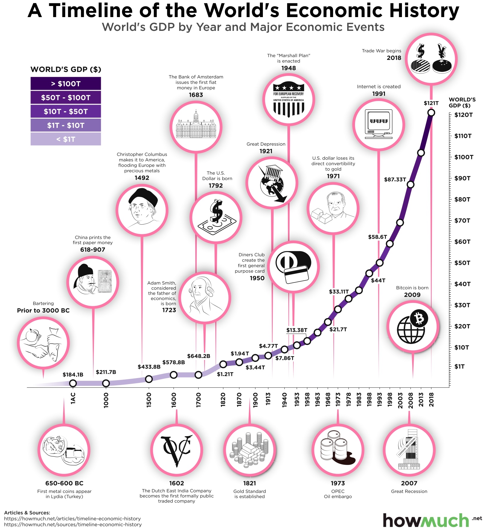
The world’s economy is seemingly poised for a slowdown, due to factors such as shifts in consumer spending, decreased global investment, and escalating tensions in the trade war between the U.S. and China. Historically, a variety of changes in international politics, technology, and monetary policy have influenced the trajectory of the world’s economy. Our newest visualization offers a timeline of the world’s economic history, with an emphasis on how worldwide GDP by purchasing power parity (PPP) has changed in response to major world events.

  • In 2018, worldwide GDP by purchasing power parity was more than $121 trillion. In 1 A.D., it was only $184.1 billion.
  • Economic growth increased exponentially after World War II, nearly tripling worldwide GDP from 1940 to 2018.
  • Advances in technology such as the Internet have also been responsible for some of the largest jumps in worldwide GDP. Between 1993 and 2018, worldwide GDP more than doubled.

For this visualization, we retrieved recent GDP by PPP data from the World Bank. To obtain the historical GDP numbers, we applied the period variation calculated with Maddison’s historical GDP database, which provides information on economic growth over the long run. All values are expressed in constant international dollars from 2011. The x-axis of the timeline lists the years ranging from 1 A.D. to 2018, while the y-axis lists the world’s GDP in trillions. The line showing the world’s economic growth over time is shaded in purple, with lighter shades of purple representing lower GDP and darker shades representing higher GDP. Interspersed along the chart, we have also included pink circles highlighting major events that have had an impact on the world’s economy.

The way that people exchange goods and services has changed over time. In prehistoric times, bartering was the main economic activity. Over time, civilizations developed coins and paper money as currency to be used for trade. Fast forwarding to the twentieth century, credit cards made it even easier for consumers to make purchases and generate more demand for products and services. In addition, the rise of cryptocurrency in the twenty-first century has also revolutionized the way we use money across borders and could play an even greater role in the future.

Another theme in the timeline of the world’s major economic events is the increased interconnectedness of different nations’ economies. The rise of mercantilism after Columbus’ contact with the New World and the creation of Dutch East India Company affected how European nations viewed their own economies in relation to each other as well as colonized parts of the world. Global interconnectedness has also caused economic strife among countries in more recent years. For example, the OPEC oil embargo in the 1970s caused massive stagflation in the U.S., while the current trade war between the U.S. and China is affecting workers and consumers in the world’s two largest economies. As we rapidly approach a new decade, it will be interesting to see what new events will continue to shape the world’s economic history.

What other events do you think have shaped the world’s economic history? Please let us know in the comments.

Data: Table 1.1

Budgeting for the Children: Where Does the Money Go?

$
0
0

How much of the federal budget is dedicated to helping children? From healthcare and nutrition to education and tax benefits, the United States government spends hundreds of billions of dollars on children.

To see exactly how much the federal government spends on the nation’s children, we created an easy-to-read visualization using data from 2018.

● Federal spending on children is decreasing and recently hit a 10-year low.
● The majority of federal spending on children goes towards healthcare, including things like Medicaid and vaccinations.
● The United States’ interest payments on debt will soon surpass total federal spending on children.
● A large portion of federal spending on children comes from tax reductions, such as the child tax credit.

To create our visualization, we used data from the Urban Institute’s annual report on federal expenditures on children. This report provides a complete picture of federal spending on programs and tax provisions that benefit children. Using this data, we created a sunburst chart to demonstrate how much the federal government spends on children in total and how this money is divided between different programs.

Top Categories for Federal Expenditures on Children

1. Health: $116.2 billion
2. Tax Reductions: $105.5 billion
3. Refundable Portions of Tax Credits: $72.7 billion
4. Nutrition: $57.2 billion
5. Income Security: $54.7 billion

Top Programs for Federal Expenditures on Children

1. Medicaid: $93.3 billion
2. Child Tax Credit (Nonrefundable): $54.9 billion
3. Earned Income Tax Credit: $52.1 billion
4. SNAP: $29.7 billion
5. Exclusion for Employee-Sponsored Health Insurance: $25.1 billion

In total, the United States government spent more than $484 billion on children in 2018, or about $6,200 per child under age 19, according to the report by the Urban Institute. The majority of this spending is dedicated to health costs and tax provisions.

While this may seem like a lot, it is actually lower than government expenditures on children in 2017 due to lower spending on education, nutrition, and child tax credits. Spending is expected to drop even more as the portion of the federal budget dedicated to children is expected to drop to 7.5% over the next decade. As child-related federal spending continues to decrease, the United States will soon be spending more on interest payments on debt than on children.

According to the Urban Institute's report, the United States has the second-highest child poverty rate among 29 developed countries. Despite high child poverty rates, the United States is continuing to decrease federal spending on children. By analyzing this visualization, we can see not only how much money the federal government spends on children, but also which programs this portion of the budget is applied to.

Do you think the U.S. should reevaluate its child-related expenditures? Should a larger portion of the federal budget be dedicated to children? Let us know in the comment section below.

Data: Table 1.1

Which Goods are Most Traded Between U.S. & China?

$
0
0

Trade talks between the United States and China are ongoing, with another round of talk set to launch soon. The standoff remains with just over a year to go before the 2020 presidential election. Two-thirds of voters said in a recent poll that tariffs on Chinese goods will increase prices on U.S. goods. But what are those goods, anyway? Likewise, what does the U.S. export to China? 

  • U.S. imports from China are down 12.5% for the year amid new tariffs.
  • China, once the number one trading partner with the United States, has since fallen to third.
  • U.S. soybean exports to China are expected to be one-third of what they were in the previous year.
  • A thirteenth round of trade negotiations between the U.S. and China is set to kick off this week.

The data comes from the Observatory of Economic Complexity, a data visualization site for international trade data created MIT Media Lab’s Macro Connections. The visualization depicts both the United States top ten categories of exports to and imports from China. The left half of the viz depicts imports, and the right half exports. Each are sorted from high to low. A darker shade of pink indicates a higher level of imports, and a darker shade of blue indicates a higher level of exports. 

Top 5 Imports from China to the U.S. 

1. Telephones for cellular networks or for other wireless networks: $43.67 B (9.80% of total imports)
2. Automatic data processing machines: $37.24 B (8.40% of total imports)
3. Tricycles, scooters and similar wheeled toys and other toys: $12.32 B (2.80% of total imports)
4. Communication apparatus: $11.25 B (2.50% of total imports)
5. Games; articles for funfair: $5.35 B (1.20% of total imports)

Top 5 Exports from the U.S. to China 

1. Aeroplanes and other aircraft: $13.13 B (9.90% of total exports)
2. Soya beans: $12.46 B (9.40% of total exports)
3. Vehicles with only spark-ignition internal combustion reciprocating piston engine: $7.89 B (6.00% of total exports)
4. Electronic integrated circuits; Processors and controllers: $4.95 B (3.70% of total exports)
5. Oils: $3.97 B (3.00% of total exports)

China’s economy may be known by American consumers mostly for its electronics exports, and indeed the majority of America’s most-imported Chinese products are in electronics. But more than just an exporter of keyboards and DVD players, China has become a significant leader in areas like currency reserves and GDP, as illustrated by this HowMuch article

That said, the rise of China’s economy coincides with its rise in trade with the United States -- namely with the trade deficit, which has doubled in just ten years. This trend has not escaped the attention of the current U.S. administration, who has imposed tariffs on various Chinese goods to level the playing field in trade. What goods are affected? Chinese electronics, the biggest import, have fallen 4.4% since last year. On the other side, semiconductors and processors are a significant export to China. Huawei, a major Chinese tech company, has been placed on a U.S. blacklist requiring American firms to obtain government permission to sell to the company.

Aside from technology, the U.S. is a major natural resources and agriculture exporter to China: of particular interest are soybeans and oil. The former is hurting: U.S. soybean exports to China are expected to be one-third of what they were last year, and prices of the commodity have fallen by half. On the other hand, U.S. crude oil exports set a new record-high monthly average of 3.2 million barrels a day in June, even briefly surpassing Saudia Arabia as the world’s leading exporter of oil, despite the trade war with China. Nevertheless, the oil market appeared at an inflection point as the U.S. and China are set to resume a thirteenth round of trade talks. 

How will the trade war with China affect the U.S. trade deficit? How will it affect the election? What products were you surprised to find on the list? Let us know in the comments and share with your friends. 

Data: Table 1.1

How Americans Spend Their Money, in One Chart

$
0
0

Americans are notorious spenders. Compared to many other nations around the world, households in the U.S. have a particularly low savings rate, and 28 percent of American adults have no emergency fund. However, consumer spending accounts for 68 percent of the country’s GDP, making it essential for economic strength. Our newest visualization takes a closer look at how Americans are spending their money.

  • While this chart shows the averages across all American consumer units, earnings and spending vary by factors such as location, gender, and age group. For example, data from the Bureau of Labor Statistics shows that the 45-54 age group has the highest mean salary ($109,366), while the 75 years and older age group spends, on average, more than they make ($43,181 spent vs. $38,786 earned).
  • Americans’ income is typically allocated to one of three places: taxes, savings, or annual expenditures (spending).
  • Most consumer spending falls into the larger categories of food, housing, transportation, healthcare, insurance, and other goods and services. Housing alone accounts for almost a third of spending.
  • The savings rate is calculated by subtracting annual mean expenditures from annual mean income after taxes.

The data from this visualization comes from the Consumer Expenditure Survey by the Bureau of Labor Statistics. The black bar on the far left of the chart shows the average income for the American consumer unit. As you go farther to the right throughout the visualization, it provides a greater level of detail for how that income is allocated. For example, it breaks down average income into taxes, spending, and savings (color-coded pink, blue, and green respectively). Then it breaks down spending into general categories, and finally into more specific categories. The average dollar amount spent is included with each section of the breakdown.

Top Consumer Spending by Category

1. Shelter - $11,747
2. Pensions & Social Security - $6,831
3. Food at Home - $4,464
4. Utilities - $4,049
5. Vehicle Purchases - $3,975
6. Food Away from Home - $3,459
7. Health Insurance - $3,405
8. Entertainment - $3,226
9. Other Vehicle Expenses - $2,859
10. Other Housing Expenses - $2,270

Changes to consumer spending will have far-reaching ramifications for the rest of the economy. Since there are warning signs that consumer spending is already starting to cool, some economists are concerned about problems down the road. For example, changes in consumer behavior are threatening traditional retail companies and have already led to nearly 200,000 lost jobs since the start of 2017. More recently, the trade war has been taking a toll on consumer confidence and that’s a serious threat to economic growth. Perhaps next year, the breakdown for the average American consumer’s spending will look very different than it did for 2018.

How do you think consumer spending will (or won’t) change in the near future? Please let us know in the comments.

Data: Table 1.1


Charted: The Highest-Paying Companies in the U.S.

$
0
0

According to the most recent data from the U.S. Census Bureau, the median household income in the U.S. is $61,937. Some companies are well-known for having sky-high salaries that are more than twice the median household income. Our new visualization ranks the highest-paying U.S. companies by median salary based on the latest research from Glassdoor.

  • Most of the highest-paying American companies are in the technology sector. Consulting and finance companies like BNP Paribas and McKinsey & Company are also represented.
  • Most of the top 25 companies are headquartered in California, especially around Silicon Valley. Only four of the companies are headquartered in other states or countries.
  • While the tech sector tends to pay the high median salaries at the company level, the  top five highest paying jobs in America are in the healthcare field, not tech.
  • Data does not take into account executive-level (C-Suite) salaries.

The data source for this visualization is Glassdoor’s 25 Highest Paying Companies in America report. The report relies on crowdsourced data about compensation (including base salary, commissions, tips, bonuses, etc.), as reported by U.S.-based employees on Glassdoor from July 2018 to June 2019. All companies included in the final report received at least 75 salary reports by U.S-based employees during this time period. Our visualization charts each of the top 25 companies by median salary, with the highest salaries on the left and the lowest salaries on the right. To illustrate each company, we also included the company logo.

Top 10 Highest-Paying American Companies

1. Palo Alto Networks: $170,929
2. NVIDIA: $170,068
3. Twitter: $162,852
4. Gilead Sciences: $162,210
5. Google: $161,254
6. VMware: $158,063
7. LinkedIn: $157,402
8. Facebook: $152,962
9. Salesforce: $150,379
10. Microsoft: $148,068

Interestingly, some of the most profitable companies in the world, such as Apple and J.P. Morgan, are not listed among the highest-paying companies in America. Instead, firms that specialize in social media networking, cybersecurity, cloud computing, and software are the most-represented on the Glassdoor list. In fact, some estimate that there will be 3.5 million unfilled cybersecurity jobs by 2021, which could drive median salaries in this field up even further. But at the same time, workers at some tech companies like Google and Facebook face an uncertain future due to increased public scrutiny and calls for regulation. As the economy, federal laws, and job market demands continue to evolve, the list of highest-paying companies could also look very different in the future. 

What companies do you think will be on this list next year, or even a few years from now? How do you think employment and salaries for tech firms will change within the next year? Would you recommend this as a career path for young workers, and why? Please let us know in the comments.

Data: Table 1.1

Charting Extreme Poverty: Population Living on Less than $1.90 a Day

$
0
0

Poverty presses at the core of humanity. We often judge the best of us by the least of us. Most of us already know that much of the world’s population lives in extreme poverty. But just how prevalent is this issue? Using data from 2018, we created an easy-to-read visualization to chart the total number of people living in extreme poverty in countries around the world.

  • The U.S. poverty rate has fallen for the fourth consecutive year.
  • The U.S. metric for measuring poverty is considered misleading as it undercounts people suffering from economic deprivation.
  • International poverty rates are already high and may be worsened by the trade war.
  • In the United States, people of color are disproportionately affected by poverty compared to white people. 

For our visualization, we pulled 2018 population data from The World Bank as well as data from the Bill & Melinda Gates Foundation’s 2019 Goalkeepers report. This is an annual report that focuses on the progress achieved toward the Sustainable Development Goals (SDGs), 17 ambitious goals the member states of the United Nations committed to reaching by 2030.

To obtain the figures used in the visualization, we multiplied the population of each country by the extreme poverty rate. We then visualized this data using circles for each country. The bigger the circle, the higher the number of people living in extreme poverty. For figures smaller than 1,000 the country is represented with a “<1,000” label. 

Countries With The Highest Extreme Poverty Rates

1. Somalia: 99.2% 
2. Central African Republic: 80.92% 
3. Burundi: 77.72% 
4. North Korea: 70.58%
5. Madagascar: 69.77%
6. Democratic Republic of Congo: 68.84%
7. Malawi: 67.56%
8. Yemen: 64.51%
9. Sierra Leone: 59.55%
10. Guinea-Bissau: 53.88%

By analyzing this data, we can see how many people across the globe are living under the international poverty line ($1.90/day). While several countries have an estimated extreme poverty rate of 0%, poverty is a much larger issue in other countries, such as Somalia, in which the majority of the population lives in extreme poverty.

The United States also has a considerably low extreme poverty rate at 0.97%. However, though the U.S. poverty rate is declining, many suggest that these numbers are misleading and don’t represent the true number of people living in poverty in the country.

Much of the world’s population is living in extreme poverty; however, you might not have realized how serious this issue actually is. By taking a look at our visualization, we can see how much of the world is living in poverty and get a better understanding of how this issue may or may not be improving.

Should the U.S. update its metric for measuring poverty? Why is extreme poverty distributed the way that it is? Let us know what you think in the comments.

Data: Table 1.1

Timeline of the Most Expensive Wars in U.S. History

$
0
0

The U.S. is the biggest military power in the world, with an annual budget of $649B. The War in Afghanistan in total has cost the country over $910B. The conflict is now over 18 years old, making it by far the longest in American history. It’s so old, some soldiers preparing to fight in it were not even born when it started. Time Magazine calls it “America’s Forever War,” which got us thinking about how its price tag compares to other wars in American history.

  • World War II is by far the most expensive in American history, totaling 4.69T, more than every other war combined.
  • The War in Afghanistan is only the third most expensive, however it is by far the longest at 18 years and counting.
  • The total cumulative cost of the Civil War for both the North and the South is surprisingly small.
  • Warfare is getting more expensive over time thanks to pricier weapons and far-off conflict zones.

We plotted each war on a timeline from the American Revolution until today, illustrating how long each conflict lasted, where in the world it took place, and how much each one cost. You can read the details about how the Congressional Research Service calculated the costs of war in the full report. Our figures from USA Today are adjusted for inflation in 2019 to represent a true apples-to-apples comparison. The visualization reveals several key trends and takeaways about the true cost of warfare. Warfare has cost the American people over $8.6T, to say nothing of the lives lost. That’s the equivalent of over one-third of the entire U.S. national debt ($22.8T), or about twice the size of the GDP of Japan ($4.6T).

Top 10 Most Expensive Major Wars in U.S. History

1. World War II: $4.69T
2. Iraq War: $1.01T
3. War in Afghanistan: $910.47B
4. Vietnam War: $843.63B
5. Korean War: $398.81B
6. World War I: $381.8B
7. Persian Gulf War: $116.6B
8. Civil War: Union: $68.17B
9. Civil War: Confederacy: $22.99B
10. Spanish American War: $10.33B

War also tends to get more expensive over time, steadily rising from a few billion dollars to just shy of trillions by the twenty-first century. This is thanks in large part to the cost of complex weapons systems, like the F-35 Lightning fighter jet, which has a lifetime cost to the U.S. military of $1T. We should also mention how the location of combat determines how much it costs. In the first several decades of American history, wars typically occurred close to American borders, usually somewhere in North America. But then the U.S. became engaged in global conflicts and in theaters of combat literally around the world, like Iraq and Afghanistan. These wars create complicated supply lines, further driving up the cost.

All that being said, nothing compares to the truly staggering cost of World War II at $4.69T. No other war even comes close to costing as much, and in fact the cumulative total of every other war in American history is just $3.77T. Although the War in Afghanistan is the longest in history, it has a long way to go before it will be as expensive as World War II.

How expensive do you think the War in Afghanistan will ultimately be? Let us know what you think in the comments.

Data: Table 1.1

The World Economy Explained in 10 Visualizations

$
0
0

The global economy has expanded rapidly over several centuries. Through depressions, wars, and other events, the world economy has continued to develop at an exponential rate. Starting at about $184 billion in the year 1 AC, the world’s GDP has risen to an astounding $120 trillion.

However, while the world’s GDP is as high as it has ever been, the world economy still faces a number of issues. Despite immense global wealth, a large number of countries struggle with extreme poverty and economic fragility. With these themes in mind, we gathered 10 of our visualizations to illustrate the complexities of the world economy.


  • The U.S. economy has steadily grown since the Great Recession; however, it may finally be starting to slow down.
  • Services make up the largest portion of the world’s GDP, followed by industry, then agriculture.
  • Some of the world’s largest economies are also some of the most fragile.
  • The world’s GDP has increased at an incredible rate over the years despite economic hardships, wars, and other major events.

How GDP Changed Through Written History

This first visualization illustrates the growth of the world economy, dating back to 3000 BC. This graphic also demonstrates how new methods for exchanging goods have developed. While we once relied on the barter system, civilization has evolved to use paper money and credit cards to drive economic growth.

Today’s Economic Leaders and Laggards of the World

We can start to take a deeper look into the world economy by analyzing each country’s GDP per capita. This metric places a value on each country’s economic output produced by each person who lives in the country.

You’ll notice that major economic powers like China have relatively low GDPs per capita despite having very high GDPs. While these countries have high economic output, the GDP per capita paints a more accurate picture of the standard of living in these nations.

Does a Low Cost of Living Help the Ones Behind Catch Up?

Purchasing power parity (PPP) is a common metric for comparing economies between countries as it accounts for the differences in standards of living when comparing the economic output.

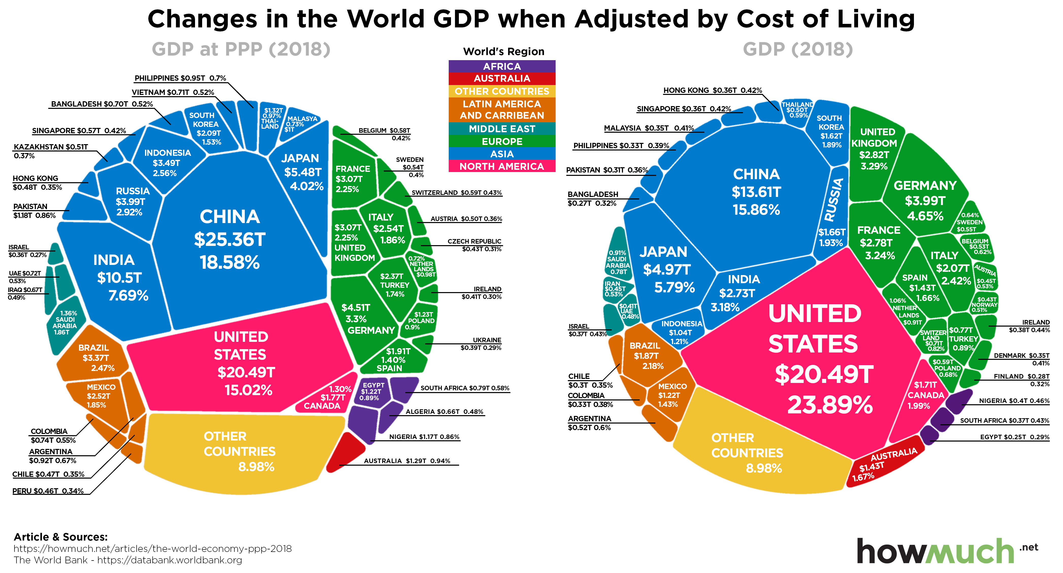
Based on this metric, we can see that the United States economy has grown every year since the Great Recession, though some think it may finally be slowing. Interestingly, when you look at GDP adjusted for purchasing power, China surpasses the U.S. China’s low cost of living drives the base $13.61 trillion to $25.36 trillion.

Those Who Feed Us Tend to Come From Developing Economies

These next three graphics visualize the importance of three sectors in the world’s economy.

Above, you can see that agriculture plays a surprisingly small role in the world economy, accounting for only 3% of the world’s GDP. Developed nations with powerful economies tend to depend less on the agriculture industry than underdeveloped countries around the world.

Does Dominating Industry Get You Ahead?

Industry plays a much more substantial role in the world economy than agriculture. This sector accounts for a significant 25% of the world’s GDP and is particularly important in developing countries.

In general, industry as a share of total GDP is highest in the Middle East, East Asia, and sub-Saharan Africa.

Or We Reward Service Based Economies?

The services industry is by far the largest contributor to the world’s economy. Services account for at least 50% of the GDP in over half of the world’s countries and about 65% of the world’s GDP.

Services as a percentage of GDP is generally highest in developed nations, such as the United States. In the U.S. services account for an astounding 77% of the GDP.

The Largest Recipients of Investment

Countries with large budget surpluses have to find something to do with their extra cash. Since domestic investment opportunities are limited, many countries turn to foreign direct investments (FDI). These are investments made in companies located in foreign nations.

China and the United States are, by far, the biggest beneficiaries of FDIs. These investments are generally a good thing as they contribute to job growth in the nations receiving these investments.

Also Invest in Their Future

Research and development (R&D) is seen by many as a great indicator of long-term economic strength. Investing in R&D allows countries to make meaningful advances in important sectors, which allows these countries to improve their economies. This can include anything from artificial intelligence to agriculture.

Unsurprisingly, countries with high GDPs spend more on research and development than other nations. The U.S. and China, in particular, spend far more on R&D than any other country in the world.

Not All Giant Economies Have Secure Economic Stability

A high GDP isn’t always indicative of a strong economy. Hard data such as economic indicators, security, strength of factions, and other indicators are used to measure the fragility of economies around the world.

While China and the U.S. are the world’s largest economic powerhouses, neither country makes it into the top 10 most stable countries in the world. Instead, this list is dominated by European nations such as Finland, Norway, and Switzerland. Meanwhile, many of the world’s most unstable economies are found in Africa.

Yet, Countries With Minimal Economies Tend to Suffer Extreme Poverty

Lastly, extreme poverty is often used as a metric to measure quality of life in countries around the world. While we often focus on the wealth of the world’s nations, it’s just as important to understand how much of the world’s population is living below the international poverty line.

The United States has a fairly low extreme poverty rate, as does China, England, Japan, and many other major economies. Meanwhile, in countries like Somalia, the majority of the population is living under extreme poverty.

The world economy is very complex and interconnected. While the world economy may be dominated by a select few countries, every country plays an important role in the development of the global economy. By examining these 10 visualizations, we can see how the world economy has performed throughout history and where it might be going next.

So what really drives the global economy? Does investment in a country payoff, or is it wasted spending? Let us know your thoughts.

Charted: These U.S. Jobs Have the Biggest Paychecks in 2019

$
0
0

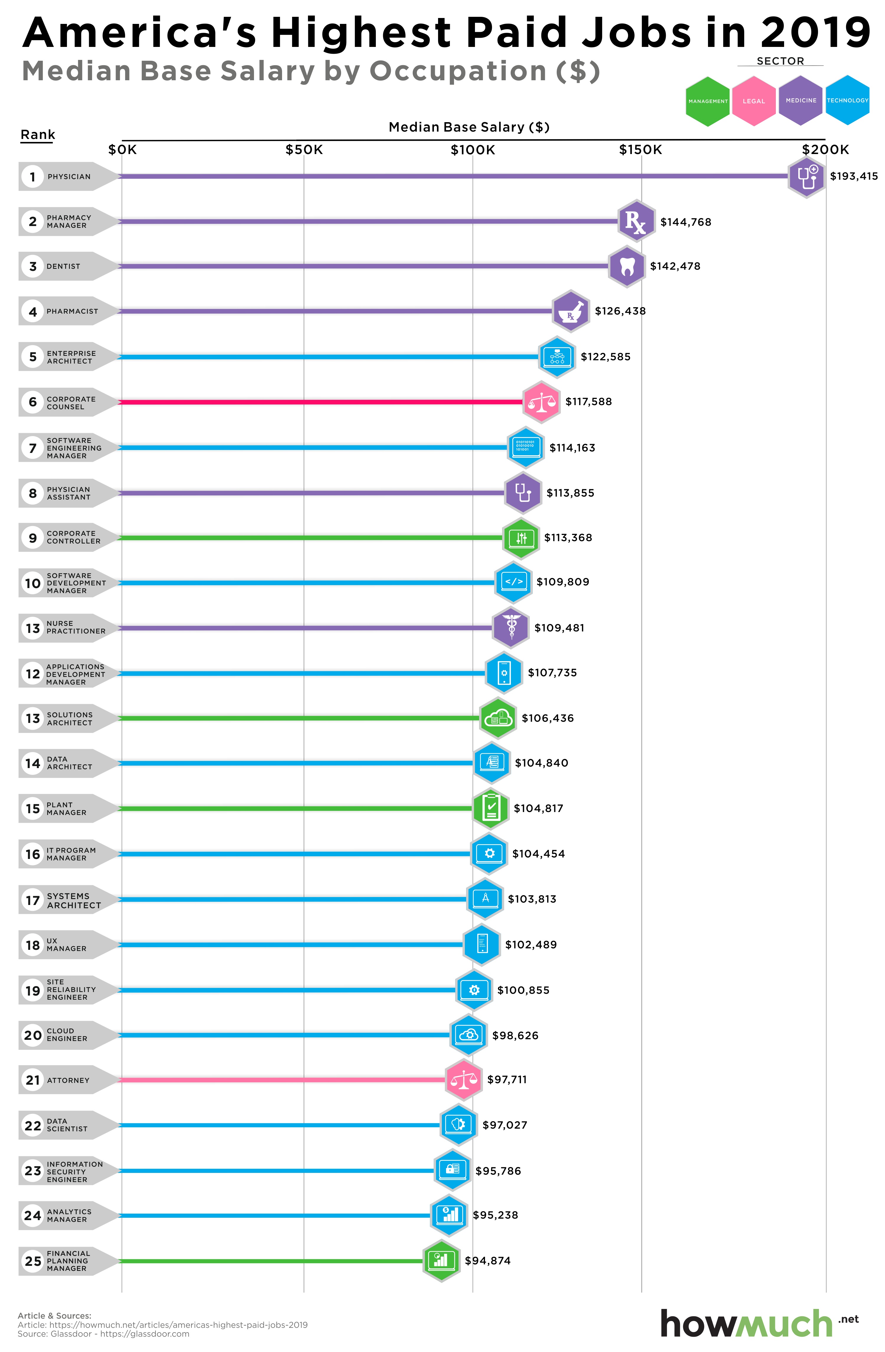
You may have heard growing up that the path to a good salary was to become a doctor or a lawyer. It turns out that this conventional wisdom is right—at least partly. Our new visualization uses the most recent data from Glassdoor to illustrate the highest-paying jobs nationwide, based on median salary.

  • Most of the highest-paying jobs are in the medicine or technology industries. Notably, five of the top ten occupations by salary are related to healthcare. 
  • While physician ranks highest on the list, the median pay for this occupation is down compared to last year ($195,842 vs  $193,415).
  • Seven of these top ten lucrative careers, especially those related to medicine and law, require a graduate degree. The technology and management roles are also likely to require a college education and/or many years of experience before reaching top dollar.
  • Demand for these occupations also varies significantly. According to Glassdoor’s data from August 2019, there were 17,572 job openings for nurse practitioners, but only 299 for corporate controllers.

The information for this visualization comes from Glassdoor’s 25 Highest Paying Jobs in America report. The report’s methodology relies on data shared by U.S. employees about their compensation, collected from the period of July 2018 to June 2019. All job titles included in the final report received at least 100 salary reports during this time period. To calculate a median base pay that took into consideration factors such as location and seniority, Glassdoor used a proprietary statistical algorithm, grouped similar job titles, and eliminated C-suite level jobs from the analysis.

Our visualization charts each of the top 25 occupations by median base salary, with the highest salaries on the top and the lowest salaries on the bottom. The longer the line on the graph, the  higher the median salary. The colors also correspond to the occupation’s relevant industry, broken out into medicine, management, technology, and law.

Top 10 Highest-Paid Occupations by Median Base Salary

1. Physician: $193,415
2. Pharmacy Manager: $144,768
3. Dentist: $142,478
4. Pharmacist: $126,438
5. Enterprise Architect: $122,585
6. Corporate Counsel: $117,588
7. Software Engineering Manager: $114,163
8. Physician Assistant: $113,855
9. Corporate Controller: $113,368
10.Software Development Manager: $109,809

These jobs might pay a lot of money, but is job stability at risk if a global slowdown strikes? Maybe. The U.S. unemployment rate is still at record lows, but the number of job openings nationwide is starting to slow down. Some occupations, such as factory workers, are especially vulnerable to layoffs as the trade war with China drags on. The threat of automation also looms large, as robots are poised to replace the jobs that are highly reliant on technology (a significant portion of the top 25 list). However, jobs that require human interaction, such as those in healthcare, management, and education, are far less likely to be replaced by robots

How do you think broader economic or technological trends will affect salaries and job demand? Do you think the highest-paid jobs will change over the next decade, and why? Please let us know in the comments.

Data: Table 1.1

Visualize the Top 25 Private Cloud Companies in the World

$
0
0

Cloud computing is changing the economy and transforming the way millions of people work, and private companies with multibillion dollar valuations are at the forefront of the disruption. Our latest visualization reveals the top 25 private cloud companies.

  • Stripe takes the top spot in the Forbes Cloud 100 ranking with $785M in private funding and 2,000 employees.
  • Illumio is the smallest company in the top 25 with only 325 employees.
  • UiPath achieved the most private equity funding at $1.1B, followed by Snowflake at $920M.
  • MailChimp is the only company in our visualization that has never taken any money from outside investors.

The data come from the Forbes Cloud 100, recognizing the best private cloud companies in the world. The ranking takes into account growth, sales, valuation and culture, including both large and small companies. The figures were accurate as of early September, 2019. In the weeks since then, Stripe raised another $250M, pushing its total raised well over $1B. We plotted the top 25 according to Forbes, showing their funding and colored it according to the number of employees who work there.

Top 10 Cloud Companies & Their Funding Levels 

1. Stripe: $785M
2. Snowflake: $920M
3. UiPath: $1.1B
4. HashiCorp: $174M
5. Datadog: $148M
6. Procore: $250M
7. Tanium: $800M
8. InVision: $350M
9. Rubrik: $553M
10. Confluent: $206M

What does it mean to be a “cloud” company? It means the business makes money from software or data accessed over the Internet. The Forbes Cloud 100 are disrupting a variety of different industries, from data and analytics to finance and payments, security to technical infrastructure and vertical software. The odds are that most people have interacted with at least a few of these companies.

Our visualization reveals two clear trends in the Forbes Cloud 100. First, the high-ranking companies tend to raise the most money. The top three, Stripe, Snowflake and UiPath, have raised a combined total $2.81B. Compare that to the three companies on the far right of our visual, Segment, Vlocity and Illumio raised a combined $780M. That’s still a lot of money, but only a select few are achieving skyhigh funding and valuations.

The second trend is that high-ranking companies in the top 25 tend to employ more people than lower ranking companies. UiPath puts 3,200 people to work, making it the largest employer in the top 25. Meanwhile, only 325 people work at Illumio. That being said, the fact that these are all cloud companies means that they don’t need tens of thousands of workers to make a big impact. Economies of scale and the Internet allow these companies to raise hundreds of millions of dollars without a large employment footprint.

How do you think cloud computing will change the economy? Will the U.S. lose or gain jobs in the coming years thanks to cloud computing? Let us know in the comments.

Data: Table 1.1

A Snapshot of Worldwide Wheat Exports

$
0
0

Agricultural production is one of the mainstays of the economy, accounting for 3% of the world’s GDP and almost 30% of global employment. One of the most widely grown crops in the world is wheat, which can be used to make products such as bread, alcohol, and baked goods. Our new visualization reveals which countries are responsible for the most wheat exports in 2018.

  • The total value of worldwide wheat exports was $41.1 billion in 2018. 
  • The value of worldwide wheat exports decreased from $49.2 billion in 2013.
  • By continent, Europe has the greatest share of the world’s exports, at 34.4%. Africa has the least, at 0.1%.
  • The top third exporting countries--Russia, Canada, and the U.S.--are responsible for almost half of wheat exports (47.65%).

The information for this visualization comes from the International Trade Centre, which details the statistics for each country that exports wheat and meslin. Our visualization is a map of the world, in which each country is represented by a circle corresponding to its wheat exports. The higher the value of wheat exports, the larger the circle. In addition, the color of each circle corresponds to the country’s share of worldwide wheat exports, with darker shades of brown representing lower percentages and lighter shades of brown representing greater percentages. All values are expressed in U.S. dollars.

Top 10 Wheat-Exporting Countries

1. Russian Federation: $8.4 billion, 20.51% of world exports
2. Canada: $5.7 billion, 13.87% of world exports
3. United States of America: $5.5 billion, 13.27% of world exports
4. France: $4.1 billion, 10.04% of world exports
5. Australia: $3.1 billion, 7.54% of world exports
6. Ukraine: $3.0 billion, 7.31% of world exports
7. Argentina: $2.4 billion, 5.88% of world exports
8. Romania: $1.2 billion, 2.98% of world exports
9. Germany: $1.2 billion, 2.84% of world exports
10. Kazakhstan: $965 million, 2.35% of world exports

Even though wheat exports are dominated by only a few countries, that doesn’t mean that agriculture isn’t important to other countries’ economies. For example, Brazil, Vietnam, and Germany collectively grow almost a third of the world’s coffee. For some countries such as Venezuela, exporting agricultural products is the only way to survive in troubled economic times. 

Aside from influencing individual countries’ economies, agriculture can be a catalyst for environmental change. Agriculture has led to many negative consequences for the environment, such as deforestation, pollution, and soil damage. However, some say that investing more in sustainable agriculture such as regenerative growing practices is the way to go if we want to combat climate change. As the world’s population continues to grow and resources become more constrained, innovative farming practices will become even more of a necessity.

Given constant changes in the economy and environment, how do you think wheat production will change over time? Please let us know in the comments.

Data: Table 1.1 


Mapping the Population of Global Millionaires in 2019

$
0
0

More millionaires live in the U.S. than any other country in the world, and it’s not even close. That’s according to the 2019 Global Wealth Databook by Credit Suisse. Here’s how the U.S. compares to the rest of the globe.

  • The U.S. has 18.6M millionaires, more than any other country in the world.
  • Europe has more millionaires than Asia, with the U.K. (2.5M) leading the continent followed closely by Germany (2.2M) and France (2.1M).
  • China (4.4M) is home to the most millionaires in Asia, followed by Japan (3.1M).
  • South America (673K) and Africa (171K) are almost entirely missing from our map because so few people are millionaires in those places.

The numbers behind our map come from the 2019 Global Wealth Databook by Credit Suisse. You can read about the researchers’ detailed methodology in the report itself. We created a map using one dot to represent 1,000 millionaires, color-coding each country by continent. Credit Suisse grouped a number of countries with a small number of millionaires together under “other” and we placed them in the top right corne. This lets you easily and quickly see where millionaires live, and where they don’t, providing a snapshot of global wealth.

Top Countries Where the Most Millionaires Live

1. U.S.: 18,614K
2. China: 4,447K
3. Japan: 3,025K
4. United Kingdom: 2,460K
5. Germany: 2,187K
6. France: 2,071K
7. Italy: 1,496K
8. Canada: 1,322K
9. Australia: 1,180K
10. Spain: 979K

For starters, the United States has by far the most millionaires of any country in the world, with over 18 million people. That’s more than four times as many as second-place China. And just like how millionaires tend to come from some countries and not others, they also tend to live in some states, especially young millionaires. In any case, there’s no doubt a lot more rich people in America than anywhere else in the world.

That being said, there’s no shortage of millionaires in Europe and Asia. The U.K. (2,460K) is home to more millionaires than any other country in Europe, followed closely by Germany (2,187K) and France (2,071K). Eastern Europe is noticeably small with only a handful of countries making it onto our map. Russia is tiny (246K). Keep in mind our map doesn’t adjust for the size of a country’s population. Japan (3,025K), South Korea (741K) and Taiwan (528K) therefore appear much bigger than they do on a physical map, indicating just how wealthy these developed countries have made some people.

There are two continents almost entirely missing. South America only has two countries appearing on the map, Colombia (27K) and Chile (64K). Africa only contributes one in South Africa (46K). In fact, an enormous portion of the world’s population still lives in extreme poverty, and our map illustrates the stark wealth inequality between developed countries and everywhere else.

Why do you think the U.S. has so many rich people? Let us know in the comments.

Data: Table 1.1

Mapped: How Much You Need to Retire Comfortably in Each State

$
0
0

Having enough savings to afford a comfortable retirement has been an issue for a long time now. In fact, some economists have recently estimated that millennials will face even a harder challenge and should save almost half of their income if they wish to retire at 65. However, the good news is that some parts of the country are friendlier on the wallet than others when it comes to retirement. Our newest visualization shows the average amount that a person will need to retire comfortably in each state, as well as the average retirement age by state.

  • The average retirement age in the U.S. is 64 years old. At the state level, the average retirement age varies from 61 years old in Alaska and West Virginia to 67 years old  in Washington, D.C.
  • The average life expectancy nationwide is 78.6. Among the states, Mississippi has the lowest life expectancy at 74.5, and Hawaii has the highest life expectancy at 81.5.
  • Nationwide, the average yearly expenses for someone over the age of 65 is $51,624. Mississippi has the lowest annual expenses at $44,758, while Hawaii has the highest annual expenses at $99,170.
  • Taking into account life expectancy as well as yearly expenses, the average savings required for retirement in the U.S. is $904,452. States in the Northeast and the West require the highest savings for retirement, at over $1 million, while states in the South and the Midwest require the lowest savings. 

The yearly figure needed for retirement comes from the Bureau of Labor Statistics 2018 Consumer Expenditure Survey. The expenditures considered were those of the age group "65 years or more," since this is the usual age range for retirement. To account for a comfortable retirement, we added an extra 20% on those expenses, and then adjusted by each state’s cost of living index as published by the MERIC. To obtain the total amount required for a comfortable retirement, we used IHME-based life expectancy figures published by National Geographic. Then, by subtracting the average retirement year published on MoneyTalks to the previous figure and multiplying it by the state-adjusted yearly expenditures, we obtained the total amount required for a comfortable retirement.     

The map of the U.S. synthesizes and illustrates all of the above data. Each state is colored a shade of pink, with darker shades corresponding to higher savings needed for retirement. Each state also has a purple circle with the average retirement age in that state, with larger circles corresponding to older retirement ages. 

Top 5 Most Expensive States for Retirement

1. Hawaii: $1,844,556, average retirement at 66 years old 
2. California: $1,456,286, average retirement at 64 years old 
3. New York: $1,408,121, average retirement at 64 years old 
4. Alaska: $1,341,805, average retirement at 61 years old 
5. Oregon: $1,335,752, average retirement at 63 years old 

Bottom 5 Least Expensive States for Retirement

1. Mississippi: $617,661, average retirement at 63 years old 
2. Tennessee: $660,870, average retirement at 64 years old 
3. Alabama: $712,832, average retirement at 62 years old  
4. Oklahoma: $723,859, average retirement at 62 years old 
5. Arkansas: $728,010, average retirement at 62 years old

Not surprisingly, states with higher life expectancies and higher costs of living (like Hawaii) require the highest retirement savings. However, regardless of where they live, most Americans are not saving enough in order to fund their retirement. Some think that the solution could be making saving mandatory, with the government stepping in to divert a certain percentage of an individual’s earnings to a savings or retirement account. Others believe taxing the rich more is the way to go in order to strengthen Social Security, which provides the primary source of retirement income for many Americans. In addition, focusing new policies on developing affordable housing for the elderly could alleviate financial pressures for retirees. 

What steps are you taking to save for your retirement, and what policies do you think should be put in place to help Americans retire comfortably? Please let us know in the comments.

Data: Table 1.1

Top 10 Hottest Stocks Since 2000: What if You had Invested $100?

$
0
0

Stock prices move up and down every day, but the very best companies bring value to their shareholders over the long term. Since 2019 is almost over, we wanted to understand the top 10 stocks so far this century. At least some of the companies making the list might surprise you.

  • Monster’s stock earns the top spot, where an initial investment of $100 would be worth $62,444 today.
  • Netflix ($23,071) and Apple ($7,416), two of the famous FAANG stocks, also make the top ten, but they aren’t nearly as valuable as the energy drink maker.
  • Other notable companies like Walmart and Berkshire Hathaway don’t make the top 10.
  • There’s a significant diversity of industries represented in the top 10, from consumer products and tech companies to retail and financial services.

Business Insider originally created a list of the top 10 best-performing stocks this century. We looked up the stock prices for each one on Yahoo Finance as of December 31, 1999, or the date the company went public, whichever was later. Imagine you invested $100. Our visual shows how much you’d have as of October 22, 2019.

Total Return (%) on $100 Investment

1. Monster Beverage: 62,444%
2. Netflix: 23,071%
3. Equinix: 12,050%
4. Tractor Supply Company: 10,171%
5. Intuitive Surgical: 9,155%
6. Ansys: 7,856%
7. Apple: 7,416%
8. IDEXX Laboratories: 6,822%
9. Mastercard: 6,279%
10. Ross Stores: 6,003%

Monster Beverage, the maker of the famous energy drink, takes the top spot by a landslide. An initial investment of just $100 on 12/31/1999 would be worth an astounding $62,444 today. That is substantially more than any other company in the top 10, including the tech heavyweights of Netflix ($23,071) and Apple ($7,416). Stock in Equinix and the Tractor Supply Company both returned over 10,000% over the last 20 years, quite an impressive accomplishment, but nowhere near Monster’s performance.

It’s also worth mentioning the significant diversity of companies present in the top 10. There’s no single sector that dominates the ranking. Monster is an energy drink company, Netflix is a streaming service, and Equinix provides data services. The other companies on our list are in things like medical supply, financial services and retail. This is more evidence that you shouldn’t invest your entire portfolio in just one industry.

And there are several notable companies missing from our list too. Where are the rest of the FAANG companies, Facebook, Amazon and Google? And what about other famous companies like Walmart, Exxon or Berkshire Hathaway? To be fair, some of these companies didn’t exist at the start of the century, and so perhaps they haven’t had enough time to rack up returns. It’s also worth noting that our methodology favors companies that started out with low share prices that ended very high. A single share of Berkshire Hathaway, for example, is worth well over $300,000. However, it’s still surprising that Walmart and Exxon are nowhere to be found.

And here’s a final question. Imagine you really did invest $100 in a company like Monster or Netflix all those years ago. Would you hold the investment for another 20 years? Or sell the shares immediately? Let us know in the comments.

Data: Table 1.1


Visualize the Entire World’s Wealth Inequality

$
0
0

Wealth inequality shows up in a variety of different ways. You can see it in the uneven distribution of millionaires around the world. You can find it in a series of maps we published this time last year, showing the average wealth per adult in each country in the world. And it’s the same story when you look at median wealth per adult around the world.

  • People living in developed countries remain the wealthiest in the world.
  • The Swiss are the richest with median wealth per adult at $227.9K.
  • Haiti is the poorest country in the world with an estimated median wealth of only $214 per adult.
  • Venezuela might be in worse shape, but given the economic instability, researchers could not provide an accurate estimate.
  • There’s no country on the African continent where median wealth exceeds $10,000 per adult.

The best way to compare levels of wealth around the world is by looking at median figures. A median number simply indicates that 50% of all people have more than that much money, and 50% have less. Our map visualizes the median total net worth per adult living in each country according to a new report from Credit Suisse. You can read the details of Credit Suisse’s methodology for yourself, including how the authors estimated the value of nonfinancial wealth. The result is a fascinating and nuanced portrait of global and regional wealth inequality.

Top 3 Countries in the Americas by Median Wealth per Adult

1. Canada: $107K
2. United States: $65.9K
3. Aruba: $21.8K

It’s no surprise that Canada ($107K) and the U.S. ($65.9K) are by far the wealthiest in the Western Hemisphere. One place that’s become measurably worse over the last year is Venezuela. The Venezuelan economy has almost entirely collapsed, destroying an untold amount of wealth. The country essentially has a worthless currency, and half of all the country’s transactions now take place in American dollars. People are now buying gasoline with cigarettes. It’s hard to see how things could get much worse.

Top 3 Countries in Africa by Median Wealth per Adult

1. Seychelles: $22.6K
2. Mauritius: $20.9K
3. Libya: $8.3K

Our map demonstrates how poor Africa is. There isn’t a single country on the continent where median wealth exceeds $10K. The only standout countries are island nations in the middle of Indian Ocean, where rich tourists and celebrities vacation.

Top 3 Countries in Europe by Median Wealth per Adult

1. Switzerland: $227.9K
2. Iceland: $166K
3. Luxembourg: $139.8K

Western European countries are clearly very wealthy, led by the Swiss. It’s an open question to what extent Swiss banking is responsible for increasing that country’s overall median wealth figures. Nevertheless, the contrast between West and East is stark. Ukraine, for example, only has $1.2K per adult, on par with many countries in Africa.

Top 3 Countries in Oceania by Median Wealth per Adult

1. Australia: $181.4K
2. New Zealand: $116.4K
3. Tonga: $19.7K

Australia and New Zealand are by far the wealthiest countries in Oceania. They are surrounded by islands with comparatively little wealth, like Fiji ($6.1K) and Vanuatu ($6.1K).

Top 3 Countries in Oceania by Median Wealth per Adult

1. Hong Kong: $146.9K
2. Japan: $110.4K
3. Singapore: $97K

Some countries in the Middle East are relatively wealthy given their abundance of oil, like Kuwait ($46.2K). Places connected to the global economy are the clear standouts in Asia, such as Hong Kong, Japan and Singapore. It will be very interesting to see where Hong Kong is on global wealth rankings next year. The recent protests have plunged the city into a recession.

It’s always helpful to balance these types of maps with a couple different ways of breaking down the cost of living. For example, how much does a pint of beer cost around the world? After all, it’s one thing to be wealthy on paper, but quite another to afford the types of things that make up a good life.

Given all this, where do you think the best place to live in the world is? Let us know in the comments.

Data: Table 1.1

In One Chart: Where Do State Tax Revenues Come From?

$
0
0

The United States federal progressive income tax dates back over 100 years, to the Revenue Act of 1913. Back then, the U.S. received most of its tax revenues from tariffs. Many states have followed the federal government’s lead in collecting a progressive state tax income. Today, income tax is one of the many ways that states collect tax revenue, but some wonder whether today’s variety is actually regressive.

  • States collected just over $1 trillion in tax revenues in 2018.
  • The federal debt has grown to $23 trillion, from $13 trillion in 2010.
  • The Treasury is on pace to borrow more than $1 trillion during the current fiscal year. 
  • Democratic presidential candidate Elizabeth Warren has proposed 2% annual tax on wealth over $50 million and a 6% tax on wealth over $1 billion. 
  • Warren claims the wealth tax would raise $3.75 trillion over the next decade, but critics point to economic and constitutional challenges.

Our data is 2018 state tax revenues for all 50 states by category as reported by the United States Census Bureau’s Annual Survey of State Government Tax Collections. Each category and its sub-categories are color-coded and plotted to scale on the viz. 

Top 5 Tax Revenue Sources for State Governments

1. Income taxes: $440.3B (42.7% of total tax revenues)
2. General sales taxes: $317.4B (30.8% of total tax revenues)
3. Selective sales taxes: $165B (16% of total tax revenues)
4. License taxes: $57.4B (5.6% of total tax revenues)
5. Property taxes: $20.1B (1.95% of total tax revenues)

The single largest category of revenue is individual income, followed by general sales. Income taxes paid by corporations fall at a distant fourth. With wages and purchasing power barely budging in years, and a federal debt that has risen to $23 trillion, from $13 trillion in 2010, many are calling for a reconsideration of how the government collects revenue. The Treasury is on pace to borrow more than $1 trillion during the current fiscal year — what sources are available to close the gap?  

A particularly aggressive strategy to drive revenues from the wealthiest individual comes from Democratic presidential candidate Elizabeth Warren, whose proposed wealth tax would set a 2% annual tax on wealth over $50 million and a 6% tax on wealth over $1 billion.

However, even with a Democratic-controlled presidency and Congress, the wealth tax faces a bevy of technical and constitutional challenges, as it’s unclear exactly how total wealth would be measured. Warren claims that her wealth tax can successfully fund providing Medicare for all citizens without raising taxes on the middle class, but billionaire investor Ray Dalio foresees taxes increasing regardless, as mounting debts and liabilities must ultimately be paid

Recently, Microsoft co-founder Bill Gates has voiced concerns about that Warren’s wealth tax would stifle entrepreneurial risk-taking: “You really want the incentive system to be there, and you can go a long way without threatening that,” Gates said. However, Warren has stood her ground on the tax, even offering Gates via Twitter to personally meet and explain how the tax would affect him.

Other potential sources of additional federal tax revenue suggested by presidential candidates include a gas tax and a value added tax.

Do you support the Warren wealth tax plan? Why or why not? What other ways could the federal government close the spending gap? Let's us know in the comments and share with your friends.

Data: Table 1.1

Viewing all 687 articles
Browse latest View live