Quantcast
Channel: howmuch.net
Viewing all 687 articles
Browse latest View live

lllustrating the Credit Card Debt Burden in All 50 States

$
0
0

Total private and public debts in the U.S. have hit an all-time high $70 trillion. One contributor, fueled by high interest rates and expanding services, is credit card debt. Per capita credit card balances top $3,000 in the U.S., with the most expensive states to live in impacted the most.


  • Credit card interest rates have hit a 25-year high, with average rates at 17%
  • Growing technological adoption has also contributed to push credit card debt per capita in the U.S. to $3,200
  • Alaska, the District of Columbia and Hawaii lead the nation in credit card debt balances
  • Mississippi, West Virginia and Kentucky are the states with the lowest credit card burdens

The data comes from the Federal Reserve’s New York branch, which puts out quarterly reports on household debt and credit for all 50 states. Our viz shows credit card debt balance per capita by state as of Q4 2018. A darker shade of blue indicates a higher debt load.

The Top 5 Credit Card Debt Balances by State (Compared to National Average)

1. Alaska: $4,350 (135.09%)
2. District Of Columbia: $4,180 (129.81%)
3. Hawaii: $4,060 (126.09%)
4. New Jersey: $4,040 (125.47%)
5. Maryland: $3,910 (121.43%)

The Lowest 5 Credit Card Debt Balances by State (Compared to National Average)

1. Mississippi: $2,110 (65.53%)
2. West Virginia: $2,240 (69.57%)
3. Kentucky: $2,330 (72.36%)
4. Arkansas: $2,410 (74.84%)
5. Alabama: $2,420 (75.16%)

Despite overall low interest rates, credit card rates have hit a 25-year high, with average interest rates at 17%. At the same time, total consumer debt in the exceeded $4 trillion for the first time, a figure which includes credit card debt.

Key players in the credit card industry have seen impressive gains with the rise in credit card debt. Card spending at JPMorgan rose 11% in the last quarter. Shares of Mastercard and Visa, the largest card processors, have risen 47% and 37%, respectively, in 2019, compared with an increase of about 20% for the S&P 500.

Credit card spending continues to rise with the ever-growing presence of online commerce, which increased by 15% in 2018 alone. Purchasing from anywhere on earth has never been easier, but paying for it is another story - 70% of U.S. consumers admit they wouldn’t be able to pay their credit card debt off in a year. 

Debt loads vary across the U.S., with overall cost of living a large factor. The states with the highest credit card burdens, Alaska and Hawaii, are some of the most expensive states to live in, and Washington DC is one of the most expensive cities to live in. 

What’s next in the credit card market? While ecommerce and mobile payments show no signs of slowing, a new competitive landscape may be forming: Apple has recently launched its own credit card, and cryptocurrency lender Nexo has recently launched a crypto credit card, complete with MasterCard branding.

How has credit debt affected people in your state? Are higher credit card rates leading you to use debit instead? Are you interested in the Apple Card? Let us know in the comments.

Data: Table 1.1 


The World’s $86 Trillion Economy Visualized in One Chart

$
0
0

The world’s GDP still grew a healthy 6.9% in 2018, up from $80.2 trillion in 2017 to $85.8 trillion. Nearly half of this growth came from the world’s two largest economies: the United States, at $20.5 trillion (up 5.4% from 2017), and China, at $13.6 trillion (up 10%). However, fear of a global recession are mounting -- much of it related to growing economic tension between the two leading economies.

  • The United States is still the world’s largest economy, contributing 23.9% to GDP
  • China, the world’s second largest economy, had its slowest quarterly GDP growth in nearly 30 years 
  • Half of economists in a recent poll have predicted an economic slowdown in the U.S. within the next year
  • Unresolved trade tensions between the U.S. and China have investors on edge about global economic growth

Our data comes from the World Bank’s 2018 global GDP figures. Each country is sized to the scale of its relative GDP. Countries are grouped and colored by region. For a look at how things have changed since 2017, check out HowMuch’s 2017 analysis of world GDP. 

The World’s 10 Largest Economies by GDP

1. United States - $20.49  trillion (23.89%)
2. China - $13.61  trillion (15.86%)
3. Japan - $4.97  trillion (5.79%)
4. Germany - $4 trillion (4.66%)
5. United Kingdom - $2.83  trillion (3.29%)
6. France - $2.78  trillion (3.24%)
7. India - $2.73  trillion (3.18%)
8. Italy - $2.07  trillion (2.42%)
9. Brazil - $1.87  trillion (2.18%)
10. Canada - $1.71  trillion (1.99%)

The United States and China together make up nearly 40% of the global economic GDP at $20.5 and $13.6 trillion, respectively, contributing that’s 23.9% and 15.9% to the global economy. Due to their prominence and their growing tensions, our analysis focuses on these two countries. 

About half of the 280 business economists polled by the National Association for Business Economics said they expect a downturn in the United States economy by the end of next year, and analysts at both Goldman Sachs and J.P. Morgan see growth slowing to below 2 percent in the second half of 2019. What’s the reason for the expected downturn? Economists point to a number of factors for the expected slower growth. The job market, which has thrived in this economy, is still hot but has signs of slowing. Expected interest rate hikes from the Fed are also at play. There’s also the factor of growing economic inequality in the U.S. -- the bottom half of Americans lost $900 billion in wealth between 1989 and 2018 -- and its impact on overall economic well-being.

But the factor making the most headlines is the impact of tariffs and the possibility of a trade war between China and the U.S. The number two economy is already feeling the impact: China’s GDP growth in the second quarter slowed to 6.2%, the smallest gain since 1992. The country’s industrial output growth slowed to 4.8% in July from a year earlier, the weakest pace since February 2002. It’s uncertain that the United States and China will overcome their trade differences anytime soon, and the markets seem to suggest a long-term impasse. Despite these signs of gloom, some economists aren’t so sure that decline is inevitable, citing decades-long periods of stable growth in countries like Australia and the UK.

What surprised you about contributions to GDP from countries or regions? Do you think the U.S. or China is headed for a recession? How will this affect the global economy as a whole? Let us know in the comments. 

Data: Table 1.1

Comparing The World’s Top Currencies Around the World

$
0
0

Money makes the world go ‘round. But, which currencies and assets make up most of the money supply? To find the answer, it takes a little more than looking at the total amount of currency in the world. The world’s money supply includes currency, cryptocurrency, precious metals, and any other liquid instruments circulating in the world’s economy.

To help get a better idea of the world’s money supply, we put together a visualization to show how much money is circulating throughout the world.

  • Central banks may be able to increase the money supply by cutting rates.
  • Gold is the largest contributor to the world’s currency at $8.7 trillion.
  • Cryptocurrency may stop central banks from altering the world’s money supply.
  • Changes in the money supply can have a significant impact on inflation and other variables of macroeconomics.

To find out how much money there is in the world, we took data from the FED and each country’s central bank. Using this data, we can see how much money is circulating in the world economy as well as which instruments contribute the most to the money supply.

The Most Valuable Currencies in Circulation

1. Gold: $8.7 trillion
2. U.S. Dollar: $1.7 trillion
3. Eurozone Euro: $1.3 trillion
4. Silver: $1.1 trillion
5. China Renminbi: $1 trillion

The answer to the question, “How much money is in the world?” is a little bit more complex than you might think.

Money supply refers to the total amount of money in circulation at any given point in time. Banks work off the fractional banking system. The system allows banks to hold less on hand for withdrawal. They can then lend out the remainder. The amount they can lend out relative to what they keep on hand is known as the deposit multiplier.

When looking at this through a narrow lens, we might only consider the world’s currencies as part of the money supply. However, in a broader sense, we can consider other instruments, such as precious metals and cryptocurrency, as part of the money supply.

Looking at it through this broader lens, we can see that the world’s money supply is dominated by gold and the U.S. dollar. And, perhaps to some people’s surprise, the cryptocurrency, Bitcoin, has become one of the largest contributors to the world’s money supply.

Recently, due to major concerns regarding future economic growth, central banks around the world have been cutting interest rates in order to avoid a downturn, which increases the money supply. Increased supply lowers interest rates. This makes borrowing for investment more lucrative to businesses, but hurts savers.

It’s important to be able to understand and analyze the money supply as it can have a significant impact on macroeconomics around the world.

Understanding the state of the world’s money supply is not only interesting, but it can also help us protect against downturns in the world economy. It helps you understand what central banks do and why they do it.

Are you concerned about the state of the world economy? How do you think cryptocurrency will impact the world’s finances in the future? Let us know in the comments below.

Data: Table 1.1

Mapping Out Mortgage Debt Across the U.S.

$
0
0

Owning a home is a major life milestone for many Americans. In order to afford a home, most people will need to take out a mortgage and pay it off over time. Mortgage debt has hit a new peak since the 2008 financial crisis, rising to $9.406 trillion in Q2 2019. Interestingly, residents of some states incur significantly more mortgage debt than residents in other states. Our latest visualization takes a closer look at how housing debt varies by state, as measured by mortgage balance per capita.

  • According to the New York Fed, the average mortgage debt per capita in the U.S. is $33.680. 
  • In general, states in the Northeast and the West have the highest mortgage debt per capita.
  • States in the South and Midwest tend to have lower-than-average mortgage debt per capita.
  • Washington D.C. has a mortgage debt per capita worth four times more than the mortgage debt per capita of West Virginia.

The data for this visualization comes from the New York Fed.  The mortgage information we used is from Q4 2018. In the map above, the size of each state is proportional to the amount of the mortgage debt per capita, with larger states representing higher mortgage balances. Similarly, states with higher mortgage balances per capita are shaded in dark orange or brown, and states with lower mortgage balances per capita are shaded in light orange.

Top 10 States with the Highest Mortgage Debt Balance Per Capita

1. District of Columbia - $63,430
2. California - $55,920
3. Hawaii - $54,980
4. Colorado - $53,250
5. Maryland - $51,590
6. Washington - $49,320
7. Virginia - $47,570
8. Massachusetts - $47,140
9. Utah - $43,310
10. Connecticut - $41,980

Despite rising mortgage debt, mortgage rates are close to historical lows. As a result, many homeowners are flocking to refinance their mortgages. Weekly mortgage refinances are skyrocketing, and retailers like Walmart are reaping the benefits of consumers spending the extra money in their pocket.

Although mortgage rates are low, they can’t compete with this brand new Danish mortgage proposal, in which banks will offer an interest rate mortgage of -0.5% a year. Yes, that is a negative number! In essence, this means that homeowners will pay back a lower amount than they were loaned. The effect of this new proposal on the Danish real estate market still remains to be seen.

If you are interested in purchasing a home or refinancing your mortgage, visit our cost guides for home loans or home refinancing. What do you think about recent changes in mortgage rates, or how mortgage debt varies by state? Please let us know in the comments section.

Data: Table 1.1

Ranking the Most Valuable Sports Teams in 2019: Is Your Team In?

$
0
0

We already know that professional sports is a major global industry, but not all sports franchises are equal. From the Dallas Cowboys to the New Orleans Saints, we put together a graphic to rank the top 50 most valuable sports teams around the world.

  • Traditional sports have large, dedicated fanbases, but eSports are on the rise. The forthcoming Fortnite Championship, for example, will have $10 million prize pool.
  • Though Football isn’t an international sport, Football franchises account for three of the top 10 most valuable sports teams in the world.
  • Pay gap issues continue to plague the sports industry and have come under additional scrutiny following the United States Women’s National Team World Cup win.
  • Several NBA teams have increased in value since last year. NBA franchises now take up nine spots in the list of top 50 most valuable sports franchises.

Every year, Forbes reveals its list of the world’s most valuable sports teams. We used this data to create an easy-to-read graphic demonstrating the world’s largest franchises.

Our graphic not only ranks the most valuable global sports teams, but also shows us the most valuable teams in each of the world’s major sports leagues, including the NFL, NBA, MLB, LaLiga, Premier League, and more.

Most Valuable Sports Teams in the World:

1. Dallas Cowboys: $5 billion
2. New York Yankees: $4.6 billion
3. Real Madrid: $4.24 billion
4. Barcelona: $4.02 billion
5. New York Knicks: $4 billion
6. Manchester United: $3.81 billion
7. New England Patriots: $3.8 billion
8. Los Angeles Lakers: $3.7 billion
9. Golden State Warriors: $3.5 billion
10. Los Angeles Dodgers: $3.3 billion

Despite not having won a championship in decades and not being a part of an international sports league, the Dallas Cowboys remain the world’s most valuable sports franchise at an astounding $5 billion.

But it’s not just the Cowboys. The NFL is the world’s most dominant league when it comes to the value of its franchises. More than half of the top 50 most valuable sports teams are football teams.

Aside from the NFL, the top 50 is made up mostly of the teams you would expect to see there, including major franchises like the New York Yankees, New York Knicks, Barcelona, Real Madrid, and more.

While traditional sports teams continue to dominate the sports industry, eSports is quickly rising in value and popularity. The Fortnite Championship Series, for example, will have more than $10 million in prize money up for grabs. It may not be too long before we see an eSports franchise take a spot on the list of most valuable sports teams.

By analyzing this graphic, we can get a better understanding of how much the world’s most popular sports teams are worth, and how much of an impact they have on the global economy.

Do you expect eSports to continue to increase in popularity, or do you think it’s just a fad? Are you surprised by any of the teams on this list? Let us know in the comment section.

Data: Table 1.1

Charted: The Companies Making the Most Money in 2019

$
0
0

Big companies around the world are reaping the benefits of a strong global economy, with many raking in hundreds of billions of dollars. Every year, Fortune Magazine publishes a ranking of the world’s largest companies by revenue. Our new visualization presents the top 100 companies to make the cut in 2019, including where the companies are located and which industries they represent.

  • Combined, the world’s top 100 companies generated more than $15 trillion in revenue.
  • There are 17 countries represented in the top 100 companies. 
  • More than half of the world’s 100 most valuable companies are located in the U.S. (35 companies) or China (23 companies). 
  • The world’s 100 most valuable companies are spread across a variety of industries, with particularly strong representation in energy, motor vehicles, and financial services.

The information for this visualization comes from the Fortune list of Global 500 companies, as ranked by revenue (see the full methodology here). We illustrated the top 100 of these companies in the chart above, with each octagon representing one company. Within each octagon, we included the company’s logo, its revenue, and the country where it is located. The size of each octagon in the visualization is proportional to the company’s revenue, with the larger shapes representing higher revenues. In addition, each company is outlined in a color that represents its industry sector, such as energy, food and retail, and technology.

Top 10 Most Valuable Companies by Revenue

1. Walmart - U.S. - $514 billion
2. Sinopec Group - China - $415 billion
3. Royal Dutch Shell - Netherlands - $397 billion
4. China National Petroleum - China - $393 billion
5. State Grid - China - $387 billion
6. Saudi Aramco - Saudi Arabia - $356 billion
7. BP - Britain - $304 billion
8. Exxon Mobil - U.S. - $290 billion
9. Volkswagen - Germany - $278 billion
10. Toyota Motor - Japan - $273 billion

According to Fortune, overall revenue for the Global 500 grew 9% compared to the year before. Decreases in national corporate taxes have been noted as a reason for higher revenues within U.S. companies, although the federal government is also bringing in less tax revenue as a result of the new tax policy. Earlier this year, analysts also predicted that even though U.S. companies were bringing in higher revenues, they could experience lower profit margins due to increases in cost for labor and raw materials. 

In addition, tariffs are having an impact on companies in the U.S. and around the world. Some new international tariffs such as the French digital services tax will not only affect company profits, especially in Silicon Valley, but they will also affect revenue. Furthermore, some economists suggest that Trump’s “America First” policies are discouraging foreign companies from investing in their U.S. operations. Big companies will be keeping a close eye on these policy developments to see how they will affect their bottom lines.

Did any of the companies on this list surprise you? Please let us know what you think in the comments.

Data: Table 1.1

Mapping International Trade: Who Are the Biggest Exporters?

$
0
0

Exports are a major aspect of international trade. Countries around the world can bolster their economies by selling their resources and consumer goods to other nations around the world. Developing and developed countries both export products around the globe.

But which countries lead the global economy in exports? We constructed a helpful visualization to find out which countries are the largest exporters in the world. You may be surprised at the results.

  • China is still, by far, the largest exporter in the world. The country exported a total of $2.5 trillion worth of goods in 2018.
  • The largest U.S. export industries include food and beverage, crude oil, civilian aircraft, auto parts, and industrial machines.
  • The United States and China are part of an ongoing trade war, which could significantly affect the world export industry.
  • Collectively, the European Union has the largest export industry — exporting $6.5 trillion worth of goods in 2018.

We gathered our data from the World Trade Organization, which tracks the total value of all the goods each country exports. Keep in mind that this data does not include services, only physical goods.

To make the map easier to read, we shaded each country based on the total value of their exports. Some countries that have minimal exports were excluded from our data

The World’s Top 10 Largest Exporters

1. China: $2.5 trillion
2. United States: $1.7 trillion
3. Germany: $1.6 trillion
4. Japan: $738 billion
5. Netherlands: $723 billion
6. South Korea: $605 billion
7. France: $582 billion
8. Hong Kong: $569 billion
9. Italy: $547 billion    
10. United Kingdom: $486 billion

Perhaps the most notable insight from this data is how much the global export industry is dominated by just a few countries. China is, by far, the largest exporter in the world, beating the United States by about $800 billion. China is, by far, the largest exporter in the world, beating the United States by about $800 billion. China’s top exports include machinery, technology, furniture, plastics, and vehicles. Furthermore, the top three countries combined (China, the United States, and Germany) exported more than the next seven countries combined. Lastly, it’s important to consider the potential impact of the U.S. and China trade war on the global economy. Not only do China and the U.S. stand to lose a lot from this trade war, but so could other countries that rely on these countries as their major trade partners.

While a small handful of countries dominate the global export industry, every country in the world relies on exports to drive their economies. Our visualization helps us see which countries lead the global economy and just how much they are exporting on an annual basis.

How do you think these numbers will be affected by the China and U.S. trade war? If a country exports lots of goods do they have to import a lot to make goods, or can they source it locally? Compare this visualization with the largest importers here.

Data: Table 1.1

Mapping International Trade: Who Are the Biggest Importers?

$
0
0

Every country in the world relies on imports to bolster its economy. Imports allow consumers to buy and take advantage of products that may not be available in their own country. Your own home is probably filled with products imported from countries around the world.

Have you ever wondered how much your home country relies on imports to thrive? Check out our visualization to find out which countries spend the most on imports.

  • At $2.6 trillion, the United States is the world’s largest import country.
  • As the trade war between the world’s two largest importers (the United States and China) carries on, it’s yet to be seen how much of an impact it will have on these countries’ economies.
  • The European Union is, collectively, the world’s largest importer, sending $6.5 trillion on imports.

To create our graphic, we pulled the latest data from the World Trade Organization on international trade. The WTO records the total value of physical goods imported by each country. Using this data, we can see the total value of each country’s imports. For ease of use, we shaded each country relative to the total amount spent on imports.

The World’s Top 10 Largest Importers

1. United States: $2.6 trillion
2. China: $2.1 trillion
3. Germany: $ 1.3 trillion
4. Japan: $749 billion
5. United Kingdom: $674 billion
6. France: $673 billion
7. Netherlands: $646 billion
8. Hong Kong: $628 billion
9. South Korea: $535 billion
10. India: $511 billion

This map reinforces the importance of international trade for the global economy. From major economies, like the United States, to smaller countries like Cuba, every nation in the world dedicates a significant portion of its budget to importing products from other countries.

As demonstrated by the visualization, the United States remains the largest importer in the world with China close behind. This raises the question: How much of an impact will the U.S. and China trade war have on these statistics? The United States is China’s largest trading partner, but this trade war could have a major effect on the U.S. trade deficit with China. Not only will the trade war impact these countries, but it will likely have a ripple effect that impacts countries around the world.

It’s no secret that international trade is a critical factor in the growth of the global economy. By analyzing this map, we can understand the importance of international trade and how much each country relies on importing products from other nations. But are the biggest importers the same as the biggest exports? Check out our companion article on the biggest exporters here.

How much do you think the U.S. and China trade war will impact the global economy? Do you think this list will look different in 2020? Let us know in the comments.

Data: Table 1.1


America's Mortgage Debt Spiral Accelerates to All-Time High

$
0
0

Since the 1940s, housing prices have soared to new levels. According to the U.S. Census Bureau, the median home value in the U.S. was $30,600 in 1940 (adjusted for inflation). By 2017, that number was $193,500. Not surprisingly, as housing prices increase, so does the amount of mortgage debt that a homebuyer must take on in order to afford a home. Our new visualization takes a closer look at how mortgage debt in the U.S. has changed over time.

  • Outstanding mortgage debt is 284 times greater in 2018 than it was in 1949.
  • Total mortgage debt first exceeded $1 trillion in 1977.
  • From 2008 to 2012, during the height of the Great Recession, total mortgage debt in the U.S. actually decreased every year.
  • As a percentage, the largest increase in mortgage debt year-over-year occurred from 1949 to 1950, when mortgage debt increased by more than 50%.

The visualization is based on data from the Federal Reserve, which lists the amount of outstanding mortgage debt in the U.S. since 1949. The chart above represents a timeline of mortgage debt, shown in circle form. The top of the circle starts with 1949, and the years progress in a clockwise direction until 2018, the most recent full year. For each year, the amount of outstanding mortgage debt is represented by smaller, stacked dots, with each dot representing $400 billion. To give a more complete picture of how much mortgage debt has been accruing over the years, the dots are color-coded. Years with yellow dots mean that the total mortgage debt is under $1 trillion, while orange dots represent $1 trillion to $10 trillion and the red dots represent more than $10 trillion in mortgage debt.

Evolution of the Mortgage Debt - Every Five Years

1953 - $112 billion
1958 - $187.8 billion
1963 - $297.6 billion
1968 - $424.5 billion
1973 - $694.2 billion
1978 - $1.21 trillion
1983 - $1.94 trillion
1988 - $3.28 trillion
1993 - $4.18 trillion
1998 - $5.6 trillion
2003 - $9.37 trillion
2008 - $14.69 trillion
2013 - $13.34 trillion
2018 - $15.44 trillion

Even though the mortgage debt is the highest in history, long-term interest rates are close to historical lows. Prominent economists, like Paul Krugman, have warned about the current real estate market status. Mortgage demand, despite record-low rates, seems unable to grow since home prices are still out of reach for many Americans.

While mortgage rates in the U.S. are low, other countries like Denmark are giving homebuyers even more of a boost. A Danish bank is offering the world’s first negative interest rate, at -0.5% a year, meaning the mortgage holders will pay back a lower amount than they took out to purchase a home. It will be interesting to see how this affects the Danish real estate market in the long run. 

Learn more about the homebuying process with our cost guides for home loans or home refinancing. Please let us know in the comments what you think about these new developments in the real estate market.

Data: Table 1.1

Making Money, Moving Money: The World's Financial Services Exports

$
0
0

International trade has been in the news lately, with a growing standoff between not just the United States and China, but even the U.S. and Europe. The focus of these headlines is usually on trade in agriculture and physical goods, but trade in financial services matters too, and has its own looming issues.

  • Total global exports in financial services was $489.8 billion in 2018, up 5.6% from the prior year.
  • The United States and United Kingdom together make up 40% of the world’s financial services exports.
  • U.S. exports of financial services was at a record-high $113 billion.
  • The United Kingdom’s access to European Union financial markets after Brexit is uncertain.

In this post we look at the World Trade Organization (WTO)’s 2018 report on financial services exports. To find the data on the WTO dashboard, make sure to set “Type of trade” to “Trade in commercial services” and “Commodity/sector” to “financial services.” Each country is drawn to scale on the map based on the size of its financial services exports. A darker shade of green also indicates more financial exports. 

Top 10 Biggest Exporters of Financial Services

1. United States: $113.04 B (23.51%)
2. United Kingdom: $83.08 B (17.28%)
3. Luxembourg: $64.29 B (13.37%)
4. Singapore: $27.15 B (5.65%)
5. Germany: $24.40 B (5.07%)
6. Hong Kong, China: $23.73 B (4.93%)
7. Switzerland: $21.79 B (4.53%)
8. Ireland: $17.88 B (3.72%)
9. Japan: $11.47 B (2.39%)
10. France: $9.54 B (1.98%)

Together, the U.S. and the European Union (EU) make up almost exactly half of the world’s financial services exports. It’s an impressive statistic, but one that’s about to be made less so: the European Union figure includes the United Kingdom (UK), which at some point will be leaving the EU.  Traditionally a banking and finance powerhouse, the UK makes up over 17% of the planet’s financial services exports. Recently, the UK financial sector has benefitted from easy exposure to European markets as part of the so-called European single market.  With Brexit, the exact trading status between the UK and EU remains unclear, but the consensus is that this will negatively impact the UK financial sector. The consulting firm PricewaterhouseCoopers suggests that the UK financial market will lose between 7 and 12 billion British pounds due to Brexit in 2020. 

The UK isn’t the only financial market bracing for hits in 2019: the yield curve for US Treasury bonds recently inverted -- a traditional harbinger for recession. On top of that, the amount of negative-yielding debt now equals nearly a third of tradeable bonds worldwide, according to J.P. Morgan. These signs of a global slowdown are likely to accompany a reduced demand in financial services. 

On what terms will the UK leave the EU, and how will this affect its access to financial markets? Is the U.S. economy headed for recession? What would that mean for financial exports? Let us know your thoughts in the comments. 

Data: Table 1.1

Charting The Most Powerful Reserve Currencies in the World

$
0
0

Most people assume the U.S. dollar holds the top spot for currencies. But by how much? Have you ever wondered which of the world’s reserve currencies are the most powerful?

Reserve currencies are currencies that a country holds in its foreign exchange reserve. These can be used for international payments and to support a country’s own national currency. Developing countries that export tend to hold more foreign currencies than developed currencies. So which currencies top the list? We put together an easy-to-read visualization to find out more about the world’s top reserve currencies in 2019.

  • The U.S. Dollar makes up 61% of all central bank foreign reserves, making it the most popular and powerful currency in the world.
  • The total value of all currencies held in foreign exchange reserves is equal to nearly $11 trillion.
  • The U.S. Dollar also dominates the forex trading market and is involved in about 90% of all forex trading.
  • The Euro and U.S. Dollar make up over 80% of the world’s currency reserves.
  • Despite being a large part of global trade, the Chinese Renminbi makes up less than 2% of global currency reserves.

To find the top reserve currencies in the world, we pulled the latest data from the International Monetary Fund (IMF). This data is from the first quarter of 2019. This data accounts for the currency composition of all official foreign exchange reserves. Using this data, we created a helpful chart which can be used to easily identify the most powerful reserve currencies in the world as of 2019. Keep in mind that this data does not reflect unallocated reserves.

The World’s Top Reserve Currencies in 2019

1. U.S. Dollar: $6.74 trillion (61.82%)
2. Euro: $2.21 trillion (20.24%)
3. Japanese Yen: $572 billion (5.25%)
4. Pound Sterling: $495 billion (4.54%)
5. Chinese Renminbi: $213 billion (1.95%)

Reserve currencies play an incredibly important role in the world economy. Not only do these currencies affect the international economy, but they play an important role in the value of each country’s national currency.  As of 2019, the U.S. Dollar, Euro, and Japanese Yen are the most prominent currencies in the world with the U.S. Dollar leading the pack by a fair margin. Currently, around $580 billion U.S. Dollars are used internationally, 90% of forex trading involves U.S. bills, and about 40% of the globe’s debt is issued in this currency.  While some countries have called for the establishment of a singular global currency for stability purposes, there doesn’t seem to be any imminent plans to do so.

Reserve currencies run the world’s economy. By taking a look at our visualization, we can see which currencies are the most abundant and have the most influence on the global economy. Do you expect the U.S. Dollar to retain its dominance in the future? Is a global currency a good idea? Let us know in the comments.

Data: Table 1.1

Visualizing the Purchasing Power of the Dollar Over the Last Century

$
0
0

It’s no secret that $1 now will get you less than it would 100 years ago, but just how much has the purchasing power of the U.S. Dollar decreased over the years? To illustrate this, we created a visualization that demonstrates the rise and fall of the dollar since 1913. Using this graphic, we can see how inflation and changes in the Consumer Price Index have decreased the dollar’s purchasing power over the last century.

  • $100 in 1913 would only be worth about $3.87 today.
  • While the purchasing power of the dollar has gone up and down since 1913, it has never surpassed the purchasing power it had in 1913.
  • The purchasing power of U.S. citizens has always topped the charts, but that could be changing in the future.
  • Inflation impacts nearly all variables of macroeconomics, and many believe that current U.S. inflation levels are too low.

To create our visualization, we used data from the Bureau of Labor Statistics’ CPI Inflation Calculator. This calculator uses the Consumer Price Index for All Urban Consumers, which represents the changes in prices for consumer goods and services purchased by urban households.

By examining this data we can see how the purchasing power, or the total amount of goods and services that can be bought with one dollar, has changed since 1913. Additionally, we can see how recessions and major economic events impact our purchasing power.

What is $100 worth in 1913 over time?

1913: $100
1923: $57.89
1933: $76.15
1943: $57.23
1953: $37.08
1963: $32.35
1973: $22.30
1983: $9.94
1993: $6.85
2003: $5.38
2013: $4.25
2019: $3.87

Though there are outliers, the purchasing power of the dollar has steadily decreased since 1913. This is due to inflation and the continued increase of the Consumer Price Index over the years. As demonstrated by the data, dollar purchasing power has a negative correlation with the CPI. As the CPI increases, purchasing power of the dollar decreases over time.

Inflation is the constant rise in the prices of consumer goods and services over the years. As these prices continue to increase, the total amount of goods and services that can be purchased with a single dollar decreases.

Typically, sustained inflation occurs when the world’s money supply outperforms economic growth, which is why many people suggest that the world’s central banks must coordinate to maintain economic stability. This isn’t necessarily a bad thing. Controlled inflation provides stable growth environment in asset prices. This increases the value of homes and other real assets.

Recessions and major economic events can also affect inflation and the CPI. During a recession, the CPI often falls or increases at a slower rate due to the decreased demand for consumer goods and services.

By taking a look at our informative visualization, we can see how inflation and the increase in the Consumer Price Index have impacted our purchasing power over the years.

What do you think of this phenomenon? Is inflation necessary for economic growth? Let us know in the comments.

Data: Table 1.1

Which States Could Suffer the Most From Trade War Tariffs?

$
0
0

As the U.S. continues to impose tariffs on goods from China, and vice versa, both countries are raising the stakes of the ongoing trade war. The new 15% tariff on Chinese goods just kicked in, and Asian markets are already feeling the effects. But the U.S. economy is also affected by these ever-escalating tariffs. Our newest visualization takes a closer look at how much each state would be affected by export tariffs imposed by China.

  • Throughout the trade war from the past year, the U.S. imposed $250 billion in tariffs on imported Chinese products. China retaliated with $110 billion in tariffs against American exports. 
  • In absolute numbers, states on the West Coast, Gulf Coast, and Mid-Atlantic region stand to lose the most money as a result of these export tariffs. By contrast, states in the Midwest and Great Plains stand to lose the least amount of money.
  • Some state economies rely more on exports than others. For example, exports comprise 26.7% of Louisiana’s economy, compared to only 0.7% of Hawaii’s economy.
  • According to the U.S. Chamber of Commerce, half of all manufacturing jobs in the U.S. are dependent on exports, and one in three acres of American farmland is used for selling agricultural products to other countries.

The data from this visualization comes from a few different sources. We used calculations from the U.S. Chamber of Commerce to show the possible cost of tariffs, the Bureau of Economic Analysis to determine each state’s GDP, and the International Trade Commission to find the value of each state’s exports. In the map above, the color of each state represents the impact that export tariffs could have on the state, with lighter shades of pink representing lower impact and darker shades of red or brown representing greater impact. In addition, we used yellow circles to illustrate how much each state’s economy relies on exports; larger circles correspond to a higher percentage of exports as a percentage of GDP.

Top 10 States with Largest Possible Impact from Tariffs

1. California - $13.4 billion
2. Texas - $10.6 billion
3. Washington - 7.5 billion
4. Louisiana - $7.1 billion
5. Illinois - $5 billion
6. South Carolina - $3.9 billion
7. Alabama - $3.4 billion
8. Ohio - $3.2 billion
9. New York - $3.1 billion
10. Pennsylvania - $2.7 billion

The effect of this new chapter of the trade war is, as usual, spilling over to more markets and commodities, such as oil and Big Tech. The tariffs will affect more than just the large markets. In addition, consumers will note the effect of the new tariffs, since many everyday products will increase in price. Economists predict that American households will spend an extra $1,000 a year as a result of these tariffs. 

The U.S. and China have agreed to hold high-level talks in October to negotiate better economic conditions. This announcement is already having a positive impact on the stock market, but the question of whether or not tariffs will actually be reduced is still up in the air.

What do you think about the effect of tariffs on the U.S. economy? Please let us know in the comments.

Data: Table 1.1

The World's Pharma Trade: Which Countries Buy & Sell the Most Drugs?

$
0
0

The pharmaceutical industry is incredibly valuable and is continuing to grow. But just how much of the world’s imports and exports involve pharmaceuticals? To understand the impact of the pharmaceutical industry on the world’s economy, we created two visualizations to demonstrate pharmaceutical imports and exports by country in 2018.

  • The United States is, by far, the world’s biggest importer of pharmaceuticals at $99.7 billion.
  • As the opioid crisis in the United States carries on, pharmaceutical companies are being scrutinized, as was demonstrated in the Johnson and Johnson settlement.
  • Despite scrutiny, the pharmaceutical industry is continuing to grow at a rapid rate.
  • Pharmaceutical companies are being forced to pay hefty fines for their role in the opioid epidemic.

To create our visualizations, we pulled data from the World Trade Organization (WTO) on pharmaceutical imports and exports throughout the world in 2018. Using this data, we constructed two visualizations to portray the world’s largest exporters and importers of pharmaceuticals around the world. Each country’s pharmaceutical trade is represented by a pill. The larger the pill, the higher the value of exports or imports.

World’s Largest Pharmaceutical Exporters

1. Germany: $84.7 billion
2. Switzerland: $71.7 billion
3. United States: $49.7 billion
4. Belgium: $45.7 billion
5. Ireland: $40 billion

World’s Largest Pharmaceutical Importers

1. United States: $99.7 billion
2. Germany: $53.7 billion
3. Belgium: $36.7 billion
4. United Kingdom: $33.8 billion
5. Switzerland: $29.3 billion

The pharmaceutical industry accounts for tens of billions of dollars in international trade each year, much of which comes from Europe and the United States.

As the opioid crisis in the United States continues to rage on, it might not come as a surprise to see that the United States leads the world in pharmaceutical imports. While local and state governments are trying to hold Big Pharma responsible for its role in the opioid crisis, pharmaceutical companies aren’t concerned about U.S. drug regulations. Big Pharma is a massive industry and has plans to grow even more by targeting growing opioid markets in countries like India.

Though many people around the world are concerned about the growing demand for pharmaceuticals, this demand is fueling the growth of these massive pharmaceutical companies. As such, the industry is likely to continue playing a major role in the global economy in the coming years.

We all know the pharmaceutical industry has a major impact on the global economy. By analyzing our visualizations, we can get an even better understanding of how Big Pharma affects countries around the world.

Do you think we need more regulations on pharmaceutical companies? Why do you think pharmaceutical trade is dominated by the U.S. and Europe? Let us know in the comments.

Data: Table 1.1

Ranking the Economic Health of Every U.S. State in 2019

$
0
0

The United States economy is on the verge of its longest economic expansion on record, but appears to be headed for a slowdown. So, what’s next for the United States economy? In this article we blend several key economic indicators to gauge the current health of each state as the country heads into uncertain economic times.

  • Six out of ten Americans are expecting a recession in the next year, along with three out of four economists in the next two
  • Job growth is slowing across the nation along with modest wage increases
  • Western states and the District of Columbia lead states in economic performance
  • Alaska, Rhode Island and southern states among the worst states economically

For this visualization we create a radar chart for each state to compare the following economic statistics as compiled from the Bureau of Labor Statistics, the Census Bureau and the Bureau of Economic Analysis: Wage growth, unemployment, job growth, GDP per capita, GDP growth and average weekly wages, adjusted by state purchasing power parity. We then derive a z-score for each indicator and blend the z-scores to calculate a total score for each state. To read more about how z-scores work, check out this guide.

Top 5 Best Economic Performing States

1. District of Columbia 
2. Washington 
3. Utah 
4. Colorado 
5. Nevada 

Top 5 Worst Economic Performing States

1. Alaska 
2. Rhode Island 
3. Mississippi 
4. Maryland 
5. Louisiana 

Much of the present uncertainty about the U.S. economy comes on the heels of the trade war with China. Economic growth is heading to 2%, compared to 3% at the start of the year and over 4% last year. On top of that, the last job updates showed mixed signals.  Nonfarm payrolls increased by just 130,000 in August, versus Wall Street estimates for 150,000. 25,000 of these positions came from temporary Census employment. On the other hand, average hourly earnings increased by 0.4% in August and 3.2% for the year, better than expected.

Despite that silver lining, Americans appear worried about their country’s economic well-being, with six out of ten expecting a recession in the next year. Their sentiment echos economists, three out of four in a recent survey predicted a U.S. recession in the next two years

All that being said, some states are in a better financial state than others. In particular, Washington State has the fastest economic growth of any state and even surpassed Massachusetts to become one of the country’s ten largest economies. Other states ranking high on our charts also come from the West --  Utah, Colorado and Nevada are among some of the fastest-growing populations in the country.

Among poorly-performing states, Alaska comes in first. Earlier we found that Alaska residents hold the highest credit card balance per capita, and is also one of the most expensive states to live in. It shares both of these qualities with the second worst state, Rhode Island.

Where does your state place in our rankings? What surprises you about the data? Leave your thoughts in the comments and share with your friends.

Data: Table 1.1 


Visualizing The World Economy When Purchasing Power is Taken into Account

$
0
0

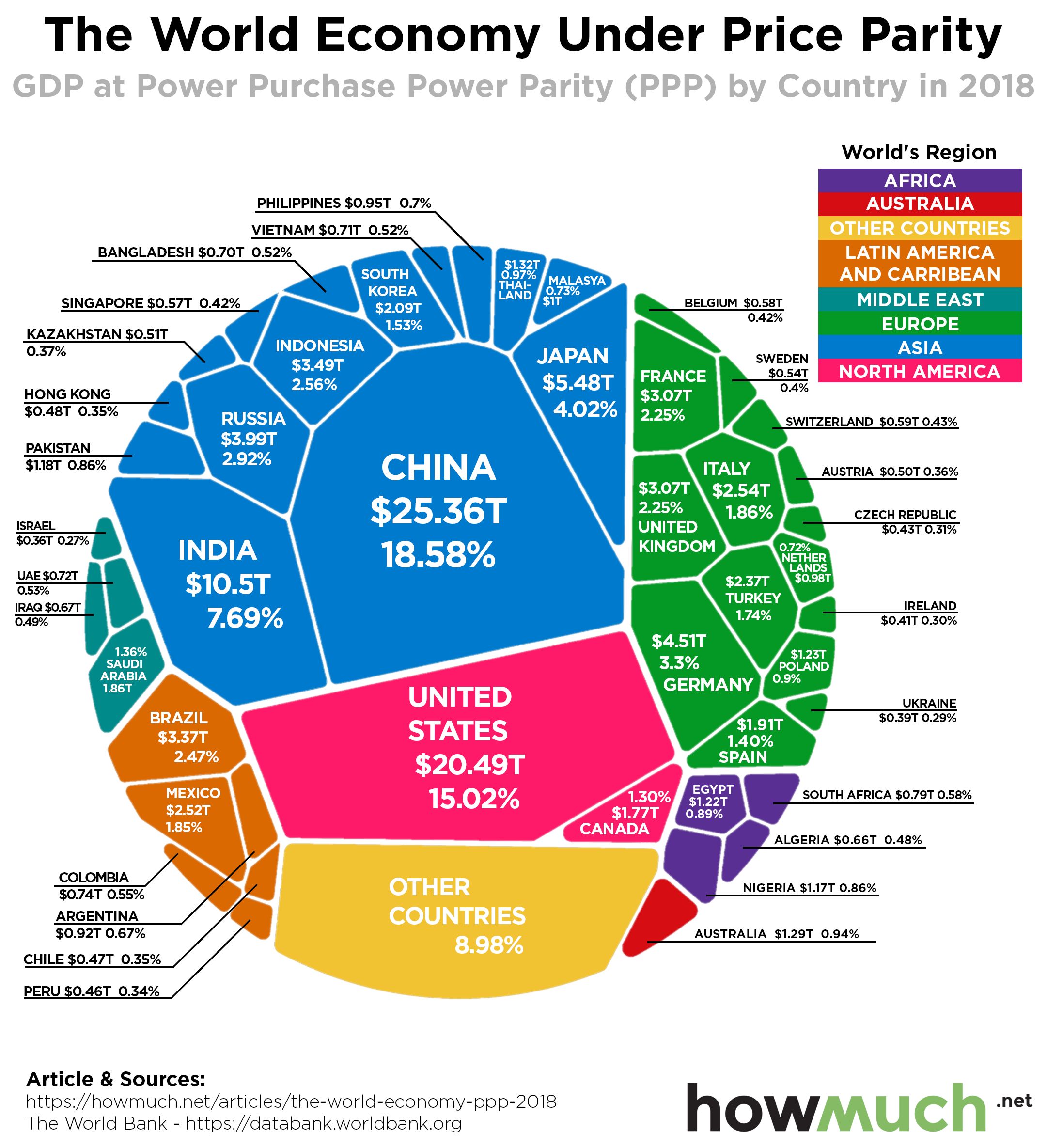
When comparing the economies of different countries, one of the most common methods is to use “purchasing power parity.” Purchasing power parity (PPP) compares international economies by standardizing the prices within a "basket of goods”. In other words, PPP accounts for the differences in standards of living (such as the different costs of a carton of milk) when comparing countries' production. Taking it one step further, our new visualization looks at the GDP of countries around the world in terms of PPP. In this chart, we use current international dollars, which has the same purchasing power as the dollar has in the United States.

  • Measuring GDP by PPP takes into account the cost of living around the world, rather than relying on market exchange rates to compare the economies of different countries.
  • In 2018, the world economy by PPP was $136.48 trillion.
  • Asian countries represent more than 40% of the world’s GDP by PPP.
  • The U.S. and China represent a third of the world’s GDP by PPP.

The information from this visualization comes from the World Bank, and the most recent numbers are from 2018. The size of each country in the visualization is proportional to its relative GDP by purchasing power parity. The countries are also color-coded by continent to illustrate the geographic distribution of the world’s production. All values are expressed in U.S. dollars.

Top 10 Countries by GDP at PPP

1. China - $25.36 trillion - 18.58% of World’s GDP
2. United States - $20.49 trillion - 15.02% of World’s GDP
3. India - $10.50 trillion  - 7.69% of World’s GDP
4. Japan - $5.48 trillion - 4.02% of World’s GDP
5. Germany - $4.51 trillion - 3.30% of World’s GDP
6. Russian Federation - $3.99 trillion - 2.92% of World’s GDP
7. Indonesia - $3.49 trillion - 2.56% of World’s GDP
8. Brazil - $3.37 trillion - 2.47% of World’s GDP
9. United Kingdom - $3.07 trillion - 2.25% of World’s GDP
10. France - $3.07 trillion - 2.25% of World’s GDP

Last month, we published a visualization that illustrated the world’s economy by GDP in current U.S. dollars (GDP that does not account for cost of living and uses market exchange rates to compare different countries’ outputs). You’ll notice there are a few differences between the visualization showing the world economy by nominal GDP (right visualization) and the world economy at PPP (left visualization). Notably, the U.S. has the largest share of the world’s GDP overall, but China has the largest share of GDP at PPP.

The World Bank data also shows that the GDP at PPP in the U.S. has grown every year since the Great Recession. However, after ten years of expansion, economic growth in the U.S. is finally slowing. But some think that the job growth is still enough to retain economic stability and continue to increase GDP. 

Similarly, China’s economic slowdown has been noted internationally, especially its decrease in exports. China’s Central Bank has taken action by reducing its reserve requirement ratio in order to encourage more lending and kickstart more production. More signs of a global economic recession are showing, as the economic performance of countries such as Japan and India have also failed to impress. The global economy is still growing for now, but these trends could be a harbinger for changes ahead.

Did anything surprise you about the differences between GDP and GDP at PPP around the world? Please let us know in the comments.

Data: Table 1.1

A Snapshot of the Tourist Spending Around the Globe

$
0
0

Despite signs of a global economic slowdown, it seems that there is no stop on tourism growth. For many individuals, traveling is an ideal way to experience new cultures, meet new people, and broaden horizons. At the same time, tourism is a major component of the economy for many countries. Our new visualization takes a look at which countries reap the greatest benefits from tourist spending. 

  • In 2018, the global tourism industry was worth $1.7 trillion.
  • Revenues generated from tourists have grown faster than the world economy.
  • The Asia-Pacific region saw the greatest growth in tourist spending, with a 7% increase year-over-year.
  • At $570 billion, Europe is the region with the most tourist spending in 2018.

The visualization and trends are based on a report released by the UN World Tourism Organization. The map above shows the biggest international tourism receipts (tourist spending) in 2018. Each country is proportional to the value of its tourism receipts. Countries that attract more tourism receipts (such as the U.S. and Spain) appear larger, while countries that have fewer tourism receipts (such as El Salvador) appear smaller. We also color-coded the countries by region, as shown in the map legend. All monetary values are expressed in USD.

Top 10 Tourist Destinations by Money Spent 

1. United States - $214 billion
2. Spain - $74 billion
3. France - $67 billion
4. Thailand - $63 billion
5. United Kingdom - $52 billion
6. Italy - $49 billion
7. Australia - $45 billion
8. Germany - $43 billion
9. Japan - $41 billion
10. China - $40 billion

Popular tourist destinations are subject to changes due to a variety of factors. Notably, media trends have surged to shape the new attractive destinations for tourists. For example, the UK city of Birmingham has seen a dramatic increase in tourism due to the popularity of the British drama “Peaky Blinders,” which takes place in the Midlands city. In addition, the political situation within a city can play a major role on its tourist performance, as shown by the negative effects that political protests have had on Hong Kong’s tourism industry. While developed countries in the West tend to have the highest tourist spending, developing countries like India are also gaining a larger share of tourism dollars. It is yet to be seen how fast-developing countries will reshape the tourist landscape in the future.

Finally, not everybody is happily welcoming tourists in their home city and concerns about overtourism abound. Being a courteous traveler and respecting the local culture will go a long way toward providing not only economic benefits to different countries, but also fostering international goodwill.

What country is next on your travel list? Please let us know in the comments.

Data: Table 1.1

The $79 Billion Plastic Item Exports Industry, Visualized

$
0
0
Have you ever wondered where your plastic comes from? You may assume it comes from previously recycled waste, but it turns out that less than 10% of the world’s plastic is actually recycled. Far more of it is discarded, often shipped overseas. But policy changes in recipient countries are making waves in the global waste management market.
 

  • Global plastic item exports were valued at $79 billion in 2018
  • The top four countries in exports alone (China, Germany, US and Italy) make up over half the plastic exports
  • Countries are scrambling to find places to ship plastic as China, a traditional recipient, has banned further imports
  • Regulatory changes worldwide have spurred changes in the plastic management market

The data from the International Trade Centre shows the total market value of plastic item exports for 2018 in U.S. Dollars. Our visualization is a map of this global market, with countries drawn to scale according to their exports. A darker shade of blue also indicates a higher export value. Only countries with more than $10 million in exports are mapped.

Top 10 Exporters of Plastic Items

1. China: $19.54B (24.73%)
2. Germany: $9.89B (12.51%)
3. United States of America: $7.23B (9.15%)
4. Italy: $3.32B (4.20%)
5. France: $3.00B (3.79%)
6. Poland: $2.29B (2.90%)
7. Netherlands: $2.17B (2.75%)
8. Japan: $2.17B (2.74%)
9. Czech Republic: $1.97B (2.49%)
10. Mexico: $1.96B (2.48%)

If so little of the world’s plastic is recycled, then where does it end up? Just five countries export over half of the world’s plastic items: China, the United States, and three western European countries. In fact, China itself makes up nearly a quarter of the exports market. But as early as 2016, China imported two-thirds of the world’s plastic waste exports. 

So, what changed? To fight pollution and overfilled trash sites, China in early 2018 banned plastic waste imports, a defining moment in the shifting plastic waste exports industry. Other industrializing countries are beginning to follow suit in cutting back on plastic waste: for example, India just this week passed a sweeping ban on single-use plastics. It has already banned plastic waste imports. Industrialized countries are also cutting down on plastic waste: various plastic bans exist across the United States, and Canada is set to instate a ban on single-use plastics by 2021. 

All the same, the world currently uses millions of tons of plastic, and it all has to go somewhere. Unfortunately, many of the developing countries which accept plastic imports, especially in the wake of China’s ban, do not have strict regulations on how to deal with this waste, and much of it ends up in the ocean. These countries, overwhelmed by the influx of plastic, do not have the infrastructure to process it.

To curb the possibility of irresponsible overseas plastic disposal, Australia has begun to ban plastic waste exports and Canada may be set to follow. On top of that, 180 nations agreed on a new UN accord to regulate the export of plastic waste.

So, where does that leave the plastic waste management? Large corporate consumers are looking to innovate away from its use: for example, McDonald’s is testing plastic-free stores. There is a push to incentivize innovations in plastic management such as clean incineration: for example, National Geographic has teamed up with impact investment fund Sky Ocean Ventures to launch a competition in plastic recycling innovations. Teams could win over a million dollars as part of the competition. So, if this article has gripped you to get involved, that’s not a bad incentive!

How much plastic does your country export? Did you ever wonder where it goes? What do you think will happen next in the plastic recycling market? Leave your thoughts in the comments.

Data: Table 1.1

How Massive is the U.S. Stock Market Compared to the World?

$
0
0

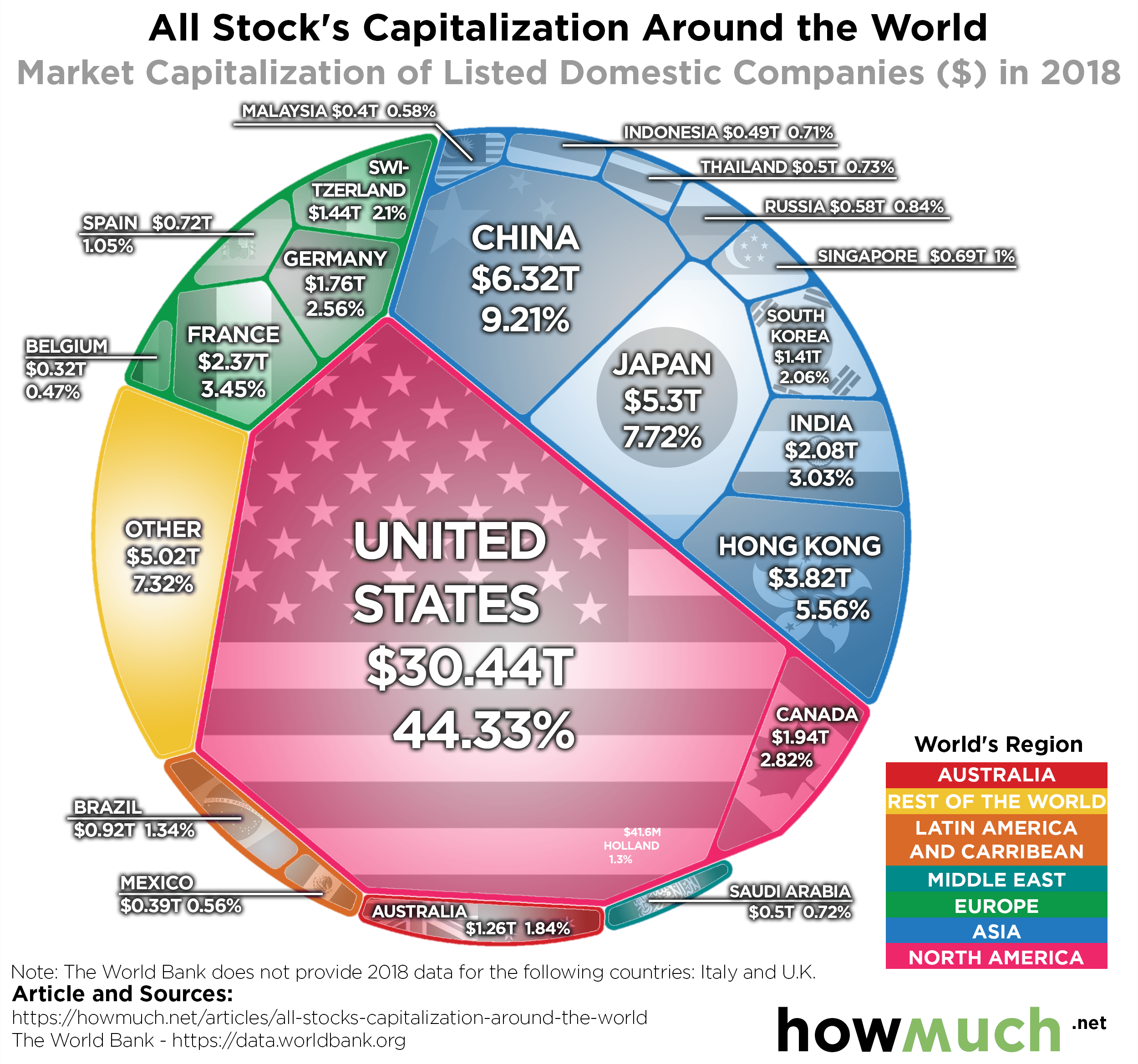
Stock markets bring wealth and woes to investors around the world. It’s hard to imagine anything more exciting and fearful. Icons like Warren Buffet made billions of dollars investing in corporate stocks. Yet, we all remember the collapse of the market a decade ago. Even with the global market whipping around, the U.S. still dominates the world stage. But where do all the rest come in?

  • The U.S. stock market is 5x the size of the closest competitor
  • In fact, the U.S. is so large it accounts for just under half of global equity value
  • China makes up the largest emerging stock market with $6.32 trillion
  • Hong Kong, being one city, matches half the equity value of China at $3.82 trillion
  • Small established economies like Switzerland have enormous markets relative to their population

It’s worth noting the World Bank data does not include the U.K. and Italy. The London Stock Exchange’s estimated size is $4.7 trillion. The Italian markets are estimated at $0.65 trillion.

The global stock markets remain volatile as we enter a historically difficult month for equities. Investors worry the global trade war and continue to pile into bonds and gold for safety. Central banks continue to drive down interest rates to keep global growth alive.

Despite the massive changes in the global landscape, the major players remain the same. The U.S. accounts for nearly half of all the stock market value globally. The closest competitor, China, remains only 1/5th the value of the U.S.

So where do all the other countries we hear about stand? Our visualization lays out the equity value for each stock market by country.

Top 10 Stock Markets Around the Globe

1. United States - $30.44 trillion
2. China - $6.32 trillion
3. Japan – $5.3 trillion
4. Hong Kong - $3.82 trillion
5. France - $2.37 trillion
6. India - $2.08 trillion
7. Canada - $1.94 trillion
8. Germany - $1.76 trillion
9. Switzerland - $1.44 trillion
10. South Korea -  $1.41 trillion

It’s astonishing that many established European markets only make up 1%-3% of the global stock market value. The U.S. domination of the global marketplace explains why the U.S. Federal Reserve remains the focus of investors around the globe. Despite this, many central banks around the world have embarked on historic rate cuts into negative yields.

Yet, given the size of the U.S. market, if it heads into a recession, how could it not impact the global markets? Trade wars with China add to uncertainty and have already hurt their global equity values. Their economy has been racked by the tariff escalations. But notice the potential regional powers that exist. Should the East Asian countries band together, they present a formidable presence against the United States.

One thing remains certain. Based on the visualization, we know that the U.S. stock market drives other markets. That creates leverage in the trade wars, as well as ties the global markets to the United States.

But what do you think? Does the graphic represent the stock market or does it speak to the global economic influence?

Data: Table 1.1

Visualizing the Importance of Industry in the World's Economy

$
0
0

When measuring economic production around the world, most of what the world produces falls into one of three categories: agriculture, industry (which includes manufacturing), and services. Industry, which is defined as mining, manufacturing, construction, electricity, water, and gas, is the second-largest contributor to worldwide GDP. Our latest series of visualizations look at how industry production contributes to the economy in individual countries around the world.

  • In 2018, industry represented 25% of the world’s GDP, down from 27% in 2010.
  • Since 2014, worldwide employment in the industry sector has dropped from 23.22% to 22.95%.
  • Industry represents a larger percentage of GDP in developing countries compared to developed countries.
  • In general, industry as a share of total GDP is highest in the Middle East, East Asia, and sub-Saharan Africa.

The information in this visualization comes from the World Bank, which publishes comprehensive data for each country’s GDP as well as the breakdown by agriculture, industry, manufacturing, and services. In a previous article, we illustrated the world’s agricultural output by country. The visualization above focuses on industrial output. The countries in the map are color-coded based on what percentage of the country’s GDP is represented by industry. Lighter shades of orange indicate a smaller share of GDP while darker orange and brown represent a larger share of GDP. 

Digging deeper into data from The World Bank also determine how industrial production and employment impact each country’s economy. The visualizations below divide the world into different regions and map out the value of each country’s GDP earned from industry (in U.S. dollars). Only countries with data from 2017 or earlier are considered. In addition, each map visualizes industry employment by the different shades of orange and brown, with lighter shades showing less employment and darker shades showing more employment. To further compare countries’ industry output, the countries appear bigger if their industry output is larger, and the countries appear smaller if their industry output is smaller.

Top 3 Countries in the Americas by Industry Output

1. United States - $3.5 trillion - 19.44% employed in industry
2. Mexico - $381.2 billion - 25.95% employed in industry
3. Brazil - $344.6 billion - 20.43% employed in industry

Even though a smaller percentage of U.S. workers are employed in industry compared to the rest of the Americas, the U.S. is responsible for the most industry output in this region. Countries in the Caribbean, the U.S., and the west coast of South America have a smaller percentage of the population engaged in industry work. Among countries in the Americas, Trinidad & Tobago has the highest percentage of the population working in industry, at 27.34%.

Top 3 Countries in Asia by Industry Output

1. China - $5.5 trillion - 28.62% employed in industry
2. Japan - $1.4 trillion - 24.5% employed in industry
3. India - $736.3 billion - 24.69% employed in industry

When measured by GDP added value, East Asian countries like China, Japan, and South Korea as well as India have the highest industry production in this region. However, countries in the Middle East like Iran and Qatar have the highest percentage of workers employed in industry sectors. In Middle Eastern countries, industry also represents a higher percentage of the country’s GDP.

Top 3 Countries in Africa by Industry Output

1. South Africa - $95.2 billion - 23.24% employed in industry
2. Nigeria - $94.9 billion - 11.55% employed in industry
3. Egypt - $88 billion - 26.58% employed in industry

In general, the African economy relies more on agricultural production than industry. As a notable exception, more than half of GDP in Equatorial Guinea and the Democratic Republic of the Congo comes from industry output. In every African country, less than a third of the population is employed in industry sectors.

Top 3 Countries in Europe by Industry Output

1. Germany - $1.1 trillion - 27.13% employed in industry
2. United Kingdom - $508.6 billion - 21.11% employed in industry
3. France - $469.3 billion - 20.32% employed in industry

Overall, countries in Western Europe have much higher industry output than countries in Eastern Europe. In most European countries, less than a third of each country’s population is employed in industry, with the exception of the Czech Republic and the Slovak Republic. Similarly, Ireland and Azerbaijan are the only European countries in which more than a third of GDP comes from industry.

Top 3 Countries in Oceania by Industry Output

1. Australia - $344 billion - 19.38% employed in industry
2. Timor-Leste - $1.1 billion - 9.44% employed in industry
3. Fiji - $880 million - 13.08% employed in industry

Countries in Oceania have very low employment in industry, with less than 20% of each country’s population engaged in an industry field. In Samoa, almost half of the country’s GDP is represented by industry, much higher than the other countries in Oceania. 

Despite the ongoing trade war with China, U.S. manufacturing production (a component of industry) has been growing in recent months. This slight improvement in one of the weaker sectors of the economy alleviates some of the tension built up regarding a possible recession

However, business leaders are divided when it comes to how the trade war with China will ultimately affect U.S. manufacturing. Some see the trade war as an opportunity to lower manufacturing costs by outsourcing to other countries and stop relying as much on China’s industrial production. However, other industrial sectors, like steel, are still worried about the future due to falling prices and low demand.  

Outside of the U.S., the future also holds new challenges for developing countries. For example, Africa’s manufacturing production is set to double in the coming years, but the question remains how far its growth can go. 

What do you think will be the future of industry in the U.S. and around the world? Please let us know in the comments.

Data: Table 1.1

Viewing all 687 articles
Browse latest View live