Quantcast
Channel: howmuch.net
Viewing all 687 articles
Browse latest View live

The United States of Unemployment Benefits: Here's What You Need to Know in 2019

$
0
0

The first half of 2019 has yielded some optimism for the U.S. economy. For example, unemployment is near its lowest point in about 50 years. At the same time, the U.S. economy has experienced the longest period of sustained economic growth ever. However, recent concerns about slower wage gains and a global economic slowdown raise the question of how long the flourishing economy will continue to last, and what the consequences will be for individuals who lose their jobs if the economy turns sour. Our latest visualization highlights how unemployment benefits differ from state to state, including how much an individual can receive in unemployment payments and for how many weeks they can be received.

  • Each state has its own way of calculating the maximum unemployment benefit payment that a person can receive. 
  • Some states, like Georgia and North Carolina, set the maximum number of weeks someone can receive unemployment insurance benefits based on the unemployment rate of the state. 
  • The maximum number of weeks that a person can receive unemployment benefits ranges from 12 weeks in Florida and North Carolina to 30 weeks in Massachusetts.
  • Compared to the rest of the country, states in the Southeast tend to have lower maximum weekly unemployment payments.

All maximum benefits data comes from each state’s Department of Labor, and average figures can be found in the U.S. Department of Labor’s database. In the visualization, the numbers in the pink circles show the maximum number of weeks that an individual can receive unemployment benefits in a state. The dollar amounts in each state also show the maximum weekly benefit payment amount. To highlight overall trends, each state is also shaded in green, with lighter green indicating lower maximum weekly payments and darker green indicating higher maximum weekly payments.

Top 5 Maximum Unemployment Weekly Payment Amounts

1. Washington - $790
2. Massachusetts - $769
3. Minnesota - $717
4. New Jersey - $696
5. Connecticut - $631

Bottom 5 Maximum Unemployment Weekly Payment Amounts

1. Mississippi - $235 
2. Arizona - $240
3. Louisiana - $247
4. Alabama - $265
5. Florida - $275

Across states, the most common way to calculate the unemployment benefit amount is to use a percentage of the individual’s base period earnings. The Maximum Benefit Amount (MBA) is either the maximum number of weeks multiplied by the person’s Weekly Benefit Amount (WBA), or a percentage of base period earnings; whichever is lesser. However, some states like Iowa and Pennsylvania have additional variations based on if the unemployed person is married or has dependents. 

Because there are so many uncertainties about the future of the economy, unemployment will be one of the hot-button issues of the 2020 election cycle. What do unemployment benefits look like in your state? Please share your thoughts in the comments.

Data: Table 1.1


The Hottest IPOs in 2019: What if You had Invested $1,000 When They Went Public

$
0
0

2019 is set to be the year of the “unicorn stampede,” with billion-dollar companies, many of them in tech, going public. But how do these “unicorn” stocks perform past their first day? For this article, we look at the performance of thirteen “unicorn” initial public offerings (IPOs) as mentioned by a recent Business Insider article. Our viz starts with a $1,000 investment in each unicorn’s IPO. By comparing the opening IPO stock price with the price listed on Yahoo Finance as of June 25, 2019, we find what the $1,000 investment would be worth today.

  • “Unicorn” is a term used in venture capital to describe a startup company with a value of over $1 billion 
  • Unicorns are going public at an unprecedented rate in 2019 due in part to demand for high-growth stocks
  • Long-term unicorn performance is mixed, with companies both gaining and losing in market value since their IPO
  • More big-name unicorn IPOs are coming this year, including Airbnb, Uber and Postmates

In finance, a “unicorn” is a real thing: it’s a privately-held startup valued at over $1 billion. What makes these companies so special to deserve the title? Traditionally, a company generally needed large amount of resources to grow to such a valuation -- it went public to open up new sources of financing. But today, a company can grow to massive size with very few resources. This is especially true of tech. 

The 5 Best-Performing Unicorns 

1. Beyond Meat: $3,274 (227.39%) - IPO Date: 5/2/2019
2. DocuSign: $1,311 (31.13%) - IPO Date: 4/27/2018
3. Zoom: $1,308 (30.82%) - IPO Date: 4/18/2019
4. PagerDuty: $1,293 (29.31%) - IPO Date: 4/11/2019
5. TradeWeb: $1,199 (19.94%) - IPO Date: 4/4/2019

The 5 Worst-Performing Unicorns 

1. Snap Inc.: $605 (-39.46%) - IPO Date: 3/1/2017
2. Lyft: $733 (-26.67%) - IPO Date: 3/29/2019
3. Dropbox: $827 (-17.34%) - IPO Date: 3/23/2018
4. Spotify: $869 (-13.10%) - IPO Date: 4/3/2018
5. Slack: $914 (-8.57%) - IPO Date: 6/20/2019

So, if companies don’t need the funding, why are they going public? A few theories exist: maybe these firms are seeing the overall strong performance of the stock market and want to get in “on a high note,” before the next recession. Maybe they are looking to fill a demand in the marketplace for stocks with potential for faster growth.

Or maybe it’s just “groupthink:” All the unicorns are going public because “that’s what all the cool unicorns are doing.” We’ve seen an episode where highly-valued, tech-centered stocks go public end very poorly: the dot-com bubble

Some point to the disappointing performance of early unicorns like Snap and Dropbox as signs that the unicorn bubble has already burst. That may be an unfair assessment, but so would the expectation that all unicorns perform strong after their IPO. Historically, 60% of companies have had negative returns after their IPO. It’s too soon to say for sure, but our small sample of unicorns is doing better than that. 

So, which companies will deliver value long after Day 1? For that, we might look to the highest-returning stock, Beyond Meat. Not a tech company per se, Beyond Meat has disrupted a market with its innovative meat-substitute products. The unicorns that can deliver unique products to unexpected markets will be the ones which live “happily ever after.”

What explains the rise in the “unicorn IPO?” Which upcoming offerings seem most promising? Are you surprised by the performance of any listed in this viz? Let us know in the comments.

Data: Table 1.1


How Big is Apple? This Visualization Puts Things Into Perspective

$
0
0

Apple in 2012 became the most valuable company in history, with a market capitalization of $621 billion. Its upward trajectory didn’t stop there: in 2018, Apple reached a market cap of $1 trillion. While it’s cooled off at times since then, sometimes dipping below $1 trillion, it’s undeniable that Apple is a big company in terms of valuation. It’s hard to take in this large of a number, so let’s put it into context with the value of other entities. 

  • Tech giant Apple hit a $1 trillion valuation in 2018
  • A recent, lower valuation dwarfs not only other corporations but also entire economies and markets
  • Apple faces mounting obstacles toward continued growth such as declining iPhone sales and trade tensions with China

Apple is Bigger than These Things

  • 20.1 times bigger than the net worth of the two wealthiest narcotic dealers combined ($44.0B)
  • 17.3 times bigger than the market capitalization of General Motors ($51.1B)
  • 6.4 times bigger than the Bitcoin market ($137.9B)
  • 6.4 times bigger than the inflation-adjusted domestic gross earnings of the top 300 movies ($138.5B)
  • 4.9 times bigger than the market capitalization of Nike and Adidas combined ($182.2B)
  • 3.8 times bigger than the entire cryptocurrency market (including Bitcoin) ($232.8B)
  • 2.1 times bigger than the market capitalization of Alibaba ($416.2B)
  • 2 times bigger than the net worth of the top five richest people combined ($450.0B)
  • 2 times bigger than NASA's budget since 1998, adjusted for inflation ($451.3B)
  • 1.6 times bigger than the market capitalization of AT&T, Verizon, T-Mobile and Sprint combined ($559.3B)
  • 1.3 times bigger than the value of McDonald's, Dunkin, Coca-Cola, Starbucks, Domino's and Pepsi combined ($677.6B)
  • 1.3 times bigger than the US Department of Defense's 2019 budget ($686.0B)
  • 1.2 times bigger than the market capitalization of Alphabet (Google's parent company) ($750.8B)
  • 1.1 times bigger than the GDP of the Netherlands ($830.6B)
  • 1.1 times bigger than the GDP of 25 countries in northern Africa ($839.4B)

So, what’s next for Apple… $1.5 trillion? $2 trillion? Will it maintain the most-valuable slot? Only time will tell, but already Apple no longer has the distinction of the only trillion-dollar company: Amazon and Microsoft have joined the club. 

Even so, a trillion-dollar valuation of anything is exceedingly rare, and that includes entire economies and industries. Even at a weaker valuation of $886B, very few entities can compete. Our visualization includes everything from Netherlands GDP to the entire cryptocurrency market. Ironically, the iPhone maker is even far more valuable than all of the major U.S. cell phone carriers put together. It’s even a full $100 billion more valuable than Google, the maker of the rival Android mobile operating system, among so many other dominant tech products. 

While Apple has beaten recent earnings estimates, it faces a series of obstacles toward future growth. Apple’s shipments in iPhones fell by 30% in Q1 2019 over last year. There’s also growing competition: Apple now holds 11.7% of global smartphone market share, down 25% from just a year ago. Along with its decline in market share, the overall market for new phones appears to be declining, at least in the U.S.: Verizon and AT&T have reported record-low phone upgrades.  Growing trade tensions between the U.S. and China is another risk: a Goldman Sachs analyst estimates that Apple’s earnings would drop by nearly 30% if China bans Apple products.

What surprised you most about the visualization? Will Apple continue to grow, or is there cause for concern? Leave your thoughts in the comments.

Data: Table 1.1

Visualizing the Highest & Lowest Paid S&P 500 CEOs in 2018

$
0
0

2018 in general was not a great year for stocks, with the S&P 500 down 6.2%. However, the CEO compensation of S&P CEOs continued to rise, reaching a median of $12.4 million in 2018. What explains this unprecedented rise in executive compensation, and is it reason for concern?

Our viz highlights the results of a Wall Street Journal report on the 2018 compensation of S&P 500 CEOs. The two circles represent the CEO’s pay and the 2018 shareholder return of their company, respectively. Circles are scaled relative to size. A green circle indicates that CEO’s company had positive returns for the year; red indicates negative.

  • Despite a poor year in stock returns, compensation for S&P 500 CEOs set another record high
  • 2018 median compensation for CEOs of S&P 500 companies reached $12.4 million -- a monthly paycheck of $1 million
  • Top 2018 earners were most likely to come from healthcare, media and financial sectors rather than tech
  • A wide range of compensation includes some CEOs taking salaries of $1, such as Alphabet’s Larry Page and Twitter’s Jack Dorsey 

Median compensation for S&P 500 CEOs hit $12.4 million in 2018, up from $11.7 million in 2017, with a median CEO compensation increase of 6.4%. The increase is in part due to what had been strong financial performance in 2018, until a December correction led to the worst year in stocks since the Great Recession. That makes for a wide disparity in the compensation of CEOs versus their company’s returns, as you’ll see in the viz.

Top 5 Highest-Paid CEOs

1. David M. Zaslav, Discovery. Total pay: $129.4 M. Shareholder return: 10.50%.
2. Stephen F. Angel, Linde. Total pay: $66.1 M. Shareholder return: 3.10%.
3. Robert A. Iger, Disney. Total pay: $65.6 M. Shareholder return: 20.40%.
4. Richard B. Handler, Jefferies. Total pay: $44.7 M. Shareholder return: -14.90%.
5. Stephen P. MacMillan, Hologic. Total pay: $42.0 M. Shareholder return: 11.70%.

Top 5 Lowest-Paid CEOs

1. Larry Page, Alphabet. Total pay: $1. Shareholder return: -0.80%.
2. Jack Dorsey, Twitter. Total pay: $1. Shareholder return: 19.70%.
3. A. Jayson Adair, Copart. Total pay: $203 K. Shareholder return: 82.20%.
4. Warren E. Buffett, Berkshire Hathaway. Total pay: $398 K. Shareholder return: 3.00%.
5. Valentin P. Gapontsev, IPG Photonics. Total pay: $1.7 M. Shareholder return: -47.10%.

One undeniable take-away from the data is that CEO pay is on the rise. At $12.4 million annually, the median CEO compensation exceeds $1 million a month. 

This rise also far exceeds the earnings rise of average workers: the AFL-CIO estimates CEOs earn 287 times more than their average employee. Compare this to a 1978 estimate of 30 to 1. Of course, the way a CEO gets paid is very different than the average worker. They are not hourly or even strictly salaried workers: instead, their compensation is a variety of base pay, bonuses and even stock options.

Ironically, the CEOs of many of the most valuable companies earn the least compensation. You’ll see in our viz that both Alphabet’s Larry Page and Twitter’s Jack Dorsey took just a dollar. It’s more common to see such low CEO compensation in tech, where executives often hold large amounts of equity in the company, and look to an increased stock worth over salary for compensation.

In fact, only three of the top 25 highest-paid CEOs this year came from tech: instead the majority came from healthcare, media and financial companies. In the #1 spot is Discovery Channel CEO David Zaslav. At a compensation of $129.4 M, Zaslav earned nearly twice as much as the second highest earner, Stephen F. Angel of chemicals company Linde. 

Does a compensation of $129 M seem like a lot for the CEO of a company that only gained 10% for the year? According to Discovery, Zaslav's pay is "nearly all performance-based.” Why “nearly?” As executive pay consultant Robin Ferracone explained to The Wall Street Journal, “People want to keep their CEOs and the best way to retain is through long-term incentives.” 

To some, the “heads I win, tails you lose” nature of increasing CEO pay is reason for concern: regardless of actual company performance, compensation keeps rising. Not all, however, are critical of this phenomenon: economist Tyler Cowen argues that executives deserve higher pay due to the growing uncertainty and complexity of a highly technological economy. 

Take a look at the viz. What results surprise you? Who deserves a raise? Or, is everyone overpaid? Will executive compensation continue its record-setting growth, and why? Let us know in the comments.

Data: Table 1.1

First-Time Home Buyer Map of America

$
0
0

Owning a home has long been a cornerstone of the American Dream. Before settling into a “dream home,” many first-time homebuyers look for a “starter home” instead. A starter home refers to a smaller, less expensive house that fulfills the buyer’s present needs, but that the buyer will probably outgrow over time. For example, a newly married couple may purchase a one-bedroom house as their starter home, but then sell it and purchase a four-bedroom house when they start a family. Our new visualization compares the median value of starter homes across the states, as well as how the median value of starter homes compares to the median values of all homes within the state.

  • The most expensive starter homes tend to be located in the Northeast and the West Coast.
  • The visualization does not take median wages, which also impact affordability, into consideration. For example, the annual median salaries in Oklahoma ($40,710) and West Virginia ($40,985) are similar, but the median value for a home is much more expensive in Oklahoma ($123,700) than in West Virginia ($97.300). 
  • In some states, the gap between the median value for starter homes and the median values for all homes is also larger than in others. For example, the median value of a starter home in West Virginia or Michigan is less than half the median value of all homes in the state. By contrast, the median value of a starter home in Rhode Island is about three-quarters of the median value of all homes in the state.

Business Insider teamed up with Zillow to find the median value of starter homes and the median value of all homes in each state, which is the basis for our visualization. To use a standard definition of “starter homes,” Zillow used its data from March 2019 to determine the value of the lower one-third of all homes in each state. 

In the visualization, each state is represented as a circle. The larger circles represent higher median home values and the smaller circles represent median home values. The shades of purple within the circle show the median value of starter homes, with darker purple representing more expensive homes. The blue outline of the circle represents the median value of all homes in the state. Thicker blue lines indicate that there is a greater difference between median starter home values and all median home values.

Top 5 States by Starter Home Value

1. Washington, D.C. - $335,700
2. Hawaii - $331,500
3. California - $305,300
4. Colorado - $247,600
5. Washington - $243,700

Bottom 5 States by Starter Home Value

1. West Virginia - $42,300
2. Oklahoma - $50,700
3. Arkansas - $56,800
4. Michigan - $58,000
5. Kansas - $61,200

With skyrocketing housing prices, some millennials are bypassing the typical starter home and conserving their funds until they can buy their “forever home.” In addition, buyers looking for a starter home are likely to face stiff competition from investors. While the concept of the “starter home” hasn’t completely disappeared, it may be worth weighing whether a starter home is the best option or if it’s better to keep saving for a lifelong home.

Learn more about how the real estate market varies across the country, including how much you have to earn to buy a home in the 50 largest metros in the U.S. What has been your experience buying your first home? Please let us know in the comments.

Data: Table 1.1

American Giants: Here's How These 8 Companies Stack Up Against the World

$
0
0

With the stock market making major gains this year, the market capitalization of some public companies is soaring to new heights. Market capitalization, or “market cap,” is calculated by multiplying the number of a public company's outstanding shares by the current market price of a share. With several public companies approaching or exceeding the $1 trillion mark in market capitalization, some have values exceeding the GDP of different countries. In this visualization, we compare the GDP of various countries with the market capitalization of some well-recognized brands to see how they stack up. 

  • Most of these high-value companies are in the tech or financial services industries.
  • Microsoft is currently the only public company with a market capitalization exceeding $1 trillion.
  • Public companies’ high market caps are particularly apparent when compared against the GDP of developing countries, especially in eastern Europe, Africa, and Latin America.
  • In addition to exceeding the value of a lot of smaller countries, some market caps are also comparable to the GDP of much larger countries, such as Argentina and Russia.

We used information from the International Monetary Fund to compile information about each country’s GDP and Yahoo Finance to find market caps for public companies, as of July 8, 2019. In the visualization above, the pink bubbles represent the companies and the gray bubbles represent the countries or regions that have a similar GDP. The bubbles are sized proportionally to the GDP and market cap values; the greater the value, the larger the bubble. All currencies are expressed in USD.

Microsoft

Microsoft, the world’s most valuable public company, has a market cap of $1.05 trillion. The company is known for its dominance in the computing industry, with some of its core products like Windows and Office used on PCs around the world. Microsoft’s market cap is greater than the combined GDP of nine eastern European countries: Estonia ($30.312 billion), Lithuania ($53.323 billion), Latvia ($34.881 billion), Belarus ($59.64 billion), Poland ($586.015 billion), Ukraine ($124.603 billion), Moldova ($11.404 billion), and Slovak Republic ($106.585 billion).

Bank of America

Opening its shares to the public in 1978, Bank of America had the earliest IPO among all the companies in the visualization. Bank of America’s market cap of $278.21 billion amounts to just slightly more than the GDP of the five Central Asian “Stans”: Kazakhstan ($170.539 billion), Uzbekistan ($41.241 billion), Turkmenistan ($44.114 billion), Kyrgyz Republic ($8.093 billion), and Tajikistan ($7.52 billion). The GDP for these five countries is $271.507 billion in total.

Alphabet

Alphabet, the parent company of Google and its subsidiaries, encompasses a wide variety of products and services including search engines, the Android operating system, and enterprise services like G Suite. Alphabet’s market capitalization of $786.092 billion is greater than the GDP of 38 African countries combined. That represents more than 70% of African countries, mostly concentrated in sub-Saharan Africa. Some of the countries include: Lesotho ($2.762 billion), Eswatini ($4.679 billion), Botswana ($18.998 billion), Namibia ($13.824 billion), Zimbabwe ($26.127 billion), Mozambique ($14.428 billion), Angola  ($107.316 billion), Zambia ($25.179 billion), Malawi ($6.925 billion), Madagascar ($12.093 billion), and more.

Facebook

The first major social media network to go public, Facebook remains a top player in the tech space. In recent years, Facebook has grown through its acquisition of other social media platforms such as WhatApp and Instagram. Facebook has also announced its intention to launch its own cryptocurrency, Libra, further diversifying its offerings. Facebook’s current market cap ($560.622 billion) is comparable to the GDP of Argentina ($518.092 billion), which is the second-highest in South America after Brazil.

Amazon

Amazon has been a major disruptor in the online retail industry, launching services such as Amazon Prime for free shipping and video streaming, AmazonFresh for groceries, and the Amazon Kindle for e-reading. To aid with the demand for delivery services, Amazon plans to increase its aircraft fleet to 70 planes by 2021. Amazon's market cap is about the same as the GDP of nine countries in Latin America: Colombia ($333.114 billion), Uruguay $60.18 billion), Paraguay ($41.604 billion), Bolivia ($41.41 billion), Peru ($225.203 billion), Ecuador ($107.511 billion), Venezuela ($98.468 billion), Guyana ($3.636 billion), and Suriname ($3.427 billion). In total, these countries have a GDP of $914.553 billion, while Amazon has a market cap of $956.557 billion.

Visa

Visa is one of the leading financial services firms in the world, expanding its offerings from credit cards and electronic transfers to its new blockchain product B2B Connect. Visa’s market capitalization of $398.008 billion is greater than the GDP of nine Central American countries, including Costa Rica ($59.006 billion), Panama ($65.206 billion), Nicaragua ($13.258 billion), Honduras ($23.778 billion), El Salvador ($26.057 billion), Guatemala ($78.979 billion), Belize ($1.925 billion), Jamaica ($15.422 billion), and Dominican Republic ($80.94 billion).

Netflix

Initially founded as a DVD rental store, Netflix is now one of the most popular streaming services in the world. In recent years, Netflix has transitioned from being a database of movies and TV shows to also creating its own original content, such as “Stranger Things” and “Orange is the New Black.” Netflix’s market capitalization of $166.384 billion is greater than the GDP of five Balkan states, including Serbia ($50.651 billion), Bosnia and Herzegovina ($19.881 billion), Montenegro ($5.402 billion), North Macedonia ($12.669 billion), and Croatia ($60.688 billion). These five countries have a combined GDP of $149.291 billion.

Apple

The brainchild of Steve Jobs, Steve Wozniak, and Ronald Wayne, Apple has revolutionized the tech industry through its innovative products, ranging from the Mac computer to the iPhone. The company has recently been under fire over privacy concerns, especially related to products like the iPhone and the Apple Watch.  Apple’s market capitalization of $939.678 billion is equal to more than half of Russia’s GDP ($815.3295 billion). Russia has the twelfth-highest GDP in the world.

Big companies’ influence is spreading everywhere, and not everybody likes that. For example, the ECB has already shown some concerns about Facebook’s intention to launch its own currency. Some people are also concerned about the political influence that these tech companies hold; Google alone spent $21.7 million on lobbying last year. As more calls for tech regulation arise, it will be interesting to see how market capitalization changes, if at all. 

What surprised you most about big companies compared to different countries’ GDP? Please let us know in the comments.

Data: Table 1.1 

Who is More Powerful – Countries or Companies?

$
0
0

With the stock market making major gains this year, the market capitalization of some public companies is soaring to new heights. Market capitalization, or “market cap,” is calculated by multiplying the number of a public company's outstanding shares by the current market price of a share. With several public companies approaching or exceeding the $1 trillion mark in market capitalization, some have values exceeding the GDP of different countries. In this visualization, we compare the GDP of various countries with the market capitalization of some well-recognized brands to see how they stack up. 

  • Most of these high-value companies are in the tech or financial services industries.
  • Microsoft is currently the only public company with a market capitalization exceeding $1 trillion.
  • Public companies’ high market caps are particularly apparent when compared against the GDP of developing countries, especially in eastern Europe, Africa, and Latin America.
  • In addition to exceeding the value of a lot of smaller countries, some market caps are also comparable to the GDP of much larger countries, such as Argentina and Russia.

We used information from the International Monetary Fund to compile information about each country’s GDP and Yahoo Finance to find market caps for public companies, as of July 8, 2019. In the visualization above, the pink bubbles represent the companies and the gray bubbles represent the countries or regions that have a similar GDP. The bubbles are sized proportionally to the GDP and market cap values; the greater the value, the larger the bubble. All currencies are expressed in USD.

Microsoft

Microsoft, the world’s most valuable public company, has a market cap of $1.05 trillion. The company is known for its dominance in the computing industry, with some of its core products like Windows and Office used on PCs around the world. Microsoft’s market cap is greater than the combined GDP of nine eastern European countries: Estonia ($30.312 billion), Lithuania ($53.323 billion), Latvia ($34.881 billion), Belarus ($59.64 billion), Poland ($586.015 billion), Ukraine ($124.603 billion), Moldova ($11.404 billion), and Slovak Republic ($106.585 billion).

Bank of America

Opening its shares to the public in 1978, Bank of America had the earliest IPO among all the companies in the visualization. Bank of America’s market cap of $278.21 billion amounts to just slightly more than the GDP of the five Central Asian “Stans”: Kazakhstan ($170.539 billion), Uzbekistan ($41.241 billion), Turkmenistan ($44.114 billion), Kyrgyz Republic ($8.093 billion), and Tajikistan ($7.52 billion). The GDP for these five countries is $271.507 billion in total.

Alphabet

Alphabet, the parent company of Google and its subsidiaries, encompasses a wide variety of products and services including search engines, the Android operating system, and enterprise services like G Suite. Alphabet’s market capitalization of $786.092 billion is greater than the GDP of 38 African countries combined. That represents more than 70% of African countries, mostly concentrated in sub-Saharan Africa. Some of the countries include: Lesotho ($2.762 billion), Eswatini ($4.679 billion), Botswana ($18.998 billion), Namibia ($13.824 billion), Zimbabwe ($26.127 billion), Mozambique ($14.428 billion), Angola  ($107.316 billion), Zambia ($25.179 billion), Malawi ($6.925 billion), Madagascar ($12.093 billion), and more.

Facebook

The first major social media network to go public, Facebook remains a top player in the tech space. In recent years, Facebook has grown through its acquisition of other social media platforms such as WhatApp and Instagram. Facebook has also announced its intention to launch its own cryptocurrency, Libra, further diversifying its offerings. Facebook’s current market cap ($560.622 billion) is comparable to the GDP of Argentina ($518.092 billion), which is the second-highest in South America after Brazil.

Amazon

Amazon has been a major disruptor in the online retail industry, launching services such as Amazon Prime for free shipping and video streaming, AmazonFresh for groceries, and the Amazon Kindle for e-reading. To aid with the demand for delivery services, Amazon plans to increase its aircraft fleet to 70 planes by 2021. Amazon's market cap is about the same as the GDP of nine countries in Latin America: Colombia ($333.114 billion), Uruguay $60.18 billion), Paraguay ($41.604 billion), Bolivia ($41.41 billion), Peru ($225.203 billion), Ecuador ($107.511 billion), Venezuela ($98.468 billion), Guyana ($3.636 billion), and Suriname ($3.427 billion). In total, these countries have a GDP of $914.553 billion, while Amazon has a market cap of $956.557 billion.

Visa

Visa is one of the leading financial services firms in the world, expanding its offerings from credit cards and electronic transfers to its new blockchain product B2B Connect. Visa’s market capitalization of $398.008 billion is greater than the GDP of nine Central American countries, including Costa Rica ($59.006 billion), Panama ($65.206 billion), Nicaragua ($13.258 billion), Honduras ($23.778 billion), El Salvador ($26.057 billion), Guatemala ($78.979 billion), Belize ($1.925 billion), Jamaica ($15.422 billion), and Dominican Republic ($80.94 billion).

Netflix

Initially founded as a DVD rental store, Netflix is now one of the most popular streaming services in the world. In recent years, Netflix has transitioned from being a database of movies and TV shows to also creating its own original content, such as “Stranger Things” and “Orange is the New Black.” Netflix’s market capitalization of $166.384 billion is greater than the GDP of five Balkan states, including Serbia ($50.651 billion), Bosnia and Herzegovina ($19.881 billion), Montenegro ($5.402 billion), North Macedonia ($12.669 billion), and Croatia ($60.688 billion). These five countries have a combined GDP of $149.291 billion.

Apple

The brainchild of Steve Jobs, Steve Wozniak, and Ronald Wayne, Apple has revolutionized the tech industry through its innovative products, ranging from the Mac computer to the iPhone. The company has recently been under fire over privacy concerns, especially related to products like the iPhone and the Apple Watch.  Apple’s market capitalization of $939.678 billion is equal to more than half of Russia’s GDP ($815.3295 billion). Russia has the twelfth-highest GDP in the world.

Big companies’ influence is spreading everywhere, and not everybody likes that. For example, the ECB has already shown some concerns about Facebook’s intention to launch its own currency. Some people are also concerned about the political influence that these tech companies hold; Google alone spent $21.7 million on lobbying last year. As more calls for tech regulation arise, it will be interesting to see how market capitalization changes, if at all. 

What surprised you most about big companies compared to different countries’ GDP? Please let us know in the comments.

Data: Table 1.1 

Visualizing Americans' Debt Problem

$
0
0

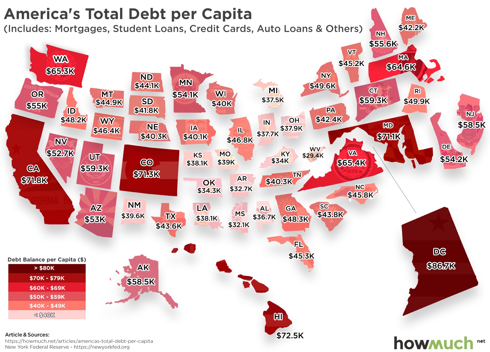
It’s no secret that millions of Americans are struggling with debt, but the numbers might still surprise you. While the economy doesn’t seem to be slowing down quite yet, U.S. debt is reaching worrying heights.

To see how extreme this debt crisis is, let’s take a look at each U.S. state’s debt per capita.

  • The District of Columbia has the highest total debt per capita at $86,730
  • Mortgages are the primary source of each state’s total debt per capita
  • The total debt per capita across the United States is $50,090
  • West Virginia has the lowest total debt per capita at $29,430
  • Federal debt is rising at alarming rates and is expected to reach 92% of the GDP by 2029

U.S. consumer debt is continuing to increase with the main causes being auto loans, credit card debt, student loans, and mortgages. Using data from Credit Karma and the New York Federal Reserve, we can see how consumer debt is affecting consumers across the nation. But consumer debt isn’t the only concern. Federal debt is increasing at unprecedented rates. To make matters worse, the federal government faces debt default by early September due to lower than expected tax revenues. Though the U.S. economy doesn’t seem to be in immediate danger of slowing down, the current debt crisis presents some cause for concern.

States With the Highest Total Debt per Capita

1. District of Columbia:  $86,730
2. Hawaii:  $72,590
3. California:  $71,860
4. Colorado:  $71,340
5. Maryland:  $71,120

States With the Lowest Total Debt per Capita

1. West Virginia:  $29,430
2. Mississippi:  $32,100
3. Arkansas:  $32,790
4. Kentucky:  $34,010
5. Oklahoma:  $34,370

The visualization used above shows us each state’s debt per capita, but that doesn’t necessarily paint the entire picture. It’s also important to look at where this debt is coming from. In all states, mortgage loans make up the largest percentage of total debt per capita, but mortgages are often considered good debt as they are used to purchase assets which can appreciate over time.

Revolving debt, on the other hand, is more troubling. While credit card debt and auto loans make up a lower percentage of total debt, are typically considered bad debt. Meaning, states with lower total debt per capita but higher credit card, auto loan, and student loan debt balances aren’t necessarily in better shape. By examining each state’s total debt per capita as well as the sources of this debt, we can get a better idea of the current state of consumer debt in the United States.

Total debt per capita, as well as federal debt, are continuing to increase at rapid rates. However, that isn’t necessarily a bad thing. Debt is relative. If you owe $20 and earn $100,000, that’s nothing. However, if you owe $20 and only make $100, that’s a big deal.

Small amounts of debt can often stimulate economic growth. Additionally, debt you take out for an investment yields positive results. Student loan debt becomes an investment when it increases your earnings potential over the cost of the debt. Debt for business equipment that increases production works the same way. Debt turns bad when you use it to purchase things that quickly lose their value. Taking out debt for things like clothes shopping beyond basic needs is bad debt. Putting a gaming system on your credit card is bad debt.

While the U.S. economy is still going strong, it’s important to be aware of the severity of the current debt crisis so that we can work to improve the situation.

Are you one of the millions of Americans struggling with consumer debt? Are you worried about the rising federal debt? Let us know in the comments below. We love to hear feedback from our readers. 


Data: Table 1.1


This Chart Shows the Rising Cost of Border Security in the U.S.

$
0
0

Border enforcement has become a top political issue in the United States, but what is its current cost and by how much has it risen? To explore this, we look at the American Immigration Council’s fact sheet titled “The Cost of Immigration Enforcement and Border Security.” The data originally comes from the Department of Homeland Security’s U.S. Customs and Border Protection webpage

  • The cost of border enforcement has hit record highs for the past five years, with total overall budgets surpassing $20 billion. 
  • The annual budget of the U.S. Border Patrol has increased more than tenfold since 1993. 
  • The number of U.S. Border Patrol agents have nearly doubled from 2003 to 2018. 
  • Since its founding in 2003, Immigration and Customs Enforcement (ICE) spending has grown 103 percent. 

Our viz shows the annual budget of the U.S. Border Patrol since 1990. Each full block represents $200M. A darker shade indicates a higher relative budget for that year. The Border Patrol is part of a larger system of immigration and border enforcement in the U.S., which the Department of Homeland Security has been tasked with since its founding in 2003. This system can mainly be broken into two segments: border security, handled by U.S. Customs and Border Protection (CBP), and interior enforcement, handled by U.S. Immigration and Customs Enforcement (ICE). The U.S. Border Patrol is an arm of CBP. The report includes data on budget and staffing for each of these areas. Because of its relative size, the Border Patrol’s staff is reported separately from CBP’s. 

Border Patrol Spending Since 2010

2010: $2.96B
2011: $3.55B
2012: $3.53B
2013: $3.47B
2014: $3.64B
2015: $3.8B
2016: $3.8B
2017: $4.29B
2018: $4.46B
2019: $4.7B

Customs and Border Patrol, Immigration and Customs Enforcement Spending Since 2010

2010 - CBP: $11.5B, ICE: $5.7B
2011 - CBP: $11.2B, ICE: $5.8B
2012 - CBP: $11.8B, ICE: $6B
2013 - CBP: $11.9B, ICE: $5.9B
2014 - CBP: $12.5B, ICE: $5.9B
2015 - CBP: $12.8B, ICE: $5.3B
2016 - CBP: $13.2B, ICE: $6.1B
2017 - CBP: $14.4B, ICE: $6.2B
2018 - CBP: $14.4B, ICE: $6.2B
2019 - CBP: $14.7B, ICE: $7.6B

Since 1990, two significant changes in immigration policy have occurred. First, in 1993, the U.S. began its current strategy of concentrated border enforcement along the U.S.-Mexico border. Then, in 2003, the Department of Homeland Security was established, along with ICE. 

Each change in policy has resulted in significant budget increases. Since 1993, the annual budget of the U.S. Border Patrol has increased to more than $4.7 billion from $363 million. Since 2003, ICE spending has grown to $6.7 billion from $3.3 billion. 

One drawback to evaluating these agencies based on their budget history is that these figures are not adjusted for inflation. However, we can also look at the overall staffing of each agency as a proxy for its overall size. These numbers tell a similar story to the budget. 

Since 1993, the number of U.S. Border Patrol agents has grown from 4,139 to 19,555. Of these agents, 16,608 were deployed to the U.S.-Mexico border, with the remainder deployed to the U.S.-Canada border and coastal border sectors. The number of ICE agents devoted to enforcement and removal operations increased from 2,710 in 2003 to nearly 8,000 in 2018. From the perspective of both budget and personnel, the costs of border enforcement continue to rise. 

Take a look at the data and the viz -- it’s great to be well-informed here, as it’s likely to be the most influential topic of the 2020 presidential election. What did you find surprising about this information? Do you believe these trends will continue? What would have to change for these cost increases to stop? Let us know in the comments. 

Data: Table 1.1


Mapping Out the 'Filthy Rich' In Each State

$
0
0

The U.S. is a nation of millionaires and billionaires. Among its population of 323 million people, there are 607 billionaires and 11.8 million individuals with a net worth of at least $1 million. This translates to roughly 3.65% of the country. So who has the most money? That’s the topic of our latest visualization, which highlights the richest person by net worth in each state.

  • According to Forbes, the richest individuals in each state have a combined net worth of $875 billion. 
  • The industries represented in this visualization are as varied as finance, technology, consumer goods, real estate, and retail. 
  • Forbes calculated that 60% of the richest individuals in each state earned their own fortunes, 21% inherited their money, and 19% became rich by expanding an existing business.
  • Jeff Bezos is not only the richest person in Washington state; he is also the richest person in the world.  
  • Even though Bezos is the richest man in the world, his family is not the richest one. The Walton family (of Walmart fame) earns that distinction. In the visualization, Jim Walton and Alice Walton are represented as the richest individuals in their respective states. 

The information in this visualization comes from the most recent Forbes ranking of the richest individuals in each state, as of June 2019. The individuals are ranked by their net worth. The visualization above is shaped like a map of the U.S., with each state represented by a picture of the richest person within that state. The person’s name and net worth are listed below their picture, and the source of their wealth is listed above the picture. In addition, the background for each picture is a shade of green, with the darker shades representing higher net worth and the lighter shades representing lower net worth.

Top 10 States with the Highest Net-Worth Individuals

1. Washington: Jeff Bezos & family - $157 billion - Amazon
2. Nebraska: Warren Buffett - $85 billion - Berkshire Hathaway
3. California: Mark Zuckerberg - $71 billion - Facebook
4. New York: Michael Bloomberg - $53.8 billion - Bloomberg LP
5. Arkansas: Jim Walton - $51.1 billion - Walmart
6. Texas: Alice Walton - $50.1 billion - Walmart
7. Kansas: Charles Koch - $42 billion - Koch industries
8. Nevada: Sheldon Adelson - $35.7 billion - Casinos
9. Oregon: Phil Knight & family - $35 billion - Nike
10. Virginia: Jacqueline Mars - $28.1 billion - Candy, pet food

Interestingly, while certain states like California and New York are home to multiple billionaires, other states like Alabama, Alaska, Delaware, New Hampshire, New Mexico, and Vermont only have centimillionaires (people with a net worth of hundreds of millions). As the wealth gap continues to widen and the average S&P 500 CEO makes 287 times what a typical American worker makes, the unequal distribution of wealth will continue to be a hot-button issue, especially for the upcoming election.

Did anyone on this list surprise you? Please let us know what you think in the comments!

Data: Table 1.1
 

Is the U.S. Debt Bubble Going to Burst?

$
0
0

The U.S. economy may be in the middle of its largest expansion in history, but record levels of debt could signal trouble on the horizon. In February 2019, the U.S. national debt reached a record $22 trillion, and the annual deficit for this year alone is expected to be almost $1.1 trillion. At the consumer level, household debt (which includes mortgages, auto loans, student loans, and credit card debt) has risen for 19 straight quarters. With these overarching trends in mind, we compiled 10 of our recent visualizations to show a more complete picture of debt in the U.S. Here’s what we learned.

  • The national debt has rapidly increased over the past 40 years, doubling in the past decade alone.
  • The U.S. has one of the highest debt-to-GDP ratios in the world. 
  • In general, the governments in larger states incur more debt than the governments in smaller states.
  • Millennials have higher debts than other generations like Gen X and Baby Boomers.
  • The type of debt that consumers incur has changed over time, with mortgage debt decreasing over the past decade and student loan debt increasing.

1. How Has the U.S. National Debt Changed Over Time?

The visualization above references data compiled by The Balance from the Treasury Department’s “U.S. Debt to the Penny” report to map how much the national debt has grown since 1934. The national debt was only $25 billion back then, and it stayed below $1 trillion until 1982. After that, the national debt increased exponentially from the 1980s to the 2010s, eventually leading to the $22 trillion mark where it is today.

2. Who Should Be Blamed the Most for The Increase in National Debt?

Another way to analyze the increase in national debt is to view it in conjunction with the political leaders of the time. According to other research conducted by The Balance, the national debt soared under certain presidents. This visualization shows how much was added to the national debt during each presidency, with each block representing $3 billion in current dollars. As shown in the previous visualization, the majority of the national debt was accrued over the past 40 years. More specifically, Reagan added $1.86 trillion, George H.W. Bush added $1.55 trillion, Clinton added $1.4 trillion, George W. Bush added $5.85 trillion, and Obama added $8.59 trillion. Trump is expected to add $4.78 trillion to the national debt during his first term. The only presidents in the past century who saw a decrease in the national debt are Warren G. Harding and Calvin Coolidge.

3. Which Foreign Countries Hold the Most U.S. Debt?

The national debt is financed by the sale of treasury securities, specifically short-term treasury bills and long-term treasury bonds. While many treasury securities are held by the American public and government agencies, foreign countries are some of the bigger holders of U.S. debt. According to the visualization above, both China and Japan each hold over $1 trillion in U.S. debt, accounting for roughly one-third of U.S. treasury securities owned by foreign countries. The data for this visualization comes from the Treasury Department’s database for Major Foreign Holders of Treasury Securities, as of April 2019. Altogether, foreign countries hold more than $6 trillion in U.S. debt. 

4. How Deep in Debt is the U.S. Compared to the Rest of the World?

The good news is that the U.S. is not alone in its accrual of debt. While the U.S. national debt of $22 trillion is truly staggering, the country’s economic output is also much higher than other countries’. The best way to compare different countries’ national debts is to use the debt-to-GDP ratio, which compares a country’s output with its debts. The visualization above uses data from the International Monetary Fund to illustrate debt-to-GDP ratios between countries, with the larger, redder countries toward the center representing the highest ratios. The countries with the highest debt-to-GDP ratio are Japan, Greece, and Barbados. By this measure, the U.S. ranks 13th. 

5. How Does Debt Compare to Output Within Each State?

Now that we’ve analyzed U.S. debt at the national and international scale, let’s take a look at how debt varies across states. In the visualization above, we used data from the U.S. Census Bureau and the U.S. Government Debt website to visualize each state’s state & local government spending (shown in pink), measured against each state’s output (shown in blue). Overall, the states have a combined state and local government debt of $3.1 trillion and gross output of $21 trillion. Large states like California, Texas, New York, Illinois and Florida have the highest output, as well as the highest debt.

6. How Does the Debt Per Capita Vary Across the States? 

Outside of government borrowing, household debt is another measure of economic health. Household debt is mostly composed of mortgages, credit cards, student loans, and auto loans. In this visualization, we used data from Credit Karma and the New York Federal Reserve to illustrate consumer debt per capita in each state.  Across the U.S., the total debt per capita is $50,090, but this ranges from $29,430 in West Virginia to $86,730 in The District of Columbia. Notably, mortgages are the largest source of total debt per capita in each state. 

7. How Has Personal Debt Changed Across Generations?

In addition to varying across location, household debt varies by age, too. For this visualization, we analyzed Federal Reserve data detailing debt and assets held by Millennials, Gen Xers and Baby Boomers (with all numbers adjusted for inflation). As of 2016, millennials had more savings than Gen X or Baby Boomers at the same point in their lives, but also more debt due to the massive increase in college loans. Millennials also have more equity in their homes than Baby Boomers did in 1989 but less than Gen X did in 2001.

8. Which American Cities Have the Highest Mortgage Payments?

With mortgages accounting for the majority of consumer debt, some locations are more budget-friendly for homebuyers than others. This map uses data from Zillow Research and the St. Louis Fed to illustrate the metro areas with the most expensive mortgage payments (shown in dark pink) and least expensive mortgage payments (shown in light pink). In general, the South and the Midwest have the least expensive mortgages while the Northeast and the West (especially California) have the most expensive mortgages. 

9. How Much Credit Card Debt Do Consumers Have In Each State?

With credit card debt reaching $1 trillion, many consumers are struggling to pay off their outstanding bills. This heat map uses research from Creditcards.com to see average credit card debt in each state and how long it would take to pay off if people in every state allocated 15% of their income toward credit card debt. Dark red states like New York and Texas represent higher credit card debt, while light red states like Iowa and Wisconsin have lower debt. In general, southern states would take the longest to pay off credit card debt.

10. Is the Debt Bubble Going to Burst by the End of 2019?

That’s the question on everyone’s mind. This final visualization uses the Federal Reserve Bank of New York’s Center for Microeconomic Data to show how individual categories of consumer debt (mortgages, auto loans, student loans, credit cards, HE Revolving debt, and other) have changed since 2003. The most noticeable changes are that mortgage debt as a share of overall household debt has decreased, while student loans as a share of overall household debt has increased. It remains to be seen if these trends are the “new normal,” or if they are part of a cycle in which different types of debt wax and wane. Regardless, it’s important for both governments and consumers to keep spending and debts to a manageable level to avoid major financial problems in the future.

What do you think about the overall picture of debt in the U.S.? Please let us know in the comments.


The Biggest Corporate Debts Visualized in One Chart

$
0
0

In the first quarter of 2019, the total private and public debt of the United States hit a record $70 trillion, raising concerns about the possibility of widespread defaults. Non-financial corporate businesses hold about $9 trillion of that debt. What companies are holding the most debt, and which are more concerning? 

  • Of the four firms with long-term debts over $100B, three are in telecommunications
  • Tech firms carry big debt loads, but small debt-equity ratios
  • GE’s debt load is a combination of financing and industrials
  • Ford and GM also hold financing operations, contributing to higher debt loads

The data comes from 24/7 Wall Street’s analysis of the long-term debt for companies in the Fortune 500 with data from each company’s SEC 10-K filings. Long-term debt is any financial obligation that matures in more than one year. The data excludes financial companies, as the usual amount of debt for these firms is much higher than for non-financial firms. The companies are grouped by industry in the viz. A larger bubble indicates more long-term debt, as indicated by the legend.To put this debt into context, we also look at the debt-to-equity (D/E) ratio. The D/E ratio is calculated by dividing a company’s total liabilities by its shareholder equity. 

Top 5 Companies With the Most Long-Term Debt

1. AT&T (Telecommunications): $166.3B
2. Comcast (Telecommunications): $107.3B
3. Verizon (Telecommunications): $105.9B
4. Ford Motor (Motor vehicles & parts): $100.7B
5. General Electric (Industrials): $95.2B

Top 5 Companies With the Highest Debt-to-Equity Ratios

1. General Electric (Industrials): 8.35 
2. UPS (Mail, package & freight delivery): 6.56
3. Ford Motor (Motor vehicles & parts): 2.
4. FirstEnergy (Utilities): 2.61
5. Amgen (Pharmaceuticals & Health Care): 2.36

This is used to measure how a company is financing its operations and how capable the company is to cover its debts in the event of a business downturn. A higher D/E ratio indicates a higher risk for investors, as in the event of bankruptcy, they are less likely to have their investment returned. In fact, the standard debt load for a company ranges widely across industries outside of finance, and this context is helpful for understanding the data.  

The viz lets us look at debt levels and D/E ratios to get a better look at each company’s total debt burden. Companies are grouped by industry as what constitutes a normal level of debt varies by industry. Capital-intensive industries such as manufacturing tend to have D/E ratios above 2. Companies in these industries have more assets to use as leverage in the event of a business downturn, which allows them to safely take on more debt. In contrast, service-based and tech firms often have a D/E ratio under 0.5. 

This distinction is clear in the viz: automotive and telecommunications firms have tend to have higher D/E ratios than tech firms. While Microsoft and Apple have nearly as much long-term debt as Ford and GM, their D/E ratios are much lower, because of higher shareholder equity. 

Earlier we mentioned that this analysis excludes financial companies because of the high levels of debt that are normal for that industry. This makes sense, then, that two of the top five companies by D/E ratio operate significant financial-services operations: GE and Ford. While it is true that both of these companies are capital-intensive to begin with, GE Capital and Ford Credit, respectively, are large contributors to the overall debt of each company. 

Should any of these debt loads worry investors? Are they justified? What surprised you about the data? Leave a comment with your thoughts. 

Data: Table 1.1
 

Visualizing the Unstoppable Car Debt in America

$
0
0

Debt is a pressing issue in the United States, with total private and public debts hitting $70 trillion. At the federal level, growing budget deficits are contributing to this rise, while the private sector has a new growing source of debt: auto loans.

  • Auto loan balances in the U.S. hit a record high $1.28 trillion in Q1 2018.
  • The average state-wide auto debt load per capita hit $4.7K
  • This is a 67 percent increase over the last six years
  • The flow into serious delinquency is up to 2.4 percent, up from 1.5 percent in 2012

The data comes from the Federal Reserve’s New York branch, which puts out quarterly reports on household debt and credit for all 50 states. For this report, we will look at the most recent figures for auto debt balance per capita, as of Q4 2018, and what these numbers mean for the automotive industry. Our viz shows the average auto debt balance per capita for all 50 states. A darker shade of purple indicates a higher debt load. 

The Top 5 Auto Debt Balances by State

1. Texas: $6.7K
2. Louisiana: $5.7K
3. Georgia: $5.4K
4. New Mexico: $5.4K
5. Arkansas: $5.3K

The Lowest 5 Auto Debt Balances by State

1. District of Columbia: $3K
2. Connecticut: $3.6K
3. New York: $3.7K
4. Rhode Island: $3.7K
5. Michigan: $3.7K

At an average debt load per state of over $4,500, the nationwide auto debt load increased by over $9 billion in Q4 2018 to $1.3 trillion. This number, boosted by historically strong levels of new loans, also comes with a boost in serious delinquency rates to 2.4 percent. To learn more about how auto loans work, check out our Auto Loan Cost Guide.

Four of the five states with the highest per capita auto debt loads are in Southern states, and four of the five states with the lowest loads are in Northeastern states (including the District of Columbia in first place). Michigan, not known for its economic robustness, has the fifth-lowest auto debt load. Of course, the cost of the car loan alone is not the only driving expense: there are also factors like parking, fuel and insurance rates

While a large-scale default crisis in the auto market has not occurred yet, high debt levels have contributed to an already shaky automotive industry. Auto sales were down in the first half of 2019, driven by higher interest rates and larger fleets of used vehicles. General Motors CEO Mary Barra, sensing industry shifts, said in a meeting with leaders of the United Auto Workers that “our collective future is at stake.”

One way to reduce debt burdens and sell more cars might be to cut the price of cars. That’s what Tesla is doing, by cutting the price of its best-selling Model 3 by $1,000 to $38,990. Unlike GM, Tesla does not have a union, which does reduce overhead, perhaps at the expense of worker well-being.

What do you think explains the rise in auto debt loads? How will this affect the automotive industry long-term? Share your thoughts in the comments.

Data: Table 1.1

Visualizing the Importance of Agriculture in the World's Economy

$
0
0

One of the things that everyone on earth has in common is the need for food. As a result, agricultural production plays a pivotal role in the world economy. Factors like climate, arable land, access to technology, and amount of human labor affect agricultural production in different parts of the world. Our new series of visualizations take a closer look at how agriculture as a share of GDP varies from country to country, as well as how many workers worldwide are employed through agriculture.

  • As of 2018, agriculture only represents 3% of the world’s GDP, down from 4% in 2010.
  • Even though agriculture represents a small share of the world’s economic output, this industry employs almost 30% of all workers.
  • Developing countries are more likely than developed countries to rely on agriculture as a larger percentage of GDP.
  • Overall, agriculture as a share of total GDP is highest in countries in Africa and South Asia.

The information in this visualization comes from the World Bank, which publishes a database for each country’s output (GDP) as well as the breakdown by agriculture, industry, manufacturing, and services. In the visualization above, the countries in the map are shaded based on the percentage of GDP that agriculture represents in each country. Lighter shades indicate a smaller share of GDP and darker shades represent a larger share of GDP. 

Using additional information from The World Bank’s World Development Indicators, we can also determine how agricultural production and employment vary by country. The visualizations below list each country’s GDP earned from agriculture, and indicates agricultural employment by the different shades of green (lighter shades are for less employment, and darker shades are for more employment). In addition, the countries appear bigger if their agricultural output is larger, and the countries appear smaller if their agricultural output is smaller. Here is the breakdown by region.

Top 3 Countries in the Americas by Agricultural Output

1. United States - $204.9 billion - 1.42% employed in agriculture
2. Brazil - $74.4 billion - 9.39% employed in agriculture
3. Mexico - $36.7 billion - 12.99% employed in agriculture

Within the Americas, there is a huge disparity between agricultural production in developed and developing countries. Developed countries like the U.S. employ fewer people, but produce more agricultural output. Countries in Central America and the west coast of South America have a higher percentage of the population engaged in agriculture.

Top 3 Countries in Asia by Agricultural Output

1. China - $952.6 billion - 26.77% employed in agriculture
2. India - $381.7 billion - 43.86% employed in agriculture
3. Indonesia - $135.5 billion - 30.53% employed in agriculture

Countries in South Asia and Southeast Asia have the highest agricultural production in this region, as well as the highest employment in agriculture. By contrast, countries in the Middle East like Oman and Yemen have the lowest agricultural output. Some economies, like fast-developing India, rely heavily on agriculture for both growth and livelihood. In other South Asian countries like Nepal and Myanmar, more than half of the population is employed in agriculture.

Top 3 Countries in Africa by Agricultural Output

1. Nigeria - $83.4 billion - 36.62% employed in agriculture
2. Kenya - $29.9 billion - 57.45% employed in agriculture
3. Egypt - $27.6 billion - 24.87% employed in agriculture

Much of the African economy relies on agricultural production. In eight African countries, including Sierra Leone, Mali, and Guinea-Bissau, more than a third of GDP comes from agricultural output. Similarly, in seven African countries, including Niger, Chad, and Uganda, more than 70% of the population is employed in agriculture.

Top 3 Countries in Europe by Agricultural Output

1. France - $55.6 billion - 2.6% employed in agriculture
2. Turkey - $46 billion - 19.2% employed in agriculture
3. Spain - $42.8 billion - 4.31% employed in agriculture

In most European countries, less than 10% of each country’s population is employed in agriculture. The exceptions are mostly located in Eastern Europe, with countries like Albania, Azerbaijan, and Georgia employing more than 30% of their populations in agriculture. The European countries with the highest agricultural output are mostly located in Western Europe, with the exception of Turkey in the southeast.

Top 3 Countries in Oceania by Agricultural Output

1. Australia - $43 billion - 2.57% employed in agriculture
2. New Zealand - $14.4 billion - 6.16% employed in agriculture
3. Papua New Guinea - $4.2 billion - 67.66% employed in agriculture

While Australia and New Zealand have low employment in agriculture, some of the Pacific island nations such as Papua New Guinea and Timor-Leste employ more than half of their workers in agriculture.  

Given its importance to the worldwide economy, agriculture is one of the most appealing markets for disruption, and also for growth. For example, the Canadian government is investing 49.5 million in technology like robotic harvesters and computer networks to digitize and automate aspects of agricultural production. Similarly, Israel’s efforts to further modernize agriculture through pollination intelligence and fruit-harvesting drones have garnered international attention. Advances in technology are likely to further change agricultural output around the world, as well as the need for human workers within this industry.

What surprised you the most about how agriculture varies around the world? Please let us know in the comments.

Data: Table 1.1 

These 10 Visualizations Put Global Trade Into Perspective

$
0
0


Global trade conjures images of busy ports, planes in the sky, forklifts driving around warehouses - really anything that moves goods. For most of history trade made up the backbone of commerce. 

Even though services now make up a significant portion of the global economy, trade still impacts the lives of countries everywhere. Consider why oil rich countries that once offered high standards of living now struggle to tamp down unrest as global commodity (raw materials for production like oil, lumber, natural gas, etc) prices fall.

The graphics below illustrate the relationship between trade and economic wealth. When you view the various trade visualizations you’ll start to see a few interesting points:

  • Large countries like the U.S., Russia, and China use trade as a way to conduct foreign policy
  • Some countries rely entirely on one commodity to fill their trade coffers
  • Countries with high natural resources leverage them and make them large parts of their economy
  • Trade is influenced as much by current events as it is by historical ones and cultural characteristics
  • Global trade often highlights the concept of comparative advantage; where one country produces a particular item better than others

1. Global Powers Dominate World’s Top Exporters 


It should come as no surprise that China leads the world in global exports with $2.263B a year as they look to expand their economy and influence. Despite what you may think, the United States still exports a ton of goods to the world. It comes in 2nd at $1.547B in exports, mainly driven by high end equipment including machinery and spacecraft.

The visualization clearly displays developed countries dominating the global export economy. Yet, it’s worth noting the growth of emerging economies such as Indonesia and Malaysia picking up steam in recent years.

2. They Also Dominate Global Imports


Compare the graphics of importers to the previous one on exporters. Notice any similarities? As you might expect, many economies that export rely on heavy import to make finished goods. This tends to break down in economies tied to commodities such as Saudi Arabia who exports twice what they import. However, they still need the equipment to drill for oil.

You’ll often see countries both import and export heavy amounts of goods, even of the same variety. Many countries will import raw materials and export value added items.

3. What Imports Mean Within a Country


Taking the global view of trade and breaking it down to the state level in the United States, you see similar relationships. High population and low manufacturing states like Florida and California import cars for their population.

You might be questioning why an oil state like Texas imports so much crude oil when they drill so much.Texas operates large amounts of refineries that turn crude oil into petroleum products. Since the capacity exceeds the production in the state, they require more crude oil to be brought in. That’s in part why they export nearly $23.365M in petroleum products each year.

4. Developing Countries Tend to Hold More Foreign Currency


Did you know that the foreign exchange market trades around $5 trillion per day while the stock market only trades around $200 billion per day? In order for countries to trade they must maintain liquidity (the ability to buy and sell) currencies around the globe. Most countries do this through the U.S. dollar, gold, or a combination. China’s particularly weak currency and high trade volume forces them to hold large amounts of foreign currency to maintain liquidity.

While more developed countries simply invest in gold, emerging markets tend to hold U.S. bonds as a way to maintain liquidity. Consequently, you’ll see in the graphics how some of the largest debt holders outside the United States are key exporters to the world. 

However, not holding enough currency can create risk. If China wanted to, they could impact the global value of the dollar simply by flooding the market with U.S. bonds. This is a real possibility and concern for the ongoing trade wars.

5. Developed Countries Tend to Hold More Gold


Back before the Bretton Woods Accord of 1971, the United States managed their currency to the price of gold. They eventually found that the country growing too fast, and needed to end this practice. Yet, many developed (and developing) countries around the world still hold large amounts of gold in reserve. Developed countries tend to rely less on foreign currency, since transactions happen more often in their own currency.

Compared to the liquidity chart previously, you’ll notice how the U.S. liquidity is almost entirely made up of gold. Developed countries tend to have a higher percentage of gold making up their liquidity reserves. Emerging markets, like China, will often hold higher reserves of currencies to facilitate trade.

6. Some Countries Rely Entirely on Commodities


Everyday we hear about the push for renewable energies. Imagine if the world truly made a meaningful shift to move off of fossil fuels. Guess who would be impacted? Countries like Venezuela, Saudi Arabia, and all the others who rely on Crude Oil exports. 

In fact, you can actually see the impacts already. Crude oil prices dropped from over $140 ten years ago to just $50 today. Russia’s currency fell. Saudi Arabia began shifting their economy away from Crude Oil exports. Venezuela confronts civil unrest everyday. Even though the U.S. happens to produce a lot of oil, they consume a good amount locally. Their diverse economy allows them to withstand changes in societal trends.

7. Wealthy Countries Have More Discretionary Income to Spend on Luxury Items


One of the most interesting cross-sections of culture and economic wealth sits at diamond imports. Diamond demand tends to ebb and flow with the global economy, as does the supply. Most diamond production comes from a few areas with rich deposits including Russia, several African nations, Australia and Canada.

Countries with large populations, a good amount of disposable income, as well as cultural identities that value wealth happens to be the largest importers. What’s interesting is not so much the United States, but Belgium being such a huge importer of diamonds relative to their population size. Belgium is known as the “Diamond Capital” of the world. During parts of the ‘90s nearly 80% of all diamonds moved through Belgium. While they import a ton, they also export almost the same amount.

8. Historical and Geopolitical Tensions Drive a Need for Defense Spending


Sometimes imports can be extremely controversial. Weapons sales is a hot button issue both in the United States and around the globe. Countries often sell their military technology to nations to build strategic relationships and allies in various regions. 

India and Saudi Arabia make up the largest global imports of military weapons with Egypt coming in 3rd. All of these countries happen to be strategic allies of the United States, and purchase significant amounts from the U.S. Still, some tiny countries like Israel import quite a bit relative to their populations. What’s more interesting is comparing the expenditures of geographies like Europe compared to Asia or the Middle East.

9. Key Industrialized Players Export Military Technology


It shouldn't come as any surprise that some of the largest and technologically advanced militaries in the world tend to export their expertise. The U.S. exports 2x that of Russia, both of which rely on military assistance to influence their global agendas.

Interestingly, you see the large powers of Europe exporting a large amount of arms. While they don’t import that much, they, like the U.S. and Russia, export their technological advantage. You can also see how Israel both imports arms and exports a significant amount as well.

10. On the Whole, When One Country Exits a Market, Another Fills the Gap


With the recent election of Boris Johnson as Prime Minister of the United Kingdom, the possibility of the U.K. crashing out of the European Union seems like a very real possibility. Given the large amount of exports the U.K. sends out each year, coupled with what they import, we can look at the winners and losers.

Export powerhouses like the U.S. China, Thailand, and Japan stand ready to backfill the markets left by the U.K. Trading partners like Iceland, Turkey, and a handful of others stand to lose a key importer of their goods.

Trade shouldn’t be analyzed in a vacuum. A true understand of trade means looking at how economies and countries changed over time. If you looked at trade 150 years ago, the world players would be completely different than today. Even 50 years ago would show significant differences.

Today’s economy relies not just on goods but services as well. Two-thirds of the U.S. economy is driven by the service sector. Yet, we can’t dismiss trade entirely. What may seem a paltry part of one economy can be the lifeblood of another. The U.S. may look to wean off of fossil fuels. Yet, they need to understand what that means for their influence with countries such as Saudi Arabia.

What strikes you as some of the most interesting points about these images?


Mapping the Best & Worst States to Get a Mortgage

$
0
0

Did you know that where you live could cost you money when you own a home? The state you live in has a major impact on the cost of property, which drives your monthly mortgage payments. At the same time, the shock left from The Great Recession has changed the way people buy their homes. Take a look at the graphic below that shows you what the average monthly payment, and interest paid over the lifetime of a loan. Where do you rank?

  • The demand and population density of your area determines the average price of a home, which drives the monthly payments and total interest paid 
  • As rates increase over time, the amount of interest you pay on a loan will increase as well as your monthly payments for new loans
  • High cost of living areas, and dense population areas tend to drive up home prices
  • Homes in the mid-west tend to cost less to purchase
  • States that were hit hardest by the housing recession still have relatively high prices for homes

Americans have long considered home ownership to be part of the “American Dream”. Home affordability reached record lows after the recession brought on by a glut of inventory and low interest rates. Although supply shrank in recent years, the interest rates still sit near the 2016 lows. Where you live and when you buy determines the average cost of your home and the interest you pay.

Our methodology looks at current market interest rates from the Federal Reserve, the average price smoothed out over time from Zillow of median home prices, and a 30-year fixed loan with 20% down payment. The data excludes any applicable federal and state taxes, or home insurance. If you want to add in home home insurance costs you can check out our guide here that explains the typical cost.

States With The Highest Mortgage Payments and Lifetime Interest

1. Hawaii: $334,040 Lifetime Interest & $2,293 Average Monthly Mortgage Payment
2. District of Columbia: $306,426 Lifetime Interest & $2,104 Average Monthly Mortgage Payment
3. California: $297,619 Lifetime Interest & $2,043 Average Monthly Mortgage Payment
4. Massachusetts: $221,625 Lifetime Interest & $1,522 Average Monthly Mortgage Payment
5. Washington: $211,133 Lifetime Interest & $1,450 Average Monthly Mortgage Payment

States With The Lowest Mortgage Payments and Lifetime Interest

1. West Virginia: $52,783 Lifetime Interest & $362 Average Monthly Mortgage Payment
2. Oklahoma: $67,460 Lifetime Interest & $463 Average Monthly Mortgage Payment
3. Arkansas: $69,037 Lifetime Interest & $474 Average Monthly Mortgage Payment
4. Mississippi: $69,363 Lifetime Interest & $476 Average Monthly Mortgage Payment
5. Alabama: $71,809 Lifetime Interest & $493 Average Monthly Mortgage Payment

States with high demand and dense populations tend to drive up home prices. Coastal states like New York, California, and Massachusetts have packed populations, while plain states like Oklahoma and Arkansas have more sparse populations.

Lower interest rates impact higher cost areas more than lower cost areas. A drop in interest rates, such as the Federal Reserve hopes to achieve with their recent rate cut, will bring down the $2,293 monthly payment in Hawaii more than the $362 monthly payment in West Virginia. Places like Florida have high rates due to heavy population growth and clustering in major cities.

What’s interesting to see are exceptions to the norm such as Illinois (home of Chicago), Pennsylvania, and South Carolina with low monthly payments. At the other end Colorado, Utah and Nevada all have pretty high monthly payments. This shows that other factors influence home demand beyond simple geography.

While you can’t always control the state you live in, you can control how you get your mortgage. Choosing the right mortgage and lender can save large amounts of money both upfront and over the lifetime of the loan.

People looking to purchase a home should understand all the options available, as well as the costs you expect. We have a great guide on home loans that can help you understand your options and the costs.

With rates as low as they are it’s worth looking at whether refinancing your home can save you money. Especially in high cost states, saving on your interest rates now can put more money in your pocket over time. Check out our guide to home refinancing costs.

Do you think this graphic accurately represents what you see in the real world? Share your thoughts and comments below.

Data: Table 1.1

Visualizing America’s Student Debt by State

$
0
0

Outstanding student loan debt in the U.S. has tripled over the last decade to $1.5 trillion, surpassing auto and credit card debt and only second to housing debt. In an earlier HowMuch article, we provided a state-by-state overview of this increase. Here, we look at current student loan debt burden per capita by state.

  • 84% of adults report that student loans are negatively impacting the amount they are able to save for retirement
  • A record $1.5 trillion in student loans nationwide carries a wide variance of per capita debt burden across states
  • The District of Columbia’s student debt capital is higher than any state’s at over twice the national average
  • Wyoming, Hawaii and West Virginia lead the states with the lowest student loan debt per capita

The data comes from the New York Fed’s Household Debt and Credit report. Our viz plots each state’s per capita debt burden on a map of the U.S., along with the District of Columbia (a clear outlier in the data). A darker shade and larger size indicates a higher debt burden. Student debt balance per capita is calculated as the total amount of outstanding student debt held by citizens in each state, divided by the total number of citizens in each state. To look at how much debt recent graduates alone are holding, check out this HowMuch article.

The Top 5 Student Debt Balances by State (Compared to National Average)

1. District Of Columbia: $13,320 (+147.1%)
2. Georgia: $7,250 (+34.5%)
3. Maryland: $6,740 (+25.0%)
4. Minnesota: $6,280 (+16.5%)
5. Ohio: $6,220 (+15.4%)

The Top 5 Student Debt Balances by State (Compared to National Average)

1. Wyoming: $3,610 (-33.0%)
2. Hawaii: $3,780 (-29.9%)
3. West Virginia: $4,020 (-25.4%)
4. Alaska: $4,030 (-25.2%)
5. New Mexico: $4,070 (-24.5%)

Adults are feeling the effects of this debt pileup in both their personal and professional lives. Many young people have postponed such rites of passage such as getting married and buying a first home until they can tame the tens of thousands in debt they may have -- which can take decades to pay off. 

High debt has also made it difficult for people to pursue career goals. More than half of people who owe $55,000 or more in student debt say they took a job outside of their field, compared with 29% of those with no debt. These high debt burdens could draw people away from taking on high-risk professional paths like entrepreneurship or low-compensation paths like public service. 

Student loans are also causing delays in retirement savings. A recent study from TIAA and the MIT Agelab found that three out of four (73%) adult borrowers report they are putting off maximizing their retirement savings because they want to pay off their student loans first. Among adults not saving for retirement at all, more than one quarter (26%) state to the need to pay off student loan debt as the reason.

Some areas of the country are particularly hard-hit by college debt. At over $13,000, the District of Columbia’s per capita debt exceeds any state, but should not entirely be a surprise -- the U.S. Census Bureau has named Washington, D.C. the most educated metro in the U.S

It’s clear that student loans are impacting young people’s well-being nationwide. Should something be done about it? Leading Democratic presidential candidates such as Elizabeth Warren have proposed student debt cancellation plans. Some critics are wary that these plans would actually support the demographic that needs it, while others question their fairness and practicality.

While the battle rages on in (coincidentally) Washington, one thing you can do about student loans is to learn more about them. To do that check out HowMuch’s Student Loan Cost Guide.

How has student debt affected people in your state? Should the government cancel student debt? If so, how? If not, why not? Let us know in the comments. 

Data: Table 1.1

Charting the World's Most Powerful Militaries - Which Countries Dominate the Globe?

$
0
0

The defense industry is one of the largest in the world. Nearly every country sets aside a large portion of their federal budget for military expenditures, which can have a major impact on their economies. 

It’s breathtaking to see that the United States and China account for nearly half of the world’s military spending! To see the effects of military spending on the world’s economy, let’s take a look at military expenditures around the world.

  • Global spending on defense hit $1.78 trillion in 2018, up 2.6% on the previous year
  • At $649B, the U.S. has the highest military spending in the entire world. This is more than double the next highest-spending country (China).
  • China and the United States account for almost half of the world’s military spending
  • Yet, India has over twice as many armed forces as the U.S.
  • China even has twice the number of armed forces as the U.S.
  • Haiti has the lowest military expenses at just $79,691, and no armed forces
  • The bottom 5 countries for military personnel combined have less than some U.S. brigades

Using data from The World Bank, which provides data and analysis on a variety of topics for countries around the world, we have compiled the numbers for armed forces personnel and military expenditures for countries across the globe. The graphic doesn’t include countries that haven’t made these available to The World Bank.

The graphic used above illustrates the military expenditures and armed forces personnel for most of the world’s countries. Military expenses are represented by the size of each country’s circle with personnel represented by the color of each circle’s outer ring.

This visualization lets us see total military spending around the world as well as the relationship between military expenses and armed forces personnel.

Countries With Highest Military Spending

1. United States: $649B
2. China: $250B
3. Saudi Arabia: 67.6B
4. India: $66.5B
5. France: $63.8B

Countries With Lowest Military Spending

1. Haiti: $79.7K
2. Cabo Verde: $10.7M
3. The Gambia: $11.5M
4. Liberia: $15.8M
5. Timor-Leste: $20.6M

Largest Armed Forces Personnel

1. India: 3,031,000
2. China: 2,695,000
3. Russia: 1,454,000
4. United States: 1,359,000
5. Pakistan: 936,000

Smallest Armed Forces Personnel

1. Haiti: 0
2. Seychelles: 0
3. The Gambia: 1,000
4. Cabo Verde: 1,000
5. Luxembourg: 2,000

Countries around the world continue to dedicate huge portions of their budgets to military spending. Still, the U.S. maintains the highest military budget in the world. Though President Donald Trump has announced his intentions to decrease military spending in the future, the new U.S. federal budget would increase military spending if approved.

While the U.S. spends nearly double on its military as the next highest country, there are still several countries that spend billions on their militaries. 71 of the 146 countries in this dataset spent over $1 billion on their militaries in 2018. This isn’t limited to countries with small militaries either. Norway’s armed personnel, for example, totals 23,000. Yet, Norway spent over $7 billion on its military last year.

With increased military spending in countries across the world, it’s no wonder that the defense industry continues to thrive. While countries like the U.S. plan to decrease military spending going forward, it’s clear that defense is a top priority for many countries around the world.

By examining the data found in the .visual above, we can have a better understanding of how military spending impacts the global economy.

Have any thoughts on this subject? Feel free to comment below. We love to hear feedback from our readers.

Data: Table 1.1


Visualizing How Much Money Americans Spend on Commutes

$
0
0

We know commuting is costly, but just how much are Americans spending on their commutes? Depending on the state, Americans spend as much as $5,000 per year on their daily commutes - including gas, maintenance costs, public transportation, and other expenses.

Let’s take a look at how much the average American spends on transportation in each U.S. state, including Washington, D.C.

  • On average, Americans are spending anywhere between $2,000 and $5,000 on transportation each year.
  • North Dakota has the highest average commuting costs in the United States.
  • Washington, D.C. is the only area in the United States in which the majority of residents utilize environmentally-friendly modes of transportation. 
  • While most Americans drive to work, many workers utilize other means of transportation to complete their daily commutes.

To demonstrate the average commuting costs in the United States, we used data from The U.S. Bureau of Economic Analysis and U.S. Census Bureau , which was also summarized in Business Insider, which demonstrates how much adults spend on transportation in all 50 states, plus Washington, D.C. By analyzing this data, not only can we see how much commuters are spending on transportation, but also which types of transportation workers are utilizing to get to work.

States With Most Expensive Yearly Commutes

1. North Dakota: $5,059.11
2. Wyoming: $4,393.4
3. New York: $3,710.71
4. Minnesota: $3,660.54
5. Michigan: $3,631.39

States With Least Expensive Yearly Commutes

1. West Virginia: $2,003.81
2. Mississippi: $2,141.44
3. Alabama: $2,178.2
4. Kentucky: $2,200.03
5. Tennessee: $2,222.31

Adults in the U.S. are spending thousands of dollars on transportation every year. While the type of transportation is a major factor in the overall cost of commuting, there are other factors to consider. Commute time, in particular, seems to be a major contributor to the overall cost of transportation.

Washington, D.C., for example, has, by far, the largest number of workers who choose environmentally-friendly transportation options. Yet, it is number 33 in transportation spending. This may be due to D.C. having the second-longest commute time in the country. New York also seems to support this trend. Despite nearly 47% of residents choosing environmentally-friendly transportation, the Big Apple has the third-highest average commute cost — likely due to the city having the longest average commute in the U.S.

As the graphic demonstrates, the average American is spending quite a bit on transportation every year. But these costs seem to be impacted by more than method of transportation. Environmentally-friendly methods allow commuters to reduce costs per-person by spreading out the cost of each ride to multiple people.

Are the cost-savings of going green worth making the switch? Have any other ideas for saving money on your commute? Let us know in the comments.

Data: Table 1.1

USA vs. China Trade War Illustrated in 6 Visualizations

$
0
0


Since World War II the United States sat atop the global throne of trade and industry. By every measure they dominated the world economy. China leveraged its massive population for economic growth. They’ve exploded onto the global stage as one of the largest economic powers.

For years the U.S. and China traded freely. Both economies grew in both size and influence. But, the trade war between the two nations brought fear to global markets. How much and where will the trade war impact?

  • The U.S. and China make up almost 40% of the world’s Gross Domestic Product
  • Exports from the U.S. to China grew from $3.9B in 1985 to $116.2B in 2015
  • However, exports from China to the U.S. grew from $4.8B in 1985 to $481.9B in 2015
  • The U.S. trade deficit sits at a whopping $420B
  • Almost 40% of Michigan and Louisiana's GDP relies on international trade
  • China not only has the biggest forex reserves, they are the largest holder of U.S. debt

1. While the U.S. still reigns, China is becoming a dominant player

The U.S. and China currently dominate the world stage for economic power. They literally control almost half of the world’s GDP. While China focuses on transforming its economy from manufacturing to services and consumption, the U.S. derives most of its GDP from services. When you talk about a trade war between these countries, you’re talking about half the economic globe fighting!

2. The trade reliance built up over decades to become one of the largest economic relationships around the globe

This didn’t just happen overnight. Over 30 years China grew more and more to rely on the U.S. to buy their goods and grow their economy. While they initially started out closer, the U.S. quickly grew to import far more than China. However, the last decade has seen this begin to decrease some in percentage terms.

3. Nevertheless, the U.S. imports nearly 4.5x what it exports to China

China happens to be one of the largest consumers of soybeans the U.S. exports. In 2018 they take in over 35.6M tonnes of soybeans, over 8x the closest country. In 2019 they’ve exported 8.7M tonnes compared to 25M tonnes through August. While the trade war hurts China plenty, farmers take a massive hit in this war.

4. Not all states feel the impacts of changes in trade the same way


So it should come as no surprise that states like Illinois, who happen to be one of the top producers of soybeans, rely economically on China for trade. Trade hits each state differently. States like Texas rely extensively on trade (though mainly petroleum). But you don’t have to look far to find places in the U.S. hurt by the trade war.

5. China holds huge amounts of foreign currency because they rely so heavily on exports


For decades the U.S. Dollar has stood as the standard for doing trade. China’s recent growth required it to hold large amounts of foreign currencies to facilitate business. Conversely, most of the partners the U.S. trades with hold U.S. dollars.

6. China invests heavily in U.S. debt to keep high quality reserves

One of the biggest fears for U.S. economists in the trade war is the U.S. debt held by China. If China unloaded their debt holdings, it would primarily hurt China. Yet, it would eventually drive up U.S. interest rates over time. However, we’ve seen the start of currencies being used in the trade war. China has allowed its currency to weaken in an effort to make it’s outputs more competitively priced with market, and offset tariff costs.

As the trade war heats up, the final impact remains unknown. But do the graphics overstate or understate the possible impact?

What do you think? Leave your comments below.

Viewing all 687 articles
Browse latest View live