Quantcast
Channel: howmuch.net
Viewing all 687 articles
Browse latest View live

Visualizing The Cost of Renting vs. Owning a Home in Each State

$
0
0

According to the U.S. Census Bureau, homeownership rates dropped in the first quarter of 2019 after steadily rising for the past two years. Factors such as student loan debt, financial insecurity, and high housing prices are disincentivizing some would-be homeowners from buying a property of their own. According to our latest analysis, it is still cheaper to rent than buy a home in most states.

Our latest visualizations use data from the U.S. Census Bureau’s most recent American Community Survey to compare the cost of renting a home and owning a home in each state. To calculate the median monthly mortgage payment, we subtracted median housing costs of houses without mortgages from median housing costs of mortgaged houses. For median rent payments, we used contract rent, which is defined as the monthly rent for a home without including payments for utilities.

The turquoise states on the map above indicate where it is cheaper to rent a home rather than buy a home, with the darker shades of turquoise representing a greater percentage difference between buying and renting. In the purple states, it is cheaper to buy than to rent. Florida is the only state in which it is generally cheaper to buy than to rent. Here’s a breakdown of the median rent and mortgage costs, state by state:

Top 10 States/Territories Where Renting is Cheaper Than Buying

1. Puerto Rico - 85% cheaper to rent than buy
2. Montana -  42% cheaper to rent than buy
3. Wyoming - 40% cheaper to rent than buy
4. Alabama -  39% cheaper to rent than buy
5. Kentucky -  35% cheaper to rent than buy
6. Louisiana -  34% cheaper to rent than buy
7. North Dakota -  33% cheaper to rent than buy
8. South Dakota -  33% cheaper to rent than buy
9. Mississippi -  33% cheaper to rent than buy
10. Rhode Island - 31% cheaper to rent than buy

Contrary to popular belief about rising home prices in major coastal hubs like New York City and San Francisco, conditions for home buyers are generally a little friendlier on the West Coast and the East Coast compared to the South or Great Plains. In the South and Great Plains, it is still significantly cheaper to rent than to buy, often leading to savings of 33% percent or more on housing costs. The geographic outliers are Puerto Rico ($688 mortgage vs. $371 rent) and Rhode Island ($1,089 mortgage vs. $832 rent). If you still have dreams of homeownership, regardless of where you live, you may find it easier to rent for a few years to save up for a down payment.

Curious to see housing costs in some of the country’s largest metro areas? You can view that visualization here.

Data: Table 1.1


Visualizing Monthly Mortgage Payments in the United States

$
0
0

Cash is king in real estate, but the reality is that most home buyers will need to take out a mortgage in order to afford a house. Many properties require at least a 20 percent down payment (less than that requires private mortgage insurance), while the rest can be financed through a mortgage loan. According to the U.S. Census Bureau, 63% of homeowners have a mortgage. However, the median home prices where you live determine not only how much you will need to amass as a down payment, but also what your monthly mortgage payment will be.

Our new visualization uses data from Zillow Research and the St. Louis Fed to find the metro areas with the most expensive and least expensive mortgage payments. The darker shades of pink indicate higher monthly mortgage payments, while lighter shades of pink are lower monthly mortgage payments. We have assumed a 20% down payment as well as a 30-year mortgage duration. The 4.08% average interest rate for a 30-year mortgage has been retrieved from FRED on 04/04/19. No taxes or insurance payment is included in our analysis. To see how we arrived at our calculations, you can view our spreadsheet here.

Top 5 Metros With the Most Expensive Mortgage Payments

1. San Jose, CA - $4,008
2. San Francisco, CA - $2,994
3. Vineyard Haven, MA - $2,963
4. Santa Cruz, CA - $2,940
5. Edwards, CO - $2,488

Bottom 5 Metros With the Least Expensive Mortgage Payments

1. Coffeyville, KS - $205
2. Newport, TN - $259
3. Union City, TN - $283
4. Rockingham, NC - $294
5. Martin, TN - $296

Overall, mortgage payments tend to be less expensive in the South and the Midwest and most expensive in the Northeast and the West. Seven of the top ten most expensive metros are located in California, especially centered around Silicon Valley. The monthly mortgage payment in the most expensive metro, San Jose ($4,008), is about 33% higher than the second-most expensive metro, San Francisco ($2,994). The cost of a monthly mortgage in San Jose is also almost 20 times greater than the mortgage cost in Coffeyville, KS ($205), the least expensive metro on this list.

Curious to see how much you would have to earn in order to afford a house in the largest U.S. metros? You can view that visualization here.

Data: Table 1.1

These Revealing Maps Show How Much Americans Pay for Electricity

$
0
0

Electricity is one of the necessities of modern life. It powers our computers. It charges our phones. For some of us, it even runs our vehicles. But that convenience comes with a price tag, which is determined not just by how much we use, but also where we live.

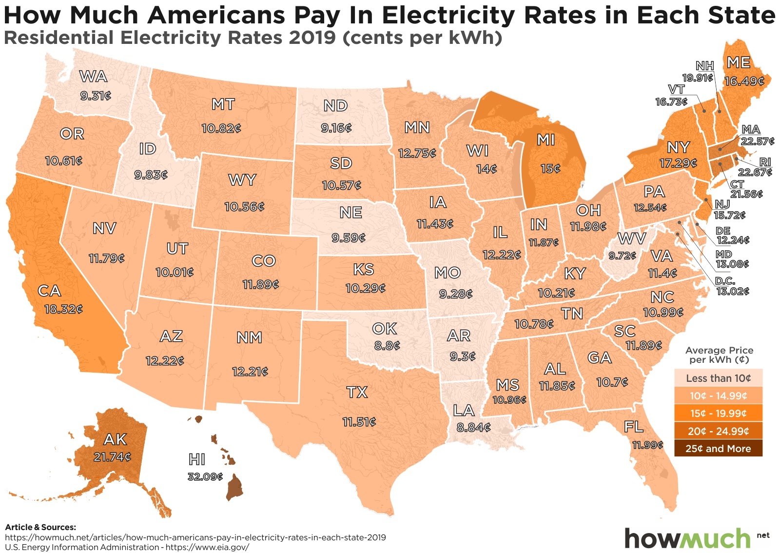
According to the U.S. Energy Information Administration (EIA), the average U.S. household spends 12.70 cents per kWh of electricity. Using recent data from the EIA, we created three heat maps to illustrate how electricity rates vary across the U.S and across different types of customers. The first map is for residential electricity, which is electricity used in a house. The second is commercial electricity, which is used by businesses like retail establishments or private corporations. The third is for industrial electricity, which is for large manufacturing plants and production facilities. On each map, the darker shades indicate a more expensive electricity rate (measured as cents/kWh) and lighter shades indicate a less expensive rate.

Top 5 States with the Most Expensive Residential Electricity Rates (cents/kWh)

1. Hawaii: 32.09
2. Rhode Island: 22.67
3. Massachusetts: 22.57
4. Alaska: 21.74
5. Connecticut: 21.56

Top 5 States with the Most Expensive Commercial Electricity Rates (cents/kWh)

1. Hawaii: 30.64
2. Alaska: 19.28
3. Rhode Island: 18.39
4. Connecticut: 17.44
5. Massachusetts: 17.02

Top 5 States with the Most Expensive Industrial Electricity Rates (cents/kWh)

1. Hawaii: 26.73
2. Massachusetts: 17.12
3. Alaska: 16.91
4. Rhode Island: 14.74
5. Connecticut: 14.51

There are a number of interesting findings. Across all types of buildings, Hawaii has the most expensive electricity rates. Alaska is also one of the most expensive states for electricity, due in part to its geographic isolation from the rest of the U.S.

In the contiguous states, the Northeast commands higher energy prices, while the Midwest, South, and Northwest tend to have comparatively lower rates. A major reason for this is because the Northeast is so densely populated that energy demand is very high; the same is true for California, which also has higher electricity prices.

By contrast, more rural states like Oklahoma and Louisiana have some of the lowest electricity rates. Notably, electricity is derived from other energy sources like coal, gas, wind, hydro, or solar power. The local availability of these resources, as well as their operating costs, will also play a role in determining prices. This explains why more resource-rich states or more sparsely populated states that have room for energy plants charge less for electricity.  

So how do these rankings stack up against 2018? View last year’s visualization here.

Data: Table 1.1 

How Much You Have to Invest to Open One of the Top 20 Franchises

$
0
0

There are an estimated three quarters of a million franchises in the U.S. alone. While most people think of franchising in terms of fast-food restaurants, the U.S. Census Bureau notes that a number of other industries including fitness, beauty, and automobiles also rely on a franchise model to generate business. Our latest visualization illustrates how much it would cost to open one of the top 20 U.S. franchises based on initial investment requirements.

This data for this visualization comes from Entrepreneur’s 40th annual Franchise 500® list. The methodology behind the ranking includes five main factors: costs & fees, size & growth, support, brand strength, and financial strength & stability. The final results were determined based on information provided by 1,094 franchisees nationwide. We used the investment information collected by Entrepreneur to map out the low-end investment cost and the high-end investment cost for the top 20 franchises.

Initial Investment Costs for the Top 10 Franchises

1. McDonald’s - $1,058,000 to $2,230,000
2. Dunkin’ - $228,621 to $1,717,103
3. Sonic Drive-In - $865,000 to $3,641,300
4. Taco Bell - $525,100 to $2,622,400
5. The UPS Store - $168,885 to $398,323
6. Culver’s - $2,043,000 to $4,652,000
7. Planet Fitness - $969,600 to $4,242,500
8. Great Clips - $136,900 to $258,250
9. Jersey Mike’s Subs - $178,523 to $746,342
10. 7-Eleven - $47,050 to $1,165,400

Most of the franchises on the top 10 list are in the food and beverage industry, with Great Clips, The UPS Store, and Planet Fitness being the notable outliers. Among the franchises in the top 20, Culver’s has the largest spread, with a $2.6 million difference between the lower end of investment and the higher end. By contrast, Kumon Math & Reading Centers had the smallest spread, with only a $79,382 difference. Within the top 20, Culver’s has the most expensive investment costs at both the low end ($2,043,000) and the high end ($4,652,000). At $40,000, REMAX has the lowest potential investment cost on this list. Keep in mind, these numbers do not take into account operating costs or ongoing royalty fees, so the total cost of owning a franchise will be much higher.

Curious to see how franchise costs vary by location? Check out another visualization here to see initial investment costs for franchises headquartered in different states.

Data: Table 1.1

Visualizing The National Debt Boom in the Last Few Years

$
0
0

In February 2019, the national debt hit an eye-popping $22 trillion. The projected annual deficit for this year alone is almost $1.1 trillion -- that’s more than the GDP of Singapore, Norway, and New Zealand combined.

Recently, The Balance published an article noting major milestones in the accumulation of national debt, using data from the ”U.S. Debt to the Penny” report from the United States Department of the Treasury. We used the information compiled by The Balance to create our latest visualization, which shows how much the national debt has grown since 1934. Prior to 1996, the visualization only uses years but not the exact dates because debt levels are not available for each day. Each box in the visualization is equal to $1 trillion.

In 1934, the national debt was only $25 billion. It began increasing rapidly in the 1980s, reaching $1 trillion in 1982 and ballooning throughout the 1990s and 2000s. 

Just as with household debt, the national debt increases when spending outpaces revenue. In the case of the government, the majority of revenue comes from taxes levied on personal and corporate income. To amass more funds (which results in accruing debt), the federal government issues treasury bills, notes, and bonds to creditors.

The national debt is composed of two main categories: intragovernmental debt  and debt held by the public. Intragovernmental debt is held by federal agencies, such as the Social Security Trust Fund and Medicare. For debt held by the public, the creditors are individuals, corporations, state or local governments, Federal Reserve Banks, foreign governments, and other entities outside the United States government. About two-thirds of the national debt is classified as debt held by the public.

Acquiring too much debt can have a negative effect on a number of economic factors, including slower economic growth, lower stock market returns, and decreased confidence in the U.S. government’s ability to repay its debt. Currently, the debt-to-GDP ratio in the U.S. is 105%, above the World Bank’s recommendation of 77%. The higher the ratio, the greater the risk of default. This makes it more imperative than ever to rein in the national debt and get the government’s “checkbook” under control.

Looking for another perspective of the national debt? Here’s our visualization on how the national debt has grown under each president.


Data: Table 1.1


Is Solar Installation Worth It? The Lifetime Savings in Each State

$
0
0

Advocates of renewable energy often claim its adoption should be considered an investment because, over time, the benefits of installation far outweigh the costs. Is that really true?

Let’s take a look in the U.S. on a state-by-state basis, using data collected from solarreviews.com as of May 3, 2019. A 5kW solar panel system is enough to power an average residential structure -- the Department of Energy uses 5.6kW for the size of an average residence in its own modeling.


Solar Panel Installation: A Deal in Any State

It appears that the claims are true -- given the cost of electricity throughout the United States, the cost of installing solar panels for the average residence will easily pay for itself over a lifetime, with a wide variance across states.  

Compare the lifetime savings with the overall cost of electricity in each state as provided by an earlier post. This comparison is focused on residential solar panel installation, so focus on residential rates. The three states with the most expensive residential electricity rates are Massachusetts, Hawaii, and Rhode Island.

Take another look at the infographic compared to the residential electricity rates. There is a strong pattern:

Top 3 States With the Most Expensive Residential Electricity Rates

1. Hawaii: 32.09 cents/kWh
2. Rhode Island: 22.67 cents/kWh
3. Massachusetts: 22.57 cents/kWh

Top 3 States With the Biggest Lifetime Savings in Solar Panel Installation

1. Massachusetts: $133.7K
2. Hawaii: $121.6K
3. Rhode Island: $114.2K

It makes sense that the three states with the most expensive electricity would be the three states where solar installation pays off the most. In fact, the payoff is over $100K for only these three states.

What About Alaska?

The pattern appears to hold that the higher the cost of electricity, the higher the savings from solar. Do you notice an outlier?

You may recall in the earlier article that Alaska has one of the most expensive residential rates in the United States. However, it also generates the least average lifetime savings of any state. How can this be? It’s not just location -- Hawaii is also a remote state, but solar panels pay off there.

Remember that one thing needed for solar panels to work is sunlight, and Alaska isn’t exactly the sunniest state in America. In fact, it is the only state in America where parts of the state during parts of the year do not receive any sunlight. Hawaii definitely does not have this problem! So, Alaska is a true outlier both in terms of the cost of electricity, and the potential utility of solar.  

Is Solar For You?

Provided you live in an area of the country that is not entirely dark during parts of the year, solar installation will likely pay for itself. Check the data below for the exact costs and benefits in your state.


Data: Table 1.1

Does Your Country’s Production Still Stack Up When You Consider Purchasing Power?

$
0
0

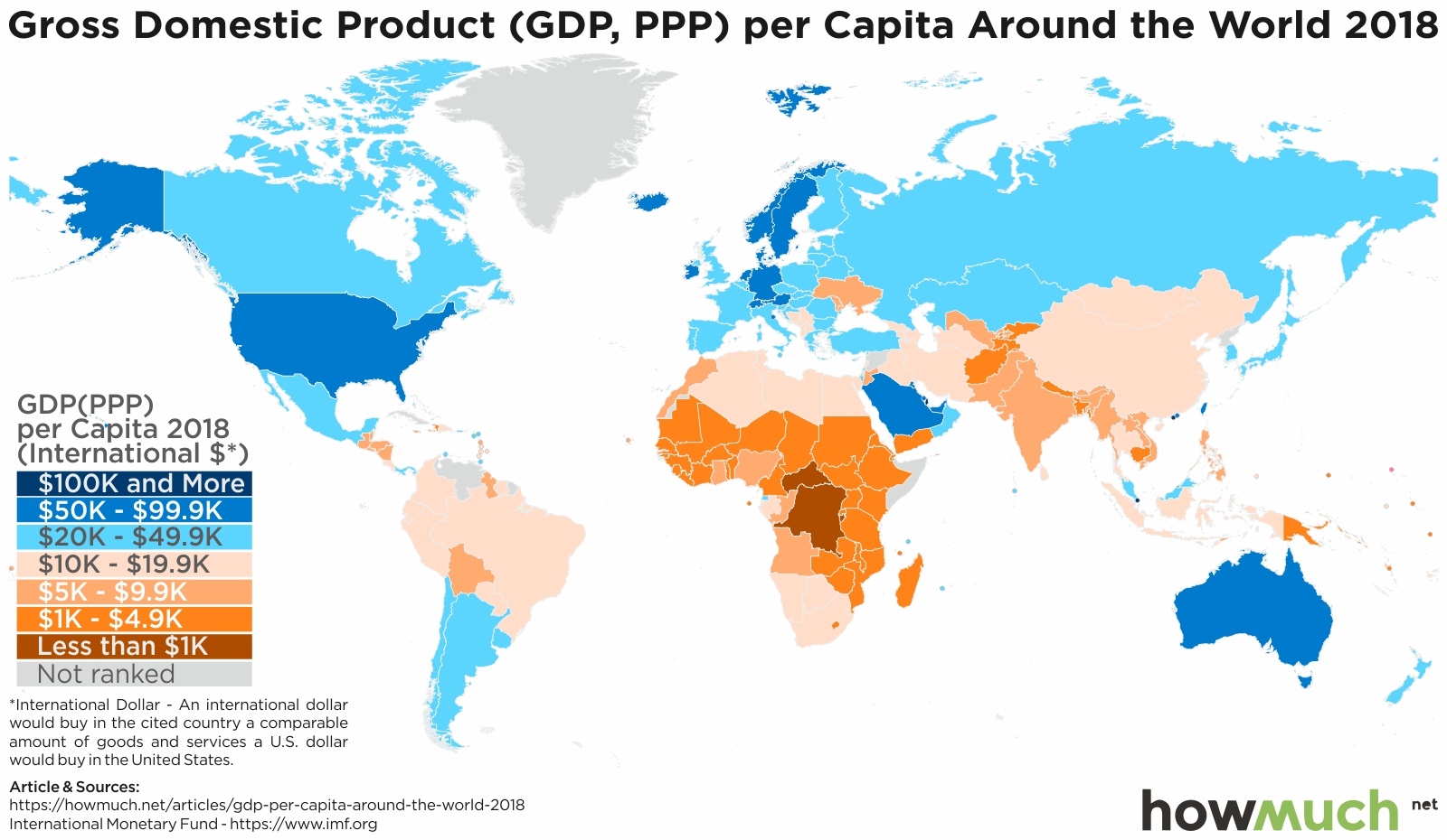
Beyond a country’s gross domestic product, economists also like to look at a metric known as purchasing power parity. Where per capita GDP shows roughly how much money individual people have, PPP demonstrates how much people can afford. PPP tries to give as much of an apples-to-apples comparison of what things cost in one country compared to another, controlling for factors like differences in currency valuations and inflation.

To paint a picture of how people are able to live, you need to understand not just how much money they have, but how much they can buy with that money.Looking at the world map of per capita GDP adjusted for PPP, you come away with two insights: The first is that, by and large, an individual’s purchasing power varies tremendously by region. And second, if you compare the PPP map with the per capita GDP map, you’ll notice that they do not reflect each other in any specific way. Some countries that have a lower relative GDP might have a higher PPP and vice versa. We’ll explore that more as we look closely at each region.

While the United States is the only North American country to earn between $50K-$99.9K in terms of GDP(PPP), it is not the only country in the region to claim one of the higher tiers. In addition to Canada, numerous Caribbean countries also have a GDP(PPP) higher than $20K. While there are still a number of countries that rank low, particularly Haiti, there’s more parity here than you might have expected.

If you looked at the per capita GDP map, fewer countries in North America rank in the higher tiers than in the GDP(PPP) map. For instance, Panama’s per capita GDP is $15,877, where its GDP(PPP) is $25,675.

So what does that mean? It means that while some countries in the region might have lower GDP and less overall money, goods and services are still relatively affordable for people who live there. This is a positive sign for the standard of living in those countries.

In terms of PPP, South America is split between north and south. Individuals in the southern countries have an easier time affording essential goods and services compared to their peers in the north. The rescaling effect of the map also helps illustrate the fact that, while Brazil might be a massive country with a relatively large GDP, when you zoom in on individual level, Brazilians are struggling to afford things. Even though Uruguay is a much smaller country, it’s slightly bigger in size on this map to demonstrate that Uruguayans have greater purchasing power.

Most countries in Europe are relatively well off, particularly in Western Europe. In this map, Luxembourg again reigns supreme with a GDP(PPP) of $106,705. Ireland is second with $78,785. With Ireland’s booming technology sector and smaller population, it is able to maintain a high purchasing power and improve the cost of living for its citizens.

Eastern Europe continues to struggle. In addition to having low GDPs, essential goods and services are also relatively expensive in countries like Moldova, Ukraine, and Armenia. Some countries in the eastern part of the region, however, show dramatic improvements on the GDP(PPP) map. Turkey, for instance, jumps up dramatically when considering the affordability of life for people who live there. Despite a low per capita GDP, its GDP(PPP) is $27,956.

There’s a distinct lack of parity in Oceania. Australia is first with $52,373, New Zealand is second with $40,135. The next closest country is Palau at $14,952, more than $25,000 less than New Zealand. While the average citizens of Australia and New Zealand live in relative prosperity, residents in the rest of the region can struggle to access even the basics.

Asia is a mix of wealth and poverty. While countries like Qatar have strong purchasing power, other countries like Tajikistan have immensely low purchasing power. The disparity is even more dramatic considering how close in proximity some of the countries are. Whether they’re ravaged by war or they’re poor in natural resources, some countries in the region have low standards of living for their citizens because basic goods can be so expensive.By and large, Africa as a region has low purchasing power. While there are some exceptions (Seychelles, Mauritius, and Equatorial Guinea), most countries in Africa have difficulty providing their citizens with affordable goods. There is some variation within the continent. Countries in the north and in the south tend to do better than the landlocked countries in the middle of the continent. And those smaller island nations with booming tourism industries also do better than other countries in the region. But by and large, average Africans have low purchasing power and, as a result, often have a lower standard of living.


Data: Table 1.1


China and the Trade War: How Liquidity Reserves Can Affect the Game

$
0
0

A country’s total reserves can have a dramatic impact on its economic policies. In this post, we’ll look at the countries with the top reserves, especially China, and how that should impact China’s trade wars with the U.S.

  • Liquid reserves allow countries significant leverage in economic policies and trade wars.
  • China currently holds over $3 trillion in reserves, far higher than Japan’s second-place $1.24 trillion in reserves.
  • China also holds a significant amount of U.S. debt, forcing them to walk a tight rope with the U.S.; they don’t want to rock the boat too much, but they have tremendous leverage to use if necessary.
  • If China were to sell off its reserves, it would have cascading effects on the economy, including driving up U.S. interest rates.

You don’t fight a trade war without ammunition on both sides. In compiling the data of the largest reserves--or total reserves measured in U.S. dollars--you’ll find a keen perspective as to why the markets seem to react to every headline related to the U.S.-China trade wars.

Why do liquid reserves matter? As it relates to trade wars, a country’s reserve stockpile has a large say in how much economic weight it can throw around. If China stockpiles a large amount of U.S. dollars, it can influence the value of its own currency, the yuan, which is pegged in U.S. dollars. Given that China holds over $3 trillion in reserves--far higher than Japan’s second-place $1.24 trillion--any movement from China can mean massive economic consequences for the globe.

Top 5 Countries with the Biggest Liquidity Reserves

1. China: $3.09 Trillion
2. Japan: $1.24 Trillion
3. Switzerland: $744 Billion
4. Saudi Arabia: $496 Billion
5. Taiwan: $462 Billion

How (and Why) Countries Use Liquidity Reserves

The reason any investor would want to hold liquidity is obvious: it makes an investor more flexible. It keeps one’s options open. But on a geopolitical level, liquidity has far-ranging uses. Countries can employ these reserves strategically to help manage the supply (and value) of their home currencies. This, in turn, can influence the price of exports. If a country like Japan manages its reserves well, it can compete with dominant exporters like China by making its products relatively cheap to consumers like the U.S. These reserves give countries economic power and financial weight for throwing around.

We constructed this graphic according to IMF Data, which provides a comprehensive list of variables that go into factoring each country’s liquid reserves.

How the Reserves Impact the U.S.-China Trade War

Because the exchange rates between currencies have such an impact on a country’s exports, one can expect these numbers to have a drastic effect on trade wars. In particular: the U.S.-China trade war.

Consider that China holds a significant amount of U.S. debt. This gives China leverage if they’re unable to otherwise respond to tariff threats from the U.S. China’s ability to buy up U.S. government debt also means that it has the ability to unload that debt in massive amounts at a moment’s notice. Drastically increasing the market supply with U.S. treasuries would, in turn, push down U.S. bond prices. With lower bond prices come higher yields, discouraging the free flow of credit in the U.S.

If China were ever to sell off these reserves, notes Bloomberg: after a cascade of effects, such a move could also drive down the value of the U.S. dollar. Low currency costs would mean that U.S. products are cheaper and more competitive on the global marketplace.

China faces a delicate balancing act with its substantial reserves. Though it could drive up U.S. interest rates, driving down the value of the dollar would also have adverse trade consequences. Watching how China manages its substantial reserves will be integral to understanding the progress of the trade war.

Data: Table 1.1


How Much Life Insurance do You Need? It Depends on These Factors

$
0
0

Everyone needs life insurance. But how much each individual needs varies from person to person. You will want to find the right life insurance policy that accounts for how much money you earn and the cost of living in your area.

So how much coverage do you need from life insurance? Here’s the breakdown based on state and income levels to help you zero in on how much you should look to get from a policy.
 

  • Even the lowest wage group in the most affordable part of the country (Jackson, Mississippi) still needs at least $162,000 of life insurance.
  • Those high earners in Washington, D.C., need the most life insurance in the whole country, averaging more than $1 million. 
  • In Sioux Falls, South Dakota, the disparity between the high- and low-income groups is relatively low, with high earners only needing policies covering $200,000.
  • In other places, like Baltimore, Maryland and Los Angeles, California, the disparity is much higher since the wealth distribution is more extreme in those cities compared to some other places in the country.

How much you want to spend on life insurance is a personal choice. But you should still weigh your particular circumstances to determine how much life insurance makes sense to protect your family’s long-term financial interests. The more money and assets you have and the higher the cost of living, the more you should consider taking out in life insurance.

Highest Life Insurance Rates

Low Income Group: 
1. District of Columbia - $344,656
2. Anchorage, Alaska - $254,630
3. Seattle, Washington - $251,006

Median Income Group: 
1. District of Columbia - $621,026
2. Boston, Massachusetts - $408,553
3. Anchorage, Alaska - $394,820

High Income Group: 
1. District of Columbia -  $1,050,947
2. Boston, Massachusetts - $685,022
3. New York City, New York - $666,045

Lowest Life Insurance Rates

Low Income Group: 
1. Jackson, Mississippi - $162,505
2. New Orleans, Louisiana - $166,129
3. Little Rock, Arkansas - $173,758

Median Income Group: 
1. Jackson, Mississippi - $246,428
2. Little Rock, Arkansas - $257,681
3. Charleston, West Virginia - $263,952

High Income Group: 
1. Jackson, Mississippi - $397,491
2. Sioux Falls, South Dakota - $399,589
3. Little Rock, Arkansas - $413,417

 In Washington, D.C., the cost of living is so high that even low-income earners still need an average policy that covers more than $300,000. In Jackson, Mississippi, where the cost of living is significantly lower, the highest earners don’t even need $400,000 in coverage on average. So if Washington, D.C.’s low earners need comparable amounts to Jackson’s highest earners, you can see that cost of living has a strong influence “in how much you should be paying in life insurance. 

We compared three income groups based on wage distribution provided by the U.S. Bureau of Labor & Statistics. These buckets represent the 25th, median, and 75th percentiles of expected earnings for the average worker in each state.  Using the tool from SmartAsset we took a sample of people born in 1984 who do not own a house and have $25,000 in savings. The insurance assumes income over a 20 year period, where you receive 50% of the monthly earnings with no dependents. Lastly, we exclude Social Security Benefits, and assume inflation of 2% and an annual return on savings of 4%.

Are you considering buying life insurance? Do you already have a policy and you’re considering revising it? It’s important for people to understand the averages, like in our map above, but it’s also helpful to hear personal anecdotes and stories. We encourage you to leave a comment and share your lessons learned for the benefit of our other readers.

Data: Table 1.1

Visualizing Fragility & GDP: How Stable is Your Country?

$
0
0

In terms of stability, all countries are not created equal. Some are rich, some are poor, some are violent and some are safe. The Fund For Peace, a U.S.-based NGO, stack ranks 174 countries every year based on how stable a country is. Hard data such as economic indicators, security, strength of factions and other indicators are analyzed and compared yearly. Each country, based on its data, is given an index score and ranked from 1 to 174. The higher the index, the more unstable the country. The data may surprise you.  

  • The Fund for Peace stack ranks 174 countries every year based on stability.
  • Yemen is the newly ranked most unstable country with Somalia slipping to the second most unstable country.
  • Western Europe, in particular Nordic countries (Finland, Norway, Demark, Sweden and Iceland)  continue to be ranked as the most stable countries in the world.
  • The world’s largest economies (U.S., China, Japan) are noticeably absent from top ten most stable countries.  

The African continent continues to dominate the world’s most unstable countries list while Westrn Europe dominates the most stable component.  Looking into the details reveals some surprising takeaways.

Top Ten Most Unstable Countries

1. Yemen. Fragility Index: 113.5 - GDP: $31.3B
2. Somalia. Fragility Index: 112.3 - GDP: $7.05B
3. Democratic Republic of Congo. Fragility Index: 110.2 - GDP: $37.6B
4. Central African Republic. Fragility Index: 108.9 - GDP: $1.95B
5. Chad. Fragility Index: 108.5 - GDP: $9.87B
6. South Sudan. Fragility Index: 108 - GDP: $117B
7. Afghanistan. Fragility Index: 105 - GDP: $19.5B
8. Zimbabwe. Fragility Index: 99.5 - GDP: $22B
9. Guinea. Fragility Index: 99.4 - GDP: $10.5B
10. Haiti. Fragility Index: 99.3 - GDP: $8.41B

Top Ten Most Stable Countries

1. Finland. Fragility Index: 16.9 - GDP: $252B
2. Norway. Fragility Index: 18 - GDP: $399B
3. Switzerland. Fragility Index: 18.7 - GDP: $679B
4. Denmark. Fragility Index: 19.5 - GDP: $330B
5. Australia. Fragility Index: 19.7 - GDP: $1.32T
6. Iceland. Fragility Index: 19.8 - GDP: $24.5B
7. Canada. Fragility Index: 20 - GDP: $1.65T
8. New Zealand. Fragility Index: 20.1 - GDP: $204B
9. Sweden. Fragility Index: 20.3 - GDP: $536B
10. Luxembourg. Fragility Index: 20.4 - GDP: $62.3B

The biggest surprise from the data comes from the most stable countries, not the unstable. Nordic countries occupy 50% of the top 10 countries. Western Europe occupies 70% of the top 10. These countries score very high on security, economics and most importantly economic inequality. Nordic countries are some of the most economically equal countries in the world.  

While there is a correlation between GDP and stability, the world’s top three largest economies (U.S., China, and Japan) don’t make the most stable countries top ten list. The U.S. doesn’t even break the top 20 coming in at 26. Japan ranks 22nd and China remains in the elevated risk category at 90. In other words, China, despite being the world’s second largest economy is in the top 100 of countries most at risk of instability.  

The rankings provide a snapshot in time. The trend of a countries ascent or decline is perhaps more instructive on where a country is heading. In the case of the U.S., it has been in a declining trend for several years despite a robust economy. Fragile State Index 2018 report devotes an entire section to the declining stability ranking of the U.S. and highlights partisan politics as a key contributing factor.  

Looking for more perspective on how the U.S. ranks against the world? Read our piece on how U.S. States compare to entire countries.

Data: Table 1.1

What the Numbers Tell Us About the U.S. Drug Crisis

$
0
0

The U.S. has been battling a growing drug use epidemic for several years. This crisis has resulted in an increase in overdose-related deaths as well as an increase in prescription drug spending. By looking at how much people are spending on prescription drugs in each state, we begin to understand the scope of the problem.

So how large of an impact has this drug crisis had on each state? Let’s take a look at the numbers to get an idea.

  • North Dakota has both the lowest spending per capita on prescription drugs ($734) and the lowest number of deaths by overdose (68).
  • Low spending per capita on prescription drugs does not necessarily indicate a lower number of overdose-related deaths. California, for example, has the second lowest spending per capita ($788) and the fourth most deaths from overdose (4,868).
  • The largest spending category on prescription drugs in the country is commercial — meaning, the majority of these prescriptions are covered by commercial and government programs.
  • 25 out of 50 states had over 1,000 fatal opioid overdoses in 2019 with only three states having less than 100 fatal overdoses — indicating that the drug epidemic is a national concern, not a localized issue.

Fatal overdoses in the United States are continuing to increase. The age-adjusted rate of overdose deaths increased significantly by 9.6% from 2016 (19.8 per 100,000) to 2017 (21.7 per 100,000).

Unsurprisingly, this correlates with an increase in prescription drug spending. In 2018, individuals in the United States spend a total of nearly $400 million on prescription drugs.

While the opioid epidemic seems to be improving, other drugs are becoming an increasingly severe threat to the U.S. population.

States With Highest Spending Per Capita On Prescription Drugs:

1. Delaware - $1,693
2. Tennessee - $1,655
3. Kentucky - $1,612
4. West Virginia - $1,507
5. Connecticut - $1,423

States With Lowest Spending Per Capita On Prescription Drug:

1. North Dakota - $734
2. California - $788
3. Montana - $828
4. Washington - $833
5. South Dakota - $862

States With Highest Opioid Prescriptions per 100 People:

1. Alabama - 107.2
2. Arkansas - 105.4
3. Tennessee - 94.4
4. Mississippi - 92.9
5. Louisiana - 89.5

States With Lowest Opioid Prescriptions per 100 People:

1. District of Columbia - 28.5
2. Hawaii - 37
3. New York - 37.8
4. California - 39.5
5. Massachusetts - 40.1

Most people would assume that either larger populations or some other correlating factor would present itself in the data. What we tend to see is that the higher the expenses per capita, the higher the opioid prescription rates. You see this in places like Alabama, Mississippi, and Arkansas.

However, this isn’t always true. States like Wisconsin and Connecticut have high per capita spending, but low amounts of opioid prescriptions. In fact, there isn’t necessarily a correlation between opioid deaths per capita and either the total expenses per capita or the prescription rate per 100 people.

To find the prescription drug spending per capita by state, we used U.S. Census data to get the population by state. KFF then provided data from IQVIA to total expenses for each state. We then divided the population to get the per capita spending for each state. The CDC provided the data on the opioid prescription rates.

The figures used in this piece were obtained by dividing all prescription drug expenses by the U.S. Census 2018 population estimates in each state. This data includes prescriptions covered by commercial and government programs, Medicaid, Medicare, and cash.

You were likely already aware of the current drug epidemic in the U.S. It has been the subject of extensive media coverage over the past several years.

However, if you haven’t experienced the effects of this problem in your own life, taking a look at the numbers surrounding this crisis can help give you a better idea of the severity of this issue.

It’s important to understand what this data represents and what it implies for the future. Moreover, it’s important to learn from others that have been affected by this epidemic to better understand the situation at hand. We encourage you to leave a comment about your personal experiences and what conclusions you think can be drawn from these figures.

Data: Table 1.1

Mapped: Who Owns the World’s Gold Reserves

$
0
0

In 2010, the world’s central banks stopped selling gold and started accumulating it. As gold provides a hedge against economic uncertainty and currency manipulation, the action of these central banks gives us insight as to which countries are most capable of handling an economic storm.

Here’s what you’ll learn in this article:

  • Data from Gold.org - courtesy of the International Monetary Fund’s International Financial Statistics - shows the U.S. by far has the world’s largest gold reserves, followed by Germany and the IMF. Two rivals of the U.S., Russia and China, come in and 6th and 7th, respectively.
  • China and Russia have been some of the most aggressive buyers of gold in recent years. Both Russia and China top the list of the most aggressive gold buyers since 2014. 
  • Although China is the world’s largest producer of gold, its overall gold stores have been anemic compared to its competitors, especially as it relates to total economy size.
  • Recently, the price of gold has moved up, especially as trade talks between the U.S. and China have put some fear into the markets and sent investors looking for safe havens.

A common theme in economics is “those who own the gold make the rules.” Recent statistics suggest a large disparity between the top gold holders in the world and those governments holding less of the yellow metal.

The Ranking of the World’s Top Gold Owners

1. United States - 8,133 tonnes - $373,430,444,426
2. Germany - 3,369 tonnes - $154,711,817,616
3. IMF - 2,814 tonnes - $129,198,164,458
4. Italy - 2,451 tonnes - $112,568,606,829
5. France - 2,436 tonnes - $111,843,187,142
6. Russia - 2,168 tonnes - $99,552,373,843
7. China - 1,885 tonnes - $86,568,279,703

Understanding the Power of Gold Across the World

According to the latest IMF statistics, the United States remains the largest holder of gold, holding some 8,133 tonnes of it in its stores. Most other countries fall below the 3,000 tonne mark, with the IMF taking third place on the list.

Gold is famous amongst investors for being a safe haven asset--a place to which money can flow when there’s uncertainty in the stock market or in currencies. Those countries with large storehouses of gold have access to a stable asset that tends to weather financial storms.

In recent years, there’s been a shift. Russia and China are fast becoming the world’s top buyers of gold, with their central banks rapidly turning to the yellow metal since 2014. We see that reflected in the rankings, where both countries rank among the top 7 holders of gold.

According to Investing.com, the price of gold has increased recently, especially with the trade wars between the U.S. and China. As investors grow increasingly uncertain about the economic future of each country’s economies, a flight to gold tends to drive up demand and, with it, prices. This increases the value of each country’s gold stores, as well.

With gold where it is, those countries with large gold reserves are in good shape. But you can watch how each country looks for more independence from global currencies (as China moves away from the dollar by buying gold) based on the movement of these numbers.

Has anything on this list surprised you? Share this infographic with your friends and browse the latest financial and economic trends here for fresh insights into the unfolding economic world.


Data: Table 1.1

A Snapshot of the World Money Transfer Market

$
0
0

Every year, migrant workers living in other countries send money back to their home countries. The flow of money earned in one country and sent to another is known as remittances. Remittances account for one of the main forms of international money transfers, in addition to foreign direct investment and development aid.

  • Developed countries like the U.S., Canada, Japan, and the U.K. tend to have more outflows than inflows of remittances.
  • Developing countries like India, Egypt, and Brazil have more inflows than outflows of remittances.
  • Remittance flows follow regional patterns. For example, eastern Europe and central America have more inflows, while the Middle East and northern Europe have more outflows.
  • Unlike foreign direct investment or development aid, most remittances are sent to individuals rather than the state. Remittances are often used for basic necessities like food and housing.

Our latest visualization uses the World Bank’s April 2019 Migration and Remittances data to chart whether each country sends out more remittances (outflows) or receives more remittances (inflows). Countries shaded in pink indicate a higher volume of outflows, while green indicates a higher volume of inflows.

Looking at a more micro level, we can gain a better idea of how remittances vary across countries and regions. In the visualizations below, we map out the remittance inflows and outflows of each country. The size of the country indicates the volume of remittances (the bigger the countries, the more remittances). The pink and green shading are also in direct proportion to the size of the inflows and outflows. All monetary values are expressed in USD.

Among all world countries, the U.S. has the largest number of outflows at $68 billion. Conversely, almost all remittances in Mexico are inflows ($32.3 billion). Countries in the Caribbean vary greatly in whether inflows or outflows are the greater proportion of remittances, while countries in Central and South America tend to have more inflows. A few notable exceptions are Chile, Argentina, and Panama, which all have a higher volume of outflows.  

In the Australia and Oceania region, Australia ($8.8 billion) and New Zealand ($969 million) have the highest total remittances. Unlike most of the Oceania region, both of these countries also have a significantly higher proportion of outflows. In Africa, Egypt ($25 billion) and Nigeria ($22.3 billion) have the highest volume of remittances. Interestingly, most of the countries in northern and central Africa have a higher volume of inflows, while countries in the south like South Africa and Angola have more outflows.

Overall, countries in east and southeast Asia tend to have more inflows than outflows. Outliers include the highly developed nations of South Korea and Japan, which send out more money than they take in as remittances. Worldwide, India has the highest volume of inflows, at $69 billion. By contrast, most countries in the Middle East have a greater percentage of outflows. For example, the United Arab Emirates sends $44.4 billion as outflows, but does not have any significant inflows.

In Europe, wealthy northern and western countries like the UK, Germany, Norway, Switzerland, and Luxembourg have a greater volume of outflows. By contrast, countries in eastern Europe like Ukraine, Hungary, and Croatia take in more inflows. At $38.9 billion, Germany has the highest number of total remittances.

Due to the high cost of regular remittance services like Western Union, new innovations in fintech and mobile banking are flourishing, especially in Latin America and sub-Saharan Africa. There is a lot of money on the line for the providers of these services, and newcomers like the TransferWise “borderless” bank account are entering the race to make money transfers as seamless as possible. Even established businesses are trying to get in on the action. Facebook, for example, wants to add cryptocurrencies to the mix to compete in the money transfer market too. As technology related to money transfer continues to evolve, it remains to be seen how these remittance statistics are going to change.

Have you worked abroad and sent remittances back home? Leave a comment below to share your experience.

Data: Table 1.1

Mapping Out Each Country’s Largest Public Company

$
0
0

Recent IPOs filed by Silicon Valley firms like Uber, Lyft, and Beyond Meat have garnered significant media attention in recent weeks. While the American news cycle has covered a lot about these newcomers to the stock exchange, they are only a small snapshot of the global network of public companies. Our newest visualization maps out the largest public company in each country, based on the most recent data from the Forbes Global 2000 list.

  • In the full Forbes list of the World’s Largest Public Companies, 9 of the top 10 companies are located in either the U.S. or China.
  • Overall, banks, tech, automobiles, telecommunications, and energy are the industries with the largest public companies around the world.
  • According to Forbes, the Global 2000 have more than $40 trillion in annual revenue and more than $186 trillion in global assets.

The Forbes Global 2000 list draws upon data from FactSet Research systems, Bloomberg, and company financial statements to analyze the sales, profits, assets and market value of public companies around the world. These four factors are combined to calculate a composite score, which Forbes uses to rank the value of public companies. Our visualization above highlights the largest public company in each country by showing the company logo on the country. The darker shades of blue also indicate the public companies with the highest profits. Below, we have divided the visualization into regions and also highlighted the market value of each country’s largest public company. All monetary values are expressed in U.S. dollars. Here’s a closer look at how the biggest public companies vary by region.

Top 3 Countries’ Largest Public Companies by Market Value in the Americas

1. U.S. - JPMorgan Chase ($368.5 billion market value)
2. Canada - Royal Bank of Canada ($114.9 billion market value)
3. Brazil - Petrobras ($91.2 billion market value)
 
Among all countries in the world, the U.S. has the largest public company by market value Overall, the largest public companies in North American countries have higher profits and market values than the largest public companies in the Caribbean or South America. 


Top 3 Countries’ Largest Public Companies by Market Value in Europe

1. Switzerland - Nestle ($281.3 billion market value)
2. The Netherlands - Shell ($264.9 billion market value)
3. Belgium - Anheuser-Busch InBev ($175.7 billion market value)

The largest public companies in Western Europe have higher profits and market values than the largest public companies in Eastern Europe. Notably, the National Bank of Greece, which is the smallest of the large public companies in Europe, has negative profits.

Top 3 Countries’ Largest Public Companies by Market Value in Asia

1. China - ICBC - ($305.1 billion market value)
2. Hong Kong - China Mobile ($197.6 market value)
3. Japan - Toyota Motor ($176.6 market value)

The most profitable and highest value Asian public companies are located in northeast Asia. The majority of the largest public companies in Asia are in the banking industry, but oil & gas and telecommunications also have a significant presence. Since only public companies are included on the Forbes list, the world’s most profitable company (Saudi Arabia’s state-owned oil company Aramco) is not shown on this visualization.

Top 3 Countries’ Largest Public Companies by Market Value in Africa and Australia

1. Australia - Commonwealth Bank ($92.8 billion market value) 
2. South Africa - Standard Bank Group ($22.9 billion market value)
3. Kenya - Safaricom ($11 billion market value)

Africa has very few public companies on the Global 2000. The largest public companies in Africa and Asia also have profits under $10 billion. 

Although most of the companies on the Forbes Global 2000 have been established for many years, there are constant newcomers filing IPOs and bursting onto the international stage. For example, in 2018 alone, 190 companies in the U.S. went public. How do you think these new IPOs will change the world’s largest public companies in the future? Please let us know in the comments.


Data: Table 1.1


Visualizing the State of Health Around the World

$
0
0

No two countries are the same when it comes to healthcare spending and outcomes. Our newest visualizations illustrate three key measures of health in each country: healthy life expectancy at birth, current health expenditure (CHE) per capita, and current health expenditure (CHE) as a percentage of gross domestic product (GDP). All monetary values are expressed in USD.

In creating these visualizations, we analyzed data from the World Health Organization’s (WHO) Global Health Expenditure Database and the World Health Statistics report for Healthy Life Expectancy. Here’s what we found region by region.

The visualizations show all the countries that have data available for healthy life expectancy and current health expenditures. The x-axis shows the healthy life expectancy at birth, while the y-axis shows CHE per capita. Each individual country is represented as a flag in a circle, and the shade of the outline of each circle indicates health expenditures as a percentage of GDP (with darker shades of pink representing higher CHE as a percentage of GDP).

Top 3 Countries by Healthy Life Expectancy in the Americas

1. Canada - 73.2 years
2. Costa Rica - 70.9 years
3. Cuba - 69.9 years

In the Americas, the U.S. has the highest health expenditures when measured per capita ($9,870) and by GDP (17.1%). The Americas also have the greatest variation in CHE per capita, ranging from $38 in Haiti to $9,870 in the U.S. With rising premiums and more than 27 million Americans living without health insurance, concerns about healthcare are growing stronger. As a result, some educational institutions, policymakers, and media outlets are taking a closer look at the state of healthcare in other countries to see how the U.S. measures up.

Top 3 European Countries by Healthy Life Expectancy

1. Spain - 73.8 years
2. Switzerland - 73.5 years
3. France  - 73.4 years

In general, countries in Western Europe have higher healthy life expectancies and higher healthcare expenditures per capita than countries in Eastern Europe. According to the World Health Organization data, Switzerland has the highest healthcare expenditures in Europe, at $9,836 CHE per capita and 12.3% CHE as a percentage of GDP. Europe is also the only continent in which healthy life expectancy in each country is age 60 or older. While most countries have similar statistics for CHE per capita and CHE as a percentage of GDP, a few countries buck this trend. For example, Luxembourg has a high CHE per capita at $6,271, but the CHE as a percentage of GDP is only 6.2%. Conversely, Moldova has a low CHE per capita at $171, but a high CHE as a percentage of GDP at 9%.

Top 3 Asian Countries by  Healthy Life Expectancy

1. Singapore - 76.2 years
2. Japan - 74.8 years
3. Republic of Korea - 73 years

Highly industrialized east Asian countries like Japan and South Korea have high healthy life expectancies and high healthcare expenditures per capita and by GDP. By contrast, countries in south Asia and central Asia tend to have lower life expectancies and lower health expenditures per capita. Countries in the Middle East, like Qatar and the United Arab Emirates, have high health expenditures when measured per capita, but lower when measured by GDP.

Top 3 African Countries by Healthy Life Expectancy

1. Tunisia - 66.3 years
2. Mauritius - 65.8 years
3. Seychelles - 65.7 years

Most African countries have a life expectancy under the age of 60. Factors such as the prevalence of the AIDS epidemic negatively affects life expectancy rates in east and sub-Saharan Africa. The African countries with the highest life expectancy tend to be located in the north or off the coast.

Top 3 Australian/Oceania Countries by Healthy Life Expectancy

1. Australia - 73 years
2. New Zealand - 72.8 years
3. Samoa - 66 years

Australia spends about as much on CHE per capita than all other countries in the region combined. Most countries in Oceania spend less than $400 on CHE per capita and have a CHE as a percentage of GDP under 6%. Papua New Guinea only spends $55 on CHE per capita, less than 3% by GDP.

What surprised you the most about how healthcare expenditures and healthy life expectancy vary around the world? Please share your thoughts in the comments section.


Data: Table 1.1


Visualizing the Wealthiest Billionaires Around the World in 2019

$
0
0

Becoming a billionaire is about as probable as being struck by lightning (i.e. NOT likely). If you live in North America your odds of becoming a billionaire are one in 785,166. Your odds of being hit by a lightning bolt are one in 750,000. If you defy the odds, you become a member of an elite club with less than 3000 members worldwide. While there are thousands of billionaires, each country has just 1 richest billionaire.  

  • The average net worth of the 73 listed billionaires is $14.8 billion
  • Jeff Bezos, wealthiest billionaire in the world, has a net worth over 10x the average at $149.7 billion
  • Most common sources of wealth: Banking/Finance/Investments, Diversified (large conglomerates with multiple divisions) and real estate
  • 5 of the 73 listed are women

Our graphic takes data from the most recent Forbes billionaire list. The graphic shows the one richest person from the 73 countries listed. The image further groups the billionaires by their respective region (Americas, Asia, Europe, Africa), highlights the source of their wealth (i.e. Banking, Diversified, Mining etc) and their estimated net worth figure. Find out who your country’s richest person is below.

Top 5 Richest Billionaires By Wealth and Country

1. Jeff Bezos - $149.7B, U.S.
2. Bernard Arnault - $89.3B, France
3. Amancio Ortega- $63.7B, Spain
4. Carlos Slim Helu- $60B, Mexico
5. Mukesh Ambani - $52.9B India

The list of billionaires is impressive with many of them touting international celebrity status. Looking at the makeup of these individuals based on their geographic location also highlights some interesting takeaways. Here is a breakdown of what industries created the most wealth in each region:

  • Americas - Banking is the dominant player for wealth creation with over $306 billion of wealth created
  • Europe - Retail focused with many iconic brands (Nutella, RedBull, LVMH, ZARA etc) with $433.7 billion of wealth
  • Asia - Real estate is the wealth creator of choice with $271 billion of wealth
  • Africa - Commodities (Cement, Foodstuff, Diamonds etc) with $43 billion of wealth

While knowing how billionaires become rich is interesting, knowing how they spend their wealth is more insightful. Philanthropy of the world's wealthiest is big business. Some have been generous giving away nearly 1% to 2% of their net worth to date. The most generous are committing to giving half, if not all away.  

The Giving Pledge founded by Bill and Melinda Gates, is an organization that seeks to convince the world's wealthiest people to give away half of their wealth to philanthropic endeavors. To date, 204 people have signed the pledge from 22 countries. Notable signers include Richard Branson, Warren Buffet, Bill Gates, Mark Zuckerberg and others. In terms of the wealthiest from each country, none are on the list with the notable exception of Mackenzie Bezos. Bezos, the ex-wife of Jeff Bezos, has a net worth of $36 billion and has committed to the Giving Pledge.

The Giving Pledge has notable billionaires but none that top the wealthiest list from their respective countries. The pledgers tend to be couples and from North America which has the greatest concentration of billionaires in the world. The U.S. has more billionaires than China, India and Germany combined. As the world’s billionaire population becomes more global, one would hope that philanthropy also follows suit.  

Thoughts on billionaires, their wealth or their philanthropic habits? Share with friends and leave your comments below.

Data: Table 1.1

Visualizing The World’s 100 Most Valuable Brands in 2019

$
0
0

Think of your favorite brand. If it’s a Big Tech company, like Apple or Microsoft, it may be worth something! That’s the takeaway from Forbes magazine’s latest list of the world’s 100 most valuable brands. For this annual report, Forbes estimated the contribution of each company’s earnings from its brand, for companies with a significant presence in the United States (See the complete methodology here).

  • Only three companies have brand values over $100B -- and they are all in technology.
  • Six of the top seven most valuable brands are in tech.
  • Apple’s brand ($205.5B) is worth nearly four times more than the most valuable non-tech brand, Coca-Cola ($59.2B).
  • The list of the five most valuable brands is unchanged since last year, and those companies are all in tech. 

Our visualization uses a bubble chart to compare valuations of the top 100 brands. The size of each brand’s bubble is proportional to its brand valuation. Colors indicate which of the 18 industries the brand belongs to. Use the legends below to look up the scale of the bubbles and the color used for each industry.

Among the top ten most valuable brands, there are only two changes from last year -- see our visualization of 2018’s brand list here. First, McDonald’s made the list at number 10, replacing AT&T (now at number 11). Second, Amazon and Facebook switched places for 2019 at ranks 4 and 5, respectively. It was not Facebook’s best year -- more on that later.

The World’s Top Ten Most Valuable Brands in 2019

1. Apple (Technology): $205.5B 
2. Google (Technology): $167.7B
3. Microsoft (Technology): $125.3B
4. Amazon (Technology): $97.0B
5. Facebook (Technology): $88.9B
6. Coca-Cola (Beverages): 59.2B
7. Samsung (Technology): $53.1B
8. Disney (Leisure): $52.2B
9. Toyota (Automotive): $44.6B
10. McDonald’s (Restaurants): $43.8B 

Brands with the Biggest One-Year Gain in Value

1. Amazon (Technology): +37%
2. Netflix (Technology): +34%
3. Google (Technology): +27%
4. Adobe (Technology): +27%
5. Gucci (Luxury): +24%

Given those minor changes in placement from last year, the biggest takeaway from this Forbes data is the continuing dominance of tech companies in brand value. Among the top 25 most valuable brands, 11 are in tech, 3 in automotive, and only 1 in financial services.

This disparity in value between “tech and the rest” only continues to grow, with four of the five top-gaining brands since last year coming from tech. Amazon in particular had a noteworthy year, with the biggest gain in value among all brands. Its gain was enough to unseat Facebook (who fell 6% in value) to take the number 4 spot. Facebook, for its part, was one of only two tech companies (along with Huawei) to lose in brand value since last year, likely due in part to its ongoing controversies over user privacy.

At the top of the tech chain remains Apple. With a valuation of over $200 billion, it remains by far the top brand in the tech industry, let alone the overall marketplace.

There are signs of life, however, in the brand power of non-tech companies. Iconic brands Disney and Coca-Cola haven’t given up their top 10 spot yet, and Gucci’s brand value increased by over 24% last year. Not bad for a brand founded nearly 100 years ago.

Do you see the trend of tech companies gaining in brand value continuing? How long can Apple dominate? What brands do you find surprisingly under- or over-valued? Leave a note in the comments or send us an email and tell us your opinion at press@howmuch.net.


Data: Table 1.1


In One Chart: A Decade of the U.S. Trade Deficit with China

$
0
0

Since 2010, the United States and China have had the world's largest economies by GDP. But one interesting difference is that the U.S. is the world's biggest importer while China is the world’s biggest exporter. The U.S. is currently China's biggest trade partner, but recent talks about tariffs have highlighted the imbalance of imports and exports between the two countries. As economic tensions continue to rise, here is a look at how the trade deficit between the U.S. and China has changed over the past ten years.

  • Every year from 2009 to 2018, the U.S. has imported more goods from China than it exported to China. 
  • Over the past ten years, the trade deficit has almost doubled.
  • For every year except 2016, the total volume of trade between the two countries has steadily increased.
  • Percentage-wise and in gross numbers, the trade deficit grew the most between 2009 and 2010, during the Great Recession.

This visualization is based on the U.S. Census Bureau's International Trade Data, which provides monthly reporting of the nominal value of imports and exports between the U.S. and China. In the visualization itself, the blue boxes represent the value of exports from the U.S. to China, while the pink boxes represent the value of imports from China to the U.S. The gray boxes with the negative number at the end represent the deficit, which is calculated by subtracting the exports from the imports. Each box in the visualization represents $10 billion. All values are expressed in USD, and these numbers have not been adjusted for inflation.

U.S. Deficit From 2009 to 2018

2009: $227B
2010: $273B
2011: $295B
2012: $315B
2013: $318B
2014: $344B
2015: $367B
2016: $347B
2017: $375B
2018: $420B

With the ongoing trade war, both the U.S. and China are levying tariffs on imports of each other's products. For U.S. consumers, this means that certain products manufactured in China are now more expensive to buy. The intention is to deter consumers from buying products made in China. The tariffs have affected products including consumer items, medical equipment, and agricultural products like soybeans. Despite these tariffs going into effect on both sides in late 2018, imports from China increased and exports from the U.S. decreased that year. With the G20 summit coming up later this month, President Trump and President Xi Jinping are expected to meet and discuss the current trade situation.

What do you think about the balance of trade between the U.S. and China? Please let us know in the comments!

Data: Table 1.1


Mapping Out Each Country’s Largest Public Company

$
0
0

Recent IPOs filed by Silicon Valley firms like Uber, Lyft, and Beyond Meat have garnered significant media attention in recent weeks. While the American news cycle has covered a lot about these newcomers to the stock exchange, they are only a small snapshot of the global network of public companies. Our newest visualization maps out the largest public company in each country, as measured by market value and based on the most recent data from the Forbes Global 2000 list.

  • In the full Forbes list of the World’s Largest Public Companies, the top 10 public companies by market value are located in either the U.S. or China.
  • Overall, banks, tech, automobiles, telecommunications, and energy are the industries with the largest public companies around the world.
  • According to Forbes, the Global 2000 have more than $40 trillion in annual revenue and more than $186 trillion in global assets.
  • Only the 60 countries with companies listed in the Global 2000 are included in the visualization. 

The Forbes Global 2000 list draws upon data from FactSet Research systems, Bloomberg, and company financial statements to analyze the sales, profits, assets and market value of public companies around the world. Our visualization above highlights the largest public company in each country by market value. For each country, the visualization shows the largest public company’s logo as well as a number representing that company’s market value. The darker shades of blue represent the public companies with the highest market value, while lighter shades represent lower market values. 

Below, we have divided the visualization into different continents to further highlight regional trends in large public companies’ market values. All monetary values are expressed in U.S. dollars. Here’s a closer look at how the biggest public companies vary by region.

Top 3 Countries’ Largest Public Companies by Market Value in the Americas

1. U.S. - Apple ($961.3 billion market value)
2. Canada - Royal Bank of Canada ($114.9 billion market value)
3. Brazil - Petrobras ($91.2 billion market value)

Among all countries in the world, the U.S. has the largest public company by market value (Apple). Overall, the largest public companies in North American countries have higher market values than the largest public companies in the Caribbean, Central America, or South America. 


Top 3 Countries’ Largest Public Companies by Market Value in Europe

1. Switzerland - Nestle ($281.3 billion market value)
2. The Netherlands - Shell ($264.9 billion market value)
3. Belgium - Anheuser-Busch InBev ($175.7 billion market value)

The largest public companies in Western Europe have higher market values than the largest public companies in Eastern Europe. Unlike the largest public companies in other world regions, which are dominated by tech, energy and banking, two of the top three largest public companies by market value in European countries are in the food and beverage industry (Nestle and Anheuser-Busch).

Top 3 Countries’ Largest Public Companies by Market Value in Asia

1. China - Alibaba - ($408.8 billion market value)
2. South Korea - Samsung Electronics ($272.4 billion market value)
3. Taiwan - Taiwan Semiconductor ($222.4 market value)

The most profitable and highest value Asian public companies are located in northeast Asia. The majority of the largest public companies in Asia are in the banking industry, but technology, energy, and telecommunications also have a significant presence. Since only public companies are included on the Forbes list, the world’s most profitable company (Saudi Arabia’s state-owned oil company Aramco) is not shown on this visualization.

Top 3 Countries’ Largest Public Companies by Market Value in Africa and Australia

1. Australia - BHP Group ($138.3 billion market value) 
2. South Africa - Naspers ($111.3 billion market value)
3. Morocco - Maroc Telecom ($13.4 billion market value)

Africa and Oceania have very few public companies on the Global 2000. Those that do make the list vary widely in their market values. For example, Australia and South Africa have public companies with market values in excess of $100 billion, but the largest public companies in countries like Morocco, Kenya, and Egypt have market values only about one tenth of that size.  

Although most of the companies on the Forbes Global 2000 have been established for many years, there are constant newcomers filing IPOs and bursting onto the international stage. For example, in 2018 alone, 190 companies in the U.S. went public. How do you think these new IPOs will change the world’s largest public companies in the future? Please let us know in the comments.


Data: Table 1.1


The Biggest Foreign Holders of U.S. Debt - In One Chart

$
0
0

In 2019, the U.S. national debt reached a new milestone of $22 trillion. Taking on debt enables the government to increase its spending on various domestic programs or make up shortfalls from tax revenue. One of the main ways the U.S. government borrows money is by issuing treasury securities, which represent an “IOU” from the government to the investor. While some of those securities are held by government agencies and the public, many are also held by foreign countries. Our latest visualization takes a look at which foreign countries hold the most treasury securities, and therefore own the most U.S. debt.

  • The total amount of treasury securities issued to foreign countries is $6.433 trillion.
  • China currently holds the most U.S. debt due to a variety of factors, including China’s desire to keep the yuan weak compared to the dollar. 
  • Most of the treasury securities held by other countries are in the form of treasury notes and bonds, rather than treasury bills.
  • The top five countries in the visualization (China, Japan, Brazil, United Kingdom, and Ireland) account for almost half of the treasury securities held by foreign countries.

The information in the visualization comes from the Treasury Department’s database for Major Foreign Holders of Treasury Securities, as of April 2019. Each country that holds U.S. debt is represented as a proportional share of the circle. The two numbers listed underneath each country’s name indicate the monetary value of the U.S. treasury securities held by that country and the percentage of U.S. debt held compared to all foreign countries.

Top 10 Foreign Holders of U.S. Debt

1. China - $1,113 billion
2. Japan - $1, 064 billion
3. Brazil - $306.7 billion
4. United Kingdom - $300.8 billion
5. Ireland - $269.7 billion
6. Switzerland - $226.9 billion
7. Luxembourg - $223.7 billion
8. Cayman Islands - $217.2 billion
9. Hong Kong - $205.9 billion
10. Belgium - $179.8 billion

Two of the main types of treasury securities are also known as treasury bills and treasury bonds. A treasury bill (T-Bill) is a security purchased at a discount (such as paying $900 for a $1,000 bill), which is redeemed for the face value upon maturity. T-bills typically mature in one year or less. By contrast, a treasury bond (T-bond) matures after 10 years or more, and makes semiannual interest payments to bondholders. While returns for both of these are generally low, they are considered “risk-free” investments since they have the full backing of the U.S. government.

If tax cuts and federal spending boosts are approved, more treasury securities could be issued and the U.S. national debt could increase even more. Recently, the government has also been paying lower interest rates for some treasury securities, which means bond prices have been rising. Some possible reasons include the trade war with China, tensions with Iran, and a global economic slowdown. Despite the rising national debt and economic concerns, the U.S. still has a lower debt-to-GDP ratio than many other countries. You can learn more about that visualization here.

How do you think foreign investment in U.S. treasury securities will change over time? Please let us know in the comments.


Data: Table 1.1

Viewing all 687 articles
Browse latest View live