Quantcast
Channel: howmuch.net
Viewing all 687 articles
Browse latest View live

The 10 Best Visualizations for Understanding the U.S. Economy

$
0
0

The U.S. economy is massive, and no other country even comes close to challenging its supremacy on the global stage. Forget the rhetoric about America in decline. As long as the U.S. can get a grip on its addiction to debt, the economy is poised to dominate the rest of the century. Here’s why.

  • The U.S. economy remains the largest and most important in the world. The American dollar is still the top reserve currency, making up 61.82% of the world’s reserves.
  • With a total market capitalization of $30.44T, the U.S. stock market is many times more valuable than that of any other country.
  • Your individual experience of the American economy depends on where you live. Some states like California have enormous and dynamic economies, but others like Arkansas and Mississippi are lagging behind.
  • There are significant problems looming on the horizon. The U.S. national debt is now over $22T, and personal debt tops $70K in several states.
  • The U.S. government collects $1.03T in taxes every year, but that’s nowhere near enough money to cover all of the government’s expenditures.

1. America Controls the World’s Largest Reserve Currency

A primary advantage the U.S. economy has over the rest of the world is that other countries hold the U.S. dollar as their reserve currency. In fact, there are $6.74T worth of USD in reserves, or 61.82% of the entire world’s total, according to our breakdown of the world’s top reserve currencies in 2019. The euro doesn’t even come close at $2.21 T or 20.24%.

2. The U.S. Has by Far the Largest Stock Market in the World

And not only does the U.S. enjoy privileged status as the issuer of the biggest reserve currency, but the American stock market is by far the largest, topping $30.44T in value. According to our visualization of all the world’s stock market capitalization, that’s over 44% of the entire world’s market value. To put that in perspective, China is in second place with a total market cap of $6.32T. And to top it off, the U.S. stock markets just hit another record high.

3. The Economies of Individual U.S. States are Larger Than Lots of Countries

What’s the best way to understand how big the U.S. economy is? By comparing U.S. states to entire countries by GDP. This approach reveals just how large and wealthy the American economy is. California ($2.9T) boasts roughly the same GDP as Great Britain ($2.81T). Texas ($1.78T) is equivalent in terms of GDP to Canada ($1.73T). New York ($1.7T) produces as much GDP as all of South Korea ($1.66T).

4. Economic Health Depends Entirely on Where You Live

But not every state’s economy is created equal. Our ranking of relative economic health breaks down several factors, including average weekly wages, wage growth, unemployment rates, job growth, GDP per capita and overall GDP growth. It turns out the Western states lead in terms of economic growth, while the South lags the rest of the country.

5. The U.S. Trade Deficit With China Keeps Getting Bigger

But there are some problems looming on the horizon for the U.S. economy. One example is the large trade deficit with China, which has grown substantially over the last ten years, even under President Trump. In fact, exports declined in 2018 to $120B from $130B in 2017, while imports grew significantly from $505B to $540B. The trade deficit continues to get larger and larger no matter Trump’s tariffs.

6. The National Debt is Exploding

The trade deficit is on an upward trajectory, but the U.S. national debt is simply exploding. Large numbers can be scary, and they can make people pay attention to a growing problem. According to our visualization of the U.S. national debt from 1934 to today, over the last decade, the U.S. added a trillion bucks to the national debt every single year. It seems like nobody cares about the mounting national debt anymore, and that could present a problem in the future.

7. Lots of Countries Own U.S. Debt, Especially China & Japan

But who owns all that debt? Two countries stand out among the rest as owning American sovereign debt: China ($1,113B) and Japan ($1,064B). No single other country even comes close to breaking the $500B mark. This means the U.S. is heavily reliant on the good faith of foreign creditors to fuel the American economy.

8. Personal Debt Levels Depend on Where You Live

Speaking of debt, Americans are notorious for living beyond their means. Just how much debt depends on where you live. In fact, Washington, D.C. ($86.7K) has the highest rate of debt per capita in the nation, followed by California ($71.8K). Americans take on debt for all sorts of things, like mortgages, cars, student loans, and consumer debt like credit cards.

9. How do Americans Spend Their Money?

And what do Americans spend all their money on, exactly? On average, the government takes a sizeable chunk of income ($11,394), but not nearly as much as the average cost of housing ($20,091). Americans also spend a sizeable amount on insurance and pensions ($6,831), and relatively little on savings ($6,017).

10. How the Government Gets its Money?

And the government collects revenue from almost everything Americans spend their money on. There are the individual ($392.1M) and corporate ($48.2M) income taxes that come right off the top, followed by general sales taxes ($317.4M). A variety of other types of taxation take place on select items like gasoline ($48.3M), motor vehicle licenses ($27.9M) and property taxes ($20.1M).

What’s missing from our collection of visualizations? What do you want to see us focus on in 2020? Drop us a line in the comments to let us know.


A Snapshot of Each State’s Financial Health

$
0
0

In November 2019, U.S. debt surpassed $23 trillion for the first time. Due to higher government spending and decreased taxes under the new 2017 tax codes, the budget deficit is also the largest it’s been since 2012. Although the federal government has been spending more than it has been accruing in revenue, that’s not necessarily the case for individual states. To get a better idea of financial wellbeing at the state level, our two new visualizations take a closer look at how each state’s expenditures compare to revenue.

  • In 2017, the total revenues for state governments amounted to $2.55 trillion. Revenue came from taxes, insurance trust revenue, intergovernmental revenue, and other sources.
  • The total expenditures for state governments amounted to $2.31 trillion in 2017. These expenditures included intergovernmental spending, current operation expenses, assistance and subsidies, interest on debt, other expenses, and insurance benefits and repayments.
  • There are only eight states in which total expenditures exceed total revenues: Wyoming, Kentucky, Alaska, Delaware, Vermont, Alabama, Pennsylvania, and Colorado. 
  • Nationwide, the revenue per capita is $7,842 and expenditure per capita is $7,120.
  • Not surprisingly, states with smaller populations tend to have higher expenditures and revenues per capita. Of the six states with a population under 1 million people, four have expenditures per capita over $10,000 (Alaska, Wyoming, Vermont, Delaware) and four have revenues per capita over $10,000 (Alaska, Wyoming, Vermont, North Dakota).

Both of these visualizations relied on data from the U.S. Census Bureau’s Annual Survey of State Government Finances. This report collected data from the 50 state governments, excluding local government data and Washington, D.C. This report defines "state government" as the executive, legislative, and judicial branches of a given state, as well as agencies, institutions, commissions, and public authorities under administrative or fiscal control of the state. The state population data used in calculating the per capita expenditures and revenues came from the Census Bureau’s FactFinder database. 

The first visualization is a color-coded map of the U.S. to show at a glance how each state’s total expenditures compare to total revenues, resulting in a surplus or deficit. Shades of blue indicate a surplus (with darker blues having a higher percentage of revenues compared to expenditures), while shades of pink indicate a deficit (with darker pinks having a higher percentage of expenditures compared to revenues). The second visualization gives a further breakdown of where these revenues and expenditures come from. The shades of pink represent total expenditures per capita and the shades of blue represent total revenues per capita. 

Top 5 States with the Highest Surplus, By Percentage

1. Nevada: 27.65%
2. Hawaii: 21.42%
3. Idaho: 18.61%
4. North Carolina: 17.66% 
5. New Hampshire: 15.5%

Top 5 States with the Highest Deficit, By Percentage

1. Wyoming: -20.93%
2. Kentucky: -7.5%
3. Alaska: -6.9%
4. Delaware: -5%
5. Vermont: -1.79%

With November 2020 on the horizon, questions about government debt, tax rates, and the expansion of social programs will be at the forefront of national conversation. For example, Elizabeth Warren has stated that expanding Medicare could be done without putting more pressure on the average American’s pocket. However, other personalities like millionaire Ray Dalio think that government debt and rising healthcare costs will force the government to raise taxes anyway.

In addition to government debt, corporate debt could play a major role in the predicted economic downturn. Despite rising debt in both the government and corporate sector, the U.S. seems to be weathering the storm comfortably, at least when it comes to job creation. However, the consensus is still to prepare for a slowdown, even though a full-blown recession is not expected any time soon.

How do you think state spending and revenue will change in 2020? How will population changes affect the economic health of each state? Let us know in the comments.

Data: Table 1.1

Visualized: What Countries Hold the Most Money in Circulation?

$
0
0

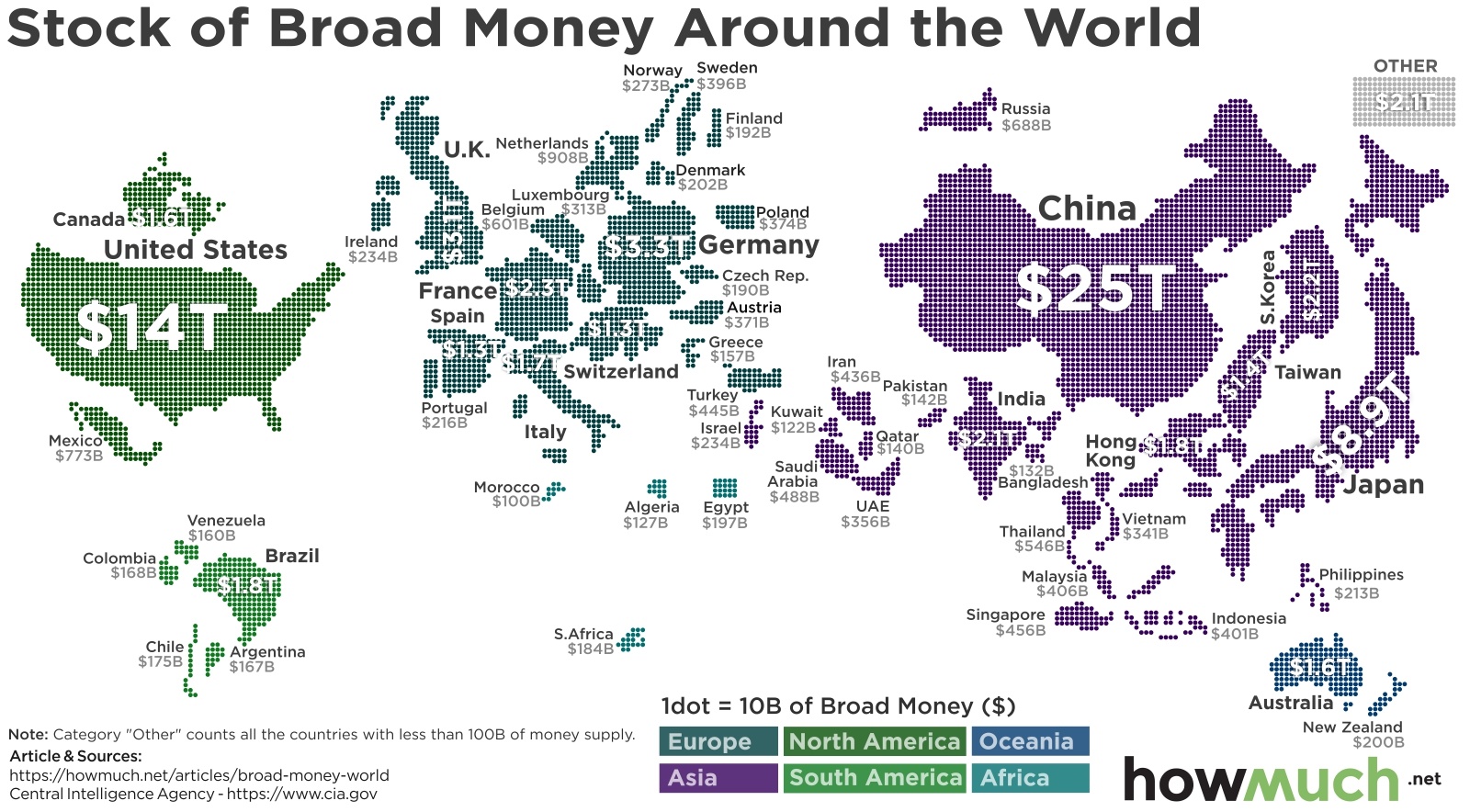
How much money is in circulation around the world at any given time? And how would the money supply of each country compare against each other? Our latest map reveals the answers.

  • China has the most money in circulation ($25T), beating out the U.S. ($14T).
  • There are 327M Americans and 1.39B Chinese people. That means the U.S. actually has more money in circulation compared to China on a per capita basis.
  • The European Union collectively has $8.1T in circulation, making it the fourth largest in the world, behind Japan ($8.9T).
  • Countries in South America and Africa have very low supplies of money. Egypt has the most in circulation in all of Africa with only $197B.

Broad money refers to the amount of currency in circulation in a given economy. It includes paper money, funds in a bank account and basically any other financial instrument that you can use to make payments. We plotted the most recent estimates from the CIA’s World Factbook on a map, where one dot equals $10B of broad money. For the sake of simplicity, we grouped every country with less than $100B in a gray category for “other.” This lets you quickly and easily see which ones have the most loot in circulation.

Top 10 Countries With the Most Stock of Broad Money 

1. China: $25T
2. U.S.: $14T
3. Japan: $8.9T
4. Germany: $3.3T
5. U.K.: $3.1T
6. France $2.3T
7. South Korea: $2.2T 
8. India: $2.1T
9. Hong Kong: $1.8T
10. Brazil: $1.8T

There are a few notable takeaways from our visualization. For starters, China has the most money in circulation ($25T), nearly double the amount of the U.S. ($14T). This is notable only for the fact that the U.S. has by far the largest economy in the world with a GDP of $20.5T compared to $13.6T in China, according to the World Bank. Of course, China is home to roughly 1.39B people, whereas the U.S. has a population of 327M, also per World Bank figures. That means there are more than 4 times as many Chinese people as there are Americans, but the country only has twice as much currency floating around.

Europe stands out because there are several nations with over $1T in circulation, including Germany ($3.3T), the U.K. ($3.1T) and France ($2.3T). In fact, the European Union boasts $8.1T in total stock of board money, making the EU the fourth largest in the world behind Japan ($8.9T). Of course, that figure includes the U.K., whose EU membership is still undetermined.

Note how Africa is almost entirely missing from our map. Egypt has the largest supply of money in Africa at only $197B. Brazil is the only country in South America topping $1T. We grouped any country with less than $100B in supply together in the “other” category in the top right, leaving lots of the Southern Hemisphere blank.

Regardless of how much money any individual country has in circulation, the U.S. dollar remains the reserve currency of choice around the world. This gives the U.S. a lot of advantages on the global stage. For example, the price of oil is priced in USD. The $14T in U.S. money supply therefore only represents one small part of how critically important the U.S. economy is to the rest of the world.

What do you think is the most important takeaway from our map? Let us know in the comments.

Data: Table 1.1

America's Soaring Inequality: Income Needed to Be a Top Earner

$
0
0

Income inequality in the U.S. is the highest it has been in decades. Not only has the gap between the richest and poorest Americans grown over the past few years, but recent IRS data shows that the new threshold for reaching the top 1% of earners in the U.S. has grown to more than half a million dollars. To further illustrate the wide disparity in income levels, our new visualization charts the minimum income needed for each income percentile, from the top 50% to the top 0.001%.

  • Currently, the combined wealth of the 1% almost surpasses that of the combined wealth of middle-class Americans.
  • Even after accounting for inflation, the income needed to reach the top 1% of earners increased 7.2% between 2016 and 2017.
  • At the same time, the wealthy have the greatest tax burden. An analysis from Bloomberg shows that the top 1% earned 21% of the country’s income and paid 38.5% of federal income taxes. By contrast, the bottom 90% of earners paid 29.9% of federal income taxes.

This data comes from the Individual Statistical Tables by Tax Rate and Income Percentile released by the IRS. Notably, this data comes from 2017, before the tax overhaul went into effect. The visualization shows a few different metrics that illustrate income inequality in the U.S. Each bar in the graph shows an income percentile, ranging from the bottom 50% to the top 0.001%. The x-axis of the bar graph shows the percentage of the country’s total adjusted gross income that each percentile represents, while the y-axis shows the number of tax returns associated with each income percentile. To show the minimum amount of income required for each percentile, we included these dollar amounts in green circles next to each gray bar in the graph. The circles also grow progressively larger in size to show increasing levels of income.

How Much You Need to Earn For the Top Income Percentiles

1. Top 0.001%: $63,430,119
2. Top 0.01%: $12,899,070
3. Top 0.1%: $2,374,937
4. Top 1%: $515,371
5. Top 5%: $208,053
6. Top 10%: $145,135
7. Top 20%: $97,870
8. Top 30%: $72,268
9. Top 40%: $54,672
10. Top 50%: $41,740

Percent of Total Income Earned by Top Income Percentiles

1. Top 0.001%: 2.34% of total income 
2. Top 0.01%: 5.17% of total income
3. Top 0.1%: 10.52% of total income
4. Top 1%: 21.04% of total income
5. Top 5%: 36.53% of total income
6. Top 10%: 47.74% of total income
7. Top 20%: 63.21% of total income
8. Top 30%: 74.23% of total income
9. Top 40%: 82.47% of total income
10. Top 50%: 88.75% of total income

Some experts say that inflation has been pressing more and more individuals into the lowest end of the income distribution. This is the current breakdown of four-member households that are considered to live in poverty, based on factors such as age, race, location, and educational attainment.

Over the past few years, this rising inequality has spurred the growth of social protests such as Occupy Wall Street, as well as a backlash against the ultra-wealthy. Some politicians have responded to rising income inequality by suggesting new legislation to redistribute wealth. Not surprisingly, these proposals have not been warmly received by the richest individuals. For example, after her proposed wealth tax, Elizabeth Warren faced opposition from many billionaires. Similarly, France tried to implement an ultra-wealthy tax, but it didn’t work out as expected due to billionaires leaving the country and the additional tax revenue being fairly small. Since there is less than a year left until the U.S. presidential election, income inequality will continue to be a hot-button issue.

Did any of these income thresholds surprise you? Are they higher or lower than you expected? Please let us know in the comments.

Data: Table 1.1

Mapping The Cost of U.S. Prisons on Each State

$
0
0

The U.S. has both the highest incarceration rate in the world and more people are in U.S. prisons than any other country. That means that Americans spend a lot of money caring for and maintaining prisoners, but just how much depends on where you live.

  • Louisiana puts more people behind bars on a per capita basis (942 per 100K) than any other state.
  • Alaska spends the most on prisons on a per capita basis ($436).
  • The Northeast has relatively low imprisonment rates. Massachusetts throws the fewest people in jail per capita (150 per 100K).
  • States across the South put people in prison at the highest rates in the country while also spending the least amount of money. Alabama is perhaps the worst in this respect, imprisoning 812 individuals per 100K people but spending only $150 per capita on their maintenance.

We compiled the data behind our map from a few different sources. First, we gathered population estimates from the U.S. Census for 2017. We combined this information with a separate report on the cost of imprisonment and an analysis on the imprisonment rate from the U.S. Justice Department. This let us create a visual showing which states put the most people in prison (the size of the red circles) and how much they spend on prisoners (the shade of blue).

Top 10 States with the Highest Imprisonment Rate (per 100K People)

1. Louisiana: 942
2. Oklahoma: 931
3. Mississippi: 812
4. Arkansas: 781
5. Texas: 746
6. Arizona: 740
7. Missouri: 687
8. Kentucky: 682
9. Georgia: 666
10.Alabama: 626

Top 10 States Spending the Most on Corrections per Capita

1. Alaska: $436
2. California: $370
3. New Mexico: $346
4. Delaware: $337
5. New York: $335
6. Wyoming: $318
7. Maryland: $317
8. Oregon: $316
9. Virginia: $310
10. North Dakota: $300

It’s not surprising that Alaska stands out as the leader in per capita corrections expenses ($436). After all, there’s a baseline amount of money needed to build and maintain prisons, and not very many people live in Alaska to pay the bill. However, California ($370) is by far the most populous state in the country with over 39.5M people calling it home. That means Californians spend a lot of money, substantially more than any other state, on corrections.

There is a clear group of states across the South that spend relatively little on prisons but which imprison a lot of people per capita. These are states colored light blue with large red circles. In short, relatively more people are going to jail in these places than elsewhere, and policymakers spend less money taking care of them. In fact, Lousianna throws more people in jail per capita than anywhere else (942). The top ten states with the highest per capita rate of imprisonment are all in the South. Many of these same states are also among the bottom ten in correction expenses per capita.

There are a lot of consequences to having so many prisoners but spending so little money on their maintenance. Jails become overcrowded and understaffed. A recent civil rights investigation from the U.S. Justice Department found severe problems and gross human rights abuses, and our map no doubt points to part of the problem.

Gallup recently found that most Americans believe crime is a serious problem, despite how both the imprisonment and crime rates are dropping. Is it worth it to spend so much money on prisoners? How can we avoid human rights abuses without raising taxes to pay for prisoners? Let us know your thoughts in the comments.

Data: Table 1.1

Visualizing How Much Americans Spend on Holidays

$
0
0

Winter is the season for sleigh rides, chestnuts roasting on an open fire--and lots of holiday shopping. Holiday spending in November and December has seen a dramatic upswing since the 2008 recession. But how does spending for the winter holidays like Christmas stack up against spending for other holidays and events throughout the year? That’s the subject of our latest visualization.

  • The winter holidays are the most expensive time of the year and  63% of Americans feel the pressure to overspend. 
  • In 2018, Americans collectively spent $6.2 billion on Black Friday and $7.9 billion on Cyber Monday alone. 
  • Retail sales in November and December are projected to increase between 3.8 percent and 4.2 percent in 2019, reaching between $727.9 billion and $730.7 billion.
  • Compared to 2018, most major holidays throughout the year saw an increase in spending per consumer in 2019. The exceptions were Halloween (decrease from $86.79 to $86.27) and Independence Day (decrease from $75.35 to $73.33).

The data for this visualization came from the National Retail Federation’s report on retail holiday and seasonal trends, which compiles information about consumer spending for major American holidays and events. Our visualization maps out these holidays on an annual timeline (from January through December), with large pink circles floating above the timeline to represent each holiday. To show consumer spending at the individual level, in each holiday’s circle we included the American consumer’s average planned spending (2019). The size of the circle also correlates to the comparative amount of consumer spending, with larger circles indicating higher average expenditures. To show consumer spending at the aggregate level, each circle is also color-coded with a different shade of pink; the darker the shade, the more consumer spending on the national scale.

Top 10 Events by Average Planned Spending 

1. Winter Holidays: $1,048
2. Back to College: $977
3. Back to School: $697
4. Mother's Day: $196 
5. Valentine's Day: $162
6. Easter: $151
7. Father's Day: $139
8. Graduation: $107
9. Halloween: $86
10. Super Bowl: $81

In general, the winter holidays and back-to-school days see the most consumer spending at both the individual and national levels. Notably, the winter holidays also span the longest time frame, from November 1st to December 31st, while most of the other events and holidays on the timeline last for only one day and tend to have shorter seasons for sales.  

Another major factor contributing to the high amount of spending during the winter holidays is the popularity of Black Friday and Cyber Monday. Contrary to popular belief, Black Friday is bad for business. Profits tend to be fairly low for companies on Black Friday since prices drop significantly, while operating costs (employee pay, etc) increase. In addition, Black Friday is more likely to attract “low-value” customers who only shop at the retailer due to the sale, rather than become a repeat, “high-value” customer. Since Thanksgiving is happening so late this year and the shopping period between Thanksgiving and Christmas will be shorter, it will be interesting to see if sales numbers change from the NRF’s 2019 projections.

Do you notice your spending habits change during the holidays? What’s on your wish list this holiday season? Please let us know in the comments.

Data: Table 1.1

How Much It Costs to Run for President? A 40-Year Timeline

$
0
0

Michael Bloomberg just announced he’s running for President by spending over $31M in TV ads in a single week. That tops the previous record set by President Obama in 2012. Bloomberg already made headlines spending $100M on an anti-Trump ad campaign, making it seem like 2020 is poised to shatter previous campaign finance records. But just how much money does it take to win the White House?

  • U.S. presidential campaign spending exploded with Obama in 2008 ($1.3B Democratic total overall). No other campaign has come close to Obama’s first White House run.
  • Republicans and Democrats raised similar amounts of money until 2008, when Democrats started to pull far ahead of the GOP. Clinton raised almost twice as much as Trump in 2016 and still lost ($621M vs. $364M).
  • Spending more money than the other party doesn’t always guarantee victory. The biggest spenders lost in 1984, 1996 and 2016.
  • Michael Bloomberg has already spent $100M on anti-Trump ads, making 2020 another banner election year for campaign expenditures.

We crunched the numbers for each presidential election going back to 1980 for Republicans (red) and Democrats (blue). The inner circle represents how much money the biggest spender in a given party spent to win the primary and general election. The outside circle represents the candidate’s and party’s total outlay for the entire election. We adjusted the numbers for inflation to represent 2019 dollars, making a true apples-to-apples comparison.

Top 5 Most Expensive Presidential Campaigns of All Time

1. Democrats in 2008: $1.3B (won)
2. Democrats in 2016: $884M (lost)
3. Democrats in 2012: $858M (won)
4. Republicans in 2008: $739M (lost)
5. Republicans in 2016: $708M (won)

Top 5 Candidates Who’ve Spent the Most

1. Obama (2008): $898M (won)
2. Obama (2012): $839M (won)
3. Clinton (2016): $621M (lost)
4. Romney (2012): $536M (lost)
5. Bush (2004): $493M (won)

There are a couple caveats to keep in mind when thinking about the underlying numbers behind our visual. For starters, it’s very difficult to track campaign expenditures across time. Changes in the numbers might actually be due to different campaign finance disclosure requirements. For example, thanks to the Citizens United decision in 2010, politicians can rely on outside groups called Super PACs to run advertisements, even if they technically aren’t supposed to “coordinate” with each other. Campaign operations have also changed significantly over the last few decades, evolving from a focus exclusively on TV and radio to robust online advertisements.

That being said, campaigns are definitely becoming more expensive. No political party surpassed $400B before the 2000 campaign. Nowadays, campaigns from both parties spend roughly 5 times as much money running presidential campaigns than they did in the 1980s. No single race tops 2008, however, where the Democrats shattered all previous campaign finance records and dropped $1.3B.

Another interesting fact about our visual is how spending lots of money isn’t necessarily correlated with ultimately winning. Democrats spent more money than Republicans but lost in 1984 and 2016. Republicans spent more than Democrats and lost in 1996. Even still, Democratic presidential fundraising numbers pulled ahead of Republicans starting with Obama’s 2008 campaign, a trend which will hold steady if current trends continue in 2020. The visualization also demonstrates how when a U.S. President runs for reelection, almost all his party’s money goes towards his campaign. It’s rare to contest a primary for a sitting President. Just ask Mark Sanford.

It’s worth wondering if these numbers are actually anything to worry about. Is a billion dollars really that much money when it comes to deciding who should be President? To keep things in perspective, Americans spent over $1.8B on peanut butter in 2017 alone. Picking a President seems much more serious and rather inexpensive by comparison, even if Trump decides to advertise during the Super Bowl.

Back to Mike Bloomberg. With a net worth of more than $53B, he’s significantly richer than President Trump. Provided that Trump survives impeachment and Bloomberg secures the Democratic nomination, prepare for another record-shattering election season.

Do you think money is bad for politics? How high can campaign expenditures go before they start to become a problem? Let us know in the comments.

Data: Table 1.1

This is How Long You Need to Work to Live Comfortably in Every State

$
0
0

Do you make enough money to enjoy a comfortable life? Or are you just scraping by? If it feels like you can’t ever truly get ahead, then you aren’t alone according to our latest map on the cost of living across the U.S.

  • Hawaii is the single most difficult state for workers to get ahead, requiging $96.1K to enjoy a comfortable life and 91-hour workweeks to get there.
  • The states where a comfortable life is within reach stretch across the South. Mississippi is the most affordable at $40.4K. Making that much money would require average workers to clock 53 hours.
  • Kansas stands out as a reasonably affordable place to enjoy the good life ($41.7K) without spending too much time on the job (46 hours).
  • There isn’t a single state in the country where an average worker can enjoy a comfortable living on 40 hours or less of work per week. North Dakota has the shortest required minimum hours at 45.

We combined a few different datasets to create our visualization. First, we figured out the median wage for workers in 2018 in each state from the Bureau of Labor Statistics. We also used numbers from the BLS to calculate average annual consumer expenditures, adding a nice 20% bump to each state’s average to represent comfortable living. Then, we divided that figure by the number of earners the average household has to obtain the annual expenditure per earner. That amount was adjusted to each state’s cost of living using MERIC’s data, giving us the number of hours needed to make that wage. States with darker shades of purple require a higher wage to live comfortably, and larger green circles indicate longer workweeks.

Top 10 States Where it is Cheapest to Enjoy a Comfortable Living

1. Mississippi: $40,349 (53 hours)
2. Oklahoma: $41,113 (48 hours)
3. Arkansas: $41,495 (52 hours)
4. Kansas: $41,733 (46 hours)
5. Tennessee: $41,877 (48 hours)
6. New Mexico: $42,354 (50 hours)
7. Alabama: $42,497 (50 hours)
8. Missouri: $42,545 (47 hours)
9. Michigan: $42,832 (46 hours)
10. Georgia: $43,023 (48 hours)

Top 10 States Where it Costs the Most to Enjoy a Comfortable Living

1. Hawaii: $96,120 (91 hours)
2. Washington, D.C.: $78,310 (44 hours)
3. California: $66,754 (63 hours)
4. Oregon: $65,417 (66 hours)
5. New York: $64,462 (57 hours)
6. Massachusetts: $62,218 (51 hours)
7. Maryland: $61,836 (55 hours)
8. Alaska: $60,881 (51 hours)
9. Connecticut: $59,783 (51 hours)
10. New Jersey: $59,401 (54 hours)

The best states based on our number-crunching are shaded light purple and have small green circles. In other words, it’s comparably much easier to enjoy a comfortable living across the South and Midwest than it is on either the West or the East coasts. The absolute worst state for the Average Joe is Hawaii, where he would need to put in almost 91 hours each week just to make enough money ($96.1K) to have a comfortable life. That would mean working almost 13 hour days, every day, without ever getting a break.

The most interesting thing our map demonstrates, however, is the widespread unattainability of comfortable living across America. There isn’t a single state in the country where the average worker can put in 40 hours and enjoy a comfortable standard of living. Even in North Dakota, workers still need to clock 45 hours. Kansas is probably the best state when accounting for a low cost ($41.7K) combined with a shorter number of hours required (46).

Clearly, the vast majority of wage earners are just getting by, and there’s a lot of ink spilled on addressing these issues. Lots of people need personal loans to plug a financial gap. Some states are trying to legislate higher pay for overtime. Cities are passing minimum wage laws, like Chicago and Denver. Some people like Andrew Yang think every American should have a universal basic income of $1,000 a month.

Do you think any of these efforts will ultimately be successful? What are the biggest reasons why workers can’t enjoy a comfortable standard of living where you live? Let us know in the comments.

Data: Table 1.1


A Snapshot of Income Inequality Around the U.S.

$
0
0

Over the past 40 years, the average individual income in the U.S. has grown by 65%. However, not everyone has reaped the benefits of higher wages. Income inequality is at an all-time high, and the combined wealth of the top 1% of earners is almost as much as the combined wealth of middle-class Americans. Interestingly, some metro areas of the U.S. have experienced severe income disparity more than others, as shown in our new visualization.

  • Nationwide, the average individual income is $58,379.45 in 2019. The 25th income percentile is $22,000 and the 90th income percentile is $116,260.
  • There are 54,659,267 Americans who are not classified in a metropolitan area. The average individual income for this group is $45,946, with a $20,000 income at the 25th percentile and $89,000 at the 90th percentile.
  • The U.S. Census Bureau, one of the sources for this data, notes that “[geographic] estimates for the smaller metropolitan areas (those with populations under 500,000) should be used with caution because of the relatively large sampling variability associated with these estimates.“ 

We based this visualization on the DQYDJ Income Percentile by City Calculator in 2019, which takes income data from the IPUMS-CPS (Integrated Public Use Microdata Series - Current Population Survey) released by U.S. Census Bureau and the Bureau of Labor Statistics. We used the IPUMS definition of a metropolitan area for our visualization. Similarly, income in this visualization is defined as “total personal income” and includes all the types of income sources listed here

The visualization is a map of the U.S., with 262 of the country’s major metropolitan areas color-coded in different shades of pink. The darker shades of pink indicate that there is a higher disparity between the 25th and 90th income percentiles, while the lighter shades of pink show lower income disparities between the 25th and 90th income percentiles. In addition, the circles on the map list the income for the 25th and 90th percentiles in the 10 most equal metro areas and the 10 most unequal metro areas. Light gray circles are for the 25th percentile and dark gray circles are for the 90th percentile. The circles also correspond to the size of individual income, with larger circles representing higher incomes. At a glance, the most unequal metro areas will show a lot of dark gray and only a little light gray.

Top 5 Most Equal Metro Areas in the U.S. by Income

1. Jacksonville, NC: $42,002 difference between 25th and 90th percentile
2. Cleveland, TN: $42,173 difference between 25th and 90th percentile
3. Goldsboro, NC: $42,830 difference between 25th and 90th percentile
4. Ocala, FL: $43,626 difference between 25th and 90th percentile
5. Florence-Muscle Shoals, AL: $48,602 difference between 25th and 90th percentile

Top 5 Most Unequal Metro Areas in the U.S. by Income

1. Erie, PA: $215,559 difference between 25th and 90th percentile
2. Hilton Head Island-Bluffton-Beaufort, SC: $206,871 difference between 25th and 90th percentile
3. Santa Rosa, CA: $157,050 difference between 25th and 90th percentile
4. San Francisco-Oakland-Hayward, CA: $152,000 difference between 25th and 90th percentile
5. Bloomington, IN: $151,340 difference between 25th and 90th percentile

In general, metro areas in the South and the Great Plains region tend to have less income inequality when comparing the differences between the 25th and 90th income percentiles. By contrast, metro areas in the Northeast, Great Lakes, and California areas have greater income inequality. But it’s not only the U.S. that suffers from income inequality. It’s also a pressing issue on the international stage. We’ve talked before about great disparities in average individual wealth in different countries, as well as the percentage of the world population that lives in extreme poverty. On the other end of the spectrum, roughly 1% of the world’s adults are millionaires. The U.S. alone has 18.6 million millionaires, more than any other country in the world. As the gap between rich and poor continues to grow--both in the U.S. and worldwide--political leaders will face increased pressure to facilitate a more even distribution of wealth.

Why do you think income inequality varies so much across different parts of the U.S.? Let us know in the comments.

Data: Table 1.1

Ranked: The Best and Worst States for Taxes in America

$
0
0

States raise money through a variety of different taxes, fees and charges. They charge different rates for income, property, sales, fuel, wireless services and sins like alcohol and tobacco. This can make it hard to see how states compare to each other.

  • Wyoming is the most tax-friendly state in the country. It has zero state income tax and on average charges only $635 per $100,000 of property value.
  • Illinois is the most tax unfriendly state with a flat income tax of 4.95% with on average $2,408 in property taxes owed for every $100,000 of property value.
  • 6 out of the top 10 most tax-friendly states have zero income tax.
  • Tax levels vary substantially at the state level, with relatively heavy burdens in the Northeast and light tax levels across rural states like Alaska, Montana and North Dakota.

We performed a few different calculations to arrive at the data underlying our spider diagrams. First, we took tax rate information from Kiplinger and found the effective tax rate with a calculator from SmartAsset, using the median U.S. household income of $61,937. We assumed an average worker lived in the state capital with no dependents. Then, we weighted each category of taxation based on their contribution to total state taxes, including taxes on income, sales, fuel, property, wireless services and “sin” taxes like alcohol and tobacco. Finally, we used the summary of the weighted scores to create the ranking of most and least friendly states for taxation.

Top 10 Most Tax-Friendly States

1. Wyoming
2. Delaware
3. Alaska
4. Montana
5. Nevada
6. New Hampshire
7. Tennessee
8. Florida
9. North Dakota
10. Hawaii

The 10 Least Friendly States for Taxation

1. Illinois
2. New York
3. New Jersey
4. Connecticut
5. Pennsylvania
6. Nebraska
7.Ohio
8. Wisconsin
9. Kansas
10. Michigan

It shouldn’t come as a shock to anyone that Illinois is the least tax friendly state in the Union. For two years, the state couldn’t pass a budget, costing taxpayers an additional $1 billion in late payments and surcharges. In fact, the state is on track to reach a deficit of $3 billion this year. Illinois taxpayers are therefore on the hook for lots of new taxes and fees.

Another story in our visual is how state income taxes in particular impact the overall tax burden that workers face. 9 states have zero income tax, 6 of which are in our top 10 list above (Wyoming, Alaska, Nevada, New Hampshire, Tennessee and Florida). Income taxes are a major factor in overall taxation because they’re progressive, meaning high-income earners pay higher marginal rates. Florida’s status as an income-tax free state is one reason why many people move to the Sunshine State in retirement.

Our visualization also demonstrates how states levy uneven taxes on workers, a fact that gets largely ignored as the media fixates on Trump’s tax cuts and Democrats’ wealth tax proposals. There are several states in the Northeast with extremely high tax burdens, like New York, New Jersey and Connecticut. By contrast, many rural states like Wyoming, Montana and North Dakota have very light tax levels. Congress and the President simply aren’t able to address these disparities.

There are lots of good reasons for different tax rates around the country. New York must raise revenue for infrastructure projects that other states simply don’t have. For example, the Gateway Program encompasses a major overhaul and renovation of the Northeast Corridor train network, which links together millions of people. And there are lots of rich people living in the area who can foot the bill.

What are the state tax rates where you live? Do you think the money is well spent, or is the state budget mismanaged? Let us know in the comments.

Data: Table 1.1

The Investment of the Decade: Bitcoin vs. World's Megacorps

$
0
0

Investors are in the game to make money. They chase yield around the world, looking for ways to generate higher returns than everyone else. And it turns out, even with the stock market rising to all-time highs and Bitcoin suffering another pullback, investing in cryptocurrency very early on was still a brilliant strategy.

  • Bitcoin blows away any other investment considered in our chart. If you had invested $100 ten years ago, you’d have $9.2M today.
  • Amazon’s stock is the top performer out of the 10 biggest companies, coming in at $3.3K.
  • Only 3 other companies generate returns above $1,000, including Apple ($2.4K), Visa ($1.7K) and Microsoft ($1K).
  • Alibaba’s stock performed the worst in our analysis, barely doubling an initial investment of $100 to $208.

We plotted the stock prices according to Yahoo Finance for the 10 largest companies measured by market capitalization. We found the stock prices as of January 2, 2009 with the exceptions of Bitcoin, Facebook and Alibaba, which weren’t public yet. In these situations, we assumed $100 was invested as soon as possible. We compared these numbers to the market price on December 3, 2019, excluding stock splits and dividends. This lets you easily see Bitcoin’s dominance over the last several years.

Total Return (%) on an Initial $100 Investment 10 Years Ago

1. Bitcoin: 9,150,088%
2. Amazon: 3,156%
3. Apple: 2,345%
4. Visa: 1,597%
5. Microsoft: 899%
6. JP Morgan: 433%
7. Facebook: 420%
8. Berkshire Hathaway: 228%
9. Johnson & Johnson: 216%
10. Walmart: 171%
11. Alibaba: 108%

Even with Bitcoin’s latest price implosion, the cryptocurrency has still created an astonishing 9,150,088% return. Other companies like Amazon (+3,156%) and Apple (+2,345%) are still impressive, but nothing truly compares to the king of the crypto world.

There’s no doubt Bitcoin's price has fluctuated dramatically over the last 2 years, reaching almost $20,000 in December 2017 before imploding below $3,500 in November 2018. It now trades at $7,475 as of this writing, down from almost $12,000 in August this year. Sometimes stock prices for individual companies can change substantially too. For example, GE’s price fell off a cliff over the last 3 years, dropping from about $30 in late 2016 to about $10 today. But that’s a notable exception, and not as fast moving compared to Bitcoin. For the most part, stock market prices for individual companies aren’t so volatile, especially ones with predictable business models and multi-billion dollar market capitalizations.

Bitcoin has received its fair share of negative attention despite its performance. Jim Cramer lampooned the cryptocurrency as “Monopoly money,” predicting it would get “annihilated.” Jamie Dimon famously called Bitcoin a “fraud” before his bank started investing in blockchain technology. And a major study accused Bitfinex of intentionally manipulating the entire Bitcoin market, thereby swindling investors of their money.

That means Bitcoin’s rise and fall (and then another rise and mini-fall) are not for the faint of heart. Are you investing in Bitcoin or other cryptocurrencies? Why do you favor crypto assets as opposed to individual stocks of companies?

Data: Table 1.1

This Visualization Shows Where Your Clothes Come From

$
0
0

Think about the last time you checked the clothing tag on a new shirt that you bought. Did it say, “Made in China”? Or how about Vietnam or Bangladesh? There’s a good chance that your new shirt was manufactured in another country, especially one in east or south Asia. Our latest visualization takes a closer look at how clothing exports vary around the world.

  • In 2018, the value of the global clothing export market was $494 billion, an increase from $464.6 billion in 2017. 
  • However, this growth was not seen across the board. Some of the countries that experienced declines in clothing exports from 2017 to 2018 include India (from $18 billion to $17 billion), the Philippines (from $1 billion to $933 million), and Hungary (from $870 million to $791 million).
  • At the same time, other countries experienced massive increases in clothing exports. Clothing exports from Myanmar and Armenia increased by about 70% from 2017 to 2018.
  • At $158 billion, China alone accounts for almost a third of the world’s clothing exports.

Our visualization draws on information from the World Trade Organization, which provides statistics related to worldwide merchandise trade and trade in services. To show which countries are responsible for the most clothing exports, we created a world map with each country represented as a circle. The larger the circle, the higher the value of clothing exports. In addition, the shade of blue for each circle represents the corresponding country’s share in world clothing exports; darker shades of blue, like China, indicate a higher percentage of worldwide clothing exports. All values are expressed in USD, and only countries with more than $50 million in exports were included in the map.

Top 10 Countries by Clothing Exports

1. China: $158 billion
2. Bangladesh: $33 billion
3. Vietnam: $28 billion
4. Italy: $25 billion
5. Germany: $24 billion
6. India: $17 billion
7. Turkey: $16 billion
8. Spain: $15 billion
9. Hong Kong, China: $14 billion
10. France: $13 billion

As you can see, the value of China’s clothing exports is almost five times higher than the value of the second-highest clothing exporter, Bangladesh. This isn’t surprising, since China beats all the competition in overall exports. The U.S. in particular relies heavily on exports from China. China was the United States' largest supplier of imports in 2018, providing $557.9 billion worth of goods. Notably, U.S. imports from China fell in September

Although clothing is not listed as one of the top imports or exports between China and the U.S., the escalating trade war between the U.S. and China has led to both countries increasing tariffs on many types of goods and has caused much uncertainty for the world’s two largest economies. Since the research from the World Trade Organization shows that the value of clothing exports from China remained fairly constant between 2017 and 2018, it will be interesting to see how the clothing industry was affected in 2019.

Do you pay attention to clothing labels and where a garment was manufactured? Why or why not? Let us know in the comments!

Data: Table 1.1

Charting the U.S. Top 50 Advertising Spenders

$
0
0

The holidays are right around the corner, which means consumers are being subjected to endless commercials and ad campaigns pushing for that last-minute gift purchase. Advertising is big money not only in the U.S., but also around the world. Just how much money is spent on advertising? That’s the subject of our new visualization, which breaks down the world’s top companies by ad spend. 

  • Among the top 50 advertisers alone, 38 are headquartered in the U.S. 
  • Forty-one companies spent more than $1 billion on advertising in 2017.
  • Ad spending for the top 200 companies increased by 1.1% from 2016 to 2017, the slowest growth since the Recession.
  • According to AdAge research, Geico, a subsidiary of Berkshire Hathaway, is the most advertised brand, with $1.4 billion in measured media ad spending.

The data comes from AdAge’s 200 Leading National Advertisers 2018 Fact Pack. According to the methodology, “Total U.S. Ad Spending” is defined as “advertising, marketing services (including promotion and direct marketing) and digital marketing (including social media).” For the visualization, we took the top 50 companies on the list and charted them in bubbles with the company logo and annual amount of U.S. ad spending. To give an idea of scale, the bigger bubbles correspond to higher ad spend and the smaller bubbles correspond to lower ad spend. The bubbles are also color-coded based on ad spend, with dark purple representing less spending and dark pink representing more spending. We also divided the companies into their associated industry, such as telecommunications, financials, pharmaceuticals, and motor vehicles.

Top 10 Advertisers by 2017 Ad Spend

1. Comcast Corp: $5.7 billion - Telecommunication
2. Procter & Gamble Co.: $4.4 billion - Household products
3. AT&T: $3.5 billion - Telecommunications
4. Amazon: $3.4 billion - Internet Services and Retailing
5. General Motors Co.: $3.2 billion - Motor Vehicles
6. Verizon Communications: $2.6 billion - Telecommunications
7. Ford Motor Co.: $2.5 billion  - Motor Vehicles
8. Charter Communications: $2.4 billion - Telecommunications
9. Alphabet (Google): $2.4 billion - Internet Services and Retailing
10. Samsung Electronics Co.: $2.4 billion - Electronics 

The rise of social media and widespread use of smartphones have changed how advertisers interact with their customer base and attract new business. The AdAge research further reveals that internet advertising and out of home advertising have increased over the past 20 years, while traditional media like TV, radio, magazines, and newspapers have suffered sharp declines. In fact, the internet became the biggest U.S. ad medium by spending as of 2017, surpassing TV. The 200 Leading National Advertisers 2018 Fact Pack estimates that internet ad spending will increase 13.1% year-over-year, reaching $78 billion. As technology and consumer preferences continue to evolve, so will marketers’ and advertisers’ strategies for getting more exposure for their company’s products and services.

Have you ever seen a particularly memorable ad or TV commercial that resonated with you? Please let us know in the comments!

Data: Table1.1

Visualizing 30 Years of China’s Unstoppable Economic Growth

$
0
0

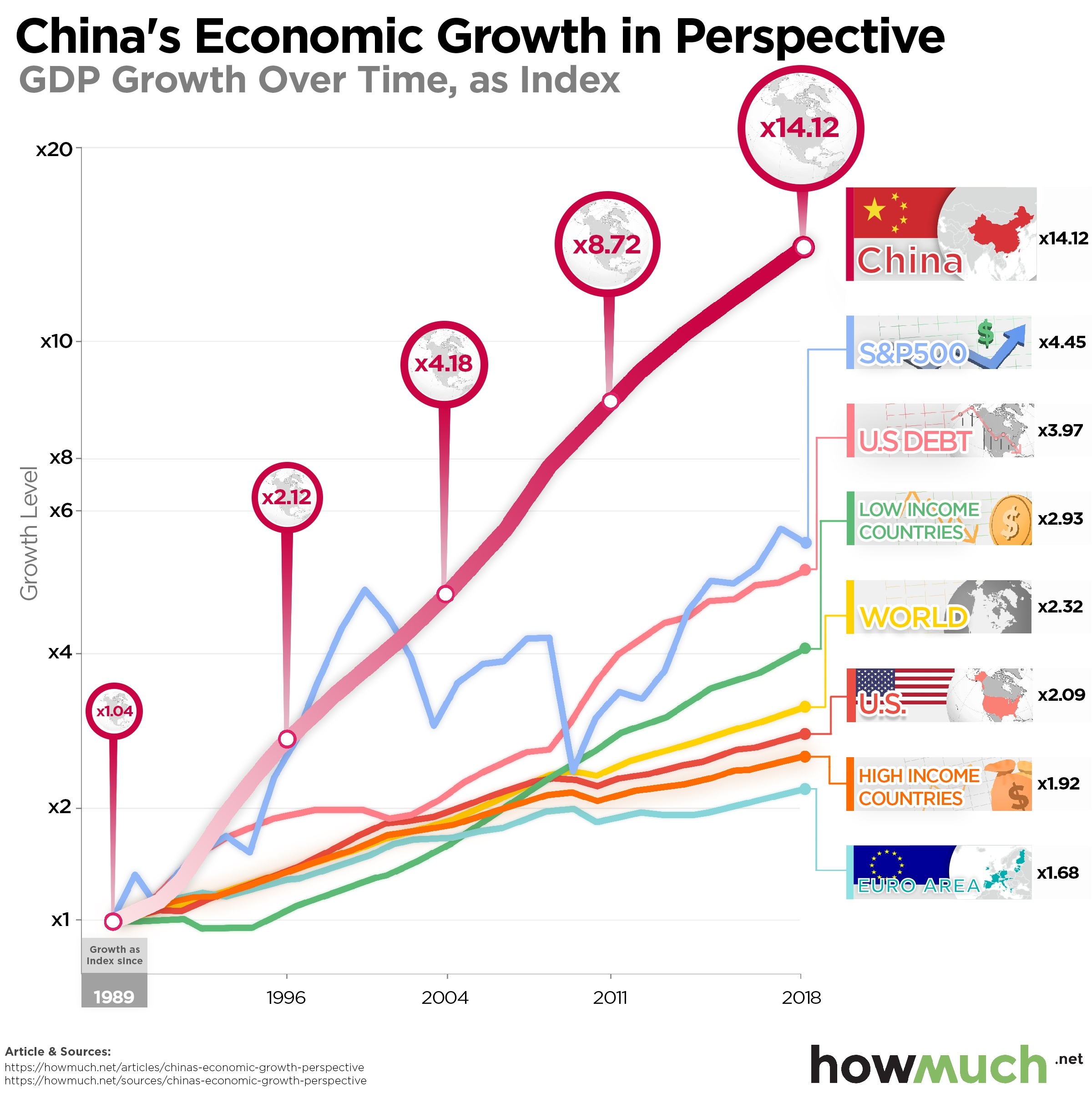
President Trump constantly warns about China as a threat to the world. China takes American jobs, adds to the national trade deficit and steals intellectual property. But how should we understand the rapid rise of China on the global economic stage? Our visualization puts things in perspective.

  • China’s economy has grown significantly faster than every measure on our visual. It’s grown 14.12 times in size since 1989.
  • The Euro area and other high income countries, including the U.S., have grown much slower than China. The U.S. economy is only 2.09 times bigger than it was in 1989.
  • The value of the Dow Jones Industrial Average ebbs and flows with recessions, recently reaching an all-time high before contracting a little to 4.45 times the size it was 30 years ago.
  • No matter the economic climate, U.S. debt levels continue to grow, almost quadrupling in inflation-adjusted dollars over the last 30 years.

We arrived at the numbers behind our visual by pulling from a few different sources. First, we grabbed GDP growth figures from the World Bank and returns from the Dow Jones Industrial Average from macrotrends. We also used the World Bank to determine high and low income countries. We found U.S. debt numbers from The Balance. We adjusted all of these figures to reflect 2019 dollars, allowing us to create a true apples-to-apples comparison across time. This lets us measure growth rates in real terms over the last 30 years.

China’s economy started to grow in 1989 and hasn’t let up, double in size roughly every 8 to 10 years. China’s growth rate surpassed every other measure we found, from the Dow Jones Industrial Average, to rich and poor countries, and even U.S. debt. It’s more than 14 times as big as it was in 1989.

Past performance is no guarantee of future results, as everyone knows. President Trump is famous for his trade war, even if a deal seems like it could happen anytime now. Even if nothing happens and tariffs continue to escalate, multinational companies are still dropping buckets of money to invest in China. It’s an open question how long it will take China to double yet again given these challenges, especially given the recent headlines about slowing down.

Another interesting storyline in our visual is how China’s rise has been steady and one-directional, but the Dow Jones Industrial Average and American debt levels have ebbed and flowed over the decades. The stock market obviously contracts during recessions before recovering, but it’s only 4.45 times as big as it was 30 years ago. U.S. national debt, on the other hand, tends to grow no matter what the economy is doing. In fact, there’s been a U.S. national debt boom over the last few years even with a strong economy.

It’s important to keep in mind how these figures are all relative, and there are lots of other ways to measure and compare wealth between countries. For example, the debt-to-GDP ratio shows how large debt levels aren’t necessarily a bad thing if a country’s economy is likewise enormous. It’s also critical to understand how the U.S. is still the biggest economy, by a lot. China is able to post such impressive growth numbers because it started as an agrarian economy in 1989, and then transformed into a manufacturing powerhouse.

Do you think China’s economic growth has been a positive thing for the world? Share this article on Twitter and let your friends know.

Data: Table 1.1

Visualizing Minimum Car Insurance Requirements by State

$
0
0

Americans spend a lot of money on car insurance every year. Part of the reason why is that state governments set minimum amounts of coverage drivers must purchase to legally drive a car. Our newest visual breaks down the 3 most important types of auto insurance: property damage, bodily injury per accident and bodily injury per person.

  • 32 states set a $25,000 minimum threshold for bodily injury liability per individual. Alaska and Maine have the highest minimums in the country at $50,000.
  • 31 states set a $50,000 target for bodily injury liability per accident. Delaware has the lowest requirement in the country at just $25,000.
  • Property damage liability minimums vary the widest across the country. 4 states only require $5,000 of coverage (California, Pennsylvania, New Jersey and Massachusetts).
  • Maine and Alaska require the highest levels of coverage across the board, totaling $50,000, $100,000 and $25,000 for bodily injury per person, per accident and property damage.

State governments require minimum insurance coverage for a few obvious reasons. If you’re going to drive a vehicle, there’s a chance you could injure someone or ruin someone’s property. If a driver doesn’t have insurance (or a lot of money) and causes an accident, then the injured parties can’t recover anything for their losses. Without insurance minimums, there would be a lot more lawsuits to determine responsibility for accidents and to garnish wages. We gathered these state-by-state minimum insurance thresholds from The Balance. Keep in mind how some states also require insurance minimums to cover uninsured and underinsured drivers.

Our visual demonstrates how most states conform to a generally accepted standard of coverage. For example, 32 states require $25,000 of coverage for bodily injury liability per individual, and 31 require $50,000 for bodily injury per accident. What does that mean? Imagine a car accident that injures 2 people, who each have $30,000 of medical bills, or $60,000 total. An insurance policy with these minimum coverage amounts would only pay out $25,000 per victim, or $50,000 total. The driver would be responsible for the remaining $10,000.

There are some exceptions where states require a lot more (or a lot less) coverage than others. 19 states require drivers to carry a minimum of $25,000 for property damage liability, however California, Pennsylvania, New Jersey and Massachusetts only require $5,000. Maine and Alaska mandate at least $100,000 of coverage for bodily injury per accident, compared to just $25,000 in Delaware.

There are lots of reasons why you should carry more than the state-required minimums. For starters, the average price of a new car in 2019 was an eye-popping $36,718. If you carry the minimum insurance and wreck someone’s brand new vehicle, you could be financially ruined. Plus, car accidents happen all the time. More than 20,000 people die every year in approximately 5 million accidents. Obtaining full coverage can be expensive. Our cost guide can help you think through all the options.

How much auto coverage do you carry? Do you think there should be higher state-mandated minimum insurance amounts? Let us know in the comments.

Data: Table 1.1


Visualizing Top 20 Most Valuable Companies of All Time

$
0
0

Saudi Aramco finally went public with the world’s largest IPO on December 11th. However, from a historical perspective Saudi Aramco would still not be the world’s largest company ever. Our new visualization looks at the most valuable companies of all time, measured by their market capitalization.

  • Eight companies have reached a market capitalization of more than $1 trillion in today’s dollars.
  • Six of the top 20 biggest companies of all time were founded by countries other than the United States.
  • The three largest companies were part of the shipping industry during the early colonial age. The next three largest are related to oil & petroleum. The tech industry rounds out the rest of the top ten largest companies of all time.
  • While most of these companies are still in business in 2019, four of them (Standard Oil, South Sea Co, Mississippi Company, and Dutch East India Company) have already gone bust.

The market capitalization data for this visualization comes from Fool.com and Yahoo Finance, with prices as of 12/20/2019. All prices are expressed in USD. The companies in the visualization are listed in order from lowest market capitalization at the top to highest market capitalization at the bottom, with each company’s corresponding circle growing larger to reflect the size of its market cap. The years on the right indicate the date we referenced for the market capitalization data. 

Top 10 Biggest Companies of All Time

1. Dutch East India Company: $8.28 trillion 
2. Mississippi Company:  $6.8 trillion
3. South Sea Company: $4.5 trillion
4. Saudi Aramco: $1.89 trillion 
5. Apple: $1.3 trillion
6. PetroChina: $1.24 trillion
7. Microsoft: $1.2 trillion
8. Standard Oil: more than $1 trillion
9. Alphabet: $931 million
10. Amazon: $886 million

The Dutch East India Co. holds the distinction of being the first company to offer shares of its business to the public, effectively conducting the world's first initial public offering (IPO). Interestingly, the three shipping companies on this list--the Dutch East India Co., the Mississippi Co. and the South Sea Co.--had market caps more than twice as high as today’s biggest company, Saudi Aramco. These “joint-stock companies” that sought to capitalize on trade with the New World ultimately went bankrupt before 1800. However, the Dutch East India Co. in particular ushered in a new wave of economic growth and social change similar to how industry giants in the tech field are doing today.

Another company on this list that no longer exists is John D. Rockefeller’s Standard Oil Company. The Standard Oil Company was dissolved on May 15, 1911 when the Supreme Court ruled that it was a monopoly and therefore violated the Sherman Antitrust Act. As legislators turn their attention to Big Tech and whether or not companies like Google and Amazon are also in violation of antitrust laws, it is interesting to ponder if history will repeat itself or what might turn out differently this time around.

Do you think more of these companies will reach market caps above $1 trillion? How do you think future legislation may impact some of these large tech and financial companies and their market caps? Please let us know in the comments.

Data: Table 1.1

Top 10 Data Visualizations of 2019

$
0
0

The best visualizations are easy to understand, informative and eye catching. After combing through dozens of our articles on everything from the world’s economy, to the stock market and price changes, we picked the top 10 visualizations from 2019.

In case you’re a new reader, our mission is to make understanding money simple and easy. The goal is to present useful information in a beautiful way to help people make sense of the business world. These are the best examples from the last year. We hope you enjoy our countdown.

10. Are Taxpayers in Your State Giving More Money to the Feds than They Get Back?

There are two things certain in life: death and taxes. One way to think about federal taxes is by analyzing how the government divides the pool of resources and sends money back to the states. It turns out some places like Virginia and Kentucky receive significantly more in federal outlays than they contribute, and some states get back only a small share of what they pay, like Connecticut and New Jersey.

9. Price Changes Over the Last 20 Years Prove the Economy is Rigged

Is the economy rigged? This visualization illustrates how the odds are stacked against people trying to join the upper class. Education and healthcare have become increasingly expensive over time, but things like televisions, cellphones and toys have gotten cheaper. That means it’s gotten cheaper to sit in front of screens instead of getting a degree, or staying healthy.

8. A Snapshot of Tourist Spending Around the Globe

Tourism means big business, even in countries where you least expect it. This map shows how some places benefit much more than others on tourist spending. The U.S., Europe and a few countries in Asia like Japan and Macao dominate global expenditures, while all of Africa misses out.

7. How Big is Apple? This Visualization Puts Things Into Perspective

Big companies got even bigger in 2019, and Apple was no exception. But just how massive is Apple? The company’s market cap is bigger than the combined GDP of 25 African countries. It’s more than the entire budget for the U.S. Department of Defense. And it’s more than the total net worth of the world’s top 5 billionaires. In short, Apple’s really, really big.

6. Mapped: Who Owns the World’s Gold Reserves

Gold is the ultimate way to store value. You can objectively measure it, everyone thinks its valuable, and the world has a finite amount of it. All of which means that the countries that control the world’s gold reserves are in a prime position to dominate the economy. Indeed, our visualization makes clear how the U.S. and European countries like Germany and Italy control most of the world’s most precious metal.

5. Visualizing the Highest-Paid Job in Every State

Our map of the highest paying jobs in the country indicate one thing: if you want to be rich, become a doctor. There isn’t much difference in take-home pay no matter where doctors live. They usually bring home between $250k and $390k. The only exceptions are in places like Puerto Rico and the Virgin Islands, where doctors can still make north of six figures.

4. How Much Does a Pint of Beer Cost Around the World?

Want an interesting way to compare the cost of living around the world? Consider our map of how much a pint of beer costs in dozens of major cities. Drinkers can expect to pay the most for a pint in Hong Kong, China ($10.86). Planning a destination bar crawl? Head to Bratislava, which has the cheapest beers in the world ($2.22).

3. The World’s $86 Trillion Economy Visualized in One Chart

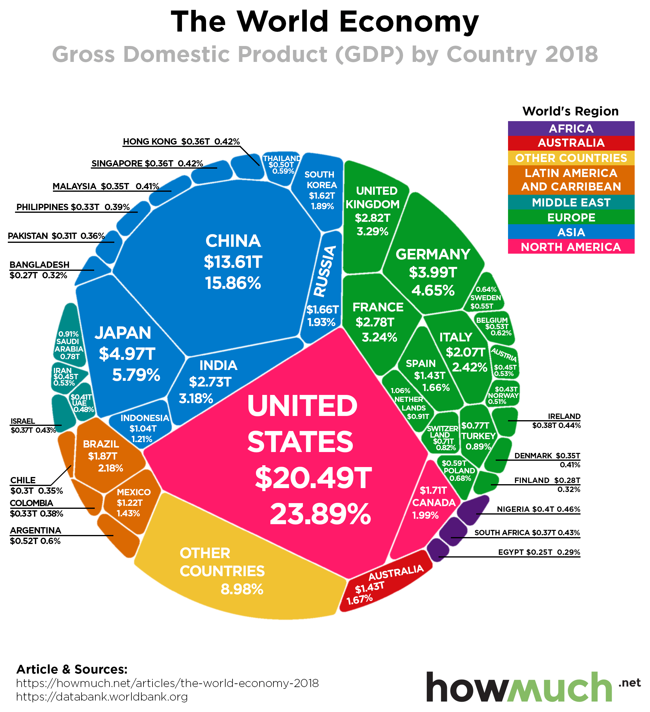
Gross domestic product (GDP) is one of the most widely accepted metrics for comparing the size of economies around the world. This single chart is perhaps the best way to understand just how big the U.S. economy is. Despite all the hype about China, the U.S. is still almost $7 trillion bigger ($13.61T vs. $20.49T).

2. Visualizing the State of Government Debt Around the World

The runner-up visual in our countdown highlights one issue creeping beneath the surface of the current global expansion: ever-increasing levels of government debt. Some countries, like Japan, have more than twice as much debt as the entire country’s GDP (238% debt-to-GDP ratio). The U.S. isn’t in much better shape (105%). This map highlights which countries are most likely to finally pop the debt bubble.

1. Mapped: How Much You Need to Retire Comfortably in Each State

Our favorite visual of the year shows how much money savers need to comfortably retire in every state. The cost of living is a major reason people move when they retire, and our map emphasizes a few unlikely states retirees should consider, like Mississippi and Tennessee, where a nest egg of less than $700K is sufficient for a decent standard of living. Retirees in Hawaii, on the other hand, need more than $1.8M.

Which one of our visualizations was your favorite in 2019? Let us know in the comments. And follow us on social media so you don’t miss anything in 2020.

Best wishes to our readers this holiday season, and a Happy New Year.

In One Map: Where the U.S. Economy is Built

$
0
0

Economic growth headlines the news in good times and bad. Financial analysts continually forecast and tweak outlooks for the U.S. and the global economy. With the holiday season coming to an end, Americans spent 3.4% more than the prior year on top of an 18.8% growth in online sales. Although the political focus has been on manufacturing growth, services still contribute more than any other component to the U.S. Gross Domestic Product. But is this economic creation equal across the U.S.?

  • California, Texas, and New York make up nearly 1/3rd of the U.S. GDP.
  • Rural and less populated states and counties tend to contribute less to the U.S. GDP.
  • The total population within a given area correlates with GDP output, not necessarily population density.
  • States like Washington and Texas will be hit disproportionately by the tariff wars.
  • 6 of the top 20 counties are located in California.
  • The top 35 counties make up 1/3rd of the U.S. GDP.

Our visualization pulls together data from the U.S. Bureau of Economic Activity and maps out GDP by county using 2012 chained dollars. The map looks at each county’s production towards GDP, whether through manufacturing, services, or otherwise. As you look through the data, consider how these highlighted areas line up with population centers and large cities across the United States. Think about what each state produces, what are their most profitable industries, as well as their growth potential.

Top 10 States Contributing to GDP

1. California - 14.6%
2. Texas - 9.2%
3. New York - 7.7%
4. Florida - 5.0%
5. Illinois - 4.1%
6. Pennsylvania - 3.8%
7. Ohio - 3.2%
8. New Jersey - 3.0%
9. Georgia - 2.8%
10. Washington - 2.7%

Top 10 Counties Contributing to GDP

1. Los Angeles, California - 3.8%
2. New York, New York - 3.2%
3. Cook, Illinois - 1.9%
4. Harris, Texas - 1.9%
5. Santa Clara, California - 1.7%
6. King, Washington - 1.5%
7. Dallas, Texas - 1.3%
8. Orange Country, California - 1.2%
9. Maricopa, Arizona - 1.2%
10. San Diego, California - 1.2%

While countries measure their success through GDP, individual states and counties do as well. That’s why the recent readings of a paltry 3rd quarter GDP in the U.S. caused some worry.

While consumer spending continues to bolster the economy, people really worry about the longevity. Even politicians understand their futures rely on economic success. That’s why the recent relief in the trade war abated some pressures on growth. It provides much-needed clarity for counties and states that rely on trade.

The interesting part of the data is who drives the GDP in each county. L.A. county certainly creates massive output through film and industry. Yet, manufacturing states like Wisconsin, Ohio, and Pennsylvania don’t come up too far behind. The Bay Area is home to tech giants that rose in prominence in the last decade. But will they stand the test of time?

Population centers change over time. The midwest rustbelt fell out of favor as steel production shipped overseas. Tariffs hope to bring back the dying industry. But so far, the large cities attract talent with high paying jobs in service industries. The real question is what this map will look like in 5, 10, or even 50 years. Will the population be the key driver given the increases in automation? Let us know your thoughts.

What if you want to start a new business? Where do you put your money to work? If you’re thinking about starting a new business in 2020, this cost guide can introduce you to the loan that can start it.

Data: Table 1.1

Visualizing 90 Years of U.S. Economic Growth, in One Chart

$
0
0

President Trump boasted at the start of his administration that he would return the country’s GDP growth rate to as high as 4,5 or even 6%. The main reason it’s so hard to believe the U.S. economy could grow that fast is because it is already enormous. Every additional percentage point represents about $2.5 trillion in new wealth. That being said, the economy is still on a roll as it continues its longstanding upward trajectory, as our latest visualization makes clear.

We originally got the idea to illustrate GDP across time by reading a set of figures on The Balance. The Bureau of Economic Analysis is responsible for tracking the numbers. Gross domestic product represents the total monetary value of all final goods and services produced across the economy. It’s a widely accepted way to measure and compare economies. The purple bar across the horizontal axis of our visual indicates a recession. Keep in mind, our figures show real GDP, which takes into account inflation. This means you’re seeing actual economic growth, not changes in the value of a dollar.

The 5 Best Years for GDP Growth

1942: 18.9%
1941: 17.7%
1943: 17.0%
1936: 12.9%
1934: 10.8%

The 5 Worst Years for GDP Decline

1932: -12.9%
1946: -11.6%
1930: -8.5%
1931: -6.4%
1938: -3.3%

Taking a long 90-year view of GDP growth, combined with major historical events, reveals a few interesting facts. First, the sharpest increases and decreases both happened during the 1930s and 1940s. The Great Depression obviously damaged the economy, and production for World War II clearly spurred economic growth. Bear in mind, however, the U.S. economy was relatively small, staying below $3T until 1959. In other words, big swings up or down are large in terms of percentages but small compared to the economy today.

In fact, the best time for GDP growth happened in the three decades following World War II. The Korean War and the Vietnam War positively impacted U.S. economic growth, or at least they didn’t halt the upward trajectory of GDP. The moon landing no doubt had a positive impact. The Apollo space program employed roughly 400,000 people. Meanwhile, the U.S. government starting spending lots of money on social programs and left the gold standard, allowing it to enjoy a long period of prosperity.

More recently, the Great Recession took an obvious bite out of GDP, slashing some $500B from the economy in real terms. The country has clearly recovered, with GDP hovering around $19.12T as of Q3 2019. It’s an open debate to what extent Trump’s tax cuts positively impacted the economy. The stock market is near an all-time high, however so is the deficit at $984B. And yet the country will need to double its most recent GDP growth of 1.9% to meet the low end of President Trump’s predictions.

What do you think? Have the Trump tax cuts helped the economy to grow, or will they end up hurting the country in the long term? Let us know your thoughts in the comments.

Data: Table 1.1

Charted: The U.S. Metro Areas with the Highest Wage Inequality

$
0
0

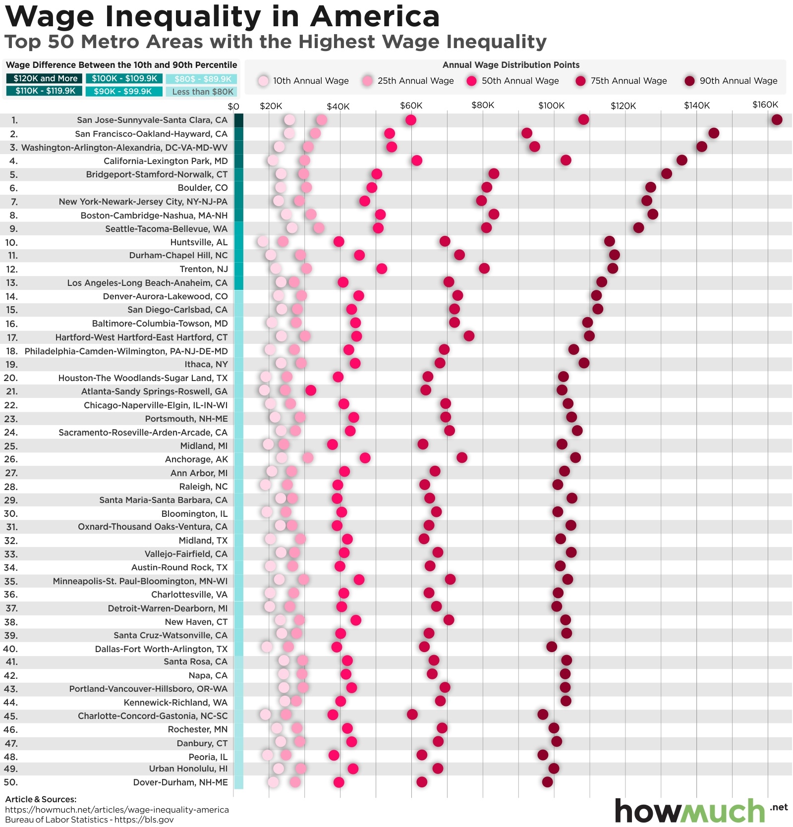
The U.S. stock market is booming, the labor market is extremely tight and wages are finally starting to rise. And yet wealth inequality remains at a five-decade high as the top 1% just keep getting richer. Take the founder and CEO of Amazon, Jeff Bezos, who is reportedly worth some $103.9 billion. Such an eye-popping number got us thinking about wealth inequality across the country for ordinary workers.

  • San Jose, CA has the highest rate of wage inequality. The top 90th percentile take home $137,390 more than someone in the 10th percentile.
  • The average wage gap in our visual between the 10th and 90th percentiles is $88,480.
  • There is a clear group of cities where inequality has reached extreme heights, however it remains significant even in places like Peoria, IL.
  • Workers in the 10th percentile do not have a similar distribution of income. Low-wage workers make about the same no matter where they live, always below $27,000.

We built our visualization with numbers from the U.S. Bureau of Labor Statistics for 2018, focusing on the top 50 metro areas with the greatest rates of inequality in the country. We ranked each city based on the size of the gap between earners in the 10th and 90th percentiles. We also included figures for the 25th, 50th and 75th percentiles for easy reference. This lets you quickly see which parts of the country have the highest levels of inequality.

Top 10 metros for wage inequality ($ dif. between 10th and 90th percentiles)

1. San Jose-Sunnyvale-Santa Clara, CA: $137,390
2. San Francisco-Oakland-Hayward, CA: $119,640
3. Washington-Arlington-Alexandria, DC-VA-MD-WV: $119,020
4. California-Lexington Park, MD: $115,300
5. Bridgeport-Stamford-Norwalk, CT: $108,700
6. Boulder, CO: $104,290
7. New York-Newark-Jersey City, NY-NJ-PA: $103,790
8. Boston-Cambridge-Nashua, MA-NH: $103,300
9. Seattle-Tacoma-Bellevue, WA: $97,690
10. Huntsville, AL: $97,630

Our visual reveals several key trends about wealth inequality in the U.S. For starters, inequality is severe all across the country. San Jose sits at the absolute extreme end of the spectrum, where the top 90th wage earners rake in $137,390 more than someone in the 10th percentile. San Francisco is not far behind with a gap of $119,640. Clearly Silicon Valley has extraordinary amounts of inequality.

That being said, our visual demonstrates how there’s only a slight drop off in equality across the South and Midwest. In places like Dover-Durham, Honolulu and Peoria, the top earners are still making $75,000 more than workers at the bottom of the income ladder. In fact, for mid-sized cities, the 90th percentile clusters just over $100,000 in total income.

Perhaps the most interesting revelation in our visual is how there isn’t a comparable curve for low-wage workers. Someone in the 10th percentile in San Jose makes about as much money as someone in the 10th percentile in Portland. In other words, we don’t see low-wage earners making more money in places with extremely high wage earners, They no doubt have a higher cost of living, meaning their wages don’t go nearly as far. Policymakers will have to do a lot more than raise the minimum wage to $15 to actually change these figures.

What do you think the greatest drivers of inequality are in the U.S. today? With the economy continuing to grow, do you think the situation will start to improve? Let us know in the comments.

Data: Table 1.1

Viewing all 687 articles
Browse latest View live