Quantcast
Channel: howmuch.net
Viewing all 687 articles
Browse latest View live

Visualizing the Largest Coffee Exporters Across the Globe

$
0
0

Drinking coffee means that you will live longer. So says a host of recent research. Even if the exact cause of increased longevity isn’t caffeine, about 2 out of 3 American adults drink a cup of coffee every day. That means the market for getting a cup o’ joe is absolutely enormous, and we decided to figure out which countries are responsible for supplying most of us with our daily morning ritual.

We found the data for our visualization at the CIA World Factbook. We placed a circle on a world map corresponding to the market size of exports leaving each country in 2017, the latest year for which numbers are available. This lets you easily see which countries (and which continents) lead the world in coffee exports.

Top 10 Countries Exporting the Most Coffee

1. Brazil: $4.6B

2. Vietnam: $3.5B

3. Germany: $2.64B

4. Colombia: $2.58B

5. Switzerland: $2.2B

6. Italy: $1.6B

7. Indonesia: $1.19B

8. Honduras: $1.16B

9. France: $1.07B

10. Belgium: $.94B

What insights can be gleaned from our visualization? First and most obviously, export statistics don’t only take into consideration where a particular product is initially produced. For example, Germany and Switzerland are both prominently displayed on the visualization, but that’s not because farmers are able to grow massive amounts of coffee beans there. Instead, they import green coffee beans from less developed parts of the world, roast it, and then ship it around the world. Roasting and flavoring coffee beans takes a lot of electricity and water, resources that developing parts of the commonly don’t have in abundance. It therefore makes a lot of sense to locate these activities close to where rich consumers throughout Western Europe live.

Taking a step back and looking only at countries where coffee beans actually grow, there are a few major players with over $2B in exports, namely Brazil ($4.6B), Vietnam ($3.5B) and Colombia ($2.58B). Combined, they account for 32.7% of the entire world’s exports. Any of these countries alone generate more coffee beans than the entire continent of Africa, a testament to how underdeveloped the industry is there. Ethiopia, Africa’s largest coffee exporter ($938M), doesn’t even crack the top ten rankings.

And yet the international coffee market is relatively dispersed among dozens and dozens of different countries. Only two account for more than 10% of the global export market, and 17 different nations contribute between 1-5% each. That means there’s no shortage of options when it comes to getting your daily fix of caffeine.

Data: Table 1.1 


See How Much the Top 1% Earn in Every State

$
0
0

Imagine the richest 1% of wage earners in your state all got together at the same stadium to watch a football game. How much money would you need to earn each year to get into the game? And what would be the average income level of everyone in attendance? Our newest visualization breaks down both components of that hypothetical situation for every state in the country.

We found our data at the Economic Policy Institute (EPI), which published a detailed study last month on income levels based on 2015 tax filings for both single adults and married couples. The EPI found both how much income is needed to count yourself in the top 1% of earners in each state (the green in our visual). They also calculated the average annual income for that specific group of people (the purple in our visual). In other words, our visualization represents both the minimum amount needed to be counted as an elite one-percenter, and the average amount for that cohort. This methodology reveals a startling level of inequality even among the richest Americans.

Here are the ten states where the top 1% of wage earners have the highest incomes on average:

Top 10 States with Highest Average Annual Income of the top 1% 

1. Connecticut: $2,522,806

2. New York: $2,202,480

3. Massachusetts: $1,904,805

4. Wyoming: $1,900,659

5. Washington, DC: $1,858,878

6. California: $1,693,094

7. New Jersey: $1,581,829

8. Florida: $1,543,124

9. Illinois: $1,412,024

10. Washington: $1,383,223

There’s a lot that can be said about our visualization. Most obviously, the purple pieces of our exploding pie chart are almost always significantly larger than the green parts. Think about it this way: if you live in Connecticut, you need to make $700,800 a year just to be counted among the top 1%. But the average income for one-percenters is $1.8M higher, at $2,522,806. In fact, the average difference between these two numbers for every state is an eye-popping $715,482. And a lot of people no doubt earn significantly more than that.

Another way to think about the visualization is by looking at the states with the lowest gaps, that is, the least amount of separation between the richest of the rich and those who are just plain rich. These states all tend to be rural and grouped in the South, like West Virginia, Mississippi, New Mexico, Maine and Kentucky. These are places where you don’t need to crack $1 million to make it into the top 1%, and in West Virginia for example, you only need to make $258,028. And of course several states stand out as places with extremely high average annual incomes at the very top of the totem pole. Connecticut, New York, Massachusetts and New Jersey no doubt have lots of wealthy folks thanks to Wall Street. Washington DC apparently has an elite group of lobbyists pulling down well over half a million, and California mints its one-percenters in Silicon Valley. Nobody’s surprised anymore to see absurdly high inequality in these places.

But take a look at Wyoming, where the average income of the top 1% is an incredible $1,900,659. The EPI actually singles out Jackson, WY as the most unequal location in the entire country. Speaking of which, guess where the Federal Reserve just held its annual economic symposium? That’s right, Jackson Hole, WY. Coincidence, anyone?

Data: Table 1.1 
 

Mapping Firefighters Salaries in Every State

$
0
0

Who doesn’t think firefighters are national heroes? They work long shifts, maintain a high level of specialized skills, and risk their lives at a moment’s notice for the public good. Despite their popularity, did you know that many firefighters don’t make a living wage? In fact, how much they earn varies wildly around the country.

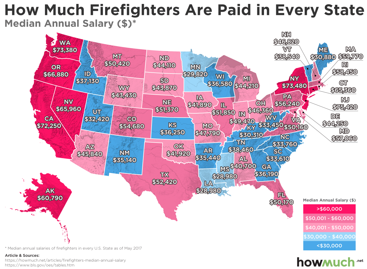
We gathered the data for our latest map from the Bureau of Labor Statistics (BLS), which publishes a wide variety of employment and economic data. We took the median annual salary of firefighters in every state as of May 2017 and created a color-coded map, highlighting the states that pay the most (and least) for professional firefighters. Median salary figures are a powerful way to understand how much most people make—half of all firefighters make less than the median amount, and half make more.

Top 10 States that Pay the Least Median Annual Salary to Firefighters 

1. Louisiana: $28,980

2. Mississippi: $28,980

3. Minnesota: $29,820

4. Kentucky: $30,310

5. Maine: $30,880

6. Utah: $32,420

7. West Virginia: $33,450

8. South Carolina: $33,610

9. North Carolina: $33,760

10. New Mexico: $35,140

These are the ten states that pay the least amount of money for firefighters in the country. To put these numbers in perspective, the federal poverty level for a family of four is $25,100.

Analyzing our map of firefighter salaries reveals three key dynamics: state expenditures and politics, how often firefighters are called into action, and what exactly firefighters do. Let’s take each dynamic in order.

First, our map highlights how state governments spend money depending on which political party controls the local government. That is, Republican administrations tend to hold down public expenditures, and Democratic ones tend to spend more on public services. To see this dynamic in play, compare our map to the states where one political party controls all branches of state government, known as the supermajority trifecta. There are a group of states concentrated primarily across the South where firefighters earn relatively meager wages. Led by the state of Louisiana where they take home only $28,980, many states across the South simply refuse to pay a living wage to these brave men and women. Conversely, West Coast states (which Democrats control) spend the most on firefighter salaries. There are certainly a few notable exceptions, like Minnesota ($29,820) and Vermont ($38,540), but the rule generally applies across the country.

Another way to think about firefighter salaries, other than politics, is to consider how often they are called into action. There’s a massive smog problem right now across several Western states because of forest fires, and you can bet the firefighters living in those states have significantly more work to do than in the South or Midwest. In other words, the cluster of states out West may have more to do with the environment and how many times firefighters are called into action than politics. Also, consider the role firefighters play in responding to natural disasters and terrorist attacks. New Jersey ($75,420) and New York ($73,480) pay the most money for firefighter salaries not just because they are expensive places to live. Firefighters are among the frontline emergency responders called to action when the unimaginable happens, and perhaps as a result they command higher salaries in these places for their efforts.

And finally, another way to think about our map is to consider why anyone would accept relatively little compensation for risking their lives. Part of it has to do with the promise of full pensions at a relatively young age. In exchange for accepting relatively low pay now, many public workers believed they would get defined-benefit public pensions backed by taxpayers. But as it turns out, states and municipalities simply don’t have the money to make good on their pension promises, leaving many firefighters with no alternative resources. Indeed, why would anyone accept $30,000 for such a dangerous job with no long-term financial security?

Data: Table 1.1 

Visualize the Net Worth of America’s Richest Self-Made Women

$
0
0

Female entrepreneurialism is on the rise. According to a new ranking from Forbes, the combined net worth of the country’s top 60 self-made women has increased 15% over last year, totaling an impressive $71B. And the minimum threshold to even make it onto the list increased to $320M. With so much money at stake, we created a new visualization highlighting the names and faces of the most successful businesswomen in the country.

We made our visualization using data from Forbes documenting the net worth and industries from which self-made women amassed their fortunes as of 2018. Forbes arrived at these figures by analyzing the value of publicly held stock as of June 22, 2018 as well as conservative estimates of the value for privately held companies compared to similar public ones. Forbes also defined anybody who built their own fortune (as opposed to inheriting it) to be “self-made,” eliminating women who are second-generation business owners. We used the value of their fortunes to create a color-coded bubble chart, letting you easily see which women have the largest net worths and how many fall into which wealth brackets.

Here are the ten richest self-made women according to Forbes, together with their net worth and the primary industry in which they made their money.

1. Diane Hendricks: $4.9B (Roofing)

2. Marian Ilitch: $4.3B (Little Caesars)

3. Judy Faulkner: $3.5B (Healthcare IT)

4. Meg Whitman: $3.3B (eBay)

5. Johnelle Hunt: $3.2B (Trucking)

6. Oprah Winfrey: $3.1B (TV shows)

7. Judy Love: $3.0B (Retail & gas stations)

8. Doris Fisher: $2.8B (Gap)

9. Elaine Wynn: $2.6B (Casinos, hotels)

10. Lynda Resnick: $2.4B (Agriculture)

Our visualization highlights a number of women that we’re betting most readers don’t know yet. There is of course Oprah, with her fortune of $3.1B and rumors of an increasingly unlikely presidential run. Meg Whitman is also very well known given her success at eBay, tumultuous tenure at Hewlett-Packard, and subsequent campaigns for governor in California. But we’re betting that in general, most people would be hard pressed to identify anyone else pictured in the bubbles in our visualization. Marian Ilitch is the mastermind behind Little Caesars, and Judy Faulkner heads up a company with healthcare software in most of the nation’s best hospitals. Every person on the list is tremendously successful in their own right. Self-made women just aren’t as well known as self-made men, but given their billions of wealth, they obviously have a lot to teach us about success.

Another interesting takeaway from our visual is the inequality it displays even among this elite group. Only two women exceed $4B, and only five are between $3-4B. The average fortune size is $1.18B, which sounds like a lot of money until you remember Mark Zuckerberg lost almost $17B in a single day this summer. He certainly still has billions and billions left over. In fact, 36 out of the 60 women represented here have amassed personal fortunes valued at less than $1B. The implication of these numbers is that there just aren’t very many self-made women in the business world.

Want to learn more about the gender wage gap? Check our our other articles on the topic (here and here).


Data: Table 1.1 

The Average Social Security Benefit Does Not Cover Basic Living Expenses

$
0
0

Social security was initially intended as a safety net to keep people out of poverty. There are a few different ways to become eligible, including reaching retirement age, becoming the widow of a former beneficiary, blind or disabled.

The bargain is simple enough to understand. Workers and employers pay into the system for several years. Once someone becomes eligible for benefits, he or she relies on the government to make distributions. It’s a great idea in theory, but in reality there are a few structural problems to consider, not the least of which is how the Social Security Administration is now tapping into its trust fund to make payouts. Our new visualization highlights yet another key problem.

We originally found the data for our visualization from GoBankingRates, which in turn collected the underlying information from the Social Security Administration, the Missouri Department of Economic Development and Zillow. We stack ranked each state based on the total cost of living, taking into account median rent, average grocery bills, utilities, transportation and healthcare costs. We then plotted the average monthly social security benefit of $1,295 to determine which states have the biggest problems in terms of affordability for people relying on the program for most (or all) of their expenses.
These are the ten states with the largest gaps between what social security pays out and the cost of living. We are including the percentage of living expenses that an average social security benefit will cover.

1. Hawaii: 26.7%

2. Washington, DC: 28.8%

3. California: 29.1%

4. Massachusetts: 31.6%

5. Alaska: 32.1%

6. New York: 34.2%

7. New Jersey: 34.2%

8. Connecticut: 35.4%

9. Washington: 35.4%

10. New Hampshire: 36.0%

Our visualization signals an ugly truth: social security hardly affords anyone a decent standard of living on its own. In 45 states, it doesn’t even cover 50% of the cost of living (make that 46 if you count Washington, DC.) The absolute best state in the country is Arkansas, and even there it doesn’t even provide 60% of the cost of living. At best, social security might be enough to cover a handful of bills for most people, but in a lot of places it’s not enough to even make rent.

Take a closer look at the geographic distribution of our ranking. States in the Deep South appear to be clustered toward the bottom, meaning social security provides for a larger share of living expenses in those places as compared to the Midwest or the Northeast, both of which tend to be higher on the visualization. This creates yet another incentive for people to relocate once they start receiving benefits to warmer climates where it’s easier to make ends meet.

What are the implications of these numbers? Social security just isn’t enough to enjoy an average standard of living. That could mean a few things for beneficiaries: continue working, get a job, find help from someone else (by moving in with adult children), drastically lower living expenses (by moving to a new state), or rely on savings (which most people don’t actually have). In fact, the vast majority of social security beneficiaries are retirees, and according to the Government Accountability Office, 29% of Americans have no retirement savings whatsoever.

To summarize: Americans don’t have the savings to retire comfortably, social security’s trust fund will be depleted in 8 years, the government will either issue debt to make payments or raise taxes to cover the difference, and the benefits are insufficient to make ends for all beneficiaries meet anyway. All of this suggests that something is going to break sooner or later.

Data: Table 1.1 

Here's How Much More Money American Men Earn than Women at Every Age

$
0
0

“Equal pay for equal work.”

That was the slogan rocking corporate America in the 1960s as women demanded more money for performing the same jobs as men. Several decades later, the gender pay gap is still alive and well, and in fact it gets worse over time.

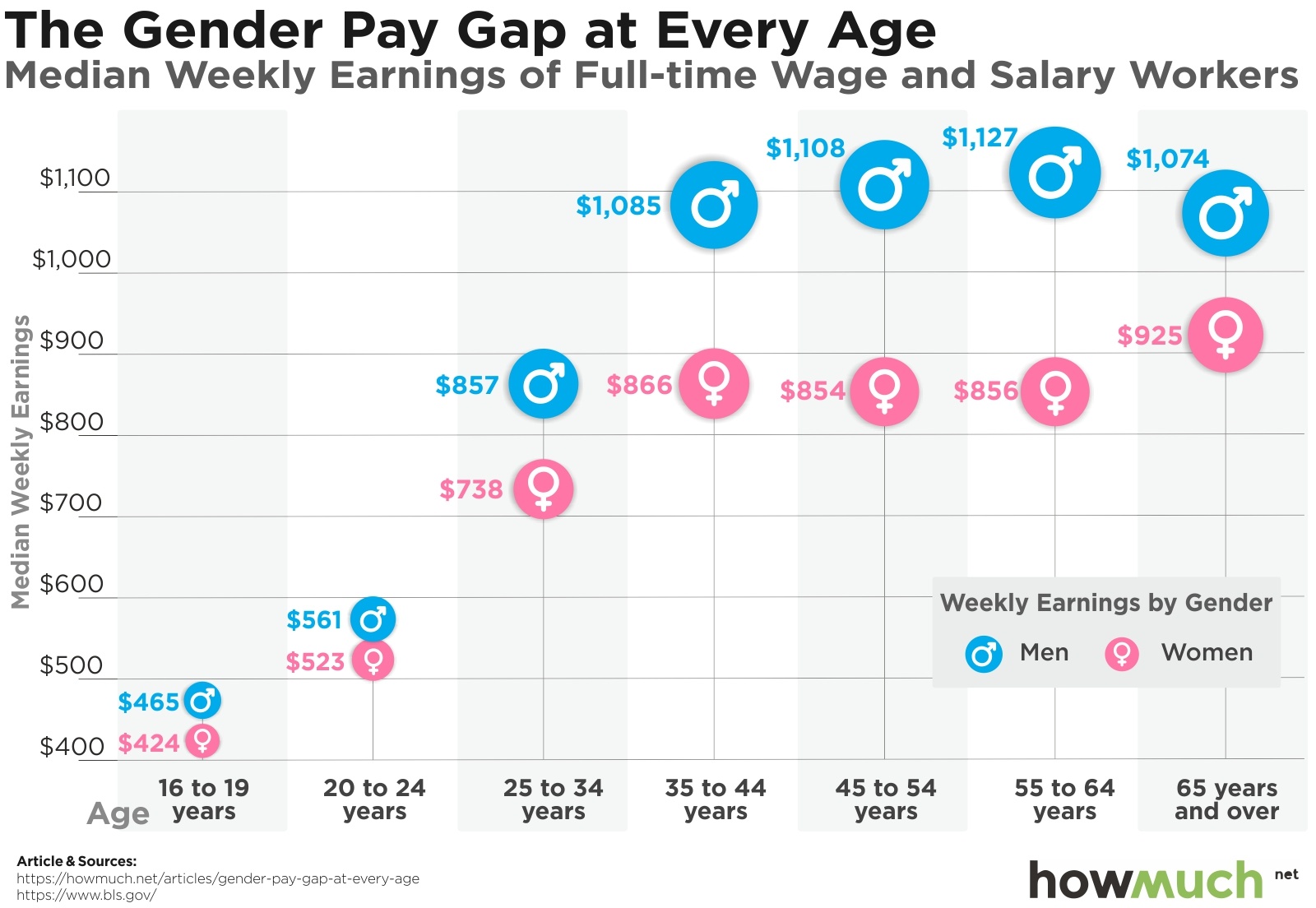
We collected the data for our visualization from the Bureau of Labor Statistics (BLS), perhaps the most impartial source for wage figures. The numbers represent median weekly income for men and women for both salary and hourly employees for the second quarter of 2018, not seasonally adjusted. Even this quick snapshot reveals several key characteristics about the economy overall and individual earning potential.

Let’s start by taking a step back from the gendered dynamic of our numbers. The same general trendline applies for both men and women, the years of fastest wage growth occurs for people 20 to 44 years of age. This makes a certain amount of sense—a lot of workers graduate from college or some other specialized program, get a few years of experience, and perhaps job hop to another employer. Interestingly, median wages for both men and women level out after 45 years old, ticking slightly up for men and actually declining for women until much later in life. Perhaps people are taking less risks in their careers as they settle down and have children, or perhaps employers just don’t need to pay older workers a lot more for 30 years of experience as opposed to 10.

There is nonetheless a striking separation between the median wages for men and women during young and middle adulthood. Men between 25-34 years of age make $119 more than women per week, but take a look at the next age bracket. The difference shoots even further up to $219. The gap continues to grow throughout life, reaching its largest point for 55-to-64-year-olds at $271 before declining to $149 for those 65 and older.

Observers have spilled a lot of ink trying to explain these numbers. Some attribute the gap to differences in career choices, educational backgrounds and parenting practices. There might be different factors contributing to the gap at different points in time. Look at the numbers for the youngest workers, those between 16-19 years old. What could possibly account for the difference of $41 between people with zero career experience and the exact same education level? Teenage birth rates are lower than they’ve been in at least 25 years, so having kids is a vanishingly rare possible explanation. Indeed, perhaps we should simply label the persist gap in wages for men and women year after year exactly what it is—gender pay discrimination, plain and simple.

Data: Table 1.1
 

CEOs Make 312 Times More Money Than Their Employees. See the Trend Over Time (1965-2017)

$
0
0

It pays to climb to the top of the corporate ladder. A lot.

There are two ways that companies compensate their CEOs: cash (including salaries, bonuses, restricted stock grants and other incentives) and stock options. Which method results in the highest total payout depends on a number of factors, including how the company’s stock price is doing at the time and if the boss cashes in the stock right away or decides to wait. We created a new timeline to understand how these last two factors have changed over the years.

Think of our new visualization as a spiraling timeline. We gathered CEO-to-worker compensation ratios from the Economic Policy Institute (EPI), a non-profit think tank focused on promoting the needs of low- and medium-income workers for public policy decisions. The EPI analyzed compensation figures for CEOs at 350 of the largest US companies based on sales from 1965 to 2017. They take into account the ratio as two numbers: as stock options realized (the dark red) and as options granted (the light pink).

Our visualization lets you easily and quickly see how both numbers have changed over the years as well as the overall pattern of exploding CEO compensation. No matter how you look at it, CEO’s have massively increased their compensation levels since 1965. Originally a mere 20x the pay of normal people, chief executives have enjoyed well over 200x almost every year since the 1990s. Somehow they are able to extract more money out of companies, whether measured as realized or gained stock options, while average workers are left with relatively little wage gains in comparison.

Despite the relentless upward trajectory of both numbers, there are a few interesting caveats. Look at the compensation numbers for 2009, the height of the Great Recession. CEO pay hit the lowest mark since 1996. Other years with economic recessions witnessed similar retreats, like after the dotcom bubble burst in 2000-01. We aren’t exactly shedding a tear for poor CEOs, however. They still took home well over 100 times more than the Average Joe.

Perhaps the most interesting insight on our visualization is that CEO pay actually reached its highest level ever when compared to average workers in 2000. In other words, inequality used to be even worse that it is today. But consider this—the pay figures for the year 2000 seem quite anomalous and far out of line with previous years. By comparison, the numbers for 2017 seem relatively stable albeit higher than in years past. In other words, we suspect CEOs will continue to enjoy hefty incomes even if there’s a new recession around the corner.

Data: Table 1.1 

Comparing Cryptocurrency Against the Entire World’s Wealth in One Graph

$
0
0

Given the 8-month long crypto bear market, lots of bitcoin naysayers are feeling smug right about now. From JPMorgan CEO Jamie Dimon to CNBC’s Mad Money host Jim Cramer and Nobel economist Robert Shiller, every media personality seems to think bitcoin’s downward trend will continue. There’s plenty of evidence to suggest things will turnaround, but that’s beside the point. Bitcoin in particular and the larger crypto-market in general are already substantial parts of the global economy.

This graph is a follow-up from a similar visualization over a year ago, giving us a unique lens through which to make several different comparisons.

Let’s start by moving from right to left. All of the world’s bitcoin is now worth more than the personal fortune of Bill Gates, and nearly the same as Jeff Bezos. But look at the combined total value of all the cryptocurrencies in the world—an eye popping $202B. That’s more than double the market cap of Goldman Sachs, no matter what the company’s CEO Lloyd Blankfein would have us believe.

Bitcoin’s total market capitalization has more than doubled from $41B to $112B in the past year. More to the point, lots of attention has been paid in the media to cryptocurrency market manipulation and successful hacks. But here’s the rub: downturns are nothing new in the crypto world, as our other research has reported. In short, the value of cryptocurrencies floats up and crashes down, but at least over the last year and half, bitcoin has still seen a substantial net gain in value.

The numbers behind our graph are incomprehensibly large. Here are a few ways to break things down:

  • The entire market cap of Amazon is $858B bigger than bitcoin ($970B vs. $112B).

  • The first trillion-dollar company, Apple, is worth $888B more than bitcoin ($1T vs. $112B).

  • The value of the entire world’s gold is over 70x more than bitcoin ($7.8T vs. $112B).

  • All of the cryptocurrencies in existence are worth 0.59% of the world’s physical money ($34.4T vs. $202B).

  • Cryptocurrencies are even tinier compared to the world’s stock markets at just 0.30% ($67.5T vs. $202B).

  • And here’s the ultimate comparison:  cryptocurrencies are the equivalent of only 0.23% of all the money in the world, broadly defined ($86.5T vs. $202B).

Here’s some additional context for these comparisons. Both Amazon and Apple are worth much more than the entire GDP of Turkey ($851B). And here’s the most interesting thing—even as Amazon has amassed such an enormous value ($970B), Jeff Bezos has personally received the equivalent of 10% (or $112B). Add Apple and Amazon together, and you’d have a conglomerate worth more than the entire value of USD in circulation ($1.5T).

Is your head starting to spin yet? What if you tried to imagine the vale of the entire world’s gold ($7.8T)? That’s roughly 8 times the value of Apple, or like having the fortune worth 70 times that of Jeff Bezos. It’s also hard to imagine all the world’s physical money ($34.4T), defined as anything that can be used as a medium of exchange in the world. That’s separate and distinct from all the stock markets’ value ($67.5T), much less the theoretical value of money in the world ($86.5T), which include the funds people keep in their bank accounts. That means if every single person wanted to physically hold all their wealth, governments would need to physically print well more than double the entire monetary value they currently have in circulation.


The Economic Cost of Mother Nature's Destructive Fury in U.S.

$
0
0

Hawaii’s Kilauea volcano is now threatening to destroy more homes, forcing the authorities to order a mandatory evacuation for additional neighborhoods. There’s no telling when the volcano will finally stop, but it has already destroyed 82 structures. That means we will have to wait assess the final cost of damages, but it got us thinking about the most expensive natural disasters in American history.
We found the numbers for our visualization from the National Oceanic and Atmospheric Administration (NOAA), which tracks the frequency of natural disasters, their total property damage and the resulting number of deaths. The numbers represent cumulative damage from each category of natural disaster between 1980 to 2017. NOAA has its own sophisticated methodology for how it accounts for these figures. They include both insured and uninsured losses that would not have happened had such an event not taken place. Of course, there’s considerable uncertainty involved in any such counterfactual estimate, but the research is backed by career scientists and economists with a sophisticated understanding of statistics. See here for a detailed description of NOAA’s methodology.

Our Voronoi diagram actually tells a compelling story. For starters, hurricanes loom large as the catastrophic events causing by far the most damage over the last 37 years, totaling an astonishing $850.5B. Hurricane season is upon us again, and sure enough Hurricane Florence has the Carolinas in its crosshairs this week. And let’s not forget Hawaii, which just got through Hurricane Lane and is now facing another tropical storm in Olivia. The City of Houston meanwhile is still struggling to recover from an insane amount of damage from Hurricane Harvey. All of this suggests that hurricane damage has been and will continue to be a perennial challenge in the US.

One surprise in our visualization is how small the damage caused by wildfires ($53.6B) is compared to droughts ($236.6B). The media spends a significant amount of time covering fires, and rightly so—they are truly terrifying events to witness. California is still suffering from the Mendocino Complex wildfire, the largest ever. A separate fire even closed Interstate 5, forcing truckers to abandon from their vehicles. To put it crudely, crops withering in the field isn’t as compelling of a story as compared to the dramatic photos of houses bursting in flames.

Want to learn more? Check out our other visualization covering the most expensive natural disasters in the US over the last 40 years.

Data: Table 1.1

This is What you Take Home from a $100K Salary in America's Biggest Cities

$
0
0

Trump’s tax cut has been in effect for several months now, and the US Congress might in fact make it permanent beyond 2025. Republicans would argue that the tax cut should never be allowed to lapse so that businesses can have confidence in their rates. What about average workers? Total take-home pay actually depends to a great degree on where people live.

We created our map by first taking the largest city in each state, and calculating the total tax burden associated with living there according to SmartAsset. We wanted to keep things simple, so we used $100,000 as a baseline annual salary. $100k comes out to $8,333 in monthly net income, from which we subtracted state and local income taxes for each city, if applicable. We also subtracted tax levies that apply equally to everyone, like the federal income tax and FICA. The size and color of each circle correspond to total take-home pay after taxes. This lets you easily see where an upper-middle class professional salary goes the furthest, and which places have comparably high tax burdens.

Here are the ten cities where workers earning $100,000 a year end up with the lowest take-home pay each month.

1. New York City, NY: $5,574

2. Portland, OR: $5,663

3. Louisville, KY: $5,691

4. Baltimore, MD: $5,701

5. Honolulu, HI: $5,726

6. Philadelphia, PA: $5,746

7. Los Angeles, CA: $5,752

8. Boise, ID: $5,772

9. Wilmington, DE: $5,791

10. Detroit, MI: $5,797

Our map reveals a few key things about the total tax burden facing Americans living in large cities. First of all, there are lots of small circles scattered throughout the Midwest and South, indicating that it’s not just coastal cities with comparably high tax burdens. Granted, the heaviest burden falls to New Yorkers, where workers earning $100,000 a year only keep $5,574 each month, but Louisville, KY isn’t too far off at $5,691. From Boise, ID to Detroit, MI and Little Rock, AR to Billings, MT, many landlocked cities nowhere near the coasts have substantial local taxes.

What’s the best place to live if you’re only interested in keeping as much money as possible? Luckily, there are several cities with zero local and state taxes, and you don’t necessarily have to move to Wyoming or Alaska to find them. Cheyenne, WY or Anchorage, AK are perfectly fine places to live (and quite beautiful), but there are other diverse cities with low taxes too, such as Houston, TX and Seattle, WA. You can keep a full $6,329 in take-home pay each month in the largest cities in 9 states.

Almost everybody loves the idea of keeping more of their own paycheck, even if they don’t realize the difference Trump’s tax cut made. Regardless of what polls say, our map proves that tax rates have more to do with location than what people often realize. Learn more about the geography of taxation in the US, how Trump’s tax plan affected workers (and especially the top 1% of earners).

Data: Table 1.1

Visualizing Where Tourists Spend the Most Money

$
0
0

Mark Twain once quipped, “Travel is fatal to prejudice, bigotry, and narrow-mindedness.”

But what if people are by and large only traveling to the same places? Our newest map highlights the countries with thriving international tourism industries, and it suggests a dramatic disparity between the places where tourists spend big bucks and the places where they hardly spend anything at all.

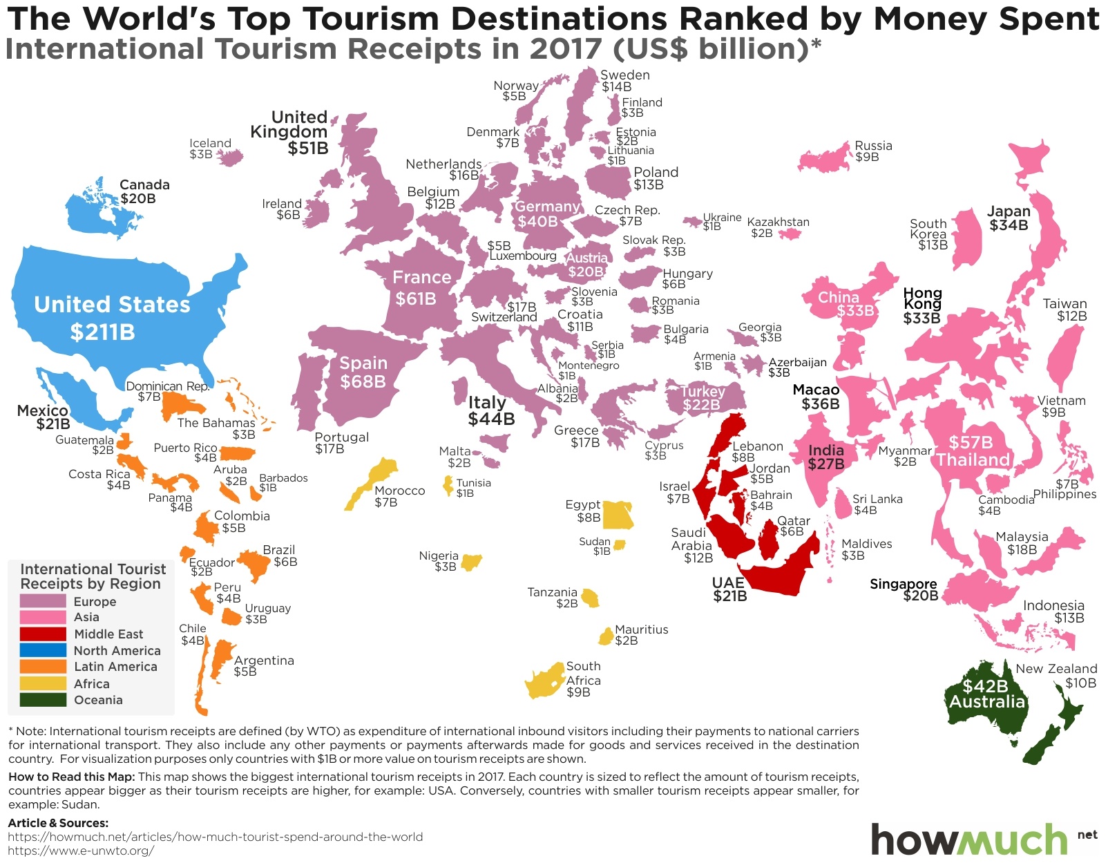
We got the data for our visualization through the World Tourism Organization, an agency in the UN. First, we color-coded each country based on the continent. Then we adjusted the size to correspond to the annual amount tourists spend in each destination in 2017 (US$ B). The WTO defines an expenditure as any amount spent by an international inbound tourist, including things like transportation, goods, and services. In other words, our figures exclude domestic tourism, giving you an accurate snapshot of which countries depend the most (and least) on the international tourism market.

Top 10 Countries with the Highest International Tourism Receipts in 2017

1. USA: $211B

2. Spain: $68B

3. France: $61B

4. Thailand: $57B

5. United Kingdom: $51B

6. Italy: $44B

7. Australia: $42B

8. Germany: $40B

9. Macao (China): $36B

10. Japan: $34B

There are several significant insights about the worldwide tourism industry in our visualization. The most obvious conclusion one can immediately draw is which countries see the most (and least) tourism dollars, looking both at continents and individual countries. Take Africa and the Middle East, for example. Only a handful of countries have tourism industries large enough to appear on our visual. Compare that to the size of the US, which is more than double the combined size of both areas. The US alone actually accounts for 16% of the entire world’s tourist expenditures ($211B), and the combined value of the top ten countries on our list make up an amazing 49% ($643B).

This means that the tourism sector is top heavy and concentrated in a few key places. In fact, the places attracting the most money tend to be Western countries, plus a few East Asian hotspots like Japan, Thailand and Macao (which is an independent territory controlled by China; more on Macao in one second). Comparatively little expenditures take place in the global south, including South America. The notable exceptions are Australia ($42B) and New Zealand ($10B), but both of those are developed English-speaking countries.

This raises interesting questions about the global travel industry. Airlines fly all over the world, and yet the tourism industry is bifurcated and unequal. How can unknown places attract visitors who spend money?

Macao offers an instructive example. It’s an obvious standout on the map at $36B. And that’s because it’s the largest gambling hub in the world. Typhoon Mangkhut recently forced all of Macao’s casinos to close, and in just 33 hours, the entire industry saw a combined loss of revenue of an astonishing $186 million. That comes out to $5.6 million in lost revenue per hour, every hour. Gambling might not be the ideal way for every country to develop a robust tourism industry, but the money sure speaks for itself.

Data: Table 1.1 

How Much You Must Earn to Afford a House in the 50 Largest U.S. Cities

$
0
0

Buying a home used to be part of the American dream. It lets you build equity over the years, gives you a significant financial asset, and provides a pride of ownership or investment in the surrounding community. The problem is that in some cities, workers must earn hundreds of thousands of dollars to afford an average-sized home.

We found the numbers behind our latest map from HSH.com, one of the largest publishers of consumer and mortgage information in the country. HSH focused on the 50 most populous metro areas in the country, and figured out the price of the median home for sale. They then calculated monthly principal, interest, property tax and insurance payments buyers have to pay for a 30-year fixed rate mortgage. To keep things simple, they determined what salary would be needed to afford each home using the 28 percent “front-end” debt ratio, meaning the total housing payment could not make up more than 28% of gross income. They also assumed a 20% down payment. We mapped the resulting needed annual salary as a spike on a geographic outline for the metro area.

Top 10 Cities Where You Need to Earn the Most to Afford a Median-priced House

1. San Jose, CA: $274,623

2. San Francisco, CA: $213,727

3. San Diego, CA: $130,986

4. Los Angeles, CA: $114,908

5. Boston, MA: $109,411

6. Seattle, WA: $109,275

7. New York City, NY: $103,235

8. Washington, DC: $96,144

9. Denver, CO: $93,263

10. Portland, OR: $85,369

Our map reveals three tiers in annual income workers need to earn to afford a median home. First, the West Coast stands out as by far the most expensive market in the country, with 4 out of the top 4 markets in California alone. San Jose, CA is easily the most expensive; workers need to make well over a quarter million dollars to afford a median-priced home. San Francisco is not far behind at $213,727, followed by Sa Diego much further down at $130,986. These numbers indicate the extent to which Silicon Valley has created a massive increase in property values.

The second tier of expensive locales is along the East Coast, led by the familiar hotspots of unaffordable housing like Boston, MA ($109,411), New York City, NY ($103,235) and Washington, DC ($96,144). But there are also other expensive metro areas located along the Atlantic Coast as well, such as Miami, FL ($78,337) and Providence, RI ($75,808). It’s clearly expensive to live somewhere close to an ocean.

The third and final tier of cities where workers don’t need to earn 6-figure salaries stretches across the country’s midsection. Ranging from Minneapolis, MN ($63,962) down to New Orleans, LA ($49,249), there are several metro areas with plenty of relatively cheap housing. A couple of old Rust Belt cities round out the bottom of the list in Cleveland, OH ($39,730) and Pittsburgh, PA ($38,253).

There is one more interesting and overarching trend\ worth noting on our map. Median household income across the US recently reached a record high of $61,400, which is great news for workers. The bad news is that isn’t enough to afford a typical house in 25 out of the 50 cities on our map. Granted, workers in metro areas tend to make more than their rural counterparts, but there is no doubt a real concern about affordable housing in certain urban areas.

Want to find out more about the true cost of living in the US? Check out this interactive tool.

Data: Table 1.1

Guess How Much More Money the Top 1% Make than the Bottom 99%

$
0
0

Why is there so much wealth inequality? Economists have been trying to answer that question for decades, and one interesting way to think about the problem has to do with geography. Our new visualization highlights the yawning gap between the top 1% of earners and the bottom 99% for every state in the country.

We gathered the numbers for our visualization from the Economic Policy Institute (EPI), a nonpartisan think tank devoted to informing fiscal policy discussions. We plotted the average annual income for the top 1% of wage earners in each state. Then we added the average income for the bottom 99%, essentially dividing the entire workforce into two groups. The gray bar on our visual therefore the size of the gap between the highest earners and everybody else, letting you quickly and easily see the extent of income inequality across the US.

Indeed, the gap is quite staggering. Across all 50 states plus Washington DC, the average difference is $1,047,435, a factor of 21.4 times. The states with the worst problems should come as no surprise: Connecticut, New York, and Massachusetts have well-documented wealth inequality problems. One notable state at the top of the chart is Wyoming. We previously used EPI data to single out Jackson Hole as the most unequal location in the entire country, no doubt due to its status as a retirement destination for the uber rich.

There’s another interesting trend lying just below the surface of our visualization. Take a look at the states with the lowest wealth inequality, toward the bottom of the visual. West Virginia, Mississippi, Maine, Kentucky and Alabama have the smallest gaps between the wealthiest 1% and everyone else. But these same states are widely known for their rural poverty and poor overall public health. In fact, the bottom 99% earn some of the lowest wages anywhere in the country.

The states with the lowest wealth inequality are also the poorest states in the country, which suggests one of two things. Either a rising tide lifts all boats, meaning the wages of the extremely well-paid inflates what everyone else makes too. Or states like West Virginia, where the average annual income for 99% of the population is a paltry $34,987, have economies that depress the wages of the top 1% too. Regardless of how we think about the correlation, moving across state lines to earn a higher wage seems like a plausible answer, even if fewer Americans are willing to move for jobs.

Let’s add one more layer of complexity. Our visual says nothing about the cost of living. For example, the bottom 99% of workers in Ohio make $46,157, but our recent analysis of housing prices indicates that’s plenty to afford a median-priced home in all of Ohio’s large cities. Wealth inequality is still no doubt a top concern for policymakers, but the real statistics aren’t exactly terrible for the average Joe in every circumstance.

Data: Table 1.1 

This Map Shows Income Inequality in Every American Metro Area

$
0
0

Wealth and income inequality are growing areas of concern. A report from Oxfam found that 82% of all wealth created throughout the world in 2017 went to the top 1%. 8 individuals literally own as much money as 3.8 billion people. It’s hard to grasp what these numbers really mean, so let’s reframe the issue at the local level. How bad is income inequality where you live?

We previously analyzed income inequality for all 50 states. This new map represents a deeper analysis looking at all 916 metro areas delineated by the U.S. Census Bureau. The data come from the Economic Policy Institute’s deep-dive into income inequality. We color-coded each metro area according to the ratio of how much more the top 1% of earners make compared to everyone else on average. For example, the lightest shade of pink indicates that the top 1% “only make” on average 5 to 15 times more than the Average Joe, but in the dark red areas, the ratio climbs to 75x and up.

Top 10 Metros with the Highest Income Inequality

1. Jackson, WY-ID: 132

2. Naples-Immokalee-Marco Island, FL: 90.1

3. Key West, FL: 81.3

4. Sebastian-Vero Beach, FL: 67.2

5. Bridgeport-Stamford-Norwalk, CT: 62.2

6. Miami-Fort Lauderdale-West Palm Beach, FL: 55.4

7. Port St. Lucie, FL: 45.5

8. Glenwood Springs, CO: 45

9. Hailey, ID: 44.9

10. Gardnerville Ranchos, NV: 44.3

Top 10 Metros with the Lowest Income Inequality

1. Junction City, KS: 5.4

2. Fort Leonard Wood, MO: 6.2

3. Rio Grande City, TX: 6.8

4. Los Alamos, NM: 7.0

5. California-Lexington Park, MD: 7.3

6. St. Marys, GA: 7.3

7. Peru, IN: 7.9

8. Juneau, AK: 8.5

9. Fort Polk South, LA: 8.5

10. Altus, OK: 8.5

There’s a lot that can be said about what our map reveals about income inequality across the US, but let’s start with the basics. At a foundational level, income inequality is pervasive. The top 1% still earn 5.4 times more than the rest of the workforce in the least unequal metro area. The average ratio across all 916 areas is an eye-popping 16.8, and 34 areas have ratios higher than 30x.

And here’s the real kicker. We are mapping the difference between two averages: the average income of the top 1%, and the average income of the bottom 99%. That means there are both people in the top 1% who make significantly more than 30x everyone else, and it means there are lots of poor people who make pennies compared to middle class workers.

So income inequality is generally high across the country, but our map also demonstrates the places where it is really high. There are several clusters of metro areas shaded pink and dark pink all over the place, but take a look at Florida. 5 out of the top 10 most unequal metro areas are in the Sunshine State, including 3 out of the top 5. There is an obvious explanation for such a disparity. Lots of people retire from colder parts of the country to Florida, making it a haven for wealthy folks who as a result drive up inequality.

Here’s another factor to consider. Does a state’s income tax rate affect wealth inequality? One could argue that high tax rates encourage wealthy individuals to move, lowering income inequality. At the other end of the spectrum, one could also argue that extremely low (or no) income taxes would attract wealthy individuals with high incomes from other states, driving up inequality.

We will leave it to economists to decide if income taxes redistribute wealth or cause rich people to move elsewhere. We will only point out that 11 of the top 20 metro areas with the worst income inequality are in states with no income tax, namely Florida, Nevada, Wyoming and Texas. It’s worth noting that Alaska, South Dakota and Washington also don’t have an income tax, but the first two tend to be extremely rural and Washington isn’t exactly the most equal place in the country either. And to be fair, there are lots of states with extremely high tax rates and enduring inequality too, like California and Oregon.

Still, low taxes and good weather are obvious ways to attract wealthy retirees.

Data: Table 1.1 

Visualized: The World's Most Valuable Retail Brands 2018

$
0
0

Warren Buffett once said, “It takes 20 years to build a reputation and five minutes to ruin it. If you think about that, you'll do things differently.”

The top 50 most valuable retail brands doing things better than everyone else are realizing substantial business value according to a new report from Brand Finance. Our latest map explores the geography of these globally dominant brands according to their overall strength ratings and monetary value.

Our data come from the Brand Finance Retail 50, a ranking from the world’s leading brand strategy and valuation consulting company. Brand Finance deploys two key metrics that we adapted into our visualization. The color of each circle corresponds to their brand rating, very similar to a credit rating, where AAA is exceptionally strong. The size of the circle represents the combined monetary value of the company’s retail brands. We also included the countries where these brands originate, letting you quickly and easily see which companies and countries dominate the retail world.

Top 10 Most Valuable Retail Brands 

1. Amazon: $151B

2. Walmart: $61B

3. Alibaba: $55B

4. Home Depot: $34B 

5. IKEA: $24B 

6. CVS Health: $21B 

7. JD.com: $20B 

8. Walgreens: $16B

9. Lowe's: $14B

10. Target: $14B 

How can we put a figure on a brand’s monetary value? Brand Finance judges the value of a brand by looking at “the efficacy of a brand’s performance on intangible measures, relative to its competitors.” For example, suppliers might be willing to make unique agreements with Amazon just to be sold on the platform, which adds value to Amazon at the expense of its competitors. Brand Finance also measures the hard value a brand adds to a company, taking into account marketing investments, stakeholder equity and business performance. The combination of these elements creates customer loyalty even if competitors offer the same products at a cheaper price.

Earlier this year we partnered with Brand Finance to create a map showing the most valuable brands by country. Amazon remains at the top of our list as easily the most valuable retail brand in the world, adding an astonishing $151B to the company. That’s roughly 2.5 times more than second place Walmart, worth “only” $61B. Keep in mind that Walmart generates significantly more revenue than Amazon ($485B vs. $178B in 2017). And Walmart’s brand value is only slightly ahead of third place Alibaba, a company that many analysts believe still has tons of room to grow. Our conclusion is that ecommerce companies are only just beginning to dominate the retail sector.

Our map also demonstrates how top-heavy the most retail brands are from a geographical perspective. The US dominates the world with 26 out of the 50 companies on our map with a combined value of $410B, followed by Germany (6), the UK and France (4 each). Exactly 0 companies made the list from South America, Africa and the Middle East, and only 3 from China and 2 from Japan. The West is clearly still in control of the retail landscape.

It is also interesting to explore the relationship between a brand’s overall value and its strength compared to competitors. The two are not the same. 7-Eleven has the strongest brand compared to other gas station/convenience stores at AAA, whereas its value is only $8B. Lots of brands are technically worth more but they aren’t so different from competitors. For example, there are 5 companies with the AAA- rating, including both Lowes ($14B) and Home Depot ($34B).

Regardless of the exact value, all these companies have spent decades building up brand name recognition. One only has to look at companies like Equifax to see how quickly that equity can slip away.

Data: Table 1.1


Visualizing the World's Tech Giants 2018

$
0
0

Technology companies have a unique advantage over other businesses, and it’s called the network effect. Each new user who joins a platform adds value to everyone already on it. Facebook would be boring if you were the only one on it. Google would be useless if websites opted out of its indexing services. Amazon would lose substantial clout if 3rd party sellers refused to participate. The network effect results in a few key companies with outsized control over a market, and indeed when you look at the industries dominated by the top 50 tech giants, the network effect is on full display.

We determined the world’s top 50 tech giants based on market cap using a ranking from Forbes, which we sliced a few different ways. The color of each bubble corresponds to the geographic region the company is from, and the size represents market cap as of October 2018. But here’s where things get interesting. Each group represents the five specific industries within the top 50 companies, like IT Software & Service, Technology Hardware & Equipment, Media, Retailing and Semiconductors. This approach lets you easily and quickly see which companies and regions dominate the global market.
Top 10 Biggest Digital Companies 2018

1. Apple: Technology Hardware & Equipment (US), $1,100B

2. Amazon.com: Retailing (US), $962B

3. Microsoft: IT Software & Services (US), $883B

4. Alphabet: IT Software & Services (US), $839B

5. Facebook: IT Software & Services (US), $460B

6. Alibaba: Retailing (China), $412B

7. Tencent Holdings: IT Software & Services (China), $383B

8. Samsung Electronics: Technology Hardware & Equipment (S. Korea), $297B

9. Cisco Systems: Technology Hardware & Equipment (US), $224B

10. Intel: Semiconductors (US), $222B

The first and most obvious takeaway from both our visualization and the above list is that the US dominates the global technology sector. The biggest companies come from North America (purple), and most are headquartered in Silicon Valley, CA. Second place clearly goes to China (red), which boasts several companies in the top 50, but none are even half the size of the world’s leaders like Apple, Amazon and Microsoft. Meanwhile, there are a few companies from Europe (green), and only 1 from the Africa (orange) and zero from the Middle East (light blue).

There is a similar top-heavy distribution of market cap within industries too, with only a few companies dominating the rest. Let’s start in the top left and move clockwise around the visual. Microsoft ($883B) and Alphabet ($839B) are the only two to crack $500B. Facebook ($460B) deserves special mention as the only true social media behemoth to make the list, but otherwise the size of every other company pales in comparison.

The same is true in technology hardware & equipment. It’s Apple’s universe ($1.1T), and then there’s everyone else. Samsung ($297B), perhaps the only real competitor to Apple’s iPhone, is the obvious standout from South Korea, but Apple is almost 4 times as big. The semiconductor industry is likewise controlled by a few companies like Intel ($222B), tsmc ($219B) and nvidia ($174B).

At first glance, retailing and media appear to be much more evenly distributed than they actually are. Consider how Amazon has so dominated the market that its North American competitors are so small, they don’t even make it onto the list of top 50 companies. Amazon is so big, there is literally no other company in sight.

Will the world of tech companies continue to be dominated by only a few players? Lots of analysts think Alibaba has a lot more room to grow, perhaps as much as 50% more this year, suggesting that once a company captures a big piece of the market, it will only continue to expand. And yet other factors like the spread of 5G wireless connectivity present serious challenges to incumbents. See the investments made by Samsung. In fact, the biggest threat to these companies might not be the changing economy or developments in technology, but rumblings that antitrust legislation is needed to break up “big tech” monopolies.

Data: Table 1.1 

The State of Student Loan in America & the Class of 2017

$
0
0

Here’s a startling fact: 1 million people defaulted on student loans last year.

It’s hard to overestimate the impact of student debt on the economy. It makes young people delay all sorts of major life events, from buying a home to getting married and having kids. But not every college graduate bears the same debt burden, and in fact a lot has to do with the state where they graduate.

We found the numbers behind our visualization in the latest annual report from The Institute for College Access & Success (TICAS), a nonprofit and nonpartisan organization focused on making higher education more affordable. They looked at the Class of 2017 broken down by the state in which they graduated college. We created an exploding pie chart for each state (excluding North Dakota due to a lack of sufficient data), where the size of each slice corresponds to the average debt load, and the color represents the percentage of graduating seniors with debt. This quickly and easily reveals which states have the biggest problem in higher education affordability, and conversely which ones are a bargain.

The first and most obvious trend has to do with the states at the high end of the spectrum: Connecticut, Pennsylvania, Rhode Island, New Hampshire and Rhode Island. They’re all located in the Northeast. In fact, there are only 2 states from the Deep South where average debt tops $30k, Alabama and Mississippi, and 0 are from the West Coast. This makes a certain amount of sense given how the Northeast is home to some of the oldest and most prestigious universities in the country. Now take a look at the low end of the visual. States in the West produce graduates with average debt burdens of only $19-25k, substantially less.

What do these numbers mean in practical terms? Consider a $20,000 loan with a 10-year repayment plan with a fixed interest rate of 5.05%. According to a loan repayment calculator from Sallie Mae, that comes out to a monthly payment of $213. A $38,000 loan on the other hand would cost $404 each month. That’s a big difference and would drain anyone’s budget of the additional capital needed for major expenditures.

The other dimension on our visual is the percentage of all graduates who carry some sort of student loan debt, regardless of how much. This is an important dynamic to consider because a relatively few number of extremely high-debt graduates can drive up the overall average, when in reality most graduates might leave with no debt whatsoever. The scary news is that in all but 8 states, 50% or more graduates are saddled with debt of some amount. New Hampshire, South Dakota and West Virginia are tied for having the greatest percentage of indebted graduates (74%). Utah takes first place as the most affordable where only 38% of students leave owing student loans. It’s not a coincidence that total debt loads are correlated with the percentage of students carrying debt. In other words, when young people start taking out loans, they usually come back for more year after year, resulting in skyrocketing numbers.

The broader point behind the research study from TICAS is that average student debt loads are on a relentless upward trajectory. But not all forms of debt are bad. That’s why it’s smart to pay close attention to the schools with the biggest bang for your buck. After all, if higher education is an investment that pays for itself many times over, these debt loads represent money well spent.

Data: Table 1.1 

Visualize the Entire Global Economy in One Chart

$
0
0

Last week President Trump announced a landmark new trade agreement replacing NAFTA, a deal that he thinks will pour “cash and jobs” into the US economy. We don’t want to debate the merits of Trump’s approach to trade, but the world should always pay attention when the leader of the world’s largest economy starts talking about tariffs. Our newest visualization highlights exactly how big the U.S. economy is compared to the every other country in the world.

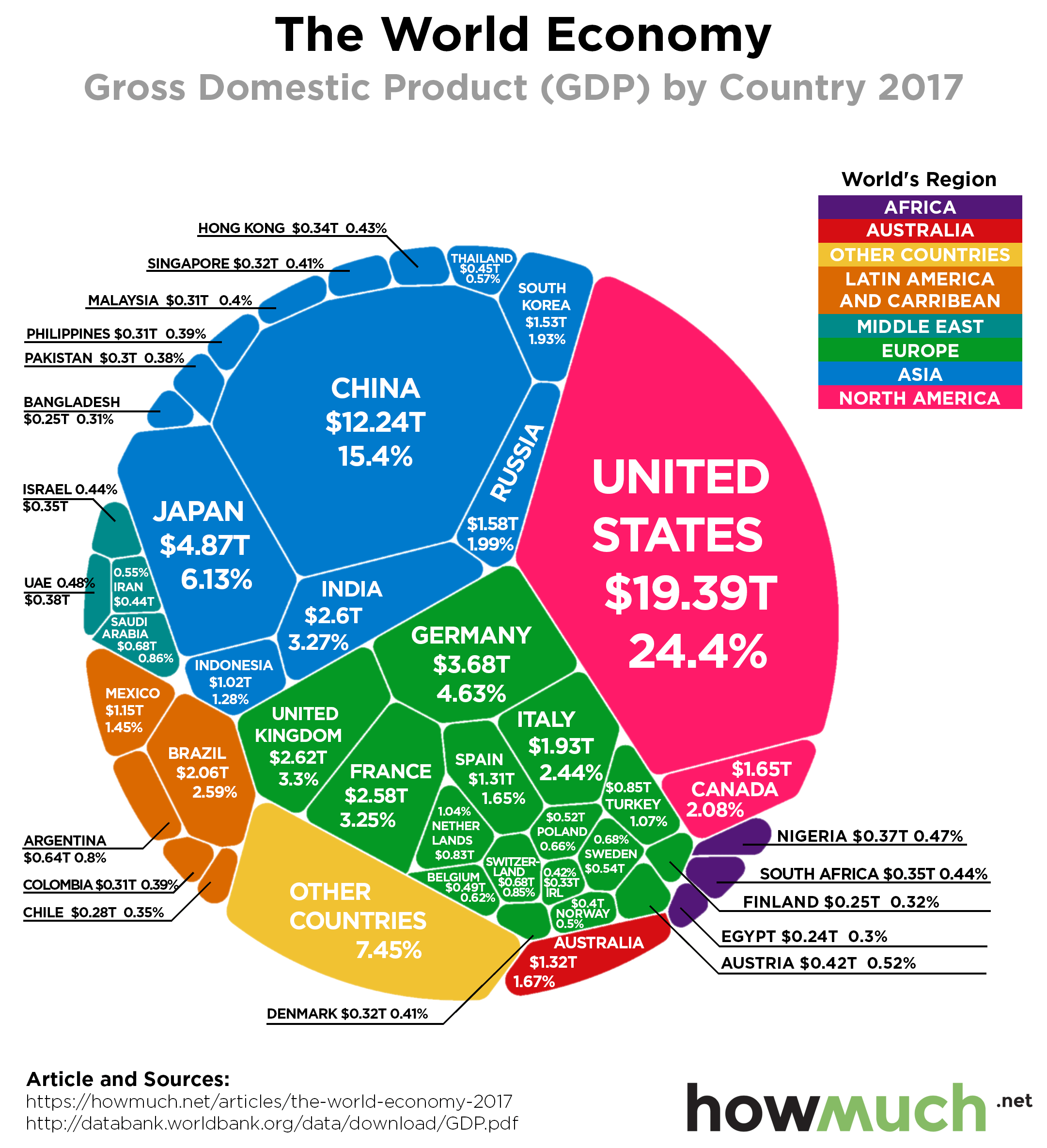
Our visualization neatly slices the latest 2017 GDP numbers from the World Bank, released on 21st of September 2018, a few different ways. The underlying idea is that GDP is not a zero-sum game, meaning the pie can continue to grow for every country in the world and not just a few. Each slice represents the total economic output, or GDP, of a country in 2017, the latest year for which definite and complete data are available. The color corresponds to its geographic location, and we included the percentage of the world’s economy each country makes up for easy references. This lets you immediately see which countries and continents dominate the world economy, and which ones lag way behind.
Top 10 Biggest World Economies by GDP

1. United States - $19.39 trillion

2. China - $12.24 trillion

3. Japan - $4.87 trillion

4. Germany - $3.67 trillion

5. UK - $2.62 trillion 

6. India - $2.60 trillion

7. France - $2.58 trillion

8. Brazil - $2.05 trillion

9. Italy - $1.93 trillion

10. Canada - $1.65 trillion

An interesting way to understand these numbers is by comparing them to a previous visualization we did last year on the relative size of economies using the same underlying dataset from the World Bank. There are in fact a few changes to note. Looking at the top ten countries overall, India’s economy surpassed France to become the 6th biggest in the world. The UK was the only economy to shrink among the top ten, dropping from $2.86 trillion to $2.62 trillion, not adjusting for inflation. The U.S. is still the biggest both in overall terms and as a share of the global economy (24.32% last year vs. 24.40% this year). China is continuing to rise as a global economic power, accounting for 15.4% of the world’s GDP, up from 14.84%. In short and in general, the world’s heavyweight economies continue to reign supreme.

So how big are they? The combined GDP of the top four countries in the world (U.S., China, Japan and Germany) is greater than the entire rest of the world. The most obvious conclusion is that the U.S., Europe and Asia collectively control an enormous swath of the global economic order, totaling over 87% of the globe’s GDP. As you can see, the Global South barely makes it onto the visualization. Hundreds of countries contribute so little to the world’s GDP that we simply lumped them together into one uncategorized bucket, otherwise the visual would become too crowded.

That’s why every time President Trump threatens to increase tariffs on Chinese goods, the world’s markets take him seriously. He’s not talking about small economies where trade deals have a only ripple effect around the world. Tariffs worth hundreds of billions in annual revenue would have a serious impact on the global economy. Whether you think the impact would be net positive or net negative is another matter altogether.

Data: Table 1.1

Visualizing Minimum Wage in the United States

$
0
0

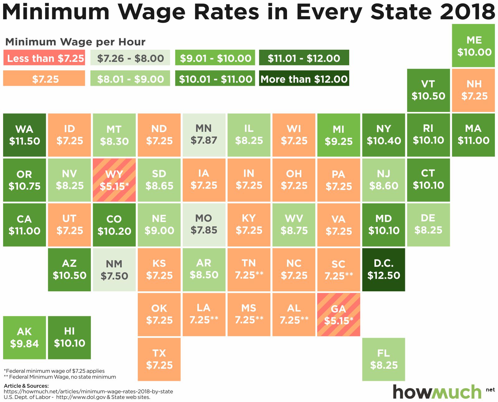
One of the most hotly contested political debates in the United States is the minimum wage. Pro-business advocates say a high minimum wage hurts business, while pro-labor advocates say the minimum wage should be raised to help the working poor. Have a look at our chart below to see your state’s minimum wage.

In the chart above, states are colored based on the value of their minimum wage. The lowest minimum wage states are colored peach, with other states becoming a darker shade of green as the minimum wage increases. The wage laws don’t apply to certain positions, such as wages for tipped workers. The data were collected from the US Department of Labor.

Top 5 States with Highest Minimum Wage

  • District of Columbia: $12.50 per hour

  • Washington: $11.50 per hour

  • California: $11.00 per hour

  • Massachusetts: $11.00 per hour

  • Oregon: $10.75 per hour

States with Lowest Minimum Wage

  • Georgia: $5.15* per hour

  • Wyoming: $5.15* per hour

  • 20 other states tie at the Federal minimum wage of $7.25 per hour

*Federal minimum wage overrules these wages

The first thing to note is the minimum wages in Georgia and Wyoming. Although both of these states have laws putting the state minimum wage at $5.15, the federal minimum wage of $7.25 overrules the state laws. There are five states – Alabama, Louisiana, Mississippi, South Carolina and Tennessee – that have no state minimum wage laws and therefore the federal minimum wage is the default. The bulk of the lowest minimum wages are located in the Midwest and the South.

The higher minimum wages are located in the West and the Northeast. It would appear to be the case that politics affects minimum wage laws, as the minimum wage is significantly higher in blue states than in red states. Washington DC, which technically isn’t a state, has the highest minimum wage at $12.50 per hour. That’s followed closely by Washington’s minimum wage of $11.50. But it’s worth pointing out that Seattle, Washington’s largest city and half of the state’s population, has a local minimum wage of $15 per hour.

It’s also worth pointing out that in 2018, a total of 18 states changed their minimum wage laws. Another interesting note is that Amazon, one of the largest employers in the US, raised its own internal minimum wage to $15 the same year. The federal minimum wage has not been changed since 2009, but there are outside pressures pushing minimum wages up, despite a lack of action on the part of federal policymakers.

What your minimum wage is will depend on your state. Minimum wages vary across the United States, but there is a clear correlation between the dominant political party in a given state and that state’s minimum wage. Additionally, your state’s minimum wage might be offset by the city you’re in or the company you work for!

Data: Table 1.1 

In One Map: Car Imports into the United States

$
0
0

Now that the global trade war, started by United States President Donald Trump, is in full swing, many people want to learn the facts before passing judgement. Global trade is a complicated problem and it may be easier to understand the issue piecemeal. Take a look at the infographic below to see the countries that exported vehicles to the U.S. in 2017.  

In the graphic above, every country that imported autos into the United States in 2017 is represented by a circle containing the flag and map of that country. The larger the value of vehicle exports to the U.S., the largest the circle of a country becomes. The data were collected from the International Trade Centre’s Trade Map and the U.S. Census Bureau.

Top 5 Car Exporters to U.S. 

  • Canada: $43.8 billion

  • Japan: $40.7 billion

  • Mexico: $30.6 billion

  • Germany: $20.8 billion

  • South Korea: $16.1 billion

The value of imports from Canada and Mexico are the first and third highest at $43.8 billion and $30.6 billion respectively. This may explain why President Donald Trump has been so eager to rewrite the North American Free Trade Agreement (NAFTA). The agreement used to allow auto manufacturers to move production facilities across North America and import vehicles back to the U.S. In order to qualify for a 0% tariff, a complicated set of requirements had to be met. Trump’s new U.S.-Mexico-Canada trade agreement, announced September 30, 2018, will incentivize automakers to build in the U.S. and stipulates that more parts must be sourced from North America.

Most of the countries on the infographic have large, advanced economies and can therefore manufacture and export high-quality vehicles to the United States. The one exception to the rule in Mexico, which is able to export vehicles to the U.S. because of NAFTA and the presence of U.S. automakers. Auto imports from Japan, known for its very high-quality vehicles, are worth the second most at $40.7bn. When taken as a whole, vehicle imports from the European Union in 2017 totaled around $43.3bn (€37.4bn), nearly tying for first place with Canada.

The majority of vehicles for sale in the United States come from foreign countries. Some will argue that lower tariffs will allow more imports from abroad and therefore more choices for consumers. Others will argue that higher tariffs should be used to promote domestic production and therefore more jobs for Americans. Either way, if you’re looking to support U.S. business by buying locally, it may be harder than you think to buy an all American car.

Data: Table 1.1

Viewing all 687 articles
Browse latest View live