Quantcast
Channel: howmuch.net
Viewing all 687 articles
Browse latest View live

Mapping the Highest-Paid CEO in Every State

$
0
0

Have you ever wondered how much the highest-paid CEO in your state makes for a living? It turns out that climbing to the top of the corporate ladder can mean dramatically different things in different parts of the country. Our new map breaks down the highest-paid CEOs in each state, letting you easily see total compensation figures and the companies they work for.
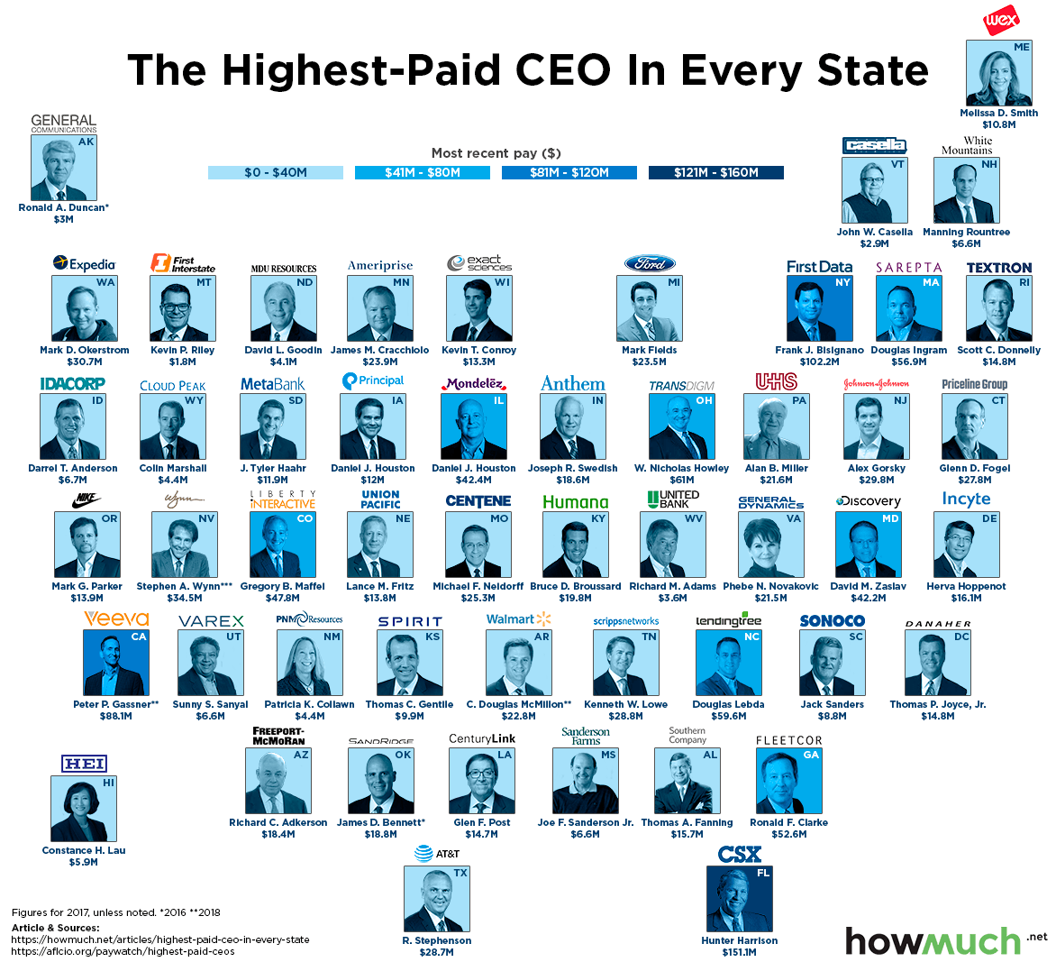
We took compensation numbers from the AFL-CIO’s Executive Paywatch project and replaced each state on a map with a photo of the highest-paid chief executive, together with their employer’s logo. We then color-coded each photo to indicate how comparatively high or low their income ranks—the darkest shade represents over $121M; the lightest shade up to $40M. This approach gives you a quick snapshot of the geography of executive compensation across the U.S.

These are the ten states topping the list on our chart with the highest paid CEOs ($M) (all figures represent 2017 compensation totals unless otherwise noted):

1. Florida: Hunter Harrison, $151.1M at CSX Corporation

2. New York: Frank J. Bisignano, $102.2M at First Data Corporation

3. California: Peter P. Gassner, $88.1M (as of 2018) at Veeva Systems

4. Ohio: W. Nicholas Howley, $61M at Transdigm Group

5. North Carolina: Douglas Lebda, $59.6M at LendingTree

6. Massachusetts: Douglas Ingram, $56.9M at Sarepta Therapeutics

7. Georgia: Ronald F. Clarke, $52.6M at FleetCor Technologies

8. Colorado: Gregory B. Maffei, $47.8M at Liberty Interactive Corporation

9. Illinois: Dirk Van De Put, $42.4M at Mondelez International

10. Maryland: David M. Zaslav, $42.2M at Discovery Communications

This first and most obvious thing our map demonstrates is the wide disparity in executive compensation at the top of the corporate ladder. Hunter Harrison from Florida’s CSX Corporation pulled in $151.1M, about 50% more than the second-place earner, Frank Bisignano from First Data at $102.2M. At the opposite end of the spectrum, Kevin Riley “only” makes $1.8M at Montana’s First Interstate BancSystem. Think about it this way: Kevin Riley makes more than 38 times the average American salary of $46,641, but Hunter Harrison made more than 83 times as much as Riley! In short, executive compensation skyrockets depending on a number of factors, but the figures definitely tend to reflect the economic status of the U.S. in general, varying widely based on location.

At a macro level, our map highlights the fact that the highest-paid CEOs are clustered in a select few coastal states. CEOs living along the Atlantic Seaboard generally make the most. In fact, there are only two states west of the Mississippi where the top-paid CEO makes over $40M: Gregory Maffei in Colorado ($47.8M) and Peter Gassner in California ($88.1M as of 2016). Also of note, almost all the CEOs on our map are white men, and only a handful are women. This is additional evidence in support of the hotly-debated gender and diversity pay gap within boardrooms in corporate America.

There are a couple of key caveats to keep in mind. Companies pay their executives with more than just simple cash salaries. The numbers behind our map might include vested company stock, unvested stock, other stock options, private security detail, or the use of a private jet—all these things factor into overall CEO compensation. You may have also noticed that high-profile CEOs like Jeff Bezos, Elon Musk, and Warren Buffett are missing from our list. That’s because they own large parts of their companies, so they don’t take a salary the same way these CEOs do.

Want to learn more? A new SEC ruling now requires companies to disclose the average pay gap between CEOs and workers at each company. Check out our other articles detailing companies with the best and worst pay gaps in the country.



The Multi-Billion Dollar ICO Market in 2018 Captured in One Graph

$
0
0

The ICO market is continuing to sizzle this summer with new coins entering the market almost everyday. With so much activity, it can be difficult to keep things in perspective. What constitutes a large initial coin offering, and what’s small peanuts? Our new visualization makes things very simple.

We got the data for our visualization over at coindesk. We placed the total value of each initial coin offering into a color-coded and clustered bubble chart. We included the logo or name of each coin and the initial valuation (if size permitted), creating a quick snapshot of the ICO market today. For visualization purposes we only looked at ICOs worth more than $20M.

Top 10 Biggest ICOs in 2018 

1. Telegram: $1.7B

2. Dragon: $320M

3. Huobi: $300M

4. Bankera: $150.9M

5. Orbs: $118M

6. Envion: $100M

7. Flashmoni: $72M

8. Neuromation: $71.7M

9. Elastos : $70M

10. Zeepin : $61M

Our visualization makes two points clear about the ICO market right now: only a couple are big in size, but there are dozens of opportunities to be had. First off, it puts Telegram’s monster $1.7B ICO into perspective. It was bigger than all the other top ten ICOs combined. And in fact, there is a similar inequality further down our list. Only 2 other ICOs broke $300M, and an additional 3 broke $100M. This suggests that ICOs struggle to break through the $100M threshold.

Second, the pace of cryptocurrency innovation is quite staggering. Consider for example the cumulative value of ICOs over the last five years. This trend manifests itself in the form of several low-value ICOs largely only known inside the cryptocurrency community. We set a floor for our visualization to only include ICOs worth $20M or more, which left us with 115 bubbles in our chart. That means we excluded 219 other ICOs from this year alone worth less than $20M but still tracked by coindesk. That’s about 2 new ICOs every single day this year.

The speed at which the market is changing can make it hard to know which cryptocurrencies deserve attention. This in turn creates an opening for things like cryptocurrency index funds. It also makes the market vulnerable to bad actors. A new study also found that the market is susceptible to scams, although investors don’t seem to be too concerned. A rapidly changing market also means that many ICOs burn out, leaving over 800 dead coins.

To a certain extent, all these things make sense for a brand new market experiencing growing pains, especially one with low barriers to entry and relatively little regulation. What do you think will happen in the second half of 2018? Will a new ICO unseat Telegram at the top of our list? Let us know at press@howmuch.net.

Visualizing Countries with the Highest Household Wealth  

$
0
0

We all know it costs money to make money, but is there a direct correlation between income and overall personal wealth? If there is, we would expect to see the relationship in our new visualization comparing accumulated wealth and disposable income at the household level across the OECD.

We got our numbers directly from the OECD. Our visualization roughly corresponds to the geographic location of each country on the map—the U.S. is furthest “west” and Japan is further “east.” The size of each bubble represents average household wealth for each country, or assets minus liabilities. This takes into account things like savings, securities, stocks and loans (but not real estate). We then color-coded each bubble based on the average disposable income for each household, which equates to the amount of income left over after taxes and transfers have been taken out. Basically, it’s how much you can spend on living expenses and other discretionary purchases.

These are the top ten countries among the OECD with the highest household wealth, together with the average disposable income.

1. United States: $176,076 with $44,049 in disposable income

2. Switzerland: $128,415 with $36,378 in disposable income

3. Belgium: $104,084 with $29,968 in disposable income

4. Japan: $97,595 with $28,641 in disposable income

5. Sweden: $90,708 with $30,553 in disposable income

6. Netherlands: $90,002 with $28,783 in disposable income

7. Canada: $85,758 with $29,850 in disposable income

8. United Kingdom: $83,405 with $28,408 in disposable income

9. Luxembourg: $74,141 with $41,317 in disposable income

10. Denmark: $73,543 with $28,950 in disposable income

Our visualization reveals several key insights about personal wealth accumulation across the OECD. First off, the U.S. clearly dominates the rankings with over $170k on average per household. The other standout on our list, Switzerland, is far behind the U.S. with $128k of accumulated household wealth on average. The rankings then become much tighter further down the list with countries grouped together in the $70-90k range. There are also a few countries in the OECD for obvious political reasons. It is hard to see why Russia should be counted with only $16,657 in disposable income and $2,260 in net financial wealth.

Now take a look at the color of each bubble, which corresponds to the average disposable income for each country. You might think that having a higher disposable income is directly associated with building household wealth, but clearly there are other factors involved. Granted, Americans enjoy both the most disposable income on average ($44,049), but this only partly explains their lead in household wealth. For example, Luxembourgers have only $3,000 less in disposable income ($41,317), but over a $100,000 less in average household wealth. And take a look at the Norwegians who have $35,739 in disposable income but only $20,347 in household wealth. Clearly all that extra money is going somewhere, and it’s not to a savings account.

One obvious assumption behind our numbers is the longstanding decline of defined benefit pension systems in the U.S. Whereas European countries maintain social programs that provide for a secure retirement, many workers are largely left alone in the U.S. to save for their golden years. Another factor is wealth inequality. Since we are only looking at average figures, a small number of millionaires and billionaires in the U.S. inflate average wealth figures, when in reality most people are barely getting by.

All these caveats aside, clearly the U.S. enjoys a leg up in wealth accumulation within the OECD. Also keep in mind that owning your own home is closely associated with building personal wealth, but the OECD excluded the value of land and dwellings from its analysis. This means that in all likelihood, our visualization actually understates the real value of American accumulated wealth.


Data: Table 1.1 

States Investing the Most (and Least) in Higher Education

$
0
0

Getting a degree is a surefire way to land a good paying job, and in general, earning more money means contributing more to the economy. But if going to college is such an obvious benefit, why do states contribute wildly different subsidies to public higher education? Our newest visualization illustrates the enormous disparities across the country.

The State Higher Education Executive Officers Association (SHEEO) keeps track of state and local allocations to public universities and colleges. To be clear, the group certainly has a vested interest in getting government to contribute more money to its members’ institutions. The SHEEO calculated how many full-time equivalent students each state supports, then they tabulated the entire state and local assistance given to higher education in 2017. This gave us an average per pupil allocation, which we simply used to create a color-coded map of the U.S.

These are the top ten states spending the most money on a per pupil basis for higher education.

1. Wyoming: $18,237

2. Illinois: $16,055

3. Alaska: $13,612

4. Hawaii: $10,810

5. North Carolina: $9,959

6. Nebraska: $9,801

7. Idaho: $9,793

8. North Dakota: $9,552

9. New Mexico: $9,348

10. New York: $8,640

There are a couple key takeaways from our map. The first is that funding for public higher education does not conform to any neat pattern. State and local governments contribute as much as $18,237 (in Wyoming) or as little as $2,695 (in Vermont). Both rural states like Idaho and those with large cities like Illinois top the charts. From a political perspective, states with overwhelming state-level majorities on both sides of the political aisle can be found in the top ten. The only clear trend is that Western states tend to spend more on a per pupil basis than Eastern states.

But there is something insightful hiding just beneath the surface of our numbers. The states with more funding tend to have smaller populations. Illinois is an exception for very specific reasons related to the dysfunction of the state government’s inability to pass a budget in recent years. According to the SHEEO, Illinois allocated only about $12,000 last year, although much of that went toward unpaid bills thanks to missing funds from the year before that. States with smaller populations like Alaska and Idaho tend to have higher numbers only because there are so few students to divide the allocation.

So where is the best place to get a degree? Don’t simply consider state-level allocations. After all, tuition costs can vary dramatically from school to school and state to state. You should instead view higher education as a long-term investment in future earning potential. Check out our other visualization on which schools have the highest ROI to help guide your decision.

Data: Table 1.1 

Mapping the Best (and Worst) Places for Millennials to Make a Living

$
0
0

Earning an above-average wage early in a career is a critical predictor of long term success. Raises and promotions compound over the course of several decades. This means that if young people start out earning relatively little compared to their peers, they tend to make less over their lifetimes. Our new map highlights the parts of the country where millennials are earning the most (and least) on an adjusted basis.

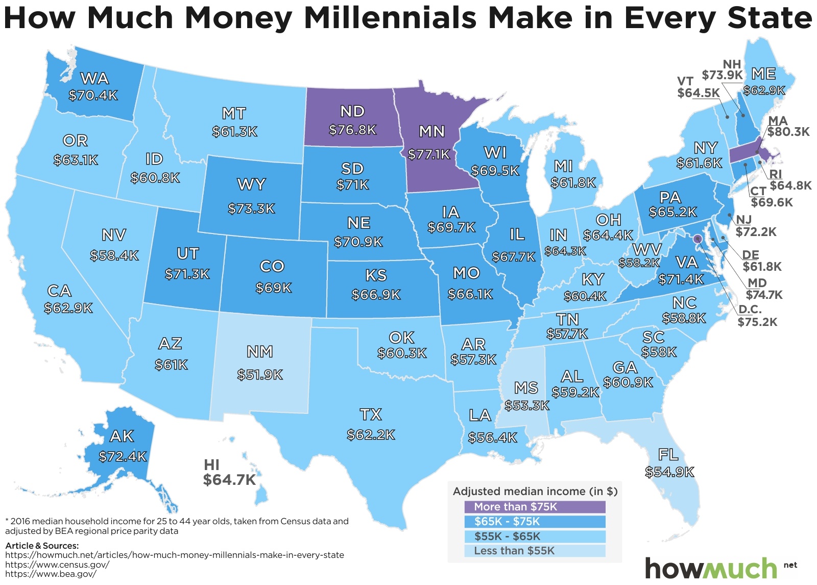
We pulled our numbers from the U.S. Census Bureau, which tracked the median amount each age cohort made in 2016, the latest year in which comprehensive data was available. The Census Bureau defines “millennials” as people born between 1982 and 2000. Another factor that influenced the data is the cost of living differences across the country. Knowing those differences, it’s clearly not surprising that people in Massachusetts earn more than those in Alabama. To account for that, we adjusted the figures to reflect the true cost of living in each region according to the Bureau of Economic Analysis. This creates a level playing field to compare income levels in different states. Our next step was to simply create a heat map of the country, showing which states have the highest (purple) and the lowest (light blue) median wages for millennials.

Here are the ten states (plus Washington, DC) where millennials earn the most money:

1. Massachusetts:  $80,307

2. Minnesota:  $77,090

3. North Dakota:  $76,836

4. Washington, DC:  $75,220

5. Maryland:  $74,737

6. New Hampshire:  $73,941

7. Wyoming:  $73,345

8. Alaska:  $72,374

9. New Jersey:  $72,150

10. Virginia:  $71,397

Millennials are an interesting group to study for a couple of different reasons. They are the most diverse generation in American history, more of them went to college than previous generations, and they are now the largest contingent in the workforce. Many of them also graduated in the middle of the Great Recession, which economists believe might have a lifelong impact on their wages.

Determining where millennials are doing well (and where they are not) indicates broader trends in the American economy. For example, there’s a pocket of purple and dark blue states in the Upper Midwest where these younger adults tend to make above-average wages, as high as $77,090, on an adjusted scale, in Minnesota. The same can be said about the Northeast between Virginia and New Hampshire. These regions contrast with the South, where Texas is the highest state at $62.2K, coming in at number 32 in our list overall. The South clearly stands out as a lackluster region for millennials in the labor market.

Perhaps the biggest surprise on our map is the West Coast, which doesn’t look that different from the South. The one exception is Washington ($70.4K), which is $7,000 higher than California ($62.9K). This highlights the fact that big tech companies are creating great jobs for a select group of skilled workers, but if making the most money is your primary goal, you have a better chance of succeeding if you move to Nebraska instead of California.

Want to learn more about where the highest-paying jobs are located? Check out our map of companies that pay the most in every state.

Data: Table 1.1 

Find Out How Much Your Country Spends on Research & Development

$
0
0

Spending money on research and development is a funny thing. It’s hard to tell what’s going to be a success, and sometimes the results aren’t valuable for decades. For example, Uber is investing heavily in driverless cars with the explicit goal of revolutionizing transportation. Even if the results aren’t always successful we’re convinced R&D investments are a leading indicator of long term economic strength.

We found the numbers for our visualization thanks to the UNESCO Institute for Statistics, which collected the data through a series of smaller regional surveys. UNESCO adjusted the figures to reflect purchasing power parity (PPP$), which makes it possible to compare amounts from country to country. The numbers include government, private, academic and non-profit investments into research and development, painting a complete picture of the R&D market across the world. We created our visualization by combining a bubble map with both an outline of the country and its flag; we also color-coded and grouped together countries based on their financial outlay. The result is a beautiful snapshot of a critical component for economic growth.

Top 10 Countries Investing the Most Money in Research and Development

1. United States: $476.5B

2. China: $370.6B

3. Japan: $170.5B

4. Germany: $109.8B

5. South Korea: $73.2B

6. France: $60.8B

7. India: $48.1B

8. United Kingdom: $44.2B

9. Brazil: $42.1B

10. Russia: $39.8B

The first and most obvious trend in our visualization is how top-heavy R&D investments are. You can easily see this just by glancing at the visualization. See how large the inner circles are compared to the rest of the visual? Try to count how many tiny red dots exist on the far exterior. Our graphic makes it easy to judge which countries are on the top (and bottom) of the R&D market.

In fact, 10 countries account for about 80% of the entire world’s outlay. The U.S. is far above and beyond the rest of the globe, contributing more than $100B than second-place China. Drilling further into UNESCO’s data reveals another leading indicator: whereas the U.S. employs 4,295 researchers per million inhabitants, China only has 1,096. Of course, China is home to a lot more people than the U.S., but the American dominance over the R&D market is clear, accounting for 27% of the entire global expenditure. That is significantly more than the bottom 100 countries combined.

Keep in mind that R&D involves a wide variety of different industries. Our figures include expenditures for everything from artificial intelligence research, to inventing new pharmaceutical drugs, to building cutting-edge fighter jets. Political scientists say that demography is destiny for winning elections. We think investment in research and development predicts how countries develop over the long term. Judging by our visualization, it’s clear that the U.S. and China will continue to be locked in an ongoing standoff for economic control over the rest of the world.

Data: Table 1.1
 

The iPhone X Index: This Chart Shows How Ridiculously Long You Have to Work to Get One

$
0
0

Be honest—where do you keep your smartphone at night? Is it on the nightstand? Having a smartphone is now an essential part of modern life, and many people wouldn’t leave home without it. And among smartphone makers, Apple is laughing at critics who thought people wouldn’t pay more than $1,000 for a phone. The ubiquity of smartphones and their ever-increasing price tag got us thinking about global inequality—how long do people have to work to afford such an expensive device?

We found the data for our visualization from UBS Group, a global investment bank headquartered in Switzerland. UBS looked at how many days someone would need to work in several cities to afford on iPhone. There are two key underlying assumptions. First, you can find different promotions for buying an iPhone at various stores, and UBS did the research to determine the average price in each location. And second, UBS’ calculations are also based on an average workday of 8 paid hours. We decided to make things more interesting by converting the figures to hours. We stack ranked the results of our analysis by the color-coded continent in which each city is located, ranging from high-to-low. This lets you easily see how purchasing an iPhone X can be used to measure the cost of living around the world.

Top 10 Cities Where People Have to Work the Longest to Afford an iPhone X

1. Cairo: 1066.2 hours

2. Mumbai: 917.8 hours

3. New Delhi: 804.2 hours

4. Kiev: 708.6 hours

5. Jakarta: 651.6 hours

6. Mexico City: 637.5 hours

7. Nairobi: 577.7 hours

8. Istanbul: 567.7 hours

9. Lagos: 508 hours

10. Buenos Aires: 470.1 hours

Top 10 Cities Where People Have to Work the Least to Afford on iPhone X

1. Zurich: 38.2 hours

2. Geneva: 47.5 hours

3. Los Angeles: 50.6 hours

4. Miami: 52.3 hours

5. Nicosia: 54 hours

6. New York: 54.1 hours

7. Chicago: 55 hours

8. Toronto: 63.5 hours

9. Montreal: 63.7 hours

10. Luxembourg: 64.5 hours

The most interesting fact about our visualization is how it demonstrates inequality both within and between continents. In Europe, for example, most of the cities on the left side are in the East, and most of the countries on the right are in the West. Similarly, in the Americas, workers living in North America like Los Angeles and Miami have a much easier time affording an iPhone X than workers living in Latin America, in places like Lima and Buenos Aires.

Now look across the visualization and compare continents. See how many cities in Asia require 200 to 300+ hours of labor before the average worker can afford the iPhone X? That roughly compares to many of the cities in Eastern Europe and Latin America. This is direct evidence confirming something people already know to be true. Apple’s brand appeals to people living in advanced economies where there’s plenty of WiFi and 4G LTE networks. Egyptians living in Cairo would have to work 1,066.2 hours. That’s more than 26 weeks! Clearly not Apple’s target demographic.

There’s another insight in our visualization hiding just beneath the surface. On average, people have to work days and days to afford an iPhone, maybe even several weeks. A lot of people get a new phone each year, so let’s extrapolate our visualization into the future. In all likelihood, Apple will get the equivalent of months of labor over the course of the average person’s lifetime--maybe even years of labor-- in exchange for a smartphone. And here’s the thing: people camp out for days to be the first to buy Apple’s products. Clearly, Apple is delivering on its brand.

Data: Table 1.1
 

Visualizing the Best and Worst Paid Jobs in the Tech Sector

$
0
0

Most people think getting into the upper middle class is straightforward: go to school, study technology, and get a job somewhere in the tech sector. But is it really that simple? We did some research and discovered that there are plenty of great high-paying gigs out there, but there are also several positions with relatively low pay.

Our data come from the Bureau of Labor Statistics, which tracks a wide variety of metrics on jobs and the American economy. We took a subset of figures from the technology sector and placed the 15 highest and lowest paying jobs in a unique visualization. Think of our graphic as a two-sided pyramid, illustrating in a vivid way the highest and lowest rungs of the tech ladder. We included average base salary expressed both as an overall number and on a per hour basis. This lets you easily see which jobs are worth going after (and which ones are probably a dead end).

As you might expect, managers generally sit at the top of the food chain. Computer and Information Systems Managers take home the best money on average, pulling in just under $72/hour. Compare that with lowly technical support representatives at the bottom, who make roughly 75% less at $16.70/hour. Remember to be nice to the guy who helps you the next time you have a technical problem!

Our two-sided pyramid also reveals a few key insights about the tech sector. First off, things aren’t actually so bad at the low end. Keep in mind all the jobs in our visualization pay above average compared to the rest of the economy. Median household income in the U.S. is about $59,000. Two spouses who both earn $16.70/hour would pull in over $69,000 a year. That’s great work if you can get it.

The visualization also suggests that slight changes in a job title can directly impact compensation even if the on-the-job duties are very similar. Look at all the positions with “representative,” “specialist” and “administrator” in the title. They come with lower pay as opposed to “analyst,” “developer” and “architect.” But what’s the difference between a specialist and an analyst?

This makes us believe that changing your job title might be worth it in the long run even if it doesn’t mean getting an immediate raise.

Data: Table 1.1


Is Cryptocurrency ‘The Mother of all Bubbles’? This Visualization Puts Things in Perspective

$
0
0

The sheer magnitude of how much money there is in the world can be quite staggering—and hard to understand. What if you could visualize every market in the world as a bubble?

Earlier this year the total U.S. stock market cap surpassed $30 trillion. It then lost more than $1 trillion in a single month. Apple might very well become the first company worth over $1 trillion in the modern era. The U.S. national debt surpassed $21 trillion, and the deficit for next year is expected to add another $1 trillion. But just how big are these numbers? Can we get some perspective?

A trillion here, a trillion there—pretty soon you’re talking about real money.

We decided to clarify things with one simple and easy to understand visualization of bubbles. We found the total value of each major market in the world, everything from brand new cryptocurrencies to sovereign debt. We stacked ranked the combined total value of each category and called out interesting subsets. We color-coded each type and added a little narrative on the right for easy reference. Categorizing each asset as a “bubble” can make you wonder—what if one of these pops?

Our visualization can help keep things in perspective. The cryptocurrency market is certainly one of the fastest growing and most exciting assets in the world, and indeed it makes many people think of the 2000 dot-com bubble. Some even say it’s the biggest bubble of all time. You can find countless articles about bitcoin and ethereum on the Internet, including on this website. But for all the hype, the entire crypto market is worth only a tiny fraction of the gold market, which is itself only worth about 10% of the entire world’s stock markets. The good news? If the bubble has already popped, there’s potentially plenty of upside in cryptocurrencies.

Pundits also spill a lot of ink about the U.S. national debt, which is indeed staggering at $21.2T. The concept of a “trillion” is impossible to comprehend, let alone 21.2 trillion. But now consider all the debt in the world, counting everything like mortgages and municipal bonds. Don’t get us wrong, the U.S. debt seems out of control, but it’s still less than 10% of the world’s total debt load. That being said, a lot of pundits see the massive accumulation of debt as itself a bubble. It would take more than 3 times the value of all the stock markets in the world to pay off the world’s debts. Is that sustainable?

Even more interesting is the market for derivatives at $532T. Most people know about the role unregulated derivatives played in the housing market crash. In short, derivatives are most commonly used as ways to purchase assets (especially commodities) in the future. They can therefore swing wildly in value, and at present amount to well over $500T, more than double all the debt in the entire world. Maybe the media should pay a lot more attention to derivatives than every tiny scandal in the crypto market.

Which one of these bubbles do you think has the best chance of popping in 2018? Or did we miss anything? Let us know at press@howmuch.net.

Data: Table 1.1 

Medicare is not Enough for Retirees. This is How Much Extra They Have to Pay for Full Coverage

$
0
0

Experts agree that you need a lot of money to retire. Life expectancy continues to increase, which means you must have a larger nest egg before leaving the workforce. Inflation and taxes will both probably increase with time. And perhaps most surprising to a lot of retirees, the cost of healthcare is now rising faster than everything else. To make things worse, Medicare doesn’t cover the entire cost of health insurance. That’s why many companies sell plans to cover the so-called “Medigap.” The size of the Medigap depends on where you live.

We found the data for our map at Health View Services, a financial advising company focused on helping people develop investment strategies to meet healthcare costs. We simply plugged HVS’ numbers onto a heat map where the color corresponds to the size of the gap in coverage between obtaining full health insurance and what Medicare covers. This lets you easily see where the biggest problems are, and it highlights the states where retirees might consider relocating.

Top 10 States with the Largest Medigap Plan Costs 

1. Massachusetts: $1,947

2. Nevada: $1,904

3. Louisiana: $1,897

4. New Jersey: $1,892

5. Maryland: $1,865

6. Connecticut: $1,861

7. Texas: $1,860

8. Alaska: $1,851

9. Florida: $1,831

10. California: $1,817

Our map contains both good and bad news for retirees. The bad news is that many states require Medigap plans costing more than $150/month. In fact, the most expensive state is Massachusetts, where it will cost $162.25 each month. That’s a decent chunk of change. Even worse news is that the state most closely associated with retirement—Florida—isn’t much better off. The Sunshine State requires an extra $152.58 each month. That’s a lot for people on a fixed income.

The good news is that there are several states with much smaller Medigap amounts, many of which are located in favorable climates. Take a look at New Mexico ($122.00/month), Georgia ($131.58/month) and North Carolina ($131.16/month). And let’s not forget the cheapest state in the Union for Medigap coverage: Hawaii, where it costs only $109.16 on average. That’s another great reason to move to the Aloha State.

At first glance, Medigap costs don’t seem like much, certainly not enough to justify moving to a whole new location. But what if you are just starting to think about retirement, and you already plan on moving to another state, somewhere warmer? Saving about $20 to $30 each month can really add up, especially if you rely on Social Security as the only source of income. That might just be enough to tip the scales in favor of one retirement destination over another.

Data: Table 1.1
 

This Visualization Shows the Real Cost of Relocation Around the World

$
0
0

People have been moving away from the countryside and into urban areas for several decades. Many economists believe this trend will only continue, making cities the engines of economic growth for the foreseeable future. But this begs the question: how much does it cost to move to a city, and can you afford it?

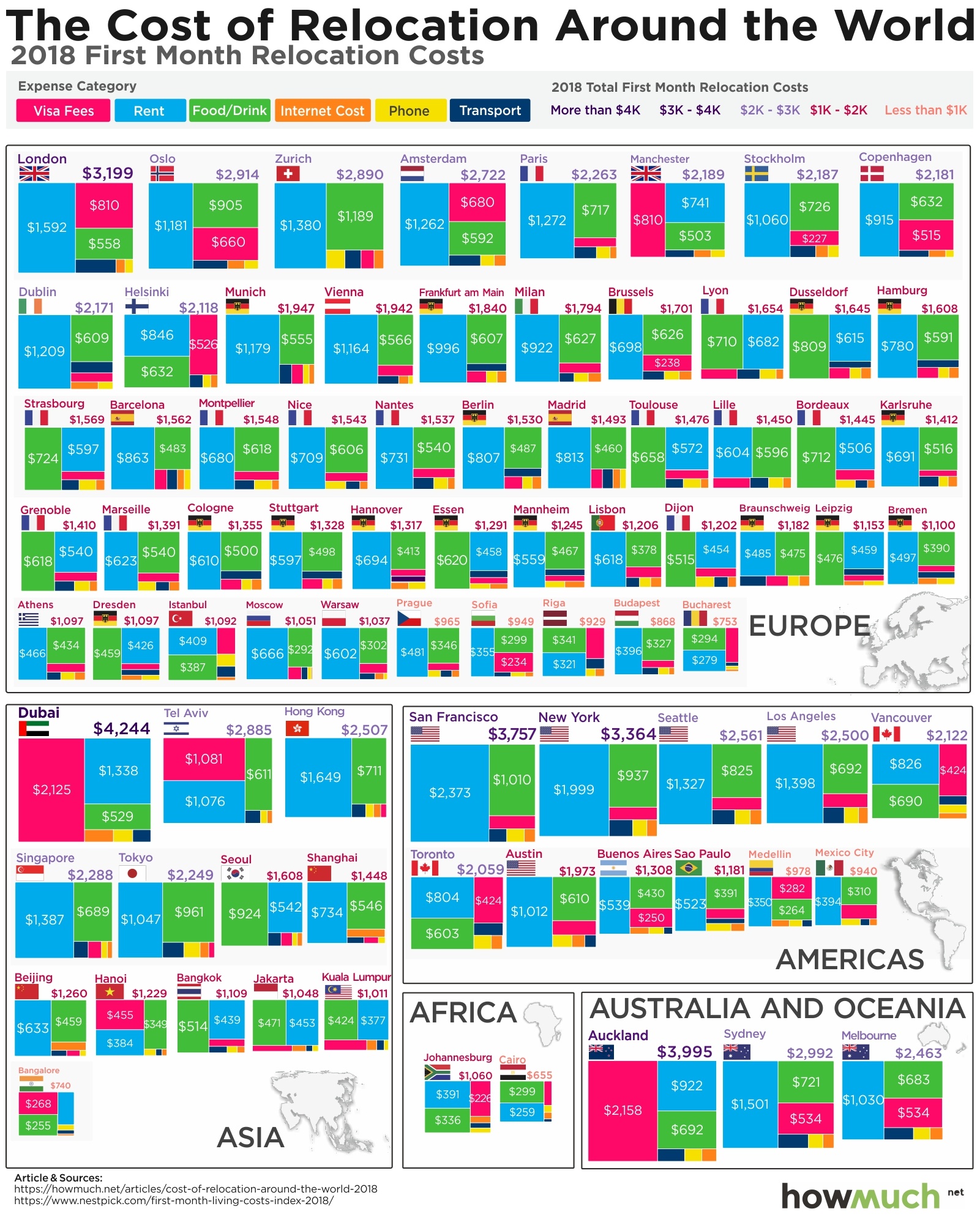
The data for our visualization come from Nestpick, an online listing service for furnished apartments. If there’s anyone with enough sophistication to accurately capture volumes of data about the cost of relocating, it’s Nestpick. They looked at a variety of factors to curate a list of 80 cities, including the processing time for visa applications, each city’s startup culture and the prevalence of job listings. We focused our analysis only on the cost of relocation. First, we grouped each city in Nestpick’s dataset by continent. Then, we created a histogram heatmap representing the cost of moving to each city, breaking down each category of expense. We included the total figures and each country’s flag for easy reference.

Top 10 Most Expensive Cities Around the World for Relocation

1. Dubai, UAE: $4,243

2. Auckland, New Zealand: $3,995

3. San Francisco, USA: $3,756

4. New York, USA: $3,363

5. London, UK: $3,199

6. Sydney, Australia: $2,991

7. Oslo, Norway: $2,913

8. Zurich, Switzerland: $2,890

9. Tel Aviv, Israel: $2,885

10. Amsterdam, Netherlands: $2,722

Our visualization lets you easily and quickly see a few different insights about the cost of living around the world. First off, most of the expensive cities tend to be in English-speaking countries like New Zealand, the U.S. and Australia. This trend holds true across continents, and it makes us wonder to what extent the relative level of expense is directly correlated with the English language. Another way to think about this is to look at the cheapest cities for relocation--Cairo, Bangalore, Bucharest. We doubt a lot of people speak very much English in these places.

Drilling further into the data, our visualization makes it readily apparent why some places are so expensive. In short, the cost of renting an apartment is exorbitantly expensive in cities like San Francisco and London. Look how much blue is contained in the graphic; it is almost always the most expensive component, as indicated by its position on the left. There are a handful of outliers, notably Dubai, Tel Aviv and Manchester. But that’s only because these places have above-average costs for getting a visa. Clearly the UAE, Israel and perhaps even Britain are interested in limiting the number of people who can afford to relocate there—or perhaps they simply want more rich people to move in.

Data: Table 1.1 

This Map Shows Where Americans Struggle to Afford Their Homes

$
0
0

The single biggest expense in most people’s budgets is for housing. Whether renters or homeowners, personal finance experts agree that a housing payment should ideally be no more than 30% of income. If you spend more than that, the government considers housing to be a financial burden. So what does the situation look like across the country?We found the numbers for our maps from the Joint Center for Housing Studies (JCHS) at Harvard University, which publishes an annual analysis of housing trends and figures. We created a series of heat maps corresponding to the metro areas where a significant share of the population (25% or more) face a burden to pay for housing.

Top 10 Metro Areas Where Americans Struggle to Afford Their Homes

1. Los Angeles, CA: 46.7%

2. Miami, FL: 45.7%

3. San Diego, CA: 43.2%

4. New York, NY: 43%

5. San Bernardino, CA: 42.9%

6. Fresno, CA: 41.2%

7. Ventura, CA: 40.4%

8. Honolulu, HI: 40.3%

9. Bridgeport, CT: 38.9%

10. Bakersfield, CA: 38.8%

An obvious trend is immediately obvious looking across the entire country: housing burdens are significantly more prevalent on the coasts as compared to the Midwest and the South, and in particular California and the Northeast. Don’t get us wrong—housing burdens are in every region. But in fact, 6 out of the top 10 metro areas with the highest percentage of people burdened by housing costs are in California, topping out at 46.7% in Los Angeles. That means almost every other person is struggling to keep a roof over their head in LA. Clearly these places have incredibly high demand for housing combined with comparatively low incomes for most people.

Taking a closer look at the Southwest reveals the extent of the problem. Stretching from San Francisco along the Pacific toward San Diego, between 30-45%+ of the population struggle to pay for housing. San Jose represents a fascinating case study of inequality. The average household income is $109,200, and yet 36.5% of people have trouble paying for their homes. In a word, that’s due to gentrification. People with high-paying jobs in Silicon Valley can afford to pay expensive prices, but that drives up the prices for everybody else too.

The situation is similar across pockets of the Northeast, in particular in the greater New York and Boston areas. Places like Bridgeport, CT have comparably high average household incomes ($89,700) but shockingly high figures for housing cost burdens (38.9%). Let’s spare a thought for Pittsburgh, though, where the average household makes significantly less at $55,000 and 25.3% of the population struggles to pay for housing. These numbers hint at the pockets of poverty that exist in old manufacturing centers.

Speaking of the Rustbelt, take a look across the Midwest. Chicago immediately stands out as the place with the highest share of housing burdens at 35.0%, which is several points above every other metro area in the region. The city with the highest average incomes is further north in Minneapolis-St. Paul at $71,700. The relatively low rates of housing burdens combined with reasonable income levels makes us believe the Midwest is the best overall place for housing in the country.

Taking a look across the South demonstrates a slightly worse situation than the Midwest. There are clearly several metro areas with significant problems, notably Virginia Beach (35.2%), New Orleans (36.2%), Orlando (37.6%) and Miami (45.7%). But what stands out to us is actually McAllen, TX, along the US-Mexico border. 31.8% of the population struggle to pay for housing on average incomes of only $36,700. These numbers indicate a severe level of poverty combined with a shortage in affordable living spaces.
There are two sides to the equation when it comes to affordable housing: income levels and housing costs. Expensive housing may in itself not be a burden if everyone has enough money to support the market. And making relatively little money doesn’t necessarily mean someone is burdened by housing costs if it takes only a couple hundred dollars to pay the rent. Unfortunately, there’s been significant pressure on both sides of the equation. As the JCHS notes, “The national median rent rose 20 percent faster than overall inflation between 1990 and 2016 and the median home price rose 41 percent faster.” And over the last 20 years, inflation-adjusted median household incomes have only barely grown to about $59,000. The combination of rising housing costs and stagnant wage growth indicates that the crisis in affordable housing will endure for many more years.

Data: Table 1.1 

Apple, on the Verge of a $1 Trillion Valuation, Dominates the World of Public Companies

$
0
0

Apple is easily the most valuable company in the world. Its stock has been on a relentless upward march for the last two years straight, and the latest earnings report brings more of the same good news for shareholders. If the company’s share price increases just $4.00 more, Apple will easily become the first company worth more than $1 trillion. That’s insane, but how does it compare with the most valuable companies from every other country? The results aren’t even close.

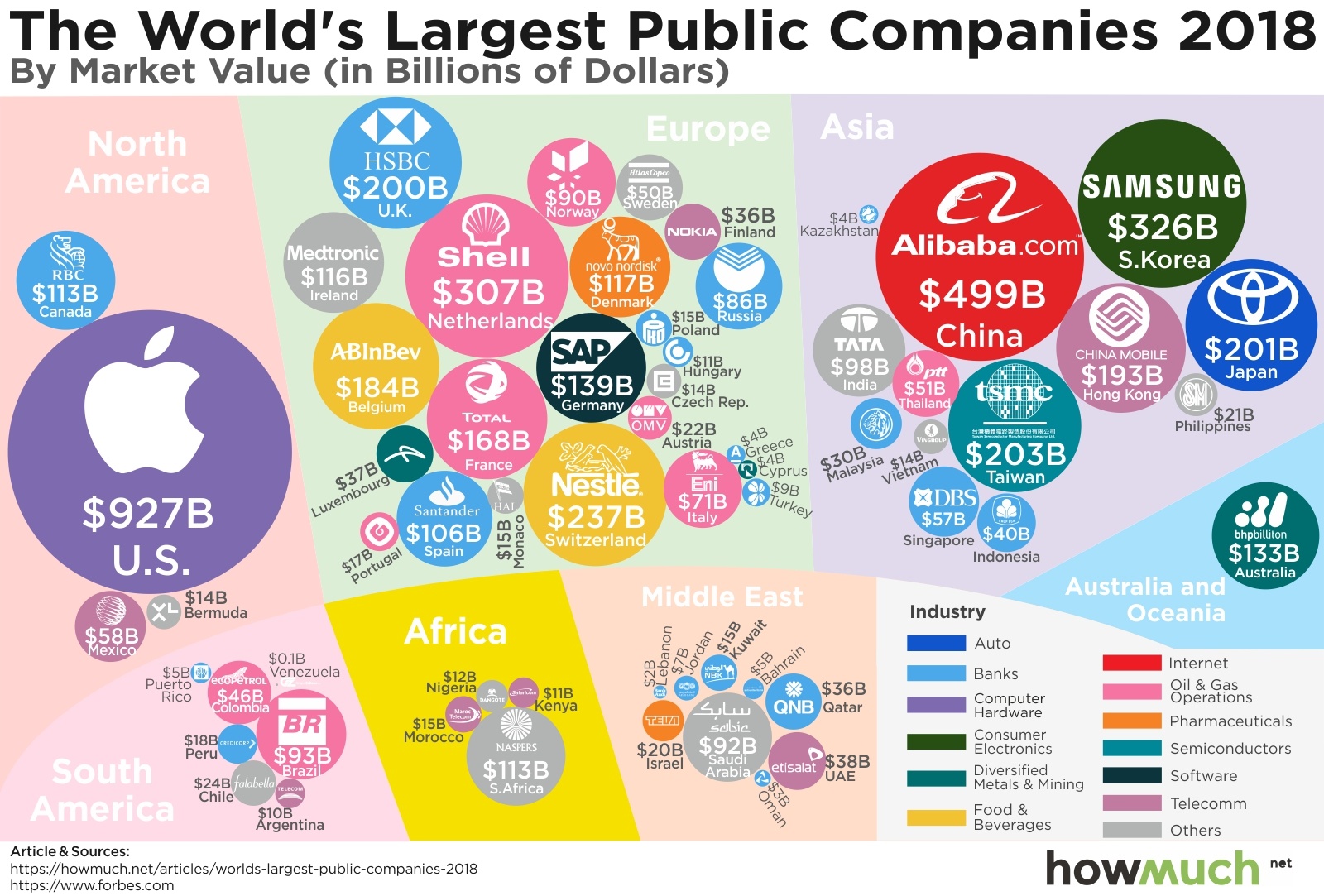
We gathered the data for our visualization from Forbes, which we used to identify the largest company headquartered in each country. We represented each company with a bubble sized corresponding to its market value. We added the market cap ($B) as well as a logo for easy reference and a color-coded legend for each company’s industry. Grouping the bubbles by continent gives a unique view of the world economy.

Remember, our data only include one company from each country, which is why household names like Walmart and Google are missing. The result is an interesting comparison of the most dominant public companies around the world.

Top 10 Most Valuable Public Companies 

1. Apple (United States): $926.9B in value and $53.3B in profits

2. Alibaba (China): $499.4B in value and $9.6B in profits

3. Samsung Electronics (South Korea): $325.9B in value and $41B in profits

4. Royal Dutch Shell (Netherlands): $306.5B in value and $15.2B in profits

5. Nestle (Switzerland): $237.3B in value and $7.3B in profits

6. Taiwan Semiconductor (Taiwan): $203B in value and $11.5B in profits

7. Toyota Motor (Japan): $200.7B in value and $22.5B in profits

8. HSBC Holdings (United Kingdom): $200.3B in value and $10.8B in profits

9. China Mobile (Hong Kong): $192.6B in value and $16.9B in profits

10. Anheuser-Busch InBev (Belgium): $184.3B in value and $7.9B in profits

For starters, our visualization demonstrates how much more valuable corporations are in the Northern Hemisphere are than in the Southern. Apple, Shell, Alibaba, Samsung—the largest bubbles in the visual are all located in the upper half, not the global South. Well on its way to becoming the first American trillion-dollar company, Apple is by itself many times bigger than the combination of all the companies in South America, Africa, the Middle East, and Australia and Oceania! Apple’s market value is truly impressive.

Looking at the companies listed within each continent is also revealing for two reasons. First, there are a few noticeable industries that tend to top the charts. There are several banks in our visualization—17 to be exact, far more than any other sector. Oil and gas companies are the second-most common, followed by telecommunications. Otherwise, our visual demonstrates the breadth of diverse sectors in the world’s economies.

And second, Europe and Asia have so many $100B+ companies compared to only one between South America, Africa, and the Middle East (Naspers at $113B). Keep in mind there are significantly more countries in Africa than any other continent, but only a handful are represented here. In other words, our visualization highlights the disparity and inequality between the world’s economies. And speaking of inequality, check out our new iPhone index to see how Apple’s products can be used to benchmark living expenses around the world.

The Real Difference Between Minimum and Full Coverage Car Insurance

$
0
0

Driving can be extremely dangerous. Even though most car trips are uneventful, the National Highway Traffic Safety Administration reports that in 2015, the latest year for which full data is available, there were nearly 6.3 million crashes reported to the police, more than 32,000 of which were fatal. These statistics highlight how important it is to carry adequate auto insurance, and, given the likelihood of getting into an accident, the more coverage you have, the better.

Car insurance can be a little confusing, so let’s break things down. Think about it like this: say you’re driving down the road and run into another car, causing significant damage and injuring the other driver. Liability coverage only protects the people you hit. Collision coverage is different, it would pay for the damage to your own vehicle even though you caused the crash. Comprehensive coverage provides another layer of protection, for example in case the weather damages your car.

There are two ways to think about paying for car insurance in the US: the amount it takes to get the minimum level of insurance required by your state (liability coverage), and the amount to get full coverage (liability, collision, and comprehensive). Nerdwallet crunched the numbers behind our latest visualization to find out the average cost of insurance in each state, which we plotted in an intuitive visualization. It turns out that insurance rates vary dramatically by state, even though there isn’t an obvious explanation why.

First off, it’s obvious that minimum coverage costs less than full coverage, but there are some states where the difference is relatively small. For example, take a look at North Carolina, where full coverage goes for $1,027 but minimum coverage is only $527, so you’re only saving $500 for a lot less coverage. Compare that to Louisiana, where the difference is $1,794. It seems like insurance companies believe driving in Louisiana is much more dangerous than in North Carolina. And if it doesn’t cost that much more for full coverage, then you may as well get it and protect yourself and your family.

There also doesn’t appear to be any obvious geographic explanation for the difference in coverage costs. Michigan stands out as the most expensive state for full coverage at $3,986, not to mention the fact that minimum coverage there is only $100 less than Louisiana’s, next-cheapest, price for full coverage! Perhaps Detroit’s status as the Motor City has something to do with it, but otherwise there is no clear pattern in the distribution. States in the Upper Midwest, Deep South, West Coast, and East Coast all appear at the top of the visualization.

Suppose you wanted to pay the least amount of money possible for insurance, and still meet the state-required minimum coverage amounts. Where can the lowest legal rates be found? The absolute cheapest insurance is in Iowa, where it costs only $309 a year (or about $26 each month) for barebones, minimum coverage. That’s so inexpensive that we wonder how much protection a policy like that would provide. Remember, you get what you pay for.

Data: Table 1.1 

Visualizing The Wage Gender Gap at America’s Top Colleges

$
0
0

Going to college is supposed to mean that you earn more money.

That’s definitely true, but did you know that going to school does not eliminate the gender pay gap? In fact, a new analysis of numbers from the Department of Education shows that going to the best schools might even make the gender pay imbalance worse.

We gathered the information for our visualization from BusinessStudent.com, which analyzed numbers for the 100 best universities and 25 best liberal arts colleges according to the US News College rankings. After removing the schools that don’t have any data available, researchers were left with 117 schools. They used data from the Department of Education to determine average earnings for men and women six years after starting their higher education, discounting anyone still in school full time. The result is a shocking portrait of gender pay inequality.

Out of the 117 top schools as defined by the US News College rankings, these are the ten with the highest overall gender pay gaps.

1. Stanford University: $36,000

2. Brigham Young University: $33,300

3. Princeton University: $32,300

4. University of Pennsylvania: $32,000

5. Duke University: $31,600

6. MIT: $30,000

7. Harvard University: $29,700

8. Carnegie Mellon: $29,600

9. Rice University: $27,200

10. Wake Forest University: $25,100

A lot of economists have researched the gender pay gap in depth, so let’s take a second to put these numbers in perspective. There are lots of ways to slice the data, but in general, the simplest pay disparity stat to look at is for white women. Working full-time, they earn 87% as much as white men. The gap is much worse for other subgroups, but let’s take 13% as a common pay gap for the sake of argument. The average pay gap in our visualization is 30%.

Stanford jumps out as having the largest post-school pay gap overall largely because students typically take very high-paying jobs out of school. In relative terms, however, Brigham Young actually has the highest pay gap, that is, women make 57.3% less than men after leaving BYU compared to 31.9% at Stanford. The smallest gap among the top 20 is still shockingly large at $12,500.

Our visualization makes clear that the gender pay gap is enormous and persistent for graduates across the best schools in the country. In fact, women made more than men at only 3 of the 117 schools. The most troubling inference to be made is that these numbers represent average earnings for men and women in their early 20s. Imagine what the difference will be in 30 years—the gaps compound on themselves and will grow bigger and bigger.

What can account for this situation? Could there be a problem with the underlying data? Remember, the Department of Education only reports average earnings for people six years after they started school. These numbers therefore include people who dropped out or otherwise did not graduate. So could more women drop out of school than men, resulting in lower wages for those without a college degree? In short, no. A lot more women graduate from college than men.

The explanation for the gender pay gap must either be found in the types of degrees or career choices men and women make, or, perhaps, the simplest explanation makes the most sense: employers tend to unfairly pay women less, even if they have a diploma from Harvard.


Data: Table 1.1


The Cost of Renting vs. Buying a Home in Every State

$
0
0

The primary benefit of renting an apartment is flexibility. Renters can move to a different neighborhood (or another city altogether) without worrying about selling their homes. But, according to our latest analysis, that flexibility often comes at a cost—renting is more expensive on average in 40 out of 50 states.

The numbers for our map and visualization come from Zillow’s housing data for March 2018, but our friends at GoBankingRates actually collected it. The map provides an intuitive look at the geography of renting vs. owning. We used a simple cutoff to compare buying and renting—if the difference was less than $50/month either way, we classified the state as neutral. That’s simply not enough money for us to make a judgement about if owning a home makes sense. But with a difference of more than about $50/month, the scales begin to tip in favor of one or the other.

We also wanted to visualize the numbers another way to understand the total cost of living across the US. We created a stacked bar chart comparing average monthly mortgage payments (pink) and monthly rent payments (blue). This approach lets you easily see which states have a significantly higher cost of living, and which are relatively cheap in comparison.
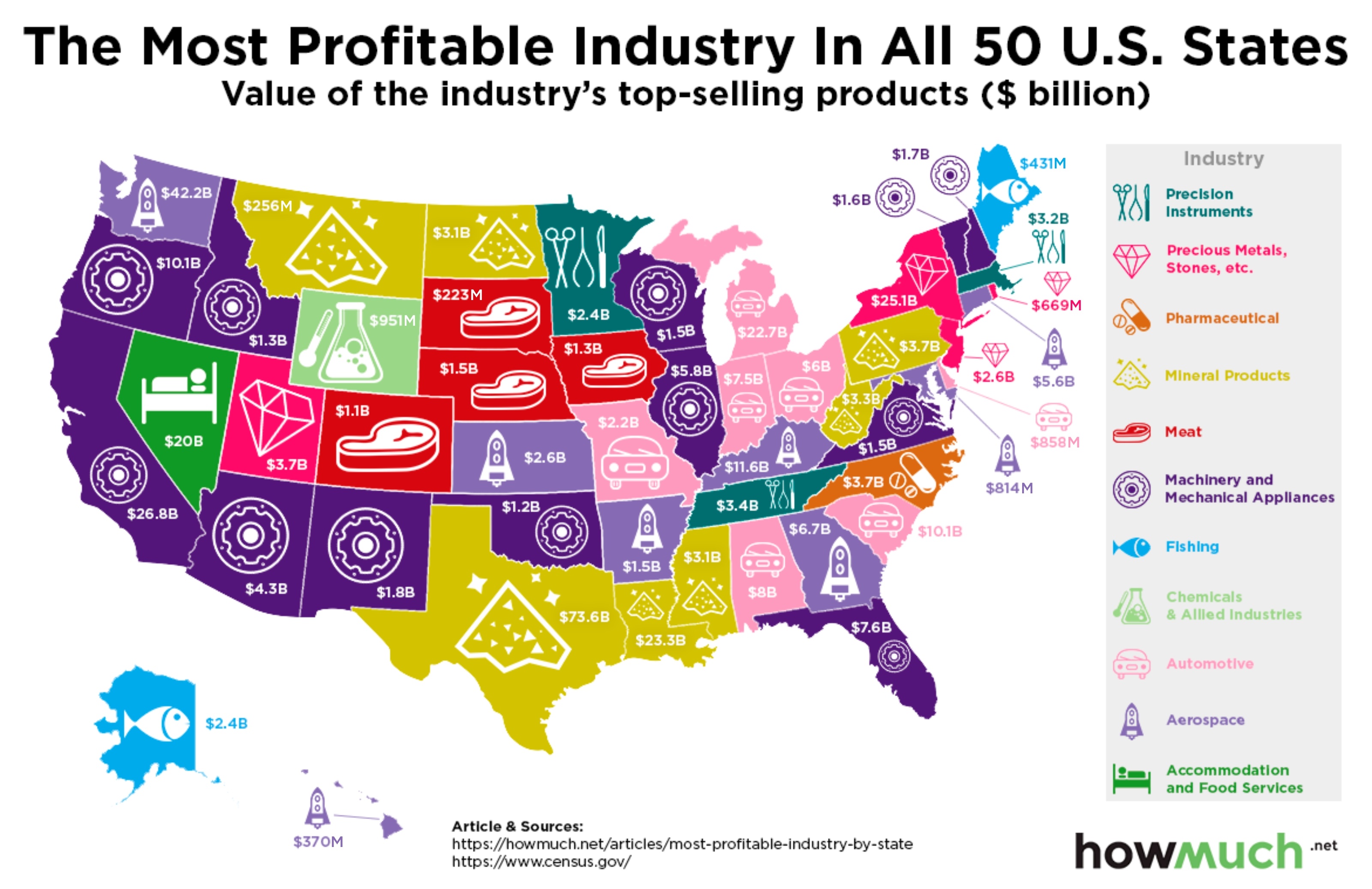
These are the ten states where it makes the least sense to rent a home (the amounts are for the average mortgage minus the average rent):

1. New York: -$1,471

2. Maine: -$675

3. Rhode Island: -$656

4. Massachusetts: -$586

5. Illinois: -$471

6. New Jersey: -$437

7. Florida: -$404

8. Vermont: -$379

9. Pennsylvania: -$368

10. Ohio: -$296

Both the map and the visualization give us a unique insight into the age-old debate about the merits of renting vs. buying. For starters, it is definitely more financially savvy to purchase in the great majority of US states. The only pocket where it’s better to rent than own is out West, plus a few outliers in New Hampshire, Washington, DC, and Hawaii. Our data are from March, 2018 when mortgage rates were already trending upward. Only time will tell if the housing market cools off, but clearly homeowners are getting a better bargain than renters.

Our visualization also highlights the vast differences in the housing market across the country. At the very uppermost end of the spectrum, owners in Hawaii shell out an eye-popping $2,839 on average each month. Renters don’t fare much better, spending $2,300. Compare that to the bottom of the graph, where West Virginians spend a relatively tiny $778 to own a home or $1,000 as renters. Across the country, the average difference is -$186 in favor of owning. That might not sound like a lot of money, but it comes out to $2,232 every year. Multiply that savings across a 30-year mortgage—and consider the prospect of building equity every month—and that’s real money.

Data: Table 1.1
 

Mapping the Most Profitable Industry in Each U.S. State

$
0
0

Diversification is a broadly accepted investment strategy designed to hedge against risk. If you invest all your money in one company or one industry, you flirt with disaster during an economic downturn. Does the US have a diverse economy? Our new map reveals that the answer is both yes and no.

We found the numbers for our visualization from GoBankingRates, which analyzed 2017 US Census Bureau data to determine the value of each industry’s products. They defined industries using Harmonized System (HS) codes from the World Customs Organization. We color-coded each state based on its most lucrative sector, and we added a nice logo and the dollar amount for easy reference. The output is an intuitive map with a few surprising, and a few predictable, results.
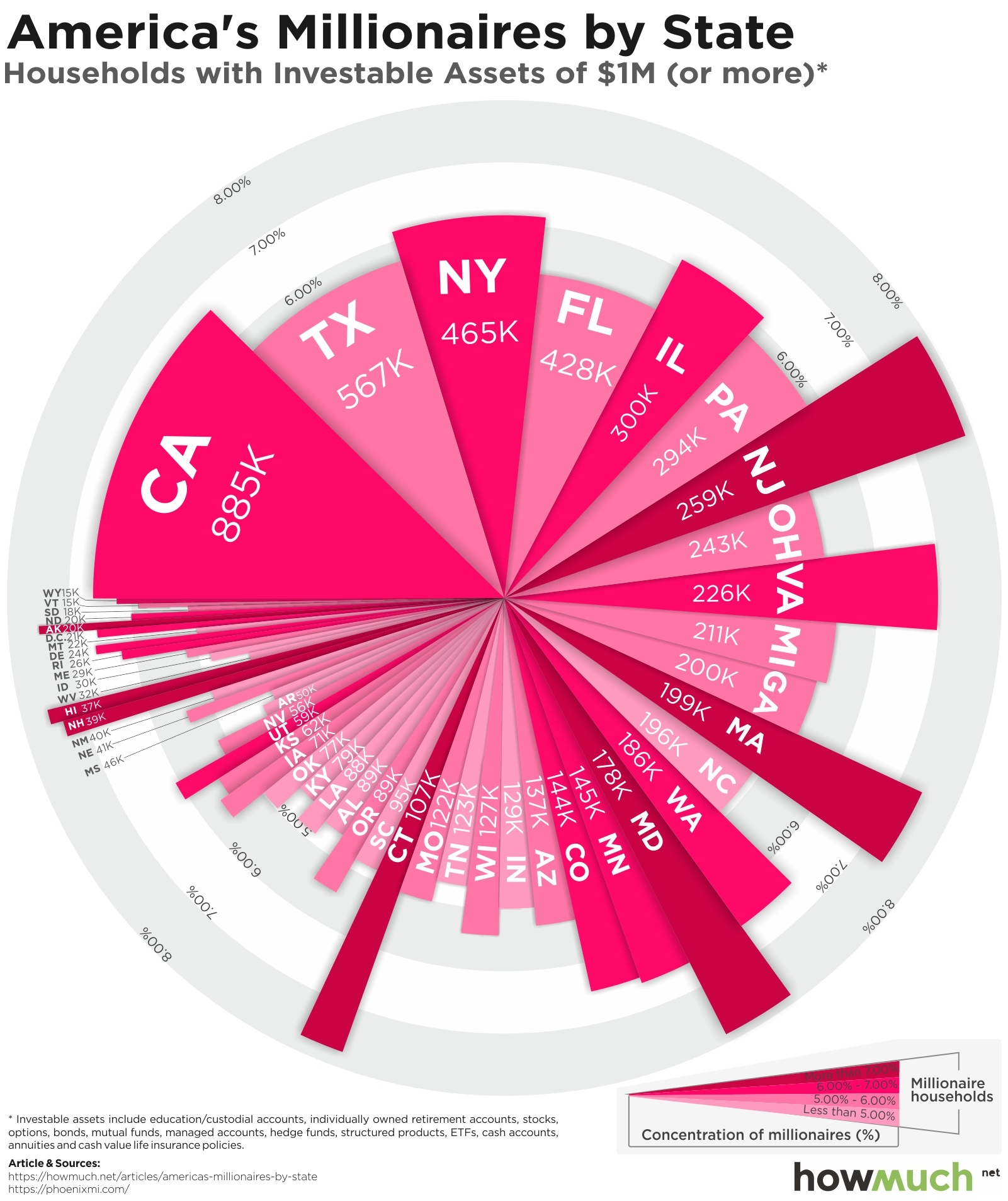
Let’s start by pointing out the industries you might expect to predominate in certain states. Michigan, Ohio, and Indiana significantly benefit from car manufacturing in and around the Motor City. South Carolina and Alabama also stand out as states with a strong automotive presence since they are destinations for in-sourcing as car makers look for cheaper (non-unionized) labor. A few states surrounding Nebraska are major meat producers, which shouldn’t catch anyone by surprise, given the region’s strong agricultural bent. Alaska and Maine likewise benefit from a substantial fishing industry. Nevada is the only state where the most profitable industry involves accommodations and food service. Viva Las Vegas!

There are a number of surprises on our map, too. Who knew that the most profitable industry in Kansas is aerospace ($2.6B)? The same goes for Arkansas, Georgia, and Kentucky. And take a look at all the states colored purple, where machinery and mechanical appliances predominate—who knew that Florida, Idaho, and Illinois have so much in common?

The overarching takeaway from our map is a little unnerving. We read all the time about how diversification is the best guard against risk. And based on our map, the US economy is diverse in some regions but not very diverse in others. In fact, 27 out of 50 US states are led by only three industries (machinery, aerospace, and mineral products), accounting for just under $1.7T in value. That means that when certain segments undergo technological disruption or economic downturns, it can disproportionately impact sections of the country in ways people don’t expect.

Data: Table 1.1 

Visualizing Where Millionaires Live in the United States

$
0
0

A logical way to get rich is to study the habits of wealthy people, figure out what makes them special, and then replicate those things in your personal life. The good news is that our latest visualization highlights the fact that there are tens of thousands of millionaires living in every state across the country.

We found the data for our exploding pie chart at Kiplinger, which collated data collected by Phoenix Marketing International, a firm tracking the affluent market. They defined a millionaire household as having more than $1,000,000 in investable assets, including everything from education accounts, IRAs, 401Ks, brokerages, savings accounts, and cash value life insurance policies. We sliced the data so that you could see both the aggregate number of millionaires living in each state as well as what percentage they make up for in the total population.

Top 10 States with the Highest Concentration of Millionaires

1. Maryland: 178,003 millionaires or 7.87% of all households

2. New Jersey: 258,988 millionaires or 7.86% of all households

3. Connecticut: 106,892 millionaires or 7.75% of all households

4. Hawaii: 36,903 millionaires or 7.57% of all households

5. Alaska: 20,444 millionaires or 7.5% of all households

6. Massachusetts: 198,750 millionaires or 7.41% of all households

7. New Hampshire: 39,209 millionaires or 7.36% of all households

8. Virginia: 226,167 millionaires or 6.98% of all households

9. Delaware: 24,212 millionaires or 6.62% of all households

10. California: 885,225 millionaires or 6.61% of all households

Our visualization reveals a few key characteristics about the distribution of millionaire households across the country. If your goal is to become a millionaire, it’s not necessarily the best strategy to move to a state with a large economy. For example, California has a lot more millionaires overall than Alaska (885,000 vs 22,000), but not as a percentage of the population (6.6% vs 7.6%). Technically speaking, this means the odds of getting a million bucks are higher in the Last Frontier than in Silicon Valley. In fact, the state with the lowest number of millionaires, Wyoming, actually has the 15th-most when measured as a percentage of the state’s total population.

Another important point clearly illustrated by our graphic is that the United States is an incredibly wealthy country with a lot of well-off people. An amazing 36 states, plus Washington, DC, have populations where 5% or more households have at least $1,000,000 in investable assets. The lowest-ranked state, Mississippi, still has 4.03% of its population as millionaires. That means in any given state, roughly 1 out of every 20 households is worth at least a million bucks. Part of the explanation for why has to do with the long bull market currently underway, which raises retirement assets for everybody who owns stock. But the general point still stands: the US is clearly one of the richest countries on the planet.

Data: Table 1.1 

This Map Shows You the Income Needed to Rent a House in Every State

$
0
0

Paying for housing is usually the most expensive fixed cost that people have, and rightly so. Advisers recommend that to maintain a healthy budget, you should spend no more than one-third of net income on housing, whether you rent or own your home. But since costs differ dramatically based on location, the amount you need to earn to afford a decent home depends entirely on where you live.

We created the data behind our map thanks to the research tools at Zillow. We calculated the average price of a rental property (including multifamily units) for every state. Next, we figured out how much money a household would need to make to be able to afford that rental price. We simply used the rule of thumb that housing costs should be no more than 30% of net income, that is, your income after taxes, retirement contributions or anything else is taken out. We then created an intuitive and color-coded map of the results.

These are the ten states (including Washington, DC) where you need to earn the most money to afford the average home as a renter.

1. Washington DC: $8,487

2. California: $8,313

3. Hawaii: $7,806

4. New York: $7,223

5. Massachusetts: $7,193

6. New Jersey: $6,717

7. Colorado: $6,197

8. Washington: $5,993

9. Maryland: $5,863

10. Connecticut: $5,590

There are a few interesting trends in our map worth calling out. There is a decent-sized cluster of states in the middle part of the country across the South where relatively modest incomes afford an average sized rental—from Iowa to Alabama, households only need to make less than $3,500 each month, or less than $42,000 a year. Compare that to the group of red states in the Northeast like New York, Massachusetts and New Jersey, where workers need upwards of $80,000 - $90,000 a year. In other words, based on the rule of applying no more than one-third of income to housing, people living in the Northeast must earn at least twice as much as those living in the South just to afford rent for what each market considers an average home.

Our map also highlights the problems of affordable housing in another way. Consider California, where the average household needs to bring in $8,313 to afford a typical rental, just shy of $100,000 a year. And in fact, median household income numbers are relatively high in California compared to the rest of the country, standing at about $67,000 a year. But pause for a moment and consider what that means: even in a comparatively well-off state, over half the population is considered unable to adequately afford an average rental. There is indeed a real problem with affordable housing when most people can’t actually afford it.

Data: Table 1.1 

Mapped: Millennials Get Paid Much Less Than Previous Generations

$
0
0

Millennials are now the largest generation in the American labor force, accounting for well over half of all workers in the US. And with three different generations now in the workplace, employers have to consider pay differences between people of all ages. Our new map reveals how the difference in pay among Millennials, Gen Xers and Baby Boomers differs dramatically based on geographic location.

We gathered the data from the American Community Survey (ACS) through the US Census Bureau, made available for researchers at IPUMS-USA. We stack ranked each generation from youngest to oldest, comparing median income levels for Millennials, Gen Xers and Baby Boomers in every state across the country. This approach lets you easily see which areas tend to produce high-earning jobs for different generations, and which states are comparatively worse off.

Our map highlights a few different trends worth discussing in detail. First off, as you might expect, millennials make less money than their older counterparts in every single state, even California where they predominate in the high-paying tech sector. That’s because younger workers are just starting out in their careers and therefore necessarily make less money than their older counterparts. No surprises there, that’s not the point of our visualization.

By large Gen Xers also lag behind Baby Boomers, but not by nearly as much. For example, in Pennsylvania the median income for Millennials is $38K compared to $53K for Gen Xers and $54K for Baby Boomers. The one exception proving the rule on our map is Washington DC, where Gen Xers pull in $15K more than Baby Boomers. After all, Washington DC isn’t a state and instead should be seen as an urban area where middle-aged people are usually in positions of power.

Taking a broader regional perspective also sheds light on the gap between Millennials and older workers. Compare how Millennials are compensated in the Deep South compared with the Northeast. Young people earn $30k in states like Alabama and Mississippi compared to $46K in Massachusetts or $38K in New Hampshire. That’s a substantial difference even after accounting for living expenses—remember, the amount of money you make early in a career usually determines wages later on. In other words, that $8,000 gap between New Hampshire and Alabama no doubt grows as workers age. But here’s the rub: salary growth usually stagnates by the time people turn 35. That’s why there is a such a steep climb between Millennials and Gen Xers, but comparably less of a climb to Baby Boomers, regardless of which state you look at.

Want to put these salary figures in context and learn more about the true cost of living in different parts of the country? Check out our tool to see all of the different factors you need to consider.

Data: Table 1.1 

Viewing all 687 articles
Browse latest View live