Quantcast
Channel: howmuch.net
Viewing all 687 articles
Browse latest View live

This Graph Shows That No Other Country Competes with the U.S. Military

$
0
0

President Trump is busy implementing his “America First” foreign policy agenda on the world stage. He has withdrawn from the Iran nuclear deal, scheduled a meeting with North Korea, and rattled American trade partners with threats of tariffs. Amid all these news stories, it is easy to lose sight of the fact that Trump also just signed the largest military budget in American history, totaling some $700B. This got us thinking about how military expenditures compare across the world.

Our numbers come from the Stockholm International Peace Research Institute (SIPRI), an organization dedicated to studying conflict and global security. SIPRI collected the military budgets for every country in the world in 2017, the latest numbers available. They also determined each country’s expenditures as a percentage of global military spending, and as a percentage of GDP. We illustrated these figures as a pie chart where the size of the piece represents the relative size of the financial outlay and the color corresponds to the percentage of GDP. We included each country’s percentage of worldwide expenditures as a label for easy reference. This gives a three-dimensional view of the military-industrial complex around the world.

Top 15 Countries Spending the Most on War

1. United States: $610B or 35% of the world

2. People's Republic of China: $228B or 13% of the world

3. Saudi Arabia: $69.4B or 4% of the world

4. Russia: $66.3B or 3.8% of the world

5. India: $63.9B or 3.7% of the world

6. France: $57.8B or 3.3% of the world

7. United Kingdom: $47.2B or 2.7% of the world

8. Japan: $45.4B or 2.6% of the world

9. Germany: $44.3B or 2.5% of the world

10. South Korea: $39.2B or 2.3% of the world

11. Brazil: $29.3B or 1.7% of the world

12. Italy: $29.2B or 1.7% of the world

13. Australia: $27.5B or 1.6% of the world

14. Canada: $20.6B or 1.2% of the world

15. Turkey: $18.2B or 1% of the world

16. The Rest of the World: $342.7B or 19.9% of the world

There are several fascinating geopolitical trends lying beneath the surface of our data. Most people already know that the U.S. spends more on its military than any other country, but the magnitude of the gap can be quite shocking. Americans spend almost three times as much as the Chinese, the second-highest on our ranking. Americans spend more than every other country (except China) in the top fifteen combined ($610B vs. $558B). It is amazing to consider just how imbalanced these figures are. In terms of population, the U.S. is home to roughly 327M people, or four times fewer than China.

Our visualization adds yet another dynamic to consider—the size of the economy. We would expect large countries with big economies to spend more overall. The U.S. government spends so much because it has such an enormous economy from which it can draw tax dollars for the military, amounting to 3.1% of annual GDP. Compare that to Saudi Arabia which spends only $69.4B, but that amounts to 10% of its GDP. This means that Saudi Arabia devotes a disproportionate amount of its economy to the military. Most countries fall somewhere between 1 and 2% of GDP.

At its core, this analysis demonstrates that President Trump inherited a very strong position in which to enact his America First agenda. The United States already spends significantly more money on its military than any other country and that number is only going to increase. A lot of this money will be going to support the American troops deployed in 177 countries around the world. We will have to wait and see how many countries will have an American military presence at the end of Trump’s presidency, but we bet it is going to be more, not less.

Data: Table 1.1


See Which Companies Make Billions from Selling Weapons Around the World

$
0
0


In 1961, President Dwight Eisenhower famously warned Americans about what he called the “military-industrial complex,” a term he used to describe the toxic union between special interests and people in power. Companies can make a lot of money selling weapons to the government, and those companies can in turn fund candidates friendly to their business model. Our new visualization shows how the United States has ignored Eisenhower’s warning.

We created our graph from a list of companies compiled by the Stockholm International Peace Research Institute (SIPRI). SIPRI figured out how much revenue each company derives from manufacturing and selling weapons—think military airplanes, tanks, drones, missiles, guns, etc. For each company we provided its logo, along with the flag showing the country where the company is headquartered. Then we made a bar graph showing the annual revenue earned from military sales. You can easily see how making and selling weapons is big business.
Our graph quickly reveals two key aspects of the military-industrial complex. First off, making military airplanes and equipment is a multi-billion-dollar industry dominated by a handful of players. Lockheed Martin jumps out as the biggest contributor, topping $40.8B in annual sales. That represents just over 86% of the company’s total annual revenue. Boeing also stands out as another household name that most people might not expect to find atop this list—they generate $29.5B in annual weapon sales. Unlike Lockheed, however, this sector only accounts for 31% of the company’s total yearly revenue. Airbus ($12.5B) also deserves special mention as the highest-ranked company from a non-English-speaking country (France).

The other interesting trend in our visualization is how American companies dominate the industry. 13 out of these top 20 companies are headquartered in the U.S., collectively generating $178.5B in yearly sales of military equipment. An additional 2 companies are from the U.K., meaning that 80% of the top 20 companies come from the English-speaking world. Another important takeaway is that every company on the list comes from the Western, developed world. Ultimately, that means any active war zone around the globe has been almost undoubtedly made possible by Western companies.

What is the big takeaway from our visualization? The countries included in our visual have foreign policies committed to international institutions, the rule of law, and peacemaking efforts (except perhaps Russia). Large segments of the economies of developed nations (especially in the U.S.) depend on manufacturing and selling weapons and other military-related manufactured goods. Does that mean the stated American foreign policy goals of encouraging global efforts toward peace are inherently at odds with the country’s own domestic political and economic interests? Private companies building and selling guns is not the same thing as the government encouraging their use in other nations’ war zones, but President Eisenhower’s prescient warning is great food for thought.

Data: Table 1.1 
 

These Countries Have the Largest Stashes of Foreign Currency in the World

$
0
0

Foreign exchange (or forex) reserves are a key indicator of economic health. They provide policymakers with a tool to control inflation, ensure the continual flow of imported goods into the country, and generally provide a sense of security in uncertain economic climates. With the U.S. national debt recently topping an eye-popping $21T, we started thinking about how the U.S. stacks up against the rest of the world in forex reserves.

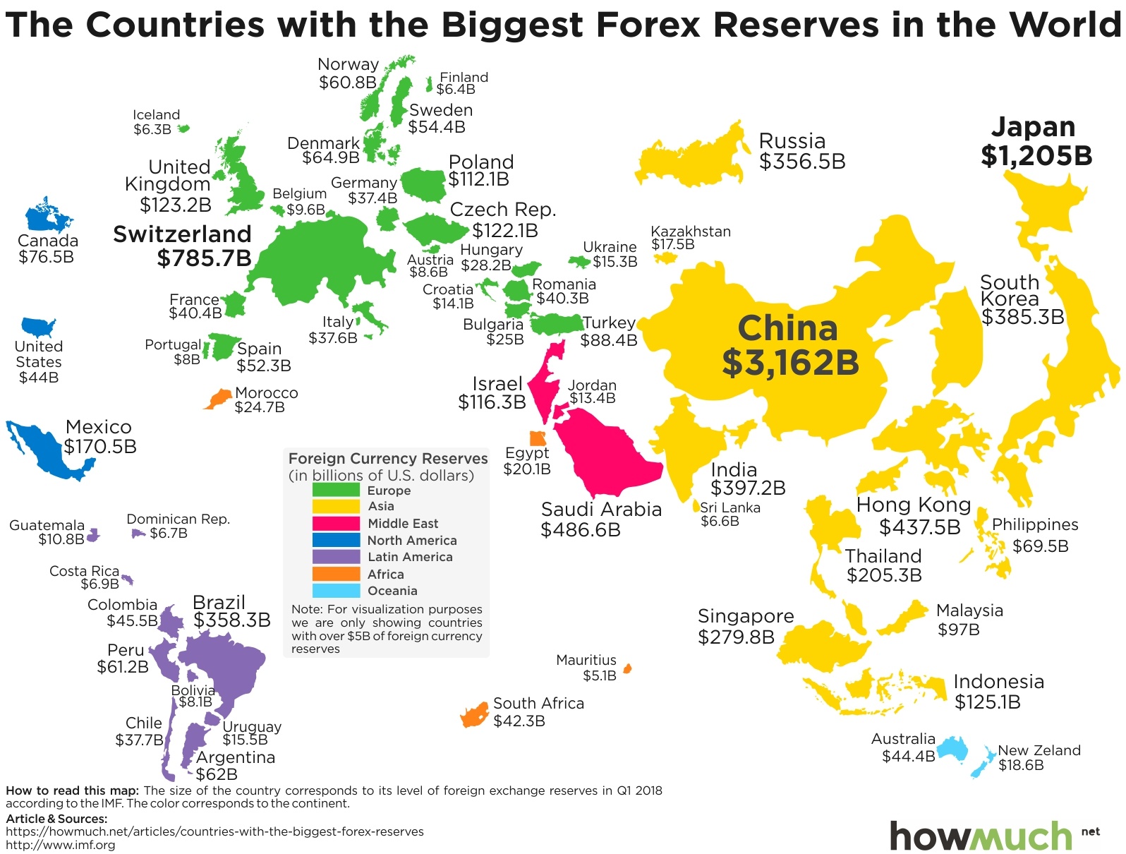
We got our data from the International Monetary Fund (IMF) for Q1 2018 (the latest numbers for a handful of countries, like Saudi Arabia, are from 2017). We first color-coded each country by continent and then adjusted the size of the country by its reserves, excluding those places with less than $5 billion in reserves. This approach provides a unique snapshot of the world economy in one easy-to-understand and colorful map.

Top 10 Countries with the Biggest Forex Reserves

1. China: $3,162B

2. Japan: $1,205B

3. Switzerland: $785.7B

4. Saudi Arabia: $486.6B

5. Hong Kong: $437.5B

6. India: $397.2B

7. South Korea: $385.3B

8. Brazil: $358.3B

9. Russia: $356.5B

10. Singapore: $279.8B

The first and most obvious trend on our map is the uneven distribution of forex reserves around the world. China leads by a longshot with $3,162B, almost three times as much as second place Japan at $1,205B. It is hard to imagine just how much money China has stashed away—it’s enough to power the entire $2,651B economy of the United Kingdom for an entire year and then some, royal weddings included. Switzerland stands out in third place with $785.7B as the only European country in the top 10. Part of the explanation is that the Swiss opted out of the European Union, making the Swiss franc a safe haven for European investors. Our ranking becomes tighter further down the list with less separation between the countries, but suffice it to say forex reserves are top-heavy.

You can see the same top-heavy trend when looking at which continents have the highest reserves. Asia clearly leads the way on the right side of the map, second to the green countries from Europe (thanks only to Switzerland). Every other continent is comparably tiny. Take a look at North and South America compared to Asia. It’s not even close. And where is the entire continent of Africa in our visualization? Since we excluded countries with less than $5B in reserves, only four orange countries made it onto the map.

What does this say about the world’s economies? Countries that have a lot of exports tend to stockpile the most forex reserves. Think about all the goods that flow out of China, consumer electronics from Japan, and oil from Saudi Arabia. These places dominate in particular industries or sectors, making them a magnate for forex reserves. Having a large stash of foreign currency means that countries like China and Japan can better handle unexpected economic surprises. The United States only has $44B in forex reserves. That’s not necessarily a cause for alarm because many export-dependent countries rely on America to purchase their goods. That’s how they ended up with such large caches in the first place. Here’s to hoping that current trends continue long into the future.

Data: Table 1.1 
 

See How Your Take Home Pay Compares to Workers Around the World

$
0
0

Tax season has finally come and gone, and by now most Americans have either gotten their refund or established a payment plan for taxes owed to the government. Here’s a nice thought experiment: go back and look at your tax return to figure out how much money the government claims through all forms of taxation. How does your own situation compare to the rest of the world?

The Organization for Economic Co-operation and Development (OECD) tracks both the average wage earnings and taxation figures for each of its 35-member countries. Gross earnings refer to the amount of money you get paid before anything gets taken out, like taxes, health insurance and retirement contributions. The remainder is referred to as net earnings. We used these numbers to create a pie chart. The overall size of each slice refers to the level of gross earnings, and the green portion represents net income after taxes. We illustrate the difference between these two figures with dark red referring to income tax rates, and pink referring to social security taxes. The result is a snapshot of how much workers actually take home across the OECD.

Top 10 Countries with the Highest Net Wages 

1. Switzerland: $58,864 after paying 16.9% in taxes

2. Luxembourg: $46,593 after paying 29.1% in taxes

3. Iceland: $45,390 after paying 28.7% in taxes

4. Korea: $44,892 after paying 14.5% in taxes

5. Netherlands: $43,835 after paying 30.4% in taxes

6. Australia: $41,655 after paying 24.4% in taxes

7. United Kingdom: $41,608 after paying 23.4% in taxes

8. Japan: $41,139 after paying 22.3% in taxes

9. Norway: $40,834 after paying 27.6% in taxes

10. United States: $39,211 after paying 26% in taxes

Our chart reveals a few different dynamics in the OECD. First off, Switzerland stands out atop the rankings with $70,835 in gross and $58,864 in net take home pay. The combination of high earnings with low taxation is hard to beat. Now take a look at South Korea. The country ranks way down in 14th place in terms of gross earnings ($52,505) but rises to 4th in terms of net earnings ($44,892). That’s entirely thanks to a relatively light tax regime of 14.5%, which is the third lowest rate in the OECD behind only Chile (7.0%) and Mexico (11.2%).

At the other end of the spectrum, some countries have extraordinarily high taxation levels that take up significant chunks of workers’ paychecks. Belgium is the clear outlier in this regard with $58,545 in gross but only $34,834 in net take home pay. This is thanks to an average total tax rate of 40.5%, pushing it below Ireland and France.

Another interesting trend in our visualization is how many OECD countries are scrunched at the low end. Mexico, Latvia and Chile are so small that the slices are almost difficult to distinguish. In fact, the average gross earnings across the entire OECD is only $43,792 with net earnings amounting to just $32,624. This means that Americans are above average in terms of their earnings, but not dramatically so. The potential to make an obscene amount of wealth is likely higher in the U.S. than any other country, but not for most people.

There are two important caveats to keep in mind. First, federal income taxes can be highly complex, and as much as 45% of taxpayers don’t pay any federal income tax whatsoever. Second, despite all the focus on take home pay, it is worth remembering that income taxes and social security taxes both eventually buy workers something—namely, everything that the government spends money on. Many people across the OECD take the long view that paying for social services through taxation makes a lot of sense for society. All that being said, more take home pay on par with Switzerland wouldn’t be too bad either.

Data: Table 1.1

The Best (and Worst) States for Teacher's Wages

$
0
0

How much should school teachers earn considering the fact that most get several weeks off from work for summer vacation? Recent protests and labor unrest from five states suggest that many educators believe they should be earning a lot more, sometimes as much as 20% more. So where can teachers earn the highest incomes today?

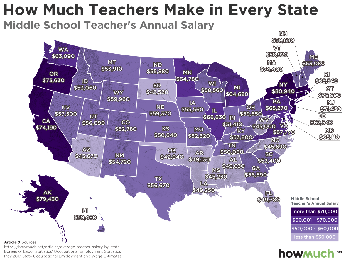
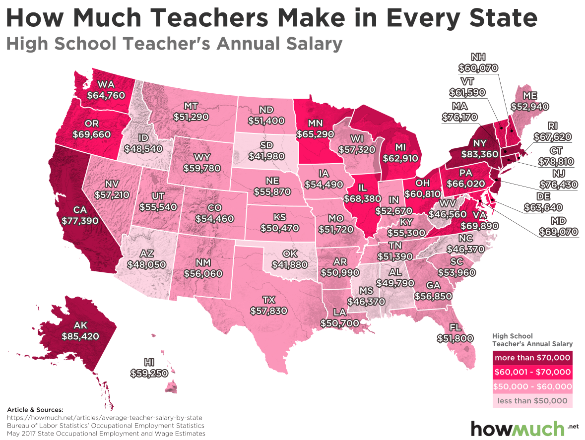
The Bureau Labor Statistics tracks overall employment and average wage numbers for a variety of professions across all 50 states. We collected figures for teachers at all three levels (elementary, middle and high school) to create three color-coded heat maps of earnings. This provides us with three snapshots of teacher compensation in the U.S.

We also calculated the average between elementary, middle and high school teachers to create a top-ten list of states where teachers earn the most.

Top Ten States Where Teachers Earn the Most

1. New York: $81,613

2. Alaska: $80,627

3. Connecticut: $78,567

4. California: $76,523

5. Massachusetts: $75,720

6. New Jersey: $72,460

7. Oregon: $69,643

8. Virginia: $68,707

9. Maryland: $67,173

10. Rhode Island: $67,050

Our maps illustrate how there are enormous differences in earning potential for teachers across the country. The coasts offer the highest salaries, led by liberal states like New York and California, where teachers can make tens of thousands of dollars more than the national average wage of about $49k. There are also a couple of states in the Upper Midwest where teachers can make between $60-70,000, including Illinois, Minnesota and Michigan. The combination of above-average incomes with great benefits like a pension make these places ideal for teachers.

But our map also reveals places where teachers make relatively little, even less than the national average. Take a look at the South and rural Western states like Oklahoma, South Dakota and Mississippi. The juxtaposition between low-wage states like Arizona (average: $45,313) and California (average: $76,513) is especially dramatic. Of course, one explanation for the difference has to do with the cost of living. Phoenix just isn’t anywhere near as expensive as San Francisco.

The most interesting trend in our maps has to do with different wages for different levels of education. The biggest outlier is Alaska where a high school teacher makes on average $8,390 more than an elementary school teacher. Compare that to Idaho, where middle school teachers make $4,520 more than their colleagues in high school. Likewise, in Oregon, moving from elementary to middle school results in average pay increase of $7,990. Teacher licensing requirements are defined at the state level, which could partly explain these differences in compensation. Still, making $8,000 more each year is a powerful incentive to just teach at a different grade level.

Our maps indicate that some educators clearly make a lot more than others, depending both on where they live and which grade they teach. Those differences may or may not justify the teacher strikes and walkouts happening around the country, but it does highlight the different values some states place on education.

Data: Table 1.1

Visualizing the Most Expensive Natural Disasters in the Last 40 Years

$
0
0

Hawaii’s Kilauea volcano is now threatening to destroy more homes, forcing the authorities to order a mandatory evacuation for additional neighborhoods. There’s no telling when the volcano will finally stop, but it has already destroyed 82 structures. That means we will have to wait assess the final cost of damages, but it got us thinking about the most expensive natural disasters in American history.

The National Centers for Environmental Information (NOAA) closely tracks severe weather events and natural disasters across the U.S. The dataset runs from 1980 to April 6, 2018, making it one of the most complete and accurate assessments of natural disasters available today. Researchers used the Consumer Price Index (CPI) to adjust the cost of damages, creating a fair apples-to-apples comparison. We illustrated each disaster on a timeline, where the size of the figure represents its total cost.

Top Ten Most Expensive Natural Disasters since 1980

1. Hurricane Katrina: $163.8B in damages, ended in August 2005

2. Hurricane Harvey: $126.3B in damages, ended in August 2017

3. Hurricane Maria: $90.9B in damages, ended in September 2017

4. Hurricane Sandy: $71.5B in damages, ended in October 2012

5. Hurricane Irma: $50.5B in damages, ended in September 2017

6. Andrew: $48.6B in damages, ended in August 1992

7. U.S. Drought/ Heatwave: $43B in damages, ended in August 1988

8. Midwest Flooding: $36.7B in damages, ended in August 1993

9. Hurricane Ike: $35.4B in damages, ended in September 2008

10. U.S. Drought/ Heatwave: $33B in damages, ended in December 2012

Our timeline illustrates how natural disasters have become increasingly expensive over the last 4 decades. In fact, last year they cost Americans a record $306B. Damages from individual events exceeded $10B prior to 2000, with only one event, Hurricane Andrew, coming close to topping $50B. Since the turn of the century, however, Mother Nature has extracted an increasingly higher price from Americans with Hurricane Katrina topping the list at $163.8B in 2005. But that figure isn’t such an extreme outlier any longer as storms have become increasingly costly.

The upward trend in damage is due entirely to hurricanes, but there’s a deeper story going on. Hurricanes have been hitting the Gulf Coast and Eastern Seaboard of North America for centuries, and yes, you can make an argument that recent storms have been more powerful than normal. But the real problem is that Americans have built so many large cities so close to the water without investing in the necessary infrastructure to protect people from disasters. The South is home to a disproportionate share of the country’s fastest growing cities, and we know natural disasters tend to strike the same place time after time. That’s a recipe for very expensive damages.

You can draw a couple more insights from our visualization too. First off, tornadoes are certainly scary events, but they just don’t cause anywhere near as much destruction and property damage as hurricanes. Second, and perhaps more surprising, droughts/heatwaves make it into the top ten most destructive natural disasters. This is no doubt connected to losses suffered on farms in crops and livestock.

The big takeaway here is that if past is prologue, expect there to be several more $50B+ hurricanes in the years ahead. And will we have to add a figure for volcanoes to our timeline if the situation in Hawaii continues to get worse? The Kilauea volcano still has a long way to go, but the costs are already piling up.

If there are other natural disasters missing, let us know at press@howmuch.net so we can update our article.

Data: Table 1.1

These are the Biggest Corporate Giants Over the Last Decade

$
0
0

Disruption is the new buzzword in business as both big and small companies are worried about scrappy startups with better technology entering their marketplaces. Our new visualization highlights the top three U.S. companies, measured in terms of overall revenue, in the last decade. Disruption occurs at the highest levels of corporate America, but our visualization highlights just how much money is at stake.

We gathered our numbers from the annual Fortune 500 list, which Fortune refreshes every year. Numbers for each year reflect the previous year ending December 31. Before diving into an analysis of our visualization, let’s call out two underlying assumptions. First, we have not adjusted these figures for inflation. As years go by, inflation causes the value of a dollar to slowly weaken. We took this approach to preserve the rankings at the time each company posted its revenue figures, not in comparison to revenues today. Second, revenue gives you a great idea about the size of a business, but very little about profitability. A company can post record-breaking revenue numbers and still lose money, like what’s happening at Tesla right now.

All that being said, our graph raises several key insights both about the particular situations of these companies and the broader U.S. economy. Walmart has remained in the top spot nearly every single year over the past decade except two years. Today, Walmart’s revenue is more than twice as high as second-place Exxon Mobil, a gap that has consistently grown year after year. It would appear that nobody will be able to challenge the country’s largest employer for quite some time.

Another interesting trend is how oil companies like Chevron and Exxon Mobil continue to post outstanding revenue numbers, even as the price of oil has fluctuated. Our visualization suggests that these companies have developed business models that are mostly immune to market pressures. They can make tons of money and pay their investors consistent dividends, no matter what the economy is doing. They fell off the top three in 2016, but don’t count Exxon out in the years ahead.

Our visualization also reveals a shift in corporate America, namely Apple’s ascendance as one of the most valuable companies ever. Beginning in 2016 especially, the multinational tech company from Cupertino, CA started shattering revenue forecasts thanks in large part to the continued success of the iPhone. People are willing to shell out over a thousand dollars for a new phone, making Apple a luxury brand that delivers both a status symbol and a sleek user experience.

Berkshire Hathaway also made it into the top three companies, but through a very different route. Instead of continuously surpassing expectations in product development, CEO Warren Buffett simply invested in companies with solid business models, like Pilot Flying J (gas stations), Duracell (batteries), Heinz (condiments), and Prudential (insurance). Buffett also has his eyes set on disrupting the healthcare industry, which would only further increase these figures.

Nothing is permanent but change, especially in the business world where so much money is at stake. These companies generate hundreds of billions in revenue year after year, but the top three rankings now include companies that weren’t anywhere near the top in 2008. Walmart is clearly paying attention to these trends as executives explore new business models, including in ag science, drones, and logistics. Time will tell if these efforts pay off for the retail behemoth.

Data: Table 1.1

See Which Schools Have the Highest ROI in Every State

$
0
0

The average student loan debt is now $39,400, and yet Americans still like to believe that going to college is an investment in the future. It brings lifelong friendships, challenging coursework and hopefully a good job at the end. But has anyone ever thought to conduct a rigorous ROI analysis, considering the average tuition costs, student debt and earnings potential for graduates?

We found the numbers for our map from Payscale.com, which calculated a few different metrics for every major college or university in each state across the country. They took the average total cost of tuition (the red part of our visual), the average student debt (the puple part), the typical length of time to graduation (usually 4 years), and the graduation rate. They then determined the 20-year ROI for going to school by comparing two different populations: people who skip college and start a career right after high school, and people who go to college and wait to start a career. In other words, think about a high school graduate with 24 years of experience compared to a college graduate with only 20. What is the net difference, if any, in pay? That’s the blue part of our visual.

Here is a comprehensive list of the best value schools in every state:

State College  20 Year Net ROI ($) Total 4 Year Cost Average Loan Amount ($)
New York United States Merchant  Marine Academy 1,094,000 34,900 20,000
Massachusetts  Massachusetts Institute of Technology 1,015,000 249,000 30,200
Maryland United States Naval Academy 1,004,000 0 N/A
California Harvey Mudd College 978,000 272,000 25,500
Colorado Colorado School of Mines 909,000 126,000 26,700
Georgia Georgia Institute of Technology-Main Campus 856,000 101,000 33,500
New Jersey Stevens Institute of Technology 832,000 250,000 26,700
Michigan Kettering University 766,000 215,000 44,200
Missouri Missouri University of Science and Technology 753,000 87,300 27,000
Indiana Rose-Hulman Institute of Technology 751,000 239,000 45,800
Pennsylvania University of Pennsylvania 739,000 262,000 28,600
Maine Maine Maritime Academy 718,000 103,000 70,200
Connecticut United States Coast Guard Academy 714,000 0 N/A
New Hampshire Dartmouth College 707,000 265,000 24,700
New Mexico New Mexico Institute of Mining and Technology 692,000 79,100 19,400
Virginia Virginia Military Institute 680,000 111,000 34,400
Texas Rice University 650,000 229,000 29,500
North Carolina Duke University 641,000 262,000 24,700
South Dakota South Dakota School of Mines and Technology 635,000 93,500 29,700
Montana Montana Tech of the University of Montana 634,000 77,400 21,200
Washington, D.C. Georgetown University 619,000 263,000 26,100
Rhode Island Brown University 616,000 257,000 28,700
Wisconsin Milwaukee School of Engineering 611,000 193,000 31,000
Washington University of Washington-Bothell Campus 609,000 109,000 23,300
Utah Brigham Young University-Provo 595,000 71,100 20,000
Illinois University of Illinois at Urbana-Champaign 585,000 118,000 27,600
Oregon Oregon Institute of Technology 572,000 90,000 25,600
Ohio Case Western Reserve University 568,000 242,000 32,200
Florida Embry-Riddle Aeronautical University-Daytona Beach 549,000 194,000 48,400
Arizona Embry-Riddle Aeronautical University-Prescott 529,000 192,000 51,100
Alaska University of Alaska Fairbanks 527,000 70,500 24,300
Alabama University of Alabama in Huntsville 518,000 96,200 25,000
Tennessee Vanderbilt University 496,000 252,000 31,600
West Virginia West Virginia University Institute of Technology 493,000 74,700 25,000
Delaware University of Delaware 488,000 106,000 35,700
Idaho Brigham Young University-Idaho 468,000 48,200 17,700
South Carolina Clemson University 461,000 114,000 33,300
Minnesota University of Minnesota-Twin Cities 449,000 104,000 30,600
Kansas Ottawa University-Ottawa 438,000 156,000 33,100
Iowa Iowa State University 435,000 77,200 27,600
Oklahoma University of Oklahoma-Norman Campus 424,000 99,900 31,300
Louisiana Louisiana State University and Agricultural & Mechanical College 422,000 102,000 26,900
North Dakota North Dakota State University-Main Campus 413,000 80,400 35,700
Arkansas University of Arkansas 374,000 93,100 28,700
Nebraska Nebraska Methodist College of Nursing & Allied Health 363,000 111,000 32,500
Nevada University of Nevada-Reno 363,000 91,500 24,400
Kentucky Thomas More College 362,000 157,000 28,900
Wyoming University of Wyoming 360,000 75,600 28,000
Vermont Middlebury College 358,000 250,000 25,400
Mississippi Mississippi State University 293,000 90,800 26,900
Hawaii Brigham Young University-Hawaii 263,000 66,200

18,500


There are several high-level trends in our visualization. First off, no matter where you live, it clearly pays to go to college. Every single state has a large blue bar in it. The worst ROI for getting a degree is in Hawaii, but even their graduates will have earned $263,000 more than their less-educated counterparts after 20 years of working. The average ROI for all 50 schools (plus Washington DC) is an eye-popping $595,000, and the average loan amount is just under $29,000. That means that, on average, going to a high-value school gives you roughly 20x return on your money. Try getting that in the stock market.

Our map also lays out a nice visual of value schools across the U.S. The best value can be found in the Northeast, which is represented by the large blue bars in several states. There are several schools with $700k+ returns. Things look relatively modest in the South, with no state topping $700k. California meanwhile anchors the West Coast with the best value in the region, where Harvey Mudd College generates just shy of $1M in ROI for graduates.

Taking a closer look at the visualization reveals another interesting trend. Some of the schools are very well known, like MIT in Massachusetts and many of the state schools across the Midwest. But if you’re honest, how many of the top ten have you previously heard of? Clearly there are several schools with the word “technology” in the name, indicating that getting a science, engineering or IT degree carries some serious ROI. Many of these schools might not be well known in pop culture, but we bet hiring managers compete for the attention of these graduates.

But what if you are nervous about taking out student loans to finance your college career? After all, a lot of people start college but don’t finish. That can lead to the worst of both worlds: student debt but no degree (or higher earning potential) to show for it. The graduation rates are relatively high for all these schools, topping 80 and even 90+%. But if you still want to hedge your bets, consider joining the armed services through the Naval Academy ($0 in debt at graduation, but an ROI of $1,004,000). And if joining the military doesn’t appeal to you, consider instead a low-cost, low-debt school on our list, like BUY-Idaho. Graduates typically only have $17,700 in average debt, which comes out to only about $200/month in repayments over 10 years. If that still seems like a lot, remember, you’re going to make $468,000 more over the next two decades!

Data: Table 1.1


Revealed: The 20 Companies with the Worst Pay Gaps Between CEOs and Workers

$
0
0

A few years back, the SEC passed a rule forcing publicly traded companies to disclose the ratio between CEO compensation and median worker pay. Many observers thought the rule would go away with President Trump’s election, but they were wrong—companies are now disclosing their pay ratios before a June 30 deadline. And surprise! The results so far don’t look good for many companies in the S&P 500.

Our visualization highlights the 20 biggest pay gaps in America according to data collected by the AFL-CIO. We started by placing a photo of the CEO and the name of their company directly above their total compensation. We then added the median worker salary, illustrating the different pay ratios with a series of corresponding circles. The bigger the circle, the bigger the ratio. This is a straightforward way of representing the data, and it reveals several key insights into executive compensation in corporate America.

Let’s start by getting clear on how to read the chart. For example, Mattel has the biggest circle on the visualization. For every $1 an average worker makes, the CEO takes home $4,987. Several companies pay their CEOs well over 1,000 times as much as the average worker. However, overall CEO compensation does not exactly follow the ratio. In fact, Richard Fahn, the CEO of Royal Caribbean Cruises, has the lowest pay ratio on our visualization at $728. But overall he gets paid more than 9 other chief executives on the list. That’s because Royal Caribbean compensates its employees better than other companies. In fact, the best company for average workers is Wynn Resorts, where the average person takes home $44,437. That’s pretty good all things considered, but not nearly as good as the $34.5M that Stephen Wynn takes home.

We should also point out how there are several important underlying assumptions behind the data. In fact, on page 17 of its actual rule, the SEC explicitly refuses to define the term “employee,” only stating that it includes anyone employed on the last day of the previous fiscal year whether in a “full-time, part-time, seasonal or temporary” capacity. Each company is also “permitted but not required” to annualize each employee’s compensation, which further complicates the data. CEO pay also include some fuzzy numbers, like the expected future value of unvested stock or the value of non-monetary forms of compensation, like a CEO’s security detail. Both factors tend to inflate the ratios, especially in the retail sector (where there is high seasonal employment).

It’s worth pointing out that even if these numbers are inflated, they still represent an enormous disparity in compensation. If Mattel’s CEO was paid only 3,000 times more than the average worker as opposed to 4,000 times more, would it be any less astonishing?

Data: Table 1.1

Breaking Down World Cup Prize Money in One Visualization

$
0
0

The U.S. soccer team failed to qualify for this year’s World Cup in Russia, and that’s going to set back more than just the development of youth soccer in the United States. The national program will also lose out on a jackpot of winnings just for participating in the tournament.

Did you know that FIFA will pay out an amazing $791M in combined incentives for the 2018 World Cup? That figure includes $400M for the national teams and an additional $391M for the various soccer clubs contributing their employees (the players) to the tournament. Our new visualization breaks down the prize money each team stands to win depending on how they perform in the tournament. We created a pie chart to look like a soccer ball where each color corresponds to a tranche of prize money. We also included the relatively percentage of the overall purse each team stands to gain for easy reference.

Our visualization demonstrates how FIFA establishes an incentive program behind each game, but not exactly how you might think. For the championship match, the winning team stands to make an additional $10M (the difference between first and second place). There is still a payoff for competing for third place, but only an extra $2M. Teams finishing 5th-8th similarly stand to make $4M more than the teams they beat in the elimination round. That all makes perfect sense.

But the most interesting part of our visualization is how it reveals the equality in participating in the World Cup regardless of how a team performs. The worst-case scenario is that a country loses every single game in group play and fails to make it into the elimination rounds. That team would still go home with $8M. That’s only 2% of the total purse, but as a group, the teams failing to advance from group play earn the most collective money at $128M. And that’s not even counting the money that FIFA pays to professional clubs that allow players to compete on national teams as well as other disbursements, which brings the total outlay to $791M.

All this goes to show that it pays to make it to the World Cup, even if a team gets blown out in every single game. Certainly, a lot of national teams can use the extra cash to help fund player development programs and foster a love of the game. And teams take every chance to make as much money as possible—that’s why Nigeria will be wearing such eye-popping jerseys. That’s just another reason why it was such a disappointment for the Americans to miss the chance at competing in Russia.

Data: Table 1.1

This Map Captures the Real Value of Each Team at the World Cup

$
0
0

Neymar, Harry Kane, Lionel Messi—each of them is worth well over $100M for their innate talent on the soccer field. Such high-profile players are expected to perform at the top of their game in the 2018 World Cup, but they got us thinking of a new way to view the competing teams. Instead of individual talents, what if we looked at the total value of all the players on a given roster?

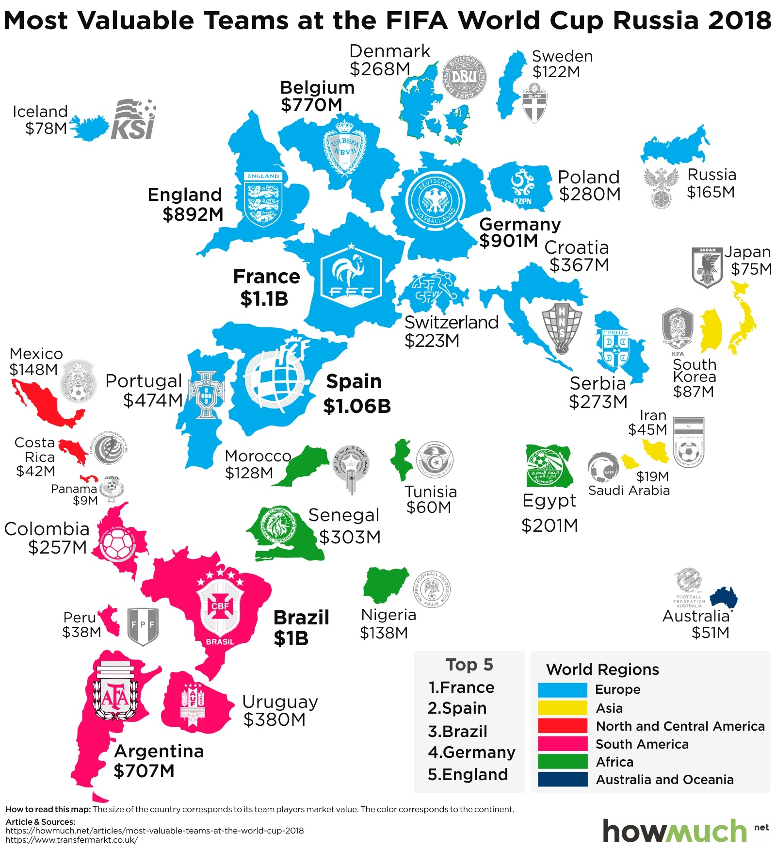
We originally found the numbers behind our visualization at transfermarkt.com, a site that tracks and measures the worldwide marketplace for top soccer players. We used the website’s numbers to create a unique map of talent at the World Cup. The size of each country represents the total value of the players on the national team, with the color corresponding to the region. We also threw in the national soccer emblem from each country just for fun.

Top Ten Most Valuable National Teams

1. France: $1,102M

2. Spain: $1,055M

3. Brazil: $1,001M

4. Germany: $901.3M

5. England: $892.1M

6. Belgium: $769.6N

7. Argentina: $707.3M

8. Portugal: $474.1M

9. Uruguay: $380.2M

10. Croatia: $367.5M

Our map reveals a few surprises about the teams competing in the World Cup. First off, there is a great deal of inequality between the rich countries in Europe and the rest of the world. And in fact, 6 out of the top 10 countries are from Europe. This makes a certain amount of sense given how European soccer leagues tend to pay the most money for top talent. We would expect people who grew up playing soccer in Europe to remain close to home as professionals.But just look how much bigger the blue European countries are compared with the green African. Take an actual example from the World Cup. Spain ($1,055M) is scheduled to play Iran ($45M) on June 20. The Spaniards are worth more than 20 times as much as the Iranians. We doubt it’s going to be competitive. At the extreme low end, Panama’s roster is valued at only $9M.

A second and related issue concerns the relationship between player valuations and talent. Remember, national teams don’t pay their players much if anything—these guys make a living playing for professional soccer clubs. So if the market is accurate, we would expect those countries with the richest players to win most of the time. Taking a look at the history of World Cup winners reveals that to be the case: over the last 80 years, the only non-European teams to even make it to the final of the competition have been Brazil and Argentina. And even then, both of those countries are loaded with millionaire talent. The last World Cup final game without a European team was way back in 1950 (Uruguay over Brazil, 2-1). Clearly, money buys talent, which in turns wins World Cups.

What can this tell us about who is most likely to win the 2018 World Cup? It depends on how teams emerge from group play, but the one team with the best chance to win it all is at the top of the list: France. The French roster is worth more than the entire bottom 14 teams combined. With over $1.1 billion in talent, it will be nothing short of a catastrophe if the French side doesn’t at least make it to the knockout rounds.

Data: Table 1.1

The World's Most Valuable Brands, in One Chart

$
0
0

Jeff Bezos, the founder of Amazon, once said, “Your brand is what other people say about you when you aren’t in the room.” We might add that if almost everybody is saying great things about you, then you have an extremely valuable brand. This is one way to think about the results our newest visualization.

We found the data for our visualization at Forbes, which publishes an annual list of companies with the best brands. Researches considered only companies with a presence in the U.S. market (which excludes a lot of valuable companies overseas). Forbes then attributed a percentage of each company’s 3-year earnings to its brand—a higher portion for luxury goods, and a lower portion for everyone else. We used these numbers to create a cluster chart, where the size of each bubble corresponds to the value of the brand, and the color represents the industry.

Top Ten Companies with the Most Valuable Brands ($B)

1. Apple (Technology): $182.8B

2. Google (Technology): $132.1B

3. Microsoft (Technology): $104.9B

4. Facebook (Technology): $94.8B

5. Amazon (Technology): $70.9B

6. Coca-Cola (Beverages): $57.3B

7. Samsung (Technology): $47.6B

8. Disney (Leisure): $47.5B

9. Toyota (Automotive): $44.7B

10. AT&T (Telecom): $41.9B

Our visualization highlights how the tech sector dominates consumer perceptions of brand value, representing an incredible $872.6B in combined value. Each of the top 5 companies come from the technology sector, including 6 of the top 10. This isn’t a surprise if you’ve been paying attention to the stock market recently, where the so-called FAANG stocks have generated outsized returns for several years running (Facebook, Amazon, Apple, Netflix and Google). If anything, the one surprise at the top of the list is that Netflix is missing; it’s way down at 55th on our list. “Netflix and chill” just doesn’t have the same appeal as iPhones.

Our visualization also makes it easy to see which sectors have the best brands. After technology, the automotive sector has the second highest collective brand value, led by companies like Toyota ($44.7B), Mercedes-Benz ($34.4B) and BMW ($31.4B). Volkswagen just barely makes it onto the list with a brand value of $7.9B, no doubt still recovering from its vehicle emissions scandal. The financial services and consumer packaged goods sectors both also stand out as industries with above-average brand valuations. Coca-Cola ($57.3B) deserves special mention as the only beverage company to crack the top 10.

To put it simply, the value of a brand is how customers perceive it. This means that brands can be fickle. Take Apple as an example, the most valuable brand in our visualization and perhaps of all time. Is the Galaxy S9 really all that different from the iPhone X? A string of corporate scandals or products that fail to deliver a premium experience suggest that Apple’s time atop the brand pyramid might be coming to an end. Then again, the company sold well over 50 million $1,000+ iPhone Xs, setting another record in revenue for the company. Good luck trying to compete with that type of premium brand loyalty.

Data: Table 1.1

Visualizing the Global Export Economy in One Map

$
0
0

President Trump has loudly complained for quite some time about U.S. trade deficits with the world, most recently following the latest G7 summit in Canada. Trump’s rhetoric implies that other countries are enjoying massive surpluses at the expense of American workers. This got us thinking about how the U.S. actually compares as an exporter in the world economy, so we create our newest map.

We got our numbers from the World Trade Organization (navigate to the Statistics Database to locate the original data). The WTO tracks the total value of physical goods each country sends across its borders. Remember, these numbers exclude services—we are only focused on physical items. To create our map, we changed the size of the country depending on the value of exports, and we likewise added a shade of blue for easy reference. This approach highlights the outliers and identifies several key trends.

Top Ten Countries with the Most Exports in 2017 ($B)

1. China: $2,263B

2. United States: $1,547B

3. Germany: $1,448B

4. Japan: $698B

5. Netherlands: $652B

6. South Korea: $574B

7. Hong Kong: $550B

8. France: $535B

9. Italy: $506B

10. United Kingdom: $445B

The most obvious insight that our map contains about international trade is how unequal it is. A few countries dominate the very top of the list, and everybody else falls far behind. The top exporter, China, has 32% more exports than the second-place Americans. The top three countries generate more exports than the rest of the top 10 combined ($5,258B vs $3,960B). You can see this inequality on our map in how China, the U.S. and Germany dominate the visual forefront.

The second interesting takeaway is that there are several surprise countries, including most notably the Netherlands in the 5th spot ($652B). What could the Dutch possibly export to the rest of the world that would land them so high on our list (and give their country such a prominent place on our map)? It turns out they manufacture a lot of heavy machinery and oil, both of which spread far and wide on the international market.

There are also more than a few surprises at the other end of the spectrum. Several countries in Southeast Asia are extremely well known for having export-dependent economies, and yet none of them are anywhere near the top of the list. Go check to see where the things in your closet were made—we bet most of the items came from Vietnam, Malaysia or Indonesia. None of these countries crack $250B in total exports. But also look at Africa, where only a handful of countries have enough exports to make it on our map. Our visualization tells a sad story about the development of these economies.

And finally, it’s easy to believe listening to Trump’s rhetoric that the U.S. hardly sells anything to the rest of the world. Our map demonstrates how that’s just not true. With more than $1.5T in annual exports, Americans stand a lot to lose if a trade war continues to escalate and eventually becomes a reality.

Data: Table 1.1

The Speed of Crypto Hacks is Picking Up: This Month Alone Thieves Stole $71.5M

$
0
0

Pundits and commentators have long worried about the security of decentralized cryptocurrencies. In fact, detractors often complain that investing in cryptocurrencies carries far too much downside for the average investor—even if the price goes up, you can still lose it all to hackers. We just saw two more crypto hacks at Bithump and Coinrail, totalling a combined $71.5M. So let’s to take a step back and analyze the history of cryptocurrency hacks.

We created our new graph by taking data from CryptoAware.org, which recently published a list of highly significant crypto hacks and scams. There’s no central record keeper for this sort of thing, so CryptoAware undoubtedly missed some. We combined a cluster graph representing the size of the hack on a timeline with the logo of the exchange or wallet provider that fell prey. This approach lets you easily see how often and to what extent the crypto-market has sustained attacks over the last several years. 

A general trend is immediately obvious about our visualization: cryptocurrency hacks have generally become more common and more valuable over time. $10M+ hacks started happening with some regularity after the summer of 2016, right when the crypto-market started taking off. Prior to that time, there was exactly one hack over $10M, the infamous Mt. Gox hack in 2014. More on that in a minute. The second-most devastating hack happened very recently in a Tokyo exchange called Coincheck, for the somewhat obscure NEM coins. The only other two cryptocurrency hacks worth more than $100M were Parity’s Ether wallet hack ($160M) and BitGrail’a Nano hack from early this year ($170M). The latter is still causing lots of consternation within the cryptocurrency community. All things being equal, the average crypto-hack comes out to about $37M.

The critical thing to remember about our graph is that it represents the value of the cryptocurrency theft at the time it occurred. This creates a fair comparison because the value of cryptocurrencies changes literally every second of every day. But keep in mind what this really means: the Mt. Gox hack represented $450M in crypto-wealth as of early 2014, back when Bitcoin cost about $560. As of this writing on May 1, 2018, those same Bitcoins are worth just over $9,000, or a total of about $7,252,000,000. Think that’s incredible? Back in December of 2017, the stash would have been worth $15B+. That’s 10% of the entire Bitcoin market cap today and several times bigger than the biggest bank robberies ever.

This raises two important questions. First, what would somebody do with so much cryptocurrency? Obviously, the value of the currency would plunge as news broke of such a massive heist. Since there is no central governing authority, it is relatively easy to launder cryptocurrencies through different exchanges, which makes it possible to convert the coins into a country’s accepted currency. Second, can cryptocurrency exchanges and wallet providers come up with some sort of system to prevent hacks without government regulations? The Wild West nature of cryptocurrencies—price manipulations, flash crashes, hacks—all indicate that these platforms have to do a better job securing value. Suppose 10% of the entire Bitcoin market were to disappear tomorrow. What are the chances that central governments will outlaw exchanges then?

Name Reported Loss (Crypto) Reported Loss (USD) Occured on Sources
MyEtherWallet DNS hack 215 ETH $152,000 April 2018 Forbes 
Coinsecure Theft 438 BTC $3,300,000 April 2018 Coindesk
South Korean Bitcoin Pyramid Scheme N/A $20,000,000 April 2018 Coindesk
GainBitcoin India Ponzi Scheme N/A $300,000,000 April 2018 Cointelegraph
Dantang coin Ponzi N/A $13,000,000 April 2018 CryptocurrencyNews
iFan/Pincoin Token Scam N/A $650,000,000 April 2018 VNExpress
BTC Global Ponzi Scam N/A $50,000,000 Mar 2018 Coindesk
Coinhoarder Phishing Scams (ongoing) N/A $50,000,000 Feb 2018 Cisco Research
Seele ICO Theft 2,162 ETH $1,800,000 Feb 2018 Cointelegraph
Bee Token Phishing 890 ETH $928,000 Feb 2018 Coindesk
BitGrail Theft 17,000,000 NANO $170,000,000 Feb 2018 Bitcoinist
BlackWallet Theft 670,000 XLM $400,000 Jan 2018 Coindesk
Coincheck 500,000,000 NEM $400,000,000 Jan 2018 Bloomberg
Youbit korean exchange hack Exact amount not reported. Lost 17% of assets ? Dec 2017 Bloomberg
NiceHash Hack 4,700 BTC $62,000,000 Dec 2017 Reddit
Coindesk
Parity Wallet suicides 513,774 ETH $160,000,000 Nov 2017 Paritytech
Tether Token Hack $30,950,010 USDT $30,000,000 Nov 2017 Coindesk
Enigma Project Scam 1,500 ETH $500,000 Aug 2017 Coindesk
Parity wallet hack 153,000 ETH $30,000,000 July 2017 Coindesk
Coindash ICO hack 43,500 ETH $10,000,000 July 2017 Coindesk
Yabizon (Youbit) 3,816 BTC $5,300,000 April 2017 Bitcoin
Asian-European Currency Ponzi Scam N/A $47,000,000 Jan 2017 Cointelegraph
OneCoin Pyramid Scheme (ongoing) N/A (actual scale unknown since the blockchain was never operational, actual loss could be much much more than estimated $50m) $50,000,000 Dec 2016 Bitsonline
Bitcurex 2,300 BTC $1,500,000 Oct 2016 Bitcoin
Bitfinex 120,000 BTC $77,000,000 Aug 2016 Arstechnica
DAO hack 3,600,000 ETH $60,000,000 June 2016 Coindesk
Gatecoin

250 BTC

185,000 ETH

$2,140,000 May 2016 Coindesk
ShapeShift

469 BTC

5,800 ETH

1,900 LTC

$230,000 April 2016

Shapeshift

Coindesk

Bitcoin

Kipcoin 3,000 BTC $690,000 Feb 2015 NewsBTC
Bter 7,170 BTC $1,750,000 Feb 2015 Coindesk
Bitstamp 19,000 BTC $5,200,000 Jan 2015 Arstechnica
796 Exchange 1,000 BTC $230,000 Jan 2015 Cointelegraph
BitPay 5,000 BTC $1,800,000 Dec 2014 Coindesk
Mintpal 3,894 BTC $1,300,000 Oct 2014 Bitcoin
Cryptsy

13,000 BTC

300,000 LTC

$9,500,000 July 2014 Coindesk
Poloniex 97 BTC $64,000 March 2014

Coinsutra

Bitcointalk

CryptoRush Theft

950 BTC

2,500 LTC

$570,000 March 2014 CCN
Flexcoin Theft 896 BTC $600,000 March 2014 Coindesk
Mt Gox Hack 850,000 BTC $450,000,000 Feb 2014 The Guardian
Picostocks Hack 6,000 BTC $3,000,000 Nov 2013 Bitcoinexchangeguide
BIPS Hack 1,295 BTC $650,000 Nov 2013 The Guardian
Inputs.io Hack 4,100 BTC $1,200,000 Oct 2013 The Guardian
Vircurex 1,454 BTC $160,000 May 2013

Coindesk

Bitcointalk

Bitmarket.eu
(related to bitcoinica hack in May 2012)
20,000 BTC $260,000 Dec 2012 Newsbtc
Bitfloor Theft 24,000 BTC $250,000 Sept 2012 Arstechnica
BitFloor Hack 24,000 BTC $250,000 Sept 2012 Coindesk
Bitcoin Savings & Trust 265,000 BTC $2,800,000 Aug 2012

The Verge

Arstechnica

Bitcoinica 3 40,000 BTC $305,200 July 2012 Bitcointalk
Bitcoinica 2 18,000 BTC $91,000 May 2012 Bitcoin
Linode Hack 46,700 BTC $228,000 March 2012 Arstechnica
Bitcoin7 11,000 BTC $50,000 Oct 2011 Bitcointalk
MyBitCoin Theft 154,406 BTC $2,000,000 Aug 2011 Observer
Coinrail N/A $40,000,000 June 2018 Techcrunch
Bithumb N/A $31,500,000 June 2018 TheNews


Cryptocurrencies have had some struggles, but what does that mean for the future? We think of these hacks as growing pains:  any new industry will have companies that cut corners on security and pay a price. The free market usually takes care of these organizations—they go out of business. Additionally,  even though the size of these hacks is certainly eye-popping, keep in mind that the entire cryptocurrency market is worth about $423B right now. Yes, losing tens of millions to hackers is significant, but these problems won’t cause most people to panic about the security of the crypto-movement writ large.

See any hacks or scams we missed? Email us at press@howmuch.net and we’ll get researching!

Data: Table 1.1

Revealed: The 20 Companies with the Best Pay Gaps Between CEOs and Workers

$
0
0

We recently released a new visualization highlighting companies with the largest pay gaps between their CEOs and their average worker. The latest SEC rule requiring companies to publish these figures doesn’t always mean that a company is put in a negative light. In fact, the figures also indicate the companies where the average Joe and a CEO aren’t so far apart on the pay scale.Similar to our previous article, we found our numbers through the AFL-CIO, a labor union with an interest in the wellbeing of normal workers. We placed a photo of each CEO directly above his or her compensation and the median worker’s pay. We then drew a circle representing the gap between the two CEOs. This approach lets you quickly see which companies compensate their CEOs and average workers at about the same levels.

Pay ratios can be a tricky thing because there are two ways to make it onto this list. First, as you might expect, a company can pay its workers an extremely high wage, usually in the hundreds of thousands of dollars. This is most commonly seen in technology companies like Facebook or Saleforce.com. Many of the other companies on the list are small tech startups. The people who work for these companies are in very high demand, and their companies are forced to pay higher wages as a result. This in turn creates a favorable pay ratio in our visualization.

But a company doesn’t necessarily have to pay its workers a great wage to create a better pay ratio. Instead, a company might pay its CEO a nominal salary because he or she is already independently wealthy. This would have the effect of artificially closing the gap between the chief executive and average workers. Berkshire Hathaway, the top company in terms of pay ratios, is a case in point. Warren Buffett is already worth about $85 billion, so it’s not like the company can incentivize him with a high salary.

The last thing worth mentioning is that companies have a lot of discretion over what they count in these numbers. For example, companies can decide whether to include employees of subsidiaries when calculating median pay. Suppose a company has lots of underpaid contractors doing the real work, while relatively few people enjoy regular employment status. In fact, some of the names listed on our visualization don’t pass the smell test. It’s very likely they excluded most of their workforce in coming up with these numbers, but we won’t mention their names here.

One more thing: these companies have the lowest pay gaps between CEOs and average workers, but pause for a moment. The lowest pay gaps are still 30 to 50 times the average person’s income. For every $1.00 the average Joe brings home, the average CEO on our list makes $38.80. Although these pay gaps aren’t that big compared to the rest of corporate America, there’s still a massive difference in compensation.

Data: Table 1.1


See How Much Each State Pays for Electricity in Two Maps

$
0
0

President Trump recently ordered the Energy Department to bail out several unprofitable power plants around the country. There’s no doubt Trump is a big supporter of the coal industry, but it made us think about how the government interferes with energy markets. After all, electric companies are a regulated public utility and they’re subject to additional scrutiny when it comes to setting prices. We wanted to better understand how this impacts the economy, so we created two maps showing residential and commercial electricity prices.

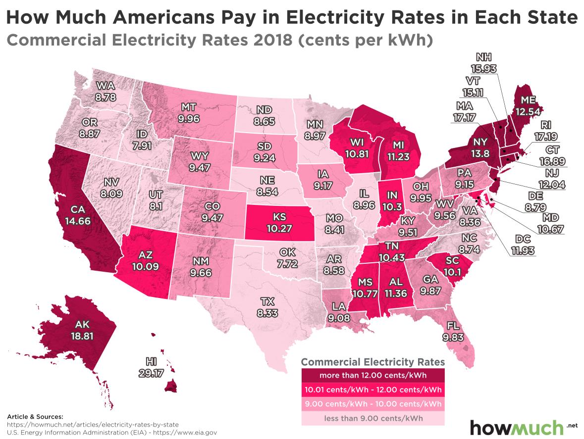
Our data comes from the U.S. Energy Information Administration. We created two heat maps, one for residential electricity (what you pay out-of-pocket at your house) and one for commercial electricity (what businesses pay). Energy utilities can charge different rates depending on the nature of their customers because some companies consume massive amounts of electricity. We turned these numbers into a heat map by state, where the shade corresponds to the price in cents per kilowatt hour (cents/kWh). The result is two snapshots of the American energy economy in easy-to-understand maps.

Top 5 States with the Most Expensive Residential Electricity Rates (cents/kWh)

1. Hawaii: 31.57

2. Massachusetts: 21.64

3. Alaska: 21.43

4. Rhode Island: 21.42

5. Connecticut: 20.77

Top 5 States with the Priciest Commercial Electricity Rates (cents/kWh)

1. Hawaii: 29.17

2. Alaska: 18.81

3. Rhode Island: 17.19

4. Massachusetts: 17.17

5. Connecticut: 16.89

Our maps reveal a few key similarities between the residential and commercial electrical markets. Let’s start by considering the Northeast, the region in which electricity is the most expensive. Both residential and business consumers pay above-average rates in states like Connecticut and New York because of the large population centers. In other words, our maps clearly illustrate how high levels of demand increase cost. The same can be said about California, where the combination of large cities and a strong environmental movement decrease the availability of things like coal-fired power plants. Alaska’s status as an expensive market makes a certain amount of sense, too—it costs a lot of money for any company to electrify the last frontier. Curiously, both maps highlight how Wisconsin and Michigan pay above average, too, owing perhaps to their location far away from natural gas and coal repositories.

Both maps are also in agreement at the opposite end of the spectrum. The cheapest markets tend to be in the deep South and other very rural states. The best prices for residential electricity are in Louisiana (9.05 cents/kWH) and the best rates for commercial electricity are in Oklahoma (7.72 cents/kWh). At a glance, there are light shades in both maps throughout the country’s midsection.

Finally, there are a few surprises beneath the surface as well. In general, consumers pay a higher rate for electricity than businesses (13.31 vs. 10.00 cents/kWh). Oddly enough, Tennessee and Louisiana are the only two states where consumers pay a better rate; every other state has a better price for commercial customers. Pennsylvania has the greatest disparity between the two rates—businesses pay 4.69 cents/kWh less than consumers, which comes out to a 33% discount.

The big takeaway from our maps is that even in a highly regulated market—including one in which the President intervenes to bail out major companies—the laws of supply and demand still determine price.

Data: Table 1.1

How Much do the World’s Highest-Paid Athletes Make?

$
0
0

The media pays a lot of attention to the gargantuan multi-year contracts that star athletes sign with different teams, but did you know that they usually make more money from sponsors than from the teams they play for? Our new visualization captures the different sources of income for the 25 most highly-compensated athletes over the last year.

We adapted a ranking from Forbes into a visualization—the vertical axis represents an athlete’s salary or winnings and the horizontal axis represents endorsement or sponsorship deals. The size of each bubble corresponds to total compensation, while the color indicates a particular sport. We also added each athlete’s photo for easy reference.

Top Ten Highest-Paid Athletes ($M)

1. Floyd Mayweather (Boxing): $285M

2. Lionel Messi (Soccer): $111M

3. Cristiano Ronaldo (Soccer): $108M

4. Conor McGregor (Mixed Martial Arts): $99M

5. Neymar (Soccer): $90M

6. LeBron James (Basketball): $85.5M

7. Roger Federer (Tennis): $77.2M

8. Stephen Curry (Basketball): $76.9M

9. Matt Ryan (Football): $67.3M

10. Matthew Stafford (Football): $59.5M

Our visualization looks different than the one we produced last year thanks in large part to Floyd Mayweather, who clearly stands out at the top of our rankings. That’s because he orchestrated a highly-anticipated boxing match and media circus with Conor McGregor, the 4th-ranked athlete on our list. Mayweather and McGregor are quite exceptional in the sense that their earnings appear to be unrepeatable (unless they have another match). Most of the other athletes in our visualization have multi-year contracts that pay tens of millions no matter what happens. All things being equal, that means they will remain on this list next year, too.

It’s easy to pick out the outliers in our visualization. Basketball has the highest number of athletes (6), but boxing clearly has the most money ($368.5M). Perhaps the most interesting fact about our visualization is what’s missing: baseball players. The original 100-athlete list from Forbes has 3 baseball players in the top 50, but none of them made it into the top 25. The comparably low compensation rates make us wonder why professional players of “America’s Pastime” don’t grumble more about their pay, considering their season consists of a whopping 162 games, compared with 82 in the NBA and a measly 16 in the NFL.

Our visualization reveals a key insight about the sports world: it is much easier to cash in on endorsement deals than normal player/athlete salaries. Look how the bubbles are spread out along the horizontal axis more so than along the vertical axis. This indicates that athletes get more money from sponsors than from actually playing their sports. Part of the reason why has to do with salary caps—for example, NBA teams are restricted in the amount of money they can offer LeBron James this summer. Things are different in tennis, but even still, Roger Federer gets paid a lot more for making sure that his tennis racket is made by Wilson than for what he accomplishes while swinging it.

Data: Table 1.1

The Explosive Growth of the ICO Market in One Visualization

$
0
0

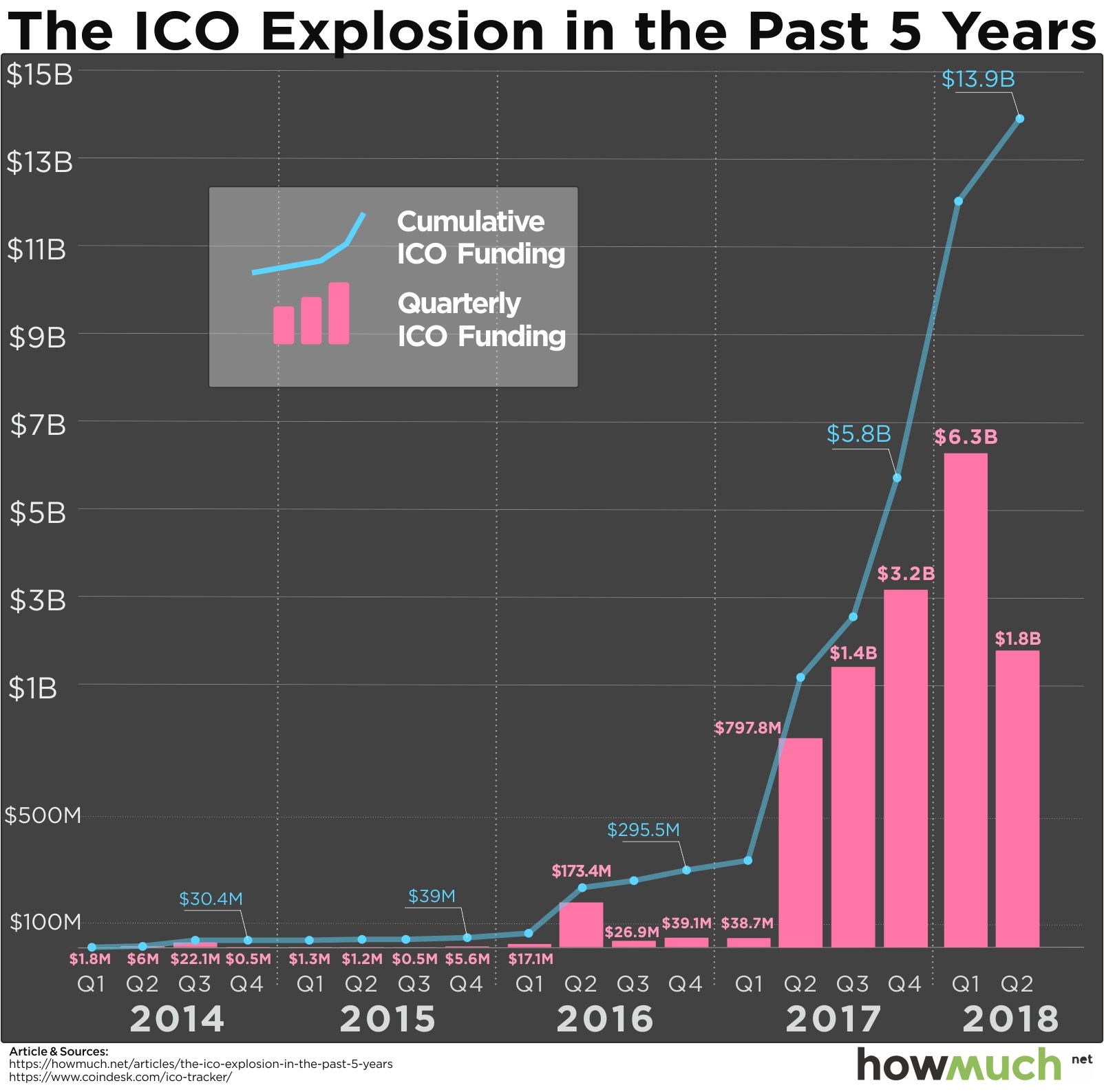
Should cryptocurrencies be understood as securities? Should the government regulate initial coin offerings (ICOs) similar to initial public offerings (IPOs)? The authorities are still figuring out exactly what they should do, and how they answer these questions is enormously important for the cryptocurrency community. Our new graph demonstrates the multi-billion-dollar growth of this five-year-old marketplace, revealing just how high the stakes are for the SEC.

We found the underlying data for our visualization over at Coindesk, a leader in reporting and tracking the cryptocurrency market. We created a bar for the value of ICOs in USD for each quarter of the past 5 years. We then added a blue line to represent cumulative funding for ICOs. This makes it easy to see just how much money is in play.

Top Ten Biggest ICO Offerings 

1. Telegram: $850M (2018)

2. Telegram: $850M (second round, 2018)

3. Dragon: $320M (2018)

4. Huobi: $300M (2018)

5. Filecoin: $262M (2017)

6. Tezos: $232M (2017)

7. Sirin Labs: $158M (2017)

8. Bancor: $153M (2017)

9. The DAO: $152M (2017)

10.   Bankera: $151M (2017)

With numbers this big, it’s easy to see why the SEC might want to get involved. Investopedia defines a security as a “fungible, negotiable financial instrument that holds some type of monetary value.” According to the SEC’s chief cryptocurrency official, William Hinman, bitcoin and ether do not qualify as securities because of their decentralization. There is no third party expecting to make a return. In other words, there’s no underlying ownership in a company or a brokerage generating the initial public offering.

That being said, Hinman chose his words carefully, saying: “Over time, there may be other sufficiently decentralized networks and systems where regulating the tokens or coins that function on them as securities may not be required." That means the SEC will determine whether a cryptocurrency counts as a security on a case-by-case basis, like Ripple.

There are a lot of good reasons for the SEC to evaluate cryptocurrencies one at a time. For one thing, our graph shows how the market is still exploding, even if it has slowed down a bit in Q2 for 2018. The continued interest in ICOs is one reason the SEC created a fake website, warning investors about suspicious ICOs. After all, a lot of ICOs are clearly scams with fake founders and plagiarized whitepapers. Remember the one with Floyd Mayweather’s endorsement but which was later found to be fraud? Some cryptocurrencies are less outrageous but should still raise the eyebrow of a discerning investor, like the currency invented by a bunch of Russians called bananacoin.

All of this goes to show the SEC may still have a valuable role to play in eliminating bad actors from the market. What do you think? Should the SEC get involved in regulating the crypto market? Send us an email and tell us your opinion at press@howmuch.net.

Data: Table 1.1

Visualizing the World's Biggest Importers in 2017

$
0
0

Imports are the lifeblood of a developed economy, they let consumers enjoy a wide range of products that they may otherwise be unable to find. Think about all the conveniences of modern life that usually come from other countries: avocados, French wine, clothing, iPhones—every room in your house probably has multiple imported items. Our new visualization reveals the size and complexity of the entire world’s import economy in one simple map.

Similar to our previous article on exports, we got our figures from the World Trade Organization (go to the Statistics Database to see the original data). The WTO tracks the total value of physical goods each country imports
(note that these numbers exclude services). To create our map we changed the size of the country depending on the value of imports and we added a shade of red for easy reference.

Top Ten Countries with the Most Imports in 2017 ($B)

1. United States of America: $2,409B

2. China: $1,842B

3. Germany: $1,167B

4. Japan: $672B

5. United Kingdom: $644B

6. France: $625B

7. Hong Kong: $590B

8. Netherlands: $574B

9. South Korea: $478B

10. Italy: $453B

There are a lot of similarities between the lists of largest exporting and importing countries. First and most obviously, if you compare the list of the ten most import-dependent countries and the list of the ten most export-dependent countries, you’d have the exact same ten countries. The order is different—China is the most export-heavy country in the world, but the U.S. is the most import-heavy. Otherwise the lists are the same, though, reinforcing how fundamental international trade has become to the global economy. Countries are extremely dependent on each other for mutual growth and prosperity.

The second and related similarity between importing and exporting countries is how unequal the lists are in terms of dollar amounts. The U.S. is in first place by a long shot, importing roughly 25% more than China ($2,409B vs. $1,842B). For its part, China far outpaces third place Germany ($1,167B), which is itself almost twice as big as Japan’s import market ($672B). And the top three import countries have a combined footprint of $5,418B compared to only $4,036B for the rest of the top 10. In fact, the top 10 countries as a group generate more than a trillion dollars of imports, more than the rest of the world combined. This imbalance is what makes our map look so interesting. Africa is practically nonexistent, Australia looks tiny, and South America could fit inside of Germany.

The markets  therefore have a lot to worry about when it comes to talk of a trade war. Tariffs and other trade barriers will not only hit the countries directly involved, but they will create ripple effects across the entire global economy. Our map demonstrates that these are multi-trillion dollar, high-stakes issues, so don’t be surprised if they become major concerns during the 2018 elections.

Data: Table 1.1

This Map Shows the Highest-Paying Companies in Every State

$
0
0

Everybody assumes that CEOs make the most money, but it turns out that getting into the C-Suite isn’t the only way to earn a giant paycheck. Publicly traded companies are now required to release pay figures for their average workers, and some are indeed paying big bucks to the Average Joe. Our new map breaks down the highest-paying companies by industry in every state.

Companies now have to disclose key data about employee compensation thanks to a new rule from the SEC. One of the organizations paying close attention to these disclosures is the AFL-CIO, where we found the data for our map. They’ve used the data to point out the discrepancy in the pay received by CEOs versus that received by “production and nonsupervisory workers,” but we wanted to take a look at where those in the latter group are also making out well. First, we identified the companies in each state that pay the highest salaries to their average workers. Then we color-coded our map by industry and overlaid the top company’s logo and its average worker’s salary for easy reference.

Top 10 Highest-Paying Companies 

1. New Jersey: NRG Yield, $964,005 (energy)

2. Nevada: VirnetX Holding Corp, $562,062 (technology)

3. California: Geron Corporation, $500,250 (health)

4. Massachusetts: Infinity Pharmaceuticals, $495,513 (health)

5. Virginia: Arlington Asset Investment Corp, $483,502 (financial)

6. Michigan: Esperion Therapeutics, $409,294 (health)

7. New York: Intra-Cellular Therapies, $354,916 (health)

8. Maryland: Chesapeake Lodging Trust, $347,750 (real estate)

9. Texas: Capstead Mortgage Corporation, $300,000 (real estate)

10. Utah: Lipocine, $299,612 (health)

Our approach to mapping the best companies for average compensation reveals several key insights about the American economy. For one, you can see which professions tend to pay the most in different parts of the country. For example, there are two obvious clusters of yellow states across the Northern Plains and the Deep South—these states have several energy companies with extremely high-paying salaries. The same can be said about health companies (like pharmaceutical and insurance companies) across the country’s mid-section.

Our map also highlights a few surprises. For instance, a bank is the highest paying employer in both Alaska and Montana, not an energy company as one might initially expect. And in California, a health company called Geron pays its average employees better than any of the Silicon Valley giants. But keep in mind there are significant differences between the companies on our map. At the high-end, NRG Yield average pay is $964k, and on the low-end, Union Bankshares from Vermont pays only $39,346. One reason for these discrepancies and surprises could be that, since it’s a new rule, companies are still releasing their figures; our data might change.

There are a few other important caveats to keep in mind when looking at our map. The underlying data only concern publicly traded companies headquartered in each state. For example, Alaska is certainly home to several highly-paid oil engineers, but they work for multinational companies headquartered elsewhere. Also bear in mind that not very many people work for these companies. On average, the top ten companies listed above only employ 21 people each (that data wasn’t available for NRG Yield). In other words, these are extraordinarily hard jobs to find. Nevertheless, if you see a job opening for one of these companies where you live, you might as well submit an application.

Data: Table 1.1 

Viewing all 687 articles
Browse latest View live