Quantcast
Channel: howmuch.net
Viewing all 687 articles
Browse latest View live

Visualizing the Wealthiest People in America & Their Generosity

$
0
0

Becoming a successful billionaire is the dream of many Americans. But often times people are more impressed by the charitable actions of billionaires, rather than by their success. This may be why Forbes included a new philanthropy score to its latest 400 billionaires list. Take a look at our chart below to see the wealthiest 30 Americans and their philanthropy score.

In the graphic above, the 30 wealthiest Americans are ranked from left to right. Each billionaire is represented by their name, the means by which they made their money, net worth and the new philanthropy score. The larger the billionaire’s net worth, the larger the green circle becomes. Philanthropy scores are measured on a scale of between 1 and 5, with 5 being the most philanthropic. If no charitable donations could be found, a philanthropic score of N.A. is applied. The data were collected from Forbes.

Top 10 Wealthiest American's & Philanthropy Score 

  • Jeff Bezos: $160 billion; 2

  • Bill Gates: $97 billion; 5

  • Warren Buffet: $88.3 billion; 5

  • Mark Zuckerberg: $61 billion; 5

  • Larry Ellison: $58.4 billion; 4

  • Larry Page: $53.8 billion; 4

  • Charles Koch: $53.5 billion; 4

  • David Koch: $53.5 billion; 4

  • Sergey Brin: $52.4 billion; 4

  • Michael Bloomberg: $51.8 billion; 5 

The new Forbes 400 list had an unsurprising change: Jeff Bezos - the founder, chairman and CEO of online retail giant Amazon – has supplanted Microsoft co-founder Bill Gates as the world’s richest man. According to Forbes, Bezos has added $78.5 billion to his net worth in the past year, giving him a total net worth of around $160 billion. Bezos has received a lot of attention in 2018 for his meteoric rise, but his philanthropy score of 2 is far from the highest. In fact, the next three richest billionaires – Bill Gates, Warren Buffet and Mark Zuckerberg – all have a philanthropy score of 5, the highest possible score.

According to Forbes, the way the philanthropy score was derived partially based on a billionaire’s involvement with the Giving Pledge. The movement was created by Bill and Melinda Gates and Warren Buffet, with more than 40 other billionaires joining soon thereafter, in which billionaires promise to give away half or more of their fortunes. Jeff Bezos is not part of the Giving Pledge, which may help to explain is relatively lower philanthropy score.

There appears to be a correlation between the net worth of an individual and how much they give away to charity. The higher a billionaire’s net worth, the more they give away, not just in absolute terms, but in percentage terms as well. The further you go down on the billionaire’s list, the more ‘N/A’ philanthropy scores you see, as well as generally lower philanthropy scores in general. Forbes mentioned that in order to get a philanthropy score of 5, a billionaire had to give away at least $1 billion and/or 20% of their net worth. By that measure, only 29 of America’s 400 richest met that standard. George Soros gave away more than any other at a total of $32 billion, or 79% of his wealth, given to charity.

Jeff Bezos may now be the richest man in the world, but he is far from the most charitable. Billionaire’s are known for their philanthropy, but when it comes to charity, not all billionaires are created equal. If you ever become a billionaire sometime in the future, remember to give away as much as you can to get your philanthropy score to 5!

A Visual Guide to State Taxes

$
0
0

The midterm elections are right around the corner, and President Trump just announced he wants to cut middle class taxes by 10 percent. It’s obvious people don’t like paying taxes, and letting workers keep more of their paychecks could be a ploy to boost GOP turnout ahead of a pivotal election. But state tax rates vary wildly across the country, and the media’s focus on Trump’s announcement ignores a more complicated reality of taxation. In fact, our maps indicate that lots of people in a high-tax burden state might not even notice an additional tax cut.

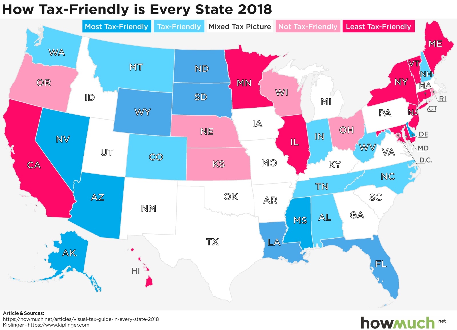
To see what we mean, let’s start by looking at which states are most and least friendly in terms of their cumulative tax burden.Kiplinger put together all the data supporting our maps, but we will also reference additional underlying sources where appropriate. Kiplinger’s analysis of “tax friendliness” considers a few different categories of taxation, including state taxes on income, property, sales and death. We won’t dive into Kiplinger’s detailed methodology, but they put each state into one of five categories, ranging from the most to least tax friendly. And just so we are clear, the least tax friendly states have the highest cumulative total tax burdens across all of Kiplinger’s categories.

There are in fact a few key patterns worth pointing out in this overall map. There is a cluster of states in the Northeast extending to the Upper Midwest with very unfriendly tax policies. Compare these states with the South, where there’s a concentration of very tax friendly governments (or states with at least a mixed tax picture). The West is also home to a lot of tax friendly locations, with the obvious exceptions of California and Oregon. We should also mention Alaska, where the state government actually pays out a dividend to its residents instead of taxing their income. This year the government paid $1,600 to every man, woman and child, making it perhaps the state with the best fiscal policies, that is, if you can stand the winters.

Let’s take a closer look at state income taxes, which vary wildly across the country. According to the Tax Foundation, 7 states have no income tax (the gray boxes): Alaska, Florida, Nevada, South Dakota, Texas, Washington, and Wyoming. New Hampshire and Tennessee also have no earned income tax, but they do tax interest and dividend income. 9 other states apply the exact same tax rates to all residents regardless of how much money they earn. But most states structure their income tax systems like the federal government, which is to say they have progressive tax systems. For example, the first $100,000 you make is taxed at a rate lower than $100,001 to $200,000, and so on. This should mean low income people pay a relatively lower tax rate compared to high income people. That’s why we used pink and green to illustrate the high- and low-end tax ranges, letting you easily get a sense for where a state falls.

Income taxes are only part of the picture. State governments must raise revenue in one way or another, and an obvious method to pad state coffers is by taxing consumption. Only 4 states don’t have any sales tax: Delaware, Montana, New Hampshire and Oregon. Note how all the states without income taxes have some form of sales tax, especially Washington with one of the highest rates in the country at 9.19%. Also consider the group of states in the South, which our first map highlighted as tax friendly, but these same places have some of the highest sales tax rates in the country. This suggests low tax rates on other items (like income, gas and inheritance) is compensated by taxing consumption.

One area of consumption that applies to almost everybody is the gasoline tax, which the American Petroleum Institute (API) tracks very closely. We created a heat map highlighting the range of tax levels, from under $0.20 per gallon across the South to over $0.50 in California and Pennsylvania. Remember, these figures are in addition to the federally mandated gasoline tax of $0.184 per gallon, which applies equally across the country. This means that Missouri, Alaska and Oklahoma are the only three states with levies below that of the federal government, and many states have levels more than twice as high. That’s because the federal government last raised the gasoline tax 25 years ago in 1993 and hasn’t touched it since.
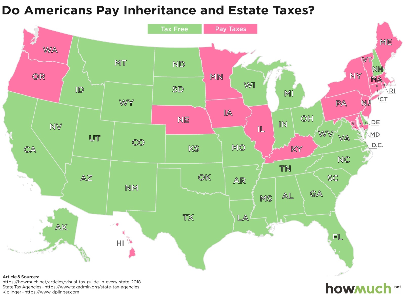
Some taxes are easier to avoid than others. If you don’t like paying a lot for your state’s gasoline tax, then purchase a more efficient vehicle. But what if you want to shield your estate from the death tax? Our map indicates the best strategy might be to simply move south or west. No state below Kentucky has an inheritance tax, and Washington and Oregon are the only two out West with some type of “death” tax. Keep in mind that most states only tax estates worth more than an established threshold, often a very high amount. For example, in Illinois an estate must be worth $4 million or more to qualify, and even then the government applies a progressive rate.

No matter which type, taxes are a big factor in determining the cost of living in one state over another. Check out our cost of living tool to learn more.

Data: Table 1.1

Visualizing $21 Trillion of National Debt: Which Presidents You Should Blame the Most

$
0
0

Ernest Hemingway once supposedly wrote, “How did you go bankrupt? Two ways. Gradually, then suddenly.”

Hemingway’s observation looks increasingly spot on when it comes to the U.S. national debt, which now stands at well over $21 trillion. A trillion dollars written out is $1,000,000,000,000. That’s 12 zeroes. How did we get here? Our visualization offers a unique perspective, breaking down the debt into the deficits each U.S. President has added throughout American history.

The U.S. Treasury tracks the historical data for U.S. government debt. Overall figures from before 1950 can be found here, and more specific numbers after 1950 can be found here. We should also give proper credit for pulling these disparate sources together to The Balance. We created a 3-D visualization showing the cumulative deficits each U.S. President has added to the national debt in history, where each block represents $3 billion in today’s dollars. All the Presidents from 1789 – 1913 are lumped together at the bottom, but as you move from the bottom up, you can see the color-coded contribution from each administration. The numbers for future increases to the debt under President Trump came come directly from the White House.

There are a few caveats to keep in mind when thinking about this visualization. First off, the numbers represent inflation-adjusted dollars to make a fair comparison over several years. Presidents also don’t have total control over the deficit. For example, the deficit during their first year in office is predetermined by their predecessor’s budget. Fiscal policies are also ultimately set by Congress even if the President submits a budget blueprint for consideration. And finally, deficits tend to grow during economic downturns and times of war and shrink during more prosperous and peaceful times. That’s why some economists prefer to look at deficits as a percentage of national GDP as opposed to overall terms. After all, a “large” deficit might not actually be very big if it’s tiny compared to the size of the economy.

With all that being said, there’s a lot that we can learn from our visualization. Let’s start by looking at the overall picture, namely, deficits only started growing substantially in the last 40 years of American history. Prior to the Reagan administration, the combined cumulative U.S. debt stood at only about $750 billion, which Reagan almost tripled over 8 years. None of his successors then slowed down, with George H.W. Bush adding $1.55 trillion in a single term, followed by Clinton at $1.4 trillion, Bush at $5.85 trillion, and Obama $8.59 trillion, all over 2 terms. Trump is meanwhile projected to add a total $4.78 trillion during his first term.

So the overall trajectory of the deficit is to keep getting bigger year after year. Reagan inherited a national debt of $750 billion, and Trump added almost $779 billion in fiscal 2018 alone. Yes, there are some periods of stabilization or even contraction, but in general, Presidents from both parties keep adding more and more to the national debt.

What does all this really mean? Is the country ever going dramatically change course? It’s hard to say, but the good news is that the U.S. government can still issue debt at historically favorable rates, with the 30-year treasury bill yielding only 3.24% right now. And measured against the size of the entire economy, the annual deficit is still less than 5% of GDP even if the total debt is now larger than 100% of GDP. Eventually something is going to have to change, but in the near term it looks like deficits really don’t matter. Remember what Hemingway said, “Gradually, then suddenly.”

Data: Table 1.1

Mapping Extreme Poverty Around the World

$
0
0

A new report from the World Bank just landed, finding that a record low of 10% of humanity now live in extreme poverty, down from 11% in 2013. But poverty rates aren’t anywhere close to equal between continents or even countries, as our new series of maps clearly demonstrates.

The World Bank provides an in-depth explanation for its methodology, which you can find in Appendix A of the full report here. We focused on the percentage of people in each country living below what the World Bank defines as extreme poverty, or $1.90/day. We’ll let the researchers defend this definition on their own, but there is one caveat to keep in mind. It can be extraordinarily difficult to collect reliable data from so many countries on a regular basis, and in fact we used the latest year in which numbers were available whenever possible. For example, in some of these maps we compare 2011 figures against 2015. In short, our maps provide the clearest possible apples-to-apples comparison for extremely poverty from around the world.

To start, there are several dark and light green countries scattered around the globe, from the United States down to Argentina and from Russia to Australia, there are lots of developed countries where very few people experience a subsistence standard of living. This is what people mean when they refer to the global North and South. To be fair, there are also several gaps in the available data in places like Saudi Arabia, Afghanistan, Poland and Greenland. But none of these countries would change the overall story, that developed countries are much wealthier than everyone else.

It’s clear that the one continent with the most extreme levels of poverty is Africa. There are only five countries on the entire landmass where less than 5% of the population lives in abject poverty, and in fact most places have levels well over 25%. The only group of green countries is clustered to the north along the Mediterranean, notably the ones closest to Europe and furthest from the heart of Africa. The Democratic Republic of Congo (77.1%) and Madagascar (77.6%) are at the epicenter of global extreme poverty. They are the 2 poorest countries on the planet, where it’s far more common to find someone living on less than $2/day than not.

There’s no better continent to illustrate the differences between the global North and South than Asia, but the 2 countries deserving special consideration here are China (0.7%) and India (21.2%). China has pursued an aggressive modernization effort under authoritarianism and one-party rule. By contrast, India is a democratic republic also undergoing a massive transformation. And according to PwC both countries will have economies larger than that of the United State by the year 2050. We’ll have to wait and see how the ongoing trade spat with President Trump changes these dynamics (or not).

South America also has an interesting story to tell. Keep in mind, the World Bank’s numbers are the latest available, which means 2015 or even 2011 for some countries. We mention this because the situation in Venezuela has rapidly deteriorated over the last few years with about 2 million people fleeing the country and inflation hitting 200,000%. Surinam (23.4%) and Honduras (16.0%) also stand out as pockets of deep poverty in the Western Hemisphere, and in fact many of the people in the caravan of migrants heading to the United States through Mexico originated from Honduras.

Skipping across the Pacific Ocean to Australia, we find a developed English-speaking country in Australia (0.5%) very close to countries in abject poverty like Papua New Guinea (38.0%) and Timor-Leste (30.3%). That being said, Australia generally has far friendlier immigration policies than other developed countries, so much so that one could say it has an “immigration economy.”

The winners in the global economy today are the same countries that colonized places life Africa and South America years ago. Indeed, the world looks decisively different in Western Europe, where only one country, Romania, has more than 5% of its population living in extreme poverty. Almost every country has fewer than 1% living in such a condition, and many report 0.0%. Social democracies with developed economies and rich in natural resources—there’s no wonder why so many immigrants want to move to the West.

And lastly, consider North America, where the rate of extreme poverty declines the further north one travels from Mexico (2.5%) to the United States (1.2%) and Canada (0.5%). There is actually an interesting comparison here, which is to say that the United States is proportionally home to more people subsisting on $1.90/day than China (0.7%). That being said, there are substantially more extremely wealthy people in the US than any other country in the world, not to mention the world’s largest economy at $19.4 trillion.

Data: Table 1.1 
 

Find Out Which City is Adding the Most Jobs in Your State

$
0
0

The years of the jobless recovery are long gone as the national unemployment rate now sits below 4%, and some cities are seeing extremely high rates of job growth coupled with strong wage gains. But is this situation sustainable? As Isaac Newton might say, “What goes up must come down.”

We analyzed changes in employment figures between 2013 and 2018 from the 381 metropolitan areas defined by the U.S. Census Bureau. We started by mapping a vertical spike indicating the relative percentage of job growth change in the best city from each state. Then we outlined the geographic region of each metro area, color-coding each one according to a sliding scale of median household income from under $50k to over $65k. The result is an intuitive map showing the best places for job seekers combined with how much money a household might expect to make.

These are the top ten job markets in terms of employment change from 2013 to 2018, together with the median household income for each metro area.

1. Lake Charles, LA: 28.3% and $52,314

2. Bend-Redmond, OR: 26.6% and $66,273

3. Elkhart, IN: 24.0% and $58,960

4. St. George, UT: 23.4% and $54,842

5. Greeley, CO: 21.1% and $68,884

6. Gainesville, GA: 20.9% and $61,977

7. Fayetteville, AR: 20% and $56,038

8. Boise City, ID: 18.6% and $55,324

9. Austin, TX: 18.4% and $73,800

10. Reno, NV: 18.0% and $61,360

We can learn a lot about the American economy and the job market by looking at our map. The broader context is that unemployment is at its lowest rate since 1969 even if wage growth hasn’t necessarily spiked. That means the places on our map are truly remarkable job markets at the center of the recovery, perhaps because they were hardest hit by the recession. Consider Elkhart, IN for example, an area that’s seen tremendous job growth of 24.0% but where wage growth is still less than $60k. The town is known for being the “RV Capital of the World” because it has several major RV manufacturers and suppliers. That means blue collar work with low wages. Workers just can’t compete for significantly higher earnings because manufactures can just move jobs overseas, something President Trump is looking to improve.

There are other places seeing substantial gains in employment thanks to a thriving and well diversified economy. Consider Austin, Charlottesville and Nashville. These cities have a reputation as fun destinations with music and tech scenes. They are mid-sized cities with universities, hospitals, and large well-known employers. These are the ingredients for long-term economic growth and positive employment numbers, as our map clearly indicates.

Another story hiding in this map of thriving job markets is the number of places seeing substand growth. Two places actually saw negative job growth from 2013 – 2018, Cheyenne, WY and Anchorage, AK. The people in Burlington, VT meanwhile only saw 0.8% growth, and even in New York City the change was just +5.3%. These are the best metro areas for job growth during a time when the unemployment rate fell across the nation from 7.2% down to 3.7%, a rate that many observers believe indicates full employment. The results are disappointing to say the least.

There is therefore significant diversity across the cities on our map. Some places are factory towns with unsustainable growth rates. Others are truly remarkable places to live with thriving, growth-oriented economies, and still others are barely seeing any benefits from the economic recovery.

Data: Table 1.1

America’s Middle Class is Vanishing. Nearly Half of Workers Earn Less than $30,000

$
0
0

The U.S. economy is booming. Republicans think President Trump deserves much of the credit for cutting business and individual tax rates combined with a deregulation agenda. And Democrats believe former President Obama rightfully deserves ownership for America’s recovery. Regardless of who gets credit, our newest visualization of net compensation levels for American workers demonstrates that the economy is indeed delivering, but not for as many people as the headlines would have you believe.

The Social Security Administration (SSA) tracks net income numbers after taxes through the Average Wage Index (AWI). We broke the AWI into a three-part hierarchy of $5K increments, letting you easily see the reality of income inequality in the U.S.. Astonishingly, 13% of workers make less than $5K, and nearly half, or 48%, take home $31,561 or less in net compensation (the dark red on our visual). If your mind isn’t spinning yet, consider the fact that these numbers are all after a multi-year economic recovery. The U.S. is allegedly at or near full employment but wages are barely growing, meaning these numbers are probably the best case scenario. Imagine what a recession would do to worker paychecks.

There is one important caveat to keep in mind when thinking about our dataset. The SSA numbers include any wage earners whatsoever, even part-time workers like students and teenagers. If the worker reports his or her income to the IRS on a W2 form, he or she is included in these stats. This drags down the aggregate wage numbers for full-time working adults, which reach $61,372 for households last year.

All that being said, the picture is still depressing. 1.4% of workers make between $250K - 50M, and another 8.2% bring home between $100K - 250K. Remember, these numbers reflect individual earners, meaning they don’t take into account household earnings. We mention this only because wealthy people tend to get married at higher rates than poor people. In other words, wage earners at the top of the income ladder are probably much wealthier than even these numbers would suggest since their spouses are generally highly educated and well-compensated too.

Our visualization makes it plain to see that most people take home very little money from their jobs. The federal poverty level for a family of 4 is $25,100, which officials believe is the bare minimum needed to purchase subsistence food, clothing and shelter. To put this another way, our visualization indicates that enormous chunks of the workforce make a substandard wage, putting them at extreme risks if unpredictable financial problems occur.

Want to learn more about the true cost of living in your city? Check out our dynamic tool.

Data: Table 1.1 

Visualizing the Relationship Between Corruption and Economic Growth Around the World

$
0
0

How should we think about corruption as it relates to economic growth? Some people argue that corruption helps to “grease the wheels” of an economy, overcoming bureaucratic obstacles to getting things done. Others see corruption as an inherent problem for economic growth because it increases the cost of doing business. We’ll let you decide for yourself, but we combined a unique corruption index with GDP figures to provide an interesting viewpoint.

We combined two datasets for our visualization. First, we took the corruption perceptions index (2017) from Transparency International to rank 180 countries from around the world. The index scores countries from 0 to 100 based on survey responses from experts and businesspeople on their perceptions of corruption. Then we used GDP figures from the World Bank to represent the size of each country’s economy. This approach lets you easily and quickly see the relationship between large economies and corruption levels.

To begin, compare the extremes at the top and bottom of our visualization. Highly corrupt countries scoring 20 and below, like Iraq ($198B), Angola ($124B) and Sudan ($117B) also have tiny economies, whereas Germany ($3.68T), the U.K. ($2.62T) and Canada ($1.65T) are counted as some of the biggest in the world. To make a general statement, developed countries also tend to have lower levels of corruption, but not always. The obvious exception to the rule is China, where an enormous economy worth $12.24T exists next to endemic corruption. Perhaps part of the reason has to do with the sheer size of China’s population, combined with its focus on manufacturing in “special economic zones.” We might just as well call that smart corruption.

Our visual also contains some uncomfortable surprises for Western democracies. Corruption in Italy for instance is comparable to Saudi Arabia, South Africa and Malaysia. A key strategic partner for the US and a member of NATO, Turkey, ranks as one of the most corrupt countries with an economy over $800B. Mention should also be made of Mexico, one of the most corrupt countries in the world with an economy valued at $1.15T. Perhaps President Trump’s new trade agreement, the U.S.M.C.A. or more commonly called a revised NAFTA, will help address some of these problems.


The broader issue at stake behind these numbers is the distinction between true corruption and legitimate activities. Some people might look at the ever-increasing amount of money spent on lobbying in the U.S. as a form of corruption. Is it?

Data: Table 1.1 

Visualizing the Huge Disparities Between People's Wealth Around the World

$
0
0

Comparing wealth inequality numbers across several countries can be very tricky. Countries have different methodologies for calculating wealth. The cost of living varies dramatically within and between countries, plus there are all sorts of gaps in any dataset that incorporates information from Albania to Zimbabwe.

The Credit Suisse Research Institute has a highly respected approach in its Global Wealth Report. Credit Suisse defines “net worth” as the market value of all assets minus any outstanding debts. Researchers calculated average wealth numbers by for adults estimated to be living in each country. We took the figures (Table 2-1 in the report) and mapped them onto a heat map of the world. It’s important to note that average numbers like these can obscure crushing levels of poverty even in what appear to be wealthy countries, however they still provide an interesting snapshot of the wealthiest and richest countries in the world.

Looking at the average net worth across the entire world indicates the enormous disparity between the developed world and everyone else. At one extreme, there are countries with net worth numbers over $500,000, and at the other extreme, there are places where people have less than $500 to their names. There is a smattering or light orange countries in between, but the worldwide map demonstrates an astonishing level of inequality between the have’s and the have-not’s.

The story in North America is one of stark inequality. Northern countries like Greenland, Canada and the United States boast extremely high average figures. It’s no surprise that Americans are by far the wealthiest with $404K, but take a look at Mexico ($20.6K) and even the Bahamas ($47.8K). This means that the US is 10 times richer than the Bahamas and an eye-popping 20 times wealthier than Mexico.

South America on the other hand reports some rather depressing numbers. Chile has the highest average in the region at $62.2K, followed by the Cayman Islands and French Guiana (both at $55.3K). However, the average across all of Latin America is a tiny $24.4K. Haiti, one of the poorest places in the entire world, only has $2.5K per adult. That’s why immigration usually happens from the South to the North.

Europe is the most fascinating continent in our series of maps for a few reasons. There’s an obvious contrast between East and West running right down the middle of the region. Germany ($214.9K), the Czech Republic ($61.5K) and Austria ($231.4K) fall into the upper (green) tiers on our map, but right next door, countries like Poland ($31.8K), Slovakia ($34.8) and Hungary ($37.6K) remain far behind. And the further east you travel, the poorer the country. Ukraine ($1.6K) and Belarus ($1.5K) are both worse off than even the poorest countries in the entire Western Hemisphere. There’s another trend worth pointing out hiding behind our color-coded map, and that’s the difference in wealth between northern and southern European countries. In general, the further north and west, the wealthier the country.

The situation in Africa is simply depressing. Our map highlights the soul-crushing extreme levels of poverty found in places like Burundi ($321), Ethiopia ($167) and Malawi ($141). To put these numbers in perspective, the United States is well over 1,000 times wealthier on an average individual basis. There is one pocket of relative prosperity worth pointing out in Libya ($61.7K), but not even this is good enough to break the top 50 wealthiest countries in the world.

Our snapshot of wealth in Asia similarly provides an interesting view of the global economy. Take note of the line of relative poverty stretching from Syria in the west all the way to Vietnam on the Pacific Ocean. Now look at all the green countries, like Japan ($227.2K), South Korea ($171.7K) and Taiwan ($212.4K). Together with Singapore, Hong Kong, the UAE and Israel, these countries are all firmly aligned with American foreign policy and Western institutions. The wealth of these nations stands in contrast to adversaries like Russia ($20K) and China ($47.8K).

And finally, the picture of wealth in Oceania provides a nice bookend to our worldwide tour. Australia ($411.1K) and New Zealand ($289.8K) both stand out at the top of the pack, but some islands like French Polynesia, Palau and New Caledonia aren’t so far behind either ($203.9K each). Part of the explanation why is no doubt the robust and longstanding high-end tourism industries in these countries, which provide relatively strong individual wealth numbers.
Want to learn more about global poverty and inequality? Check out our other recent article on extreme poverty rates around the world.

Data: Table 1.1 


Visualizing Financial Literacy Rates Around the World

$
0
0

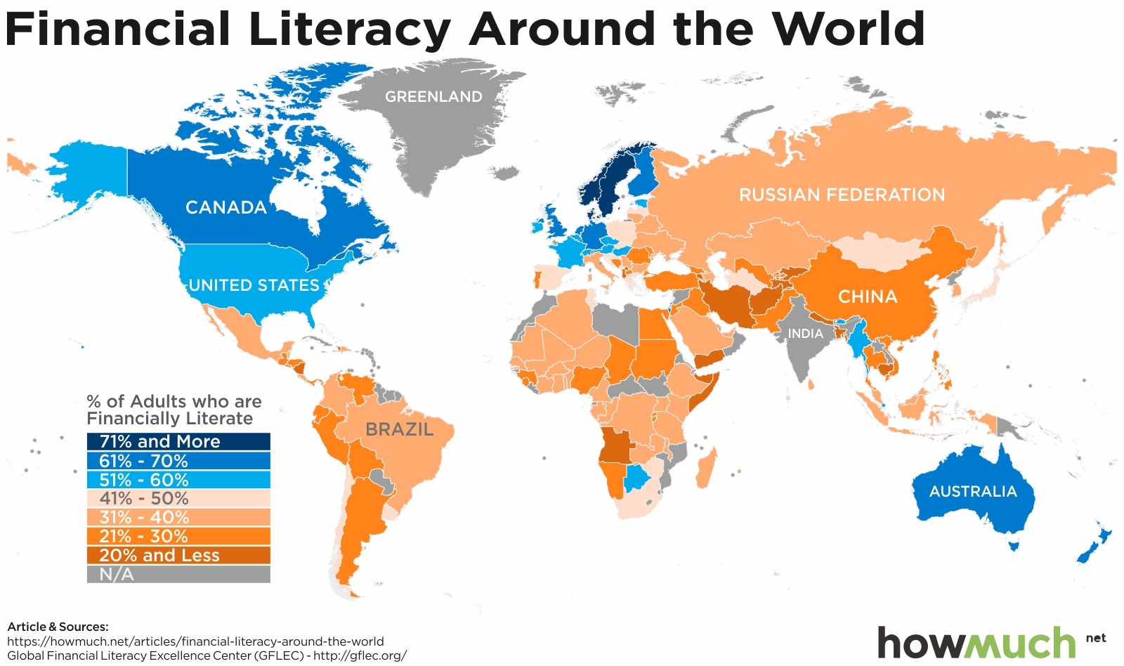
What is financial literacy? The S&P’s Global Financial Literacy Survey defines it as the ability to understand essential financial concepts in making informed decisions about saving, investing and borrowing. The survey asked respondents a series of financial literacy questions. Here’s one example. Suppose you have some money. Is it safer to put your money into one business or investment, or to put your money into multiple businesses or investments? The answer is obvious to anyone familiar with risk diversification.

Top 10 Most Financially Literate Countries (%)

1. Denmark: 71%

2. Norway: 71%

3. Sweden: 71%

4. Canada: 68%

5. Israel: 68%

6. United Kingdom: 67%

7. Germany: 66%

8. Netherlands: 66%

9. Australia: 64%

10. Finland: 63%

At the highest level, financial literacy around the world appears strongest in countries with developed and advanced economies, especially Western Europe and English-speaking countries. There are no countries in South America where more than 50% of people are financially literate, and only one country in all of Africa.

Here’s a thought-provoking exercise. Compare this map to the one we recently created for extreme poverty around the world. There doesn’t seem to be a clear correlation between poverty and financial literacy. After all, there are many places with very few extremely poor people, like Russia and China, and yet these same places also have extremely low financial literacy rates. That means poor people aren’t necessarily financially illiterate, and neither are rich people.

The obvious conclusion to draw from our map of North America is that financial literacy improves the further north one travels. Mexico’s 32% compares favorably to countries further south, but it stands in stark contrast to the US (57%) and Canada (68%). Researchers weren’t able to collect data from Greenland.

In a word, financial literacy rates in South America are depressing. Uruguay and Chile post the best rates at 45% and 41%, respectively, but most places fall between 21%-30%. There are no doubt lots of historical explanations for this disparity, but Nicaragua (20%) stands out as particularly troubling. It has the lowest score in all of Central and South America excluding the Caribbean, and it’s indicative of the desperate situation in that country.

But there’s no other place in the world with such wide-ranging differences in financial literacy as Europe. The continent is anchored by a group of high scoring countries in Scandinavia, most notably Norway and Sweden (both scoring 71%). In fact, northwestern European countries appear to perform the best on the Financial Literacy Survey, and the further south one looks, the worse the situation. Portugal manages a paulty 26%, the worst in all of Western Europe. The Eastern Bloc, meanwhile, has some obvious and staggering problems, with no country east or south of Hungary scoring over 50%.
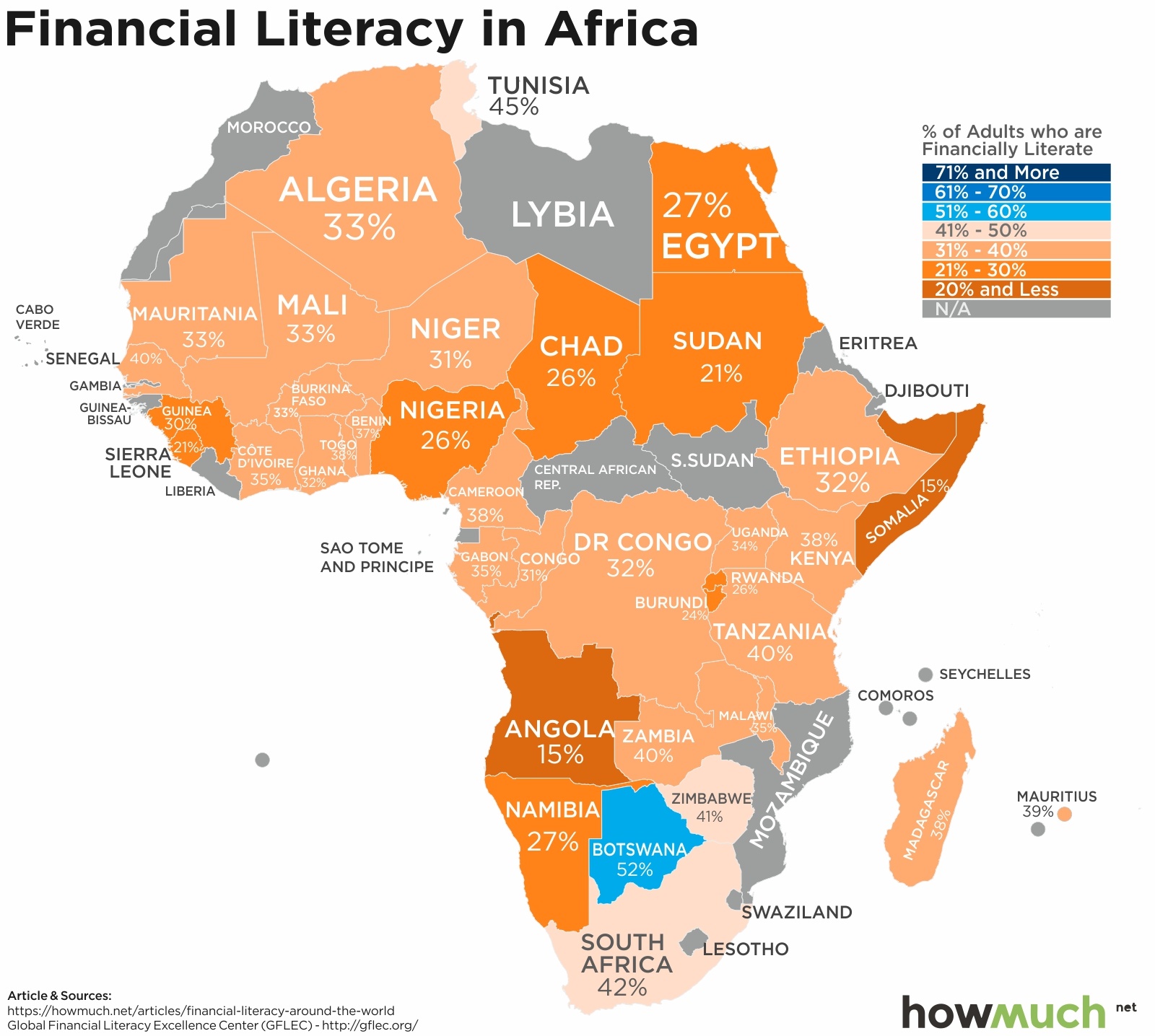
Like on so many other measures of economic progress and development, Africa scores the worst of all the continents. Only one country, Botswana, breaks the 50% barrier, with more places falling in the 31%-40% range. The worst country for financial literacy on the entire continent is Somalia, at 15%. The situation in Western Africa isn’t much better, where Sierra Leone is at 21%.

The situations in Asia and the Middle East are comparable to Africa. Yemen (13%) and Afghanistan (14%) are at the rock bottom of the worldwide rankings, but they aren’t the only places in the teens. From Kyrgyzstan (19%) to Nepal (18%), Bangladesh (19%) and Cambodia (18%), there are several countries with horrible results. China scored a surprising 28% given it’s the second largest economy in the world. The most interesting standout countries in our opinion, however, are Myanmar and Bhutan, where a relatively impressive 50%+ of the population counts as financially literate. These rates are immediately next to some of the worst scores on the planet, proving that local factors can make a big difference.

And finally, there’s really no surprise in Oceania. Australia (64%) beats out New Zealand (61%) for the top spot, but otherwise the Financial Literacy Survey wasn’t able to collect robust data from any other country in the region.

Data: Table 1.1

Find Out Which States Have the Most Expensive Car Insurance Rates in 2018

$
0
0

There’s a lot that goes into determining how much you pay for car insurance. Your age, gender, marital status, driving record and perhaps most importantly your home address are all major factors. This makes it difficult to compare prices between car insurance companies without going through the hassle of obtaining very specific quotes. That’s why we crunched the numbers for you and created our newest map.

The data behind our map come from Insure.com, which provides lots of information on different insurance products, including health, life and auto insurance. They worked with Quadrant Information Services to calculate car insurance rates for a 40-year old man seeking full coverage from 6 different major carriers. They tabulated the price quoted in 10 zip codes for every state, looking for the average of a 2018 model-year version of America’s 20 best-selling vehicles. We mapped the average annual premium as a heat map, letting you easily and quickly see at a glance the states and regions with the best (and worst) rates.

Top 10 Most Expensive States for Buying Auto Insurance

1. Michigan: $2,239

2. Louisiana: $2,126

3. Florida: $2,050

4. Rhode Island: $1,852

5. Connecticut: $1,831

6. Washington, DC: $1,827

7. California: $1,731

8. Georgia: $1,668

9. Delaware: $1,600

10. Texas: $1,589

The good news? There are a few clusters of states with relatively cheap rates for insurance. Across the Northeast, Vermont ranks among the cheapest in the entire country at just $932. There’s also a smattering of states across the Midwest with affordable numbers, stretching from Pennsylvania ($1,130) all the way to Nebraska ($1,214). Oregon ($1,250), Idaho ($989) and Utah ($1,131) also appear to be favorable markets for motorists.

Moving up the pricing scale, there are 19 states shaded yellow, indicating a medium-to-high price range for car insurance. One of the most interesting states in this group is New York, where average rates include prices for New York City as well as rural upstate areas. Presumably insurance rates within the metro area are significantly higher than $1,361.

There are also 9 states at the high end of the spectrum, which we define as $1,600 or more, or about $133 a month. A number of explanations readily come to mind for why insurance is so expensive in these states. Insurance is regulated at the state level. For example, Michigan is the most expensive in the country at $2,239, well over $1,000 more than neighboring Ohio. Part of the explanation for why has to do with state-mandated no-fault insurance policies. This lets people claim insurance proceeds from a company regardless of who is at fault for the accident, and according to the Insurance Information Institute, Florida and Michigan are two states with no-fault conditions that make it easier to get money from car insurance companies.

It’s no surprise to see California topping the charts as one of the most heavily populated and well-trafficked states in the country. Los Angeles is literally the worst city in America in terms of congestion. The group of pink and red states from Louisiana ($2,126) to Georgia ($1,668) and Florida ($2,050) also makes a lot of sense. They each have large metro areas that suffer damage from hurricanes. Mississippi ($1,410) and Alabama ($1,235) simply don’t have any huge cities. Connecticut ($1,831) and Rhode Island ($1,852) are similarly near the top of the chart as wealthy exurbs of New York City, not to mention the fact that winters in the Northeast can be particularly harsh for drivers.

Insurance companies pay very close attention to location when setting their rates. Moving to a new neighborhood even within the same zip code can justify a rate increase. Check out our cost of living tool to learn more.

Data: Table 1.1 
 

All the World’s Billionaires in a Single Map

$
0
0

If you added up all the money of every billionaire in the world, you’d have about $8.9 trillion in wealth as of 2017. That represents the greatest total growth in wealth among billionaires ever. That’s according to a new report from UBS and PWC analyzing the uber wealthy. Where do these people live, how big are their fortunes, and what does it tell us about the global economy?

Every bubble on our map represents a billionaire, and the size corresponds to the fortunes for every billionaire living in that country. And the size of each country represents the grand total wealth of every billionaire living there. And finally, we color-coded each region, giving you a quick visual snapshot of the world’s most elite individuals.

The United States clearly dominates both in terms of the overall number of billionaires and the total value of their wealth. The US is home to several titans of technology, including household names like Jeff Bezos, Bill Gates and Larry Ellison. It’s important to remember that almost all of these luminaries hold their wealth in the stock market, usually tied directly to the company they founded. Mark Zuckerberg is so loaded that he lost $15 billion on a single day last summer. That’s a drop in the bucket when you compare it to the 585 billionaires in the US who control well over $3 trillion in wealth.

Asia-Pacific is not far behind in challenging the United States as an engine for astonishing levels of wealth. China alone accounts for 373 individuals boasting $1,120B in total value. Compare that to Japan, where according to the World Bank, the economy is about a third the size of China’s. But Japan has only about 10% as many billionaires (35 vs 373). Hong Kong’s billionaires have more total wealth than Japan’s despite its smaller size ($335B vs $138B).

Western Europe is also home to lots of extremely wealthy billionaires, though not as many as Asia or North America. Germany leads the pack with 123 individuals controlling $579B, followed by France with 40 people owning $320B. 101 Russian billionaires meanwhile have a claim to $409B in wealth, though it’s worth pointing out that many Russian oligarchs made their money in highly questionable ways after the fall of the Soviet Union. That’s one of the reasons why Russia has one the most corrupt large economies in the world.

And finally, one of the most interesting questions our map raises is why there aren’t more people in the billionaire club from the Middle East and North Africa. There’s certainly enough wealth in the oil industry to make at least several people fabulously wealthy, but perhaps part of the reason why we don’t see more people here is due to state-owned companies.

Learn more about who the wealthiest people are in the world, where they live, and how they got their money.

Data: Table 1.1 

What’s the Average Cost of Utilities Where You Live?

$
0
0

If you are trying to save money, take a look at your electrical usage. That’s the message from a new report detailing average utility costs across five different categories for every state across the country.

Researchers at move.org crunched the numbers for five essential utilities. They looked to the U.S. Energy Information Administration (EIA) to determine average electrical consumption per U.S. resident. They also used EIA’s figures for average natural gas usage, which is 168 cubic feet per day. They relied on Numbeo to calculate average figures for both Internet and cable bills, assuming 60 Mbps with unlimited data. And finally, they looked to the U.S. Environmental Protection Agency (EPA) to estimate the average daily water usage of 300 gallons per day for a family.

This methodology gives us a true apples-to-apples comparison of utility costs across states. And instead of creating a simple heat map comparing total prices, we broke each state into a diagram illustrating how much each one costs, letting you easily see which states and which utilities drive the highest monthly expenditures.

States with the Highest Total Cost for Utilities

1. Hawaii: $730.86

2. Alaska: $527.96

3. Rhode Island: $521.98

4. Connecticut: $496.07

5. New York: $477.31

6. New Hampshire: $477.02

7. South Carolina: $473.78

8. Massachusetts: $469.13

9. Vermont: $468.3

10. Maine: $464.45

At its most basic level, our visualization demonstrates where utilities are very expensive (or relatively cheap). There’s an obvious large block of color in the Northeast representing a cluster of states with above-average prices. Hawaii and Alaska both stand out toward the bottom left of the map as well. The most budget-friendly states stretch across the Midwest and West. Idaho takes first place as the cheapest state overall at just $344 per month. California is also relatively expensive but not necessarily budget-shattering at $438.

One way to think about these figures is to compare it with population density. Utilities cost more where there is higher demand, like the Northeast. Hawaii and Alaska stand alone as unique situations given their geographic distance from the mainland. And as we might expect, prices are substantially lower in sparsely populated regions, like the West.

But the real value of our visualization is how it ranks each category. Electricity is the most expensive for every state in the Northeast, but natural gas takes first place across the South. And here’s the interesting thing. There appears to be a ceiling on the cost of natural gas, but not electricity. In some states like California, New Jersey and Massachusetts, electricity makes up a whopping 40% of the overall outlay for utilities. Compare that to states like South Carolina and Georgia, where natural gas sits at about 32% of the total. To put it simply, electrical rates are the primary driver pushing up overall utility costs. If you want to save money, odds are you should look for high-efficiency light bulbs and appliances.

Data: Table 1.1

Visualizing Where Obamacare Rates Are Exploding

$
0
0

Open enrollment for health insurance plans under the Affordable Care Act, also called Obamacare, will last until December 15, 2018. Unless you get insurance through your employer, you might be in for a surprise.

We crunched some numbers from a report by the Urban Institute, a nonprofit research organization dedicated to injecting facts into the public discourse. If you aren’t familiar with Obamacare, the first thing you should know is that health insurance plans fall into different tiers based on your total out-of-pocket expense for healthcare. Bronze plans are generally the cheapest because they provide minimal coverage, and at the other end of the spectrum, platinum plans provide rock-solid coverage but for a high price. Silver and gold plans fall between these two extremes. They offer a decent level of protection without such a comparably high cost. Our analysis focuses on monthly premiums for the lowest cost silver and gold plans for a 40-year-old healthy male.

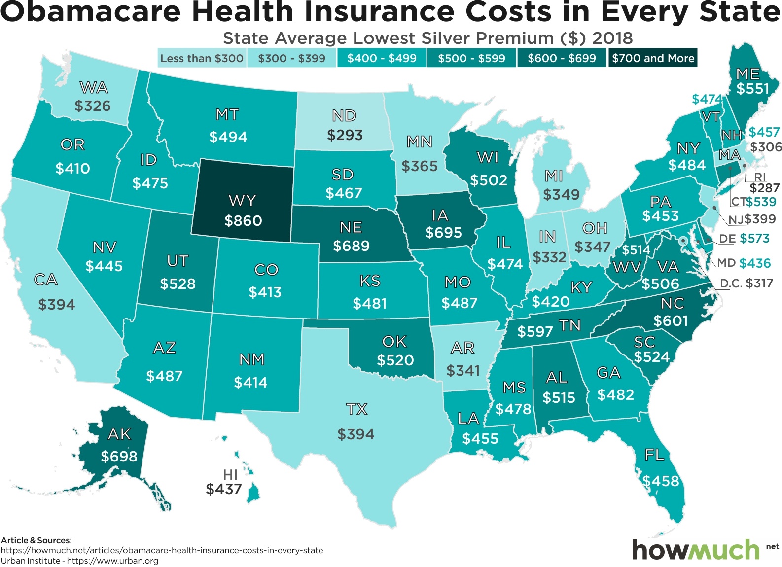
The cost of basic health insurance in the U.S. is indeed extremely expensive. Keep in mind these are all monthly figures, meaning some people are spending well over $6,000 just on insurance premiums. But here’s the kicker. State governments play a large role in subsidizing the markets (or not), leading to wide-ranging price disparities between comparable states in the same region. Consider for example Wyoming ($860), by far the most expensive state in the West. Moving directly south to Colorado and purchasing the same type of policy would save you $5,364 each year. Rhode Island takes first place as the most affordable state at only $287, but most states fall into the $400-$500 range.

Overall the marketplace for silver insurance plans looks very uneven. There isn’t really a clear pattern, suggesting that specific prices depend almost entirely on specific state regulations and subsidies.

Prices for gold plans appear similarly scattered and geographically dependent. Some states have significantly higher costs compared to their silver plans, like Tennessee ($910), the most expensive in the country. And yet Rhode Island remains one of the cheapest marketplaces at only $300, an increase of just $13 from silver.

We should point out that some silver plans actually cost more than gold plans for a few states, like Wyoming ($860 for silver vs $710 for gold). There are some complicated reasons why, but part of the explanation has to do with how the government provides preferential tax subsidies to silver plans. Insurers want to raise those rates to increase subsidies. President Trump also ended a provision related to cost sharing reductions, which drove up rates for silver plans.

We’ll end by pointing out an insight from behavioral economics called price framing. If you were initially shocked to see how expensive health insurance costs in every state, our guess is that you think states like Rhode Island ($287) and North Dakota ($293) aren’t so pricey after all. That’s because we are comparing their rates with much more expensive states, making them seem like a better bargain. In reality, according to the Kaiser Foundation, the average cost for a worker participating in an employer-sponsored plan is only $118 a month, or $1,415 per year. That’s a significantly lower cost and a powerful incentive for sticking with an employer.

Data: Table 1.1

See How Much More Expensive Childcare Is than Getting a Higher Education

$
0
0

Unemployment in the U.S. is now hovering around its lowest point in almost half a century, and pretty much anyone who wants a job right now can get one. But here’s one segment of the workforce that may not be experiencing the benefits of growth: new parents. In fact, childcare is so expensive that in many states around the country it costs more than getting a college education.

A new report from Child Aware of America compares the average annual center-based childcare costs for infants across the U.S. with the average annual tuition and fees at public universities. Child Aware of America is a nationwide nonprofit focused on reducing the costs associated with children’s learning in childcare. They relied on their own survey results from January 2018 to calculate childcare costs, and they tapped the College Board Trends in College Pricing for tuition numbers from 2017. We placed these figures on a map to visualize the differences by region, letting you see in a straightforward way the states and regions with the biggest problems in affordability.

Here’s a stunning fact. Dropping your kid off at daycare costs more in 28 states than getting a college education (data was not captured in Montana and South Dakota). The problem is most readily apparent across the Northeast and West Coast. In fact, the state with the highest disparity is Massachusetts, where childcare costs an astonishing $7,683 more on average each year than higher education. California is not far behind with an average difference $6,862. It’s even more expensive in Washington, DC where new parents can expect to spend $23,666 on childcare but only $8,060 on tuition for a public university.

The numbers don’t look as bad across the middle section of the country. College is slightly more expensive than childcare in states like Illinois ($147) and Oklahoma ($88). And the most favorable numbers are clustered around the South in states like Mississippi ($2,681), Arkansas ($1,827) and Louisiana ($1,762).

But even in states where childcare costs less than college, there really isn’t any good news. In truth, these numbers reflect a two-part crisis in affordability. New parents struggle to pay for high-quality childcare just like they face problems for high-quality public education. Keep in mind many parents opt for private childcare that they pay for on their own. The same qualification applies to higher education, where private tuition costs are often much higher than what’s available at a public school. That’s why the IRS provides for several tax-advantaged savings accounts, including the Dependent Care FSA and the 529 Plan. It’s also related to President’s Trump proposal for 6-weeks paid parental leave. And in fact the prohibitive costs associated with childcare are a major reason why some parents decide to stay home with their newborns as opposed to returning to work. And high costs are also a major reason why young people take out massive loans to pay for college, or skip it altogether.

All of this suggests that if you want to start a family and eventually send your kids to college, it’s never too early to start saving.

Data: Table 1.1

Visualizing the Most Innovative Companies in 2018

$
0
0

"Move fast and break things. Unless you are breaking stuff, you are not moving fast enough." So said Mark Zuckerberg, back when Facebook was still growing rapidly and not engulfed in so many public problems. Zuckerberg meant that innovation is messy, and as it turns out, expensive.

PwC’s 2018 Global Innovation Study analyzed the top 1,000 companies spending the most on research and development (R&D). We broke out the rankings by industry for the top 50, letting you easily see the leaders in each category both in overall terms ($B) and R&D intensity (% of total revenue). This approach creates a dynamic view into several different industries and companies, revealing the ones leaning hard into innovation and disruption.

First, a couple caveats. Companies had to publicly disclose their expenditures to be included in the ranking. PwC excluded any subsidiaries with financials included in a parent company. For example, Google’s expenditures roll up to its parent company, Alphabet. Taken altogether, the rankings comprise an astonishing 40% of all the world’s R&D spending for 2018, which includes government R&D.

Top 10 Companies that Spend the Most on R&D 

1. Amazon.com (United States): $22.62B

2. Alphabet Inc. (United States): $16.23B

3. Volkswagen (Germany): $15.78B

4. Samsung Electronics (South Korea): $15.31B

5. Intel (United States): $13.10B

6. Microsoft (United States): $12.29B

7. Apple (United States): $11.58B

8. Roche Holding AG (Switzerland): $10.80B

9. Johnson & Johnson (United States): $10.55B

10. Merck & Co. (United States): $10.20B

Amazon is by far and away the leader of the pack with over $22.6B in total expenses. To be fair, we classified Amazon as a retailer, although it should properly be understood as a conglomerate. Much of its R&D budget no doubt goes to things like natural language processing (Alexa), web hosting services and logistics. Even still, Amazon easily surpasses the outlay of Alphabet, which is famous for its “moonshot” innovation projects.

Our visualization also hints at underlying corporate strategies. Take technology hardware and equipment as an example. Samsung ($15.3B) and Apple ($11.6B) are both investing heavily in R&D, but both companies are so successful that these huge figures only represent 5 to 10% of their overall revenue. They have enormous balance sheets. Nokia ($5.9B) is spending substantially less overall on R&D but not when expressed as a percentage of its total revenue (21%). Clearly Nokia is betting the farm, so to speak, on its ability to innovate and stay in business.

Yet another way to look at our visual is to compare different industries against each other. Software and services companies clearly spend substantial percentages of their revenue on R&D, with only IBM allocating less than 10%. That’s similar to the pharmaceuticals industry, where every single company on our visual is well over 10%. In fact, if we ranked the top companies by their R&D intensity, 4 out of the top 5 would be in pharmaceuticals. There’s an obvious and strong linkage between discovering new drugs and staying competitive.

Compare these industries with the auto manufactures, capital goods companies, diversified financials and consumer durables. Not a single company in our visual from these categories allocates more than 10% of its revenue. Granted, their R&D budgets are still enormous by any reasonable standard, but only because most of these companies are gigantic multinationals.

Are these companies safe from disruption? Or should they be spending billions more on R&D? We’d only point out that GE stock is trading below $8 a share. Sears is in a fight for its life. And big companies tend to decline with old age.

Data: Table 1.1 


Visualizing the Aftermath of the Real Estate Bubble (2007-17)

$
0
0

The economy is at full employment, the stock market is doing fine, and memories of the Great Recession are finally starting to fade.

Unfortunately, not everyone is feeling the love of a growing economy, and nowhere is that more apparent than in the housing market. As it turns out, according to the U.S. Census Bureau’s American Community Survey for both 2007 and 2017, lots of states have barely recovered from the housing crash. In fact, the housing market is still below its 2007 figures in several locations around the country.

Our visualization provides a useful way to quickly see a snapshot of the housing market before-and-after the Great Recession. The first image from 2007 shows median home values in a heat map. The second image displays prices as of 2017, plus the percentage change in value from 10 years prior. Housing prices declined almost everywhere across the country in 2008 and 2009. Our GIF therefore highlights the places that have seen prices surge in recent years as well as the states that are still recovering from the crash.

Before the housing bubble burst, the most affordable housing market was sandwiched in the middle of the country between the expensive West and East Coasts. Stretching from North Dakota ($106,800) down to Texas ($120,900), housing prices were relatively cheap. California was the most expensive state on the mainland where the typical house cost an eye-popping $532,300. Another cluster of pricey states can be found in the Northeast around New York. The Upper Midwest around the Great Lakes region was somewhere between these two extremes.

In total, median house prices are now higher in 41 states plus Washington, DC than they were in 2007. But a closer look at the map reveals how underwhelming housing prices are. 22 states have seen values climb by 20% or less over the course of 10 years. Granted, prices have not only recovered but surged to double-digit increases in a few locations. North Dakota (+82.3%), Colorado (+49.2%) and Texas (+42.4%) have posted massive gains. The boom in domestic shale fracking largely explains the growth in North Dakota. The same can be said about Colorado and Texas, plus the fact that lots of young people are moving to cities like Denver and Austin.

But the housing market doesn’t look so positive everywhere, especially in those states that have yet to recover. Nevada is a case in point, where median home values are still 17.1% lower than their pre-recession levels. Las Vegas clearly doesn’t hold the same appeal for millennials starting their careers or baby boomer relocating for retirement. Other states like Rhode Island (-12.0%), Connecticut (-11.7%) and New Jersey (-10.0%) similarly remain below their pre-Recession levels.

The Great Recession revealed that housing prices don’t always go up year after year. With the Fed raising interest rates and growth starting to slow around the world, what will this same map show in 2027? There’s no telling what the market will look like after a housing correction, much less years into the future.

Data: Table 1.1 

How Much Longer Until the U.S. Debt Bubble Bursts?

$
0
0

The American government is fast approaching the $22 Trillion mark in national debt. That’s about 137% of our entire GDP, one of the highest rates of indebtedness in the entire world.

If the government seems addicted to adding to the national balance sheet, then Americans have a similar obsession for personal debt. The Federal Reserve Bank of New York’s Center for Microeconomic Data recently found that household debt has risen for 16 straight quarters. What does that look like today?

Our visualization paints a detailed picture of what’s really going on underneath the surface of alarming headlines about debt. There are different categories of personal debt, like mortgages, student loans, and home equity loans. Some of these are healthy for economic growth. Having a mortgage is good if it lets you build equity. Student loans represent an investment in yourself and usually bring about higher future earning potential. Car loans are likewise necessary because most people can’t afford to buy a vehicle outright.

Here’s the problem. Even if carrying certain kinds of personal debt at reasonable levels is a good financial decision, lots of Americans are in way over their heads. Demand is soaring for subprime mortgages, which caused the housing crash 10 years ago. More than 44 million people carry a student loan and 10.7% default on their repayments every year. GM’s decision to cut 14,000 jobs is rooted in the fact that Americans prefer large SUVs and trucks to more efficient and affordable sedans. The average new vehicle now costs an astonishing $36,000, and delinquency rates are ever increasing.

And that’s just for the so-called “good” forms of personal debt. Credit card and home equity debt are both universally considered unhealthy because they fuel unsustainable levels of consumption in exchange for punitive interest rates. Good debt, like mortgages, usually don’t cost very much. Home loans are about 4.5% to 5.0% right now if you have good credit. But credit card rates start at 13.99% at the low end. And what about that $0.4T “other” bubble sitting at the right of the visual? That includes things like payday and car title loans. Only the companies actually offering these products think they’re good for the economy.

Debt isn’t an essential part of life. There are really only two ways to pay it off. You either have to increase your income, or cut things from your budget. Either way, paying off debt requires the discipline to devote the extra cash toward a long-term goal. And if past is prologue, Americans won’t be able to look to their leaders for inspiration.

Data: Table 1.1 

Top 50 Places to Live in the United States in 2018

$
0
0

There are lots of ways to compare cities against each other.

To name only a few, you could look at average income, expenses, housing prices, crime rates, the quality of schools, traffic, proximity to professional sports teams, weather, politics, job security and racial diversity. The list goes on and on. With so many different factors to consider, a simple list just isn’t enough information. We decided to cut through the noise using one of the most popular rankings around: Money’s top 50 best places to live in the U.S.

Money combed through hundreds of cities and focused on three main categories: earning potential, the cost of living and quality of life. Researchers focused on racially diverse places with reasonable crime rates and more than 50,000 people. They ranked each city across a variety of different factors, including the weather, high school graduation rates, the length of an average worker’s commute and the ratio of income to home prices.

We wanted to create a simpler visual breaking down the main categories that people care most about, so we concentrated only on median family income, home prices and projected job growth (2017-2022). The resulting visualization lets you quickly compare different locations depending on what matters most to you.

The first piece to consider is the relative size of an average worker’s paycheck. 30 out of the 50 cities boast median family income levels over $100,000, led by Bethesda, MD at $179,478. To keep that in perspective, median household income across the country sits just under $76,000. Places like Bethesda and Brookline are actually suburbs of much larger metro areas, notably New York City, Boston and Washington, DC. In other words, a key ingredient to high wages is proximity to a competitive job market with lots of employers.

But income is only one factor to consider when comparing cities. Home prices provide another critical angle because housing costs are typically the single biggest expense in any family’s budget, and a high salary might not go very far if your mortgage is outrageously expensive. Unfortunately, median home prices for the cities on our list are quite expensive. Brookline, MA tops the charts at an eye-popping $996,550, or about 7 times the median family income for that area. At the opposite end of the spectrum, Rock Hill, SC has the most affordable housing market on our list at just $175,000, roughly 3 times median income. This suggests that workers stand a much better chance totally paying off their mortgages in cities outside the Northeast

In fact, many of the places with the highest median incomes also have the lowest projected job growth. The top 10 highest median incomes have a combined projected job growth rate of 6.5%, compared with the bottom 10 at 8.0%. After all, why would employers dramatically expand payrolls in already crowded markets with workers expecting high salaries?

All of which goes to say that there are lots of factors that go into ranking cities, and in turn, determining the best place to spend one’s career. If you’re interested in relocating for a job, there’s a lot more to think about than just your baseline salary. Consider a variety of different factors instead, and use our cost of living calculator to paint a complete picture.

Data: Table 1.1 

This Chart Shows Which States Produce the Most Wind Energy

$
0
0

There are lots of problems with wind power.

Wind turbines are ugly and loud. They kill lots of birds. They only produce electricity if the wind is blowing, obviously. Plus, they’re expensive, relying on lots of government subsidies to get up and running. Combined with the fact that green energy is associated with left wing politics, it’s surprising to find out that states like deep red Texas and Oklahoma lead the country in wind power capacity.

We gathered our data from the American Wind Energy Association, a national trade association advocating for public policies friendly to the wind power industry. We used turbines in place of a bar chart to indicate how much electrical capacity each state generates. We then color-coded each turbine to highlight the number of homes the industry can power, combined with the total investment each state has made in the industry as of 2018. This approach gives you a quick snapshot of wind energy investments around the country.

Wind is a tricky thing to harness for electrical power, but there appears to be a correlation between the amount invested and total power returned. For instance, Indiana forked over some $4.5B to the wind industry and created in 2,117 MW of power. Texas put forward $42B and received 23,262 MW for the money, or about 10 times as much as Indiana. That being said, there are clearly some start-up costs associated with wind turbines. Unless a state is willing to spend or subsidize at least several billions of dollars, it won’t ever see substantial levels of power generation. Delaware, Connecticut and New Jersey have a long way to go.

At first glance, it also appears that the sheer amount of electrical capacity is directly related to the number of homes able to subsist on that power. After all, it makes intuitive sense that states generating the most power can supply more homes. But look at North Dakota, which only has 2,996 MW of installed capacity supplying some 1M+ homes. How can that be?

Part of the answer is that there is another dynamic hiding beneath the surface of our visualization. It’s critical to bear in mind differences between rural and urban states when looking at a chart like this. For example, Iowa and Kansas both have comparable wind capacity to California, but California is the most populous state in the country by far, with just under 40 million people. Iowa (30th most populated) and Kansas (35th) are several orders of magnitude smaller, not to mention Oklahoma (28th), which by this measure is truly the nation’s leader in green energy. If California invested in wind energy at the same rate as Kansas, it’d have some 10 times more electrical capacity.

Data: Table 1

How Much Money Americans Need for Economic Security in Every State

$
0
0

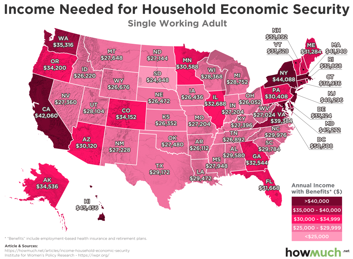
1 out of 3 adults in the U.S. is economically insecure, meaning they don’t have the resources to provide for housing, food, transportation and childcare.

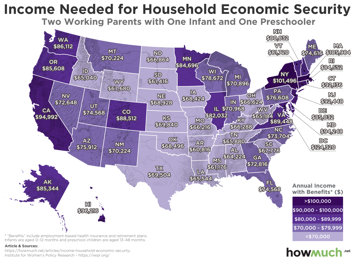
That is according to a new report from the Institute for Women’s Policy Research (IWPR), an advocacy organization designed to promote research benefiting women and their families. We adapted data from the IWPR’s most recent report on economic security for single adults and two working adults with two small children two create two heat maps. The results indicate which states and regions are the hardest places for working Americans to get by, and how having children can put economic security increasingly out of reach.

Financial security is obviously much easier to achieve for single working adults than anyone else. There is literally only one mouth to feed. But that doesn’t mean that economic security is attainable for everyone across the country. There’s a clear cluster of states around the Northeast led by New York, where an adult would need at least $44,088 to get by. The situation across the Midwest is comparably much more manageable with only a couple in the middle band of expensive states. South Dakota is boasts the lowest threshold in the country at only $24,648.

Going to the other extreme, California ($42,060) stands out on the West Coast. Hawaii takes the cake as the most expensive state in the Union ($45,456), not counting Washington, DC ($50,508). In other words, if someone working in Washington, DC were to move to South Dakota but keep the same job, he or she would earn double the amount needed for minimal economic security.

The situation is a bit more complicated for two working parents with one infant and a preschooler. The Northeast remains prohibitively expensive with young parents in New York needing to earn an astonishing $101,496 just for economic security. The threshold for Washington, DC meanwhile jumps to $124,320. It’s the same story on the West Coast too, where working Californians with two children need to make $94,992.

But here’s the real story. Economic security becomes much harder to obtain in several other surprising states too, like Minnesota ($84,696), Colorado ($88,512) and even Montana ($70,224). In many of these places, economic security requires more than 3 times as much income for two parents with children as it does for single adults. If you get married and start having children, you better hope you also start getting huge raises at work too.

Another way to think about these maps is to understand them as proxies for the true cost of living around the country. Check out our interactive tool to learn more.

Data: Table 1.1


Viewing all 687 articles
Browse latest View live