Quantcast
Channel: howmuch.net
Viewing all 687 articles
Browse latest View live

The Highest Paying Jobs with the Most Growth Potential in 2018

$
0
0

The American economy is finally humming along at a nice clip, and most people are optimistic about the future. Some people are just not starting to see real wage growth, but not everyone. With so much disparity in economic outcomes, it got us thinking about the best jobs in the country.

We gathered information about the best jobs from U.S. News, including the average total compensation for each profession and the projected growth rate over the next decade. U.S News explored a variety of different factors as well, like the stress level and work-life balance associated with each line of work. We wanted to make things simpler. Each figure on our viz represents a profession, the size of which corresponds to the compensation level—the bigger the figure, the more money one can expect to earn. We then color-coded each figure based on future job prospects. Blue figures represent professions with under 10% in total growth, but dark green represents those professions with high growth potential, over 20%. We also arranged the figures in a pyramid, making the winning professions even more obvious. Our viz quickly reveals the best bets for finding a highly paid job in the future.

First off, the majority of the positions on the top half of the pyramid are from the medical profession. Anesthesiologists have the best prospects in terms of overall compensation, netting on average $269,600 each year with a projected growth rate of 17.8% in the available jobs. In fact, every job in the top three levels of the pyramid involve medical school of one kind or another, and they are universally expected to see strong job creation of higher than 10%. In short, going to medical school is still a solid path to earn a good living.

Things get more crowded further down the pyramid. The actuarial sciences are expected to see the strongest overall increase in demand, with 22.5% job growth in the coming years. That suggests actuaries are in for a pay raise as demand for their services outstrips the supply of labor. That being said, actuaries make on average $100,610 per year, not half as much as an anesthesiologist. $100k is nothing to sneeze at, but it’s not the type of work that quickly leads to riches. Political scientists are projected to see the slowest increase in demand, growing only 2.1% in total over the next ten years. Perhaps part of the reason is that political observers have been unable to foresee many of the major political events over the past few years, including President Trump’s election.

Top 10 Highest Paying Jobs with the Most Growth

1. Anesthesiologist: $269,600 and 17.8%

2. Surgeon: $252,910 and 16.8%

3. Obstetrician and gynecologist: $234,310 and 17.9%

4. Oral and maxillofacial surgeon: $232,870 and 17.2%

5. Orthodontist: $228,780 and 17.3%

6. Physician: $201,840 and 14.9%

7. Psychiatrist: $194,740 and 13.1%

8. Pediatrician: $168,990 and 17.8%

9. Nurse anesthetist: $160,270 and 16%

10.   Dentist: $159,770 and 17.2%

There are two things to keep in mind about all this data. First, high overall job growth doesn’t matter that much if the profession is small to begin with. For instance, oral and maxillofacial surgeons pull in $232,870 each year, and the profession is expected to grow 17.2% in a decade. But that’s only 1,200 total jobs. Good luck trying to get one! Second, there’s no telling how technology is going to disrupt various industries, including medicine. Do doctors really need so much training when big data can recommend tailored treatment plans specific to each patient’s individual situation? Innovative technologies might render all these projections moot. But that’s the best we can do for now, and for many people, the promise of $250K per year with strong job prospects is more than enough to make medical school an attractive option.

Data: Table 1.1 


Visualizing The Meteoric Rise Of Cryptocurrency in the Past 5 Years

$
0
0

The cryptocurrency’s meteoric rise has stunned the world and defied traditional laws of market behavior. After years of being labelled as an “experiment,” “bubble,” and “fade,” the cryptocurrency market continues to remain overall resilient in the face of incredible uncertainty. The crypto movement has gained such a vast amount of steam in such a short period of time that a visual is needed in order to truly appreciate the dramatic changes.

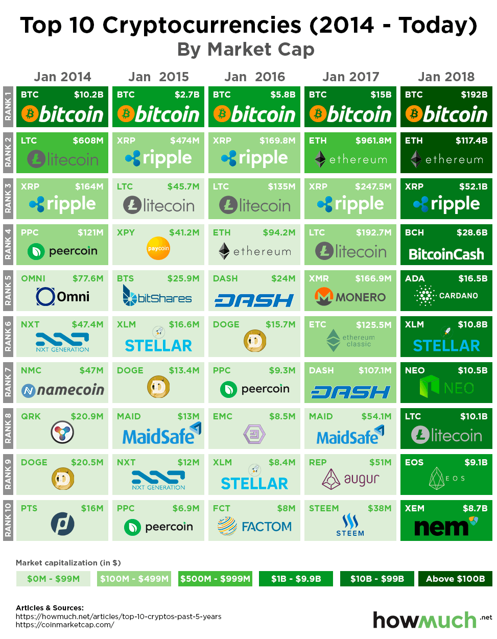
In order to showcase the growth in the overall cryptocurrency, we chose to create a visual showing how the top ten cryptocurrencies by market cap have changed over the past five years. Using January as the benchmark, we found the top ten cryptocurrencies by market cap between the years of 2014 and 2018 from CoinMarketCap.com. In order to more clearly depict the market cap growth during the time period, we used a green color scale ranging from light to dark shade. The darker the green background on each square, the larger the market capitalization. Conversely, lighter shades represent smaller market caps.

Bitcoin Still Top Dog, But Market Cap Dominance In Downtrend

The “grandfather of cryptocurrency,” Bitcoin, has single-handed brought the crypto market to where it is today. Without Bitcoin, there would be no cryptocurrency market. However, the “grandfather” is getting old as other altcoins continue to see massive growth and influence within the emerging industry. In January 2014, Bitcoin’s market cap was $10.20 billion, which represented 89% of the total market cap of all cryptocurrencies. As of January 2018, Bitcoin’s market cap has skyrocketed to $192 billion, but now only represents 33.40% of the overall cryptocurrency industry’s market cap.

As cryptocurrencies were continuing to ride out the final stages of its first bull market in January 2014, only four coins were valued above $100 million dollars. By 2015, the market saw a steep crash, which resulted in only two cryptos above the $100 million mark in the top ten. The market reloaded in 2016 before leading to the start of the current bull run. In January 2017, the crypto market saw a record seven coins above the $100 million mark, but only Bitcoin was still in the billions club. After cryptos began going mainstream in late 2017, a face-melting rally began which propelled all top ten of the largest cryptocurrencies into the billion-dollar market cap club.

Here is a breakdown visual, based on the total size of market cap of the top ten cryptocurrencies between January 2014 and January 2018:

- January 2014: $11,356,979,703

- January 2015: $3,403,948,945

- January 2016: $6,283,781,652

- January 2017: $16,985,815,798

- January 2018: $455,573,149,014

Overall, the total market cap of the top ten cryptocurrencies has risen from $11.36 billion to $455.57 billion between January 2014 and January 2018. This translates to an increase of $444.22 billion or 190.27% over the five-year period. Interestingly enough, the top three largest cryptocurrencies in January 2014 would be the only three to consistently make the top ten list each year: Bitcoin, Litecoin and Ripple. Ethereum busted onto the top ten scene by January 2016, and has surprised the entire community with its massive rise to be undisputed second largest cryptocurrency by market cap for the second year running. Overall, each year brings new revelations and insight into the state of the cryptocurrency market.

Data: Table 1.1 

Every State Medicaid Spending, in One Map

$
0
0

Now that tax reform has passed and Americans are about to see higher paychecks, Republicans in Congress are starting to talk about making changes to social welfare programs, specifically Medicare and Medicaid. There’s a lot of confusion and misinformation about these programs, depending on which side of the political aisle you sit. We decided to simplify things and crunched the numbers to create this map of Medicaid expenditures by state.

We got the data directly from the Medicaid and CHIP Payment Access Commission (MACPAC). We adjusted the size of each state according to the relative size of its Medicaid expenses, color-coding each one (dark red for over $50B, dark blue for under $1B). Our map quickly demonstrates where the highest- and lowest-spending states are across the country.

Let’s back up for one second. Medicare and Medicaid are two programs that sound similar, but they work differently. Medicare works like Social Security—it covers anyone over 65 regardless of income. Medicaid, on the other hand, specifically provides health coverage to vulnerable people, like the poor. The federal government pays about half the cost of Medicaid depending on the state. Obamacare encouraged states to expand Medicaid by footing most of the bill. But 19 states didn’t go along, meaning state governments fund Medicare at different levels, which creates wide disparities in the program around the country.

How wide? Several red states immediately jump off the map. There are two main groups: a band stretching along the South from California to Texas and Florida, and a second cluster in the Northeast extending as far West as Illinois. Population size explains most of these numbers, but not all of them. For example, the five largest states by population are California, Texas, Florida, New York and Pennsylvania. These are the top-five Medicaid-spending states too, but in a slightly different order (see the list below). But the 8th biggest in the country, Georgia ($10.28), falls to the 17th place in terms of Medicaid expenditures. We suspect state politics probably play a role in keeping things relatively inexpensive.

The map also has two groups of low expenditure states. The first, concentrated primarily in the Deep South, has many states spending between $5B and $10B on an annual basis. The exceptions are places with several large cities, like Texas ($41.07B) and Florida ($22.46B). Another obvious trend is a massive gap running across the middle of the country, from North Dakota ($1.3B) down to New Mexico ($5.54B). These states appear small on our map because they spend so little money on Medicaid, typically not more than a few billion dollars.

It’s worth pausing for just a second to consider how vastly different Medicaid expenditures are between California ($88.69B) and Wyoming ($637M). No, that isn’t a typo. California spends more on Medicaid than the bottom 25 states in the Union combined. That single budget item is bigger than the entire GDP of Bolivia ($83.5B).

Top 10 States with the Highest Medicaid Expenditures ($ mln)

1. California, $88,694

2. New York, $62,910

3. Texas, $41,068

4. Pennsylvania, $28,220

5. Florida, $22,459

6. Ohio, $22,388

7. Illinois, $20,171

8. Massachusetts, $17,865

9. Michigan, $17,439

10. New Jersey, $15,080

Top 10 States with the Lowest Medicaid Expenditures ($ mln)

1. Wyoming, $637

2. South Dakota, $875

3. North Dakota, $1,303

4. Montana, $1,446

5. Vermont, $1,768

6. Idaho, $1,795

7. Alaska, $1,929

8. Delaware, $2,003

9. New Hampshire, $2,077

10. Nebraska, $2,093

The most important takeaway from all this information is that Medicaid has 50 different implementations, depending on the state. It might be a massive part of the budget, or it could be a minor allocation worth only several hundred million dollars.

Data: Table 1.1 

Mapping the World's Most Valuable Brands in 2018

$
0
0

The most valuable companies in the world often have an immediately recognizable brand with a clear message. But the market value of a company’s brand is only half the picture. The brand’s relative strength compared both to its competitors and to companies in other industries is often much more indicative of the company’s future prospect. So we combined both measurements to map the most valuable brands in each country combined with a brand strength index score from Brand Finance.

We got our numbers from the good folks at Brand Finance, who gave us a sneak peak at their 2018 list of the Global 500 most valuable brands in the world. They calculate the market value for the brand names of the most popular companies in the world, which includes the hard dollar value of a company’s assets as well as its trademarks, patents, and what accountants call “goodwill.” Then, Brand Finance scores the overall the strength of a company’s brand based on how it is perceived by customers, employees and other stakeholders. We created our map by adjusting the size of each country according to the market value of its most valuable brand, and we color-coded each country based on its strength.

We did this same type of analysis last year. It’s interesting to flip between 2017 and 2018 versions of the map because it quickly demonstrates how the economy has changed in the past year. Amazon surpassed Google to become the most valuable company in the United States at $150.8B, thanks in large part to the acquisition of Whole Foods. And before Google, the most valuable American brand was Apple—meaning the top spot has changed 3 years in a row. Perhaps Amazon shouldn’t get too comfortable, unless they get those Prime Air drones to take off soon.

Europe also has several highly valuable and strong brands, including Mercedes-Benz ($43.9B) from Germany and Shell ($39.4) in the Netherlands. The strongest brand on our map is Lego at 90.6, although the brand itself is worth comparatively less ($7.6B). They clearly have the market for plastic building brick toys cornered.

China has the second strongest brand in the world in the Industrial and Commercial Bank of China (ICBC) at 90.3, a multinational banking company with a huge portfolio. ICBC puts China in elite territory with a very high market value ($59.2B). Another bank based in Russia, Sberbank, also cracks that 90-point threshold, coming in at 90.1 with a respectable market value of $11.6B. ICBC and Sberbank are both controlled by their respective governments, which makes Lego’s accomplishment all the more impressive.

That brings up a larger point. Our map has a wide variety of different companies on it, but they generally fall into three categories: consumer brands, legacy manufacturers, and banks. There just isn’t the same dominance in other industries like insurance, health care or even brick and mortar stores.

Top 10 Countries with the Most Valuable Brands in the World

1. United States: Amazon at $150.8B and 79.7

2. South Korea: Samsung at $92.3B and 89.5

3. China: ICBC at $59.2B and 90.3

4. Germany: Mercedes-Benz at $43.9B and 79.7

5. Japan: Toyota at $43.7B and 82.9

6. Netherlands: Shell at $39.4B and 80.6

7. Sweden: IKEA at $24.4B and 79.1

8. France: Orange at $22.2B and 82.7

9. United Kingdom: BP at $19.6B and 75.2

10. Switzerland: Nestlé at $19.4B and 83.4

The main take away from our analysis is that a brand’s value and strength are not necessarily correlated. Sure, Amazon’s market dominance contributes to its brand, but the strongest brand (Lego) doesn’t even break the top ten in value. In fact, three countries in the top ten have brands with scores in the 70s, which suggests that the list will only keep changing next year.

Data: Table 1.1 

Suburbs Really are the Best Places to Live in America

$
0
0

Algorithms help us make almost every decision—they can even decide court cases and predict legislation—but is it possible to objectively calculate the best places to live? The answer depends on which factors are included and how the different metrics are weighted against each other. Luckily, MONEY has already done the hard work in creating the data behind our new map.

MONEY incorporates more than 170,000 data points into its ranking, such low crime rates, the quality of education systems, and public amenities. In short, they conduct a robust analysis. We wanted to simplify things, so we focused only on median household income (which corresponds to the size of the dot on the map) and future job prospects (which relates to the color of the dot). Mapping the data in this manner creates an easy snapshot of the most desirable places to live in the country.                                                              

Let’s look at the data one step at a time. There are eight cities where the median household income cracks $100K (see the list below). Paradise Valley, AZ tops the list with an incredible median income of $138,192. Second place is a full $10,000 lower in Mercer Island, WA, where the typical family brings home $128,484. Lower Merion, PA takes third place with a respectable median income of $117,438, a full $11,000 lower than Mercer Island. There’s not as much separation from one place to another further down the list.

Median household income is a good metric for understanding how well-off communities are right now, but projected job growth serves as a leading indicator for how the economy will change in the future. Taking a look at only job growth reveals a very different list, with St. Augustine, FL leading the pack at an incredible 18.2% projected growth. We hasten to add the median income is only $47,748, but that will only increase if labor remains in high demand. Allen, TX comes in second place with projected growth topping 17% and median income at $104,524. That’s more than twice as much as St. Augustine. These numbers indicate the labor market is going crazy in certain parts of the country.

Ideally, the best place to live would have both a high median income and strong projected job growth. In other words, looking at our map, the best place would be a large green dot—Allen, TX. As a matter of fact, there’s a clear cluster of green dots stretching from Allen to Fishers, IN, indicating a buoyant economy in certain parts of the mid-South. The Northeast meanwhile continues to boast some of the highest median incomes but comparatively little in the way of robust job growth.

If we have to pick one and only one metric for a ranking, median income is a good choice. Here’s a simplified list of the top ten places to live, ranked in order of the median household income. We included the expected job growth rate for each location as a reference.

1. Paradise Valley, AZ: $138,192 and 9.1%

2. Mercer Island, WA: $128,484 and 7.6%

3. Lower Merion, PA: $117,438 and 4.5%

4. Lone Tree, CO: $116,761 and 7.9%

5. Hockessin, DE: $115,124 and 4.3%

6. Reston, VA: $112,722 and 3.1%

7. Allen, TX: $104,524 and 17.0%

8. Rockville, MD: $100,158 and 5.8%

9. Woodbury, MN: $99,657 and 4.8%

10.   Valley Stream, NY: $88,693 and 3.6%

Almost all the best places to live are suburbs, located outside large urban centers. These places have all the hallmarks of ideal places to buy a home and start a career—access to large legacy employers, good school systems, and proximity to the amenities of big cities. And with millennials starting to buy homes in the burbs, we’re guessing many of these places will have a bright future too.

Data: Table 1.1 

Mapping Governor's Salary in Every State

$
0
0

President Trump promised that he would take no salary if elected, and thus far he has donated his compensation to worthy causes. That’s all well and good, but with the 2018 election season heating up, it got us thinking about the differences in compensation for executives at the state level. So we did a little research and created our new map of the governor’s salary for every state in the country.

We used salary figures from Ballotpedia, a website that works to inform voters in a nonpartisan way about how the government operates and what elected officials are doing. We colored each state based on the political affiliation of the governor, then added a photo of the chief executive together with his or her salary. This approach creates a quick snapshot of their compensation, allowing for an easy comparison between states and political parties.

First off, there are a lot more red than blue states on our map simply because Republicans tend to win governorships more often than Democrats. There are a lot of reasons for that, including how many gubernatorial elections happen during off-Presidential election cycles (there are 36 this year). More to the point, listing a salary on a map reveals the stark differences in compensation for governors in states right next to each other. For example, Jerry Brown (D) in California makes $75K more each year than Kate Brown (D) in Oregon. Brian Sandoval (R) in Nevada pulls in $50K more than Doug Ducey (R) next door in Arizona.

Keep in mind governors serve four-year terms, which makes the discrepancies that much more significant over time. OK, governors in Vermont and New Hampshire only serve two-year terms, but here’s the point. Let’s take the most extreme example. The highest paid governor in the country is Tom Wolf (D) from Pennsylvania, who pulls in an impressive $187,818 each year. That’s good work if you can get it. The lowest is Paul LePage (R) in Maine, who only makes a measly $70,000. Think about that—after four years, Wolf will make $471,272 more than LePage. Pennsylvania is a lot different than Maine, but they have the same job. An annual salary of $70K is certainly quite low for a governor, but it’s still quite a bit higher than the median income in the U.S., so let’s not shed too many tears for LePage.

Another way to analyze the data is by making partisan comparison between Republicans and Democrats, and to make things fair, let’s compare the two groups by looking at averages. The average Democratic governor’s salary is $146,221 compared to $128,327 on the Republican side. As a matter of fact, 7 out of the 10 highest paid governors are Democrats, even though there are just 16 Democratic governors in the country compared to 33 Republicans (Gov. Bill Walker from Alaska is the lone independent).

1. Pennsylvania: Tom Wolf (D) at $187,818

2. Tennessee: Bill Haslam (R) at $181,980

3. New York: Andrew Cuomo (D) at $179,000

4. Illinois: Bruce Rauner (R) at $177,412

5. New Jersey: Phil Murphy (D) at $175,000

6. Virginia: Ralph Northam (D) at $175,000

7. California: Jerry Brown (D) at $173,987

8. Delaware: John Carney (D) at $171,000

9. Washington: Jay Inslee (D) at $166,891

10. Michigan: Rick Snyder (R) at $159,300

For whatever reason, Democratic governors are comparatively more expensive for taxpayers than Republicans. We will leave it to you to draw your own conclusions about exactly why.

Editor's Note:

A previous version of this article ignored the fact that Gov. Tom Wolf (D) from Pennsylvania has donated his salary to charity for the last several years. Wolf deserves a lot of credit for his service free-of-charge to the public. We apologize for the error.

Data: Table 1.1 

Most & Least Expensive States in the Country for Home Insurance

$
0
0

“Buy land, they aren’t making it anymore,” said Mark Twain. There’s no doubt Twain was onto something, but these days any sensible person who invests in real estate no doubt considers the importance of buying insurance. But how much does it cost, and what are the underlying factors driving the market?

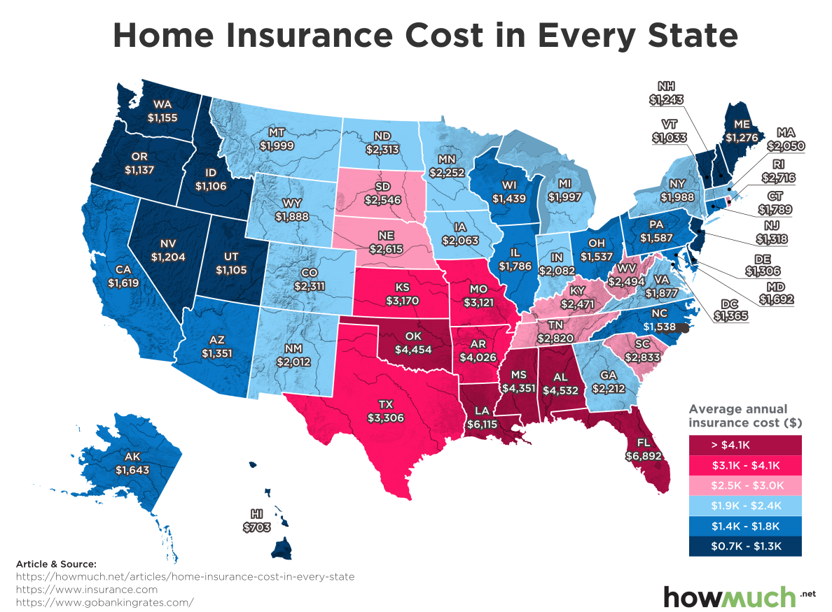
We gathered our numbers from GOBankingRates, a personal finance website that analyzes the most common expenses in everyone’s budget. We colored each state according to the average cost of insurance. Dark red states are the most expensive, costing over $4,000/year, and dark blue states are the cheapest with under $1,300/year. Our map makes the geographic and weather-related factors underlying the cost of home insurance.

Let’s back up for a second and make sure we cover the basics. Home insurance covers both the structural value of a home and all the belongings inside it. Federally-backed mortgages require homeowners to buy insurance—if a fire comes along and burns down a house without insurance, the lender is left with no tangible asset. Many people also don’t realize that homeowners insurance is different from flood insurance and earthquake insurance. It’s a complex marketplace with a lot of different pricing factors.

With all that being said, severe weather directly affects home insurance costs. The least expensive state for home insurance is in the middle of the Pacific Ocean—it costs only $703 in Hawaii. Florida is at the opposite end of the spectrum, where it costs a whopping $6,892 to insure a home. Hurricanes are the obvious explanation for the discrepancy between both states. Hawaii almost never gets severe weather, and only a handful of hurricanes have hit the island in the last 70 years. Florida, on the other hand, endures more direct hits than any other state. The University of Miami’s mascot is—guess what—the Hurricanes.

Let’s take the difference between Hawaii and Florida to the logical conclusion. A homeowner in Florida would pay $6,189 more every year. Think about that cost for the typical 30-year loan: the average Floridian will drop over $185K more than someone in Hawaii just on insurance. According to Zillow, that’s almost how much it costs to buy a home in the first place.

It isn’t surprising that states bordering the Gulf of Mexico have the highest home insurance costs in the nation. Louisiana is the second most expensive at $6,115, and Alabama is the third-priciest at $4,532. Both states suffered massive devastation in recent memory due to hurricanes. The band of dark red states around the Gulf stand in stark contrast with the dark blue states in the Northwest, where widespread severe weather almost never happens. Things are also comparatively cheap across the Upper Midwest and the Northeast.

Top 10 Most Affordable States for Home Insurance 

1. Hawaii: $703

2. Vermont: $1,033

3. Utah: $1,105

4. Idaho: $1,106

5. Oregon: $1,137

6. Washington: $1,155

7. Nevada: $1,204

8. New Hampshire: $1,243

9. Maine: $1,276

10. Delaware: $1,306

To put it simply, our big takeaway from mapping home insurance costs is that rates get cheaper further away from the Gulf of Mexico. Homeowners can pay significantly more for insurance, all depending on where they live. Today, Mark Twain might say, “Buy land, but not in Florida.”

Data: Table 1.1

Visualizing the History of Bitcoin Crashes: Are Hodlers Prepared for the Next Bull Run?

$
0
0

The latest Bitcoin crash has some investors believing the “end of days” are near. Once bullish “hodlers” and committed individuals now voice their concerns and fears that this crash indicates that the cryptocurrency market may be faced with a new normal. While the latest crash has been painful, it is best to step back and assess the current state of Bitcoin relative to its past. Bitcoin has “crashed” many times over the past several years, but how does this latest downturn compare to past steep sell offs?

In order to compare the most recent Bitcoin crash to other past panics, we decided to create a visual that clearly shows twelve other times that the top cryptocurrency has sold off. Each box represents a specific time period in which the price of Bitcoin came under extreme selling pressure. Using the BitStamp Bitcoin-to-U.S.-Dollar (BTC/USD) pair, our team found the specific highs and lows of the past crashes dating back to January 2012. Utilizing a blue arrow, we highlight the percentage of value lost during each sell off. Lastly, we measured the length of each specific crash period by stating the number of days the correction ultimately lasted.

This Is Not Bitcoin’s First Rodeo, Top Crypto Has History Of Surviving Crashes

Despite the steep 70% losses during the latest cryptocurrency sell off, this is not an unusual event for Bitcoin. Since January 2012, there have been thirteen major corrections or crashes in Bitcoin, including this latest rout. Losses have been as minimal as 30% and as severe as 87% during these Bitcoin panics. Compared to its past events, this latest correction was not even as severe or painful as it has been in the past.

The latest correction took place between December 17, 2017 and February 6, 2018, or 48 days, in which 70% of Bitcoin value was lost. However, if you look at the period between April 10, 2013 and April 12, 2013, Bitcoin lost an astounding 83% of its value over a three-day period. Talk about a panic! The point is that crashes have become relatively common throughout the cryptocurrency market, which is known for its swift volatility. It is important to turn to data and the facts in times of turmoil, rather than relying on one’s emotions.

Here is a breakdown of the visual, showing each of the corrections in Bitcoin by date of occurrence. It will also include the percent of value loss and the length of the correction in number of days:

1. January 12, 2012 – January 27, 2012, -30%, 16 Days

2. August 17, 2012 – August 19, 2012, -57%, 3 Days

3. March 6, 2013 – March 7, 2013, -33%. 2 Days

4. March 21, 2013 – March 23, 2013, -35%, 3 Days

5. April 10, 2013 – April 12, 2013, -83%, 3 Days

6. November 19, 2013 – November 19, 2013, -50%, 1 Day

7. November 30, 2013 – January 14, 2015, -87%, 411 Days

8. March 10, 2017 – March 25, 2017, -34%, 16 Days

9. May 25, 2017 – May 27, 2017, -33%, 3 Day

10. June 12, 2017 – July 16, 2017, -39%, 35 Days

11. September 2, 2017 – September 15, 2017, -40%, 14 Days

12. November 8, 2017 – November 12, 2017, -30%, 5 Days

13. December 17, 2017 – February 6, 2018, -70%, 48 Days

Overall, the latest correction in the price of Bitcoin is nothing out of the ordinary. History shows that the top cryptocurrency has sustained much more rapid losses during a shorter period of time over the course of the past several years, yet it has not discouraged long-term investors. Regulatory crackdown fears seem to be main source of the latest crash, but the recent cryptocurrency regulatory hearing before the U.S. Senate struck a much brighter tone than crypto traders had anticipated. This shows that fears of regulators attempting to shut down the cryptocurrency market are overblown. In the end, cryptocurrency is still a very relatively new concept that will have its highs and lows, but its resilience in the face of uncertainty has been nothing short of incredible.


Comparing Mexico’s Remittances to Every Other Country

$
0
0

President Trump has long threatened to impose a tax on remittances to Mexico to pay for a wall along the U.S.-Mexico border. We won’t get into the politics surrounding such a hot button issue, but it raises an important issue about just how much money gets sent from the U.S. to other countries. Answering that question formed the basis for our newest map.

Our map was inspired by the Pew Research Center, which gathered data from economists at the World Bank. The numbers reflect cash flows in 2016 leaving the U.S. to people in other countries through official channels, like a bank or wire transfer service. The data exclude cash flows through informal networks—think of sending cash through the mail—which economists suspect might add up to 50% to these totals. We placed the official statistics on a bubble chart, where the size of the circle corresponds to the total annual remittance for each country. We then color-coded each continent and included a percentage for easy reference. Our creative approach lends itself to several quick insights into global remittances leaving the U.S.

First off, the Americas and Asia receive the majority of remittance payments, accounting for 42% and 39.8% of the total global cash flow, respectively. Europe, Africa and Australia and Oceana receive very little money in comparison. Mexico ($28.1B), China ($15.4B), India ($10.7B) and the Philippines ($10.5B) immediately stand out as the top four countries, making up a combined $64.7B in annual remittances, or almost half the entire market (47%, combined).

There are a lot of other interesting trends within each continent too. Generally speaking, remittances are not evenly spread out between countries—a select few dominate the market. Mexico is the obvious stand out in the Americas, but that’s probably because of its physical proximity to the U.S. Instead, take a look at the Dominican Republic ($4.1B). Combined with Haiti ($1.4B), this one island would crack the top ten destinations for cash leaving the U.S. But just how big is the market for remittances to Mexico (at $28.1B? It’s at an all-time high right now, and represents the equivalent of the entire economy of Paraguay. In other words, there’s an enormous transfer of wealth happening year after year.

There’s a similar pattern on other continents too, where a select few countries receive a disproportionate share of remittances. Look at Africa, where Nigeria pulls in $5.7B every year. Or consider Europe, where Germany ($2.8B), France ($2.3B) and Italy ($1.4B) are the only three countries breaking the $1 billion mark. Things look similar in Asia, where four different countries receive more than $5 billion on an annual basis; every other country lags far behind. In short, a few key countries dominate the market.

Top 10 Destinations for Remittances from the United States

1. Mexico: $28.1B

2. China: $15.4B

3. India: $10.7B

4. Philippines: $10.5B

5. Guatemala: $6.8B

6. Vietnam: $6.7B

7. Nigeria: $5.7B

8. El Salvador: $4.2B

9. Dominican Republic: $4.1B

10. Honduras: $3.4B

We can summarize our map of remittances like this: when it rains, it pours. Cash flows accrue at different rates for different countries, and a select few tend to dominate the market. We can speculate about why this happens—perhaps once an immigrant population starts sending money, businesses spring up to facilitate the transfers, making it easier for more money to go overseas. Regardless, the flow of money is so large that taxing it will likely carry enormous economic consequences.

Data: Table 1.1 

Visualizing Why Banks Hate Cryptocurrencies

$
0
0

Banks have largely been against cryptos, often citing the volatility and the ability to be used for money laundering. This is a bit of an ironic criticism coming from banks that are seemingly paying massive sums of money on a regular basis to settle allegations of money laundering or other financial crimes. The real answer to why the banks’ dislike cryptocurrencies is most likely that they feel threatened. The rise of cryptocurrencies has exceeded all expectations and, while the concept is still very young, it does have potential to shake up the aging fiat system. In order to understand the race between the banks and cryptocurrencies, we developed a visual to see just how “David” is comparing to “Goliath.”

Using data from Yahoo Finance and CoinMarketCap.com, our data team developed a visual that compares the market caps between some of the world’s largest banks and cryptocurrencies. On the left blue column, we have four banks listed from largest-to-smallest market caps: JPMorgan Chase, Bank of China, Goldman Sachs, and Morgan Stanley. Conversely, the right red column features the total cryptocurrency market, Bitcoin, Ethereum, Litecoin, NEO, Ripple, Bitcoin Cash, Cardano, and Stellar. Using circles, we made the shape size correspond to market cap size. This means larger circles have bigger market caps than small circles.

Total Crypto Market Exceeds Size Of JPMorgan, Banks Fight Back In Attempt To Slow Growth

After an extremely volatile start to 2018, cryptocurrencies are once again on the rally track. As of February 16, 2018, the total crypto market had a market cap of $470 billion (as of February 16th, 2018), which exceeds the size of the United States’ largest bank, JPMorgan Chase.

Bitcoin's market cap alone is comparable to Bank of China's. The second largest cryptocurrency by market cap, Ethereum, is comparable in size to Morgan Stanley. It is stats like these that have the global banking sector worried that cryptocurrencies are on track to make a serious impact on their operations.

One of the most recent efforts to help slow the pace of crypto growth were announcements from several banks saying that customers could no longer purchase digital currency with their credit cards. Charlie Munger, the 94-year-old Berkshire Hathaway Vice President has called Bitcoin “totally asinine” and says “it’s disgusting” that people buy cryptocurrency.

Overall, cryptocurrencies are seeing their size and value top even some of the largest financial institutions in the world. This has caused banks to fight back and attempt to slow their growth. However, even banks clearly don’t know what they really want. After JPMorgan CEO Jamie Dimon famously called Bitcoin a “fraud” in late 2017, it is interesting to now see a report published by the investment bank that calls Bitcoin-based ETFs the “holy grail for owners and investors.” Clearly, we have a bit of a Jackal-Hyde situation going with the banks, which can’t decide if cryptocurrencies are friend or foe.

So what do you think: Are Banks Afraid of Cryptocurrencies?

This Map Shows How Gas Taxes Determine the Price at the Pump

$
0
0

Americans are back to purchasing large SUVs and trucks instead of passenger cars, fueled in large part by confidence in the U.S. economy. And with President Trump set to unveil a broad new infrastructure plan with a rumored $200 billion price tag, now would be a good time to review the current levels of gas prices and taxes around the country. That’s why we created our new map.

We gathered the data from a couple different places—we found average gas prices from AAA.com and tax information from API.org. We combined both datasets to color-code each circle on the map, representing how expensive a gallon of gas costs on average in each state. Dark blue circles indicate expensive prices over $3.00/gallon, and light blue indicates cheap fill ups under $2.50/gallon. Then, we added a second circle to represent both the state and federal taxes levied on gas. This approach transforms the complicated reality of energy taxes into an easily understandable map.

Several interesting trends are readily apparent. First off, the federal gas tax comes out to 18.4 cents on the gallon sold in every state. The amount was last adjusted 25 years ago in 1993, back when a gallon cost about $1.06. And since the federal gas tax is not pegged to inflation, gas could cost $10.00 a gallon and the feds would still only collect 18.4 cents. This situation might change as Congress and President Trump negotiate an infrastructure spending deal, but who knows? For now, total taxes only change on our map from one state to another based on that particular state’s laws.

There are two clear regions with high gasoline prices in the Northeast and across the Midwest. Hawaii ($3.34) and Alaska ($3.08) are outliers in the dataset because of their extreme distance from the continental U.S. Hawaii has a relatively high total tax burden of $0.64 built into its price, but Alaskans pay the lowest rate in the country of $0.31/gallon, of which only 12 cents goes to the state government. That’s extraordinarily low because Alaska is one of the top oil-producing states, and the government already collects so much money directly from oil companies that it actually pays its citizens every year. Anyway, there’s also a group of light blue states across the South, where the tax burden is low and the price at the pump is relatively cheap. The least expensive state in the country is Texas, where it costs only $2.28. That’s right, gas is cheaper than a gallon of milk ($2.33) in six states—Arkansas, South Carolina, Mississippi, Missouri, Alabama and Texas.

All of this indicates how state and federal gas taxes are the primary reason why it costs more at the pump in some places than others. Take California for example. The state is obviously in a league of its own regarding taxation. The average cost for a gallon is $3.18, of which 22.6% goes to the state and federal governments. That tax represents $0.72 of the price for every gallon. In neighboring Arizona, the tax burden is only $0.37 on the gallon, and the average overall price is consequently much cheaper at $2.35 per gallon. It’s simple—the more something is taxed, the more it costs.

Top 10 States Where it is Most Expensive to buy a Gallon of Gas

1. Hawaii: $3.34 and $0.64 for taxes

2. California: $3.18 and $0.72 for taxes

3. Alaska: $3.08 and $0.31 for taxes

4. Washington: $2.94 and $0.68 for taxes

5. Oregon: $2.83 and $0.55 for taxes

6. Pennsylvania: $2.82 and $0.77 for taxes

7. New York: $2.69 and $0.63 for taxes

8. Connecticut: $2.68 and $0.58 for taxes

9. Nevada: $2.68 and $0.52 for taxes

10. Michigan: $2.64 and $0.61 for taxes

If President Trump proposes an increase in the federal gas tax, people living in these states are likely to feel it the most. They are already paying more than anyone else to fill up, and an increase in the federal tax will only make the situation worse. A better solution might be to peg the federal gas tax to inflation so that it rises and falls in tandem with the broader economy. This option would remove the issue as a hot-button political debate and ease the pain people feel when they hit the road.

Data: Table 1.1 

This Graph Shows the Average Tax Refund in Every State

$
0
0

Everyone dreads tax season, but at least there’s one thing to look forward to – your tax refund! Every year, the federal government gives back hundreds of billions of dollars to taxpayers who paid too much. But not all taxpayers receive the same amount. Take a look at our map below to see the average tax refund in every state.

In the map above, states are split into four groups depending of the size of their average tax refund. Dark green states have average tax refunds over $3,001, light green states between $2,751 and $3,000, light blue states between $2,501 and $2,750 and dark blue states between $2,300 and $2,500. The data were collected from the IRS and SmartAssset.com.

Top Five States by Tax Refund Size

  • Texas: $3,133

  • Oklahoma: $3,088

  • Louisiana: $3,073

  • New York: $2,986

  • Connecticut: $2,958

Bottom Five States by Tax Refund Size

  • Maine: $2,302

  • Oregon: $2,342

  • Vermont: $2,348

  • Wisconsin: $2,367

  • Montana: $2,367

In 2017, the IRS returned $324 billion back to taxpayers. According to IRS data, the average tax refund was $2,895 per taxpayer. But that’s just the average. The refunds received by taxpayers varied significantly between states and was within a range of between $2,302 and $3,133.

There are only three states where the average tax refund was more than $3,000: Texas, Oklahoma and Louisiana. Taxpayers in Texas received the most on average at $3,133 per taxpayer. That compares to the national average of $2,895. Additionally, Texas is one of the seven states that do not tax earned income. If you’re really looking to save on taxes, Texas is the place to be. The three states with the lowest average were Maine, Oregon and Vermont. Maine had the lowest average tax refund in the country at $2,302 per taxpayer. One thing to notice is that eight of the 10 states with the lowest tax refund share a border with Canada. Also, states with refunds lower than average tend to states with low populations, but there are a few exceptions.

Another thing to notice is that the states with the lowest tax refunds are further away from the national average than the states with the highest refunds. Texas is only $238 above the average ($3133 - $2895). The bottom five states – Maine, Oregon, Vermont, Wisconsin and Montana – are all more than $500 away from the average, more than double the distance from the average of Texas. This is because the four most populated states in the country – California, Florida, New York and Texas – all had relatively larger refunds compared to smaller states. This weighed the average national refund higher.  

If you’re looking to save the most on your taxes, you still might want to move away from the border with Canada and towards a southern state. If you are considering moving to a new state to save on taxes, then Texas is that best choice. Either way, you’ll only save a few hundred dollars. But if you’re a penny pincher, every dollar counts!

Data: Table 1.1 

Here are the Most & Least Expensive States for Health Insurance

$
0
0

Health insurance is a hotly debated political issue in the United States. It’s something we all need, but it is often expensive and out of reach for some people. While the health insurance debate takes place at the national level, health insurance rates actually vary between states. The two maps below show health insurance rates by state and average annual deductibles with a silver plan. Find your state and see how it compares to others.

In the map above, states are split into four categories based on average monthly premiums per person. States colored red have an average monthly premium of between $651 and $780, states colored pink are between $451 and $550, states colored light green are between $451 and $550 and states colored dark green are between $411 and $450. The data were collected from United Benefit Advisors.

The Five States with Lowest Monthly Premiums

  • Hawaii: $411

  • Idaho: $415

  • Utah: $423

  • Arkansas: $431

  • Mississippi: $432

The Five States with the Highest Monthly Premiums

  • Alaska: $780

  • Wyoming: $662

  • New York: $624

  • Vermont: $607

  • New Jersey: $591

In this map, states are split into four categories based on the average annual deductible with a silver plan. States colored dark purple have an average annual deductible of between $5,000 and $6,913, states colored light purple are between $4,000 and $4,999, states colored teal are between $3,000 and $3,999 and states colored dark teal are between $1,733 and $2,999. The data were collected from Stride Health. The figures were calculated based on the average of four popular silver plan deductibles from each state for single males, age 40 years old, non-smokers and annual income of $51,640 (the median income for males of that age). The data were collected from Stride Health.

The Five States with Highest Annual Deductibles

  • Florida: $6,913

  • Indiana: $6,763

  • Ohio: $6,625

  • Georgia: $6,188

  • New Hampshire: $6,163

The Five States with the Lowest Annual Deductibles

  • Pennsylvania: $1,733

  • Oklahoma: $1,863

  • New Jersey: $2,075

  • Massachusetts: $2,125

  • New York: $2,175

In the first map of the average health insurance rates, it is plain to see that most states fall into the bottom two categories. Wyoming and Alaska have the most expensive average health insurance rates in the country. Only 11 states fall into the second highest category of between $551 and $650 per month on average. Average annual deductibles are more spread out compared to health insurance rates. States in the Midwest region, with some notable exceptions in the rust belt, have low deductibles compared to the rest of the country.

The rust belt is the region with the worst overall health insurance in terms of both costs and deductibles, but there are a few outliers. This is true of the south to a lesser extent. Deductibles are high in the south, but the premiums are generally lower. Indiana appears to have the worst combination of health insurance premiums and deductibles. The state has the 13th highest average monthly premium at $552 and the second highest a deductible in the country at $6,763. A study by the Rand Corporation found that some hospitals in Indiana charge more than three times what they charge Medicare for the same procedures. Neighboring Illinois is a close second for the worst outcome with the ninth highest average monthly premium at $552 and the 11th highest average annual deductible at $5,325.

There doesn't appear to be a connection between monthly premiums and annual deductible. Take for example New York and New Jersey. New York has the third highest average monthly premium at $624 per month on average, yet it has the fifth lowest deductible in the country at $2,175. New Jersey has a similar trend. The state has fifth highest monthly premium at $591 per month on average, but it also has the third lowest annual deductible at $2,075 on average. People in New York and New Jersey pay more per month but pay less towards their deductible over all.

Now compare New York and New Jersey to Nevada and Kentucky. Nevada has the ninth lowest average monthly premium at $445 per month and also the ninth highest annual deductible in the country at $5,513 on average. Kentucky has the seventh lowest average monthly premium at $437 and the 13th highest deductible at $5,025. Although people in Kentucky and Nevada pay less per month on health insurance than people in New York and Kentucky, they have to pay far more towards their deductible if they need medical care. Currently Nevada is in the process or creating its own health insurance exchange to help people money.

Alaska is by far the most expensive at $780 per month on average. But despite the high monthly premiums, Alaska’s average annual deductible is right around average at $3,750. The federal government alleges that Alaska has anticompetitive healthcare laws that raises health insurance costs and hurts consumers. Hawaii has to lowest monthly premiums in the country at $411 per month on average and the seventh lowest average annual deductible at $2,750. When taking into account both monthly health insurance premiums and annual deductibles, Hawaii comes out on top compared to other states.

Both average monthly health insurance costs and average annual deductibles vary over the 50 states. But it’s not easy to tell what your deductible will based on your monthly health insurance costs, as the data shows. It’s best to take both factors into consideration. Based on these two factors, Hawaii has the best overall health care outcome. But if you spend all your day at the beach, your stress levels are so low you might not even need health care!

Data: Table 1.1 

The Biggest Banks for Your Buck in Every State

$
0
0

Socking away money for an emergency fund is one of the first steps to building a financially secure future. Most experts recommend keeping these dollars immediately available, and a savings accounts provides the liquidity to access the cash on a moment’s notice. So which banks have the most deposits on hand? Figuring out the answer to that question led us to create our new map.

We adopted a list of the largest banks in each state from GOBankingRates. First, GOBankingRates figured out the largest bank headquartered in each state. It is important to pause and consider GOBankingRates’ methodology in putting the data together. They looked at official FDIC documents to find the headquarter location and deposit totals from 2017, which can often be different from what one might expect. For example, Wells Fargo has its world headquarters in San Francisco, but the bank’s U.S. operates are actually headquartered in Sioux Falls, SD. Same thing goes for Charles Schwab—the investment company is located in San Francisco, but the bank is kept separately in Nevada. And if you watched the Super Bowl, you know U.S. Bank is associated with Minneapolis.

In terms of general trends, our map demonstrates how almost none of the states with a large bank (over $50B in deposits in a single market) are located in the Midwest. The two exceptions are U.S. Bank which controls the top spot in Ohio ($62.4B) and Wells Fargo in South Dakota—as if South Dakota even belongs in the Midwest. All the other banks headquartered across the country’s midsection are relatively small in terms of deposit size.

In fact, the smallest banks tend to be in states with comparably small populations. Wyoming takes last place with the only institution under a billion in deposits, Hilltop National Bank ($0.6B), followed by Idaho with D.L. Evans Bank ($1.1B). Even the First National Bank of Alaska is more than twice as big ($2.5B). If these banks want to grow deposits, they need to move to larger population centers.

Here are the ten largest banks in terms of deposits held within a single market ($ billion), together with their total holdings company wide ($ billion).

1. Wells Fargo Bank: South Dakota $264.9 inside market and $1,200 in total

2. Bank of America: North Carolina $171.9 inside market and $1,300 in total

3. Charles Schwab Bank: Nevada $162.4 inside market and $162.4 in total

4. Ally Bank: Utah $86.3 inside market and $86.3 in total

5. MUFG Union Bank: California $80.6 inside market and $86.8 in total

6. TD Bank: Delaware $79.7 inside market and $227.1 in total

7. USAA Federal Savings Bank: Texas $72 inside market and $72 in total

8. Capital One Bank: Virginia $66.2 inside market and $66.2 in total

9. U.S. Bank: Ohio $62.4 inside market and $329.5 in total

10. SunTrust Bank: $54.3 inside market and $162.7 in total 

All this goes to show that the world of bank deposits is complicated. Never assume the largest banks are always located in booming metropolises, as Wells Fargo and Northfield Savings Bank demonstrate. And yet the general trend remains undeniable—having a large population only helps to grow the size of a bank’s deposits too.

Data: Table 1.1 

This Map Shows the Cheapest Gas Station in Your State

$
0
0

Gas is one of the most import commodities in the United States. We’re a large, spread out country and we’re always on the go. That means we need cars and trucks to quickly take us to our destination. The problem is, gas isn’t cheap. If you want to save on gas prices, look at the map below and see which gas station chain offers the lowest price in your state.  

Inside of every state on the map there are the name and logo of the gas station chain that offers the lowest gas prices in that state. There are three tiers of gas prices: states that are dark green have gas chains that offer between $2.50 and $2.99 per gallon of gas, states that are just green prices between $2.00 and $2.49 per gallon and states that are light green offer prices between $1.50 and $1.99 per gallon. The data were collected from Business Insider. To determine the list, BI analyzed information from GasBuddy.com’s lists of Top Ten Lowest Gas prices in every state; this information is based on daily input from its 60,000,000 plus users and is subject to change.

States with gas chains that offer high prices per gallon tend to lie within the Northwest region of the United States, although there are some exceptions. New York, Pennsylvania, Maine and Vermont all lie within the highest tier of prices. One reason states in the Northwest have higher gas prices may be due to Hurricane Harvey, according to GasBuddy and Oil Price Information Service.

But there are states outside of the Northeast that don’t get hit by hurricanes, but still have high gas prices. Both Alaska and Hawaii have the highest gas prices, but that is likely due to how remote those states are. The chain that offers the lowest prices in Hawaii is Freedom at $2.92 per gallon, which is the highest price for gas in the country. California is neither remote nor suffers from hurricanes, yet the chain with lowest gas prices in California is the third highest in the country at $2.73 per gallon.  

One trend to notice is the prevalence of the chain wholesale company Costco found throughout the country. Costco appears far more than any other company as the chain with the lowest gas price across the 50 states. But Costco doesn’t offer the same prices in those states. For example, Costco is the chain that offers the lowest gas prices in Texas at $1.95 per gallon, which is the cheapest price in the country. At the same time, Costco is also the chain that offers the lowest price in Connecticut at $2.49 per gallon, which is much higher than Texas and nearly falls into the highest price tier.

Various gas chains are represented on the map, but not all offer the same prices. But don’t be fooled by Costco’s prevalence on the map. Costco still must raise and lower prices based on the relative competition for gas services in those states. If you want to save money on gas costs, you’ll have to consider both the state and the gas chain.

Data: Table 1.1 


Visualizing the World's Most Admired Companies

$
0
0

“It takes 20 years to build a reputation and five minutes to ruin it. If you think about that, you’ll do things differently,” Warren Buffett once said. Reputations are a tricky thing to measure, and they are especially hard to grasp when a company’s products impact millions of people every single day. Lucky for us, Fortune developed a clever way to survey industry observers and executives, giving us with the data behind our new visualization.

We got the data from Fortune’s list of the most admired companies in the world. Fortune took the largest companies in the world in every industry, and surveyed executives and analysts asking them to rate the strength of each one. We took the top 50 all-star companies and placed the logos of each one in a circle within the headquartered country. The size of the circle corresponds to the company’s total market capitalization, with the largest circles representing companies valued at over $500B. We then color-coded each one by industry, and grouped the ones belonging to the same industries together. The result is a kaleidoscopic map of the most admired companies in the world that lets you quickly identify several trends about reputations in the corporate world.

First off, companies headquartered in the United States dominate the list, partly because Fortune’s methodology favored American companies, but also because the U.S. simply has the largest economy in the world. Within the U.S., Apple totally dominates with a market cap of $905B, terrifyingly close to becoming the first trillion-dollar company in history. Amazon ($737B) and Microsoft ($735B) also stand out in the computer industry. Interestingly, the fourth largest company on our list is Facebook, but its market cap is significantly less at only $443B. The companies start to get crowded below Facebook’s valuation, as the map clearly demonstrates. In other words, the biggest companies are really, really big compared to everyone else.

The map also illustrates how the most admired companies come from a variety of different industries. From Internet companies to hotel chains and petroleum manufacturers, it is fair to say that a company can build a solid reputation regardless of industry. Many sectors also have more than one company making the list too, suggesting that a positive reputation can rub off onto similar competitors.

One more trend is worth pointing out. Almost all the companies on the list specialize in one industry. The exception is Berkshire Hathaway, which is listed as the only insurance company on our viz. That’s because they own GEICO as well as a few other insurance companies. In reality, Berkshire is a giant holding company with vested interests across a variety of different industries. Amazon, Apple and Google might be headed down a similar path, but they aren’t quite there yet. Building a good reputation requires a killer business model with mass appeal in a single industry.

Top 10 Most Admired Companies 

1. Apple: Computers/Software/IT, $905B

2. Amazon: Internet, $7367B

3. Microsoft: Computers/Software/IT, $735B

4. Facebook: Internet, $443B

5. Berkshire Hathaway: Insurance, $237B

6. JPMorgan Chase: Financial Services, $412B

7. Johnson & Johnson: Pharmaceuticals, $354B

8. Alphabet: Internet, $341B

9. Exxon Mobil: Petroleum, $334B

10. Visa: Financial Services, $225B

The youngest company on this list is Facebook at 14 years old. Google is the second youngest with 20 years of experience organizing the world’s knowledge. Every other company has a longstanding legacy of product innovation and customer service. It looks like Warren Buffett was probably right with how long it takes to build a good reputation.

Data: Table 1.1 

Meet the Wealthiest People in Crypto

$
0
0

Forbes recently released a list of the world’s richest individuals in terms of cryptocurrency. There are currently 19 people in the world who own an equivalent of more than $350 million in crypto assets. The top owners of cryptocurrency in the world amassed their wealth in a variety of ways, but most are founders of large cryptocurrency projects and cryptocurrency exchange platforms. Others are either individual investors or part of investment groups and some have established very profitable cryptocurrency mining operations. The one thing that the richest in crypto have in common is that they are all the types to “HODL” (hold on for dear life), meaning that they hold on to their cryptocurrency through any downturns in the market and aren’t quick to make crypto-to-crypto or crypto-to-fiat trades.

The Richest Person

Chris Larson, CEO and Founder of Ripple (XRP), is the undisputed #1 largest crypto owner in the world. No one else on the list even comes close to Larson’s net worth. He personally owns 5.2 billion XRP. The amazing thing is that in early 2018 Ripple is only valued around $0.80 to $1.00 on average. If XRP rises to the price level of BTC, or even to the level of ETH, Larson will very easily become the world’s richest person and have the potential to be the world’s first trillionaire.

Demographics

Another notable thing to mention about this list is that not everyone made their fortunes early on. While some did invest in the early days of BTC (circa 2009 to 2012), lots of people won big by either working on the team at Ethereum or investing in ETH. This is significant because ETH’s Initial Coin Offering (ICO) didn’t take place until July 30, 2015.

The world’s largest owners of crypto are also very young. The average age of the 19 richest people in crypto is only 42; in contrast, the average age of the Forbes 400 list of richest Americans is 67. It’s also interesting to note that there are only men on the crypto list, while two of the people at the top of the 2018 list of the world’s billionaires are women. 

Determining the Future of Crypto Wealth

With price fluctuations and the rise of new cryptocurrencies, the rankings for the wealthiest people in crypto is likely to change a lot in the coming years. The crypto market price volatility in January and February 2018, for example, was much higher compared to blue chip stocks or commodities like gold. That means that the rankings could change drastically, even week to week.

Promising new cryptos continue to emerge every day. Some have the technology and resources behind them to overtake the current breadwinners. On top of that, new, decentralized exchanges are emerging to compete with centralized exchanges like Binance and Coinbase. These changes could catapult founders of new exchanges to the top of the crypto wealth rankings.

As the cryptocurrency market continues to develop, it will be interesting to see which people emerge to become the wealthiest crypto owners of the future and who from the current Forbes list may fall out of the rankings.

This Chart Shows How GDP Determines Unemployment & Wages Over the Past 20 Years

$
0
0

The United States hasn’t seen GDP growth over 4% since the year 2000, but President Trump recently said he thinks 6% GDP growth is within reach. What would that look like for the American economy and what could people expect in terms of employment and wage growth? Take a look at our new visualization.

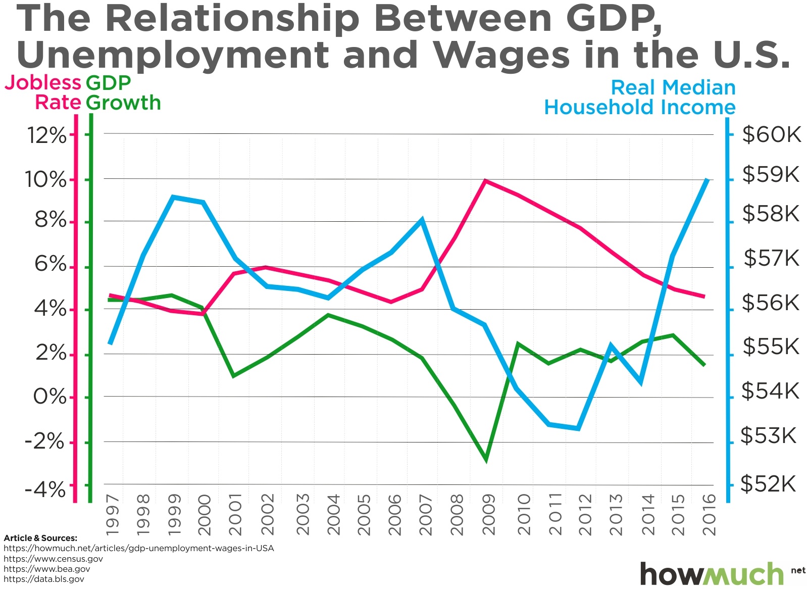
We retrieved the data relating to GDP, unemployment, and median income from the online financial magazine The Balance, which compiled its figures from the respective offices of the U.S. government (see the viz for sources). To generate our viz we first adjusted median income totals to account for inflation, also called real income, so that we could make true comparisons between different years. We then plotted figures for every year since 1997 on the same graph, revealing a quick snapshot of 20 years’ of economic history.

GDP is an old school measure of the economy that originated during the industrial era. Many people think it doesn’t matter anymore because it fails to capture the changes in the quality of products in use at any given time. For example, GDP counts the physical costs of telegrams against the physical costs of email without considering the less tangible benefits of using the latter. GDP also ignores entire industries geared toward creating high-quality experiences (as opposed to physical products). That being said, it is still a shorthand way of measuring the health and trajectory of an economy, and it says a lot about both unemployment and wage growth. Developed countries like the United States typically have slower GDP growth than developing ones, like India or China.

Looking at the real median income figures tells an interesting story. The numbers have actually declined in 11 of the past 20 years, meaning that workers in general have smaller paychecks. As our graph demonstrates, wages are inversely correlated with employment. In other words, as employers shrink the number of individuals they employ the supply-and-demand effect allows them to pay their people less. Alternatively,  when employment ticks up and labor becomes scarce, wages shoot back up. If the past is any indication, recent headlines suggest that American workers are due for another pay raise. In fact, in our graph 2016 was the best year for median incomes, rising 3.2% over the previous year to $59,039.

Things have generally been going well for American workers with GDP growth of 2-3% every year. Doubling that output to 5%, or even 6% as President Trump would like to see, would mean colossal and sustained gains in real wages for workers. We aren’t talking one-time bonuses thanks to a tax cut, but thousands and thousands of dollars in extra base pay. As long as inflation stays under control, additional increases in GDP would only benefit American workers even more.

Data: Table 1.1 

This Graph Shows Which Political Party Corporate America Loves the Most

$
0
0

President Trump has already started his reelection campaign for 2020 and he’s well on his way to raising a lot of money for the effort. Fortunately, candidates are required to publicly disclose campaign contributions to the Federal Election Commission, which in turn makes the data available to the public. This disclosure process includes where the donors work, allowing us to create our new visual.

Zippia, a career advice website, gathered the data from the Federal Election Commission (FEC). Zippia analyzed contributions from employees at the 250,000 biggest companies in the country and found well over 30 million donations records from 2007 through 2017. We took the 30 most politically active companies on the Fortune 500 and ranked them in order of their campaign contributions over the last ten years. The bars represent the total contributions ($M) given to candidates in each party. We added the total figures and the percentage breakdown for Democrats and Republicans for easy reference. Several fascinating trends immediately jump out from our visual.

First off, there’s a lot more blue than red on the graph, indicating that Democrats rake in most of the political cash from corporate America. Keep in mind that these contributions are coming from employees who work at these companies, not the corporations themselves. It’s actually illegal for corporations to make contributions directly to candidates. Republicans received more than 50% of the donations from only nine of the 30 companies, most of which tend to be grouped toward the bottom. Additionally, almost all of the bars include a tiny sliver of green, representing contributions to independent candidates. These contributions are there but they definitely don’t amount to much overall. Ultimately, it is fair to say that employees of these big companies have spent the bulk of their political cash on Democrats over the last decade.

Let’s take a closer look at the top of the list. Financial institutions dominate the marketplace for political donations, making up six of the top ten companies. Goldman Sachs is in first place by a long shot, shoveling $11.5M to members of both parties. The bank’s money is split almost evenly across the aisle—possibly showing an effort to hedge against whichever party controls the levers of power. Charles Schwab provides an interesting contrast with Goldman in that the discount broker spends almost 70% of its political donations on Democrats. Microsoft and Apple also crack the top ten, but both companies clearly favor Democrats a lot more than Republicans, pumping 80% and 88%, respectively, of their political money into candidates on the left.

Perhaps the most interesting fact about our visual is what it doesn’t show. Where is Walmart, the top ranked company on the Fortune 500? Or Berkshire Hathaway, McKesson, United HealthGroup, or CVS? What about other behemoths like Google or Amazon? Maybe their business models aren’t as reliant on politicians for their business models to work. On the other hand, if so many major companies are missing from the list, why do employees at these particular companies spend so much on political campaigns? A new piece of legislation or a change in the regulatory environment could drastically affect the bottom line for big banks. Utilities like Comcast and AT&T are heavily invested in the ongoing debate around net neutrality. Other companies rely directly on government contracts for business, like Boeing and Lockheed Martin. In short, what’s a couple million dollars spent on a political campaign if it means the government will stay out of your way? Political contributions might be one of the smartest investments some workers can make for their own job security.

Data: Table 1.1 

Mapped: The Largest Company by Revenue Headquartered in Every State

$
0
0

A lot of people look for jobs at big companies because they can be great places to build a solid career. Unfortunately, if we measure the size of a company in terms of annual revenue, there may not be a lot of options in the state where you live. Check out our new map to compare the size of the largest companies headquartered in every state.

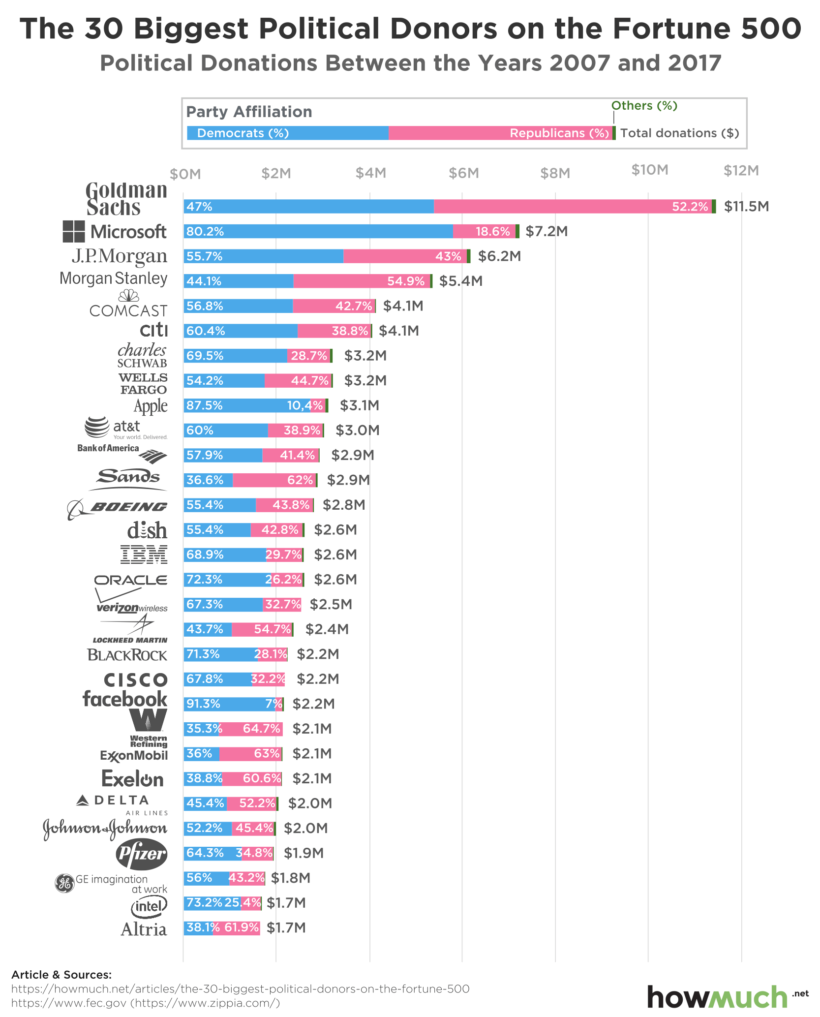
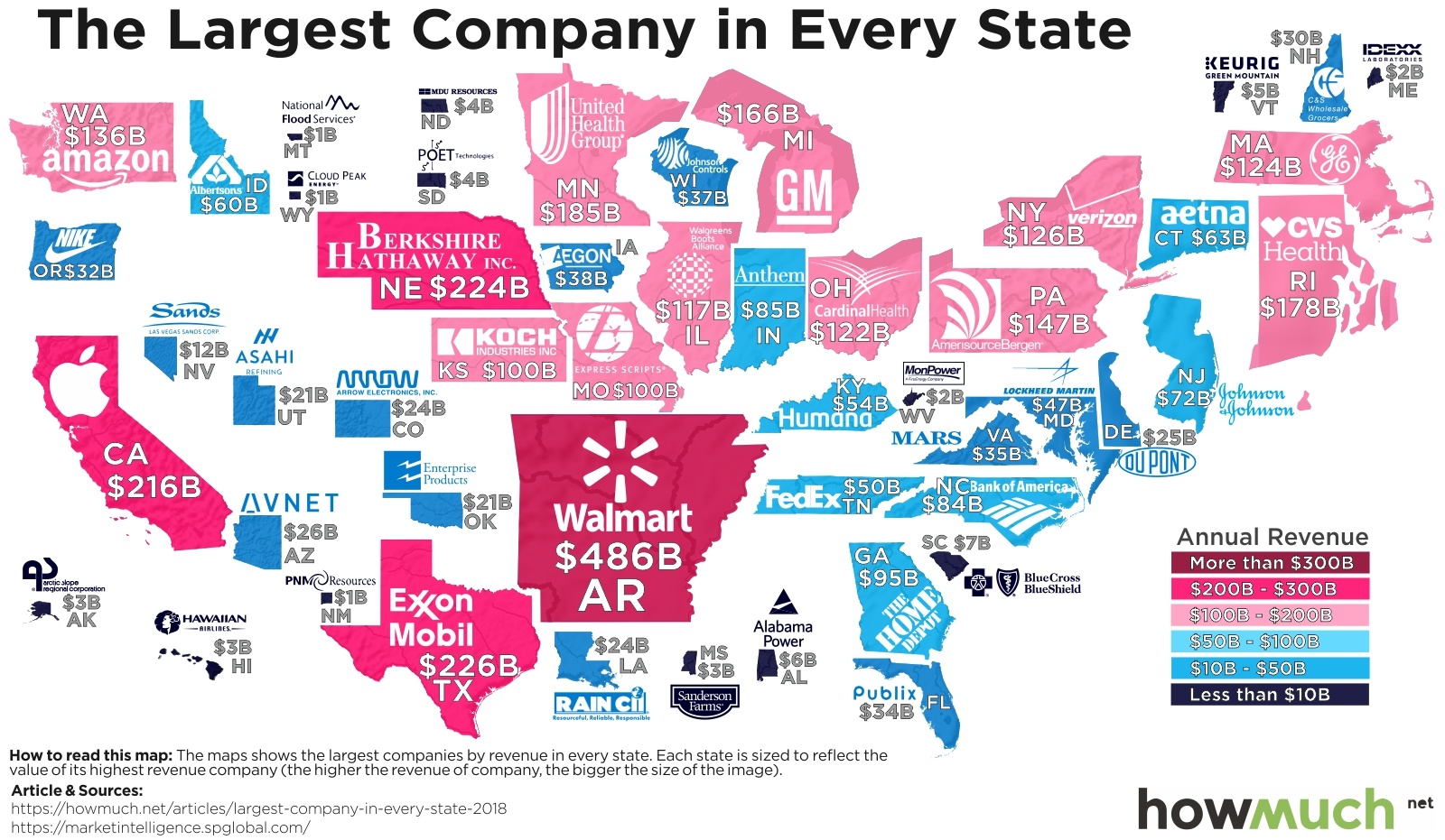
The data included in our map is based on company filings as well as estimates of private company figures from S&P Capital IQ. The numbers come from 2017, the latest year for which information is available. We adjusted the size of each state to reflect annual revenue—the larger the state, the more revenue its largest company generates. We then color-coded each one for easy reference and added the annual revenue figures, creating a unique map of the American economy.

Walmart (headquartered in Arkansas) immediately stands out for obvious reasons:  the company brings in $486B in annual revenue, more than twice as much as the second-biggest company, Texas’ ExxonMobil  ($226B). Arkansas is also located right in the middle of the country, making Walmart’s dominance seem even more noticeable than other well-known behemoths like Berkshire Hathaway in Nebraska ($224B) or Apple in California ($216B). Of course, Walmart makes its money through its thousands of stores located across the country, but all the revenue is counted in Arkansas because of the location of its home office.

There are several notable trends in our map, too. The Northeast contains quite a few blue states, indicating that the largest companies did not crack $100B in annual revenue. Rhode Island actually takes first place in the region thanks to CVS Health ($178B), surpassing even New York (Verizon, $126B) and Massachusetts (GE, $124B). The Midwest similarly contains a mixed bag of companies. Some are extremely large organizations with household names, like GM in Michigan ($166B) and UnitedHealth Group in Minnesota ($185B), and yet other states have large companies that are nowhere near $100B, including Aegon in Iowa ($38B) and Johnson Controls in Wisconsin ($37B). Perhaps a lesson to be learned is that big companies are often headquartered together in the same states , but the same may not necessarily be true in neighboring states. Think of how many other $100B companies are in California and Texas, for example.

In another region, the Southeast disappoints with not a single company headquartered east of the Mississippi breaking $100B. Look, for example, how small Mississippi appears when compared to Arkansas. When a poultry company (Sanderson Farms) is the state’s largest employer by revenue ($3B), that says a lot about the region’s economy. The Southwest and Northwest similarly contain very few large companies, outside of Texas, California, and Washington (home to Amazon, $136B).

Let’s take a step back and break down the top ten states ranked in order of revenue earned by their largest companies.

1. Arkansas, Walmart, Inc.: $486B

2. Texas, ExxonMobil Corporation: $226B

3. Nebraska, Berkshire Hathaway Inc.: $224B

4. California, Apple Inc.: $216B

5. Minnesota, UnitedHealth Group Incorporated: $185B

6. Rhode Island, CVS Health Corporation: $178B

7. Michigan, General Motors Company: $166B

8. Pennsylvania, AmerisourceBergen Corporation: $147B

9. Washington, Amazon.com, Inc.: $136B

10. New York, Verizon Communications Inc.: $126B

Clearly there are a lot of states without any exceptionally large companies, while there are others like California and Texas with several companies generating hundreds of billions of dollars in annual revenue. Of course we should mention that revenue is a different metric than profit, which is probably a better indicator of a company’s staying power. That being said, however, revenue figures do provide a great way to compare companies in different industries and parts of the country. So if climbing the corporate ladder at a big company is your idea of a great career, we recommend moving to a state where a $100B+ company is headquartered as fast as possible.

Data: Table 1.1

Viewing all 687 articles
Browse latest View live