Quantcast
Channel: howmuch.net
Viewing all 687 articles
Browse latest View live

Visualizing Your Country's Unsustainable Debt per Person

$
0
0

National debt levels can be hard to understand, not to mention boring. For example, Puerto Rico is making headlines because it is $74 billion in debt, but the United States is about to reach $20 trillion, and that doesn’t seem like a big deal. How can this make sense, and who cares about all this stuff anyway? We created a new graph to break it down in layman’s terms.

We used new numbers from the Organization for Economic Co-operation and Development (OECD) about per capita national debt. It’s a straightforward metric. For instance, if Americans wanted to completely eliminate their national debt, they would each owe $61,539. We created a series of donut circles: the larger the circle, the higher the per capita debt ratio. We then color-coded each one to correspond with a sliding scale of severity. Dark red means the country is in serious trouble with over $75K in per capita debt, while blue countries on the outside have less than $10K of debt per capita.

Comparing the debt loads of different countries on a per capita basis makes the most sense for a few different reasons. It’s like comparing apples to apples. That’s why the United States can run a $63 billion deficit for the month of October—which barely makes the news on Reuters—but missing $900 million in debt payments from Venezuela causes that country’s entire economy to tailspin. This makes the comparisons between countries fair.

Japan is at the center of our graph because that country has the highest per capita debt anywhere in the world at $90,345. There isn’t a country on earth where average people make nearly that much money on an annual basis. Ireland takes second place at $62,687 followed by the United States in third with $61,539. That’s almost twice as much as the average American taxpayer who files as a single adult makes in an entire year.

Take a look at one country on the far outside of our graph, China. The Chinese government has managed to create so much economic growth (which may finally be slowing down) while only amassing $7,119 in per capita public debt. Granted, China is the most populated country on the planet. That’s still an amazing accomplishment given how much modernization the country has undergone.

Take a look at a list of the top ten countries with the highest per capita debt in the world. Keep in mind that the average for all countries in the OECD is $50,245. And notice how many countries are in Western Europe.

1. Japan – $90,345

2. Ireland – $62,687

3. United States – $61,539

4. Italy – $59,372

5. Belgium – $59,680

6. Austria – $49,975

7. France – $51,768

8. Greece – $49,630

9. United Kingdom – $52,816

10. Portugal – $44,819

Per capita numbers are always a great way to compare different economies from around the world. It doesn’t matter who you are—if every citizen in a country suddenly became liable for paying an equal share of the national debt, there’d by serious problems. And that’s especially true when an individual’s portion of the national debt amounted to more than an entire year’s salary.

Data: Table 1.1 


Mapping the Fiscal Burden of Illegal Immigration on the United States

$
0
0

There’s a lot of confusion and misunderstanding out there around the economic impact of illegal immigration in the United States. We decided to bring some clarity around the issue by mapping new numbers on the estimated costs of illegal immigration on a state-by-state basis.

Our viz takes data from the Federation for American Immigration Reform (FAIR) about how much illegal immigration costs in each state. FAIR takes into account a variety of different expenditures, like healthcare, education and refundable tax credits. We mapped these numbers across the United States according to a color-coded scale. Purple and dark red states have comparatively high expenditures, but the pink and blue states spend relatively less money because of illegal immigrants. There are two interesting trends you can see from looking at the data in this way.

First, states that spend the most on illegal immigration tend to be located close to Mexico. Looking at out map, the two states with the highest expenditures are California ($23B) and Texas ($11B), both sharing long borders with Mexico. In fact, there’s a cluster of dark red states stretching along the Southwest. States closest to the phenomenon pay the most as a result.

Second, states with higher population levels tend to spend more than their less populated counterparts. You can see a group of high-expenditure states clustered around the Northeast, not to mention Illinois and Florida. According to the U.S. Census Bureau, California and Texas are also the two most populous states in the country. High population levels and proximity to Mexico act like a double-whammy for illegal immigration expenses.

Now take a look at the places with relatively low levels of expenditures for illegal immigration, the light blue states. They are all located far away from the U.S.-Mexico border with relatively small population levels. West Virginia is perhaps an exceptional state, seeing that it is surrounded by red and dark red. We can speculate that this is likely due to the fact that West Virginia has a struggling economy which actually contracted last year.

We should add that the source for the numbers in our viz come from a partisan outfit. The Federation for American Immigration Reform (FAIR) advocates for legislation designed to decrease immigration, and you can poke holes in their methodology. For example, suppose immigrants really are paying less in income taxes because of their illegal status. Forbes estimates that granting them amnesty would actually boost their state tax contributions by $2.1 billion. That’s the exact opposite conclusion than what FAIR would like you to believe.

That being said, here’s a list breaking down the States with the highest expenditures for illegal immigration according to FAIR.

1. California - $23,038,125,353

2. Texas - $10,994,614,550

3. New York - $7,489,141,357

4. Florida - $6,290,429,108

5. New Jersey - $4,466,838,574

6. Illinois - $3,220,767,517

7. Georgia - $2,487,719,503

8. North Carolina - $2,437,965,113

9. Maryland - $2,378,996,947

10.   Arizona - $2,314,131,964

Remember, these numbers only look at the net expenditures that states spend on illegal immigration, and they say nothing about other contributions to the economy. Any way you cut it though, whenever states are spending billions of dollars on something, it’s worth taking a hard look at where the money is going and why.

Data: Table 1.1 

Mapping the Greatest Employers on the Planet

$
0
0

With the stock market hitting record highs almost every day and unemployment dropping to its lowest level in 17 years, it’s safe to say that skilled employees are now discovering the flexibility to decide where they want to work. This raises an interesting question. What’s the best company to work for where you live? We took new data from Forbes to create a unique map to help you find out.

Forbes recently released a ranking of the best companies in the world. They consider a variety of different perks and benefits, like the quality of food served to employees and parental leave policies. Forbes even looked at whether companies allow their employees to nap while on the job. We mapped these companies by paying attention to their market capitalization to get a feel for how large an organization needs to be to afford such high-quality benefits. One company therefore represents each country, color-coded by market cap. Red countries have an employer worth over $100B, and dark blue countries boast relatively small employers under $10B. Several trends immediately pop out from our map.

Red countries with huge companies predominantly originate in North America and Western Europe. Alphabet (think Google) is the largest on our list by a landslide with a market cap of $579.5B, bigger than the entire GDP of Argentina. The three exceptions proving the rule are a tobacco company in India called ITC with a market cap of $51.6B, plus Hong Kong (CNOOC, $54.8B) and Taiwan (Han Hai Precision, $54.4B). All three of these places experienced long-term and unique economic and political relationships with the West.

There are three obvious and glaring gaps on our map as well. Africa only contributes a single company to Forbes’ list, namely Remgro from South Africa, a conglomerate made of many subsidiaries from different industries. The Middle East and Eastern Europe also have only a few companies counted among the best places to work in the world. These places have a long way to go before they will become desirable destinations for people to find work.

Here’s a simplified list of the countries with the best employers in the world, ranked in order of their total market cap ($ billion). We also included the number of employees working at each company for reference. Think about the list like this: the U.S. has the biggest and best company in the world, Alphabet. Which country has the second biggest company? Switzerland.

1. United States - Alphabet: Computer Services - $579.5B and 72,053 employees

2. Switzerland - Nestle: Food Processing - $229.5B and 328,000 employees

3. Netherlands - Unilever: Household/Personal Care - $143.9B and 169,000 employees

4. Germany - Daimler: Auto & Truck Manufacturers - $76.1B and 282,488 employees

5. Hong Kong - CNOOC: Oil & Gas Operations - $54.8B and 19,718 employees

6. Taiwan - Hon Hai Precision: Electronics - $54.4B and 1,000,000 employees

7. Canada - Suncor Energy: Oil & Gas Operations – $51.7B and 12,837 employees

8. India - ITC: Tobacco - $51.6B and 25,564 employees

9. Italy - Enel: Electric Utilities - $47.5B and 62,080 employees

10. Australia - CSL: Biotechs - $43.9B and 16,000 employees

So Alphabet takes the cake as the best place in the world to work, both because it tops Forbes’ ranking and because of its size and market dominance. There’s no doubt that the company will be around for a long time, so if you can manage to get your foot in the door, even only as an intern, then plan on making the most of the opportunity. There will almost always be a line of people trying to work there.

Data: Table 1.1 

Where Does Your Medicine Come From? This Map Shows You

$
0
0

Drugs and medicine are big business. In 2016, there was a 1.5% global decline in the total value of drug and medicine exports. Even with that drop, the industry's players exported $318B, making drugs and medicine one of the world's top industries. But where do all those pills, serums, and creams come from? We wanted to find out. So we dissected the data from 2016 and broke it down by continent, country, and export totals. Then we put it on this map. Check it out.

Who gets all the medicine money?

For most of the world's population, medicine comes from somewhere else. This is truest among residents of the Southern Hemisphere. As our map reveals, there is a big disparity between the industry's export totals in the north and the south. And I mean big. The Northern Hemisphere exports 55 times more drugs and medicine than the Southern Hemisphere.

While Europe holds a dominating 79.2% market share, the entirety of Central America, South America, Africa, and Oceania export only 1.8% of the world's drugs and medicine. Africa exports the fewest (0.2%), despite having 15% of the world's population.

In Africa specifically, the disparity feels dubious. Africans are plagued with disease and illness, but have no significant market for drugs and medicine. That means that they need to import them all. Impoverished and dependent on foreign nations for medical support, Africans are in a bad spot.

America’s role in the drug market

In 2016, the U.S. exported drugs and medicine valued at $22.5B. That is more than every other country in the world, except for four:

  • France ($22.8B)  

  • Belgium ($26.5B)  

  • Switzerland ($39.9B)  

  • Germany ($48.6B)

The U.S. eked out the U.K.'s sixth place spot by a mere $500M. In the Western Hemisphere, the U.S. has no rival in drug and medicine exports. Canada comes closest, at $7.4B. Mexico exported $1.2B. No nation in South or Central America has joined the billionaire's club.

Market trends

In Europe, it's obvious that all the cool kids are exporting drugs and medicine.  The concentration of knowledge, training, medical manufacturing, and infrastructure that must cause (and result from) this huge market it makes it unlikely that the Europeans will see their market share disappear to another part of the world. In fact, European countries are still seeing impressive growth. Switzerland and the Netherlands in particular, have seen notable increases.

South Africa and Egypt - two of Africa’s three biggest economies - have developing drug and medicine export economies, but the numbers remain low. While it will probably be these two nations that lead the way in African medical development, they still have a long way to go before they become major players.

Data: Table 1.1 

Tracking Billions of Dollars in Foreign Aid in One Map

$
0
0

Donald Trump ran for President on the concept of “America First.” What does this mean in practice for his governing philosophy and foreign policy? Drastic cuts to foreign aid expenditures, namely, the money the U.S. sends to other countries for humanitarian, developmental and economic reasons. This made us wonder how much foreign aid the U.S. currently sends overseas and where the money is going, so we created a new viz.

We compiled data from the United States Agency for International Development (USAID) for 2016, the last year for which numbers are available. USAID keeps track of how much money U.S. taxpayers send overseas, what activities we spend it on, and why. We changed the proportions of a world map to represent the countries receiving the most money (the larger the country appears in the viz, the more money it receives). We also color-coded each one according to the purpose of the funds. Mapping USAID activities in this way shows you exactly how and why the U.S. sends money overseas.

First off, you can see a lot of large, red countries on the map from the Middle East, where the U.S. spends billions of dollars each year to reduce conflict, maintain peace and promote stability. This is because foreign aid tends to follow U.S. troop deployments. In fact, the number one and number two recipients of aid—Iraq and Afghanistan—remain major theaters of combat for hundreds of U.S. soldiers. Israel, the third highest recipient on our list, continues to be a strong U.S. ally. President Trump is considering whether to refer to Jerusalem as the capital of Israel, so we suspect the $3.1B Israel receives is likely safe from cuts. In total, the U.S. spends more than $18.3B in conflict reduction.

The second obvious trend in our map is a group of medium-sized pink countries, representing American expenditures for health and population measures across Africa in countries like Kenya and Ethiopia. Taken as a whole, these countries account for $7.2B in expenses. The third most expensive category is for emergency situations, like earthquakes and floods, totaling $6.1B.

At first glance, when you read that the U.S. is sending billions of dollars to other countries, it seems like a ton of wasted money. The total budget for USAID in 2016 that we’ve accounted for here represents $36.1B. Is that a lot of money for an economy with a GDP of $19.5T? What if you consider that President Trump’s budget for the Defense Department alone costs $639B? If these expenditures prevent future conflicts and keep people from starving, perhaps it’s money well spent.

With those caveats in mind, here are the top ten recipients of USAID funds for 2016, broken down to the exact dollar amount.

1. Iraq: $5,281,179,380 (for conflicts, peace and security)

2. Afghanistan: $5,060,306,051 (for conflicts, peace and security)

3. Israel: $3,113,310,210 (for conflicts, peace and security)

4. Egypt: $1,239,291,240 (for conflicts, peace and security)

5. Jordan: $1,214,093,785 (for conflicts, peace and security)

6. Kenya: $1,143,552,649 (for population policies and reproductive health)

7. Ethiopia: $1,111,152,703 (for emergencies)

8. Syria: $916,426,147 (for emergencies)

9. Pakistan: $777,504,870 (for conflicts, peace and security)

10. Uganda: $741,326,448 (for population policies and reproductive health)

The United States sends billions of dollars overseas for a variety of different reasons, but when you look at this list it’s clear that many of these are poor and war-torn places. None of the top twenty countries are even located in the Western Hemisphere. Regardless if you think these are smart investments or wasted dollars, it’s a good idea to know where and why the government spends this much on the other side of the planet.

Data: Table 1.1

This Map Shows Where Millennials are Buying Houses (and for How Much)

$
0
0

Millennial homeownership rates are essential to understanding the housing market because they facilitate additional home sales for other people. How does this work? Suppose you make an offer on a house. The current owner is also probably on the market, and he or she likely has a contingent offer on another house. This sets off a chain reaction throughout the economy. Millennial homeownership rates are therefore an easy way to judge the economic vitality of any given area. That’s why we created this new map.

Our viz takes millennial homeownership data from Abodo and maps it by metro area across the country. Abodo adopted the data from the U.S. Census Bureau, which regularly collects a variety of information about the population, including the age of homeowners, the estimated value of their homes, and how long it would take to accumulate a 20% down payment. Our numbers are from 2015. We then overlaid this information across metro areas with bubbles representing the portion of millennial homeowners in each market: the bigger the bubble, the more millennial homeowners there are. We also color-coded each bubble to represent the median value of their homes—dark red circles mean the homes are worth over $500k, and dark blue means under $200k. This gives you a quick snapshot of the overall economy and the housing market.

The first trend you can see on the map is a clustering of red circles on both the West Coast and along the Northeast. The most expensive city in the country for millennials is San Jose, CA, where the average millennial buys a home worth $737,077. Seattle, WA in the Northwest is also relatively expensive at $342,769. These are population-dense areas with booming tech sectors. At the other end of the spectrum, you can see clusters of blue bubbles across the Midwest in old manufacturing cities like Detroit, MI ($148,404) and Cleveland, OH ($160,251). Memphis, TN is the cheapest place for millennials at $142,795. Southern states like Texas and Florida are also relatively affordable thanks in large part to their suburban sprawl, which Zillow predicts will expand next year.

It’s no surprise that homes are more expensive in California (think Silicon Valley) than the industrial heartland, but consider how homeownership rates change based on affordability. The red bubbles all tend to be smaller than the blue bubbles. This means that as homes get more expensive, millennials become increasingly unable to afford them. It’s not like there’s a surplus of ultra-rich millennials buying up all the houses in California and New York. Millennials are just as sensitive to high prices as everyone else.

Let’s break the map down into a top ten list of the urban areas with the highest rates of millennial homeownership, combined with the average price of their home. A full 42% of the millennials living in Minneapolis-St. Paul, MN own their own home, the highest rate in the country.

1. Minneapolis-St. Paul-Bloomington, MN-WI: 42.4% and $222,528

2. St. Louis, MO-IL: 40.2% and $167,791

3. Detroit-Warren-Dearborn, MI: 40.2% and $148,404

4. Louisville/Jefferson County, KY-IN: 38.5% and $158,974

5. Pittsburgh, PA: 37.5% and $152,731

6. Indianapolis-Carmel-Anderson, IN: 37.4% and $161,856

7. Kansas City, MO-KS: 37.1% and $170,254

8. Nashville-Davidson--Murfreesboro-Franklin, TN: 37.0% and $213,090

9. Oklahoma City, OK: 36.7% and $172,485

10. Baltimore-Columbia-Towson, MD: 36.3% and $272,805

Buying a home is often the biggest financial decision anybody makes, and that’s especially true for young people. And there’s a lot to consider when buying your first home, but one thing other than affordability to keep in mind is how many other millennials are in the same situation. If you’re a millennial looking to buy a home, and you want to live next to other young people, you just might have to move to the Midwest.

Data: Table 1.1

These Maps Show How Economic Freedom Around the World Enriches/Impoverishes People

$
0
0

The Heritage Foundation recently came out with an updated ranking of countries’ economic freedom. Heritage is focused on creating laws that encourage economic freedom, by which they mean low taxation, open trade policies, and few barriers to start a new business. We mapped Heritage’s scores from the freest countries in the world (in green) to the most repressed (dark red). This lets you easily see the best (and worst) places to live when it comes to making your own financial choices.

Looking at a map of economic freedom for the entire world reveals distinct pockets of freedom and repression. The freest continuous group of countries stretches from the United States and Canada over to northern Europe and the Baltic countries. Russia is the only country touching the Arctic Ocean in a color other than dark and light green. Australia and New Zealand also stand out in the Pacific as bastions of freedom, especially combined with the other countries in Southeast Asia. On the other hand, almost all of South America, Africa, and Asia (at least on the continent itself) remain repressed.

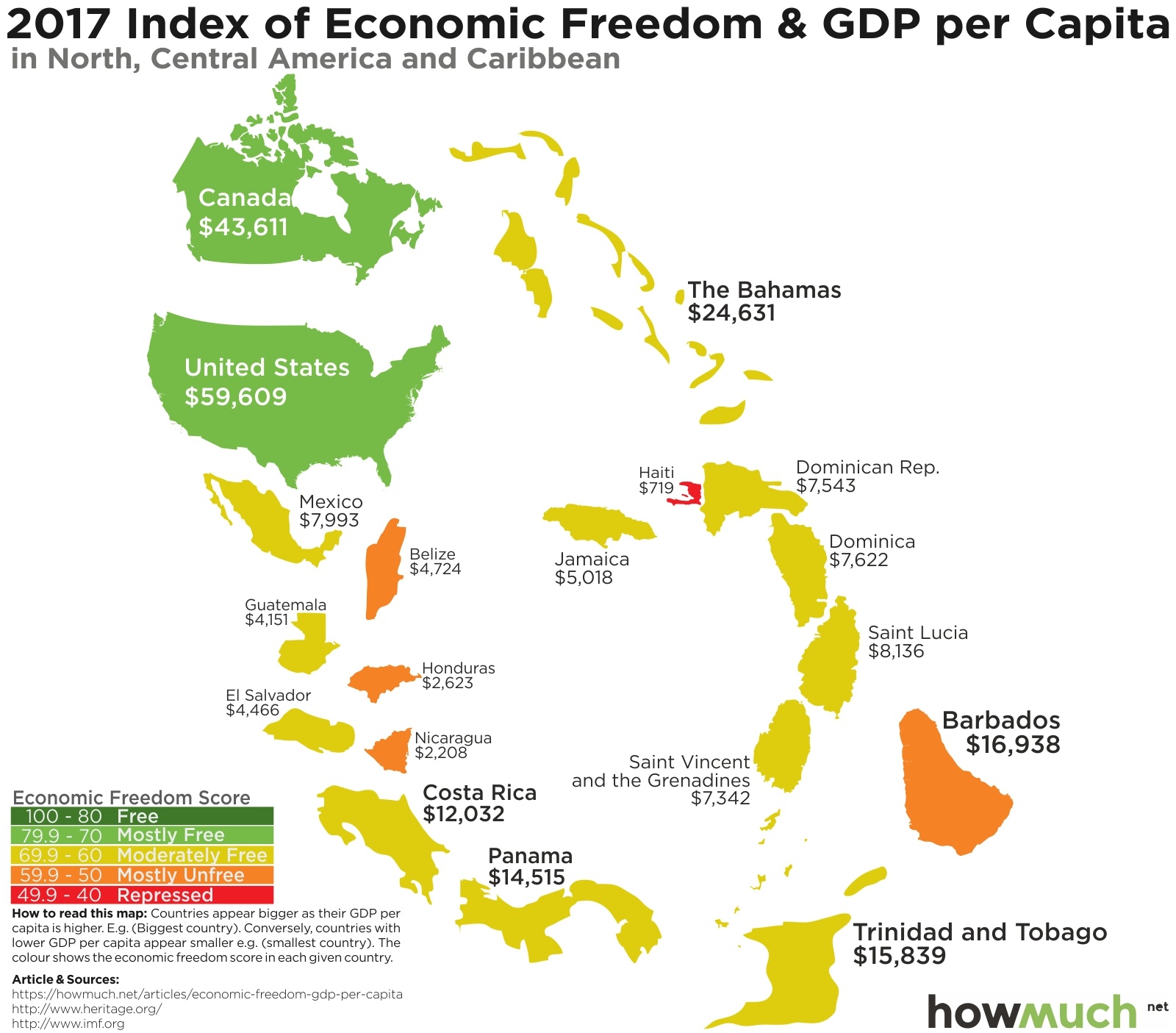
Searching for patterns across the entire globe is interesting, but we thought we could take our viz up a notch and see if there are any correlations according to average GDP per capita and economic freedom. Gross Domestic Product (GDP) is a simple economic measurement for the total value of the goods and services sold in an economy. Looking at GDP per capita is not the same as average income, but it lets you quickly judge how well off the average person in that country is. So we used GDP figures from the International Monetary Fund to change the size of each country on the map—the larger the country appears, the higher per capita GDP is. There are some surprising insights you can gather from crunching the numbers like this.

First off, the United States is obviously the richest country in North America with a GDP per capita of $59,609, followed by Canada ($43,611). Every other country is either moderately free or mostly unfree, and third richest country in the bunch is actually The Bahamas ($24,631) followed by Barbados ($16,938). But look at how small Mexico appears, where GDP per capita doesn’t even reach $8,000. That fact alone tells you a lot about the Mexican economy.

Moving down to South America reveals other interesting trends. Chile is the freest country around, scoring a respectable 76.5 in Heritage’s ranking, but it only has a per capita GDP of $13,663. Two other countries are comparably less free but richer: Uruguay ($16,639) and Argentina ($14,267). This is our first clue that economic freedom is not a surefire guarantee for a wealthy economy.

Crossing the Atlantic Ocean into Europe reveals a significant amount of economic freedom with several developed and rich economies. Luxembourg blows away the competition in terms of its GDP, boasting $101,715 in economic output per citizen, followed by Switzerland ($78,245) and Norway ($73,450). Not everything is so great across Europe, however. Several countries along the Mediterranean remain only moderately free, with other countries in Eastern Europe along the Balkan Peninsula generating comparably small economic outputs. Greece is an interesting place our map given the recent news about its debt restructuring. It still has a per capita GDP of $17,806, which certainly isn’t the best, but its about the same as Portugal. There is yet hope that the Greek economy can muddle its way through.

For the purposes of this map, we define Asia as the entire continent stretching from Israel in the East all the way to Indonesia and Taiwan in the West. There’s a tremendous amount of diversity in this region, both in terms of the relative freedom of these places and the size of their economies. Hong Kong ($44,752) and Singapore ($51,431) are the two standout countries with the freest citizens. We should mention that both countries inherited their current government and legal systems from their historical legacy as British colonies. Macau actually has the largest economy for its size ($68,401) thanks to a robust gambling industry, while Qatar ($64,447) and the UAE ($40,162) make the list thank to their oil wealth. Every other country across the Middle East still has a long way to go before joining the ranks of economically developed countries.

The situation is Africa is quite different from the rest of the world. Looking at our map, you can immediately see a large number of repressed or mostly unfree countries with tiny economies. Seychelles actually has the largest economy for its size with a GDP per capita of $15,578, but its not technically in Africa (it’s actually in the middle of the Indian Ocean). Equatorial Guinea ($13,867) is the wealthiest on the continent itself, but the country scores extremely low on Heritage’s ranking at 45.0. Mauritius ($9,619) and Botswana ($7,141) are the freest countries around, but their economies are still puny in comparison to almost everywhere else in the world.

Oceania is the last stop on our world tour, and you can clearly see a dichotomy between Australia and New Zealand and the rest of the region. The Auzis have the most robust economy with a per capita GDP of $55,215, roughly $14,000 higher than New Zealand. There’s simply no other place in the region with nearly as much wealth or economic freedom. Fiji is the only other island to cross $5,000 in per capita GDP, scoring only 63.4 on Heritage’s rankings.

Let’s break this down one more way. Take a look at the top ten freest countries on Earth. We also listed Heritage’s freedom score and the GDP per capita as a quick reference.

1. Hong Kong: 89.8 and $44,751

2. Singapore: 88.6 and $51,431

3. New Zealand: 83.7 and $41,107

4. Switzerland: 81.5 and $78,245

5. Australia: 81.0 and $55,215

6. Estonia: 79.1 and $17,891

7. Canada: 78.5 and $43,611

8. United Arab Emirates: 76.9 and $40,162

9. Ireland: 76.7 and $62,085

10. Chile: 76.5 and $13,663

As you can see, Estonia and Chile both crack the top ten, but they don’t exactly have high performing economies. The things that the Heritage Foundation measures for economic freedom only tell part of the story in terms of economic development. Countries also need to get lucky in terms of geography (like the United Arab Emirates) or historical legacies (like Hong Kong and Singapore).

Data: Table 1.1 

This Map Shows You the Richest Politician In Every State

$
0
0

Did you know that George Washington was so rich that he wanted to reject his presidential salary? Wealth has always been a part of American politics, but, recently, political wealth crossed a new milestone (most Congresspeople are millionaires). This map shows the richest politician in every state, and reveals just how rich they really are.

There are 34 states with Republicans as their richest politicians, 15 with Democrats, and one with an Independent. Interestingly, every single one is in Congress. There are no executive branch politicians, including governors, whatsoever.

Geographic Influence

In many places, the results were predictable. No richest-in-state Democrats can be found in the South, but there is a cluster in New England.

There are a few surprises, though. For instance, the richest politicians in Democratic strongholds California and New York are Republicans. The Midwest is split evenly. And despite being severely outnumbered, there are a few very wealthy Democrats in the top five on this list.

Top 10 Richest Politicians in Each State

1. Rep. Darrell Issa (R-CA) - $330M

2. Rep. Jared Polis (D-CO) - $313.6M

3. Sen. Mark Warner (D-VA) - $238.2M

4. Rep. John K. Delaney (D-MD) - $232.8M

5. Rep. Dave Trott (R-MI) - $177.1M

6. Rep. Vernon Buchanan (R-FL) - $115.5M

7. Sen. Richard Blumenthal (D-CT) - $81.7M

8. Rep. Diane Black (R-TN) - $75.3M

9. Rep. Chris Collins (R-NY) - $66.4M

10. Rep. Thomas MacArthur (R-NJ) - $64M

The 50 politicians on this map are worth just under $2.5B altogether. These ten officials have a cumulative net worth of nearly $1.7B by themselves.

Gender Disparity

We already know that the gender pay gap is pervasive. This remains true in politics.

Of the 50 highly paid politicians on our visualization, only six are women. We couldn’t find any patterns explaining why these states had such wealthy female politicians. Among the women, there is a 4:2 Republican advantage and they are scattered across all parts of the country, from Hawaii to New England.

The wealthiest among them is Tennessee’s Republican Representative, Diane Black ($75.3M).

Political Wealth vs. General Wealth

While some politicians are very wealthy, not all are. Over 100 members of Congress actually have negative net worths, and a handful are right around zero. (Check out Roll Call’s Wealth of Congress Index for a deep dive into Congressional finances.).

We also found that political wealth pales in comparison to the state-by-state wealth of non-politicians. Nearly every state’s richest person is a billionaire, but no politicians (aside from Donald Trump, who doesn’t represent a single state) have reached that pinnacle.

Editor’s Note: Al Franken, the junior Senator from Minnesota, has announced his resignation, after being accused of sexual misconduct by several women. Until his resignation is official, he remains the wealthiest politician in Minnesota, with a net worth of $7.1M.

Data: Table 1.1 


Mapping Internet Prices Around the World

$
0
0

Bill Gates said that “the Internet is becoming the town square for the global village of tomorrow.” He’s right, but that doesn’t mean that internet is affordable everywhere yet. We recently came across a report showing that broadband access in the Southern Hemisphere is more expensive than the north. It also showed that some countries have mind-blowingly expensive internet and that highly affordable internet can often be found in the most surprising places. (The world’s cheapest internet can be found in Ukraine - and Iran!)

North America

In North America, things are pretty consistent. You can move around the continent without too much variation in internet costs. Of the NAFTA nations, Mexico is the cheapest. The average cost of broadband internet there is only $26 per month. On our visualizations, we clumped the Caribbean in with South America, except for the Bahamas and Bermuda. Internet in the Bahamas ($77) is $11/month more expensive than in the U.S.A ($66). Bermuda’s monthly average is over $126/month.

South America

This map contains 44 countries and territories. Overall, internet here is pretty affordable. On the South American mainland, internet prices average just over fifty bucks monthly. The islands, however, have remarkably inconsistent pricing. Some have internet costs 2-3x that of their immediate neighbors. For instance, the Dutch side of Saint Martin (Sint Maarten) has a monthly average of $73, while the French side’s is only $20!

Asia

Overall, the world’s largest continent has very affordable internet. Notably, China and India offer their 2.7 billion combined residents broadband for less than $40/month, on average. In a few Asian countries, such as Brunei and Laos, internet costs skyrocket to roughly $250/month, but these are the exceptions, not the rules. Elsewhere, broadband costs are more in line with the Americas. Extremely cheap internet is provided in Russia ($10), Syria ($12), Kazakhstan ($13), and Iran ($5.40). These countries are reminders that a reputation for technological advancement does not necessarily result in the most affordable internet.

Africa

Overall, Africa is the worst place to have internet access. Many countries didn’t even have data to review. The original report says: sub-Saharan Africa fared worst overall with almost all of the 31 countries measured found in the most expensive half of the table, 16 of them in the most expensive quarter. The extremes are huge. In Egypt, broadband costs less than $15 monthly, but in Namibia it costs over $450. In Burkina Faso, the priciest of all, internet costs an astonishing $963 per month! On the other hand, a spacious apartment in the country’s capital will only cost you about $460/month.

Oceania

All countries in Oceania are among the bottom half of nations when it comes to internet affordability.  Australia ($60) and New Zealand ($65) are comparable to most Western European nations, but the most interesting case in Oceania is Papua New Guinea, where internet cost a staggering $590 each month. A few years ago, internet cost over 225% of the average annual income. Prices are nowhere near that high today. (We found this incredible research paper that explains why.)

So how much does internet cost in your country? 

Data: Table 1.1

American Consumption Greatly Varies by State. See Where the Biggest Spenders Live.

$
0
0

Consumer spending is the engine that powers the American economy, accounting for about 70 percent of all activity. An uptick as small as 0.3% can cause the Federal Reserve to reevaluate its plan on raising interest rates. Since looking at these numbers in aggregate can tell you a lot about the economy’s direction, we thought we’d break down personal consumption at the state level. This reveals an interesting snapshot about the economy.  

The Bureau of Economic Analysis— part of the U.S. Department of Commerce—published new numbers in October 2017 tabulating how personal consumption has changed year-over-year. This includes things as wide ranging as housing and utilities, health care expenses, and eating at restaurants. We color-coded each state based on how expensive it is there—green states are comparatively cheaper, and red states are more expensive. This approach gives you a good idea not only how much things cost, but also a thing or two about the economy at the state level.

There are a few obvious trends when you map the data for each state. First off, there’s a cluster of pink and red states grouped in the Northeast. The most expensive place on our map is Washington, DC ($56,843), followed by Massachusetts ($51,981). As a matter of fact, six of the top ten most expensive places are in the Northeast. It’s cliché that housing is expensive in New York, but there are a lot of other expensive states in the region too.

There’s also a collection green states across the Deep South to the Southwest, stretching all the way from North Carolina ($33,779) to Nevada ($36,177) and even up to Oregon ($39,742). The cheapest place is Mississippi, where it costs only $30,200 to pay for life’s most common expenses. Florida is the only state in the Deep South where it costs more than $37k. Keep in mind, Florida’s warm winter climate makes it a prime candidate for migration, which increases personal consumption..

There are a few other fascinating stories that you can infer based on our map. Take a look at Alaska ($49,547), the third most expensive state. There’s no doubt Alaska’s location far away from the contiguous United States plays a large part in driving up housing and health care costs, but who knew it costs more to live in the Last Frontier than New Jersey? Another standout is North Dakota, the seventh most expensive state in the country. It’s no coincidence that both Alaska and North Dakota have enormous oil wealth, which only puts upward pressure on prices. In fact, oil extraction in Alaska is only going to grow in the New Year.

Here’s another interesting trend. This map is a close approximation of the results for the 2016 election. East of the Mississippi River, every expensive state voted for Hillary Clinton, and every inexpensive state went for Donald Trump. The situation is a little convoluted out West, but it’s remarkable how the political divide mirrors an economic reality.

Top 10 Places Where Americans Spend the Most

1. Washington, DC: $56,843

2. Massachusetts: $51,981

3. Alaska: $49,547

4. New Jersey: $48,972

5. New Hampshire: $48,810

6. Connecticut: $48,497

7. North Dakota: $48,225

8. Vermont: $47,648

9. New York: $46,906

10. Hawaii: $45,123

The big takeaway from all this is that no matter where you live, you need a decent amount of money to make ends meet. Exactly how much depends on where you live, but you need more than $40,000 in 28 states, and more than $50,000 for two (if you count Washington, DC).

Source: Table 1.1 

This Map Shows Where the Most Debt-Burdened People in America Live

$
0
0

Americans have racked up almost $13 trillion in personal debt for things like mortgages, car notes and student loans. $13 trillion is an enormous pile of money, but here’s the kicker. That’s significantly better than the run-up to the Great Recession. Still, it’s hard to imagine what that looks like across the country. So, we created a new map to figure out exactly what’s going on.

GOBankingRates recently conducted a survey in which they asked Americans how much debt they had. This included things like a mortgage, credit card debt, student loans, car notes and medical bills—basically every major category of debt. They broke the respondents down by state to calculate an average total debt load, which we then mapped across the country. As one can see, people living in states colored dark red and pink have higher debt burdens (as much as $500k) compared to light and dark blue, where the debt load is less than $50k.

Hawaiians have by far the highest debt, averaging $869,250. This makes sense considering the Aloha State’s location in the middle of the Pacific Ocean, and the fact that our numbers take into consideration mortgages. There’s only so much land someone can buy before demand outstrips supply and drives up price (the new land constantly created by volcanoes notwithstanding). People with the second highest debt burden live in Maryland ($284,851), but that’s almost four times as small as Hawaii. Further down the list, there are some obvious clusters of states, with five states surpassing $100k and an additional six between $50k-$100k. The rest all have lower debt levels.

There really isn’t a clear pattern on the map: there are low-debt states sitting right next to high-debt states. The lowest debt-burdened people live in Washington, DC ($1,611), followed closely by Alaskans ($2,286). What could these places possibly have in common? The one exception can be found in the Deep South, where a cluster of blue and dark blue states all group together. Louisianans have the third lowest debt burden in the country, averaging only $6,140 per person. Other than that, personal debt levels swing wildly from state to state.

Here’s the key insight. A few different factors explain the wide-ranging differences. For example, people living in New York City probably don’t own a car, and many still rent an apartment. Compare that to Texas and Oklahoma, where most people own a home in the suburbs from which they commute to work in vehicle they also own. Simply, put, lifestyle choices go a long way in determining debt levels. Not only that, there are good kinds of debt that build equity—like paying a mortgage—and add to overall net worth. Having very little debt is great if you consistently save money.

Top 10 States Where People Have the Most Debt

1. Hawaii: $869,250

2. Maryland: $284,851

3. Texas: $185,584

4. Oklahoma: $174,839

5. Indiana: $166,844

6. Nevada: $165,740

7. Minnesota: $113,455

8. Illinois: $98,309

9. Maine: $91,183

10. Virginia: $81,194

All of this suggests that average debt depends more on an individual’s choices than where he or she lives. People can achieve extremely low debt levels if they are in expensive urban areas or rural towns. If both the bureaucrats in Washington, DC and frontiersmen in Alaska can do it, then we bet you can too.

Data: Table 1.1


Bitcoin’s Stunning Rise Far Outperformed the Best Stocks in 2017

$
0
0

The market correction in late December notwithstanding, 2017 was the year of bitcoin. The cryptocurrency made headlines both for its eyepopping returns and its highly speculative nature. Jamie Dimon, the CEO of JP Morgan Chase, famously said bitcoin was a “fraud,” and that people who buy it are “stupid.” Regardless of what you think about it, bitcoin’s inexorable rise got us wondering how it compares against the fastest growing publicly traded companies. So we ran the numbers and created a new graph to find out.

To get our numbers, we simply searched Google Finance for the top companies in terms of percentage growth year-to-date. We ranked each company (or cryptocurrency) from highest to lowest, placing each logo on a straightforward bar chart. This lets you see how the prices of different stocks behaved throughout the year, putting them on an even playing field with Bitcoin. This lets you easily see how Bitcoin’s performance stacks up against other high-growth companies.

As you can clearly see, Bitcoin investors by far saw the most growth in 2017, totaling an amazing 1,324%. That’s insane by any measure, especially when you compare it against other high-growth stocks. The second-highest performing stock was Madrigal Pharmaceuticals at an impressive 475%, but that’s only about a third as much as the rise of Bitcoin. Never heard of Madrigal? It’s a low-key drug company that recently discovered a promising treatment for liver disease. That’s right: Madrigal might have cured liver disease—which afflicts almost 4 million people—and the company didn’t even match half of Bitcoin’s rise in value.

The other company on our list boasting more than 401% growth is Straight Path Communications, which specializes in millimeter bandwidth licenses for 5G networks. 5G represents the next level of mobile network connectivity—imagine streaming Netflix directly on your phone, outside of WiFi coverage, with minimal lag. The Pew Research Center estimates that roughly 3 out of 4 Americans have a smartphone, a trend which is probably only going to increase. It makes a lot of sense that a company like Straight Path would skyrocket in value.

Things start to get crowded further down the list. Weight Watchers had a great year, posting 300% growth, followed by Exact Science (292%) and Scientific Games (266%). In fact, there are actually a lot of technology companies among the top-performers from 2017. Square (151%) and Shopify (136%) are obvious standouts, but take another look at Alibaba at 95% growth. Alibaba is a massive e-commerce and retail conglomerate in Asia. Think of it as the Amazon of China, only better. Alibaba was already a huge company, and now its market cap sits at $470B. For the sake of comparison, Bitcoin’s market cap is only $253B. No other company comes anywhere close to Alibaba.

No matter how you slice it, the rapid rise of Bitcoin blew away the competition in 2017. There’s no telling where the currency will be at the end of 2018, much less any of the other companies on our list. That being said, we will let you decide whether or not to invest in cryptocurrency.

Data: Table 1.1 

Mapping States with the Best and Worst Credit Scores and their Household Income

$
0
0

A good credit score is essential for every major financial decision. Buying a house, getting a car loan, and even getting hired all depend on maintaining a score. And perhaps the most obvious predictor of credit worthiness is whether the applicant has a high income with a steady track record of employment. With so much riding on a single number, we decided to compare average credit scores across the country and weight the results by median income levels.

We gathered our data from two different places. We used average credit score numbers from the VantageScore system. We color-coded each state according to the average credit score of people living there: states with high numbers were colored shades of green, and states with low scores became red and pink. We also took median household income numbers from the U.S. Census Bureau, allowing us to adjust the size of each state. Analyzing credit scores and income data in this way allows us to see a couple interesting trends in the economy.

Three large groups of similar states are immediately obvious on the map. There’s a group of green states stretching from the Northwest across the Northern Great Plains, all the way to the Great Lakes. All of these states have similar credit scores over 685 and decent-sized incomes, with Minnesotans in the lead with a score of 722 and a median income of $63,217. There’s another pocket of rich states in the Northeast, the richest being Massachusetts at 706 and $70,954. And finally, there’s a large group of states across the Deep South where people on average have very bad credit scores. Mississippians post the worst scores in the country (648) and make comparatively less on average ($40,528). In other words, our map quickly demonstrates which parts of the country are enjoying an economic expansion, and which places are struggling.

The more income people have, the better their credit scores are. This makes intuitive sense because a good income consistently pays the bills. Looking at our map, the Deep South is obviously the poorest region in the country, and the states there have the lowest credit scores. The same trend stretches across some of the old Rust Belt states, particularly Michigan ($50,803), Ohio ($50,674) and Indiana ($50,433). States right next door probably have similar living expenses, but people have median incomes of about $4,000 more. That makes it much easier to make ends meet.

A few exceptions prove the rule. Alaskans enjoy some of the highest incomes in the country thanks to oil ($74,444) and the average score is 675, but the state is completely different from the rest of the country. Nevada (think: Las Vegas) which has a median income of $53,094 but an average score of just 657. Remember, the house always wins!

Here’s a list off the top ten states according to the average credit score of the people living there, together with the median household income.

1. Minnesota: 722 and $63,217

2. North Dakota: 713 and $59,114

3. Vermont: 713 and $56,104

4. New Hampshire: 712 and $68,485

5. South Dakota: 711 and $52,078

6. Wisconsin: 710 and $54,610

7. Iowa: 708 and $54,570

8. Massachusetts: 706 and $70,954

9. Washington: 704 and $62,848

10. Hawaii: 702 and $71,977

It’s no surprise that higher incomes are correlated with better credit scores. But it’s worth pointing out that the two aren’t perfectly aligned. People in Washington D.C. enjoy a median income of almost $73,000, but their credit scores are worse than Iowans, who make less than $55,000. That’s because there are a lot of other reasons behind credit worthiness, namely, the individual decisions people make every day with their money. Still, the extra few thousand dollars doesn’t hurt either.

Data: Table 1.1

Transactions Speeds: How Do Cryptocurrencies Stack Up To Visa or PayPal?

$
0
0

Cryptocurrency bag holders often boast that their network transaction speeds are faster than mainstream payment methods, such as Visa or Paypal. As cryptocurrencies continue to rise in popularity, it will be important to determine which blockchain payment networks could eventually become the “new Visa.” While both sides continue to debate their arguments, we jumped through the hard data and created a unique visual to highlight transaction speeds across several different payment networks.

We chose to compare the transaction speeds of some of the largest cryptocurrencies by market-cap relative to Visa and PayPal. Each payment network is ranked largest-to-smallest based on the size of their balloon, which equates to the number of transactions per second. The larger the balloon, the more transactions their payment network can process per second. This allows for a clear and concise visual to show once and for all how some of the most popular crytpocurrencies stack up to more traditional payment methods.

Ripple Shows Potential, But Visa is Still the King of Speed

As you can see, Visa still has the fastest transaction speeds over any other payment networks measured, with 24,000 transactions per second. It was surprising to see Ripple come in second and beat out PayPal by a whopping 1,307 transactions per second. This shows that Ripple may have the capability to be a viable payment solution on a much larger scale.

PayPal had 218 million active users during the third quarter of 2017. PayPal is still among the most popular and well-known digital peer-to-peer platforms out there, but Ripple’s transaction speed dominance could be the key to a next-generation peer-to-peer payment platform that is not only faster, but also safer.

Our data shows that Bitcoin Cash has the second fastest transaction speed of the major cryptos. Maybe this will finally give Bitcoin Cash the proper respect and recognition as the second most viable crypto for transaction speeds. To be fair to Charlie Lee (Litecoin creator) and his loyal Litecoin followers, four transactions less per second is a close margin of speed and does deserve recognition.

Those of us who are actively vested within the cryptocurrency space are not shocked to see Dash, Bitcoin and Ethereum bringing up the rear. Crypto traders are consistently hit with transaction delays when they go to transfer their Ether or Bitcoin, as their growing popularity outpaces their network’s processing capabilities.

Here is a breakdown of the chart, which includes each network’s number of transactions per second data results:

1. Visa: 24,000 transactions

2. Ripple: 1,500 transactions

3. PayPal: 193 transactions

4. Bitcoin Cash: 60 transactions

5. Litecoin: 56 transactions

6. Dash: 48 transactions

7. Ethereum: 20 transactions

8. Bitcoin: 7 transactions

Overall, Visa continues to have one of the fastest transactions speeds across several different payment networks. Keep in mind that cryptocurrency and blockchain technology is still in the very early stages. Visa was founded in 1958 and has had 60 years to improve and grow its payment network capabilities. Imagine if we give Ripple, Bitcoin Cash, Litecoin, and other cryptocurrencies 60 years to develop their networks, the data may not be so skewed in Visa’s favor. For now, cryptocurrency pioneers continue deeper into uncharted territory in search of faster speeds, improved network stability, and user adoption.

Data: Table 1.1


The Most Valuable Sports Brands in the World

$
0
0

It’s a new year, and that means more people are hitting the gym in the hopes of making a sustainable lifestyle change. With everyone making New Year’s resolutions to get healthy, it made us think about the broader sport brands and athletic apparel markets. Who are the biggest players, and what’s the market look like? We put together a new viz to find out.

We got our data from Forbes, which publishes an annual list of the most valuable companies in almost every conceivable industry. We placed each company inside a rectangle corresponding to its market value, then we added logos and the valuation as a quick reference. This creates a snapshot of the entire market at one glance.

There are some obvious reasons why looking at the data in this way is better than a boring bar chart. Nike dominates the sports brand market with a value of $29.6B, accounting for 42% of the entire market capitalization. The second, third, and fourth largest companies similarly make up a combined 41% of the market. In other words, sports brands tend to be very top-heavy—dominated by a few large companies, with no other brand topping $5B. That’s right—four companies control more than 80% of the space.

So what might this chart look like at the end of 2018? It’s hard to say with so much disruption going on in the economy. When it comes to the athletic apparel market, Adidas and Under Armour have a long way to go before they can seriously challenge the top company. Nike has a lot of advantages being the largest, especially since they recently returned to double-digit earnings growth.

The second largest company, however, faces a more uncertain future. Disney actually owns ESPN, which is bundled with other popular channels. That means if you want cable TV, you have to get ESPN. But since cable bills keep getting more expensive, more and more people are cutting the cord in favor of streaming services like Netflix. All of this means that ESPN’s recent round of layoffs probably foreshadows more difficult times for the network.

Let’s take a step and break things down. Here’s the data in a simple list, from highest to lowest valuation ($ M).

1. Nike: $29,600

2. ESPN: $15,800

3. Adidas: $7,900

4. Sky Sports: $5,500

5. Under Armour: $4,400

6. MLBAM: $2,400

7. UFC: $2,000

8. YES: $1,400

9. Reebok: $800

10. NESN: $650

If your New Year’s resolution calls for going to the gym more, take a look around the next time you’re there. We bet you’ll see a lot of people wearing Nike outfits, and odds are that ESPN will be playing on the TV in the corner. That is, unless your treadmill has Netflix.


This Map Shows Which Countries are Buying Most of the World's Diamonds

$
0
0

A widely accepted symbol of status and love, diamonds are very valuable and highly tradeable. While they can’t compare with oil or machinery imports, worldwide diamond imports totaled $117.4B in the last year. That’s big business. We wanted to know how big, so we created this visualization to show you where all the diamonds are going.

As with most industries, the top players command a huge majority of the wealth. The world’s top 15 diamond importers represent over 96% of global imports.

Top 10 Diamond Importers

1. United States: $24.4 billion (20.8%)

2. India: $19 billion (16.2%)

3. Hong Kong: $18.9 billion (16.1%)

4. Belgium: $15.4 billion (13.1%)

5. United Arab Emirates: $9.2 billion (7.8%)

6. China: $7.8 billion (6.6%)

7. Israel: $7.1 billion (6%)

8. Switzerland: $2.5 billion (2.1%)

9. United Kingdom: $2.2 billion (1.9%)

10. Singapore: $1.7 billion (1.5%)

Among top 15 importers, there are no countries from Oceania or South America. Australia appears #18 and Brazil at #52, with $7.6M, or just 0.01%, of the world’s diamond imports.

Small-scale Diamond Importers

The 34 countries from the bottom of the list import less than $1.5M totals. Some of these countries import so few diamonds that the entire value may be the result of purchases made by a private individual.

Nigeria, for instance, had total diamond imports of just $1,000. Many other countries in Africa, South and Central Americas, and central Asia also have fewer than $100,000 in diamond imports.

Why Some Countries Import and Export

Most understand diamonds this way: poor countries, like those in Western Africa, mine diamonds and rich countries, like the U.S. and the U.K., buy them. This narrative became especially popular in the 1990s and early 2000s, as a result of journalism covering blood diamonds.

In reality, the market is more complex than that. Countries don’t exclusively buy or sell diamonds. Several (the U.S., India, and China, for instance) are importing and exporting diamonds in huge quantities. The reason for this often has to do with quality and preference. For instance, a rich country may export cheap diamonds and import expensive ones.

The Import/Export Discrepancy

The worldwide total for diamond imports in 2016 was $117.4B, but we checked the export total that same year and discovered that it was $127.6B. So what happened to the other ten billion?

According to the IMF, “The principal reasons for inconsistent statistics on destination and origin for a given shipment are differences in 1) classification concepts and detail, 2) time of recording, 3) valuation, and 4) coverage, as well as 5) processing errors.” Turns out that $10B is just the cost of doing business in the diamond industry.

Diamond Market Trends

Someone without awareness of nation-by-nation economic trends might be surprised to know where the diamond import markets are growing and shrinking. Namibia, Singapore, and Italy – three nations on different continents with wildly different cultures – represent the three fastest growing markets. Namibia and Singapore each skyrocketed, growing over 100%. The U.K., the U.A.E., Botswana, and even Belgium (the world’s historic diamond capital) all represent shrinking markets. But why?

In the U.K., diamond imports dropped nearly 75% since 2012. Part of this drop in demand could be a result of the trend toward other gemstones in bridal jewelry. In other places, like Dubai (the diamond bazaar of U.A.E.), may just be on the back end of a boom.

The Future of Diamond Imports

The diamond industry has a history of success based in cheap labor, high demand, tightly monitored supply, and incredible marketing. Although the artificial diamonds and market forces are changing the industry, there’s no reason to think that diamonds are going anywhere.

In fact, a new supply of valuable ocean diamonds will begin hitting the market in the next few years, and may cause a new “wave” of diamond imports.

Data: Table 1.1

Mapped: Bitcoin’s Legality Around The World

$
0
0

Bitcoin’s popularity has increased exponentially over the past year, as cryptocurrency continues to go mainstream. However, not everyone is excited and optimistic about Bitcoin. Several governments have stepped in recently, as Bitcoin’s popularity and market cap have impacted fiat currency valuations. Feeling threatened with a lack of understanding of cryptocurrencies, some countries have gone as far as to put out-right bans on Bitcoin trading. With all the recent sweep of government regulations, we wanted to develop a visual that highlights the legality of Bitcoin by country.

In our visual, we wanted to highlight the globe and where each country stands on Bitcoin. Using a color legend, we created a range of Bitcoin legality that helps show the varying degrees of acceptance around the world. Green countries are legal Bitcoin markets. Orange represents neutral markets that are not outright legalizing Bitcoin, but do not have any major restrictions against the use of cryptocurrency. Light pink countries are restricted Bitcoin markets that may have lots of red-tape, regulations, and government attempts to slow the use of cryptocurrencies. Dark pink countries represent markets where Bitcoin has been made completely illegal and criminalized. Lastly, some countries have yet to comment on Bitcoin’s legality, which are represented by gray color.

Eastern Countries More Closed Off To Bitcoin Compared To West

As the visual shows, Eastern countries appear a lot more closed off to Bitcoin than their Western counterparts. Russia is currently the largest country to illegalize Bitcoin. However, China and South Korea are the latest two countries to step up their scrutiny and regulation of Bitcoin use. This has led to the recent sell off across the cryptocurrency market, as China and South Korea are two vital hotspots that have historically contributed a lot of trading liquidity to the emerging market. However, South Korean citizens are not going down without a fight. A recent petition to stop the cryptocurrency ban and fire government officials has exceeded 100,000 signatures.

North American and Western Europe are the most accepting regions for Bitcoin. The Middle East appears to be very divided on the topic of Bitcoin. Interestingly enough, Iraq, Iran, and Turkey are legal Bitcoin markets, while Afghanistan, Pakistan, Saudi Arabia, and Egypt have varying degrees of restrictions on the cryptocurrency.

There are currently 99 (40%) countries that have unrestricted Bitcoin laws, out of 246 total. Nearly seventeen countries, or 7% of the world, has either restricted or illegalized Bitcoin. Interestingly enough, 53% of the world has yet to comment on Bitcoin and the legality of its use within their countries. This is a risk for Bitcoin, as some of these undecided countries could eventually decide to place restrictions on cryptocurrencies.  

Here is a breakdown of the chart, based on the global legality of Bitcoin out of 246 countries:

  • Legal and Neutral (Green and Orange): 99 Countries or 40% of World

  • Restricted (Light Pink): 7 Countries or 3% of World

  • Illegal (Dark Pink): 10 Countries or 4% of World

  • No Information (Gray): 130 Countries or 53% of World

Overall, a majority of the world still has yet to comment on the legality of Bitcoin. The emerging industry is still not fully understood by global regulators, which may explain why some countries have yet to comment on the movement. As time passes, countries that have remained on the sideline will eventually come out with a set of regulations that either approve Bitcoin’s use or illegalize the activity. Bitcoin’s rise in popularity continues to exceed expectations, but not all countries will see cryptocurrency in a favorable light.  

How Much Money the Highest Paid CEOs in America Make

$
0
0

The stock market continues to set record highs, and the Republican tax cut is about to hit workers’ paychecks in February. The new tax law also impacts skyrocketing executive compensation, which made us wonder how a CEO compensation correlates with the company’s financial performance. We created a new graph to find out.

We took our numbers from 24/7WallSt, which tracks things like executive compensation on a regular basis. We put each of the 25 highest paid CEO’s on a scatterplot graph, where the vertical axis corresponds to the CEO’s personal earnings and the horizontal matches the company’s annual revenue. We then sized each point on the graph to the size of the CEO’s salary—the larger the circle, the more he or she makes. Our viz makes several different trends in executive compensation readily apparent.

There’s a clear trend in the middle, where a company’s annual revenue parallels its CEO’s salary. Starting with Meg Whitman ($32.9M) from Hewlett Packard, and moving all the way to Mark Hurd ($41.1M) at Nike, there’s a substantial cluster of CEO’s whose pay increases as their companies’ revenue increases. This suggests a linear correlation: as the company grows and generates more money, the CEO is rewarded with more money too. That makes perfect sense.

But here’s another obvious fact about our graph: there are examples where a CEO’s compensation is out of line with the company’s performance. This can cut both ways. Brian Roberts ($28.6) from Comcast and Virginia Rometty ($32.3) from IBM both seem relatively underpaid for how large their respective companies are. On the other side, Thomas Rutledge ($98) from Charter Communications and Leslie Moonves ($68.6) at CBS both appear to excessively overpaid—they’re way above everyone else. Rutledge makes $268,000 every single day, counting weekends and holidays. That’s hard to believe.

It’s also worth pointing out that there are a lot of huge companies missing from our graph. Where are companies like Facebook or Amazon? They take a radically different approach to executive compensation, focusing instead on stock options. Mark Zuckerberg from Facebook literally makes $1 a year. Jeff Bezos from Amazon makes about $1.7M a year with a base salary of only $82,000. But don’t shed a tear for these billionaires—Bezos’ personal net worth shot up by $2B after Amazon bought Whole Foods. Not bad for a day’s work.

Top ten Highest Compensated CEO’s in USA

1. Thomas M. Rutledge $98M @ Charter Communications $29B

2. Leslie Moonves $68.6M @ CBS $13.2B

3. Fabrizio Freda $47.7M @ Estee Lauder $11.8B

4. Mark G. Parker $47.6M @ Nike $34.4B

5. Mark V. Hurd $41.1M @ Oracle $37.7B

6. Robert A. Iger $41M @ Walt Disney $55.1B

7. Safra A. Catz $40.9M @ Oracle $37.7B

8. David M. Zaslav $37.2M @ Discovery Communications $6.5B

9. Robert A. Kotick $33.1M @ Activision Blizzard $6.6B

10. Margaret C. Whitman $32.9M @ Hewlett Packard Enterprise $28.9B

Some CEOs clearly make a killing even though they don’t work for the largest or most profitable companies. It raises important questions about the value these individuals contribute to their respective employers. That being said, making a quarter million each day—every day—is great work if you can get it.

Data: Table 1.1 


ICO Frenzy: Top 10 Offerings Raised $1.74 Billion In 2017

$
0
0

Initial Coin Offerings (ICO) took off in 2017, as crypto-fever continues to reach new heights. This relatively new fundraising method has captivated companies ranging from startups to large-cap enterprises. The cryptocurrency craze in 2017 led to over $5 billion in fundraising from a little more than 706 ICOs. While there were many different ICOs that are worth mentioning, we set out to highlight the top ten of 2017 by funds raised.

Using key sources: tokendata.ioicodrops.comcoinschedule.com, and coinspeaker.com, we were able to accurately determine the true top ten ICOs of 2017 by funds raised. Using hot air balloons, we placed the ICOs with the highest amount of funds raised at the top and with the largest-sized balloons. As you go down the visual, the balloon sizes shrink as the amount of funds raised by the ICOs decrease. This clearly shows how dominant the top ten ICOs were in their ability to attract investor capital in 2017.

According to the hard data, the top ten ICOs by funds raised in 2017 generated a total of more than $1.74 billion. Hdac was the number one ICO, which raised $258 million. Filecoin was a close second with $257 million in funds raised. Together, Hdac and Filecoin account for $515 million or 30% of the total $1.74 billion raised.

Tezos was the third highest grossing ICO of 2017 with $232.32 million and EOS’s stage 1 offering generated $230 million. Tezos and EOS raised impressive amounts of money in their ICOs, as both infrastructure businesses accounted for 26% of the total $1.74 billion raised. Overall, this means that the top four ICOs of 2017 have generated more than half of the top ten’s total funds.

Infrastructure companies did very well in their initial coin offerings last year. Seven of the top ten coin offerings were backed by infrastructure businesses, which shows that the industry is currently in high demand among investors. Of the remaining businesses, two operate within trading & investing and one in data storage.

Top 10 ICOs in Terms of the Amount of Funds Collected in 2017

1. Hdac (infrastructure): $258 Million 

2. Filecoin (data storage): $257 Million 

3. Tezos (infrastructure): $232.32 Million

4. EOS Stage 1 (infrastructure): $230 Million 

5. Sirin Labs (infrastructure): $157.90 Million 

6. Bancor (infrastructure): $153 Million 

7. Polkadot (infrastructure): $144.3 Million 

8. QASH (trading & investing): $108.20 Million 

9. Status (infrastructure): $107.60 Million 

10. Comsa (trading & investing): $95.60 Million

Total Funds Raised By Top 10 ICOs in 2017: $1,743,920,000

Overall, ICOs saw a monumental year in 2017, as the funding concept began to go mainstream. This year is positioned to be another major milestone for ICOs, as companies continue to jump on the bandwagon. Infrastructure, trading & investing, and data storage companies raised the most money in 2017, but what will dominate the top ten list for 2018?

Mapping Out The World’s Bitcoin ATMs

$
0
0

Bitcoin ATMs allow consumers to exchange their cash for Bitcoins, and vice versa. Although the Bitcoin machines are not ATMs in the more traditional sense that we are accustomed, these kiosks are connected to the internet in order to accept cash deposit, exchange for Bitcoins or send Bitcoin to a public key on the blockchain. However, fees to using Bitcoin ATMs are known for being excessive. The Consumer Financial Protection Bureau (CFPB) says that “they may also charge high transaction fees – media reports describe transaction fees as high as 7% and exchange rates $50 over rates you could get elsewhere." However, the high fees have not slowed the growth of crypto kiosks popping up around the world. We decided to take a deeper look into the world’s Bitcoin ATM supply.

We gathered our data primarily from Coin ATM Radar and Bitnews Today. Using circle sizes, we mapped out geographical locations where Bitcoin ATMs are in operation. The larger the size of the circle, the greater total number of Bitcoin ATMs there are within the country. In addition, we used a light-to-dark color scheme in order to measure the ratio of Bitcoin ATMs to population. The smaller the circle, the fewer number of Bitcoin ATMs per 1 million people. On the other hand, the darker Bitcoin logos represent the greater number of Bitcoin ATMs available per million individuals.

U.S. Has Greatest Number Of Bitcoin ATMs, Austria Has Largest Concentration

According the visual, the United States is home to greatest number of Bitcoin ATMs with 1,330 machines. However, Austria has the greatest concentration of Bitcoin ATMs per million people, which makes the country have some of the greatest accessibility to crypto funds in the world. With that said, North America dominates the Bitcoin ATM market, which accounts for 76.10% of the world’s cryptocurrency machines. Europe is home to the second most Bitcoin ATMs in the world with 18.80% of the total market. As Asian governments have continued to crackdown on cryptocurrency with imposing bans or strict regulations, the continent has fallen to the third largest region with 2.50% of the Bitcoin ATM market.

Making up the bottom half of the Bitcoin ATM market is Australia, Central & South America, and Africa. Australia accounts for 1.20% and Central & South America make up 1.30% of the world’s operational Bitcoin ATMs. While Africa has essentially no Bitcoin ATM coverage, with a meager 0.05% thanks to one machine located in Nigeria.

In the future, Africa will likely adopt Bitcoin ATMs as the continent further discovers the potential benefits that could help unlock economic growth. Cryptocurrency still remains in its early stages and it will likely take some more time before we start seeing further growth in the number of Bitcoin ATMs within the region.

Here is a breakdown of the chart, based on each continent’s percentage of the world’s Bitcoin ATM market share:

1. North America: 76.10%

2. Europe: 18.80%

3. Asia 2.50%

4. Central & South America 1.30%

5. Australia 1.20%

6. Africa 0.05%

Overall, the total number of Bitcoin ATMs doubled in 2017. As of the end of 2017, there were more than 2,000 operational machines across sixty countries. On average, there were five new cryptocurrency ATMs installed each day last year. While the United States may have the most Bitcoin ATMs, Austrians that have the greatest access to these crypto machines. By having the greatest concentration of crypto ATM machines, Austria serves as a stand-out model on how to increase adoption and accessibility to cryptocurrency funds.  

Viewing all 687 articles
Browse latest View live