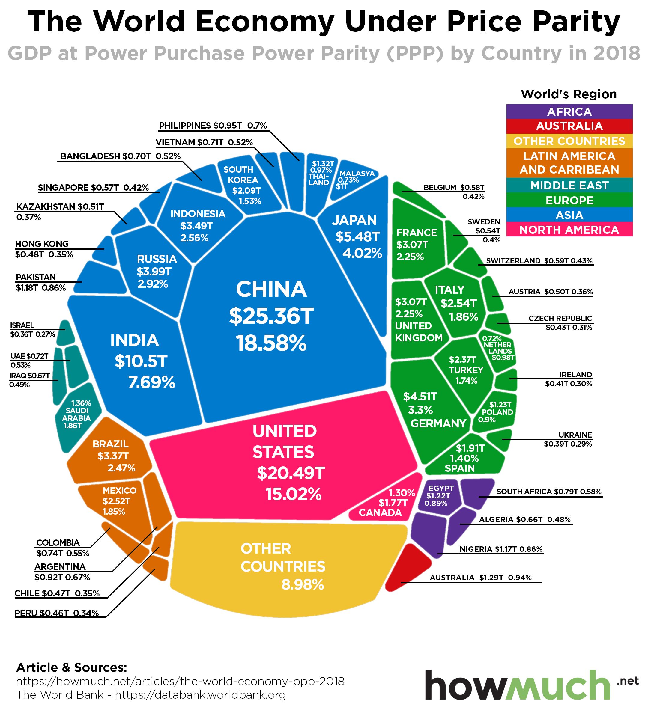
When comparing the economies of different countries, one of the most common methods is to use “purchasing power parity.” Purchasing power parity (PPP) compares international economies by standardizing the prices within a "basket of goods”. In other words, PPP accounts for the differences in standards of living (such as the different costs of a carton of milk) when comparing countries' production. Taking it one step further, our new visualization looks at the GDP of countries around the world in terms of PPP. In this chart, we use current international dollars, which has the same purchasing power as the dollar has in the United States.

- Measuring GDP by PPP takes into account the cost of living around the world, rather than relying on market exchange rates to compare the economies of different countries.
- In 2018, the world economy by PPP was $136.48 trillion.
- Asian countries represent more than 40% of the world’s GDP by PPP.
- The U.S. and China represent a third of the world’s GDP by PPP.
The information from this visualization comes from the World Bank, and the most recent numbers are from 2018. The size of each country in the visualization is proportional to its relative GDP by purchasing power parity. The countries are also color-coded by continent to illustrate the geographic distribution of the world’s production. All values are expressed in U.S. dollars.
Top 10 Countries by GDP at PPP
1. China - $25.36 trillion - 18.58% of World’s GDP
2. United States - $20.49 trillion - 15.02% of World’s GDP
3. India - $10.50 trillion - 7.69% of World’s GDP
4. Japan - $5.48 trillion - 4.02% of World’s GDP
5. Germany - $4.51 trillion - 3.30% of World’s GDP
6. Russian Federation - $3.99 trillion - 2.92% of World’s GDP
7. Indonesia - $3.49 trillion - 2.56% of World’s GDP
8. Brazil - $3.37 trillion - 2.47% of World’s GDP
9. United Kingdom - $3.07 trillion - 2.25% of World’s GDP
10. France - $3.07 trillion - 2.25% of World’s GDP
Last month, we published a visualization that illustrated the world’s economy by GDP in current U.S. dollars (GDP that does not account for cost of living and uses market exchange rates to compare different countries’ outputs). You’ll notice there are a few differences between the visualization showing the world economy by nominal GDP (right visualization) and the world economy at PPP (left visualization). Notably, the U.S. has the largest share of the world’s GDP overall, but China has the largest share of GDP at PPP.

The World Bank data also shows that the GDP at PPP in the U.S. has grown every year since the Great Recession. However, after ten years of expansion, economic growth in the U.S. is finally slowing. But some think that the job growth is still enough to retain economic stability and continue to increase GDP.
Similarly, China’s economic slowdown has been noted internationally, especially its decrease in exports. China’s Central Bank has taken action by reducing its reserve requirement ratio in order to encourage more lending and kickstart more production. More signs of a global economic recession are showing, as the economic performance of countries such as Japan and India have also failed to impress. The global economy is still growing for now, but these trends could be a harbinger for changes ahead.
Did anything surprise you about the differences between GDP and GDP at PPP around the world? Please let us know in the comments.
Data: Table 1.1